
Search results for "Inadequate" in Home Design Ideas

 Rolf Schroeder General Contractors, Inc.
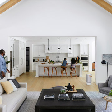
The layout of this early 90’s home was adequate for the husband when he was just living there. However, now the family of three and their loving cat live there together; the space quickly became confined and inadequate. The Clients contacted us to discuss what their options may be to help the home feel more spacious. After a few weeks of design and engineering, we went to work on opening up the first floor to increase the size of the rooms while creating continuity with the adjoining rooms. A once tired and confined layout became a spacious, comfortable, & aesthetically pleasing space to live and entertain.

 Butler Restorations LLC
New solid oak cabinet of deep drawers with oak top, plus upper cabinet for glassware to match existing units. The drawers have high capacity tracks so they can be loaded with serving pieces, dishes and other heavy objects.
The client had lived in this house for 30 years with the original builder-grade cabinets, poor lighting, inadequate storage and dated appearance. We built several new cabinets to supplement the old; added oak skins on the unfinished exposed cabinets; installed crown molding and glass tile backsplash.
The old can lights and useless center ceiling light were removed and new LED track lighting installed behind the new crown molding; new under cabinet lights; new glass cabinets with LED lights.

 Edmond Kitchen & Bath LLC
This 1970s ranch style home was in need of a whole revival in the kitchen including a complete new orientation in the space. In order to solve the problem of inadequate passage at the garage door, laundry machines were relocated to another area of the home, and a new "drop zone" for mail and phones was created. A dated soffit was removed and the cooking area was relocated to a longer - focal point wall that allows the cook to be more included while entertaining. An updated rustic and simplified craftsman style was chosen to compliment the other elements of stone and beams in the rest of the home. Another great kitchen for a wonderful family. Photos by David Cobb Photography.
Find the right local pro for your project
 CIAO Kitchen and Bath Ltd
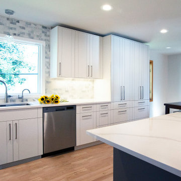
Bold Boulder contemporary. Nestled in the treetops this fresh redo features Euro cabinets with a warmer feel with the simple addition of vertical lines in the door design. Clean lines and classic white coloring gave this happy kitchen a carefree, sunny appeal.
Inadequate storage, a multi-activity twelve-year-old, and busy working parents were causing kitchen-living room clutter that no amount of effort could tame. The solution included an all-drawer approach; adding two tall pantries featuring 3 drawers and two pullouts in each; more cabinet units; and a German solution for the corner base cabinet.
The island was optimized by eliminating a half wall and adding drawer stacks, overhangs for seating the family of three, and on the back side, a row of under-counter base cabinets perfect for child-accessed storage.
Natural, stoney grey and stainless set off the pale natural color of the restored oak floors.

 clear path imports
Large galley dark wood floor eat-in kitchen photo in Los Angeles with a farmhouse sink, furniture-like cabinets, red cabinets, concrete countertops, gray backsplash, stainless steel appliances, gray walls and an island
 Rolf Schroeder General Contractors, Inc.
The layout of this early 90’s home was adequate for the husband when he was just living there. However, now the family of three and their loving cat live there together; the space quickly became confined and inadequate. The Clients contacted us to discuss what their options may be to help the home feel more spacious. After a few weeks of design and engineering, we went to work on opening up the first floor to increase the size of the rooms while creating continuity with the adjoining rooms. A once tired and confined layout became a spacious, comfortable, & aesthetically pleasing space to live and entertain.
 Rolf Schroeder General Contractors, Inc.
The layout of this early 90’s home was adequate for the husband when he was just living there. However, now the family of three and their loving cat live there together; the space quickly became confined and inadequate. The Clients contacted us to discuss what their options may be to help the home feel more spacious. After a few weeks of design and engineering, we went to work on opening up the first floor to increase the size of the rooms while creating continuity with the adjoining rooms. A once tired and confined layout became a spacious, comfortable, & aesthetically pleasing space to live and entertain.
 Rolf Schroeder General Contractors, Inc.
The layout of this early 90’s home was adequate for the husband when he was just living there. However, now the family of three and their loving cat live there together; the space quickly became confined and inadequate. The Clients contacted us to discuss what their options may be to help the home feel more spacious. After a few weeks of design and engineering, we went to work on opening up the first floor to increase the size of the rooms while creating continuity with the adjoining rooms. A once tired and confined layout became a spacious, comfortable, & aesthetically pleasing space to live and entertain.
 Rolf Schroeder General Contractors, Inc.
The layout of this early 90’s home was adequate for the husband when he was just living there. However, now the family of three and their loving cat live there together; the space quickly became confined and inadequate. The Clients contacted us to discuss what their options may be to help the home feel more spacious. After a few weeks of design and engineering, we went to work on opening up the first floor to increase the size of the rooms while creating continuity with the adjoining rooms. A once tired and confined layout became a spacious, comfortable, & aesthetically pleasing space to live and entertain.

 J Brew
Trillium Ovatum / Pacific Trillium
Photo: brewbooks, licensed under Creative Commons Attribution-ShareAlike 2.0 Generic
Woodland garden in Seattle
 Rolf Schroeder General Contractors, Inc.
The layout of this early 90’s home was adequate for the husband when he was just living there. However, now the family of three and their loving cat live there together; the space quickly became confined and inadequate. The Clients contacted us to discuss what their options may be to help the home feel more spacious. After a few weeks of design and engineering, we went to work on opening up the first floor to increase the size of the rooms while creating continuity with the adjoining rooms. A once tired and confined layout became a spacious, comfortable, & aesthetically pleasing space to live and entertain.

 Bell & Associates
Kitchen originally had dark contemporary cabinets and inadequate lighting. We enlarged the opening from foyer to kitchen and from kitchen to dining/family room. I specified new cabinet doors and a color befitting the homeowners design aesthetic. Doing so allowed for the back splash tile and granite counter top to be salvaged as they worked perfect with new color scheme. Added a new louvered door to laundry room allowing for better ventilation. Beautiful reclaimed wood flooring was installed.
Interior Design: Bell & Associates Interior Design, Ltd
Construction: Sigmon Construction
Cabinets: Cardinal Cabinetworks
Photography: Steven Paul Whitsitt Photography
 Edmond Kitchen & Bath LLC
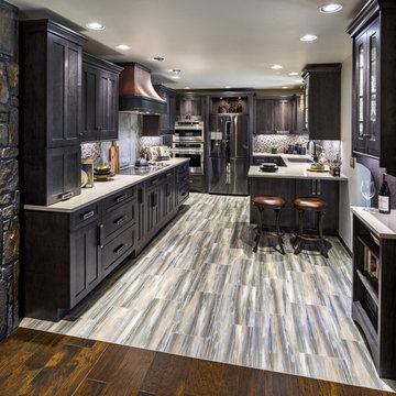
This 1970s ranch style home was in need of a whole revival in the kitchen including a complete new orientation in the space. In order to solve the problem of inadequate passage at the garage door, laundry machines were relocated to another area of the home, and a new "drop zone" for mail and phones was created. A dated soffit was removed and the cooking area was relocated to a longer - focal point wall that allows the cook to be more included while entertaining. An updated rustic and simplified craftsman style was chosen to compliment the other elements of stone and beams in the rest of the home. Of specific note is the installation of both induction and gas cooktops under the same real copper venthood for optional cooking methods. Another great kitchen for a wonderful family. Photos by David Cobb Photography.

 Edmond Kitchen & Bath LLC
This 1970s ranch style home was in need of a whole revival in the kitchen including a complete new orientation in the space. In order to solve the problem of inadequate passage at the garage door, laundry machines were relocated to another area of the home, and a new "drop zone" for mail and phones was created. A dated soffit was removed and the cooking area was relocated to a longer - focal point wall that allows the cook to be more included while entertaining. An updated rustic and simplified craftsman style was chosen to compliment the other elements of stone and beams in the rest of the home. Of specific note is the installation of both induction and gas cooktops under the same real copper venthood for optional cooking methods. Another great kitchen for a wonderful family. Photos by David Cobb Photography.
 Edmond Kitchen & Bath LLC
This 1970s ranch style home was in need of a whole revival in the kitchen including a complete new orientation in the space. In order to solve the problem of inadequate passage at the garage door, laundry machines were relocated to another area of the home, and a new "drop zone" for mail and phones was created. A dated soffit was removed and the cooking area was relocated to a longer - focal point wall that allows the cook to be more included while entertaining. An updated rustic and simplified craftsman style was chosen to compliment the other elements of stone and beams in the rest of the home. Of specific note is the installation of both induction and gas cooktops under the same real copper venthood for optional cooking methods. Also note our preferred location for a warming drawer - 2nd position in a nearby drawer stack where it can easily be used. Another great kitchen for a wonderful family. Photos by David Cobb Photography.

 Design Tech Remodeling
The lovely family of four had a small bathroom to share. Their shower was inadequate for the 6'4" homeowner. In order to provide them a more functional bathroom for them all, space was taken from one of the large bathrooms. We bumped the wall out a couple feet to provide these homeowner's with a large shower and linen cabinet storage space. They now have a beautiful transitional space that fits their needs. Initially the homeowner's were looking at a neutral beige palatte but fell in love with this grey color scheme. The grey, blue, and brown border tile helps pull all the colors together. The gorgeous Blue Pearl countertop provides a new element of color and complements the grey bathroom
Mike Kaskel
 Edmond Kitchen & Bath LLC
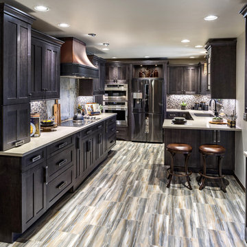
This 1970s ranch style home was in need of a whole revival in the kitchen including a complete new orientation in the space. In order to solve the problem of inadequate passage at the garage door, laundry machines were relocated to another area of the home, and a new "drop zone" for mail and phones was created. A dated soffit was removed and the cooking area was relocated to a longer - focal point wall that allows the cook to be more included while entertaining. An updated rustic and simplified craftsman style was chosen to compliment the other elements of stone and beams in the rest of the home. Of specific note is the installation of both induction and gas cooktops under the same real copper venthood for optional cooking methods. Another great kitchen for a wonderful family. Photos by David Cobb Photography.
 Bell & Associates
Kitchen originally had dark contemporary cabinets and inadequate lighting. We enlarged the opening from foyer to kitchen and from kitchen to dining/family room and specified new cabinet doors and a color befitting the homeowners design aesthetic. Doing so allowed for the back splash tile and granite counter top to be salvaged as they worked perfect with new color scheme. Added a new louvered door to laundry room allowing for better ventilation and specified new counter depth refrigerator which opened up walkway. Beautiful reclaimed wood flooring was installed.
Interior Design: Bell & Associates Interior Design, Ltd
Construction: Sigmon Construction
Cabinets: Cardinal Cabinetworks
Photography: Steven Paul Whitsitt Photography

 SELECT KITCHEN & BATH
The existing kitchen was a small 7.5 x 11.5 area with inadequate heating and limited natural light, available through an awkward peninsula dividing the kitchen from a previous family room addition.
The design concept was to create a larger, brighter and more open space integrated with an outdoor deck (not shown) off the family room, creating a family and guest gathering space within the overall kitchen area.
The layout was centered around a large “island-table” with seating for seven; extensive countertop space and separate cooktop and ovens allow for family member participation in meal preparation.
The design theme was contemporary, with warm, muted colors and textures. Cabinets were an engineered veneer grey oak with slab door style and obscured glass in the upper cabinets. Countertops are neutral quartz, flooring a natural oak, 5” plank engineered hardwood.
8