
Search results for "Increased connectivity" in Home Design Ideas
 Dyer Studio Inc.
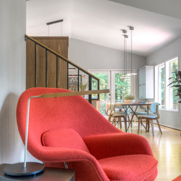
In collaboration with Green Hammer, this forested lot in the West Hills achieved the goals of increased daylight, improved energy efficiency, and optimized functionality through a series of mindful space planning, finish, and fixture decisions. By re-orienting the split level stair circulation, individual yet interconnected spaces were clearly defined, while celebrating the home’s connection to its natural setting.
 Klopf Architecture
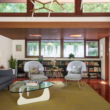
Nestled in the hills of Orinda, California, this 1951 residence is one of only seven extant homes, now known as “The Magnificent Seven”, designed by architect Olof Dahlstrand, a protégé of Frank Lloyd Wright. With its low-slung rooflines, natural materials, and deep integration with the sloping landscape, the home is a pristine example of mid-century modern design inspired by Wright’s organic principles. Over the years, prior homeowners have emphasized preservation, ensuring that the house remained relatively untouched. Each owner has respected the original architecture and stayed true to Dahlstrand’s intent. When a family of five—two college-aged sons and a middle school-aged daughter—acquired the property, they were captivated by its history, legacy of care, and architectural significance. While they appreciated Dahlstrand’s original vision, they also recognized the need to adapt the home for contemporary living while preserving its design integrity.
The remodel was conceived as a thoughtful response to the past—an effort to bring the house into the 21st century without compromising its soul. The primary mandate was to maintain architectural continuity while improving the functionality, comfort, and livability for a modern family. The design team—architects and contractor alike—worked with a shared reverence for the original architecture, allowing that mindset to guide even the most technical or pragmatic decisions.
A key objective was to increase natural light in the kitchen—a departure from Wrightian principles of enclosed, intimate cooking spaces—while maintaining the home’s architectural language. The kitchen was reconfigured to foster a stronger connection to adjacent living spaces while retaining the underlying concept of spatial separation. One of the most transformative architectural changes was the removal of a ridge beam that was originally planned to remain visible through the kitchen. During construction, the team collaborated on a better solution: a wide-flanged steel beam concealed within the roof envelope. This subtle move preserved the clean lines and ceiling continuity, a modern update carried out with utmost respect for the existing framework.
The home’s original powder room, previously accessible only through the kitchen, was relocated for better flow and privacy. A new powder room was carved out of former kitchen cabinetry—a narrow, interior space that could have felt dark and enclosed. To avoid this, the design extended the line of original transom windows into the new powder room and added a skylight above the vanity. The result is a bright and airy space that feels consistent with the rest of the home. Other updates included the installation of new solid-core interior doors with veneers carefully matched to the original mahogany, enhancing the continuity of the interiors. Even smaller decisions, such as placing the door knobs at 42 inches high, mirrored the original proportions. Every choice reflected a shared belief between the architect, contractor, and client: that new work should serve the integrity of the old.
The home’s extensive interior redwood millwork and paneling was meticulously restored. Where new materials were introduced—such as the replacement redwood soffit paneling—the contractor took pains to find finish nails that matched the original, rather than using modern equivalents. This level of craftsmanship and collaboration defined the project. It extended even to the detailing of a blind door to the new powder room, which had to disappear into the existing redwood board-and-batten wall. It was a team effort: the owner found a suitable handle, the architects devised the custom in-swing mechanism, and the contractor executed it so the door aligned precisely with the battens. Throughout, the homeowners were deeply engaged in the design process. One, a meticulous design enthusiast, focused on aesthetic integrity and historic detail. The other brought a practical and function-driven perspective, ensuring that new fixtures and materials would be durable and require minimal maintenance.
While the home’s location posed no major site challenges, sustainability was a key concern. The team upgraded the roof insulation, installed solar panels with battery storage, and added ductless mini-split cooling systems. Lighting was another area where modern technology was woven into a historic framework: new square LED fixtures echo the original custom perimeter soffit lights, maintaining the design language while offering advanced performance.
A planned expansion of a bedroom into suite with a bathroom had to be shelved due to budget constraints and the high cost of below-grade foundation work. Still, the team focused their efforts on making the most of the existing footprint, resolving constraints through design ingenuity rather than adding square footage. This renovation represents a collaborative achievement in preserving and evolving a historically significant home. Every decision was shaped by a shared ethos among clients, architects, and contractor: to maintain the home’s architectural soul while updating it for contemporary life. The result is a timeless modernist residence that continues Olof Dahlstrand’s legacy, remaining grounded in nature, craftsmanship, and human-scale design.
Klopf Architecture Team: John Klopf, AIA, Klara Kevane, Fernanda Bernardes
Interior Architectural Design: Klopf Architecture
Structural Engineer: Daniel Bastiao
Contractor: Don Larwood, Larwood Construction
Photography: Mariko Reed
Year Completed: 2022
 AG Millworks
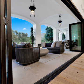
Expansive doors naturally create the illusion of larger spaces. As seen in this image, the Bi-fold patio door opens up the interior room to the outdoor patio, enhancing the flow and seamlessly connecting the two areas. This design effectively increases the usable square footage, making it easier to navigate between indoor and outdoor spaces.
Find the right local pro for your project
 Bell+Associates Architecture Inc.
This 1,800 sq ft all-season cottage is designed to make the most of its breathtaking south-facing view of the Ottawa River. Every aspect of the cottage was carefully considered to optimize the relationship between indoor and outdoor spaces, ensuring the water views are an integral part of daily life.
At the heart of the cottage is the expansive open-concept kitchen, dining, and living area, featuring a striking stone fireplace and vaulted ceilings. An abundance of windows along the river-facing side allows natural light to flood the space while offering uninterrupted views of the water. Strategic design elements, including retractable canopies, provide shade during hot summer months while allowing for increased sunlight during the winter to enhance the warmth and comfort of the interiors.
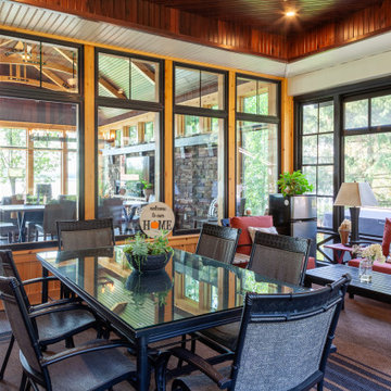
Perfect for entertaining, the spacious sunroom serves as a flexible space for both intimate gatherings and larger groups. It includes a second stone fireplace and ample room for dining and lounging, with seamless access to the outdoor deck. For sun lovers, the deck provides the perfect spot to bask in the warmth, while the canopy offers a shady retreat to enjoy the river views during hot days. A cozy firepit patio closer to the water creates an inviting space for evening gatherings, complete with the charm of a crackling fire and views of the river.
Off the sunroom, a screened porch offers a shaded escape, providing relief from the heat and bugs during the summer afternoons. This porch is conveniently located next to the BBQ area, allowing for easy outdoor cooking and socializing.
The primary bedroom suite includes a bedroom partition wall that allows the bed to face the river while providing unimpeded access to the walk-in closet and ensuite bathroom. The main level also includes a butler’s pantry, office, full bathroom, and a second bedroom ideal for family.
The lower level expands the living space further, offering four additional guest bedrooms, a bunk room for the kids, ample storage, a laundry room, and a versatile games room. With thoughtful design and functional spaces, this cottage balances comfort, style, and connection to nature.
 Katie Hutchison Studio
As readers of architect/designer Katie Hutchison’s book The New Cottage (Taunton Press 2018), these homeowners approached KHS about designing a second home in Westerly, Rhode Island. Theirs is a double-long lot with street frontage on both ends, a short walk from the water. In addition to the new house, their wish list included a new lap pool (with associated patio) and new garage.
Aesthetically, they were looking to create an informally elegant, human-scaled family compound, engaged with the site and connected with the outdoors. They further requested sustainable features/systems and low-maintenance materials.
In response, KHS proposed an ell-shaped house that wraps two sides of a lap pool/patio. A porch-fronted two-story gabled component faces the main street and is flanked by the one-story primary suite in one leg of the ell and the one-story kitchen and rear porches in the other leg of the ell. The house is an efficient +/- 2800 square-feet and contains four bedrooms and three and one half bathrooms.
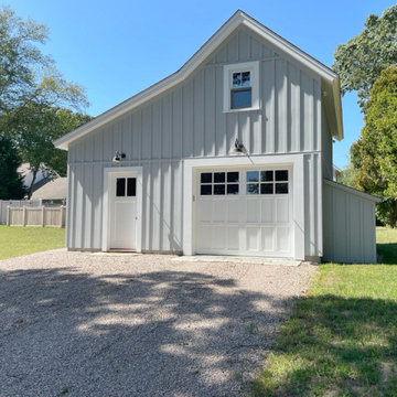
A salt-box inspired garage is detached so as not to increase the building massing. It helps shape outdoor spaces and doesn’t block daylight and direct exterior access from the house. It faces the secondary street. Driveways off both streets offer different modes of arrival.
The south-facing roof of the two-story volume – which includes three bedrooms and two baths – and the south-facing one-story roof of the kitchen and rear porches, as well as the south-facing roof of the garage support 47 photovoltaic solar panels, providing the bulk of the property’s electric power.
Two oversized exterior folding glass doors off the living area and kitchen blur the boundary between indoors and outdoors, welcoming abundant daylight, views of the pool and patio, as well as summer breezes. An airy living/dining area includes a long custom window seat and borders a semi-open kitchen beneath a cathedral ceiling. Living area built-in shelving frames a TV and surrounds a modern efficient pellet stove.
A cheerful interior palette of soft hues features pops of color, Scandinavian wallpapers, custom textiles, and a dash of warm wood accents in the form of counters, built-in desks, and custom furnishings. On the exterior, natural shingles side the main volume and environmentally friendly and durable Boral board-and-batten side the one-story components and garage, communicating a legible hierarchy of spaces. The overall effect is a breezy, crisp New England home, pool patio, and garage for today’s living.
 Designs by BSB
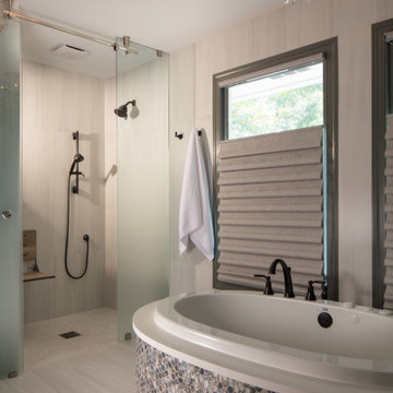
As the designer behind this master bathroom transformation, my mission was clear: to breathe new life into an outdated and dimly lit space while catering to my client's distinct desires. The project was marked by the client's unwavering commitment to enhancing functionality privacy and preserving the owner’s cherished MTI tub, all while adhering to the unalterable presence of existing windows.
FEATURES:
1. A glass pass-through between rooms allows natural light to flow freely, promoting a sense of openness.
2. The ceiling-mounted sliding glass door hardware elevates the shower experience with taller glass panels and effortless operation.
3. Accessibility and safety were paramount, resulting in a zero-entry shower, strategically placed grab bars, and an 'assist' TP holder.
4. To cater to varying preferences, a main showerhead and hand shower were accessible for standing and bench use.
5. A shared glass door between rooms eliminated the inconvenience of cumbersome door swings.
6. Privacy was enhanced through gradient glass etching, ensuring comfort and tranquility.
7. The digital shower system allowed for personalized controls, accommodating the unique preferences of the couple.
Creating a private bath around the existing MTI tub initially seemed insurmountable. However, innovative thinking led to a transformative solution. The drop-in tub was ingeniously converted into a free-standing tub with a narrow quartz deck adorned with a captivating mother-of-pearl mosaic tile surround. A floating walnut shelf at the tub's end introduced practicality and organic beauty.
Black plumbing fixtures were chosen to accentuate the mesmerizing depth of the mother-of-pearl mosaic tile. Horizontal book-matched walnut vanities introduced warmth and character, seamlessly connecting the interior to the outdoor view. The white quartz countertop is a refreshing contrast to the intricate finishes, lending a touch of sophistication. The ceiling light over the tub, akin to the icing on a cake, added a final note of elegance.
To meet the client's need for increased storage, the vanities have pullouts & roll-outs. These thoughtful additions ensured effortless access to personal care products. LED-lit medicine cabinets not only provided excellent lighting but also served as storage for everyday essentials. Vanity toe kick lighting is thoughtfully designed with a motion sensor at the entry, providing a guiding path to the water closet. Particularly valued during nighttime, this feature prevents unnecessary lights from illuminating, preserving the tranquility of those in bed.
 Katie Hutchison Studio
As readers of architect/designer Katie Hutchison’s book The New Cottage (Taunton Press 2018), these homeowners approached KHS about designing a second home in Westerly, Rhode Island. Theirs is a double-long lot with street frontage on both ends, a short walk from the water. In addition to the new house, their wish list included a new lap pool (with associated patio) and new garage.
Aesthetically, they were looking to create an informally elegant, human-scaled family compound, engaged with the site and connected with the outdoors. They further requested sustainable features/systems and low-maintenance materials.
In response, KHS proposed an ell-shaped house that wraps two sides of a lap pool/patio. A porch-fronted two-story gabled component faces the main street and is flanked by the one-story primary suite in one leg of the ell and the one-story kitchen and rear porches in the other leg of the ell. The house is an efficient +/- 2800 square-feet and contains four bedrooms and three and one half bathrooms.
A salt-box inspired garage is detached so as not to increase the building massing. It helps shape outdoor spaces and doesn’t block daylight and direct exterior access from the house. It faces the secondary street. Driveways off both streets offer different modes of arrival.
The south-facing roof of the two-story volume – which includes three bedrooms and two baths – and the south-facing one-story roof of the kitchen and rear porches, as well as the south-facing roof of the garage support 47 photovoltaic solar panels, providing the bulk of the property’s electric power.
Two oversized exterior folding glass doors off the living area and kitchen blur the boundary between indoors and outdoors, welcoming abundant daylight, views of the pool and patio, as well as summer breezes. An airy living/dining area includes a long custom window seat and borders a semi-open kitchen beneath a cathedral ceiling. Living area built-in shelving frames a TV and surrounds a modern efficient pellet stove.
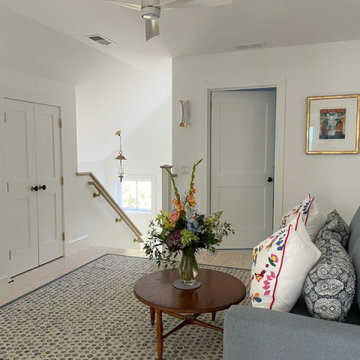
A cheerful interior palette of soft hues features pops of color, Scandinavian wallpapers, custom textiles, and a dash of warm wood accents in the form of counters, built-in desks, and custom furnishings. On the exterior, natural shingles side the main volume and environmentally friendly and durable Boral board-and-batten side the one-story components and garage, communicating a legible hierarchy of spaces. The overall effect is a breezy, crisp New England home, pool patio, and garage for today’s living.
 D2 Architects
"We often rush to divide everything as white and black and store them separately in a separate place. But seemingly opposing things that are inseparable - that is the world - are a mixture of different things." _Matisyahu_
The contrast between black and white is not only a choice but also a way to make it special. When stepping into an all-white or all-black living space, it is easy to feel purity or luxury, but it can also suggest a little skepticism about the monotony or oppressiveness it brings. So using black and white is therefore not difficult but definitely not easy.
In the apartment project at Vinhomes Symphony apartment that we implemented this time, white and black are no longer just two opposing colors, but they are combined and mixed, intertwined creatively to create a unity. As an expression of day and night, brilliance and mystery, white and black have adopted tricks and materials, arrays of blocks and light, blending together with the goal of creating living spaces with comfort, convenience and luxury.
"This is probably a very special and interesting project for me and my colleagues, right from the first approach, the investor is also a sister, a person with a young, dynamic way of thinking with a very special and very own taste. After each actual project, we keep a diary of the conceptualization, design and execution process. Join us to look back on the process of project formation as well as better understand the philosophy, ideas and functions that have been sent in the project" - Kts. Dang Duong - Founder of D2Architects.
The current status of the project is 2 apartments located at location A-20 and A-21 in S6A building of Vinhomes Symphony apartment. With an east-facing façade, the apartment is endowed with the advantage of natural light as well as excellent panoramic views. The highlight of this apartment is the view opening to the Phuc Loi lotus lagoon with a large area, more than 10 hectares and airy landscape by the Duong River.
These are not merely apartments, but they are also places to express creativity and make harmonious use of natural light and surrounding nature. Every view from these apartments not only opens up amazing scenery but also a lifestyle full of relaxation and tranquility amidst the noisy city.
With the special importance of location and unique views, making perfect use of space and light here is not only an advantage but also a great potential to create a sophisticated and classy living space. The sophistication in design and handling of space has been put on top by us, in order to make the most of these extremely special advantages.
In order for a living space to truly become a place called "Home" – a place where we want to return and feel peaceful while there, we have carefully researched the preferences and desires of the owner. Sharing with me about her hobby, Ms. Yen expressed that she loves a modern space with minimalist style and cool tones, creating a sense of tranquility and elegance. This is clearly reflected in the original idea for the apartment.
What's even more interesting is his teenage son's hobby of playing Lego. This is not only a personal preference but also a special source of inspiration for the design process. From these data, we built a preliminary idea for the comprehensive living space of the apartment.
The combination of the requirement of modern, minimalist space and cool tones along with creative elements from his son's personal hobby of playing Lego has created a unique living space, both reflecting the owner's own personality and meeting the needs of living and personal preferences. This is the foundation for creating a real home, where each member of the family feels content and peaceful every time they return.
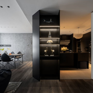
The project uses the main tone of industrial wood painted in dark gray, white and dark veneer. Versatile combination with other modern materials such as smoke glass and artificial stone,... Create a work of architectural art where everything intersects harmoniously with natural light like a great symphony.
The contrast between the bass of the cool tone and the warm, gentle touch of the light creates an impressive picture of a delicate blend of opposing elements. The soft, beautiful touch of this space is hidden in the strength and modernity of the materials used. This is not only a house, but also a mirror that clearly reflects the personality and philosophy of life of the owner.
The modern, youthful spirit is clearly shown from the moment you cross the threshold to enter the house. Flexibility, creativity and the harmonious intersection of materials and light have created a colorful and sophisticated living space, while celebrating the beauty of modernity and youthful vitality.
LIVING ROOM:
The living room is not merely a living area or common living space of the family, but according to feng shui concept, this is the place where the best energy of the house is concentrated. Therefore, creating a special living room space is extremely important.
Neutral gray-white tones are made in the background, creating the foundation for sophistication and elegance. Color accents are subtly applied, creating a unique touch for the house, increasing the creativity and style of the owner.
Maintaining the spirit of LEGO - unlimited creativity - through every corner, every architectural line has created an interesting space experience right in the living room. It stimulates the imagination of all ages, opening up space for each person to freely create, build and connect with each other through the common language of LEGO.
KITCHEN & DINNING ROOM:
The kitchen is an indispensable piece in every family, this place is likened to the heart of the whole house. All one needs to create great taste is love and creativity in the kitchen. Because the kitchen with family meals is the emotional bond between members. Therefore, designing a beautiful and functional kitchen requires a delicate combination of colors, shapes and meticulousness in choosing the right materials.
Today's kitchen is invested by many people in both form and quality, so a beautiful, luxurious, modern, comfortable kitchen that fully meets the needs of each family is the design criterion D2 Architects aims for.
The Lego House project is not just a project anymore but it is really the result of sending all our core values and creative spirit to create a living space that symbolizes the interconnectedness of design, art and soul.
D2Architects
A : Khuat Duy Tien -Thanh Xuan Bac - Ha Noi – Viet Nam
M: d2architects.vn@gmail.com
W: d2architects.vn
P: 0965551101 - 0965554792
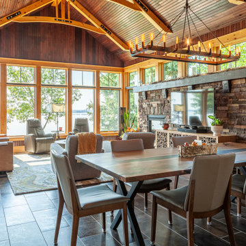 Bell+Associates Architecture Inc.
This 1,800 sq ft all-season cottage is designed to make the most of its breathtaking south-facing view of the Ottawa River. Every aspect of the cottage was carefully considered to optimize the relationship between indoor and outdoor spaces, ensuring the water views are an integral part of daily life.
At the heart of the cottage is the expansive open-concept kitchen, dining, and living area, featuring a striking stone fireplace and vaulted ceilings. An abundance of windows along the river-facing side allows natural light to flood the space while offering uninterrupted views of the water. Strategic design elements, including retractable canopies, provide shade during hot summer months while allowing for increased sunlight during the winter to enhance the warmth and comfort of the interiors.
Perfect for entertaining, the spacious sunroom serves as a flexible space for both intimate gatherings and larger groups. It includes a second stone fireplace and ample room for dining and lounging, with seamless access to the outdoor deck. For sun lovers, the deck provides the perfect spot to bask in the warmth, while the canopy offers a shady retreat to enjoy the river views during hot days. A cozy firepit patio closer to the water creates an inviting space for evening gatherings, complete with the charm of a crackling fire and views of the river.
Off the sunroom, a screened porch offers a shaded escape, providing relief from the heat and bugs during the summer afternoons. This porch is conveniently located next to the BBQ area, allowing for easy outdoor cooking and socializing.
The primary bedroom suite includes a bedroom partition wall that allows the bed to face the river while providing unimpeded access to the walk-in closet and ensuite bathroom. The main level also includes a butler’s pantry, office, full bathroom, and a second bedroom ideal for family.
The lower level expands the living space further, offering four additional guest bedrooms, a bunk room for the kids, ample storage, a laundry room, and a versatile games room. With thoughtful design and functional spaces, this cottage balances comfort, style, and connection to nature.
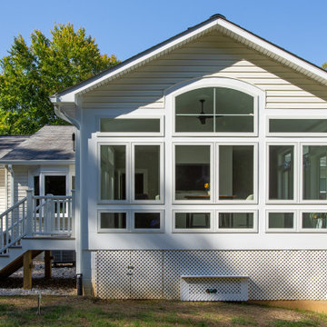
 Schroeder Design/Build, Inc.
The sunroom was designed with beautiful transom windows, creating a glass enclosure that maximized the view of the backyard. The existing porch ceiling was low, so we increased the height to give the room a sense of connection to the backyard through the high glass windows.
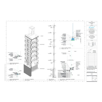
 KURV Architecture DPC (Alex Hughes Architects)
Located in the heart of Manhattan’s Lower East Side, the building was erected on a shallow commercial lot between two 120 year old masonry buildings and a new residential rental building. 330 Grand Street is a mix of 725 SF 1BRs and 1050 SF 2BR apartments. It also contains a 1100 SF two story duplex as well as private and public rooftop space, large private balconies for most units and two large private terraces for the ground floor units.
330 Grand Street was originally designed and approved at the NYC DOB as a prefabricated modular building. During the pandemic, as shipping costs skyrocketed putting the project at risk, we suggested redesigning the building as a reinforced cast-in-place concrete structure. Concrete was readily available and prices had not been affected by the demand increase that many other materials suffered in the pandemic. We took this opportunity to raise floor to ceiling heights, enlarge high performance windows and redistribute the buildings MEPFS and Structural Systems to create very open floor plans.
The challenge was to create a luxurious sensorial living experience with very limited means. In a city with very high construction costs, low cost residential buildings in the area are usually devoid of good quality, design and character. Our approach was to aim high for the end user, prioritizing natural light, open space with long visual perspectives, high ceilings and as always, rejecting the use of predefined building templates.
Our biggest challenge was to ensure that the small spaces feel as clean cut, large and bright as possible. Several unique design decisions were made to ensure low cost and high quality;
Floor plans were laid out so that spaces were wide open and free of clutter from mechanical or structural interruptions. Therefore all infrastructure was placed in lateral demising walls, which in turn act as the unit’s storage and kitchen. The apartments feel wide open, are super quiet and have more storage space than any other comparable apartment in the city.
To solve the problem of the site’s shallow commercial lot which is typically prone to dark interior spaces we focused our attention on the building’s envelope. Instead of the usual small punched window openings, oversized high performance windows were designed to ensure that light penetrated as far as possible into the units. In the smaller 1BR units, the full 50’ depth of the lot is perceived by partitioning spaces with sliding pocket doors that can be retracted to allow deep visual perspectives, making the sight lines in the space feel longer, larger, more ample than normal. In addition to the full height glazing, each unit above the 2nd floor receives a 7 foot covered balcony, adding 120 to 240 sf to each apartment, something unusual in New York City buildings. The space is large enough for a full size dining table, when the weather permits being outside.
We also worked hard to ensure modularity. For example, all kitchen units are all identical throughout the building. The idea of modularity and the economy of the repetitive unit is exercised to the maximum through the building.
Hardware, appliances, flooring, wall coverings and material finishes are all carefully selected to feel bespoke, high quality and unique.
It was important to KURV that the result of this work manifest into something that would deeply connect with the end user and sustain relationships with the consumers of this space.
All images by KURV Architecture ©
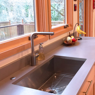
 Agate Architecture, LLC
Terri and Jim loved many things about their home, but the outdated, poorly designed kitchen, laundry room that was shoved into the corner of the kitchen, and loft that was annexed from other living spaces needed a complete makeover. The house is nestled on a large lot filled with mature trees that offer filtered morning and afternoon light. Establishing a strong visual link from the front yard through the house and into the back yard was a high design priority, as well as connecting the living spaces with an open floor plan, all without increasing the overall footprint of the home. Agate Architecture's completed remodel includes a full kitchen and dining room renovation, a new mud/laundry room, renovation of the second-floor loft, a new staircase, and exterior improvements. The use of Douglas Fir as a main unifying material and simple clean lines lends a bright Pacific Northwest style, with natural light in abundance. Terri and Jim’s home is now a truly exceptional space for everyday use and family entertaining.
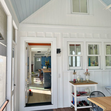 Katie Hutchison Studio
As readers of architect/designer Katie Hutchison’s book The New Cottage (Taunton Press 2018), these homeowners approached KHS about designing a second home in Westerly, Rhode Island. Theirs is a double-long lot with street frontage on both ends, a short walk from the water. In addition to the new house, their wish list included a new lap pool (with associated patio) and new garage.
Aesthetically, they were looking to create an informally elegant, human-scaled family compound, engaged with the site and connected with the outdoors. They further requested sustainable features/systems and low-maintenance materials.
In response, KHS proposed an ell-shaped house that wraps two sides of a lap pool/patio. A porch-fronted two-story gabled component faces the main street and is flanked by the one-story primary suite in one leg of the ell and the one-story kitchen and rear porches in the other leg of the ell. The house is an efficient +/- 2800 square-feet and contains four bedrooms and three and one half bathrooms.
A salt-box inspired garage is detached so as not to increase the building massing. It helps shape outdoor spaces and doesn’t block daylight and direct exterior access from the house. It faces the secondary street. Driveways off both streets offer different modes of arrival.
The south-facing roof of the two-story volume – which includes three bedrooms and two baths – and the south-facing one-story roof of the kitchen and rear porches, as well as the south-facing roof of the garage support 47 photovoltaic solar panels, providing the bulk of the property’s electric power.
Two oversized exterior folding glass doors off the living area and kitchen blur the boundary between indoors and outdoors, welcoming abundant daylight, views of the pool and patio, as well as summer breezes. An airy living/dining area includes a long custom window seat and borders a semi-open kitchen beneath a cathedral ceiling. Living area built-in shelving frames a TV and surrounds a modern efficient pellet stove.
A cheerful interior palette of soft hues features pops of color, Scandinavian wallpapers, custom textiles, and a dash of warm wood accents in the form of counters, built-in desks, and custom furnishings. On the exterior, natural shingles side the main volume and environmentally friendly and durable Boral board-and-batten side the one-story components and garage, communicating a legible hierarchy of spaces. The overall effect is a breezy, crisp New England home, pool patio, and garage for today’s living.
 Hebai Furniture | Smart Nightstand
Many buyers ask the same question when sourcing bedside tables from China:
“Why is the MOQ so high?”
For OEM bedside table and nightstand projects, MOQ is not only a sales rule. It is connected with material purchasing, machine setup, finishing process, hardware ordering, packaging, and production efficiency.
For standard ODM bedside tables, MOQ is usually easier to manage because the factory already has the structure, material plan, and production process ready.
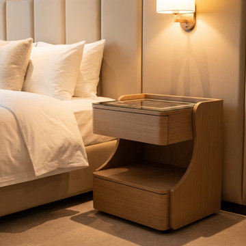
For custom OEM nightstands, MOQ is usually higher because the project may involve custom size, color, drawer structure, legs, handles, finish, logo, packaging, or smart functions such as USB-C, wireless charging, LED lighting, Bluetooth speaker, fingerprint lock, or password lock.
For importers, distributors, hotel buyers, e-commerce sellers, and private label furniture brands, the best solution is not always to ask for the lowest MOQ.
A better approach is:
- Start with existing ODM models
- Keep the material and finish simple
- Use mixed SKUs under one material plan
- Accept a reasonable small-order price increase
- Build long-term cooperation with the factory
- Test the market first before placing a larger order
Hebai Furniture, operated by Ganzhou Hebai Wood Products Co., Ltd., is a China-based OEM bedside table and nightstand manufacturer supporting OEM/ODM projects for global buyers.
We support:
- Modern bedside tables
- Leather nightstands
- Upholstered nightstands
- Smart nightstands
- Hotel bedside tables
- Wireless charging nightstands
- USB-C bedside tables
- LED nightstands
- Bluetooth speaker nightstands
- Fingerprint lock nightstands
- Custom packaging
- Private label furniture projects
If you are sourcing bedside tables or nightstands from China, understanding MOQ can help you reduce risk, control cost, and negotiate with suppliers more professionally.
Full MOQ guide:
https://hebaifurniture.com/blog/bedside-table-moq-guide
Browse product catalog:
https://hebaifurniture.com/category
Request catalogue and quotation:
https://hebaifurniture.com/catalogue
Hebai Furniture | OEM Bedside Table & Nightstand Manufacturer in China
 The Jack + Mare | Portland Design & Build
The Jack + Mare worked with the homeowners of this cool mid-century inspired kitchen from schematic design all the way through construction.
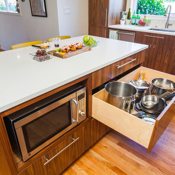
The existing kitchen was demolished all the way to studs, subfloor and ceiling joists and completely rebuilt with custom cabinets, solid oak flooring, task and ambient lighting, new electrical/plumbing, counter-to-ceiling wall tile, new beam (took down wall between living/kitchen), new window and colorful barn door.
The final design maximized storage, increased counter space, improved traffic flow, connected kitchen to adjacent living room (by removing existing wall), and improved the social aspect of the kitchen.
The kitchen is now efficient, beautiful, full of light and a happy place to call home!
Features: custom walnut cabinets (designed by The J+M), tile backsplash, new lighting plan (LED can lights, under-cabinet LED lights, Cedar+Moss pendants with LED bulbs), quartz countertops, new Marvin window with new trim, pantry with pull out shelves, glass upper cabinet (with puck LED) to feature antique glass-ware, island with microwave under counter, island seating.
photo credit: Jason Quigley
 Old World Hardscaping
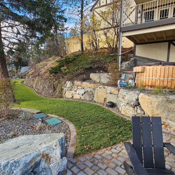
This house's backyard was limited by very steep terrain. To add value to the property and create a more functional backyard a terrace was raised on the slope, increasing the overall lot size. To dress this up and enjoy the veranda and its hot-tub were repaved and connected by a stair case to the new fire pit patio.
 Gordon Reese Design Build
FEATURES:
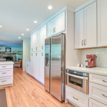
Larger doorway between kitchen and formal dining connecting spaces
New layout of kitchen increasing storage and improving functionality
Installed a smaller window at the eat in area to allow peninsula location creating a larger kitchen area
Patched and refinished all hardwood flooring
Improved lighting
Pull out pantry system
 New England Design & Construction
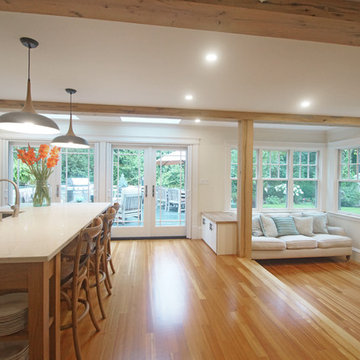
In this total gut and reconfiguration of the kitchen and adjacent spaces, a seamless marriage of farmhouse aesthetic with materials that are already in the home create a space that integrates with the feeling of the original home. Significant changes to the layout and removal of walls has created an open concept living, larger kitchen area, and an organized and functional kitchen space. New French doors connect to the outdoors and introduce more light into the space, as well as increased recessed and accent lighting assist in generating a light-filled home. The new layout provides an open, inviting entertaining space where children can play in the den while meals are prepared on the oversized island.
 Jones Pierce Architects
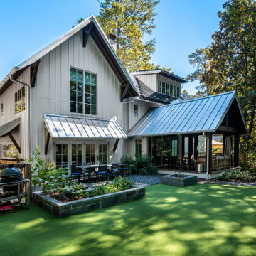
The culmination of design ideas, inspiration, and client feedback is reflected in the transitional design and comfortable home approach:
- The operable doors in the side of the garage open to a food-producing garden for access to supplies and for the flexibility of using the garage for large-scale entertainment events.
- Board and Batten offer a low country feel
- Stained eaves with exposed rafter tails provide warmth and earthiness
- White grid bars on the windows, while increasing the scale of the panes, was a conscious decision to retain character and nod to a timeless tradition.
- The galvalume metal roof gave an updated sleekness to the design.
 LBK Design Build
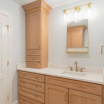
The goal of this renovation was to modernize the home while preserving its warmth and character. The design introduces a more functional layout, increased storage, and a cohesive material palette that connects the mudroom, kitchen, pantry, primary suite, and bathroom. Clean-lined millwork, warm wood tones, painted cabinetry, and layered textures create a balanced aesthetic that feels both timeless and updated.The original layout featured a compartmentalized kitchen with limited storage and circulation challenges. The mudroom lacked built-in organization, and the pantry provided minimal functionality. Within the primary suite, the bathroom and closet areas did not maximize available square footage or storage opportunities. Existing finishes throughout the home relied heavily on warm wood cabinetry and beige-toned tile.
30