
Search results for "Inefficient" in Home Design Ideas
 Project Mint Developments
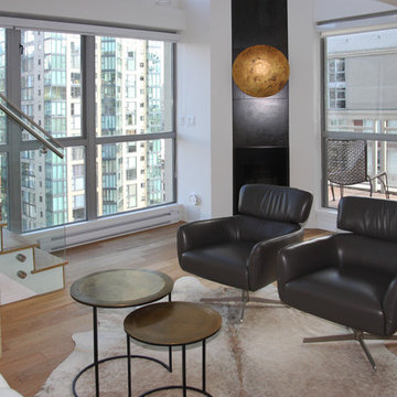
Originally an inefficient and dated apartment, this Vancouver Loft was stripped back to its shell and remodeled into a 2 bedroom 2 bath home made to entertain. The combination of subtle warm and cool materials/colours create a calm backdrop for feature elements like the 18’ tall fireplace and contemporary chandelier.
 Anita Buchheim Interiors
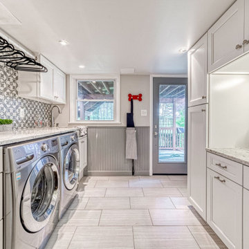
The “Before” Laundry Room was an eye sore with a huge inefficient furnace with no storage for laundry/cleaning supplies and pet food. It sadly lacked any counter space for sorting or folding clothes.RoomAntics got a hold of the disjointed space and designed a plan to have the furnace relocated. We also replaced the old furnace with a more efficient model. Our design plan incorporated space from the adjoining garage to create a small utility room so we could enclose the furnace and get it out of the laundry room. Next we tackled the space left behind starting fresh making use of every inch of space.
With fresh white cabinets, graphite appliances, new counters, tile, grey glazed porcelain backsplash and pops of red, we created a welcoming, pretty, and functional space for laundry as well as feeding and corralling the client’s three dogs!
 Tom Bassett-Dilley Architect, Ltd.
Photography by Natalie Marotta
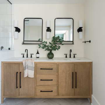
Bungalows are lovable homes, but how can they be better? Along with many of our clients, we find that older (early 20th c.) homes have a lot of character and a comfortable scale, but are leaky, damp (especially in the basement), have fair to poor air quality, and use unconscionable amounts of fossil fuels to heat. The owners of this bungalow were ready to change that, and wanted to do so with minimal upfront carbon emissions as well.
The gut renovation included replacing the basement slab and providing capillary breaks and insulation continuously below grade. The brick structure was treated with a fluid-applied air and water barrier from the interior and insulated entirely with cellulose, a carbon-storing insulation. The roof used HFO-blown spray foam to provide sufficient insulation while allowing headroom for bedrooms, bathrooms, and laundry.
One great benefit of a full renovation is the possibility of reconfiguring spaces to suit the family’s lifestyle, and to make the best of indoor-outdoor connections. We opened up the main rooms on the first floor, creating a family gathering spot with a view to the back yard, and a spacious kitchen that supports the family’s commitment to cooking for healthy eating. The stair uses a north-facing skylight to bring light from above into the middle of the home, where it was previously dark.
As a decarbonization retrofit, the inefficient furnace was replaced with two small ducted heat pump systems, water heating and clothes drying are powered by air-source heat pumps, and cooking uses an induction cooktop plus electric ovens. Energy recovery ventilation provides filtered fresh air continuous exhaust from the kitchen, baths, and laundry, and supplies fresh, highly filtered air to bedrooms and living spaces.
The Better Bungalow now makes sense for the 21st century–it now fits the owners’ life-patterns, is super comfortable, has great air quality, and uses a fraction of the energy it did before, greatly lowering the demand on the utility grid. In the near future, when solar PV is installed, it can achieve net zero or near net zero emissions, and with battery backup, can provide great resilience in the event of power outages.
Find the right local pro for your project
 ALL Renovation & Design LLC
Mrs. Deighan loved to cook, but hated her kitchen.
It was nonfunctional, inefficient, and an eyesore.
The sink was in the corner under low cabinets. The awkwardly placed fridge made it impractical for the entire family to be working together.
And that was a big deal.
She wanted a beautiful place to cook and entertain.
Besides the cramped space, the old, brown plywood cabinets were falling apart.
Because the cabinets were low, under-cabinet lighting was useless.
The kitchen was dark.
The previous owners had updated the flooring, but only by putting uglier tiles over the old vinyl.
And the ceiling had a leak stain.
It was time for a big change.
The Deighan's called Amos from ALL Renovation & Design.
Amos’s many successful remodeling projects done for them over the years had forged a friendship that made him the obvious contractor of choice.
Amos sat down with them and asked them to make a dream kitchen list.
If budget were of no concern, what would the space look like?
Once the Deighan's had their list, Amos helped them to evaluate each investment, taking into consideration the age and value of the home.
Then Amos presented a plan that fit perfectly in the Deighan's budget.
The basic U-shaped kitchen layout stayed the same.
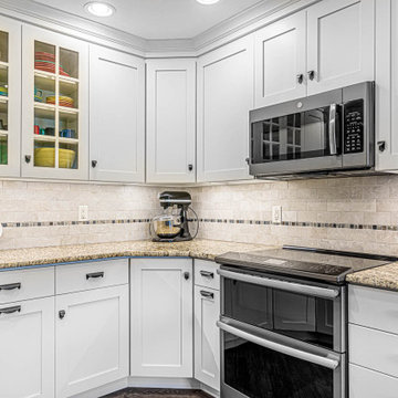
Modern, creamy white custom cabinets replaced the dark plywood cabinets.
The fridge moved to make space for more cabinets.
The biggest challenge was moving the laundry room wall a few feet.
Moving it was necessary to add more space, but, since the wall was load-bearing, moving it required extra attention.
It was worth it.
Extra space allowed the counter to extend and the sink to move.
After the hard work ended, the reason for the transformation became reality.
Now “we can have the whole family in there comfortably and working together,” Mrs. Deighan said.
She loves her kitchen.
Especially the windowed cabinets that show off her fiestaware.
And when you see the beautiful St. Cecilia granite countertops, with Milstone Sari porcelain mosaic tile backsplash, maple flat-panel cabinets with under-cabinet lighting, and all new appliances including a double oven, you will see why she does.
 123 Remodeling Inc.
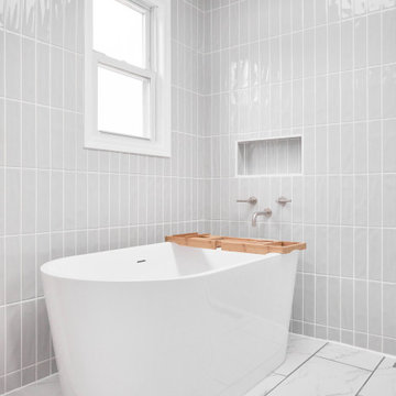
We wanted to update the master bathroom to be a more modern and open layout. There were existing skylights that we wanted to utilize and brighten the space because it was dark, dated, and closed off, making the layout inefficient. The client also wanted to add a tub, which did not exist. We reconfigured the entire layout to allow for adding a freestanding tub. We accomplished this by designing the shower and tub area to create a wet room on one side of the space.
 Simmons and Company
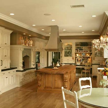
French manor styling was the result of the client's love of all things French, down to the chandelier found in a little shop in Paris. The focus on a serious working kitchen required plenty of attention to detail while layering on the opulence. It's really a French pastry.
The teak butcher block island top provides a lifetime of food preparation. Not able to find a hood with the right proportions Simmons & Co. designed a custom stainless hood with the correct gentle curve. Authentic French hardware was plated in pewter to soften the hardware's impact. Generous pantry storage and the oven wall replaced an inefficient walk in pantry. A dust bin access to the central vacuum system is tucked into the toe kick under the pantry and an emphasis was placed on the toe kick designs to eliminate the typical awkward appliance toe kick resolutions. Note the paneled dishwasher door to the right and left of the sink. When closed, the dishwasher disappears entirely. For those chilly winter mornings in Lake Sherwood an authentic English coal fire basket adding both beauty and function with the tile selection and color coordination completing the "Interior Hardscape".
The chandelier is symbolic of the fun we all had working with a client whose shining spirit and creativity guided our goal of "doing the right thing" at each and every a decision. What a creative project should be all about. Oh, yes, the chandelier. Look closely to find old colanders, pie tins, tea cups and parts and pieces from and old working kitchen.
 Alli Rader Creative
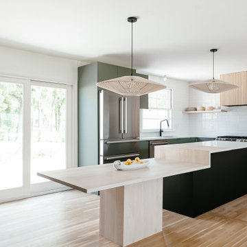
This 1963 brick home was given the opportunity for new life when a creative couple from Brooklyn took a chance and moved their life to Nashville! The kitchen went from a dreary, sad, barely functional room to an inspiring space to gather and entertain. Removing the wall between the living and kitchen opened up the previously choppy, inefficient layout to bring a sense of flow and ease to the home. We designed a custom island/dining table, seamlessly flowing from the terrazzo style quartz countertops into the solid maple table, complimented by the slat wood design on the range hood. We decided to go with a larger scale subway tile in a horizontal stacked pattern to keep the feel light, but also modern and timeless. The built-in matte black wall cabinetry brings a minimal but striking moment to balance the airiness of the other side of the kitchen, while providing ample storage for the pantry as well as a large bar for the cocktail aficionado couple. We incorporated some beautiful handmade pendants from Mexico and hung them at differing heights to accentuate the custom island. Now the space is modern, bright, textured, minimal and elevated. The clients are so pleased, and feel that this house can be a home for them to create and host and be.
 Space Craft, LLC
The owners bought this 1970s 'Colorado Lodge Style' student rental in central Boulder to turn it into a home for their family of four. The existing interior layout was awkward and inefficient. Thus, the first floor was reorganized to create more usable, family-friendly spaces and to create a relationship with the well-used backyard.
The barn lumber and wood floor were salvaged from the existing house to create a softened contrast for the light-filled, full-height spaces.
The kitchen and two bathrooms were completely renovated using modern finishes to tie the house together. The result is a modern home that functions effortlessly for a family of four.
Chris Nyce, Nyceone Photography
 TVL Creative Ltd.
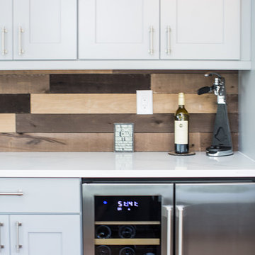
This project is an incredible transformation and the perfect example of successful style mixing! This client, and now a good friend of TVL (as they all become), is a wonderfully eclectic and adventurous one with immense interest in texture play, pops of color, and unique applications. Our scope in this home included a full kitchen renovation, main level powder room renovation, and a master bathroom overhaul. Taking just over a year to complete from the first design phases to final photos, this project was so insanely fun and packs an amazing amount of fun details and lively surprises. The original kitchen was large and fairly functional. However, the cabinetry was dated, the lighting was inefficient and frankly ugly, and the space was lacking personality in general. Our client desired maximized storage and a more personalized aesthetic. The existing cabinets were short and left the nice height of the space under-utilized. We integrated new gray shaker cabinets from Waypoint Living Spaces and ran them to the ceiling to really exaggerate the height of the space and to maximize usable storage as much as possible. The upper cabinets are glass and lit from within, offering display space or functional storage as the client needs. The central feature of this space is the large cobalt blue range from Viking as well as the custom made reclaimed wood range hood floating above. The backsplash along this entire wall is vertical slab of marble look quartz from Pental Surfaces. This matches the expanse of the same countertop that wraps the room. Flanking the range, we installed cobalt blue lantern penny tile from Merola Tile for a playful texture that adds visual interest and class to the entire room. We upgraded the lighting in the ceiling, under the cabinets, and within cabinets--we also installed accent sconces over each window on the sink wall to create cozy and functional illumination. The deep, textured front Whitehaven apron sink is a dramatic nod to the farmhouse aesthetic from KOHLER, and it's paired with the bold and industrial inspired Tournant faucet, also from Kohler. We finalized this space with other gorgeous appliances, a super sexy dining table and chair set from Room & Board, the Paxton dining light from Pottery Barn and a small bar area and pantry on the far end of the space. In the small powder room on the main level, we converted a drab builder-grade space into a super cute, rustic-inspired washroom. We utilized the Bonner vanity from Signature Hardware and paired this with the cute Ashfield faucet from Pfister. The most unique statements in this room include the water-drop light over the vanity from Shades Of Light, the copper-look porcelain floor tile from Pental Surfaces and the gorgeous Cashmere colored Tresham toilet from Kohler. Up in the master bathroom, elegance abounds. Using the same footprint, we upgraded everything in this space to reflect the client's desire for a more bright, patterned and pretty space. Starting at the entry, we installed a custom reclaimed plank barn door with bold large format hardware from Rustica Hardware. In the bathroom, the custom slate blue vanity from Tharp Cabinet Company is an eye catching statement piece. This is paired with gorgeous hardware from Amerock, vessel sinks from Kohler, and Purist faucets also from Kohler. We replaced the old built-in bathtub with a new freestanding soaker from Signature Hardware. The floor tile is a bold, graphic porcelain tile with a classic color scheme. The shower was upgraded with new tile and fixtures throughout: new clear glass, gorgeous distressed subway tile from the Castle line from TileBar, and a sophisticated shower panel from Vigo. We finalized the space with a small crystal chandelier and soft gray paint. This project is a stunning conversion and we are so thrilled that our client can enjoy these personalized spaces for years to come.
 Lasley Brahaney Architecture + Construction
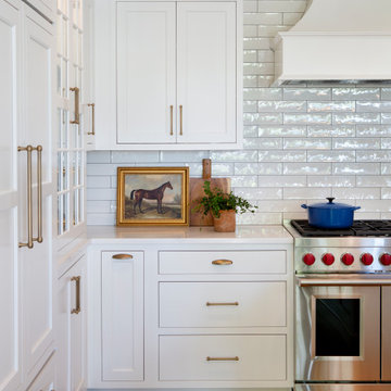
The original 1970's kitchen with a peninsula to separate the kitchen and dining areas felt dark and inefficiently organized. Working with the homeowner, our architects designed an open, bright space with custom cabinetry, an island for seating and storage, and a wider opening to the adjoining space. The result is a clean, streamlined white space with contrasting touches of color.
 House of Brazier
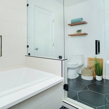
What began as an awkward and inefficient layout turned into a sleek, high contrast bath with a dose of modern warmth perfect for my client's growing family. The footprint (and even the window!) remained the same while the rest was gutted and redesigned to include a double vanity with storage and a wet space that combines the walk-in shower and tub.

 Ohio Basement Authority
This is an old, inefficient sump pump with surrounding cracks and water damage.
Urban basement photo in Columbus
Urban basement photo in Columbus
 More Space Place - Palm Harbor/Lutz/St Petersburg
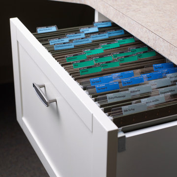
The Home Office including work and study areas are essential in today's modern home. New technologies, work at home as well as shared spaces make the standard desk system inefficient if not obsolete. We can help create the ideal high performance area that will not only work for you but also add to the beauty of your home.
 Hermitage Kitchen Gallery LLC
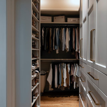
What began as a dated primary bathroom and undersized closet evolved into a light-filled retreat designed around the homeowners' lifestyle. The original space featured a large built-in tub, oversized shower enclosure, limited storage, and an inefficient closet layout that no longer met the family's needs.
Through extensive demolition and structural modifications, the bathroom and closet were completely reconfigured to maximize both function and beauty. Walls were removed, storage was reimagined, and every square foot was carefully planned to create a more open, luxurious experience.
The finished space features a freestanding soaking tub positioned beneath expansive windows, a custom walk-in shower wrapped in marble-look porcelain, warm brass fixtures and hardware, custom cabinetry, and a fully tailored dressing room with dedicated storage for clothing, shoes, and accessories. Soft neutral finishes, elegant lighting, and thoughtfully layered details create a timeless primary suite designed to feel like a private retreat.
 Dwellify
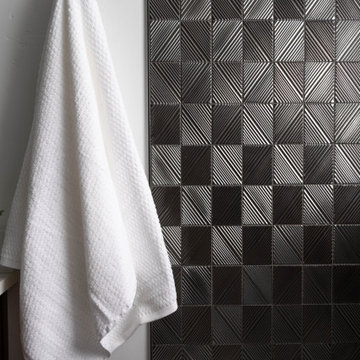
In this home remodeling project, the homeowners sought to transform their bathroom into an Industrial-style space. The original bathroom was dark, dated, and inefficient in its layout, prompting a complete overhaul to achieve a modern and functional feel. To optimize the space, unnecessary walls were knocked down, opening the area and allowing for a more logical flow. To preserve some of the home's historical elements, carefully selected materials were used, seamlessly blending the old with the new. A distinctive feature of the design was the incorporation of exposed pipes, not only as an industrial aesthetic element but also to create more space in the shower. The result is a bathroom that pays homage to the history of the home while introducing eye-catching tiles and a stylish vanity area, successfully combining industrial design elements with the practicality and aesthetics desired by the homeowners.
 Saikley Architects
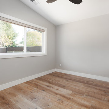
The clients wanted to update their ranch house and make good use of their unusually large site next to downtown Mountain View. We sketched several options for design and scope of work to assess feasibility and value to the clients.
The chosen design retains an existing bedroom wing, while the layout of the living spaces is re-worked to an open plan flooded with light, with vaulted ceilings and strong indoor-outdoor connection to a yard optimized for outdoor living. Awkward angles and inefficient spaces of the former house have been replaced with a clear, simple floor plan designed for ease of everyday living.
One end of the site is used for a two-bedroom ADU (Accessory Dwelling Unit) with its own face to the street and its own back yard. Income from the ADU will go a long way toward financing the rebuild of the main house.
Photography: Kurt Manley
https://saikleyarchitects.com/portfolio/open-ranch-adu/
 Mom's Design Build
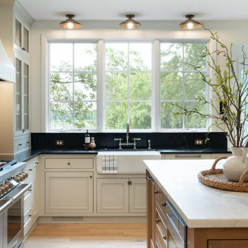
Built in 1992, this lakeside home was ready for a full renovation to match its scenic setting and the demands of modern living. The original layout felt dated and inefficient, so the remodel opened the space by replacing a pantry closet with a sleek pantry cabinet and adding a large window above the sink to flood the kitchen with light and views. An oversized closet became a stylish wet bar and butler’s pantry in rich alder, now a walk-through between the dining and living areas. Warm white oak floors, contrasting cabinetry, honed Borghini marble, and soapstone counters complete the sophisticated yet inviting kitchen design. The bathroom, laundry room, sitting room, front entry, and dining area were also updated in the home remodel. Welcome to Heart of Home.
 Corinthian Fine Homes
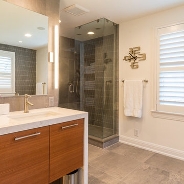
Our homeowner had worked with us in the past and asked us to design and renovate their 1980’s style master bathroom and closet into a modern oasis with a more functional layout. The original layout was chopped up and an inefficient use of space. Keeping the windows where they were, we simply swapped the vanity and the tub, and created an enclosed stool room. The shower was redesigned utilizing a gorgeous tile accent wall which was also utilized on the tub wall of the bathroom. A beautiful free-standing tub with modern tub filler were used to modernize the space and added a stunning focal point in the room. Two custom tall medicine cabinets were built to match the vanity and the closet cabinets for additional storage in the space with glass doors. The closet space was designed to match the bathroom cabinetry and provide closed storage without feeling narrow or enclosed. The outcome is a striking modern master suite that is not only functional but captures our homeowners’ great style
 LBK Design Build
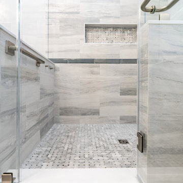
This Primary Suite renovation was designed to enhance both functionality and aesthetics, creating a luxurious yet practical retreat. The original floor plan presented several challenges, including inefficient space utilization, lack of storage, and outdated design elements that no longer met the homeowner’s needs. To address these concerns, the new layout was carefully planned to improve flow, maximize storage, and incorporate modern conveniences while maintaining a timeless appeal.
 Mom's Design Build
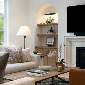
Built in 1992, this lakeside home was ready for a full renovation to match its scenic setting and the demands of modern living. The original layout felt dated and inefficient, so the remodel opened the space by replacing a pantry closet with a sleek pantry cabinet and adding a large window above the sink to flood the kitchen with light and views. An oversized closet became a stylish wet bar and butler’s pantry in rich alder, now a walk-through between the dining and living areas. Warm white oak floors, contrasting cabinetry, honed Borghini marble, and soapstone counters complete the sophisticated yet inviting kitchen design. The bathroom, laundry room, sitting room, front entry, and dining area were also updated in the home remodel. Welcome to Heart of Home.
19