
Search results for "Inefficient" in Home Design Ideas
 Tom Bassett-Dilley Architect, Ltd.
Photography by Natalie Marotta
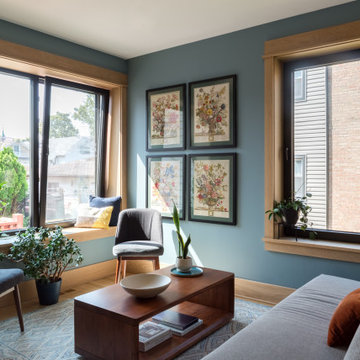
Bungalows are lovable homes, but how can they be better? Along with many of our clients, we find that older (early 20th c.) homes have a lot of character and a comfortable scale, but are leaky, damp (especially in the basement), have fair to poor air quality, and use unconscionable amounts of fossil fuels to heat. The owners of this bungalow were ready to change that, and wanted to do so with minimal upfront carbon emissions as well.
The gut renovation included replacing the basement slab and providing capillary breaks and insulation continuously below grade. The brick structure was treated with a fluid-applied air and water barrier from the interior and insulated entirely with cellulose, a carbon-storing insulation. The roof used HFO-blown spray foam to provide sufficient insulation while allowing headroom for bedrooms, bathrooms, and laundry.
One great benefit of a full renovation is the possibility of reconfiguring spaces to suit the family’s lifestyle, and to make the best of indoor-outdoor connections. We opened up the main rooms on the first floor, creating a family gathering spot with a view to the back yard, and a spacious kitchen that supports the family’s commitment to cooking for healthy eating. The stair uses a north-facing skylight to bring light from above into the middle of the home, where it was previously dark.
As a decarbonization retrofit, the inefficient furnace was replaced with two small ducted heat pump systems, water heating and clothes drying are powered by air-source heat pumps, and cooking uses an induction cooktop plus electric ovens. Energy recovery ventilation provides filtered fresh air continuous exhaust from the kitchen, baths, and laundry, and supplies fresh, highly filtered air to bedrooms and living spaces.
The Better Bungalow now makes sense for the 21st century–it now fits the owners’ life-patterns, is super comfortable, has great air quality, and uses a fraction of the energy it did before, greatly lowering the demand on the utility grid. In the near future, when solar PV is installed, it can achieve net zero or near net zero emissions, and with battery backup, can provide great resilience in the event of power outages.
 Alli Rader Creative
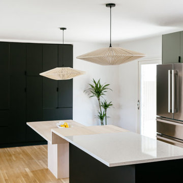
This 1963 brick home was given the opportunity for new life when a creative couple from Brooklyn took a chance and moved their life to Nashville! The kitchen went from a dreary, sad, barely functional room to an inspiring space to gather and entertain. Removing the wall between the living and kitchen opened up the previously choppy, inefficient layout to bring a sense of flow and ease to the home. We designed a custom island/dining table, seamlessly flowing from the terrazzo style quartz countertops into the solid maple table, complimented by the slat wood design on the range hood. We decided to go with a larger scale subway tile in a horizontal stacked pattern to keep the feel light, but also modern and timeless. The built-in matte black wall cabinetry brings a minimal but striking moment to balance the airiness of the other side of the kitchen, while providing ample storage for the pantry as well as a large bar for the cocktail aficionado couple. We incorporated some beautiful handmade pendants from Mexico and hung them at differing heights to accentuate the custom island. Now the space is modern, bright, textured, minimal and elevated. The clients are so pleased, and feel that this house can be a home for them to create and host and be.
 Michael Nash Design, Build & Homes
2010 REGIONAL AWARD WINNER
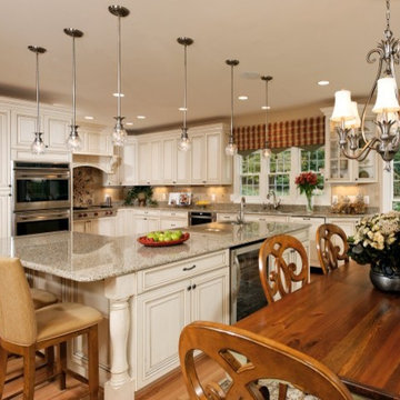
Built in 2000, this center hall colonial in Fairfax Station, Virginia had a kitchen that was neither functional nor aesthetically pleasing.
First, the floor plan was poorly rationalized. The work triangle was inefficient, a large pantry took up too much floor space, and a series of railings between the kitchen and family room obstructed traffic flow.
Aesthetically, the space was dated. Dutch cabinetry, floral wallpaper and a faux Victorian chandelier all cried for an update. Additionally, the homeowners wanted to incorporate high-end appliances and other amenities like a wine cooler and steam cooker.
Overall, the owners were seeking to replace worn out-of-style kitchen with a substantially upgraded “open” facility that combines traditional and contemporary features configured to support multiple social and culinary needs.
Working with Michael Nash Design, Build & Homes, they decided to implement a series of strategic revisions that would support their new use goals.
First, they removed an obstructive bearing wall between the existing kitchen and mudroom, creating a recessed niche for a new 48” gas range with custom hood. An unused desk taken out provided a spot for the new 48” two-drawer refrigerator/freezer.
A custom-designed L-shaped granite-surfaced island with bar sink, icemaker and mini-drawer refrigerator takes center stage in the space and offers seating for six. Now the chef can entertain guests while preparing the meal.
From an aesthetic point of view, the interior features are nothing less than stunning. Softly painted walls, decorative ceramic tile backsplashes and granite surfaces combine with custom made cabinets to create an elegant space. Antiqued soft-opaque cabinet facings, wood panel refrigerator door inserts, glass-facing display cabinets and a custom mantle range hood are true works of craftsmanship. Fine detail is expressed with flutes and corbels. Beauty is truly in the details of this award-winning kitchen.
Find the right local pro for your project
 Lundin Architects LLC
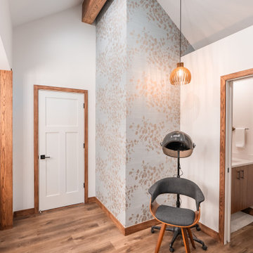
An under used whirlpool tub and inefficient layout were rectified by removing the tub and outdated glass block shower to create a generous walk-in shower area and dual vanity with built ins for storage. Woods and textured materials add warmth and sophistication to the space.
 George Clemens Architecture
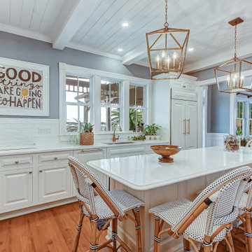
This 1904 Key Victorian is steps from historic St. Augustine, Florida and sits on the water with breathtaking views of the harbor and St. Augustine Lighthouse. The clients wanted to expand their living space and create a separate guest house for visitors and family. We replaced a single-story garage to create a two-story guest house in keeping with the original Victorian architecture of the main house. This compact little house includes a full kitchen, sitting area, bath, two bedrooms, laundry, and a second story office space with deck. A first-floor porch with outdoor fireplace provides perfect shelter from the hot Florida sun or a place to cuddle on a cool evening, while watching boats and sea birds come and go. An outdoor shower, additional bathroom and decorative pergola complete the structure which seamlessly complements the original main house.
In the main house, a dark, cramped, inefficient kitchen was transformed into a cook's dream kitchen. Walls were opened up to create space and improve flow with the rest of the main house. New windows and transoms were added along with beautiful beam work to create an expansive sun-filled work area with beautiful water views of the St. Augustine inlet.
Builder: John Valdes & Associates , St. Augustine, FL
Interior Design (Guest House) : East Coast Design, Jill Traister
Photography: East Coast Virtual Tours (ECVT)
 Legacy Builders Group
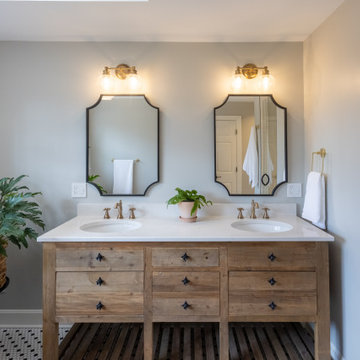
This Wyoming master bath felt confined with an
inefficient layout. Although the existing bathroom
was a good size, an awkwardly placed dividing
wall made it impossible for two people to be in
it at the same time.
Taking down the dividing wall made the room
feel much more open and allowed warm,
natural light to come in. To take advantage of
all that sunshine, an elegant soaking tub was
placed right by the window, along with a unique,
black subway tile and quartz tub ledge. Adding
contrast to the dark tile is a beautiful wood vanity
with ultra-convenient drawer storage. Gold
fi xtures bring warmth and luxury, and add a
perfect fi nishing touch to this spa-like retreat.
 Design Vision Studio
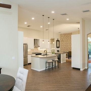
James Latta Photography - Big Dreams… Little Budget. This really is the little kitchen that could. The designer was given the challenge of providing an updated, traditional, open kitchen, with a new island, upgraded lighting, finishes, and appliances. Also a wall needed to be removed, appliances needed to be relocated, AND the budget was “close to nothing.” After months of planning, negotiating, and compromising, this kitchen received a TOTAL transformation. Once inefficient, unattractive and closed-in, the new space is beautiful, functional, and light and bright. It now boasts a “WOW” factor that can be appreciated the moment you enter the home. Truly, this kitchen is unrecognizable from the “before” photos. The material selections compliment the espresso wood color furniture in surrounding living areas. Quartz countertops, glass and stone backsplash tile, a composite sink, stainless steel appliances and lighting all create a classic and elegant kitchen. Would you have ever guessed this dramatic kitchen remodel includes Ikea cabinetry and appliances? The result proves that big dreams do come true even with a little budget.
 Designed Smart - Laila Ferri Johnson
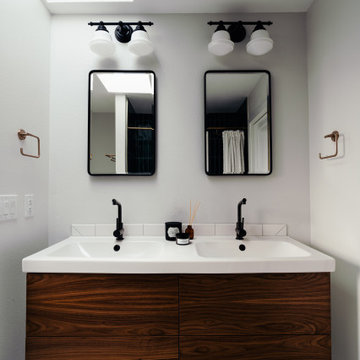
This mid-century modern bathroom remodel began by tackling the challenge of reconfiguring a cramped and inefficient master suite layout. The goal was to create a spacious bathroom with double sinks and integrated linen storage, alongside a better-organized closet. Originally positioned above the closet, the skylight was better suited for the bathroom, so we flipped the floor plan to bring that natural light where it’s most needed. The result is a bathroom that seamlessly blends mid-century modern style with craftsman-inspired details, perfectly complementing the character of this early 1900s home.
 User
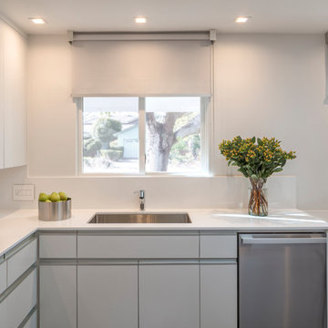
UserOur instructions from the client were to "create a fiercely modern, all-white kitchen, but with humanity."
Working within a ten by fifteen foot space that was originally dark, cramped and inefficient, we created a new kitchen which is bright, open, and highly efficient for cooking. While no walls were moved, the openings to adjacent spaces were relocated and resized, further expanding the appearance of the space. The result is a kitchen which looks and feels dramatically larger than it really is.
Photos © Michael Hospelt
 Corinthian Fine Homes
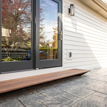
This couple approached us to design and renovate their existing master suite on their adorable Broad Ripple area home. Their goals were to update, open up and improve the function of their space. The ceilings were very low and the space was tight with an inefficient master bath and separate closet. We began by removing the ceiling and providing a high cathedral space for an expanded feel in the bedroom. We removed a side door and picture window and installed a sliding glass door to improve the natural lighting of the space and allow access to their landscaped patio on the back of the home. We stole space from the large master bedroom and eliminated the door that led into the closet, to allow for a larger bathroom and walk-in master closet with dressing area. This permitted a larger shower with a bench and the addition of a make-up vanity area. We also enlarged the window in the bathroom to allow more natural light into the space. The final design element was a floating step outside the sliding door onto their patio which is clean, modern and enhances the entrance to their serene master suite from the exterior.
 Kitchen Solvers of Spring Hill
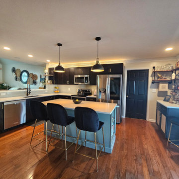
These homeowners wanted to work with a designer to make their inefficient kitchen into a dark and chic space that would match the rest of their newly remodeled home. They had a clear vision of style and theme and believed they wanted all black painted cabinets with white quartz countertops, gold toned hardware, an island and more functional cabinet space. As we moved through the design process, they fell in love with the warmth and richness of Ebony stained maple doors and were delighted at how the Acacia Haze island and Palisa Tile in Fern softened the feel of the space. We designed the concept for their wine racks, dry bar, and custom floating shelves to make the giant window more purposeful which tied the two rooms together. Then we redesigned the layout with a Lazy Susan instead of a blind corner cabinet, an upper corner cabinet, spice rack cabinet, sheet pan cabinet and a functional fridge box. The island tied the whole room together with the bookshelf, roll outs, and pull-out trash bin. Nothing sets a mood better than under and above cabinet lighting! We revamped the light fixture placement, and they chose the perfect lights for the island. All their finishing touches make it a showstopper and a truly dark, chic and delightful space to hang out in.
 TVL Creative Ltd.
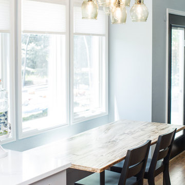
This project is an incredible transformation and the perfect example of successful style mixing! This client, and now a good friend of TVL (as they all become), is a wonderfully eclectic and adventurous one with immense interest in texture play, pops of color, and unique applications. Our scope in this home included a full kitchen renovation, main level powder room renovation, and a master bathroom overhaul. Taking just over a year to complete from the first design phases to final photos, this project was so insanely fun and packs an amazing amount of fun details and lively surprises. The original kitchen was large and fairly functional. However, the cabinetry was dated, the lighting was inefficient and frankly ugly, and the space was lacking personality in general. Our client desired maximized storage and a more personalized aesthetic. The existing cabinets were short and left the nice height of the space under-utilized. We integrated new gray shaker cabinets from Waypoint Living Spaces and ran them to the ceiling to really exaggerate the height of the space and to maximize usable storage as much as possible. The upper cabinets are glass and lit from within, offering display space or functional storage as the client needs. The central feature of this space is the large cobalt blue range from Viking as well as the custom made reclaimed wood range hood floating above. The backsplash along this entire wall is vertical slab of marble look quartz from Pental Surfaces. This matches the expanse of the same countertop that wraps the room. Flanking the range, we installed cobalt blue lantern penny tile from Merola Tile for a playful texture that adds visual interest and class to the entire room. We upgraded the lighting in the ceiling, under the cabinets, and within cabinets--we also installed accent sconces over each window on the sink wall to create cozy and functional illumination. The deep, textured front Whitehaven apron sink is a dramatic nod to the farmhouse aesthetic from KOHLER, and it's paired with the bold and industrial inspired Tournant faucet, also from Kohler. We finalized this space with other gorgeous appliances, a super sexy dining table and chair set from Room & Board, the Paxton dining light from Pottery Barn and a small bar area and pantry on the far end of the space. In the small powder room on the main level, we converted a drab builder-grade space into a super cute, rustic-inspired washroom. We utilized the Bonner vanity from Signature Hardware and paired this with the cute Ashfield faucet from Pfister. The most unique statements in this room include the water-drop light over the vanity from Shades Of Light, the copper-look porcelain floor tile from Pental Surfaces and the gorgeous Cashmere colored Tresham toilet from Kohler. Up in the master bathroom, elegance abounds. Using the same footprint, we upgraded everything in this space to reflect the client's desire for a more bright, patterned and pretty space. Starting at the entry, we installed a custom reclaimed plank barn door with bold large format hardware from Rustica Hardware. In the bathroom, the custom slate blue vanity from Tharp Cabinet Company is an eye catching statement piece. This is paired with gorgeous hardware from Amerock, vessel sinks from Kohler, and Purist faucets also from Kohler. We replaced the old built-in bathtub with a new freestanding soaker from Signature Hardware. The floor tile is a bold, graphic porcelain tile with a classic color scheme. The shower was upgraded with new tile and fixtures throughout: new clear glass, gorgeous distressed subway tile from the Castle line from TileBar, and a sophisticated shower panel from Vigo. We finalized the space with a small crystal chandelier and soft gray paint. This project is a stunning conversion and we are so thrilled that our client can enjoy these personalized spaces for years to come.
 Zola European Windows
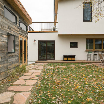
This Boulder, Colorado remodel by fuentesdesign demonstrates the possibility of renewal in American suburbs, and Passive House design principles. Once an inefficient single story 1,000 square-foot ranch house with a forced air furnace, has been transformed into a two-story, solar powered 2500 square-foot three bedroom home ready for the next generation.
The new design for the home is modern with a sustainable theme, incorporating a palette of natural materials including; reclaimed wood finishes, FSC-certified pine Zola windows and doors, and natural earth and lime plasters that soften the interior and crisp contemporary exterior with a flavor of the west. A Ninety-percent efficient energy recovery fresh air ventilation system provides constant filtered fresh air to every room. The existing interior brick was removed and replaced with insulation. The remaining heating and cooling loads are easily met with the highest degree of comfort via a mini-split heat pump, the peak heat load has been cut by a factor of 4, despite the house doubling in size. During the coldest part of the Colorado winter, a wood stove for ambiance and low carbon back up heat creates a special place in both the living and kitchen area, and upstairs loft.
This ultra energy efficient home relies on extremely high levels of insulation, air-tight detailing and construction, and the implementation of high performance, custom made European windows and doors by Zola Windows. Zola’s ThermoPlus Clad line, which boasts R-11 triple glazing and is thermally broken with a layer of patented German Purenit®, was selected for the project. These windows also provide a seamless indoor/outdoor connection, with 9′ wide folding doors from the dining area and a matching 9′ wide custom countertop folding window that opens the kitchen up to a grassy court where mature trees provide shade and extend the living space during the summer months.
With air-tight construction, this home meets the Passive House Retrofit (EnerPHit) air-tightness standard of
 Sensational Surroundings
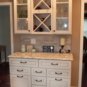
Our very busy clients turned to us to help them remodel the kitchen in their twenty year old home. While the layout was good, and the cherry cabinetry looked fine on the the surface, they wanted to make some important updates. The cabinets were starting to show some wear and tear and did not have any of the bells and whistles they desired (soft close drawers, pull-out shelves, a wine rack, and file drawer storage). Dated laminate countertops, an inefficient island, lack of a suitable backsplash material, and a need to replace appliances led them to this remodel. While the kitchen was basically gutted, we did not need to reconfigure the space other than making a slight change to the island. We enjoyed helping our clients select creamy maple cabinets, a gorgeous Quartz counter by Cambria, neutral stone backsplash in a linear pattern, and striking dark hardwood floors throughout the first floor. Finishing touches included cabinet pulls, lighting (we especially love the oversize lantern above the table), and custom valances and chair cushions. Now, the kitchen is not only functional but beautiful!
Photography by Karen Captline, Better Be Creative
 Lundin Architects LLC
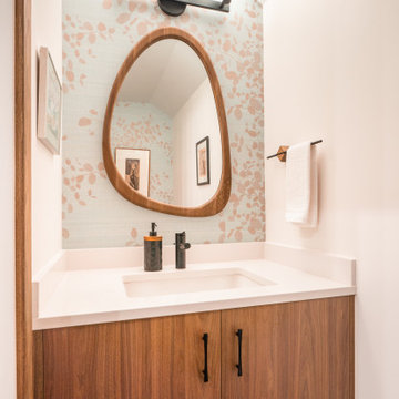
An under used whirlpool tub and inefficient layout were rectified by removing the tub and outdated glass block shower to create a generous walk-in shower area and dual vanity with built ins for storage. Woods and textured materials add warmth and sophistication to the space.
 Tom Brzoskwinia
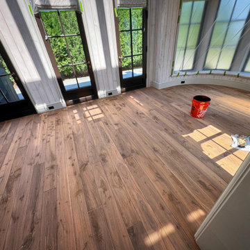
Beautiful Hand Scraped Hardwood Flooring in Highland Park, Illinois ?
Here are a few shots from this week’s project over 3,000 sq.ft. ???.
Custom Hand scraped Walnut Hardwood Flooring and edges
with custom color Bona stain + Bona HD Traffic Satin finish Bona US Professional ❤️. The Floor look at this stunning !!! With our handcrafted wood flooring, we use old-school methods, such as hand-scraping and hand-finishing, to enhance the natural beauty of each salvaged species wood . Every board is finished by hand, piece by piece. Yes, it’s inefficient, but the result and value of authenticity are unparalleled. ??? Hand scraped wood floors are trendy in recent times because they capture the old world historic charm of days gone by. This style of flooring can be a touch more expensive than others – especially in comparison to a traditional flooring.
Hand Scraped Flooring Pros:
❤️ UNIQUE – No two boards are the same, and your house won’t look like everyone else’s!
❤️ Long Term Durability – while normal wear and tear might be catastrophic for more refined hardwood floors, these are more beautiful with time.
❤️ Low Maintenance – because this flooring is already rustic and distressed, a scrape or scratch here and there won’t be cause for concern.
 Madelene Ross Design Studio
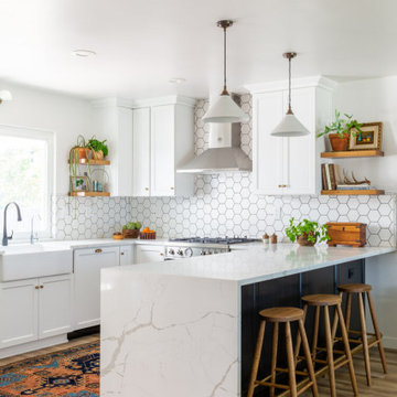
Cramped and inefficient kitchen to a light-filled, refreshed space with plenty of room for a young family.
Kitchen - kitchen idea in San Diego
Kitchen - kitchen idea in San Diego
 KCBR Design | Remodel
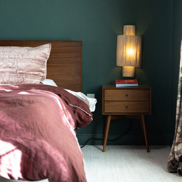
What was once an awkward and inefficient primary bathroom is now a space designed to truly function. The original doorway cut directly into the vanity, and a built in tub consumed valuable square footage, limiting both storage and circulation.
By relocating the entry and reworking the layout, we were able to create a more natural flow. An upgraded shower and a large double oak vanity with thoughtful storage solutions now anchor the space, making daily routines seamless. Heated terrazzo floors add comfort underfoot, while streamlined plumbing fixtures bring a clean, intentional finish to the design.
In the guest bathroom, we moved beyond purely functional and introduced color, pattern, and layered texture to create a space that feels personal and inviting.
Hearing our client share that this remodel has genuinely improved her quality of life is exactly why we do what we do. The result is a cohesive primary and guest bathroom renovation that balances beauty, comfort, and everyday function.
 Stuart Kitchens Inc.
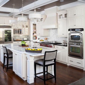
Although large and spacious the original kitchen did not meet the client's needs. The appliances were old and inefficient and the cabinets did not reflect the style of the home. The goal was to design the kitchen for more than one cook and include high-end appliances and stylish cabinetry and finishes. The new design allows for food preparation, cooking and storage areas. The professional style refrigerator allows access from both sides of the island. The microwave oven is beside the refrigerator for quick re-heats while the professional oven at the other end cooks food at remarkable speed. The range top becomes the command center. Plenty of space was allocated at the window at the end of the kitchen for a large table and chairs that overlook a beautiful backyard. A wet bar was located at the opposite end just outside the kitchen along with a walk-in pantry for additional storage. The kitchen is now completed in a traditional style with simple, but elegant, white painted cabinetry. White marble counter tops and back splashes are highlighted by elegant pendant lights above the island. Finally, this beautiful room is dramatized by a black coffered ceiling accented by lighting above the crown molding.
 Craftsman Design and Renovation
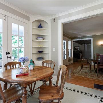
This beautiful 1935 cottage nestled in the forest needed a kitchen update that honored the rest of this quaint home. The homeowners contacted us to complete a period remodel, with some craftsman detail inspiration from their friend's home. Their current kitchen was not only inefficient for them, but also reflected a different era not true to the house.
58