
Search results for "Intentionally non functional" in Home Design Ideas
 User
UserReference: BB514EW-US
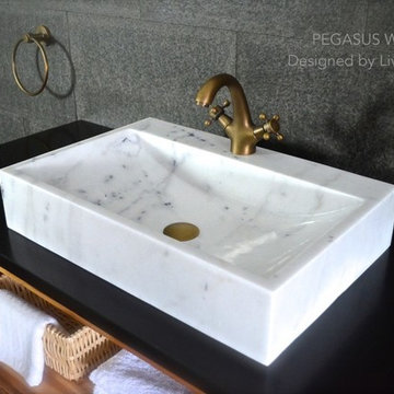
Model: PEGASUS WHITE
Color: White
Shape: rectangular
Finish: polished
US Dimensions: 23.62''x15.75''x4.72''
EU Dimensions: 60x40x12cm
US Drain size: 1-1/2"
Faucet hole size: 1.38" - 35mm
Weight: 88 lbs - 40 Kgs
Material: Guangxi White marble grade A
Rectangular Natural stone vessel sink PEGASUS WHITE - 23.62''x15.75''x4.72'' - genuine interior decoration Guangxi White marble. The "Exceptional" cut in the block without any comparison with plastic and other chemical resin market often unaffordable. You will definitely not let anyone feel indifferent with this 100% natural stone unique in the US and exclusively available on Living'ROC.net.
How to make your bathroom unique! Made from a superb block of Guangxi White Marble this basin will delight lovers of beautiful work, looking for rare, products. Add value to your home by transforming your bathroom into an oasis of elegance, calm, and tranquillity. Discover the well-being and the restful feeling our creation can offer you.
PEGASUS WHITE is one of the most fashionable in our bathrooms range. This vessel sink is not only beautiful to look at it is also functional with its height and its edges allowing a large amount of water. Guangxi marble is dominant in strength of great value and authentic in look and feel.
Our creation is delivered without an overflow drain and faucet (not included) - every US drains and faucets models you can find on the market will fit perfectly on Living'ROC vessel sink. This model is ready to use over the countertop.
The photos you see online have been taken with extreme care by our Founder CEO - Florent LEPVREAU to give our visitors an idea on how it might looks like. However product may vary from block to block as only mother nature decides what you may receive because each sink is unique. Therefore, we invite you to browse on our product portfolio to see the differences in each piece. We also draw your attention to the fact that veining, crystallization, that may appear to be cracks, but are actually indigenous to the stone, and other variations of colors up to 30% and more sometime (often on marble and onyx) and various stone features make all the charm of the stone and distinguish it from non-natural materials! Torrence White , Bali White, Toji White, Pegasus white, tahiti White, Rondo White are all made and carved from the same Guangxi White Marble and it can't be considered as a pure white as you can see. Our Quality Control photos shown on our portfolio are not available to choose by numbers.
 Amy Pearson Design
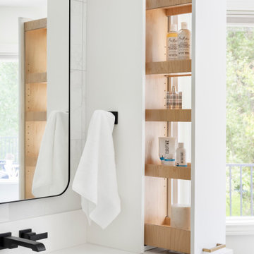
A dated and non-functional primary bathroom receives a modern refresh! Crisp whites combined with charcoal gray ground the space with contrast. Matte black fixtures combined with brushed brass cabinet hardware and sconces for a casual mixed metal look. A luxurious freestanding tub and floor mount tub filler create a relaxing oasis and restful space to enjoy the lush landscape beyond. Ample storage is provided at the vanity, including towers with clever pull-out storage. Marble look tiles are combined for a cohesive look filled with texture and movement.
 Urbanology Designs
A captivating transformation in the coveted neighborhood of University Park, Dallas
The heart of this home lies in the kitchen, where we embarked on a design endeavor that would leave anyone speechless. By opening up the main kitchen wall, we created a magnificent window system that floods the space with natural light and offers a breathtaking view of the picturesque surroundings. Suspended from the ceiling, a steel-framed marble vent hood floats a few inches from the window, showcasing a mesmerizing Lilac Marble. The same marble is skillfully applied to the backsplash and island, featuring a bold combination of color and pattern that exudes elegance.
Adding to the kitchen's allure is the Italian range, which not only serves as a showstopper but offers robust culinary features for even the savviest of cooks. However, the true masterpiece of the kitchen lies in the honed reeded marble-faced island. Each marble strip was meticulously cut and crafted by artisans to achieve a half-rounded profile, resulting in an island that is nothing short of breathtaking. This intricate process took several months, but the end result speaks for itself.
To complement the grandeur of the kitchen, we designed a combination of stain-grade and paint-grade cabinets in a thin raised panel door style. This choice adds an elegant yet simple look to the overall design. Inside each cabinet and drawer, custom interiors were meticulously designed to provide maximum functionality and organization for the day-to-day cooking activities. A vintage Turkish runner dating back to the 1960s, evokes a sense of history and character.
The breakfast nook boasts a stunning, vivid, and colorful artwork created by one of Dallas' top artist, Kyle Steed, who is revered for his mastery of his craft. Some of our favorite art pieces from the inspiring Haylee Yale grace the coffee station and media console, adding the perfect moment to pause and loose yourself in the story of her art.
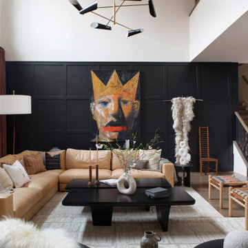
The project extends beyond the kitchen into the living room, where the family's changing needs and growing children demanded a new design approach. Accommodating their new lifestyle, we incorporated a large sectional for family bonding moments while watching TV. The living room now boasts bolder colors, striking artwork a coffered accent wall, and cayenne velvet curtains that create an inviting atmosphere. Completing the room is a custom 22' x 15' rug, adding warmth and comfort to the space. A hidden coat closet door integrated into the feature wall adds an element of surprise and functionality.
This project is not just about aesthetics; it's about pushing the boundaries of design and showcasing the possibilities. By curating an out-of-the-box approach, we bring texture and depth to the space, employing different materials and original applications. The layered design achieved through repeated use of the same material in various forms, shapes, and locations demonstrates that unexpected elements can create breathtaking results.
The reason behind this redesign and remodel was the homeowners' desire to have a kitchen that not only provided functionality but also served as a beautiful backdrop to their cherished family moments. The previous kitchen lacked the "wow" factor they desired, prompting them to seek our expertise in creating a space that would be a source of joy and inspiration.
Inspired by well-curated European vignettes, sculptural elements, clean lines, and a natural color scheme with pops of color, this design reflects an elegant organic modern style. Mixing metals, contrasting textures, and utilizing clean lines were key elements in achieving the desired aesthetic. The living room introduces bolder moments and a carefully chosen color scheme that adds character and personality.
The client's must-haves were clear: they wanted a show stopping centerpiece for their home, enhanced natural light in the kitchen, and a design that reflected their family's dynamic. With the transformation of the range wall into a wall of windows, we fulfilled their desire for abundant natural light and breathtaking views of the surrounding landscape.
Our favorite rooms and design elements are numerous, but the kitchen remains a standout feature. The painstaking process of hand-cutting and crafting each reeded panel in the island to match the marble's veining resulted in a labor of love that emanates warmth and hospitality to all who enter.
In conclusion, this tastefully lux project in University Park, Dallas is an extraordinary example of a full gut remodel that has surpassed all expectations. The meticulous attention to detail, the masterful use of materials, and the seamless blend of functionality and aesthetics create an unforgettable space. It serves as a testament to the power of design and the transformative impact it can have on a home and its inhabitants.
Project by Texas' Urbanology Designs. Their North Richland Hills-based interior design studio serves Dallas, Highland Park, University Park, Fort Worth, and upscale clients nationwide.
Find the right local pro for your project
 Edmond Kitchen & Bath LLC
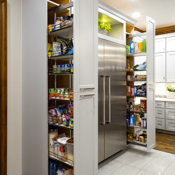
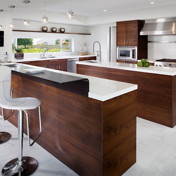
This creative transitional space was transformed from a very dated layout that did not function well for our homeowners - who enjoy cooking for both their family and friends. They found themselves cooking on a 30" by 36" tiny island in an area that had much more potential. A completely new floor plan was in order. An unnecessary hallway was removed to create additional space and a new traffic pattern. New doorways were created for access from the garage and to the laundry. Just a couple of highlights in this all Thermador appliance professional kitchen are the 10 ft island with two dishwashers (also note the heated tile area on the functional side of the island), double floor to ceiling pull-out pantries flanking the refrigerator, stylish soffited area at the range complete with burnished steel, niches and shelving for storage. Contemporary organic pendants add another unique texture to this beautiful, welcoming, one of a kind kitchen! Photos by David Cobb Photography.
 ZeroEnergy Design
Lincoln Farmhouse
LEED-H Platinum, Net-Positive Energy
OVERVIEW. This LEED Platinum certified modern farmhouse ties into the cultural landscape of Lincoln, Massachusetts - a town known for its rich history, farming traditions, conservation efforts, and visionary architecture. The goal was to design and build a new single family home on 1.8 acres that respects the neighborhood’s agrarian roots, produces more energy than it consumes, and provides the family with flexible spaces to live-play-work-entertain. The resulting 2,800 SF home is proof that families do not need to compromise on style, space or comfort in a highly energy-efficient and healthy home.
CONNECTION TO NATURE. The attached garage is ubiquitous in new construction in New England’s cold climate. This home’s barn-inspired garage is intentionally detached from the main dwelling. A covered walkway connects the two structures, creating an intentional connection with the outdoors between auto and home.
FUNCTIONAL FLEXIBILITY. With a modest footprint, each space must serve a specific use, but also be flexible for atypical scenarios. The Mudroom serves everyday use for the couple and their children, but is also easy to tidy up to receive guests, eliminating the need for two entries found in most homes. A workspace is conveniently located off the mudroom; it looks out on to the back yard to supervise the children and can be closed off with a sliding door when not in use. The Away Room opens up to the Living Room for everyday use; it can be closed off with its oversized pocket door for secondary use as a guest bedroom with en suite bath.
NET POSITIVE ENERGY. The all-electric home consumes 70% less energy than a code-built house, and with measured energy data produces 48% more energy annually than it consumes, making it a 'net positive' home. Thick walls and roofs lack thermal bridging, windows are high performance, triple-glazed, and a continuous air barrier yields minimal leakage (0.27ACH50) making the home among the tightest in the US. Systems include an air source heat pump, an energy recovery ventilator, and a 13.1kW photovoltaic system to offset consumption and support future electric cars.
ACTUAL PERFORMANCE. -6.3 kBtu/sf/yr Energy Use Intensity (Actual monitored project data reported for the firm’s 2016 AIA 2030 Commitment. Average single family home is 52.0 kBtu/sf/yr.)
o 10,900 kwh total consumption (8.5 kbtu/ft2 EUI)
o 16,200 kwh total production
o 5,300 kwh net surplus, equivalent to 15,000-25,000 electric car miles per year. 48% net positive.
WATER EFFICIENCY. Plumbing fixtures and water closets consume a mere 60% of the federal standard, while high efficiency appliances such as the dishwasher and clothes washer also reduce consumption rates.
FOOD PRODUCTION. After clearing all invasive species, apple, pear, peach and cherry trees were planted. Future plans include blueberry, raspberry and strawberry bushes, along with raised beds for vegetable gardening. The house also offers a below ground root cellar, built outside the home's thermal envelope, to gain the passive benefit of long term energy-free food storage.
RESILIENCY. The home's ability to weather unforeseen challenges is predictable - it will fare well. The super-insulated envelope means during a winter storm with power outage, heat loss will be slow - taking days to drop to 60 degrees even with no heat source. During normal conditions, reduced energy consumption plus energy production means shelter from the burden of utility costs. Surplus production can power electric cars & appliances. The home exceeds snow & wind structural requirements, plus far surpasses standard construction for long term durability planning.
ARCHITECT: ZeroEnergy Design http://zeroenergy.com/lincoln-farmhouse
CONTRACTOR: Thoughtforms http://thoughtforms-corp.com/
PHOTOGRAPHER: Chuck Choi http://www.chuckchoi.com/
 JLC Architecture
Located at a prominent corner on one of the few undeveloped residential sites left in Solana Beach, this project is important not only for the homeowner, but for the community as well. A rigorous site analysis laid the groundwork for a design response which took into account the homeowner’s program, input from the neighbors, and the scale of the project and the character of the neighborhood. The end result is a design that is well set into the existing grade, a move which preserves adjacent views and reduces the visual impact of the structure from the street; all while graciously meeting the desires of the owner.
The plan is broken into six unique floor plates. The bottom four of which tie together along the gradually sloping site. An intentionally long southern exposure implements the basics of passive solar design: large amounts of glass bring in abundant light and warmth in the winter, while deep overhangs protect from unwanted summer heat gain. Ocean views to the west are selectively framed throughout the house without compromising privacy from the busy street corner. Public functions within the house flow seamlessly between indoor and outdoor living spaces. JLC Architecture was responsible for a full architecture and interior package as well as exterior hardscape design.
 K&L Interiors
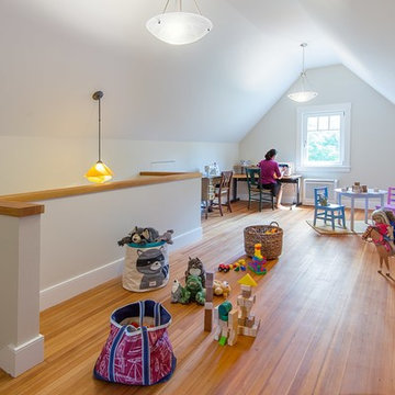
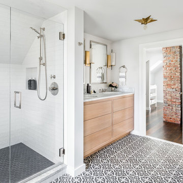
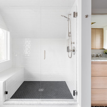
The 70th Street project started as an empty and non-functional attic space. We designed a completely new master suite, including a new bathroom, walk-in closet, bedroom and nursery for our clients. The space had many challenges because of its sloped and low ceilings. We embraced those challenges and used the ceiling slopes to our advantage to make the attic feel more spacious overall, as well as more functional for our clients.
Photography: Mike Duryea

Sponsored
Columbus, OH

Structural Remodeling
Franklin County's Heavy Timber Specialists | Best of Houzz 2020!
 TKS Design Group
Free ebook, Creating the Ideal Kitchen. DOWNLOAD NOW
Having a space for their teenage kids to hang out after school, study and interact with Mom & Dad was at the top of the list for this remodel. The 1928 home, sits in a lovely Glen Ellyn neighborhood, near downtown and near all the action of the local high school and lake. It’s was a great house with great bones but the kitchen was in need of some TLC. The remodel project had been a long time coming, and since both the homeowners work from home, they had been nervous about disrupting their bustling daily schedules to get the project in motion.
Once we had a plan in place, we dug in and got to work. The first step was to remove a non-load bearing wall between the kitchen and dining room. We then reworked the space a bit, eliminating a redundant passage way to the hall, and reworking a closet to allow for a large galley style kitchen and small bar area open to the dining room. The new kitchen has a small peninsula for the family to have casual meals and for the kids to hang out after school. A window was eliminated to give more space for cabinetry and storage, and another window was made larger to allow for a grander view into the backyard.
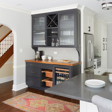
We decided upon a layered approach to this space to provide character appropriate to the older home. White painted cabinetry provides a backdrop for interesting touches such as gray herringbone tile, a reeded farmhouse sink and bronze hardware and lighting. The bar has its own unique look featuring gray cabinetry with a patterned cement tile backsplash and walnut top. A bar fridge, glass cabinets and baskets for tucking away homework give this little multi-functional area loads of character. A miniature mudroom area was also added to the dining room so that the new space can be kept neat and tidy.
The stylish result looks both appropriate to the 1928 home and provides loads of functionality for this active family that can now take advantage of every square inch their home.
Designed by: Susan Klimala, CKD, CBD
Photography by: Michael Alan Kaskel
For more information on kitchen and bath design ideas go to: www.kitchenstudio-ge.com
 K&L Interiors
The 70th Street project started as an empty and non-functional attic space. We designed a completely new master suite, including a new bathroom, walk-in closet, bedroom and nursery for our clients. The space had many challenges because of its sloped and low ceilings. We embraced those challenges and used the ceiling slopes to our advantage to make the attic feel more spacious overall, as well as more functional for our clients.
Photography: Mike Duryea

 StudioLAB
Nestled at the end of a long flag lot driveway in Amagansett, NY, a young couple purchased the property with intentions to construct a second home for their growing family. A home that would not only be comfortable for the immediate family but also serve and grow on busy summer weekends to accommodate extended family, friends, children and guests. The tight lot along with the sizable program culminated in the building envelope being pushed to every limit, restriction and regulation one could imagine. The resulting architecture possesses a traditional Hamptons cottage exterior juxtaposed with modern elements that help break up the single mass. Centered on the entry façade is a large double story window that shrouds the floating switchback staircase on the interior. A bluestone patio wraps three sides of the home, which, in the rear, leads to a small in ground pool with a frameless glass railing. In the interior, custom white washed white oak floors run throughout the home as well as on the floating central staircase. For a more modern style of living, the open living, kitchen and dining area serve as one large entertaining space. In an area surrounded by sprawling Mcmansions, this tightly knit home functions more similar to that of a large NYC apartment by serving the perfect balance between maximized form with the right amount of function given the strict parameters. Large glass sliders open the living and dining rooms to the backyard patio and pool creating harmony between the indoor and outdoor spaces. Shaker style cabinets in the kitchen pair with a more contemporary staircase softened by the warmer wood tones of the vertical slats that surround it.
 MOTIV Interiors
Interior Designer: MOTIV Interiors LLC
Photographer: Sam Angel Photography
Design Challenge: This 8 year-old boy and girl were outgrowing their existing setup and needed to update their rooms with a plan that would carry them forward into middle school and beyond. In addition to gaining storage and study areas, could these twins show off their big personalities? Absolutely, we said! MOTIV Interiors tackled the rooms of these youngsters living in Nashville's 12th South Neighborhood and created an environment where the dynamic duo can learn, create, and grow together for years to come.
Design Solution:
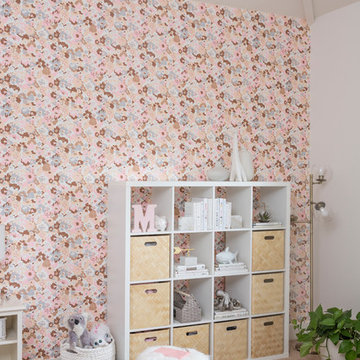
In her room, we wanted to create a fun-filled space that supports softball, sleepovers, science, and anything else a girl might want to get into. The star of the show is a beautiful hand-printed wallpaper by Brooklyn designer Aimee Wilder, whose FSC-certified papers contain no VOC’s (Volatile Organic Compounds). That means that in addition to packing a powerful visual punch, they meet our standard for excellent indoor air quality. We also love this wallpaper because it is composed of so many different neutral colors - this room can organically evolve over time without necessarily replacing the paper (which was installed with a no-VOC adhesive).
We refreshed the remaining walls with a scrubbable no-VOC paint from Sherwin Williams (7008 Alabaster) and gave the carpets in both of the twins’ rooms a good cleaning and simple stretch as opposed to replacing them. In order to provide more functional light in her room, we incorporated a corner floor lamp for reading, a telescoping desk lamp for studying, and an eye-catching LED flower pendant on a dimmer switch sourced from Lightology. Custom window treatments in a linen/cotton blend emphasize the height of the room and bring in a little “bling” with antiqued gold hardware.
Before we even thought about aesthetics, however, MOTIV Interiors got to work right away on increasing functionality. We added a spacious storage unit with plenty of baskets for all of our young client’s animal friends, and we made sure to include ample shelf space for books and hobbies as she finds new passions to explore down the road. We always prefer eco-friendly furnishings that are manufactured responsibly, made with sustainably harvested wood (FSC Certified), and use no glue or non-toxic glues and paints.
The bedding in this project is 100% cotton and contains no synthetic fibers. When purchasing bedding, check for the GOTS Certification (Global Organic Textile Standard). The introduction of a desk and drawer unit created a calming space to study and reflect, or write a letter to a friend. Gold accents add a bit of warmth to the workspace, where she can display her memories, goals, and game plans for a bright future.
We hope you enjoyed this project as much as we did! Each design challenge is an opportunity to push the envelope, by creating a new and exciting aesthetic or finding creative ways to incorporate sustainable design principles.
 MOTIV Interiors
Twins on 12th - HER ROOM - View the complete Photo Gallery and project details at motivinteriors.com/portfolio
Design: MOTIV Interiors LLC
Photography: Sam Angel
Design Challenge: This 8 year-old boy and girl were outgrowing their existing setup and needed to update their rooms with a plan that would carry them forward into middle school and beyond. In addition to gaining storage and study areas, could these twins show off their big personalities? Absolutely, we said! MOTIV Interiors tackled the rooms of these youngsters living in Nashville's 12th South Neighborhood and created an environment where the dynamic duo can learn, create, and grow together for years to come.
Design Solution:
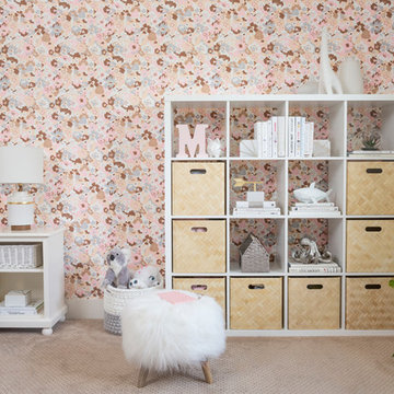
In her room, we wanted to create a fun-filled space that supports softball, sleepovers, science, and anything else a girl might want to get into. The star of the show is a beautiful hand-printed wallpaper by Brooklyn designer Aimee Wilder, whose FSC-certified papers contain no VOC’s (Volatile Organic Compounds). That means that in addition to packing a powerful visual punch, they meet our standard for excellent indoor air quality. We also love this wallpaper because it is composed of so many different neutral colors - this room can organically evolve over time without necessarily replacing the paper (which was installed with a no-VOC adhesive).
We refreshed the remaining walls with a scrubbable no-VOC paint from Sherwin Williams (7008 Alabaster) and gave the carpets in both of the twins’ rooms a good cleaning and simple stretch as opposed to replacing them. In order to provide more functional light in her room, we incorporated a corner floor lamp for reading, a telescoping desk lamp for studying, and an eye-catching LED flower pendant on a dimmer switch sourced from Lightology. Custom window treatments in a linen/cotton blend emphasize the height of the room and bring in a little “bling” with antiqued gold hardware.
Before we even thought about aesthetics, however, MOTIV Interiors got to work right away on increasing functionality. We added a spacious storage unit with plenty of baskets for all of our young client’s animal friends, and we made sure to include ample shelf space for books and hobbies as she finds new passions to explore down the road. We always prefer eco-friendly furnishings that are manufactured responsibly, made with sustainably harvested wood (FSC Certified), and use no glue or non-toxic glues and paints.
The bedding in this project is 100% cotton and contains no synthetic fibers. When purchasing bedding, check for the GOTS Certification (Global Organic Textile Standard). The introduction of a desk and drawer unit created a calming space to study and reflect, or write a letter to a friend. Gold accents add a bit of warmth to the workspace, where she can display her memories, goals, and game plans for a bright future.
We hope you enjoyed this project as much as we did! Each design challenge is an opportunity to push the envelope, by creating a new and exciting aesthetic or finding creative ways to incorporate sustainable design principles.
 MOTIV Interiors
Interior Designer: MOTIV Interiors LLC
Photographer: Sam Angel Photography
Design Challenge: This 8 year-old boy and girl were outgrowing their existing setup and needed to update their rooms with a plan that would carry them forward into middle school and beyond. In addition to gaining storage and study areas, could these twins show off their big personalities? Absolutely, we said! MOTIV Interiors tackled the rooms of these youngsters living in Nashville's 12th South Neighborhood and created an environment where the dynamic duo can learn, create, and grow together for years to come.
Design Solution:
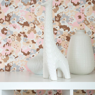
In her room, we wanted to create a fun-filled space that supports softball, sleepovers, science, and anything else a girl might want to get into. The star of the show is a beautiful hand-printed wallpaper by Brooklyn designer Aimee Wilder, whose FSC-certified papers contain no VOC’s (Volatile Organic Compounds). That means that in addition to packing a powerful visual punch, they meet our standard for excellent indoor air quality. We also love this wallpaper because it is composed of so many different neutral colors - this room can organically evolve over time without necessarily replacing the paper (which was installed with a no-VOC adhesive).
We refreshed the remaining walls with a scrubbable no-VOC paint from Sherwin Williams (7008 Alabaster) and gave the carpets in both of the twins’ rooms a good cleaning and simple stretch as opposed to replacing them. In order to provide more functional light in her room, we incorporated a corner floor lamp for reading, a telescoping desk lamp for studying, and an eye-catching LED flower pendant on a dimmer switch sourced from Lightology. Custom window treatments in a linen/cotton blend emphasize the height of the room and bring in a little “bling” with antiqued gold hardware.
Before we even thought about aesthetics, however, MOTIV Interiors got to work right away on increasing functionality. We added a spacious storage unit with plenty of baskets for all of our young client’s animal friends, and we made sure to include ample shelf space for books and hobbies as she finds new passions to explore down the road. We always prefer eco-friendly furnishings that are manufactured responsibly, made with sustainably harvested wood (FSC Certified), and use no glue or non-toxic glues and paints.
The bedding in this project is 100% cotton and contains no synthetic fibers. When purchasing bedding, check for the GOTS Certification (Global Organic Textile Standard). The introduction of a desk and drawer unit created a calming space to study and reflect, or write a letter to a friend. Gold accents add a bit of warmth to the workspace, where she can display her memories, goals, and game plans for a bright future.
We hope you enjoyed this project as much as we did! Each design challenge is an opportunity to push the envelope, by creating a new and exciting aesthetic or finding creative ways to incorporate sustainable design principles.

Sponsored
Columbus, OH
Structural Remodeling
Franklin County's Heavy Timber Specialists | Best of Houzz 2020!
 309design
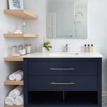
This beautiful, functional bathroom for the family's two daughters is a light, bright and modern space. The patterned tile floor speaks to a european influence, while the clean lined vanity mirrors the hue. The custom floating maple shelves give a clean, modern and functional storage component in a beautiful way. The frameless shower enclosure features white oversized tile with white penny rounds on the floor and the shampoo niche. A soothing space for a busy family.
 Klopf Architecture
Nestled in the hills of Orinda, California, this 1951 residence is one of only seven extant homes, now known as “The Magnificent Seven”, designed by architect Olof Dahlstrand, a protégé of Frank Lloyd Wright. With its low-slung rooflines, natural materials, and deep integration with the sloping landscape, the home is a pristine example of mid-century modern design inspired by Wright’s organic principles. Over the years, prior homeowners have emphasized preservation, ensuring that the house remained relatively untouched. Each owner has respected the original architecture and stayed true to Dahlstrand’s intent. When a family of five—two college-aged sons and a middle school-aged daughter—acquired the property, they were captivated by its history, legacy of care, and architectural significance. While they appreciated Dahlstrand’s original vision, they also recognized the need to adapt the home for contemporary living while preserving its design integrity.
The remodel was conceived as a thoughtful response to the past—an effort to bring the house into the 21st century without compromising its soul. The primary mandate was to maintain architectural continuity while improving the functionality, comfort, and livability for a modern family. The design team—architects and contractor alike—worked with a shared reverence for the original architecture, allowing that mindset to guide even the most technical or pragmatic decisions.
A key objective was to increase natural light in the kitchen—a departure from Wrightian principles of enclosed, intimate cooking spaces—while maintaining the home’s architectural language. The kitchen was reconfigured to foster a stronger connection to adjacent living spaces while retaining the underlying concept of spatial separation. One of the most transformative architectural changes was the removal of a ridge beam that was originally planned to remain visible through the kitchen. During construction, the team collaborated on a better solution: a wide-flanged steel beam concealed within the roof envelope. This subtle move preserved the clean lines and ceiling continuity, a modern update carried out with utmost respect for the existing framework.
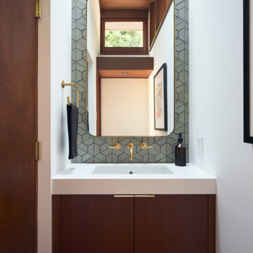
The home’s original powder room, previously accessible only through the kitchen, was relocated for better flow and privacy. A new powder room was carved out of former kitchen cabinetry—a narrow, interior space that could have felt dark and enclosed. To avoid this, the design extended the line of original transom windows into the new powder room and added a skylight above the vanity. The result is a bright and airy space that feels consistent with the rest of the home. Other updates included the installation of new solid-core interior doors with veneers carefully matched to the original mahogany, enhancing the continuity of the interiors. Even smaller decisions, such as placing the door knobs at 42 inches high, mirrored the original proportions. Every choice reflected a shared belief between the architect, contractor, and client: that new work should serve the integrity of the old.
The home’s extensive interior redwood millwork and paneling was meticulously restored. Where new materials were introduced—such as the replacement redwood soffit paneling—the contractor took pains to find finish nails that matched the original, rather than using modern equivalents. This level of craftsmanship and collaboration defined the project. It extended even to the detailing of a blind door to the new powder room, which had to disappear into the existing redwood board-and-batten wall. It was a team effort: the owner found a suitable handle, the architects devised the custom in-swing mechanism, and the contractor executed it so the door aligned precisely with the battens. Throughout, the homeowners were deeply engaged in the design process. One, a meticulous design enthusiast, focused on aesthetic integrity and historic detail. The other brought a practical and function-driven perspective, ensuring that new fixtures and materials would be durable and require minimal maintenance.
While the home’s location posed no major site challenges, sustainability was a key concern. The team upgraded the roof insulation, installed solar panels with battery storage, and added ductless mini-split cooling systems. Lighting was another area where modern technology was woven into a historic framework: new square LED fixtures echo the original custom perimeter soffit lights, maintaining the design language while offering advanced performance.
A planned expansion of a bedroom into suite with a bathroom had to be shelved due to budget constraints and the high cost of below-grade foundation work. Still, the team focused their efforts on making the most of the existing footprint, resolving constraints through design ingenuity rather than adding square footage. This renovation represents a collaborative achievement in preserving and evolving a historically significant home. Every decision was shaped by a shared ethos among clients, architects, and contractor: to maintain the home’s architectural soul while updating it for contemporary life. The result is a timeless modernist residence that continues Olof Dahlstrand’s legacy, remaining grounded in nature, craftsmanship, and human-scale design.
Klopf Architecture Team: John Klopf, AIA, Klara Kevane, Fernanda Bernardes
Interior Architectural Design: Klopf Architecture
Structural Engineer: Daniel Bastiao
Contractor: Don Larwood, Larwood Construction
Photography: Mariko Reed
Year Completed: 2022
 Klopf Architecture
The Roger Lee designed house from 1962 was purchased by the current homeowners in almost original condition, as the previous owners elected to defer most maintenance projects over the years. The clients were able to see beyond the dated materials and finishes, single-paned glass and uninsulated walls and they approached Klopf Architecture to help them expand and update the entire home, one the family could settle into and enjoy for years to come. It was important that the new designs were aligned with Lee's original intent not only because of the client's appreciation for mid-century modern architecture, but also because the house was deemed historical. The Stanford Real Estate Office requires a stringent design review which safeguards the integrity of the community, which Klopf Architecture was happy to oblige going into their updated designs.
As with many original mid-century modern homes, the house was scaled to the 1960s lifestyle where rooms were smaller and openings to views were limited and tightly framed. The original conditions defined the direction the family of four would take in updating the house and making it comfortable for their modern lifestyle. Klopf designed a full gut remodel and major addition to bring the house into the 21st century and provide the living area needed for the client's family. The newly expanded house added just about 1,100 sf to create an airy, comfortable and family friendly house, taking full advantage of the beautiful southwestern views that extend out to the hills beyond. The enclosed garage created an additional 240 sf of covered space for long-term storage.
A cracked swimming pool created an eyesore taking up a majority of the backyard landscape, so it was one of the first elements to go during the transformation. Working with Outer Space Landscape Architects, the family asked for a mix of relaxing outdoor patio spaces that eventually blend into the native landscaping, extending their views outward toward the natural greenery of the trees beyond their property. Filling in the old pool was a smart way to expand the living spaces outward. The orientation of the house was designed to enjoy the views, but the original architecture provided the first homeowners with mere glimpses of the landscape outside.
Klopf was able to broaden those views, continuing and extending on the original architecture to take full advantage of the unobstructed natural views across the rear facade of the house. Small horizontal openings in the primary bedroom and office were replaced with much taller windows that now follow the angled roof line upward, extending across almost all of the facade. We worked with Western Windows, whose designs included an oblique-shaped, operable casement that allowed our design to rise with the slope. A new corner office added to the primary suite, offers a bright and functional work-from-home solution that looks out at the distant views and added natural light from the expanded window configuration that now wraps around the corner.
The existing lower level was designed by Lee as a utilitarian space, serving as a wet pool room with a drain in the center of the floor, bathroom, laundry and storage areas. Without the need for a pool room, Klopf was able to convert the area into a much more comfortable and functional living space with a new family room and guest suite. The new spaces enjoy easy access to a new outdoor patio through floor to ceiling, full-width glass sliders.
Continuing along the rear facade, a previously exposed deck extending from the living room and hallway provided access to the backyard through a single set of stairs leading toward the side of the house which made sense when the pool was in place. The new deck was re-envisioned as an extension of the main living room and now serves as a second outdoor living room. A new slatted pergola above provides the homeowners welcome relief from the hot afternoon sun. A second set of stairs now creates a better connection to the redesigned lower level. Klopf was able to reconfigure the spaces, extending the living room outward toward the views, where the family now claims it as the heart of the home, spending a large majority of their time outdoors.
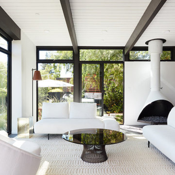
Back inside, the original wood-burning Malm fireplace was beautifully restored and a gas burner installed to comply with California's strict air standards. It now rests in front of a wall of Heath accent tiles where a dated red brick wall used to stand. A new taller window brings more light and views into the refreshed interior living room. The original glass doors opposite the fireplace were replaced by larger sliders that when fully opened, create a seamless transition to the new outdoor living area so the two spaces feel like one connected space. The original utilitarian kitchen was needlessly tucked into the far back corner and closed-off, out of sight from the living room, so the clients asked Klopf to open it up and expand the kitchen forward so it felt more connected. Today the much larger kitchen is connected to the living area where a short wall with a cutout offers a visual glimpse into the kitchen and a handy pass-through counter for serving guests. A new breakfast nook was also added to create another spot where the family can gather for casual meals. Just outside, a new built-in outdoor grill and prep area extends the kitchen outside and connects to a new outdoor dining spot nestled amongst the trees, taking advantage of the views out back.
Klopf was able to expand the other two bedrooms, add a new laundry room and half-bath and convert the carport to an enclosed garage to add more storage areas which was lost when the pool house was converted to the family and guest room.
To maintain a historical connection to the original designs, the exterior siding was repeated on all exterior walls, a full-height stained glass window at the front entryway restored, and an interior slatted screen element repeated outside at the exterior entry courtyard and over the new outdoor living room to create a shade trellis. The new house stands proudly and shines against it's new landscaping features, while respecting and expanding on the original intent of Roger Lee's designs epitomizing the comforts of indoor-outdoor living in Northern California.
Completion year: 2020
Klopf Architecture project team: John Klopf, Klara Kevane, Noel Andrade
Contractor: ORB Construction, Brendan O'Reilly
Structural engineer: Sezen and Moon
Landscape architect: Outer space
Furnishings and decoration: Urbanism Designs
Photographer: Mariko Reed
 Artisan Kitchens and Baths
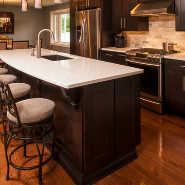
Cabinetry – Kemper Echo Cabinetry
Hardware- Jeffrey Alexander stainless bar pulls
Countertops- Cambria Quartz Torquay
Sinks and Faucets- Blanco Anthracite undermount Silgranite sink. Moen Faucet Nickel
Appliances- Samsung French door refrigerator in stainless, Samsung slide in gas range, Whirlpool wall Oven/ Microwave combination, Bosch 500 series dishwasher, and Broan Elite series pro range hood.
Flooring- prefinished 3/4 oak hardwood.
Backsplash- Natural stone subway tile.
-Inspiration and Design Challenges
The Original kitchen in this 1970’s raised ranch was bright an open yet left the dining room closed off from the home and wasn’t large enough for the island that Joe and his wife would have liked. Joe and Tim from THI Co. had developed a plan relocate the kitchen to one exterior wall and allow for an island that would function for both seating and entertaining. The challenge we faced was the original windows of the kitchen had to completely go. Relying solely on the open floor plan for natural light, Tim opened up the Dining room wall, removed the dividing half wall to the family room and widened doorways to the great room leading from the kitchen and dining room. The removal of the soffits and consistent wood flooring help tie together the adjacent rooms. The plan was for simple clean lines with subtle detail brought out in the trim on the cabinetry and custom 10ft island back panel. Finding a set of appliances was the next task. The kitchen was designed with the intention of being used. The Whirlpool convection wall ovens give the kitchen 3 possible functioning ovens with along with the Samsung 5 burner range. The end result is a simple elegant design that has all the functionality of galley kitchen yet the feel of an open kitchen with twice the square footage.



 Advance Design Studio, Ltd.
Karen and Chad of Tower Lakes, IL were tired of their unfinished basement functioning as nothing more than a storage area and depressing gym. They wanted to increase the livable square footage of their home with a cohesive finished basement design, while incorporating space for the kids and adults to hang out.
“We wanted to make sure that upon renovating the basement, that we can have a place where we can spend time and watch movies, but also entertain and showcase the wine collection that we have,” Karen said.
After a long search comparing many different remodeling companies, Karen and Chad found Advance Design Studio. They were drawn towards the unique “Common Sense Remodeling” process that simplifies the renovation experience into predictable steps focused on customer satisfaction.
“There are so many other design/build companies, who may not have transparency, or a focused process in mind and I think that is what separated Advance Design Studio from the rest,” Karen said.
Karen loved how designer Claudia Pop was able to take very high-level concepts, “non-negotiable items” and implement them in the initial 3D drawings. Claudia and Project Manager DJ Yurik kept the couple in constant communication through the project. “Claudia was very receptive to the ideas we had, but she was also very good at infusing her own points and thoughts, she was very responsive, and we had an open line of communication,” Karen said.
A very important part of the basement renovation for the couple was the home gym and sauna. The “high-end hotel” look and feel of the openly blended work out area is both highly functional and beautiful to look at. The home sauna gives them a place to relax after a long day of work or a tough workout. “The gym was a very important feature for us,” Karen said. “And I think (Advance Design) did a very great job in not only making the gym a functional area, but also an aesthetic point in our basement”.
An extremely unique wow-factor in this basement is the walk in glass wine cellar that elegantly displays Karen and Chad’s extensive wine collection. Immediate access to the stunning wet bar accompanies the wine cellar to make this basement a popular spot for friends and family.
The custom-built wine bar brings together two natural elements; Calacatta Vicenza Quartz and thick distressed Black Walnut. Sophisticated yet warm Graphite Dura Supreme cabinetry provides contrast to the soft beige walls and the Calacatta Gold backsplash. An undermount sink across from the bar in a matching Calacatta Vicenza Quartz countertop adds functionality and convenience to the bar, while identical distressed walnut floating shelves add an interesting design element and increased storage. Rich true brown Rustic Oak hardwood floors soften and warm the space drawing all the areas together.
Across from the bar is a comfortable living area perfect for the family to sit down at a watch a movie. A full bath completes this finished basement with a spacious walk-in shower, Cocoa Brown Dura Supreme vanity with Calacatta Vicenza Quartz countertop, a crisp white sink and a stainless-steel Voss faucet.
Advance Design’s Common Sense process gives clients the opportunity to walk through the basement renovation process one step at a time, in a completely predictable and controlled environment. “Everything was designed and built exactly how we envisioned it, and we are really enjoying it to it’s full potential,” Karen said.
Constantly striving for customer satisfaction, Advance Design’s success is heavily reliant upon happy clients referring their friends and family. “We definitely will and have recommended Advance Design Studio to friends who are looking to embark on a remodeling project small or large,” Karen exclaimed at the completion of her project.
 Boca do Lobo
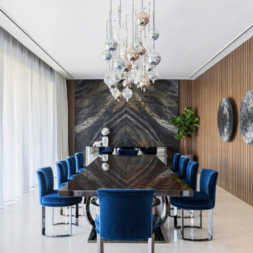
This 28,000 private residence is located in Bicholi, an upcoming exurb of Indore (akin to what the Hamptons are to New York). The North and East Facades of the house were more open to welcome light with large floor to ceiling openings, with deep terraces to cut any glare. The South and West facades are more closed out housing services like the lift & staircase block and store and non-habitable spaces like the Kitchen, Pantry and Bathrooms. Any rooms facing south and west had large overhanging decks and cavity walls. Terracing towards the north and the east to create a comfortable environment for the infinity pool and semi-formal seating areas around it. The result is a Contemporary house with strong Indian roots, that it is Instagrammable yet livable, with Functionality and Aesthetics maintaining a fine balancing act. Photo Credits: Suleiman Merchant @toophotographedu
 Simply Home Decorating
This beautiful North Vancouver home belongs to a nature-loving and health-conscious couple, Emma and Vince (names changed), their two young children, and their dog, Jasper. When they contacted us about renovating and furnishing their kitchen and family room, we walked in and saw a world of potential waiting to be uncovered.
Before: Larkhall Crescent Home:
Like many original North Vancouver homes, the interior was definitely dated. We encountered late ‘80s finishes in powder pink and teal green, old carpet, and a kitchen that wasn’t maximized to suit this family’s modern-day lifestyle. However, the size of the rooms offered us a ton of space with which to get creative.
Knowing our clients’ love of cooking, need for work spaces (Emma and Vince both work remotely), and growing family, we developed a design concept that would increase usable space, optimize storage, and create intimacy in this large area. As for the style, we were inspired by their European roots, inventing a new and modern take on “Belgian Farmhouse” style. Now, the home is truly one-of-a-kind.
After: Warm & Cozy Family Room:
Fresh, bright, and comfortable, this living area has been transformed! We started with the fireplace as a focal point, selecting aged brick tiles for added texture and a crisp wood mantle. The taupe-coloured sectional infuses the room with visual warmth and serves the added purpose of separating the family room from the kitchen.
Emma and Vince were also keen on using non-toxic materials in their home, and we were happy to oblige. To meet their needs, we sourced natural wood elements and sought out Canadian-made products - that adhere to high health standards - whenever possible.
Look closer at the elements of this space, and you will find this stunning, honeycomb-patterned rug in earthy gold, beige, and charcoal tones. It’s plush to the touch and full of visual texture that brings this room’s colour palette together. We sourced these two-tone chairs with caning, petrified wood side table, black sconces, and botanical prints in greyscale from local artist, Heather Johnston.
We topped off the space with this dark wood and rattan console that offers storage facing the kitchen and presents an opportunity to display cherished items. The result is a cozy lounging space brimming with comfort and functionality. It’s perfect for enjoying quality family time, or Emma can simply slide the coffee table away to make room for her morning yoga practice.
Now, let’s turn around and give some attention to the kitchen. Do you remember what the original kitchen looked like? If not, scroll back up, because the transformation is shocking…
Moody & Welcoming Kitchen for Healthy Living:
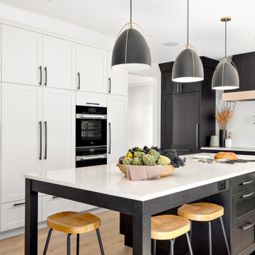
This kitchen looks very different from how it started, right? Though we didn’t touch any walls, the kitchen has almost doubled in usable space! We created a long, extended island with storage, an outlet for small appliances, and seating for comfortable prep, after-school snacking, or mingling among friends.
On the other side of the island, the family has even more storage and an integrated dishwasher within easy reach of the sink, perfect for quick clean-up. From this angle, you can also see the expansive custom Shaker cabinetry in white and the integrated double ovens. These facilitate their cooking experience and gave us the opportunity to add an additional surprise…
A coffee garage station and more hidden storage! Keeping these items located along the perimeter allows them to be accessed by the family or their guests without someone getting under the cook’s feet. These are the little details that make everyday life easier and more enjoyable.
Moving deeper into the kitchen, the seamless induction cooktop topped with a freestanding concealed hood fan commands attention in a soft yet prominent way. The natural wood accent mirrors the fireplace mantle, and the choice of off-black wood-grain cabinets not only continues our black-and-white colour palette but adds a sense of depth and contrast. The corner sink is located to the right and perfectly positioned with a view of their thriving backyard.
To invite more of this family’s character into the space, we mixed metals for interest — matte black, dark pewter, and warm brass — and created open shelves in white oak for their plants and decor. You can also glimpse the tumbled edge of the backsplash tile, which echoes the rustic brick of the fireplace. It adds that farmhouse charm while still feeling timeless and sophisticated.
Last but not least, we designed this dining banquette in the bay window (with integrated bench storage, of course), where the family can share a meal together, the kids can do homework, or Emma and Vince can work and enjoy a change of scenery from their offices. Like the other spaces in the home, it was designed to be beautiful, multi-functional, and long-lasting.
Praise from Our Clients:
It is clear that we love this home, but what did our clients have to say?
“Lori is a visionary and masters execution to the finest detail all at the same time. When she first met us to know more about who we are and how we live, she could right away envision how we could use the space in our kitchen and living room…The results exceeded our expectations.
Lori and her team were also a delight to work with — coordination with all the trades, fast problem-solving, regular updates, professional and friendly attitude of her entire team — made it the dream team. Thank you SHD for making our space so beautiful!”
In turn, we are so grateful for this family’s trust, their open communication, and for being wonderful people with whom to work. (So, thank you!)
8