
Search results for "Isolate" in Home Design Ideas

 pipexai
Pipex.ai is an example of an efficient sourcing option through a reliable B2B platform, where buyers can search for relevant components of intricate piping systems. The bleed ring flange can be used between two flanges to provide a safe way to measure the pressure, sample the fluid, and vent the pipeline without breaking the pipeline. This element is also extensively used in oil and gas, refineries, petrochemical plants, and power plants, where the aspects of operational safety and control are paramount. A buyer can also compare specifications, compliance information, and order certified bleed ring flanges that would fit in the high-pressure, high-temperature environment and ensure the system reliability, maintenance control, and continuous industrial processes.
In case of critical pipeline installations, the Bleed Ring Flanges Manufacturers prepare components that are built to fit between normal flanges without pressure reduction. The bleed ring flange will enable the controlled monitoring and isolation, which will reduce downtime even when inspection or sampling is in progress. A B2B Portal assists buyers in accessing qualified suppliers that will supply the products and materials that have been machined correctly, and a reliable supply. Adequate selection of the Bleed Ring Flange of the system would enhance safety precautions, system diagnostics, and add to the future efficacy of the systems, hence a required change in the case of industries operating with pressurized and hazardous media.
 Gail Green
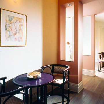
The design begins with a renovation of the major spaces. Before gutting, the foyer and dining room were two awkwardly shaped rooms of approximately the same size, isolated from each other. The problem is to create a more spacious, open feeling while maintaining a sense of division between the two spaces. This is accomplished by removing the wall between them and adding a low-ceilinged portal in its stead. The design of the portal is a modern abstract of the Palladian motif, which serves several functions. It reduces the awkward length of the foyer, making the dining room seem larger by comparison. The portal's depth and rhythmic symmetry create an axis through to the dining room which makes the entire space seem larger. Finally, the portal serves as an ante-space redirecting circulation to the living room. Sandblasted panels et into the sides of the portals help conceal the kitchen door; ledges provide a display space for art or flowers.
 Architecture Office
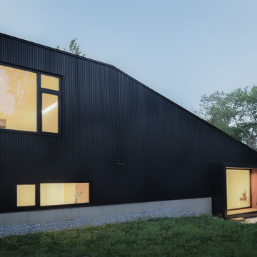
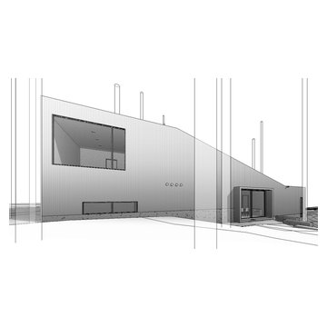
Nestled in an undeveloped thicket between two homes on Monmouth road, the Eastern corner of this client’s lot plunges ten feet downward into a city-designated stormwater collection ravine. Our client challenged us to design a home, referencing the Scandinavian modern style, that would account for this lot’s unique terrain and vegetation.
Through iterative design, we produced four house forms angled to allow rainwater to naturally flow off of the roof and into a gravel-lined runoff area that drains into the ravine. Completely foregoing downspouts and gutters, the chosen design reflects the site’s topography, its mass changing in concert with the slope of the land.
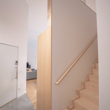
This two-story home is oriented around a central stacked staircase that descends into the basement and ascends to a second floor master bedroom with en-suite bathroom and walk-in closet. The main entrance—a triangular form subtracted from this home’s rectangular plan—opens to a kitchen and living space anchored with an oversized kitchen island. On the far side of the living space, a solid void form projects towards the backyard, referencing the entryway without mirroring it. Ground floor amenities include a bedroom, full bathroom, laundry area, office and attached garage.
Among Architecture Office’s most conceptually rigorous projects, exterior windows are isolated to opportunities where natural light and a connection to the outdoors is desired. The Monmouth home is clad in black corrugated metal, its exposed foundations extending from the earth to highlight its form.
Find the right local pro for your project
 Denver Mattress
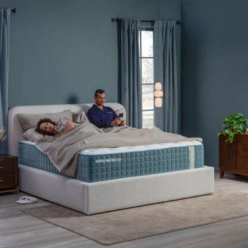
The Telluride® Luxury Medium Mattress is showcased in a sophisticated modern organic primary suite designed for restorative sleep and elevated living. Featuring a balanced comfort feel, this luxury mattress delivers the ideal combination of pressure relief and supportive alignment, helping couples enjoy personalized comfort without compromising support.
The serene space blends rich blue walls, warm walnut furnishings, soft boucle upholstery, and layered neutral textiles to create a calming retreat inspired by boutique hospitality design. Lifestyle elements highlight one partner sleeping comfortably while the other enjoys quiet relaxation, reinforcing the importance of motion-reducing comfort and individualized rest.
Crafted for homeowners who view sleep as an essential part of wellness, the Telluride® Luxury Medium combines premium materials, thoughtful craftsmanship, and refined comfort in a bedroom designed to promote deeper sleep and better mornings.
 Architecture Office
Nestled in an undeveloped thicket between two homes on Monmouth road, the Eastern corner of this client’s lot plunges ten feet downward into a city-designated stormwater collection ravine. Our client challenged us to design a home, referencing the Scandinavian modern style, that would account for this lot’s unique terrain and vegetation.
Through iterative design, we produced four house forms angled to allow rainwater to naturally flow off of the roof and into a gravel-lined runoff area that drains into the ravine. Completely foregoing downspouts and gutters, the chosen design reflects the site’s topography, its mass changing in concert with the slope of the land.
This two-story home is oriented around a central stacked staircase that descends into the basement and ascends to a second floor master bedroom with en-suite bathroom and walk-in closet. The main entrance—a triangular form subtracted from this home’s rectangular plan—opens to a kitchen and living space anchored with an oversized kitchen island. On the far side of the living space, a solid void form projects towards the backyard, referencing the entryway without mirroring it. Ground floor amenities include a bedroom, full bathroom, laundry area, office and attached garage.
Among Architecture Office’s most conceptually rigorous projects, exterior windows are isolated to opportunities where natural light and a connection to the outdoors is desired. The Monmouth home is clad in black corrugated metal, its exposed foundations extending from the earth to highlight its form. Construction is scheduled to begin in the spring of 2020.
 Architecture Office
Nestled in an undeveloped thicket between two homes on Monmouth road, the Eastern corner of this client’s lot plunges ten feet downward into a city-designated stormwater collection ravine. Our client challenged us to design a home, referencing the Scandinavian modern style, that would account for this lot’s unique terrain and vegetation.
Through iterative design, we produced four house forms angled to allow rainwater to naturally flow off of the roof and into a gravel-lined runoff area that drains into the ravine. Completely foregoing downspouts and gutters, the chosen design reflects the site’s topography, its mass changing in concert with the slope of the land.
This two-story home is oriented around a central stacked staircase that descends into the basement and ascends to a second floor master bedroom with en-suite bathroom and walk-in closet. The main entrance—a triangular form subtracted from this home’s rectangular plan—opens to a kitchen and living space anchored with an oversized kitchen island. On the far side of the living space, a solid void form projects towards the backyard, referencing the entryway without mirroring it. Ground floor amenities include a bedroom, full bathroom, laundry area, office and attached garage.
Among Architecture Office’s most conceptually rigorous projects, exterior windows are isolated to opportunities where natural light and a connection to the outdoors is desired. The Monmouth home is clad in black corrugated metal, its exposed foundations extending from the earth to highlight its form.

 NILES
NILESThis private studio, built in collaboration with producer, engineer, and pianist Ian Miller, is a fully custom creative space designed around his workflow and artistic process. The project blended NILES’ technical execution with Ian’s hands-on finishing work, resulting in a studio where every corner has intention and every system supports a seamless, plug-and-play workflow.
The structure began as a barn-style two-car garage with a second floor. After exploring several layouts and engineering options, we landed on a design that leveraged the high ceilings and existing footprint to create a dynamic and spacious acoustic environment. Generous daylight from surrounding windows connects the interior to the outdoors, while layered textures, warm tones, and custom finishes create a grounded yet inspiring atmosphere.
The Control Room is fully isolated from the rest of the building with sound-reducing wall systems, a full soft-ceiling bass trap, tuned corner traps, treatment throughout, and full-lite doors for controlled transmission and visibility. Though modest in size, it delivers accurate monitoring and integrates smoothly with the larger live environment.
Roasted Bean Studio was built to support any direction Ian pursues—from producing to mixing to live performance. The space provides the sonic palette and creative flexibility needed for a wide range of projects, offering a visually inspiring and acoustically reliable environment that empowers his work every day.

 Visbeen Architects
Photographer: Chuck Heiney
Crossing the threshold, you know this is the home you’ve always dreamed of. At home in any neighborhood, Pineleigh’s architectural style and family-focused floor plan offers timeless charm yet is geared toward today’s relaxed lifestyle. Full of light, warmth and thoughtful details that make a house a home, Pineleigh enchants from the custom entryway that includes a mahogany door, columns and a peaked roof. Two outdoor porches to the home’s left side offer plenty of spaces to enjoy outdoor living, making this cedar-shake-covered design perfect for a waterfront or woodsy lot. Inside, more than 2,000 square feet await on the main level. The family cook is never isolated in the spacious central kitchen, which is located on the back of the house behind the large, 17 by 30-foot living room and 12 by 18 formal dining room which functions for both formal and casual occasions and is adjacent to the charming screened-in porch and outdoor patio. Distinctive details include a large foyer, a private den/office with built-ins and all of the extras a family needs – an eating banquette in the kitchen as well as a walk-in pantry, first-floor laundry, cleaning closet and a mud room near the 1,000square foot garage stocked with built-in lockers and a three-foot bench. Upstairs is another covered deck and a dreamy 18 by 13-foot master bedroom/bath suite with deck access for enjoying morning coffee or late-night stargazing. Three additional bedrooms and a bath accommodate a growing family, as does the 1,700-square foot lower level, where an additional bar/kitchen with counter, a billiards space and an additional guest bedroom, exercise space and two baths complete the extensive offerings.
 Alex Nerland
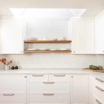
NBR turned a Lone Mountain residence into an absolute STUNNER! This 2 bedroom, 1 bathroom was revamped into a 2 bedroom, 2 bathroom including a new wonderful open kitchen. The flow of the house is now open and bright with a new entrance into the kitchen. The guest bathroom is a beautiful jewel box and the master bathroom is elegant, spacious and inviting.
Photos by David Kingsbury, www.davidkingsburyphoto.com
 SV Design
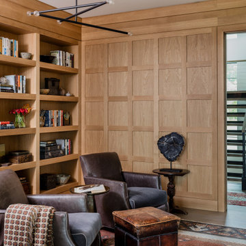
What began as a renovation project morphed into a new house, driven by the natural beauty of the site.
The new structures are perfectly aligned with the coastline, and take full advantage of the views of ocean, islands, and shoals. The location is within walking distance of town and its amenities, yet miles away in the privacy it affords. The house is nestled on a nicely wooded lot, giving the residence screening from the street, with an open meadow leading to the ocean on the rear of the lot.
The design concept was driven by the serenity of the site, enhanced by textures of trees, plantings, sand and shoreline. The newly constructed house sits quietly in a location advantageously positioned to take full advantage of natural light and solar orientations. The visual calm is enhanced by the natural material: stone, wood, and metal throughout the home.
The main structures are comprised of traditional New England forms, with modern connectors serving to unify the structures. Each building is equally suited for single floor living, if that future needs is ever necessary. Unique too is an underground connection between main house and an outbuilding.
With their flowing connections, no room is isolated or ignored; instead each reflects a different level of privacy and social interaction.
Just as there are layers to the exterior in beach, field, forest and oceans, the inside has a layered approach. Textures in wood, stone, and neutral colors combine with the warmth of linens, wools, and metals. Personality and character of the interiors and its furnishings are tailored to the client’s lifestyle. Rooms are arranged and organized in an intersection of public and private spaces. The quiet palette within reflects the nature outside, enhanced with artwork and accessories.
 Castle Building & Remodeling
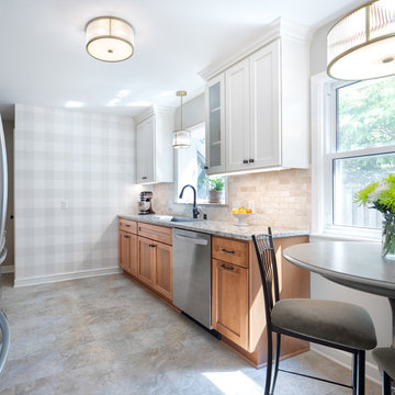
This twin home was the perfect home for these empty nesters – retro-styled bathrooms, beautiful fireplace and built-ins, and a spectacular garden. The only thing the home was lacking was a functional kitchen space.
The old kitchen had three entry points – one to the dining room, one to the back entry, and one to a hallway. The hallway entry was closed off to create a more functional galley style kitchen that isolated traffic running through and allowed for much more countertop and storage space.
The clients wanted a transitional style that mimicked their design choices in the rest of the home. A medium wood stained base cabinet was chosen to warm up the space and create contrast against the soft white upper cabinets. The stove was given two resting points on each side, and a large pantry was added for easy-access storage. The original box window at the kitchen sink remains, but the same granite used for the countertops now sits on the sill of the window, as opposed to the old wood sill that showed all water stains and wears. The granite chosen (Nevaska Granite) is a wonderful color mixture of browns, greys, whites, steely blues and a hint of black. A travertine tile backsplash accents the warmth found in the wood tone of the base cabinets and countertops.
Elegant lighting was installed as well as task lighting to compliment the bright, natural light in this kitchen. A flip-up work station will be added as another work point for the homeowners – likely to be used for their stand mixer while baking goodies with their grandkids. Wallpaper adds another layer of visual interest and texture.
The end result is an elegant and timeless design that the homeowners will gladly use for years to come.
Tour this project in person, September 28 – 29, during the 2019 Castle Home Tour!
 Western Cabinets
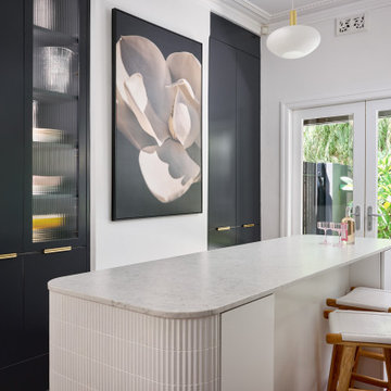
With its decorative mouldings and traditional influences throughout the home, this renovation is a classic take on modernism. Approaching the gates to the property, rich red brick surrounds a beautiful traditional white lacquered timber door with lead lite coloured panels on either side. Entering into the home, deep jarrah planked timber floors lead the way through to the kitchen and living areas.
The kitchen was small for my client who loved to cook as well as her daughter’s love for baking, needing a re- configure of the space to allow the kitchen to flow and function between the existing kitchen and small meals room. Outdated cabinetry made their home look tired and needed a fresh take on the newly architecturally extended home.
Traditional pairings of fresh whites, marbles and glass are delicately detailed within the design, modernising the homes interior. Lacquered chalky slabbed fronts surrounded by marbled benches and splashbacks, the introduction of curves to the isolated hood and island centre piece and depth injected with deep navy to create a monochrome palette. Warmth is then allowed in by brass hardware, reeded glass, a play on texture with tiles and warmly lit surfaces. Now a cook’s kitchen.
 Byggmeister Inc
Photo by Mike Casey
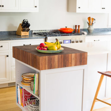
While boasting abundant square footage, Victorian houses often "live small" because of their outdated space configuration. With its undersized kitchen, minimal storage and awkward floor plan, this house was no exception.
RECONFIGURING ROOMS
The first and most pivotal design decision the architect (Anita Rogers) made was to move the basement stair. The stair ran between the kitchen and adjacent breakfast room, obstructing traffic flow and isolating the breakfast room from the rest of the living space. Moving the stair allowed us to integrate these two rooms into a generous eat-in kitchen with views to the backyard. It also allowed us to carve out a mud-room space with a bench and storage for shoes, coats and bags.
Thoughtfully detailed cabinetry fulfilled the clients' storage needs, rendering an existing dining room pantry obsolete. Removing the pantry created space to relocate the basement stair without sacrificing dining room floor area: we grew the dining area into the space vacated by the pantry and widened the doorway between the dining room and kitchen, facilitating traffic flow and creating a feeling of spaciousness.
ACCESSING THE OUTDOORS
The finishing touch is a new back deck with access from both the kitchen and the dining room. Glass doors to the deck admit plenty of natural light while also inviting the family outdoors to their backyard living space. The result is a lovely, vintage home whose space plan gracefully accommodates twenty-first century living.
 Durango Remodeling, LLC
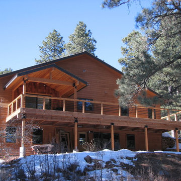
Deck addition and post and beam covered patio area added to 1970's ranch style home. REplace existing window in dinning room with sliding wood patio door.
 Byggmeister Inc
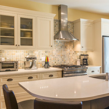
The owner of this distinguished Somerville late Victorian wanted not just a new kitchen, but a more efficient and healthier house overall. The challenge wasn’t just to capture the light and view towards the Boston skyline; we also needed to improve the space plan and work flow. Overlaid on those goals, we needed to respect the carefully maintained Victorian character of the rest of the home and bring that sensibility back into the kitchen space.
OPENING THE SPACE
We removed the wall that isolated the sink space to create one unified kitchen area. We relocated the sink to a center island so that we could replace the small window with a large sliding glass door out onto the deck and the view of the skyline.
REPURPOSING MATERIALS
We salvaged and re-used the honey-colored southern yellow pine wainscoting; we matched and extended it to a window seat and laundry room door to create continuity and tie those new elements to the old. The cabinets and counters have traditional styling in light colors to reflect the light from the new sliding doors deep into the space. More light from the rear utility stairs is brought into the space by means of a frosted glass door.
IMPROVING EFFICIENCY
More prosaically, but just as important to the client and the project team, we upgraded the insulation and air-sealing throughout the house to improve the home’s comfort and efficiency.
Photo by Jim Raycroft
 Byggmeister Inc
Photo by Mike Casey
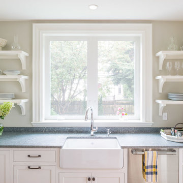
While boasting abundant square footage, Victorian houses often "live small" because of their outdated space configuration. With its undersized kitchen, minimal storage and awkward floor plan, this house was no exception.
RECONFIGURING ROOMS
The first and most pivotal design decision the architect (Anita Rogers) made was to move the basement stair. The stair ran between the kitchen and adjacent breakfast room, obstructing traffic flow and isolating the breakfast room from the rest of the living space. Moving the stair allowed us to integrate these two rooms into a generous eat-in kitchen with views to the backyard. It also allowed us to carve out a mud-room space with a bench and storage for shoes, coats and bags.
Thoughtfully detailed cabinetry fulfilled the clients' storage needs, rendering an existing dining room pantry obsolete. Removing the pantry created space to relocate the basement stair without sacrificing dining room floor area: we grew the dining area into the space vacated by the pantry and widened the doorway between the dining room and kitchen, facilitating traffic flow and creating a feeling of spaciousness.
ACCESSING THE OUTDOORS
The finishing touch is a new back deck with access from both the kitchen and the dining room. Glass doors to the deck admit plenty of natural light while also inviting the family outdoors to their backyard living space. The result is a lovely, vintage home whose space plan gracefully accommodates twenty-first century living.
 Castle Building & Remodeling
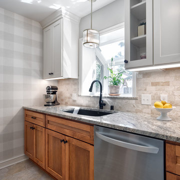
This twin home was the perfect home for these empty nesters – retro-styled bathrooms, beautiful fireplace and built-ins, and a spectacular garden. The only thing the home was lacking was a functional kitchen space.
The old kitchen had three entry points – one to the dining room, one to the back entry, and one to a hallway. The hallway entry was closed off to create a more functional galley style kitchen that isolated traffic running through and allowed for much more countertop and storage space.
The clients wanted a transitional style that mimicked their design choices in the rest of the home. A medium wood stained base cabinet was chosen to warm up the space and create contrast against the soft white upper cabinets. The stove was given two resting points on each side, and a large pantry was added for easy-access storage. The original box window at the kitchen sink remains, but the same granite used for the countertops now sits on the sill of the window, as opposed to the old wood sill that showed all water stains and wears. The granite chosen (Nevaska Granite) is a wonderful color mixture of browns, greys, whites, steely blues and a hint of black. A travertine tile backsplash accents the warmth found in the wood tone of the base cabinets and countertops.
Elegant lighting was installed as well as task lighting to compliment the bright, natural light in this kitchen. A flip-up work station will be added as another work point for the homeowners – likely to be used for their stand mixer while baking goodies with their grandkids. Wallpaper adds another layer of visual interest and texture.
The end result is an elegant and timeless design that the homeowners will gladly use for years to come.
Tour this project in person, September 28 – 29, during the 2019 Castle Home Tour!
 Irons Brothers Construction Inc
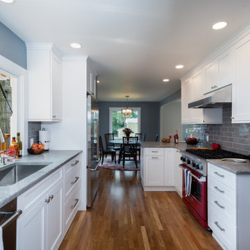
This rambler’s small kitchen was dysfunctional and out of touch with our client’s needs. She desired a larger footprint without an addition or expanding the footprint to stay within a realistic budget for her homes size and neighborhood.
The existing kitchen was “boxed-in” at the back of the house. The entrance from
the hallway was very narrow causing congestion and cramping the cook. In the living room the existing fireplace was a room hog, taking up the middle of the house. The kitchen was isolated from the other room’s downstairs.
The design team and homeowner decided to open the kitchen, connecting it to the dining room by removing the fireplace. This expanded the interior floor space. To create further integration amongst the spaces, the wall opening between the dining and living room was also widened. An archway was built to replicate the existing arch at the hallway & living room, giving a more spacious feel.
The new galley kitchen includes generous workspaces and enhanced storage. All designed for this homeowners’ specific needs in her kitchen. We also created a kitchen peninsula where guests can sit and enjoy conversations with the cook. (After 5,6) The red Viking range gives a fun pop of color to offset the monochromatic floor, cabinets and counters. It also plays to her Stanford alumni colors.
One of our favorite and most notable features of this kitchen is the “flip-out” window at the sink. This creative solution allows for an enhanced outdoor living experience, without an expansive remodel or addition. When the window is open the party can happen inside and outside with an interactive experience between spaces. The countertop was installed flush to the window, specifically designed as a cocktail/counter rail surface.
 Byggmeister Inc
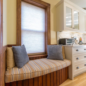
The owner of this distinguished Somerville late Victorian wanted not just a new kitchen, but a more efficient and healthier house overall. The challenge wasn’t just to capture the light and view towards the Boston skyline; we also needed to improve the space plan and work flow. Overlaid on those goals, we needed to respect the carefully maintained Victorian character of the rest of the home and bring that sensibility back into the kitchen space.
OPENING THE SPACE
We removed the wall that isolated the sink space to create one unified kitchen area. We relocated the sink to a center island so that we could replace the small window with a large sliding glass door out onto the deck and the view of the skyline.
REPURPOSING MATERIALS
We salvaged and re-used the honey-colored southern yellow pine wainscoting; we matched and extended it to a window seat and laundry room door to create continuity and tie those new elements to the old. The cabinets and counters have traditional styling in light colors to reflect the light from the new sliding doors deep into the space. More light from the rear utility stairs is brought into the space by means of a frosted glass door.
IMPROVING EFFICIENCY
More prosaically, but just as important to the client and the project team, we upgraded the insulation and air-sealing throughout the house to improve the home’s comfort and efficiency.
Photo by Jim Raycroft
 John Barton Architect
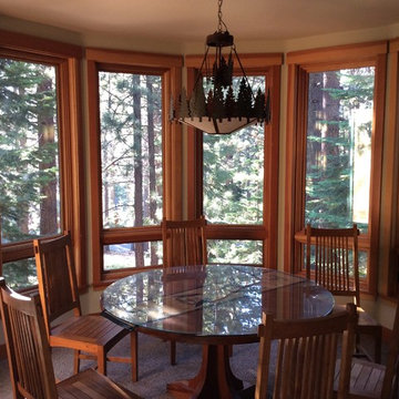
We used awning windows at the bottom for ventilation but left the top windows undivided to maximize the view out to the forest beyond
John Barton
Joh
Arts and crafts dining room photo in San Francisco
Arts and crafts dining room photo in San Francisco
81