
Search results for "Lacking" in Home Design Ideas


 Laura Medicus Interiors
The small 1950’s ranch home was featured on HGTV’s House Hunters Renovation. The episode (Season 14, Episode 9) is called: "Flying into a Renovation". Please check out The Colorado Nest for more details along with Before and After photos.
Photos by Sara Yoder.
FEATURED IN:
Fine Homebuilding

 River Valley Landscapes
The property is one of the original farm houses located on the main street of a small town. It has been in the family for many years and our client just inherited the property. They were trying to have balance of preserving the old while realizing modern day living has its benefits too. The house had a large addition added using mostly old style materials, but designed with function and modern day luxuries. Our goal was to carry that theme to the outside.
Our first problem we had to address was how to transition between the first floor elevation changes. The lower room was the husband’s office. He stated in the future he may have clients over and it would be nice to have an area to sit outside. The wife’s main concern was to renew the four corner garden. She also felt it was very important to be able to see it from the kitchen area. Finally there was an old wishing well stuck right outside the kitchen. They both felt it would be neat to be able to incorporate this in some how. They wanted a patio area with a built in grill to accommodate there family and friends. They also wanted to keep a large play area for the kids.
We were able to pull this off successfully. We addressed the first issue by having a small lower level flagstone area. This area is large enough for 1 to 2 people to sit comfortably. It also provides a transition from his office to the larger patio area. We installed a simple small gravel sitting area opposite of the main patio. This provides our client a secluded place to relax or do business. Mrs.... told me she is amazed how much her and her husband enjoys this area. It is so peaceful looking at the small creek over a glass of wine.
We built a natural limestone retaining wall to create the patio terrace. The stone was chosen to extend the houses architectural elements into the landscape. Irregular broken flagstone was used to give it a more casual feel. We installed three Serviceberries into the patio terrace to replace some trees that were taken down during the remodeling. She was very concern that they would block the view of the four corner garden. We new they were crucial to nestle in the terrace, so we placed them for a couple days for her to decide. Fortunately she agreed they not only kept the view open, but helped frame the garden.
The four corner garden was designed to be viewed from afar and experienced up close. We wanted the space to have some formal structure while keeping with the casual farm house feel. Another natural limestone retaining wall was created. This leveled the garden terrace and helped associate it with the rest of the property. The four corner garden is nestled into the existing woods edge. This provides three distinct experiences to entering the garden; a more formal from the driveway, an open feel from the lower lawn, and a more natural / casual experience from the wooded area. The Plymouth brown gravel was used for the center of the garden. This helped highlight the stone post that was found during construction. The gravel also brings the sense of sound into the garden space. Lamb’s ear was chosen as a fun way to get kids interest in horticulture.
The balance of using the new to create the old feel is what makes this project a success. The property has already hosted a local historical society event and won an award for its preservation efforts. When Mrs.... can’t find her husband, she knows he is either reading the newspaper by the grill or resting in the hammock along the wood’s path.
Find the right local pro for your project

 Hoffman Grayson Architects LLP
Originally, the front of the house was on the left (eave) side, facing the primary street. Since the Garage was on the narrower, quieter side street, we decided that when we would renovate, we would reorient the front to the quieter side street, and enter through the front Porch.
So initially we built the fencing and Pergola entering from the side street into the existing Front Porch.
Then in 2003, we pulled off the roof, which enclosed just one large room and a bathroom, and added a full second story. Then we added the gable overhangs to create the effect of a cottage with dormers, so as not to overwhelm the scale of the site.
The shingles are stained Cabots Semi-Solid Deck and Siding Oil Stain, 7406, color: Burnt Hickory, and the trim is painted with Benjamin Moore Aura Exterior Low Luster Narraganset Green HC-157, (which is actually a dark blue).
Photo by Glen Grayson, AIA

 SV Design
The layout of this colonial-style house lacked the open, coastal feel the homeowners wanted for their summer retreat. Siemasko + Verbridge worked with the homeowners to understand their goals and priorities: gourmet kitchen; open first floor with casual, connected lounging and entertaining spaces; an out-of-the-way area for laundry and a powder room; a home office; and overall, give the home a lighter and more “airy” feel. SV’s design team reprogrammed the first floor to successfully achieve these goals.
SV relocated the kitchen to what had been an underutilized family room and moved the dining room to the location of the existing kitchen. This shift allowed for better alignment with the existing living spaces and improved flow through the rooms. The existing powder room and laundry closet, which opened directly into the dining room, were moved and are now tucked in a lower traffic area that connects the garage entrance to the kitchen. A new entry closet and home office were incorporated into the front of the house to define a well-proportioned entry space with a view of the new kitchen.
By making use of the existing cathedral ceilings, adding windows in key locations, removing very few walls, and introducing a lighter color palette with contemporary materials, this summer cottage now exudes the light and airiness this home was meant to have.
© Dan Cutrona Photography

 Finstad's Carpet One
A gorgeous, northwestern inspired outdoor living space, Montana style with beautiful hardwood floors to boot!
Mountain style patio photo with a roof extension and a fireplace
Mountain style patio photo with a roof extension and a fireplace

 Studio Miel
Photography: Stacy Zarin Goldberg
Living room - small contemporary open concept porcelain tile and brown floor living room idea in DC Metro with a bar and white walls
Living room - small contemporary open concept porcelain tile and brown floor living room idea in DC Metro with a bar and white walls

 Moore House Design
Modern Kitchen redesign. We switched out the kitchen light fixtures, hardware, faucets, added a shiplap surround to the island and added decor
Kitchen - small cottage l-shaped brown floor and medium tone wood floor kitchen idea in Bridgeport with a farmhouse sink, shaker cabinets, white cabinets, quartz countertops, white backsplash, subway tile backsplash, stainless steel appliances, an island and gray countertops
Kitchen - small cottage l-shaped brown floor and medium tone wood floor kitchen idea in Bridgeport with a farmhouse sink, shaker cabinets, white cabinets, quartz countertops, white backsplash, subway tile backsplash, stainless steel appliances, an island and gray countertops

 Studio McGee
Shop the Look, See the Photo Tour here: https://www.studio-mcgee.com/studioblog/2016/4/4/modern-mountain-home-tour
Watch the Webisode: https://www.youtube.com/watch?v=JtwvqrNPjhU
Travis J Photography

 GMT Home Designs Inc.
The original kitchen was dark and lacked storage space. It was cut off from the rest of the house and needed an update. We removed the wall between the dining room and kitchen and bumped the kitchen out in the rear of the house. We created lots of storage, a new island with seating and added windows bringing in much needed natural light. The kitchen is now a hub of activity for the whole family.
 G. Lebron Interiors
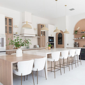
View of the the design combines delicate curves that evoke Spanish colonial architecture with soft hues of pink sand and natural woods. Neutral finishes and subtle textures create a cozy and sophisticated atmosphere.

 Alair Homes Plano
This home had a previous master bathroom remodel and addition with poor layout. Our homeowners wanted a whole new suite that was functional and beautiful. They wanted the new bathroom to feel bigger with more functional space. Their current bathroom was choppy with too many walls. The lack of storage in the bathroom and the closet was a problem and they hated the cabinets. They have a really nice large back yard and the views from the bathroom should take advantage of that.
We decided to move the main part of the bathroom to the rear of the bathroom that has the best view and combine the closets into one closet, which required moving all of the plumbing, as well as the entrance to the new bathroom. Where the old toilet, tub and shower were is now the new extra-large closet. We had to frame in the walls where the glass blocks were once behind the tub and the old doors that once went to the shower and water closet. We installed a new soft close pocket doors going into the water closet and the new closet. A new window was added behind the tub taking advantage of the beautiful backyard. In the partial frameless shower we installed a fogless mirror, shower niches and a large built in bench. . An articulating wall mount TV was placed outside of the closet, to be viewed from anywhere in the bathroom.
The homeowners chose some great floating vanity cabinets to give their new bathroom a more modern feel that went along great with the large porcelain tile flooring. A decorative tumbled marble mosaic tile was chosen for the shower walls, which really makes it a wow factor! New recessed can lights were added to brighten up the room, as well as four new pendants hanging on either side of the three mirrors placed above the seated make-up area and sinks.
Design/Remodel by Hatfield Builders & Remodelers | Photography by Versatile Imaging

 Ferguson Bath, Kitchen & Lighting Gallery
Photo Credit: Martin King Photography
Designer: Kittrell & Associates Interior Design - Corona del Mar, CA
Tub: Mirabelle tub, tub filler, faucets
Shower and Bath: Hansgrohe Shower head and hand held shower head
Steam Shower: Thermasol Steam Shower
Wall Color: Dunn Edwards, number DEC 767 "Riverbed". We used the Velvet sheen, which is one step up from Flat.

 Texas Construction Company
Photo by Ryann Ford
Example of a farmhouse white two-story gable roof design in Austin
Example of a farmhouse white two-story gable roof design in Austin

 Cummings Architecture + Interiors
With expansive fields and beautiful farmland surrounding it, this historic farmhouse celebrates these views with floor-to-ceiling windows from the kitchen and sitting area. Originally constructed in the late 1700’s, the main house is connected to the barn by a new addition, housing a master bedroom suite and new two-car garage with carriage doors. We kept and restored all of the home’s existing historic single-pane windows, which complement its historic character. On the exterior, a combination of shingles and clapboard siding were continued from the barn and through the new addition.

 Rainier Cabinetry & Design, Inc
Eat-in kitchen - large contemporary u-shaped light wood floor and brown floor eat-in kitchen idea in Seattle with an undermount sink, recessed-panel cabinets, black cabinets, marble countertops, green backsplash, glass tile backsplash, stainless steel appliances, an island and white countertops

 Devine Bath & Kitchen
Northeast Portland is full of great old neighborhoods and houses bursting with character. The owners of this particular home had enjoyed their pink and blue bathroom’s quirky charm for years, but had finally outgrown its awkward layout and lack of functionality.
The Goal: Create a fresh, bright look for this bathroom that is both functional and fits the style of the home.
Step one was to establish the color scheme and style for our clients’ new bathroom. Bright whites and classic elements like marble, subway tile and penny-rounds helped establish a transitional style that didn’t feel “too modern” for the home.
When it comes to creating a more functional space, storage is key. The original bathroom featured a pedestal sink with no practical storage options. We designed a custom-built vanity with plenty of storage and useable counter space. And by opting for a durable, low-maintenance quartz countertop, we were able to create a beautiful marble-look without the hefty price-tag.
Next, we got rid of the old tub (and awkward shower outlet), and moved the entire shower-area to the back wall. This created a far more practical layout for this bathroom, providing more space for the large new vanity and the open, walk-in shower our clients were looking for.

 Story Hill Renovations LLC
This was a dated and rough space when we began. The plumbing was leaking and the tub surround was failing. The client wanted a bathroom that complimented the era of the home without going over budget. We tastefully designed the space with an eye on the character of the home and budget. We save the sink and tub from the recycling bin and refinished them both. The floor was refreshed with a good cleaning and some grout touch ups and tile replacement using tiles from under the toilet.


 Dichotomy Interiors
Deborah De graffenreid
Trendy ceramic tile eat-in kitchen photo in New York with an undermount sink, flat-panel cabinets, white cabinets, quartz countertops, gray backsplash, ceramic backsplash and stainless steel appliances
Trendy ceramic tile eat-in kitchen photo in New York with an undermount sink, flat-panel cabinets, white cabinets, quartz countertops, gray backsplash, ceramic backsplash and stainless steel appliances
19