
Search results for "Larger goals" in Home Design Ideas
 River Valley Landscapes
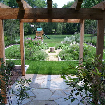
The property is one of the original farm houses located on the main street of a small town. It has been in the family for many years and our client just inherited the property. They were trying to have balance of preserving the old while realizing modern day living has its benefits too. The house had a large addition added using mostly old style materials, but designed with function and modern day luxuries. Our goal was to carry that theme to the outside.
Our first problem we had to address was how to transition between the first floor elevation changes. The lower room was the husband’s office. He stated in the future he may have clients over and it would be nice to have an area to sit outside. The wife’s main concern was to renew the four corner garden. She also felt it was very important to be able to see it from the kitchen area. Finally there was an old wishing well stuck right outside the kitchen. They both felt it would be neat to be able to incorporate this in some how. They wanted a patio area with a built in grill to accommodate there family and friends. They also wanted to keep a large play area for the kids.
We were able to pull this off successfully. We addressed the first issue by having a small lower level flagstone area. This area is large enough for 1 to 2 people to sit comfortably. It also provides a transition from his office to the larger patio area. We installed a simple small gravel sitting area opposite of the main patio. This provides our client a secluded place to relax or do business. Mrs.... told me she is amazed how much her and her husband enjoys this area. It is so peaceful looking at the small creek over a glass of wine.
We built a natural limestone retaining wall to create the patio terrace. The stone was chosen to extend the houses architectural elements into the landscape. Irregular broken flagstone was used to give it a more casual feel. We installed three Serviceberries into the patio terrace to replace some trees that were taken down during the remodeling. She was very concern that they would block the view of the four corner garden. We new they were crucial to nestle in the terrace, so we placed them for a couple days for her to decide. Fortunately she agreed they not only kept the view open, but helped frame the garden.
The four corner garden was designed to be viewed from afar and experienced up close. We wanted the space to have some formal structure while keeping with the casual farm house feel. Another natural limestone retaining wall was created. This leveled the garden terrace and helped associate it with the rest of the property. The four corner garden is nestled into the existing woods edge. This provides three distinct experiences to entering the garden; a more formal from the driveway, an open feel from the lower lawn, and a more natural / casual experience from the wooded area. The Plymouth brown gravel was used for the center of the garden. This helped highlight the stone post that was found during construction. The gravel also brings the sense of sound into the garden space. Lamb’s ear was chosen as a fun way to get kids interest in horticulture.
The balance of using the new to create the old feel is what makes this project a success. The property has already hosted a local historical society event and won an award for its preservation efforts. When Mrs.... can’t find her husband, she knows he is either reading the newspaper by the grill or resting in the hammock along the wood’s path.
 Tiffany Brooks, HGTV Host & Interior Designer
Inquire About Our Design Services
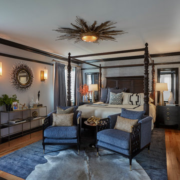
When we first started talking in the spring of 2015, I was impressed. She was witty, realistic, and understood that as much as she loves my shows on HGTV, design does not does not happen in 43 minutes! She told me about her space, and how she felt that her bedroom seemed “blah” to her. She had no retreat. Molly desperately longed for a place that she could spend time in, read in, play in and above all, relax in.
What we did:
Many people are terrified of hiring a designer. Rightfully so, they are investing a pretty penny in their homes. They want to make sure that everything, down to the last floral arrangement, is to their liking, because they will have to live it (and pay for it). Unfortunately, a client can unintentionally stifle a designer’s creativity through micro-management. This can produce lackluster results and ultimately cause more time (and money) to be spent on a project than is really necessary.
With Molly, that was never an issue. Before she even showed me the room in question, she said that I could have full creative license to do what I needed to do to her bedroom. SAY WHAAH!?
With Molly giving me complete creative freedom, I planned everything out and got down to business. The result: Bite-your-bottom-lip sexy. I don’t get jealous of too many of my clients’ spaces, but this one still takes my breath away every time I look at the pics!
The craziest part was that by adding more furniture, it actually made the space feel larger.
Molly and her husband Patrick loved the finished space, and promised me I will be back to finish the rest of the house!
Here’s the highlights of the rest of the project:
I came up with a space plan with three options.
Next, we reviewed mood boards and fabric schemes that would work for both Molly and her hubby Patrick.
We started with the bed. My goal was to add edge to its otherwise traditional style.
We decided to spice things up by painting the trim work in the room black.
We built in layers of lighting with dimmers. In a bedroom everything should be on dimmers, right? Right.
We designed and customized bedding, chairs and window treatments.
Together with Molly, we selected the most perfect wallpaper. This geometric “grasscloth” adds so much depth and dimension that was just missing before.
What I love:
That light fixture. I mean it is really, really amazing in person.
The porcupine mirror. This thing came packaged like it was the hope diamond, and everyone was terrified to handle it. But it really became a highlight of the room.
 Advance Design Studio, Ltd.
Curtis and Peggy had been thinking of a kitchen remodel for quite some time, but they knew their house would have a unique set of challenges. Their older Victorian house was built in 1891. The kitchen cabinetry was original, and they wanted to keep the authenticity of their period home while adding modern comforts that would improve their quality of life.
A friend recommended Advance Design Studio for their exceptional experience and quality of work. After meeting with designer Michelle Lecinski at Advance Design, they were confident they could partner with Advance to accomplish the unique kitchen renovation they’d been talking about for years. “We wanted to do the kitchen for a long, long time,” Curtis said. “(We asked ourselves) what are we actually going to do? How are we going to do this? And who are we going to find to do exactly what we want?”
The goal for the project was to keep the home renovation and new kitchen feeling authentic to the time in which it was built. They desperately wanted the modern comforts that come with a larger refrigerator and the dishwasher that they never had! The old home was also a bit drafty so adding a fireplace, wall insulation and new windows became a priority. They very much wanted to create a comfortable hearth room adjacent to the kitchen, complete with old world brick.
The original cabinetry had to go to make way for beautiful new kitchen cabinetry that appears as if it was a hundred years old, but with all the benefits of cutting-edge storage, self-closing drawers, and a brand-new look. “We just wanted to keep it old looking, but with some modern updates,” Peggy said.
Dura Supreme Highland Cabinets with a Heritage Old World Painted Finish replaced the original 1891 cabinets. The hand-applied careful rubbed-off detailing makes these exquisite cabinets look as if they came from a far-gone era. Despite the small size of the kitchen, Peggy, Curtis and Michelle utilized every inch with custom cabinet sizes to increase storage capacity. The custom cabinets allowed for the addition of a 24” Fisher Paykel dishwasher with a concealing Dura Supreme door panel. Michelle was also able to work into the new design a larger 30” Fisher Paykel French refrigerator. “We made every ¼ inch count in this small space,” designer Michelle said. “Having the ability to custom size the cabinetry was the only way to achieve this.”
“The kitchen essentially was designed around the Heartland Vintage range and oven,” says Michelle. A classic appliance that combines nostalgic beauty and craftsmanship for modern cooking, with nickel plated trim and elegantly shaped handles and legs; the not to miss range is a striking focal point of the entire room and an engaging conversation piece.
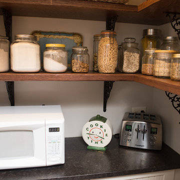
Granite countertops in Kodiak Satin with subtle veining kept with the old-world style. The delicate porcelain La Vie Crackle Sonoma tile kitchen backsplash compliments the home’s style perfectly. A handcrafted passthrough designed to show off Peggy’s fine china was custom built by project carpenters Justin Davis and Jeff Dallain to physically and visually open the space. Additional storage was created in the custom panty room with Latte Edinburg cabinets, hand-made weathered wood shelving with authentic black iron brackets, and an intricate tin copper ceiling.
Peggy and Curtis loved the idea of adding a Vermont stove to make the hearth-room not only functional, but a truly beckoning place to be. A stunning Bordeaux red Vermont Castings Stove with crisp black ventilation was chosen and combined with the authentic reclaimed Chicago brick wall. Advance’s talented carpenters custom-built elegant weathered shelves to house family memorabilia, installed carefully chosen barn sconces, and made the hearth room an inviting place to relax with a cup of coffee and a good book.
“Peggy and Curtis’ project was so much fun to work on. Creating a space that looks and feels like it always belonged in this beautiful old Victorian home is a designer’s dream. To see the delight in their faces when they saw the design details coming together truly made it worth the time and effort that went into making the very compact kitchen space work”, said Michelle. “The result is an amazing custom kitchen, packed with functionality in every inch, nook and cranny!” exclaims Michelle.
The renovation didn’t end with the kitchen. New Pella windows were added to help lessen the drafts. The removal of the original windows and trim necessitated the re-creation of hand-made corbels and trim details no longer available today. The talented carpenter team came to the rescue, crafting new pieces and masterfully finishing them as if they were always there. New custom gutters were formed and installed with a front entry rework necessary to accommodate the changes.
The whole house functions better, but it still feels like the original 1891 home. “From start to finish it’s just a much better space than we used to have,” Peggy said. “Jeff and Justin were amazing.” Curtis added; “We were lucky to find Advance Design, because they really came through for us. I loved that they had everything in house, anything you needed to have done, they could do it”.
Find the right local pro for your project
 Michael Nash Design, Build & Homes
2010 CAPTIAL COTY, HONORABLE MENTION AWARD WINNER, RESIDENTIAL
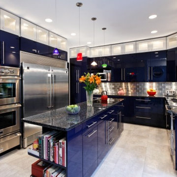
The owners of this single family home were seeking a more colorful, contemporary kitchen style. Other goals for the renovation included having larger appliances, better traffic flow, better lighting and other updated amenities.
To help the couple achieve their goals, the design team at Michael Nash Design, Build & Homes relocated all the electrical and plumbing from the bulk heads to create additional cabinet space. Then, they opened up the bearing wall between the family room and kitchen using structural beams and brought plumbing for a wall mounted faucet and a vessel sink for the wet bar. A new pantry replaced the old doorway to the dining room.
All of the new appliances were relocated to the wall between the kitchen and dining room that was previously blank. It now houses a new 36” refrigerator and 36” freezer, double ovens, and additional cabinets. A central island was installed to accommodate a large cooktop.
The design team then suggested double stack upper cabinetry that contains stainless steel glass door cabinets in upper part with a cobalt blue high-gloss lacquer on the lower part. Use of complementary exotic granite to tie in stainless steel appliances and color of the cabinets is one of the nice features of this job.
The entire kitchen and leading hallway to the front foyer was filled in with very contemporary metallic porcelain tiles. Use of LED lighting, pendant lights and creative paint were just of few of the finishing touches. An old brick fireplace in the family room was covered in granite that complements the kitchen’s colors to facilitate the new connection between the two rooms.
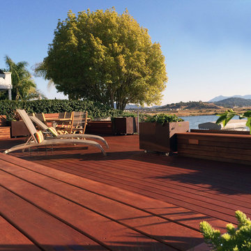
 Dig Your Garden Landscape Design
Lagoon-side property in the Bel Marin Keys, Novato, CA. Entertaining and enjoying the views were a primary design goal for this project. The project includes a large camaru deck with built-in seating. The concrete steps and pavers lead down to the water's edge. I included a sunken patio on one side and a beautiful Buddha statue on the other, surrounded by succulents and other low-water, contemporary plantings. I also used Dymondia ground cover to create a natural pathways within the garden.
Photo: © Eileen Kelly, Dig Your Garden Landscape Design. Design Eileen Kelly

 Metro Interiors
I first came to Mary Beth’s home to help with her living room. But that changed when we looked at the office, and started talking about how it wasn’t working. When I stepped it to take a look, I immediately noticed how heavy and cramped it felt. Too many large pieces and clutter created a feeling of overwhelm.
It needed to be redone. Since Mary Beth works full time from home, I wanted to help her make this a space where she could be productive, and feel good about being in for long periods of time.
The end result is an impressive transformation – and it was done very affordably. “Prior to the re-design, my office was a cluttered, disorganized mess that really said nothing about who I am. I tended to use it as a catch all for things I didn’t know where to put or what to do with,” tells Mary Beth. Now, she says it feels so much better working in there, and even got rave reviews from her family when they visited for the Holidays. “It’s now well-organized, bright and seems to flow in the way it’s laid out”.
To remove clutter and the “heavy” feeling, two large bookcases and the couch were removed, and lots of time was spent decluttering. A nicer bookcase was moved to a place that made more sense; together with a cozy rug and upholstered chair we created a lovely reading area, a place she can also relax.
A neutral green on the walls is also soothing, and brings an element of nature inside. Groupings of photos from her travels hang on the walls now, and a larger piece of art creates a focal point. A piece I was delighted to help her find – hand-painted but affordably priced – it makes Mary Beth feel happy, “The art above the desk is beautiful, and it showed me that big doesn’t have to be overwhelming”.
A new desk, relocated to the “command position” in the room (a more powerful placement) is also less weighty than what she had before, but functionally allows for more workspace. We upgraded her desk chair to a high-back leather one. In total, this setup was intentional, for an enhanced feeling of being in control. Mary Beth notes, “I love the desk and how it sits. I can either work by the window and look out at the garden and at the birds, which I love to do, or look out into the living room and be part of anything going on there”.
On the windows we replaced metal blinds with woven roman shades, also with a natural look. They’re cordless, so nothing hangs in front of the beautiful backyard view, and they feel lighter. With the new office design, we also gave Mary Beth plenty of places for storage. Now the things she does use and need don’t need to be out in plain sight, cluttering things up.
In the end, we accomplished our goal of creating a space for Mary Beth conducive to work and also enjoyable. She says, “My work attitude and feeling of what the office is has definitely changed – I like to be there even when I’m not working. It doesn’t feel only like an office but is actually a relaxing place to be”.
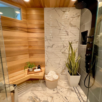
 Change Your Bathroom©
This transformation started with a builder grade bathroom and was expanded into a sauna wet room. With cedar walls and ceiling and a custom cedar bench, the sauna heats the space for a relaxing dry heat experience. The goal of this space was to create a sauna in the secondary bathroom and be as efficient as possible with the space. This bathroom transformed from a standard secondary bathroom to a ergonomic spa without impacting the functionality of the bedroom.
This project was super fun, we were working inside of a guest bedroom, to create a functional, yet expansive bathroom. We started with a standard bathroom layout and by building out into the large guest bedroom that was used as an office, we were able to create enough square footage in the bathroom without detracting from the bedroom aesthetics or function. We worked with the client on her specific requests and put all of the materials into a 3D design to visualize the new space.
Houzz Write Up: https://www.houzz.com/magazine/bathroom-of-the-week-stylish-spa-retreat-with-a-real-sauna-stsetivw-vs~168139419
The layout of the bathroom needed to change to incorporate the larger wet room/sauna. By expanding the room slightly it gave us the needed space to relocate the toilet, the vanity and the entrance to the bathroom allowing for the wet room to have the full length of the new space.
This bathroom includes a cedar sauna room that is incorporated inside of the shower, the custom cedar bench follows the curvature of the room's new layout and a window was added to allow the natural sunlight to come in from the bedroom. The aromatic properties of the cedar are delightful whether it's being used with the dry sauna heat and also when the shower is steaming the space. In the shower are matching porcelain, marble-look tiles, with architectural texture on the shower walls contrasting with the warm, smooth cedar boards. Also, by increasing the depth of the toilet wall, we were able to create useful towel storage without detracting from the room significantly.
This entire project and client was a joy to work with.


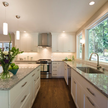
 Taylor Design Studio
1950s Bungalow Kitchen Renovation. This Kitchen is all about the view. The goal of this space was to keep it simple, timeless, and bright. Photography by David Berlekamp
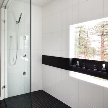
 Melton Design Build
The goal of this project was to update the outdated master bathroom to better meet the homeowners design tastes and the style of the rest of this foothills home, as well as update all the doors on the first floor, and create a contemporary mud room and staircase to the basement.
The homeowners wanted a master suite that had a masculine feel, incorporated elements of black steel, wood, and contrast with clean white tiles and counter-tops and helped their long and skinny layout feel larger/ make better use of the space they have. They also wanted a more spacious and luxurious shower with water temperature control. A large window that existed above the original soaking tub offered spectacular views down into Boulder valley and it was important to keep this element in the updated design. However, privacy was also very important. Therefore, a custom-built powder coated steel shelf, was created to provide privacy blocking, add storage, and add a contrasting design element to the white wall tiles. Black honeycomb floor tiles, new black walnut cabinetry, contemporary wall paper, a floor to ceiling glass shower wall, and updated fixtures elevated the space and gave the clients exactly the look and feel that they wanted.
Unique custom metal design elements can be found throughout the new spaces (shower, mud room bench and shelving, and staircase railings and guardrails), and give this home the contemporary feel that the homeowners desired.
 Copper Sky Design + Remodel
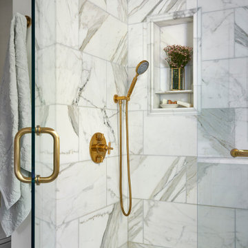
This renovation project of a 1920s home included a kitchen, bar/mudroom, laundry room, guest bathroom and primary bathroom. This home, located in the Virginia Highland neighborhood of Atlanta, had an unusual layout and a good bit of unused space. The two main goals were to bring the outdated spaces to suit modern living standards, and to better utilize the space.
 MANDARINA STUDIO interior design
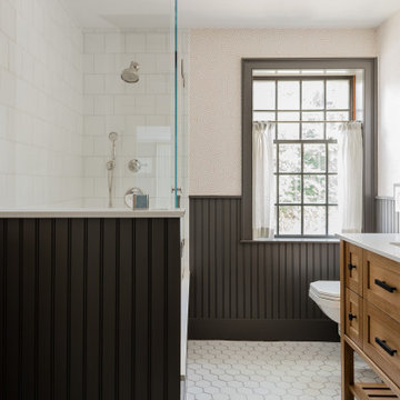
Summary of Scope: gut renovation/reconfiguration of kitchen, coffee bar, mudroom, powder room, 2 kids baths, guest bath, master bath and dressing room, kids study and playroom, study/office, laundry room, restoration of windows, adding wallpapers and window treatments
Background/description: The house was built in 1908, my clients are only the 3rd owners of the house. The prior owner lived there from 1940s until she died at age of 98! The old home had loads of character and charm but was in pretty bad condition and desperately needed updates. The clients purchased the home a few years ago and did some work before they moved in (roof, HVAC, electrical) but decided to live in the house for a 6 months or so before embarking on the next renovation phase. I had worked with the clients previously on the wife's office space and a few projects in a previous home including the nursery design for their first child so they reached out when they were ready to start thinking about the interior renovations. The goal was to respect and enhance the historic architecture of the home but make the spaces more functional for this couple with two small kids. Clients were open to color and some more bold/unexpected design choices. The design style is updated traditional with some eclectic elements. An early design decision was to incorporate a dark colored french range which would be the focal point of the kitchen and to do dark high gloss lacquered cabinets in the adjacent coffee bar, and we ultimately went with dark green.
 Forward Design Build Remodel
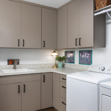
Our client’s goal was to create a welcoming, warm, forever home that acted as the family gathering spot for their children’s growing families.
To achieve our client’s goals, our design focused on increasing the square footage with a second story, creating a true primary suite and guest space, and maintaining the gorgeous exterior views.
Our clients also wanted a dedicated foyer and a much larger kitchen and community space.
 User
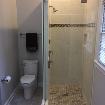
UserThe new shower enclosure is slightly larger. The wall with the fixtures was cut back so that a glass panel could be extended around the corner which makes it feel more open.
This was a challenging remodel, but we achieved the primary goals of attaining more storage and making the space feel larger. The homeowners are happy with their decisions and love their new bathroom!
 Reico Kitchen & Bath
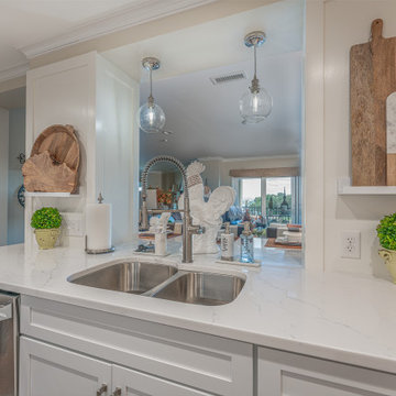
Designed by Christine Wade of Reico Kitchen & Bath in Salem, VA, this small kitchen remodeling project features a modern style inspired design with Merillat Masterpiece cabinets in the Martel door style with a Dove White finish. Kitchen countertops are Spectrum Sterling.
The kitchen also includes a Carrara Mosaic 1x2 Herringbone tile backsplash and Viking appliances.
“The old kitchen had black cabinets and old halogen lighting. My goal for the kitchen remodel was to have a brighter space,” said the client.
“Changing to LED lighting, changing from black to white cabinetry and lowering countertops to all one level were keys to meeting that goal. Although the layout was a galley style kitchen, removing side walls opened up the space and created a feeling that the space was bigger even though the footprint didn’t change.”
“The customer originally wanted to open up and take out the columns. After doing research and some preliminary probing we found that one of the columns was the main concrete structure for the building,” said Christine.
“With that in mind we were able to still open up the space and give the illusion of the kitchen being larger even though it’s the same foot print as before. For the bar, there was a piece of furniture that we added an end panel to the side of the wine fridge and a quartz top too. We also added shiplap, mantel, tile and additional molding around the built-in open shelves at the fireplace."
Photos courtesy of Sowder Group LLC.
 Kowalske Kitchen & Bath
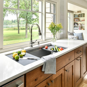
Kowalske Kitchen & Bath was hired as the remodeling contractor for this first floor remodel in the countryside of Oconomowoc, WI. By opening the kitchen up to the living room, the layout is better for hosting family gatherings. The entire family can be together in the kitchen and living room – cooking or spending time together. Highlights of this country kitchen include a window seat, walk-in pantry and space for their treasured piano.
Project Goals
+ Restore the beauty of their family home, that was built by the homeowner’s grandfather
+ Cooking functionality for their family farm
+ Add a workstation sink for easy food prep
+ Pantry storage space for canned items & wine collection
+ Design that honors the mid-century ranch bones of the house her grandfather built and their own traditional style
Challenges & Issues
+ Needed space to highlight their piano, since the homeowner is an avid pianist
+ Old layout didn’t have good views of their outdoor space – the lake, gardens and chicken coop
+ Kitchen was too small and cut off from the rest of the home
+ The heat and air conditioning did not function well due to several past additions
Country Kitchen Features:
Cooking Kitchen – We created a larger kitchen by expanding into the old dining room. The homeowners needed more space for canning vegetables, cooking and entertaining.
Mid-Century Country Design – The ranch home was built in the 1950s so we kept the mid-century and country kitchen design aesthetic by using hickory wood, tall verticals and long horizontals.
Kitchen Window Seat – A custom window seat with a curved backrest creates a gathering spot in the kitchen. This connects the home to the outdoor view of the lake where the family fishes and ice skates in winter. The bench is large enough to be used as a guest bed when they have visitors. The cozy nook has shelving, art lights, and a hidden radiator underneath to keep it warm and toasty.
Window Backsplash – Along the range wall, a new window backsplash features the beautiful view of the farm driveway, trees and gardens.
Minimalistic Hood – The hood with the wood shelf mimics the new fireplace mantel and ties the country kitchen and living room together.
New Pantry – The old kitchen area was converted into the new pantry and a laundry room. The pantry is their working kitchen where they can store food, their wine collection, and have countertop space for small appliances. Butcher block countertops, colorful wallpaper and a new window make the pantry inviting. Adjustable shelves allow for flexible storage options. The pocket door can be closed when they have guests.
Recycled Ash Flooring in Kitchen – The homeowners chose an eco-friendly flooring for their country kitchen. The beautiful varied width wood planks are from recycled ash trees from Milwaukee parks.
Workstation Sink – This sink has sliding platforms that hold bowls, colanders and cutting boards to multiply the countertop by going deep instead of wide. The sink can be used to chop, rinse, prep, dry dishes, hold hot dishes and clean up after a meal more efficiently.
Country House Living Room:
New Tile Floor – To better conduct the heat, we replaced the old wood floors with porcelain tile. New radiators, insulation, ductwork, and enclosing the basement staircase improved the function of their HVAC.
Fireplace Makeover – To create a new focal point for the living room, we installed a new fire box, new mantle, and floor to ceiling stone. The goal was to draw the eye up to the vaulted beamed ceiling.
Open Concept Layout – The wall between the kitchen and living room was removed to connect the two spaces. We added new cabinetry along the wall with a tall bookcase. Since they didn’t use their formal dining room, a small dining table was added to the living room.
New Railing & Stairs – The staircase to the kitchen area was tricky because we needed to find a style that would make it feel airy. We did a glass enclosure with a simple metal railing and moved the staircase to the center of the room to allow room for the piano.
 Metropolis Drafting and Construction Inc
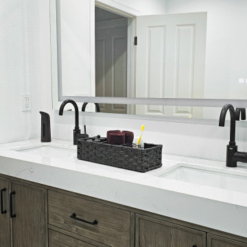
A simple refreshment is always needed for all bathrooms large and small.
The issue is always what to do in a kids / guest bathroom that will have lots of use and yet you still wish to remain clean and timeless.
The clean look of extra-large porcelain tiles is the way to go when you want to achieve such a goal.
The black plumbing fixtures by Grohe complement the marble look of the porcelain tile.
The tub you see here is an XL 72"x36" to gives the room one needs for a spa like soaking experience and at the same time is larger (if not larger) than most regular shower pan areas.
The stained inset vanity cabinet provides a much-needed warmth in the cool black and white color scheme.
 Metropolis Drafting and Construction Inc
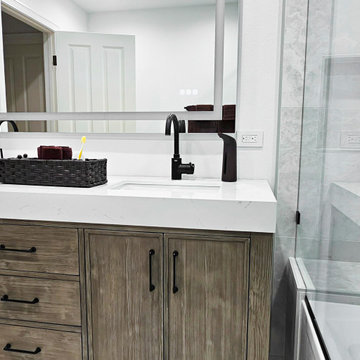
A simple refreshment is always needed for all bathrooms large and small.
The issue is always what to do in a kids / guest bathroom that will have lots of use and yet you still wish to remain clean and timeless.
The clean look of extra-large porcelain tiles is the way to go when you want to achieve such a goal.
The black plumbing fixtures by Grohe complement the marble look of the porcelain tile.
The tub you see here is an XL 72"x36" to gives the room one needs for a spa like soaking experience and at the same time is larger (if not larger) than most regular shower pan areas.
The stained inset vanity cabinet provides a much-needed warmth in the cool black and white color scheme.
 Drury Design
The Setup
For this primary bathroom project, the homeowners sought to transform their outdated, beige-toned space into a bright, functional sanctuary. The existing bathroom felt cramped and lifeless, with a small shower and limited storage options. The goal was to create a fresh, updated bathroom that maximizes the existing footprint while addressing specific desires for a more open, organized space with timeless materials.
Design objectives:
Brighten the bathroom and eliminate the dated beige color scheme
Install a freestanding tub in a compact space
Create a larger, more open shower without encroaching on the existing foot print too much
Incorporate hidden storage solutions
Maintain the existing bathroom layout while improving functionality
Update lighting and fixtures to create a contemporary feel
The Remodel
Design challenges to be solved:
- Compact Space Utilization – The small bathroom required careful planning to accommodate a freestanding tub while maintaining functionality and avoiding overcrowding.
- Hidden Storage Integration – The clients wanted a discreet hamper solution that wouldn’t clutter the limited floor space.
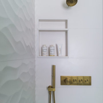
- Shower Niche Placement – With plumbing limitations and the clients’ desire to preserve their wavy accent tile wall, finding the perfect niche spot became a creative puzzle.
- Tile and Finish Coordination – Selecting complementary white tile and floor materials that worked harmoniously together.
- Larger Shower Space – Make the shower feel more open and brighter
The Renewed Space
Design solutions:
- Strategic Tub Placement – The freestanding tub was carefully positioned to maximize space, with its faucet strategically placed to allow easy access while preserving walking room. We reduced the counter depth just a bit by the tub, allowing more room for hamper cabinet and window access.
- Concealed Hamper Storage – A custom pull-out hamper was integrated into the vanity (right side, by tub), providing discreet storage within an 18-inch depth constraint.
- Shower Plumbing Wall Niche – We shifted the niche left, just enough to work around the plumbing infrastructure and still score a roomy storage spot that looks intentional.
- Sophisticated Selections – Porcelanosa curvy white tile, Kohler brushed gold fixtures, and a neutral grey tile floor created a simple, timeless aesthetic that will be loved years to come.
- Open Shower – Replacing the side wall with a clear glass surround, continuing the tile on the ceiling and extending the footprint opened up this area to the room while allowing more natural lighting into the shower space.
This bathroom transformation shows how thoughtful design turns challenges into opportunities. Brushed gold fixtures add warmth to the fresh white palette, while the perfectly balanced floor tile brings just the right depth. A partially glass-fronted vanity introduces subtle charm, giving the space a unique edge. Once cramped and outdated, this bathroom now feels bright, spacious, and serene—a testament to how every design detail makes a difference.
 Corinthian Fine Homes
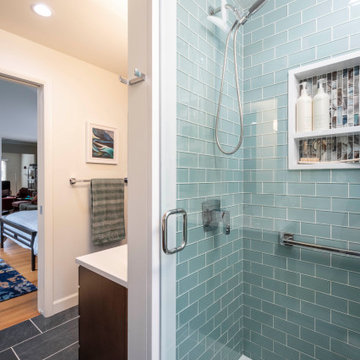
This couple approached us to design and renovate their existing master suite on their adorable Broad Ripple area home. Their goals were to update, open up and improve the function of their space. The ceilings were very low and the space was tight with an inefficient master bath and separate closet. We began by removing the ceiling and providing a high cathedral space for an expanded feel in the bedroom. We removed a side door and picture window and installed a sliding glass door to improve the natural lighting of the space and allow access to their landscaped patio on the back of the home. We stole space from the large master bedroom and eliminated the door that led into the closet, to allow for a larger bathroom and walk-in master closet with dressing area. This permitted a larger shower with a bench and the addition of a make-up vanity area. We also enlarged the window in the bathroom to allow more natural light into the space. The final design element was a floating step outside the sliding door onto their patio which is clean, modern and enhances the entrance to their serene master suite from the exterior.
 Kowalske Kitchen & Bath
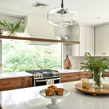
Kowalske Kitchen & Bath was hired as the remodeling contractor for this first floor remodel in the countryside of Oconomowoc, WI. By opening the kitchen up to the living room, the layout is better for hosting family gatherings. The entire family can be together in the kitchen and living room – cooking or spending time together. Highlights of this country kitchen include a window seat, walk-in pantry and space for their treasured piano.
Project Goals
+ Restore the beauty of their family home, that was built by the homeowner’s grandfather
+ Cooking functionality for their family farm
+ Add a workstation sink for easy food prep
+ Pantry storage space for canned items & wine collection
+ Design that honors the mid-century ranch bones of the house her grandfather built and their own traditional style
Challenges & Issues
+ Needed space to highlight their piano, since the homeowner is an avid pianist
+ Old layout didn’t have good views of their outdoor space – the lake, gardens and chicken coop
+ Kitchen was too small and cut off from the rest of the home
+ The heat and air conditioning did not function well due to several past additions
Country Kitchen Features:
Cooking Kitchen – We created a larger kitchen by expanding into the old dining room. The homeowners needed more space for canning vegetables, cooking and entertaining.
Mid-Century Country Design – The ranch home was built in the 1950s so we kept the mid-century and country kitchen design aesthetic by using hickory wood, tall verticals and long horizontals.
Kitchen Window Seat – A custom window seat with a curved backrest creates a gathering spot in the kitchen. This connects the home to the outdoor view of the lake where the family fishes and ice skates in winter. The bench is large enough to be used as a guest bed when they have visitors. The cozy nook has shelving, art lights, and a hidden radiator underneath to keep it warm and toasty.
Window Backsplash – Along the range wall, a new window backsplash features the beautiful view of the farm driveway, trees and gardens.
Minimalistic Hood – The hood with the wood shelf mimics the new fireplace mantel and ties the country kitchen and living room together.
New Pantry – The old kitchen area was converted into the new pantry and a laundry room. The pantry is their working kitchen where they can store food, their wine collection, and have countertop space for small appliances. Butcher block countertops, colorful wallpaper and a new window make the pantry inviting. Adjustable shelves allow for flexible storage options. The pocket door can be closed when they have guests.
Recycled Ash Flooring in Kitchen – The homeowners chose an eco-friendly flooring for their country kitchen. The beautiful varied width wood planks are from recycled ash trees from Milwaukee parks.
Workstation Sink – This sink has sliding platforms that hold bowls, colanders and cutting boards to multiply the countertop by going deep instead of wide. The sink can be used to chop, rinse, prep, dry dishes, hold hot dishes and clean up after a meal more efficiently.
Country House Living Room:
New Tile Floor – To better conduct the heat, we replaced the old wood floors with porcelain tile. New radiators, insulation, ductwork, and enclosing the basement staircase improved the function of their HVAC.
Fireplace Makeover – To create a new focal point for the living room, we installed a new fire box, new mantle, and floor to ceiling stone. The goal was to draw the eye up to the vaulted beamed ceiling.
Open Concept Layout – The wall between the kitchen and living room was removed to connect the two spaces. We added new cabinetry along the wall with a tall bookcase. Since they didn’t use their formal dining room, a small dining table was added to the living room.
New Railing & Stairs – The staircase to the kitchen area was tricky because we needed to find a style that would make it feel airy. We did a glass enclosure with a simple metal railing and moved the staircase to the center of the room to allow room for the piano.
15