
Search results for "Main elements" in Home Design Ideas
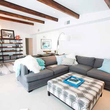
 La Bella Casa Interior Designs
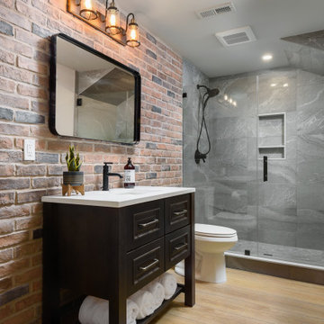
This 1600+ square foot basement was a diamond in the rough. We were tasked with keeping farmhouse elements in the design plan while implementing industrial elements. The client requested the space include a gym, ample seating and viewing area for movies, a full bar , banquette seating as well as area for their gaming tables - shuffleboard, pool table and ping pong. By shifting two support columns we were able to bury one in the powder room wall and implement two in the custom design of the bar. Custom finishes are provided throughout the space to complete this entertainers dream.
 Wayne Windham Architect, P.A.
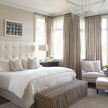
Inspiration for a coastal master dark wood floor and brown floor bedroom remodel in Charleston with beige walls
Find the right local pro for your project
 Storie Collective
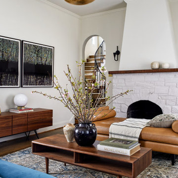
Boho meets Portuguese design in a stunning transformation of this Van Ness tudor in the upper northwest neighborhood of Washington, DC. Our team’s primary objectives were to fill space with natural light, period architectural details, and cohesive selections throughout the main level and primary suite. At the entry, new archways are created to maximize light and flow throughout the main level while ensuring the space feels intimate. A new kitchen layout along with a peninsula grounds the chef’s kitchen while securing its part in the everyday living space. Well-appointed dining and living rooms infuse dimension and texture into the home, and a pop of personality in the powder room round out the main level. Strong raw wood elements, rich tones, hand-formed elements, and contemporary nods make an appearance throughout the newly renovated main level and primary suite of the home.


 Advance Design Studio, Ltd.
Jennifer and Dan have lived in their Deer Park Illinois home for 15 years, slowly making minor fixes like painting and decorating; but they had a new plan for their kitchen the entire time. An awkwardly placed garage door, and an island cooktop with a terrible downdraft made a full-scale kitchen remodel an absolute must. Jennifer had many ideas in mind and wanted to work with a company that could provide high-end work, while partnering with a designer that would tailor the kitchen to her ideas.
She was intrigued by the phrase “Common Sense Remodeling” in Advance Design’s feature she discovered while perusing an issue of the community’s Quintessential Barrington Magazine. Doing further research on the company’s website, as she looked through project profiles and read about Advance Design’s “Common Sense Remodeling” philosophy, she promptly scheduled an appointment to see if the people and ideas she read about were truly who they said they were. The more she read, the more she knew that the “Common Sense” approach to remodeling they described was exactly the type of company she was looking for.
The partnership was sealed after an initial consultation with Owner Todd Jurs and Project Designer Michelle Lecinski. They displayed a combination of friendliness, professionalism and respect that was unmatched by any of the other companies Jennifer talked to. She knew that with Advance Design, she would be able to retain the vision that she had in mind with high-quality craftsmanship.
“I reached out to Advance Design because of the ‘Common Sense Remodeling’ tagline,” Jennifer said. “That’s what lingered for me”. “Advance Design was the most respectful- of the house and of my design ideas, and the most professional of the handful of companies that looked at my project”.
Soon after the meeting Jennifer began working with Michelle on the project design. They quickly developed chemistry. Jennifer loved how Michelle researched and located every detail that Jennifer wanted for the kitchen. Between the two of them, every concept and idea was worked through and perfected. “Jennifer had definite ideas about what she wanted the new kitchen to look like, she just didn’t know how to bring it all together. We worked together really well to make her ideas into the practical reality necessary for a well-functioning kitchen, with the look and feel that she had envisioned”, says Michelle.
“Michelle was wonderful in using the CAD system she would show me new drawings every time we changed the layout while working through the design,” Jennifer said. “She was a really wonderful partner in execution, she made sure everything happened quickly and easily.”
The finished design drew out elements of Jennifer’s style and personality. The pair call the look “sophisticated farmhouse” to describe the kitchen renovation to family and friends. The result was a beautifully crafted, authentic-feeling space that satisfied Jennifer’s dreams 15 years in the making. The whole project consisted of a kitchen remodel, mudroom upgrade with powder room, and garage entry relocation. “The projects I personally like the best, are the ones that put the client’s dreams on display,” Project Designer Michelle said. “And this is one of those projects.”
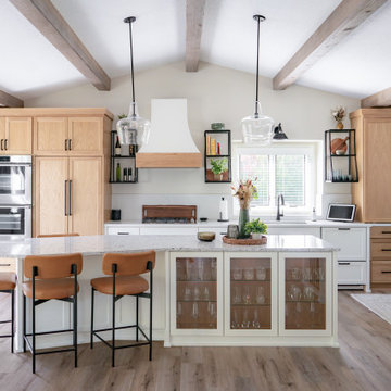
The main focal point of the kitchen is custom zinc and brass ventilation hood with a vintage sheen, which was hand made to order by a small company in Indiana named Vogler Metalworking. “It’s like sculpture, a true work of art”, says Jennifer. Your eye is immediately drawn towards this elegant yet practical hood that eliminated the home’s downdraft problem and added a striking conversation piece at the same time. The carpenters had to use special gloves when transporting and installing it, so they didn’t smudge it with fingerprints. The beautiful hood centers proudly over the stunning black enamel and brass LaCornue Range. “I had a friend who had a LaCornue range and after learning how easy it was to cook perfect meals, I was convinced I wanted to have one”, says Jennifer. This unique, breathtaking combination anchors the entire kitchen and is apparent immediately as you walk into the great room the surrounds the space.
DuraSupreme Crestwood cabinets with a Kendall Panel add function and sophistication. A custom gray paint color paired with a storm blue was developed so that the new kitchen looked like it belonged to the existing space. Unlacquered brass faucets and hardware were important to Jennifer because she wanted the living finishes to age over time. Remarkable brass diamond mesh cabinet door inserts imported from the UK continue to add this one-of-a-kind kitchen renovation; giving it a “you won’t see this everywhere” quality. The use of old railcar flooring for the coffee bar countertop and reclaimed oak for the open shelving gives an authenticity to the space uncommon in kitchens today.
Jennifer and Michelle fell in love with the Limestone Grey Stone while they were investigating unique island countertop ideas. They liked the fact that the limestone as a living finish will age and change over time. Calcutta Miel Quartz countertops made for an excellent pairing around the perimeter, as it’s durable and perfect for cooking preparations. A textured white subway tile backsplash that runs to the ceiling keeps your eye moving towards the open shelving, and to the main focal point of the stunning range hood combination.
“The kitchen functions beautifully, and it’s gorgeous,” beams Jennifer as she gestures with both hands while smiling ear to ear. “The most important thing was I wanted a kitchen that had a wonderful flow, cooked beautiful meals and was a great gathering place for family and friends, and this space does that perfectly! Beauty wise, it turned out exactly how I had envisioned. I felt the function part was the hardest part, and that was nailed”!
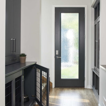
Relocating the garage entry to the new mudroom was a huge priority and has finally separated the family’s arriving home functions from their kitchen. Now coats and shoes and bags have their own area for dropping once members arrive home. Matching gray DuraSupreme cabinetry helped create gorgeous, purposeful lockers for the family. A reclaimed vintage sink and custom wall paper were added to the tiny powder room to beautify the once previously only functional space. Advance Design was even able to create a custom space for their dog to sleep while the family is away.
“It was unbelievable that a project of this size was completed in such a short time, and I think that’s because of the large amount of planning and preparation that went into it,” Jennifer marveled, “When we started, we were ready, and everything was prepared”.
When it came to execution, Project Manager Justin Davis and his crew were quick, accessible, and organized. Projects like this kitchen are typically completed in as little as 8-10 weeks. Jennifer’s kitchen however despite the relocation of some challenging HVAC in a soffit and moving of an exterior door was completed remarkably fast in part because the team was working with an existing tile floor that ran throughout the first floor that the client really loved.
“You get to know these people really well because they’re living in your house while you’re living in your house. They were so fast and really good, it didn’t take as long as even planned” reported Jennifer. “I would text Justin and he always responded almost immediately. I got to know all the guys who were working in our house and they were all wonderful people”.
Details in a customized kitchen like this one require skill and care from the people who install it. “All the guys on the job were skilled at what the did. I wanted small details like little feet to look like furniture, that is where their carpentry skill came in to make these all perfect”, said Jennifer. “The tile guys were wonderful. They even let me determine how I wanted the texture with the grout to appear for a salt and pepper look; now that is a very skilled trade person making it custom”.
In Jennifer’s interview, she continued to reference Advance Design’s “Common Sense Remodeling”, so I took a minute to ask her exactly what that phrase meant to her and how it played out in her experience with her project and the Advance Design team. Here is what she said: “I was intrigued about Common Sense Remodeling and in my head that there would be clear costs and prices, great communication between the design team, the execution team and me”, said Jennifer. They did deliver on that, it was so clear about the cost breakdown, what I could expect from everyone who came to my house, and everything that we had ordered. That to me is the Common Sense”!
It’s great to see a client take literally our assertion that a well-planned remodeling project is simply “Common Sense”! She anticipated each step of the way would be clear, concise, and predictable, all the while protecting the outcome due to the careful upfront planning. “Advance Design delivered on their ‘Common Sense Remodeling’ promise,” Jennifer said. “From the design team, to the execution team - everything was straight forward like I imagined. The project turned out exactly how I envisioned, I enjoyed this process and absolutely would recommend Advance Design Studio to anyone.”
 Vision Interiors
As a conceptual urban infill project, the Wexley is designed for a narrow lot in the center of a city block. The 26’x48’ floor plan is divided into thirds from front to back and from left to right. In plan, the left third is reserved for circulation spaces and is reflected in elevation by a monolithic block wall in three shades of gray. Punching through this block wall, in three distinct parts, are the main levels windows for the stair tower, bathroom, and patio. The right two-thirds of the main level are reserved for the living room, kitchen, and dining room. At 16’ long, front to back, these three rooms align perfectly with the three-part block wall façade. It’s this interplay between plan and elevation that creates cohesion between each façade, no matter where it’s viewed. Given that this project would have neighbors on either side, great care was taken in crafting desirable vistas for the living, dining, and master bedroom. Upstairs, with a view to the street, the master bedroom has a pair of closets and a skillfully planned bathroom complete with soaker tub and separate tiled shower. Main level cabinetry and built-ins serve as dividing elements between rooms and framing elements for views outside.
Architect: Visbeen Architects
Builder: J. Peterson Homes
Photographer: Ashley Avila Photography

Sponsored
Columbus, OH

Wannemacher Interiors
Customized Award-Winning Interior Design Solutions in Franklin Cnty OH

 River Valley Landscapes
The property is one of the original farm houses located on the main street of a small town. It has been in the family for many years and our client just inherited the property. They were trying to have balance of preserving the old while realizing modern day living has its benefits too. The house had a large addition added using mostly old style materials, but designed with function and modern day luxuries. Our goal was to carry that theme to the outside.
Our first problem we had to address was how to transition between the first floor elevation changes. The lower room was the husband’s office. He stated in the future he may have clients over and it would be nice to have an area to sit outside. The wife’s main concern was to renew the four corner garden. She also felt it was very important to be able to see it from the kitchen area. Finally there was an old wishing well stuck right outside the kitchen. They both felt it would be neat to be able to incorporate this in some how. They wanted a patio area with a built in grill to accommodate there family and friends. They also wanted to keep a large play area for the kids.
We were able to pull this off successfully. We addressed the first issue by having a small lower level flagstone area. This area is large enough for 1 to 2 people to sit comfortably. It also provides a transition from his office to the larger patio area. We installed a simple small gravel sitting area opposite of the main patio. This provides our client a secluded place to relax or do business. Mrs.... told me she is amazed how much her and her husband enjoys this area. It is so peaceful looking at the small creek over a glass of wine.
We built a natural limestone retaining wall to create the patio terrace. The stone was chosen to extend the houses architectural elements into the landscape. Irregular broken flagstone was used to give it a more casual feel. We installed three Serviceberries into the patio terrace to replace some trees that were taken down during the remodeling. She was very concern that they would block the view of the four corner garden. We new they were crucial to nestle in the terrace, so we placed them for a couple days for her to decide. Fortunately she agreed they not only kept the view open, but helped frame the garden.
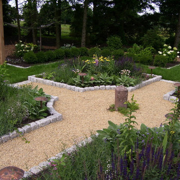
The four corner garden was designed to be viewed from afar and experienced up close. We wanted the space to have some formal structure while keeping with the casual farm house feel. Another natural limestone retaining wall was created. This leveled the garden terrace and helped associate it with the rest of the property. The four corner garden is nestled into the existing woods edge. This provides three distinct experiences to entering the garden; a more formal from the driveway, an open feel from the lower lawn, and a more natural / casual experience from the wooded area. The Plymouth brown gravel was used for the center of the garden. This helped highlight the stone post that was found during construction. The gravel also brings the sense of sound into the garden space. Lamb’s ear was chosen as a fun way to get kids interest in horticulture.
The balance of using the new to create the old feel is what makes this project a success. The property has already hosted a local historical society event and won an award for its preservation efforts. When Mrs.... can’t find her husband, she knows he is either reading the newspaper by the grill or resting in the hammock along the wood’s path.
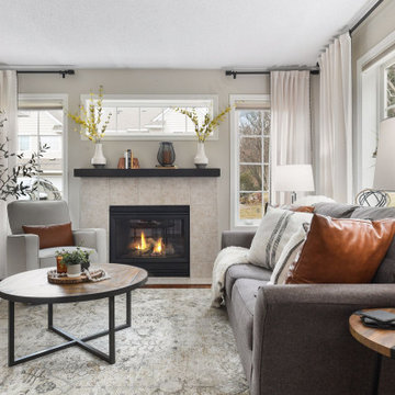
 1st Impressions Design, LLC
Black and white trim and warm gray walls create transitional style in a small-space living room.
Living room - small transitional laminate floor and brown floor living room idea in Minneapolis with gray walls, a standard fireplace and a tile fireplace
Living room - small transitional laminate floor and brown floor living room idea in Minneapolis with gray walls, a standard fireplace and a tile fireplace
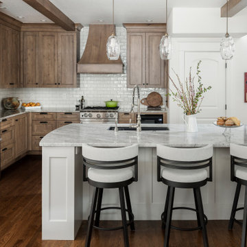
 Kraft Custom Construction
After a not-so-great experience with a previous contractor, this homeowner came to Kraft Custom Construction in search of a better outcome. Not only was she wanting a more functional kitchen to enjoy cooking in, she also sought out a team with a clear process and great communication.
Two elements of the original floorplan shaped the design of the new kitchen: a protruding pantry that blocked the flow from the front door into the main living space, and two large columns in the middle of the living room.
Using a refined French-Country design aesthetic, we completed structural modifications to reframe the pantry, and integrated a new custom buffet cabinet to tie in the old columns with new wood ceiling beams. Other design solutions include more usable countertop space, a recessed spice cabinet, numerous drawer organizers, and updated appliances and finishes all around.
This bright new kitchen is both comfortable yet elegant, and the perfect place to cook for the family or entertain a group of guests.
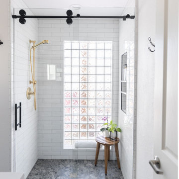
 KS Designs LLC
This guest bath has a light and airy feel with an organic element and pop of color. The custom vanity is in a midtown jade aqua-green PPG paint Holy Glen. It provides ample storage while giving contrast to the white and brass elements. A playful use of mixed metal finishes gives the bathroom an up-dated look. The 3 light sconce is gold and black with glass globes that tie the gold cross handle plumbing fixtures and matte black hardware and bathroom accessories together. The quartz countertop has gold veining that adds additional warmth to the space. The acacia wood framed mirror with a natural interior edge gives the bathroom an organic warm feel that carries into the curb-less shower through the use of warn toned river rock. White subway tile in an offset pattern is used on all three walls in the shower and carried over to the vanity backsplash. The shower has a tall niche with quartz shelves providing lots of space for storing shower necessities. The river rock from the shower floor is carried to the back of the niche to add visual interest to the white subway shower wall as well as a black Schluter edge detail. The shower has a frameless glass rolling shower door with matte black hardware to give the this smaller bathroom an open feel and allow the natural light in. There is a gold handheld shower fixture with a cross handle detail that looks amazing against the white subway tile wall. The white Sherwin Williams Snowbound walls are the perfect backdrop to showcase the design elements of the bathroom.
Photography by LifeCreated.
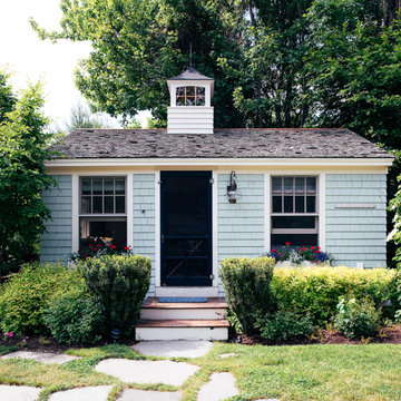
 Tyler Karu Design + Interiors
A tiny waterfront house in Kennebunkport, Maine.
Photos by James R. Salomon
Example of a small beach style blue one-story wood tiny house design in Portland Maine with a hip roof and a shingle roof
Example of a small beach style blue one-story wood tiny house design in Portland Maine with a hip roof and a shingle roof
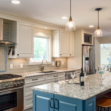
Sponsored
Columbus, OH

Trish Takacs Design
Award Winning & Highly Skilled Kitchen & Bath Designer in Columbus
 Restructure Studio
Michael Hsu
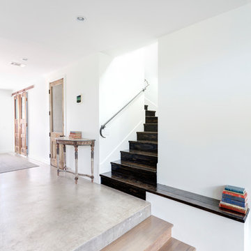
Inspiration for a large contemporary wooden u-shaped staircase remodel in Austin with wooden risers
Inspiration for a large contemporary wooden u-shaped staircase remodel in Austin with wooden risers
 Vision Interiors
As a conceptual urban infill project, the Wexley is designed for a narrow lot in the center of a city block. The 26’x48’ floor plan is divided into thirds from front to back and from left to right. In plan, the left third is reserved for circulation spaces and is reflected in elevation by a monolithic block wall in three shades of gray. Punching through this block wall, in three distinct parts, are the main levels windows for the stair tower, bathroom, and patio. The right two-thirds of the main level are reserved for the living room, kitchen, and dining room. At 16’ long, front to back, these three rooms align perfectly with the three-part block wall façade. It’s this interplay between plan and elevation that creates cohesion between each façade, no matter where it’s viewed. Given that this project would have neighbors on either side, great care was taken in crafting desirable vistas for the living, dining, and master bedroom. Upstairs, with a view to the street, the master bedroom has a pair of closets and a skillfully planned bathroom complete with soaker tub and separate tiled shower. Main level cabinetry and built-ins serve as dividing elements between rooms and framing elements for views outside.
Architect: Visbeen Architects
Builder: J. Peterson Homes
Photographer: Ashley Avila Photography
 Equiterra Regenerative Design
Patrick Coulie
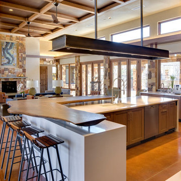
Open concept kitchen - huge contemporary u-shaped open concept kitchen idea in Albuquerque with shaker cabinets, dark wood cabinets, stainless steel appliances, an island and an undermount sink
Open concept kitchen - huge contemporary u-shaped open concept kitchen idea in Albuquerque with shaker cabinets, dark wood cabinets, stainless steel appliances, an island and an undermount sink
 Stuart Sampley Architect
Casey Dunn
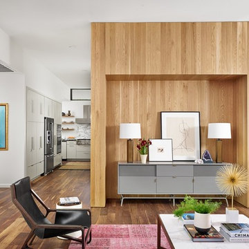
Example of a mid-century modern open concept medium tone wood floor living room design in Austin with white walls
Example of a mid-century modern open concept medium tone wood floor living room design in Austin with white walls
 Elizabeth Eason Architecture LLC
Bruce Cole Photography
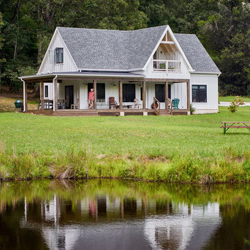
Example of a small farmhouse white exterior home design in Other with a shingle roof
Example of a small farmhouse white exterior home design in Other with a shingle roof
 Brian O'Keefe Architect, P.C.
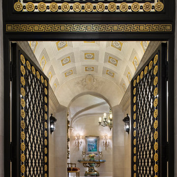
The new interior iron doors in the Main Entry Vestibule incorporate gold leaf rosette accents and hardware and a custom sculpted Angel in the transom to bless everyone as they enter and leave the home.
Historic New York City Townhouse | Renovation by Brian O'Keefe Architect, PC, with Interior Design by Richard Keith Langham
 Vision Interiors
As a conceptual urban infill project, the Wexley is designed for a narrow lot in the center of a city block. The 26’x48’ floor plan is divided into thirds from front to back and from left to right. In plan, the left third is reserved for circulation spaces and is reflected in elevation by a monolithic block wall in three shades of gray. Punching through this block wall, in three distinct parts, are the main levels windows for the stair tower, bathroom, and patio. The right two-thirds of the main level are reserved for the living room, kitchen, and dining room. At 16’ long, front to back, these three rooms align perfectly with the three-part block wall façade. It’s this interplay between plan and elevation that creates cohesion between each façade, no matter where it’s viewed. Given that this project would have neighbors on either side, great care was taken in crafting desirable vistas for the living, dining, and master bedroom. Upstairs, with a view to the street, the master bedroom has a pair of closets and a skillfully planned bathroom complete with soaker tub and separate tiled shower. Main level cabinetry and built-ins serve as dividing elements between rooms and framing elements for views outside.
Architect: Visbeen Architects
Builder: J. Peterson Homes
Photographer: Ashley Avila Photography
3