
Search results for "Main elements" in Home Design Ideas
 Amazing Spaces
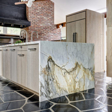
This is a great house. Perched high on a private, heavily wooded site, it has a rustic contemporary aesthetic. Vaulted ceilings, sky lights, large windows and natural materials punctuate the main spaces. The existing large format mosaic slate floor grabs your attention upon entering the home extending throughout the foyer, kitchen, and family room.
Specific requirements included a larger island with workspace for each of the homeowners featuring a homemade pasta station which requires small appliances on lift-up mechanisms as well as a custom-designed pasta drying rack. Both chefs wanted their own prep sink on the island complete with a garbage “shoot” which we concealed below sliding cutting boards. A second and overwhelming requirement was storage for a large collection of dishes, serving platters, specialty utensils, cooking equipment and such. To meet those needs we took the opportunity to get creative with storage: sliding doors were designed for a coffee station adjacent to the main sink; hid the steam oven, microwave and toaster oven within a stainless steel niche hidden behind pantry doors; added a narrow base cabinet adjacent to the range for their large spice collection; concealed a small broom closet behind the refrigerator; and filled the only available wall with full-height storage complete with a small niche for charging phones and organizing mail. We added 48” high base cabinets behind the main sink to function as a bar/buffet counter as well as overflow for kitchen items.
The client’s existing vintage commercial grade Wolf stove and hood commands attention with a tall backdrop of exposed brick from the fireplace in the adjacent living room. We loved the rustic appeal of the brick along with the existing wood beams, and complimented those elements with wired brushed white oak cabinets. The grayish stain ties in the floor color while the slab door style brings a modern element to the space. We lightened the color scheme with a mix of white marble and quartz countertops. The waterfall countertop adjacent to the dining table shows off the amazing veining of the marble while adding contrast to the floor. Special materials are used throughout, featured on the textured leather-wrapped pantry doors, patina zinc bar countertop, and hand-stitched leather cabinet hardware. We took advantage of the tall ceilings by adding two walnut linear pendants over the island that create a sculptural effect and coordinated them with the new dining pendant and three wall sconces on the beam over the main sink.
 Visbeen Architects
Interior Designer: Vision Interiors by Visbeen
Builder: Joel Peterson Homes
Photographer: Ashley Avila Photography
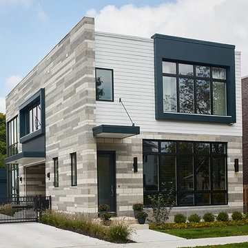
As a conceptual urban infill project, the Wexley, is designed for a narrow lot in the center of a city block. The 26’x48’ floor plan is divided into thirds from front to back and from left to right. In plan, the left third is reserved for circulation spaces and is reflected in elevation by a monolithic block wall in three shades of gray. Punching through this block wall, in three distinct parts, are the main levels windows for the stair tower, bathroom, and patio. The right two thirds of the main level are reserved for the living room, kitchen, and dining room. At 16’ long, front to back, these three rooms align perfectly with the three-part block wall façade. It’s this interplay between plan and elevation that creates cohesion between each façade, no matter where it’s viewed. Given that this project would have neighbors on either side, great care was taken in crafting desirable vistas for the living, dinning, and master bedroom. Upstairs, with a view to the street, the master bedroom has a pair of closets and a skillfully planned bathroom complete with soaker tub and separate tiled shower. Main level cabinetry and built-ins serve as dividing elements between rooms and framing elements for views outside.
 Dream Kitchens
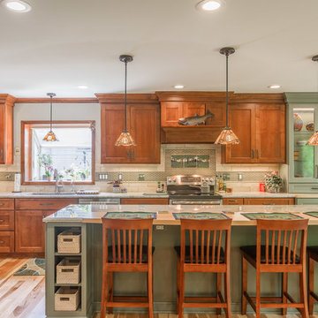
Large arts and crafts l-shaped light wood floor and brown floor eat-in kitchen photo in Detroit with an undermount sink, flat-panel cabinets, brown cabinets, granite countertops, beige backsplash, limestone backsplash, stainless steel appliances, an island and beige countertops
Find the right local pro for your project
 Kitchen Design Concepts
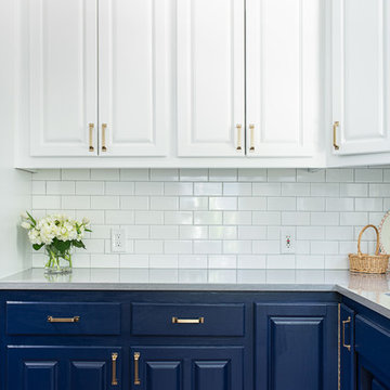
We introduce to you one of our newer services we are providing here at Kitchen Design Concepts: spaces that just need a little reviving! As of recent, we are taking on projects that are in need of minimal updating, as in, spaces that don’t need a full-on remodel. Yes, you heard right! If your space has good bones, you like the layout of your kitchen, and you just need a few cosmetic changes, then today’s feature is for you! Recently, we updated a space where we did just this! The kitchen was in need of a little love, some fresh paint, and new finishes. And if we’re being honest here, the result looks almost as if the kitchen had a full-on remodel! To learn more about this space and how we did our magic, continue reading below:
The Before and After
First, see what an impact new finishes can make! The “before” image shows a kitchen with outdated finishes such as the tile countertops, backsplash, and cabinetry finish. The “after” image, is a kitchen that looks almost as if its brand new, the image speaks for itself!
Cabinetry
With the wooden cabinetry in this kitchen already having great bones, all we needed to do was our refinishing process that involved removing door and drawer fronts, sanding, priming, and painting. The main color of the cabinetry is white (Sherwin Williams Pure White 7005) and as an accent, we applied a deep navy blue that really pops in this space (Sherwin Willaims Naval 6244). As a special design element, we incorporated a natural wooden band across the hood which is subtle but adds an element of surprise.
Countertops
The original countertops in this space were a 12×12 tile with cracks and discolored grout from all the wear and tear. To replace the countertops, we installed a clean and crisp quartz that is not only durable but easy to maintain (no grout here!). The 3cm countertops are a Cambria quartz in a grey-tone color (Carrick).
Backsplash
Keeping things simple, yet classic, we installed a 3×6 subway tile from Interceramic. The crisp white pairs well with all the other finishes of the space and really brighten the space up! To spice things up, we paired the white tile with a contrasting grout color (Cape Grey) that matches the countertop. This is a simple method to add interest to your white backsplash!
Fixtures and Fittings
For the fixtures and fittings of the kitchen, we wanted pieces that made a statement. That’s why we selected this industrial style faucet from Brizo! The faucet is a Brizo LITZE™ PULL-DOWN FAUCET WITH ARC SPOUT AND INDUSTRIAL HANDLE (63044LF-BLGL). The matte black paired with the luxe gold elements really make a statement! To match the gold elements of the faucet, we installed cabinetry hardware from Topknobs in the same gold finish. The hardware is a Channing pull TK743HB. Lastly, the large single bowl sink (who doesn’t want a large sink?!) is a great functional touch to the kitchen. The sink is a Blanco Precision 16″ R10 super single with 16″ Drainer in stainless steel (516216).
 River Valley Landscapes
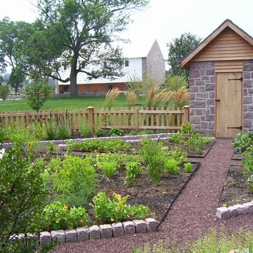
 This project presented unique opportunities that are not often found in residential landscaping. The homeowners were not only restoring their 1840's era farmhouse, a piece of their family’s history, but also enlarging and updating the home for modern living. The landscape designers continued this idea by creating a space that is a modern day interpretation of an 1840s era farm rather then a strict recreation. The resulting design combines elements of farm living from that time, as well as acknowledging the property’s history as a horse farm, with staples of 21st century landscapes such as space for outdoor living, lighting, and newer plant varieties.
Guests approach from the main driveway which winds through the property and ends at the main barn. There is secondary gated driveway just for the homeowners. Connected to this main driveway is a narrower gravel lane which leads directly to the residence. The lane passes near fruit trees planted in broken rows to give the illusion that they are the remains of an orchard that once existed on the site. The lane widens at the entrance to the gardens where there is a hitching post built into the fence that surrounds the gardens and a watering trough. The widened section is intended as a place to park a golf cart or, in a nod to the home’s past, tie up horses before entering. The gravel lane passes between two stone pillars and then ends at a square gravel court edged in cobblestones. The gravel court transitions into a wide flagstone walk bordered with yew hedges and lavender leading to the front door.
Directly to the right, upon entering the gravel court, is located a gravel and cobblestone edged walk leading to a secondary entrance into the residence. The walk is gated where it connects with the gravel court to close it off so as not to confuse visitors and guests to the main residence and to emphasize the primary entrance. An area for a bench is provided along this walk to encourage stopping to view and enjoy the gardens.
On either side of the front door, gravel and cobblestone walks branch off into the garden spaces. The one on the right leads to a flagstone with cobblestone border patio space. Since the home has no designated backyard like most modern suburban homes the outdoor living space had to be placed in what would traditionally be thought of as the front of the house. The patio is separated from the entrance walk by the yew hedge and further enclosed by three Amelanchiers and a variety of plantings including modern cultivars of old fashioned plants such as Itea and Hydrangea. A third entrance, the original front door to the 1840’s era section, connects to the patio from the home’s kitchen, making the space ideal for outdoor dining.
The gravel and cobblestone walk branching off to the left of the front door leads to the vegetable and perennial gardens. The idea for the vegetable garden was to recreate the tradition of a kitchen garden which would have been planted close to the residence for easy access. The vegetable garden is surrounded by mixed perennial beds along the inside of the wood picket fence which surrounds the entire garden space. Another area designated for a bench is provided here to encourage stopping and viewing. The home’s original smokehouse, completely restored and used as a garden shed, provides a strong architectural focal point to the vegetable garden. Behind the smokehouse is planted lilacs and other plants to give mass and balance to the corner and help screen the garden from the neighboring subdivision. At the rear corner of the garden a wood arbor was constructed to provide a structure on which to grow grapes or other vines should the homeowners choose to.
The landscape and gardens for this restored farmhouse and property are a thoughtfully designed and planned recreation of a historic landscape reinterpreted for modern living. The idea was to give a sense of timelessness when walking through the gardens as if they had been there for years but had possibly been updated and rejuvenated as lifestyles changed. The attention to materials and craftsmanship blend seamlessly with the residence and insure the gardens and landscape remain an integral part of the property. The farm has been in the homeowner’s family for many years and they are thrilled at the results and happy to see respect given to the home’s history and to its meticulous restoration.
 Maine Coast Homes
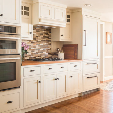
This lakefront home's kitchen draws from traditional Swedish design and style. A deep basin sink and calm color palette branch from cabinets to tile backsplash and articulate fixtures. All elements combine and bathe in the gorgeous natural light reflecting off the lake outside. Like a picture frame around a work of art, this kitchen complements, rather than competes, with the element the owners loved most: the view.
Photos by: Jeff Roberts
Project by: Maine Coast Kitchen Design
 Casework Inter Design
This 1950’s mid century ranch had good bones, but was not all that it could be - especially for a family of four. The entrance, bathrooms and mudroom lacked storage space and felt dark and dingy.
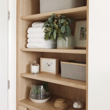
The main bathroom was transformed back to its original charm with modern updates by moving the tub underneath the window, adding in a double vanity and a built-in laundry hamper and shelves. Casework used satin nickel hardware, handmade tile, and a custom oak vanity with finger pulls instead of hardware to create a neutral, clean bathroom that is still inviting and relaxing.
The entry reflects this natural warmth with a custom built-in bench and subtle marbled wallpaper. The combined laundry, mudroom and boy's bath feature an extremely durable watery blue cement tile and more custom oak built-in pieces. Overall, this renovation created a more functional space with a neutral but warm palette and minimalistic details.
Interior Design: Casework
General Contractor: Raven Builders
Photography: George Barberis
Press: Rebecca Atwood, Rue Magazine
On the Blog: SW Ranch Master Bath Before & After
Sponsored
Columbus, OH

Trish Takacs Design
Award Winning & Highly Skilled Kitchen & Bath Designer in Columbus
 LIVDEN Designs
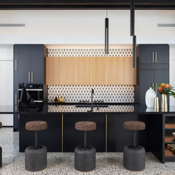
March 2020 marked the launch of LIVDEN, a curated line of innovative decorative tiles made from 60-100% recycled materials. In the months leading up to our launch, we were approached by Palm Springs design firm, Juniper House, for a collaboration on one of the featured homes of 2020 Modernism Week, the Mesa Modern.
The LUNA series in the Medallion color on 12x12 Crystallized Terrazzo tile was featured as the main kitchen's backsplash. The LUNA was paired with matte black cabinetry, brass hardware, and custom mid-century lighting installations. The main kitchen was packed with color, texture and modern design elements.
 Regan Baker Design Inc.
Well-traveled. Relaxed. Timeless.
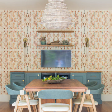
Our well-traveled clients were soon-to-be empty nesters when they approached us for help reimagining their Presidio Heights home. The expansive Spanish-Revival residence originally constructed in 1908 had been substantially renovated 8 year prior, but needed some adaptations to better suit the needs of a family with three college-bound teens. We evolved the space to be a bright, relaxed reflection of the family’s time together, revising the function and layout of the ground-floor rooms and filling them with casual, comfortable furnishings and artifacts collected abroad.
One of the key changes we made to the space plan was to eliminate the formal dining room and transform an area off the kitchen into a casual gathering spot for our clients and their children. The expandable table and coffee/wine bar means the room can handle large dinner parties and small study sessions with similar ease. The family room was relocated from a lower level to be more central part of the main floor, encouraging more quality family time, and freeing up space for a spacious home gym.
In the living room, lounge-worthy upholstery grounds the space, encouraging a relaxed and effortless West Coast vibe. Exposed wood beams recall the original Spanish-influence, but feel updated and fresh in a light wood stain. Throughout the entry and main floor, found artifacts punctate the softer textures — ceramics from New Mexico, religious sculpture from Asia and a quirky wall-mounted phone that belonged to our client’s grandmother.
 Asha Maía Design
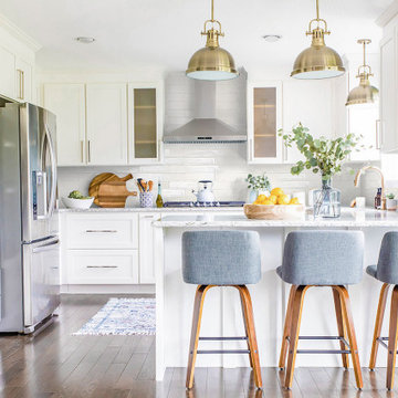
Transforming key spaces in a home can really change the overall look and feel, especially in main living areas such as a kitchen or primary bathroom! Our goal was to create a bright, fresh, and timeless design in each space. We accomplished this by incorporating white cabinetry and by swapping out the small, seemingly useless island for a large and much more functional peninsula. And to transform the primary bathroom into a serene sanctuary, we incorporated a new open and spacious glass shower enclosure as well as a luxurious free-standing soaking tub, perfect for ultimate relaxation.
 TreHus Architects+Interior Designers+Builders
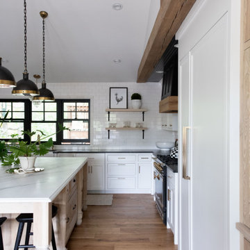
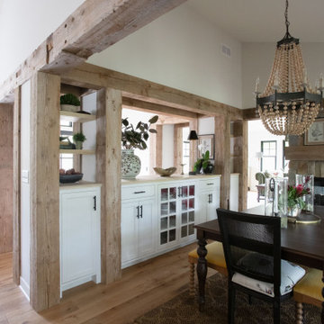
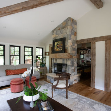
This charming whole house remodel focuses on renovations to the home's basement, primary suite, main level, and upper level. 100+ year old reclaimed beams in the kitchen and dining room compliment the natural hues of the stone fireplace to create a rustic, French cottage inspired atmosphere. Brass accents pair with contrasting black and white design elements throughout the home for a balanced element of modernity and elegance in this cozy, inviting home. Darker elements such as sleek black detailing in the primary suite, black window frames, and jet mist granite countertops in the kitchen compliment the lighter elements of white cabinetry, bathroom subway tile, and simple trim, creating feel of continuity and unique design in each room.
 TreHus Architects+Interior Designers+Builders
This charming whole house remodel focuses on renovations to the home's basement, primary suite, main level, and upper level. 100+ year old reclaimed beams in the kitchen and dining room compliment the natural hues of the stone fireplace to create a rustic, French cottage inspired atmosphere. Brass accents pair with contrasting black and white design elements throughout the home for a balanced element of modernity and elegance in this cozy, inviting home. Darker elements such as sleek black detailing in the primary suite, black window frames, and jet mist granite countertops in the kitchen compliment the lighter elements of white cabinetry, bathroom subway tile, and simple trim, creating feel of continuity and unique design in each room.
 TreHus Architects+Interior Designers+Builders
This charming whole house remodel focuses on renovations to the home's basement, primary suite, main level, and upper level. 100+ year old reclaimed beams in the kitchen and dining room compliment the natural hues of the stone fireplace to create a rustic, French cottage inspired atmosphere. Brass accents pair with contrasting black and white design elements throughout the home for a balanced element of modernity and elegance in this cozy, inviting home. Darker elements such as sleek black detailing in the primary suite, black window frames, and jet mist granite countertops in the kitchen compliment the lighter elements of white cabinetry, bathroom subway tile, and simple trim, creating feel of continuity and unique design in each room.
 Vision Interiors
As a conceptual urban infill project, the Wexley is designed for a narrow lot in the center of a city block. The 26’x48’ floor plan is divided into thirds from front to back and from left to right. In plan, the left third is reserved for circulation spaces and is reflected in elevation by a monolithic block wall in three shades of gray. Punching through this block wall, in three distinct parts, are the main levels windows for the stair tower, bathroom, and patio. The right two-thirds of the main level are reserved for the living room, kitchen, and dining room. At 16’ long, front to back, these three rooms align perfectly with the three-part block wall façade. It’s this interplay between plan and elevation that creates cohesion between each façade, no matter where it’s viewed. Given that this project would have neighbors on either side, great care was taken in crafting desirable vistas for the living, dining, and master bedroom. Upstairs, with a view to the street, the master bedroom has a pair of closets and a skillfully planned bathroom complete with soaker tub and separate tiled shower. Main level cabinetry and built-ins serve as dividing elements between rooms and framing elements for views outside.
Architect: Visbeen Architects
Builder: J. Peterson Homes
Photographer: Ashley Avila Photography
 Storie Collective
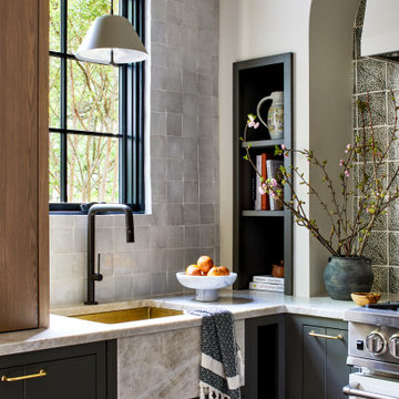
Boho meets Portuguese design in a stunning transformation of this Van Ness tudor in the upper northwest neighborhood of Washington, DC. Our team’s primary objectives were to fill space with natural light, period architectural details, and cohesive selections throughout the main level and primary suite. At the entry, new archways are created to maximize light and flow throughout the main level while ensuring the space feels intimate. A new kitchen layout along with a peninsula grounds the chef’s kitchen while securing its part in the everyday living space. Well-appointed dining and living rooms infuse dimension and texture into the home, and a pop of personality in the powder room round out the main level. Strong raw wood elements, rich tones, hand-formed elements, and contemporary nods make an appearance throughout the newly renovated main level and primary suite of the home.
 ZeroEnergy Design
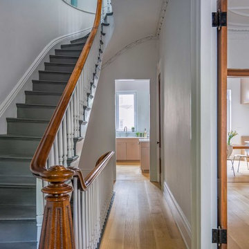
This renovated brick rowhome in Boston’s South End offers a modern aesthetic within a historic structure, creative use of space, exceptional thermal comfort, a reduced carbon footprint, and a passive stream of income.
DESIGN PRIORITIES. The goals for the project were clear - design the primary unit to accommodate the family’s modern lifestyle, rework the layout to create a desirable rental unit, improve thermal comfort and introduce a modern aesthetic. We designed the street-level entry as a shared entrance for both the primary and rental unit. The family uses it as their everyday entrance - we planned for bike storage and an open mudroom with bench and shoe storage to facilitate the change from shoes to slippers or bare feet as they enter their home. On the main level, we expanded the kitchen into the dining room to create an eat-in space with generous counter space and storage, as well as a comfortable connection to the living space. The second floor serves as master suite for the couple - a bedroom with a walk-in-closet and ensuite bathroom, and an adjacent study, with refinished original pumpkin pine floors. The upper floor, aside from a guest bedroom, is the child's domain with interconnected spaces for sleeping, work and play. In the play space, which can be separated from the work space with new translucent sliding doors, we incorporated recreational features inspired by adventurous and competitive television shows, at their son’s request.
MODERN MEETS TRADITIONAL. We left the historic front facade of the building largely unchanged - the security bars were removed from the windows and the single pane windows were replaced with higher performing historic replicas. We designed the interior and rear facade with a vision of warm modernism, weaving in the notable period features. Each element was either restored or reinterpreted to blend with the modern aesthetic. The detailed ceiling in the living space, for example, has a new matte monochromatic finish, and the wood stairs are covered in a dark grey floor paint, whereas the mahogany doors were simply refinished. New wide plank wood flooring with a neutral finish, floor-to-ceiling casework, and bold splashes of color in wall paint and tile, and oversized high-performance windows (on the rear facade) round out the modern aesthetic.
RENTAL INCOME. The existing rowhome was zoned for a 2-family dwelling but included an undesirable, single-floor studio apartment at the garden level with low ceiling heights and questionable emergency egress. In order to increase the quality and quantity of space in the rental unit, we reimagined it as a two-floor, 1 or 2 bedroom, 2 bathroom apartment with a modern aesthetic, increased ceiling height on the lowest level and provided an in-unit washer/dryer. The apartment was listed with Jackie O'Connor Real Estate and rented immediately, providing the owners with a source of passive income.
ENCLOSURE WITH BENEFITS. The homeowners sought a minimal carbon footprint, enabled by their urban location and lifestyle decisions, paired with the benefits of a high-performance home. The extent of the renovation allowed us to implement a deep energy retrofit (DER) to address air tightness, insulation, and high-performance windows. The historic front facade is insulated from the interior, while the rear facade is insulated on the exterior. Together with these building enclosure improvements, we designed an HVAC system comprised of continuous fresh air ventilation, and an efficient, all-electric heating and cooling system to decouple the house from natural gas. This strategy provides optimal thermal comfort and indoor air quality, improved acoustic isolation from street noise and neighbors, as well as a further reduced carbon footprint. We also took measures to prepare the roof for future solar panels, for when the South End neighborhood’s aging electrical infrastructure is upgraded to allow them.
URBAN LIVING. The desirable neighborhood location allows the both the homeowners and tenant to walk, bike, and use public transportation to access the city, while each charging their respective plug-in electric cars behind the building to travel greater distances.
OVERALL. The understated rowhouse is now ready for another century of urban living, offering the owners comfort and convenience as they live life as an expression of their values.
Eric Roth Photo
 Kraft Custom Construction
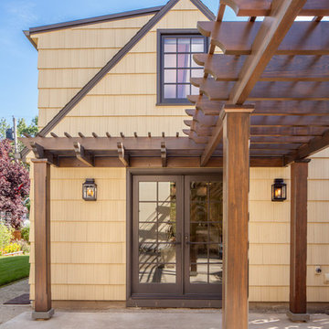
The homeowner of this old, detached garage wanted to create a functional living space with a kitchen, bathroom and second-story bedroom, while still maintaining a functional garage space. We salvaged hickory wood for the floors and built custom fir cabinets in the kitchen with patchwork tile backsplash and energy efficient appliances. As a historical home but without historical requirements, we had fun blending era-specific elements like traditional wood windows, French doors, and wood garage doors with modern elements like solar panels on the roof and accent lighting in the stair risers. In preparation for the next phase of construction (a full kitchen remodel and addition to the main house), we connected the plumbing between the main house and carriage house to make the project more cost-effective. We also built a new gate with custom stonework to match the trellis, expanded the patio between the main house and garage, and installed a gas fire pit to seamlessly tie the structures together and provide a year-round outdoor living space.
 Grandeur Hills Group,Inc.
The kitchen is decorated in an unusual medieval style, the main element of which is the beige walls. The room does not seem cramped despite the large amount of multifunctional furniture and contemporary household appliances.
The prevailing colors are beige and grey. The calm colors create an atmosphere of tranquility, warmth, and comfort. Thanks to a few different kinds of lighting, the owners can easily work and relax in the kitchen.
If you wish your kitchen were similar to this one, don’t hesitate to contact Grandeur Hills Group managers and order the best interior design service ever!
 Vetter Architects
The owners requested a Private Resort that catered to their love for entertaining friends and family, a place where 2 people would feel just as comfortable as 42. Located on the western edge of a Wisconsin lake, the site provides a range of natural ecosystems from forest to prairie to water, allowing the building to have a more complex relationship with the lake - not merely creating large unencumbered views in that direction. The gently sloping site to the lake is atypical in many ways to most lakeside lots - as its main trajectory is not directly to the lake views - allowing for focus to be pushed in other directions such as a courtyard and into a nearby forest.
The biggest challenge was accommodating the large scale gathering spaces, while not overwhelming the natural setting with a single massive structure. Our solution was found in breaking down the scale of the project into digestible pieces and organizing them in a Camp-like collection of elements:
- Main Lodge: Providing the proper entry to the Camp and a Mess Hall
- Bunk House: A communal sleeping area and social space.
- Party Barn: An entertainment facility that opens directly on to a swimming pool & outdoor room.
- Guest Cottages: A series of smaller guest quarters.
- Private Quarters: The owners private space that directly links to the Main Lodge.
These elements are joined by a series green roof connectors, that merge with the landscape and allow the out buildings to retain their own identity. This Camp feel was further magnified through the materiality - specifically the use of Doug Fir, creating a modern Northwoods setting that is warm and inviting. The use of local limestone and poured concrete walls ground the buildings to the sloping site and serve as a cradle for the wood volumes that rest gently on them. The connections between these materials provided an opportunity to add a delicate reading to the spaces and re-enforce the camp aesthetic.
The oscillation between large communal spaces and private, intimate zones is explored on the interior and in the outdoor rooms. From the large courtyard to the private balcony - accommodating a variety of opportunities to engage the landscape was at the heart of the concept.
Overview
Chenequa, WI
Size
Total Finished Area: 9,543 sf
Completion Date
May 2013
Services
Architecture, Landscape Architecture, Interior Design
18