
Search results for "Main issue" in Home Design Ideas
 George Ocampo
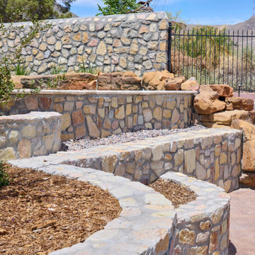
Complete Hillside Backyard Renovation, El Paso – by GoDesigns
This breathtaking backyard transformation in the historic area of El Paso, Texas, is a shining example of GoDesigns’ vision, expertise, and resilience. Situated on a challenging hillside property, the original backyard installed in 2005 was plagued by critical design flaws that led to a complete failure of the outdoor space. The existing negative edge pool, improperly installed with insufficient grade, drainage, and support, caused massive water loss and structural issues. The consequences were severe — the side rock wall broke in half, the backyard destabilized, and even a portion of the house was compromised.
GoDesigns was brought in to turn crisis into opportunity. During the height of COVID-19, they launched Phase 1 of a multi-phase master plan to restore and reinvent the space. The entire backyard was demolished, including the compromised pool shell. The broken negative edge section was filled in, making way for a reimagined pool design. A new, reinforced pool structure was shot, finished with 5cm tumbled travertine coping, oversized mossrock boulders, new waterline tile, and a premium PebbleTec interior.
Beneath the beauty lies smart engineering: GoDesigns replaced all plumbing and regraded the property, applying subsurface remediation and compaction techniques to ensure long-term stability. A new rocksalt steel reinforced concrete deck was poured, replacing the narrow wraparound layout with a spacious, functional outdoor living area. Now, the family enjoys ample room for chaise lounges, alfresco dining, and relaxing by the existing outdoor fireplace — luxuries they never had before.
GoDesigns didn’t stop there. Advanced drainage systems — including underground piping, box drains, and planter drains — were installed to protect the integrity of the hillside. These systems are integrated into leveled planters that not only beautify the space but also reinforce the structure of the pool and surrounding terrain.
Phase 2 focused on upgrading the patio directly outside the main house, while Phase 3 was the final touch — a lush landscape planting plan paired with elegant outdoor lighting to enhance ambiance and curb appeal.
What was once a scene of despair is now a luxurious retreat — completed in thoughtfully timed phases over four years. Thanks to GoDesigns’ master planning and unwavering commitment, this hillside haven is a true testament to transformation. The clients are now looking forward to their next chapter: the front yard.
 OakWood Designers & Builders
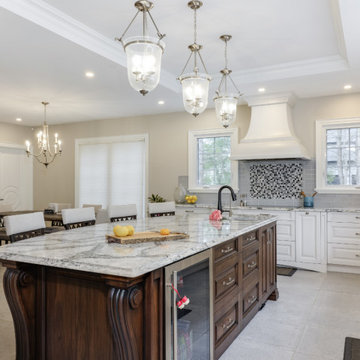
When local business owners with four kids and an extended family decided to build their custom home with OakWood, they knew what they wanted – a luxurious yet functional space.
This kitchen was designed with the intention of considering the fast-paced lives the family members while also looking to provide a space where everyone can interact and spend time together. Not only was this spacious kitchen inspired by a love of cooking, it was configured to easily facilitate informal dining for the whole large family. A large window behind the main sink brings natural light into the space but also provides a nice view into the backyard so mom can be in the kitchen and see the kids in the backyard.
The kitchen was also designed with a variety of entry points; clients can access the kitchen from their sunroom, mudroom, formal dining area and more. As a result, the space is a central space for the family. Directly adjacent to this space is the informal dining area and a desk with a computer which allows the clients to work while still being present for the comings and goings of everyone in this family space.
Although two colours and textures are used for the cabinetry, there is harmony created between them as a result of the raised panel being used. The cloudy glass backsplash not only breaks up the light toned cabinetry but also adds a glossy finish that contrasts with the smooth wood finishes. Seagrove quartz is present on both the counter and island. This highly detailed quartz adds a great deal of texture and also helps to guide the viewer’s eye around the space. Pendant lights placed above the island help to draw attention toward the center of the space while also mimicking the glass seen in the cabinetry.
This project was a finalist for the GOHBA Awards in the category Traditional Custom Kitchen and was also featured in the Fall issue of LUXE Magazine Ottawa. You can read the full story here: https://console.virtualpaper.com/luxe/luxe-fall-2020/#42/
 Just in Thyme Landscape Design
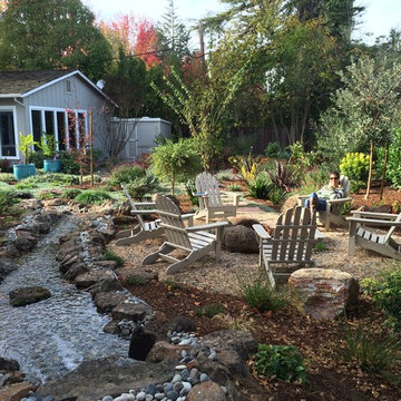
This 44' long water feature blends into the woodland setting of this large back yard by starting in the Redwood grove outside the client's bedroom deck, meandering by a fire pit sitting area, and ending in front of their dining patio. It has become the main feature of the yard as it can be heard and seen throughout. It is subtle, yet central. There are three falls and a place to cross from the deck to the fire pit. The water recirculates and is stored in a reservoir underground, eliminating evaporation, algae, and bug issues. The grade of the yard needed to be raised near the Redwood grove to increase the slope of the stream.
Find the right local pro for your project
 Bobby Singleton, Realtor with Keller Williams
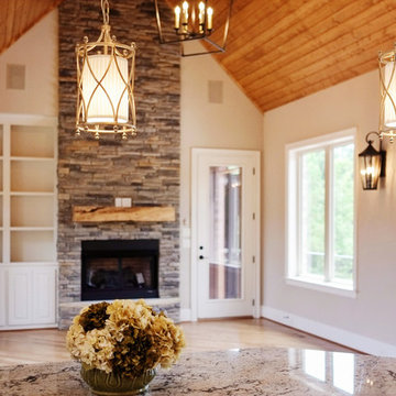
This home is sold, yet showcases the talent of the team at Don Mills Builders. The main living area is pictured on the cover of the current issue of our local "The Real Estate Book".
 Reico Kitchen & Bath
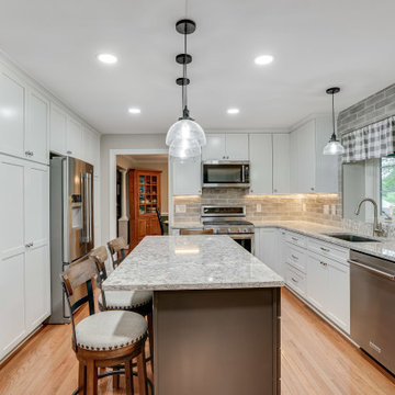
Designed by Carolina Maholik of Reico Kitchen & Bath in Chantilly VA, in collaboration with Victoriano Home Improvements, this transitional kitchen design features Merillat Masterpiece cabinets in the Martel Evercore door style in two finishes, Dove White (perimeter cabinets) and Riverbed (kitchen island). The kitchen countertops are Cambria Berywn.
The kitchen includes a tile backsplash in Elon Opal in Gray 3x12 with a Light Pewter grout and Maytag, Whirlpool and KitchenAid appliances.
“The clients were very big on the function of their space,” said Carolina. “The largest issue we faced was finding a balance between brightening and updating the look of the space while also not sacrificing the functionality of their daily lives. Many design iterations brought us back to classic beauty with an updated look that was the main gathering space of their home. My favorite aspect was seeing the once hated window box over the sink be transformed by updating the initial focal point of the space and create harmony with the rest of the space!”
“Every aspect of our kitchen was a pleasure, from start to finish. We knew the minute we met Carolina that she would be the right person to design our kitchen and guide us through the process,” said the client. “Because Reico truly values its customers, indicated by both their words and their actions, our confidence never wavered. Carrie responded to all communications nearly instantaneously, and like Carolina, she made us feel like we were the only customers in her world.”
“The care that the entire Reico team brought to the table and the patience Carolina extended were much appreciated. She really listens and has talent for sifting through all the talk to get to the best design. We love that our kitchen has a wide appeal and is very us. It is light and bright while remaining warm and inviting.”
Photos courtesy of BTW Images LLC.
 George Ocampo
Complete Hillside Backyard Renovation, El Paso – by GoDesigns
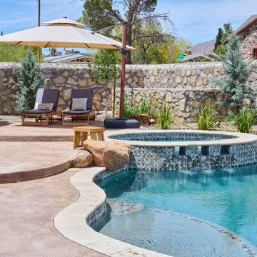
This breathtaking backyard transformation in the historic area of El Paso, Texas, is a shining example of GoDesigns’ vision, expertise, and resilience. Situated on a challenging hillside property, the original backyard installed in 2005 was plagued by critical design flaws that led to a complete failure of the outdoor space. The existing negative edge pool, improperly installed with insufficient grade, drainage, and support, caused massive water loss and structural issues. The consequences were severe — the side rock wall broke in half, the backyard destabilized, and even a portion of the house was compromised.
GoDesigns was brought in to turn crisis into opportunity. During the height of COVID-19, they launched Phase 1 of a multi-phase master plan to restore and reinvent the space. The entire backyard was demolished, including the compromised pool shell. The broken negative edge section was filled in, making way for a reimagined pool design. A new, reinforced pool structure was shot, finished with 5cm tumbled travertine coping, oversized mossrock boulders, new waterline tile, and a premium PebbleTec interior.
Beneath the beauty lies smart engineering: GoDesigns replaced all plumbing and regraded the property, applying subsurface remediation and compaction techniques to ensure long-term stability. A new rocksalt steel reinforced concrete deck was poured, replacing the narrow wraparound layout with a spacious, functional outdoor living area. Now, the family enjoys ample room for chaise lounges, alfresco dining, and relaxing by the existing outdoor fireplace — luxuries they never had before.
GoDesigns didn’t stop there. Advanced drainage systems — including underground piping, box drains, and planter drains — were installed to protect the integrity of the hillside. These systems are integrated into leveled planters that not only beautify the space but also reinforce the structure of the pool and surrounding terrain.
Phase 2 focused on upgrading the patio directly outside the main house, while Phase 3 was the final touch — a lush landscape planting plan paired with elegant outdoor lighting to enhance ambiance and curb appeal.
What was once a scene of despair is now a luxurious retreat — completed in thoughtfully timed phases over four years. Thanks to GoDesigns’ master planning and unwavering commitment, this hillside haven is a true testament to transformation. The clients are now looking forward to their next chapter: the front yard.
 Natural Stone Institute
This private residence involved construction of a modern architectural style estate property in Highland Park, Texas. Dee Brown Inc’s role came into play late in the project, when corrections were needed to some specialty stonework.
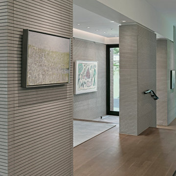
The home’s center is formed around the main entry. The floorplan is largely open, but parallel core wall areas serve to define the foyer, kitchen, dining, and living areas. As key areas, the architect put special focus on materials selection for the core walls. It was decided that Indiana limestone would be the finish, and that the cladding panels would all have unique continuous horizontal grooves.
Material was received and installed by the original subcontractor. Upon seeing the completed work, it was evident to the architect and owner that grooves in the fabricated material were not consistent, and that the installation process had left numerous chips to the panels. It was at this point that the partially completed work was removed, and the second fabricator/installer was contacted.
Dee Brown Inc ordered the Indiana limestones slabs. There, special care was taken to hold tight tolerances to the horizontal grooves as well as to the typical cut-to-size aspects. Erection of these mechanically set panels was done very carefully. The result was a clean finished product with none of the tolerance and chipping issues of the original installation.
Dee Brown, Inc also created and installed special stone finishes at the adjacent half-bath. Semi-precious white onyx was transformed into a lavatory top/bowl assembly, water-closet wall cladding, and even tissue and towel holders.
 George Ocampo
Complete Hillside Backyard Renovation, El Paso – by GoDesigns
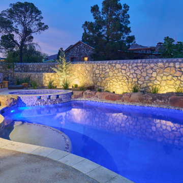
This breathtaking backyard transformation in the historic area of El Paso, Texas, is a shining example of GoDesigns’ vision, expertise, and resilience. Situated on a challenging hillside property, the original backyard installed in 2005 was plagued by critical design flaws that led to a complete failure of the outdoor space. The existing negative edge pool, improperly installed with insufficient grade, drainage, and support, caused massive water loss and structural issues. The consequences were severe — the side rock wall broke in half, the backyard destabilized, and even a portion of the house was compromised.
GoDesigns was brought in to turn crisis into opportunity. During the height of COVID-19, they launched Phase 1 of a multi-phase master plan to restore and reinvent the space. The entire backyard was demolished, including the compromised pool shell. The broken negative edge section was filled in, making way for a reimagined pool design. A new, reinforced pool structure was shot, finished with 5cm tumbled travertine coping, oversized mossrock boulders, new waterline tile, and a premium PebbleTec interior.
Beneath the beauty lies smart engineering: GoDesigns replaced all plumbing and regraded the property, applying subsurface remediation and compaction techniques to ensure long-term stability. A new rocksalt steel reinforced concrete deck was poured, replacing the narrow wraparound layout with a spacious, functional outdoor living area. Now, the family enjoys ample room for chaise lounges, alfresco dining, and relaxing by the existing outdoor fireplace — luxuries they never had before.
GoDesigns didn’t stop there. Advanced drainage systems — including underground piping, box drains, and planter drains — were installed to protect the integrity of the hillside. These systems are integrated into leveled planters that not only beautify the space but also reinforce the structure of the pool and surrounding terrain.
Phase 2 focused on upgrading the patio directly outside the main house, while Phase 3 was the final touch — a lush landscape planting plan paired with elegant outdoor lighting to enhance ambiance and curb appeal.
What was once a scene of despair is now a luxurious retreat — completed in thoughtfully timed phases over four years. Thanks to GoDesigns’ master planning and unwavering commitment, this hillside haven is a true testament to transformation. The clients are now looking forward to their next chapter: the front yard.
 TKS Design Group
Download our free ebook, Creating the Ideal Kitchen. DOWNLOAD NOW
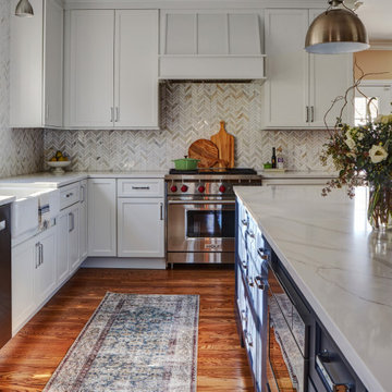
Like many families with older children, this local Glen Ellyn couple wanted to expand the size of their kitchen while also creating a more open, airy feel for their main level. The home had plenty of space that included a formal living room, formal dining room, family room with eat-in area and kitchen with butler’s pantry. What it didn’t have, was an effortless flow between the areas used daily for cooking, eating and gathering.
Additionally, the kitchen had become outdated, feeling dark and dismal, despite the abundance of natural light. Our clients wanted a bright, cheerful interior that would inspire the family to congregate in this part of the house. No easy feat with teenagers.
An open floor plan design solved the issues with functionality and circulation, removing the walls that restricted flow and opening up the entry to the dining room. We also eliminated the rarely used butler’s pantry allowing us to expand the kitchen and add a large island for food prep and gathering. To create a sense of symmetry and consistency in the space, a clerestory window was added below the header and framed to match the existing adjacent entry from the living room.
Inspired by the owner’s Scottish ancestry, the island cabinetry boasts a beautiful blue hue, paired with stools upholstered in a sprightly plaid. The built-in buffet area provides additional storage, topped with a beautiful wooden top stained to coordinate with the stunning tones of the flooring.
The owner’s opted for stainless steel appliances, inspiring the selection of brushed silver light fixtures and polished chrome hardware. Marble-look quartz offered a durable, lightly colored surface to reflect sunlight and enhance the cheer factor. According to this happy family, this uplifting space is now everyone’s favorite place to gather.
Designed by: Susan Klimala, CKBD
Photography by: Michael Kaskel
For more design inspiration go to: www.kitchenstudio-ge.com
 Ashton Renovations
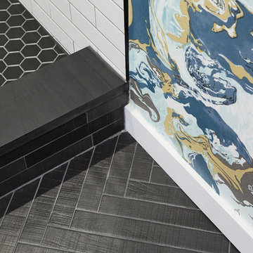
The original ensuite bathroom in this condominium required renovations to replace problematic Kitec plumbing. The layout in the space remained the same, but improvements were made to address certain design challenges with lighting, automation, and space. The aim was to create a modern bathroom design with textured wood features, and the feel of metallic black accents.
A number of prominent changes were made to improve the use of space. The original entry, a left-handed door swinging into the bathroom, was replaced. It interfered with the vanity clear floor space. It also made the use of the bathroom difficult when two users were present. It was changed to a soft closing pocket door. To avoid losing space it was installed by creating a wall cavity on the outside of the bathroom. This door also included frosted glass panels to allow natural light into the space. Double sliding glass shower doors were also installed to address access issues to the shower valve.
Storage improvements included the installation of dual inset medicine cabinets, and pull out drawers within the wall hung vanity. The depth of the medicine cabinets were extended outwards, and this nice detail was finished with a textured wood finish. The addition of the wall hung vanity also created the feeling of more space beneath the units and allowed for under cabinet lighting.
Lighting and automation improvements included the addition of HUE LED lighting. This was done by installing two shower pot lights, a 6” main potlight, and under cabinet lighting. These are all controlled by the Philips Hue App that programs routines, scenes, and other settings.
Some of the other highlights of this modern bathroom include dark grout, which contrasts nicely with the elongated white tile, a thermostatic shower system, herringbone textured porcelain floor tile, and a Schluter Kerdi waterproofing shower system. This bathroom is made most unique though with the choice of wallpaper, which can be described as modern luxury, a graphic take on agate stone patterns with metallic embellishments.
 Star Furniture
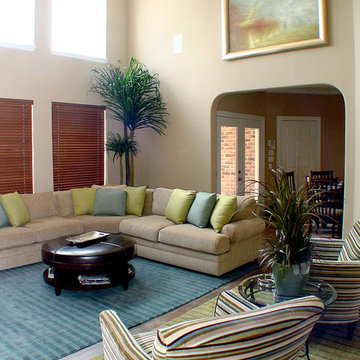
Meet Susan McDermott.
Susan is a graduate of the University of Texas, is licensed in the state of Texas and has more than 30 years design experience. She has used her talent and experience with Star Furniture since 1991.
Susan's main objective is to create a pleasing environment that makes her clients happy. She is an "idea expert" and has the expertise needed to solve any design issue. "I design in layers: The base layer is the wood and furniture - the next layer is color. The last layer is accessories. My clients finish their room with the confidence those layers reflect their personality."
"I enjoy doing a wide variety of styles and learning from my clients. When starting, I find out what my client's goals are and incorporate them into my design."
https://www.starfurniture.com/susan-mcdermott
 Advance Design Studio, Ltd.
After six years of living in their Huntley IL home, Chris and Meghan were tired of their dark, dingy, outdated kitchen and it was finally time for a long-anticipated change. “The kitchen is the place where we live, it’s where we do everything,” Meghan said. “It was important that it be a space where we wanted to be.” Meghan loves cooking and enjoys including their girls in healthy meal prepping, this led them to want a brighter, more enjoyable kitchen with increased functionality and improved storage.
For Chris especially, the laundry room was an entirely dysfunctional eyesore. “We had a washer and a dryer, but it was all kind-of cobbled together!” Chris said. “There were always laundry piles everywhere, we weren’t really sure what we wanted to do in there, but it was time for us to make a change.” The mess of the space was stressful every time they walked in the door from the garage each day. Kids’ backpacks and shoes piled up haphazardly in the makeshift boot-bench closet left the family feeling disorganized and stressed. They needed space for folding clothes and locker cubbies to help keep the family organized.
Having known Christine and Todd in the Huntley community for years, Chris and Meghan were familiar with their work. “We already trusted them personally and having seen their projects for years we knew they did top notch work. After we reviewed the initial round of designs, we knew that hiring them was definitely the right choice,” Meghan and Chris said. Although Chris had done a lot of work in their home himself, the kitchen and laundry room renovation was such a large undertaking that he didn’t want to steal time away from his family to spend what would surely be many long weekends doing the job himself. “That would not have been a wise choice for us,” Chris laughed.
“Our designer, Michelle was very, very, easy to work with; anything we wanted to see or weren’t sure about, she went above and beyond to make this easy for us. She was easy to get hold of and always quick to respond,” the couple said. Michelle pulled ideas that mirrored the couple’s taste and style and was adept at directing the couple to limited choices that didn’t overwhelm them and kept the process moving. “I have a hard time making decisions. Michelle made the decision-making process so easy. I loved how she listened to what I liked and then presented three great options for me to choose from,” Meghan said.
The main objectives for the kitchen were better storage solutions, they wanted the space to reflect their lifestyle and taste, and they wanted it to last for years with low maintenance. One of the first steps in creating a more functional kitchen was relocating the refrigerator, creating an improved workflow for the busy family.
“We didn’t know that we could even move the refrigerator to a new location where it is now, that was something that we never would have thought of,” Chris said. “The new refrigerator location makes the kitchen feel so much bigger. We didn’t add any space, but our whole kitchen with the new design just seems like it’s so much larger than before!” Meghan said.
The perimeter mist colored cabinets helped warm and brighten the entire room, while the graphite colored cabinets on the island added contrast. Using this fresh, clean color palette satisfied the couple’s desire for a bright space that was the exact opposite of what they had before. Organization accessories were also added to the cabinets such as a spice drawer tray and roll outs to create hidden convenience.
“I absolutely love the hidden spices – it makes cooking so much more enjoyable!” Chris said. “And all the pull outs, and the double trash bin, who would think you could get so excited about organization!” the couple said in unison.
One thing they hated in their original kitchen was how dark the space felt. Added lighting on the ceiling with the new light fixtures combined with the lighter cabinetry colors throughout solved this problem. “Our new kitchen has this warm, almost cozy feeling that our old kitchen never had, it’s just a space that I love spending my time in now,” Meghan said. The light airy feeling was accentuated with the use of floating white shelves on either side of the decorative range hood. “We have so much cabinetry space, the new design is amazing we actually have more storage space than we will ever need,” Meghan said.
The island was extended to create more work surface and added space for stool seating. “The new island changes how we live. Now the kids can be in the kitchen with us, doing homework, eating breakfast, and the three of us have special dinners there when Chris is working late,” Meghan said.
The Carrara Marmi Quartz countertops were chosen because they are, not only beautiful, but are made from hard-working material that doesn’t require maintenance. The white subway tile backsplash that wraps to the ceiling behind the focal point cooktop range/hood compliments the crisp white countertops perfectly, while brushed brass hardware and light fixtures keep the design fresh and new.
The couple had a few fears at the beginning of the project, as most homeowners do. Their biggest fear was being out of their kitchen and laundry room for an extended time. The crew made it very easy for the family to work in a limited space keeping the washer and dryer hooked up the majority of the time, and also getting appliances working with minimal downtime.
“They above and beyond accommodated us to get us through the process,” Meghan said. “They did a great job making sure we were as comfortable as possible throughout the process,” Chris added.
“Our project manager DJ did a great job. He was very good at updating us on schedule changes, getting guys in as quickly as possible. Everyone that stepped in the house was nice and did great work,” said Chris. They thought Advance’s carpenter was phenomenal and were impressed when he took a conceptual idea from a photograph and worked with designer Michelle to create a one of a kind range/hood that has become the topic of conversation with friends and family who visit the new kitchen. “He was in our house literally every day for several weeks. He was easy to work with and good at what he did,” Meghan and Chris said.
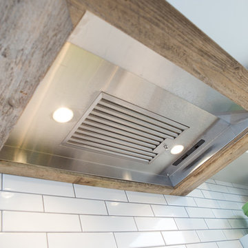
The focal point of the kitchen; a hand-crafted, custom-built ventilation hood was clad with handpicked reclaimed barnwood. Advance Design’s carpenter built the framework and the cladding to create a one-of-a-kind design element that the couple loves.
“I think it was especially fun for him to create something unique from scratch, showcasing his talent in this area,” Meghan said. “I love that my kitchen is not like everyone else’s. I got to pick out the wood on my hood and watch it being built and was able to choose what pieces of wood went where on it. It’s totally unique.”
Red Oak flooring was toothed-in throughout the kitchen and the rest of the first floor anywhere changes were made. Then the whole floor was refinished to tone down the orange undertones in the existing floor stain, ultimately changing the color complexion of the entire first floor. The result is a completely new feeling to the entire home.
Renovating the laundry room was extremely important to Meghan and Chris, but they had trouble visualizing what the possibilities were for the seemingly small space. Michelle produced beautiful 3D illustrations that helped them envision the space in a whole new way.
“I must have told Michelle 100 times that I am a visual person, seeing the designs in 3D made it so easy to make decisions and see what we could really do with our space,” Meghan said.
A dividing wall and doorway were removed between the existing laundry room and hallway formerly containing a coat closet, providing space to design specialized graphite colored cabinetry matching the kitchen island to house custom storage cubbies for each family member. Adding the tall utility cabinetry in the new laundry area helped solve the storage issue, tucking away cleaning supplies, household items, and even the cat got its own cubby.
“I love how everything is now hidden in its own space. I can’t tell you how much I hated coming home and seeing everything sitting around on counters,” Chris said.
Electrical outlets were planned for the inside of utility cabinets, so devices could charge in hidden locations. Stacking the washer and dryer allowed for wider countertop space to provide a folding area and a special space for clothes to hang. “The way I do laundry has been completely transformed! I can actually fold clothes and hang them now right out of the washer and dryer,” Meghan said.
“The end result in the kitchen and the laundry/mud room was an updated light and bright space, with a smarter work flow that better meets the needs of this family,” Michelle said.
“I would totally recommend Advance Design,” Meghan said. “Sometimes I sit and just look at my kitchen and laundry room and think ‘Wow, I can’t believe I get to live here!’ It’s an understatement to say we love our new space.”
 Ashton Renovations
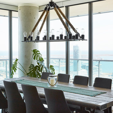
This beautiful Downtown Toronto condo, with magnificent views of the city, and Toronto Island, required some updates to the original kitchen. There were space & storage issues mainly, and much of the upper cabinets were open and not very functional. The kitchen island also needed to be transformed into a functional area with proper storage as well.
Our clients really wanted to transform this space into a beautiful modern kitchen with clean lines and warm wood accents, while including a number of automated features. This was achieved with Sub Zero refrigeration and wine cooling, along with enhanced Miele cooking features. They include an induction stove with steam features, and a built in speed oven.
This kitchen also features touch faucet controls, Casetta Wireless, and Lutron Serena wireless shades to assist with bright southern exposures.
 The Decorating Therapist
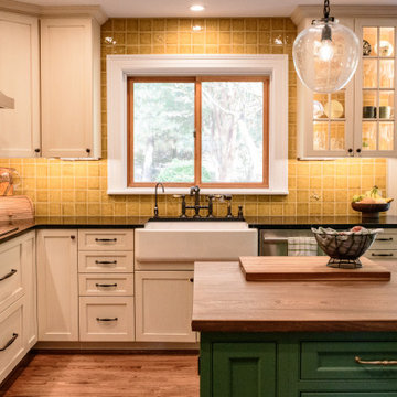
This kitchen renovation began with the challenge of reimagining an addition that had been DIYed onto the house 40 years ago. The previous homeowner’s efforts, while well-intentioned, fell short of today’s standards, both in terms of building codes and design choices. Materials like modern bamboo cabinetry and a choppy, poorly thought-out layout clashed with the timeless character of the home. The interior design didn’t reflect the 250-year-old Federal-style brick home’s essence, located in the heart of Historic Ellicott City. The current homeowners purchased this house because of its rich history and unique charm, and they wanted a kitchen that honored that legacy—not necessarily a period-perfect replica, but one infused with vintage character and a touch of the home’s original quirkiness.
Homes from that era were rarely perfect—they were designed for function, not flawless aesthetics. With that in mind, the renovation focused on balancing modern convenience with historical charm. For example, a small, awkwardly placed window by the refrigerator offered a view of an outdoor wall. Instead of keeping it, we opted to close it up, creating a more cohesive design. The result is a space that feels like it belongs to the home’s history while incorporating the comfort and efficiency of a modern kitchen. Every detail was carefully considered to create harmony between the old and the new. Even down to the Tiffany lampshade that effortlessly binds all of the kitchen hues in one place.
To accommodate the homeowners, who are on the shorter side, we designed countertops with their needs in mind. While we couldn’t lower the main counters without creating appliance-fitting issues—and custom appliances were cost-prohibitive—we prioritized usability wherever possible. For the countertops, they selected soapstone, a material that perfectly marries beauty and function. Its natural, timeworn appearance fits seamlessly with the home’s vintage aesthetic, and as a bonus, its antimicrobial properties make it a practical choice for a busy kitchen.
The result is a space that feels like it has always been part of this historic home—authentic, functional, and full of character.
 HartmanBaldwin Design/Build
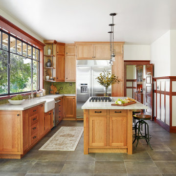
A major aspect of the Craftsman style home renovation included an extensive kitchen remodel. The 1950’s kitchen, while still functional, was dated and disconnected from the style of the home and the main living area. Our clients wanted a bright and airy space to enjoy with family and friends. The entire existing kitchen was gutted and expanded by 186 square feet in order to accommodate a new family room. The new steel French Doors and windows have a “gun metal” or burnished “bronze” live finish to complement the other accessories found within the kitchen. Not only do they flood the space with natural light, but also frame incredible city views over the tops of lush green surroundings. The new Taj Majal Quartzite stone countertop from Brazil resembles Italian Calacatta marble in appearance, but it is much harder and more durable since it does not have the scratching and etching issues of marble. The combination of cherry cabinetry and a unique handmade Motawi Tile backsplash in a dazzling pear matte color, vividly completes the home’s Craftsman aesthetic. It is bright and dynamic, while still appearing tastefully in line with its classic style
 Whistler Builder
Challenge: Our clients wanted to modernize the look of their 1997 home, and update all electrical and plumbing infrastructure. Structural issues were apparent at the onset of the project with missing bearing points and beams that should have been incorporated into the original build.
Solution: The work started with a complete strip out of the interior. Existing finishes, appliances, kitchen, bathrooms, flooring, electrical, plumbing, doors and frames, heating systems, all trim, drywall, insulation and vapour barrier we all removed. This left a bare wood frame shell which required some tricky structural changes to open up the interior necessitating load transfer modifications and additional foundations.
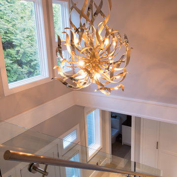
The main stair was widened to create a luxurious ascent to the master bedroom overlooking the golf course. All bathrooms were fully replaced with a new kitchen designed to be open to the dining room and living room. The new interior finishes, and the essential design thereof, came together smoothly with all trades meeting agreed time frames and prices.
We had a great time working with the client throughout the project. Communication was strong during the course of construction which resulted in a renovation that exceeded the client’s criteria and that also met our exacting level of quality.
 Ashton Renovations
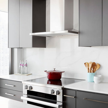
This beautiful Downtown Toronto condo, with magnificent views of the city, and Toronto Island, required some updates to the original kitchen. There were space & storage issues mainly, and much of the upper cabinets were open and not very functional. The kitchen island also needed to be transformed into a functional area with proper storage as well.
Our clients really wanted to transform this space into a beautiful modern kitchen with clean lines and warm wood accents, while including a number of automated features. This was achieved with Sub Zero refrigeration and wine cooling, along with enhanced Miele cooking features. They include an induction stove with steam features, and a built in speed oven.
This kitchen also features touch faucet controls, Casetta Wireless, and Lutron Serena wireless shades to assist with bright southern exposures.
 TimeLine Renovations Inc.
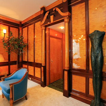
Our client had originally owned the duplex apartment in the front of this town house (1st and 2nd floor). Once the studio apartment on the 2nd floor in the rear of the town house was placed on the market, they immediately purchased it to combine with their existing space.
This apartment would become the extension of the apartment for entertaining and guests, as there was a kitchen and dining room in the front duplex.
The studio apartment had a small kitchen in which we turned into a walk in closet, then main room remained the living room and the bedroom / out cove became the library.
The entire apartment was re wired with new electrical for outlets, wall sconces, center chandelier and recessed lights. Each light location is controlled by its own dimmer for energy efficiency.
The challenge was going to be for our cabinet manufacturer flying into the United States from Europe. To take detailed and precise measurements of all walls, ceiling heights, window opening and doorway in order to create shop drawings. All millwork was custom built in England and there was going to be no room for error. From its travel over the Atlantic, passing through customs, delivered to the building and carried up 2 flights of stairs it all needed to be perfect.
A complaint that the neighbor living below had was always hearing footsteps of someone walking. To rectify this issue and to make a happy neighbor, we installed a soundproof mat with 2 layers of plywood prior to the installation of the carpet.
The 2 tone wood combination of tiger birch and mahogany gives definition and shows the depth of layering. All fixtures are gold plated, from the chandelier, to the recessed light trims even the custom screw less plate covers are gold.
In the powder room we relocated all plumbing fixtures to accommodate the new layout and walk through from each apartment.
Below each window the custom millwork covers the radiators, the front panels are removable to access and service the units.
The goal was to transform this empty room into true elegance…
 Kraft Custom Construction
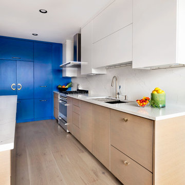
This remodel incorporated the client’s love of artwork and color into a cohesive design with elegant, custom details that will stand the test of time. The space was closed in, dark and dated. The walls at the island were the first thing you saw when entering the condo. So we removed the walls which really opened it up to a welcoming space. Storage was an issue too so we borrowed space from the main floor bedroom closet and created a ‘butler’s pantry’.
The client’s flair for the contemporary, original art, and love of bright colors is apparent in the materials, finishes and paint colors. Jewelry-like artisan pulls are repeated throughout the kitchen to pull it together. The Butler’s pantry provided extra storage for kitchen items and adds a little glam. The drawers are wrapped in leather with a Shagreen pattern (Asian sting ray). A creative mix of custom cabinetry materials includes gray washed white oak to complimented the new flooring and ground the mix of materials on the island, along with white gloss uppers and matte bright blue tall cabinets.
With the exception of the artisan pulls used on the integrated dishwasher drawers and blue cabinets, push and touch latches were used to keep it as clean looking as possible.
Kitchen details include a chef style sink, quartz counters, motorized assist for heavy drawers and various cabinetry organizers.
 Inviting Spaces By Kim
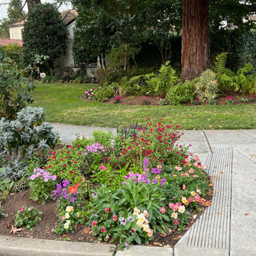
This centrally located intersection to a main thoroughfare a block away was a concern because of the corner lot visibility issue for cars making a turn driving in either direction. The Quince tree bloomed annually for just a short time and was originally planted by the prior home owners decades ago. Keeping it maintained to a height of 4’ maximum, dictated for safety reasons, was still obstructing and limiting the visibility of oncoming traffic at this busy intersection.
The existing roses planted in the same space as the Quince were a perfect backdrop to the new perennials and annuals planted to paint this corner with flowers. The project also included expanding the beautification to both corner areas in coordination with several other planting areas already seasonally updated on the property. With the Redwood Tree as a focal point and Roses, Daphnes, Iris, Azaleas, Fuchsias, Hydrangeas and Camilias highlighting the planting beds the addition of color, including around the driveway and side entrance, transformed the entire space.
Painting With Flowers Is Adding Beauty to Benefit Homeowners & Neighbors!
Kim Beber
46