
Search results for "Married" in Home Design Ideas
 Kimberley Bryan
Photo: Kimberley Bryan © 2013 Houzz
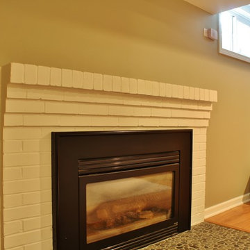
Inspiration for a contemporary family room remodel in Seattle
Inspiration for a contemporary family room remodel in Seattle
 Pool Environments, Inc.
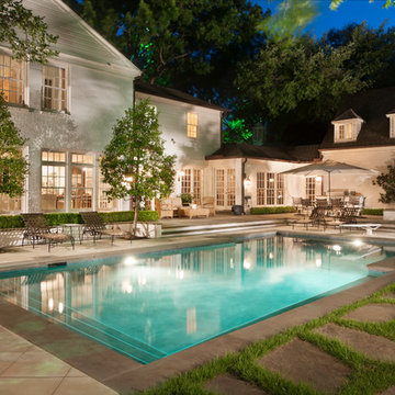
Originally designed by one of the most notable landscape architects in town, this once impressive project had faltered in recent years. The pool and spa still functioned well, and the client wanted to keep it intact. In addition, they wanted to keep as much of the existing landscaping as possible. The surrounding decks, walls, and steps were fair game. At first glance, one might think that our changes were simple material changes. Upon closer inspection, however, one can see the subtle, yet transformative changes that come together to update this classic pool in a tasteful, timeless manner, and improve the flow and usability of the deck areas, while softening the feel of the massive hardscape.
The subtle changes begin as soon as you walk out the back door of the house. The existing decking had a lot of what we call “tweeners”; areas that are overly generous walkways, yet not large enough to house furniture. The awkwardly small bluestone patio was expanded to accommodate a generous seating area, by pushing the step-down closer to the pool. Our talented stone mason carefully married the new bluestone into the existing, resulting in an imperceptible difference between the two. As you descend the new bluestone steps to the pool level, your bare feet will be thankful for the new smooth-finished limestone colored concrete, with a hand cut pattern carefully etched into its surface. The old red brick decking was so hot that the owners could not walk around the pool in bare feet. The brick coping was also replaced with an eased edge Pennsylvania Premier Stone which matches the new step treads throughout the project. Between the house and the pool, a large raised planter was reconfigured, giving additional space to the pool deck for a shaded lounge chair area.
Across the pool, a bank of rather tall painted brick retaining walls were cut down, shortened, and moved. This lessened the visual impact of the walls, which were rather overwhelming in the space, as well as opening up a new seating area, nestled under the arms of the massive pecan at the back of the property. Rather than continuing solid decking around the entire pool, the area near these walls has been transformed to large stone stepper pads set in a sea of beautiful St. Augustine lawn. This creates a visually softened area that is still suited to setting tables and chairs when the guest list calls for additional seating.
The spa area is quite possibly the most dramatic change on this project. Yet more raised planter walls divided this area into awkward spaces, unsuited to proper furniture placement. The planters were removed, new stone decks, once again expertly married into the existing, opening the area to house a large dining table and new built in bbq area. The spa itself was re-imagined with the bluestone coping, and painted brick veneer. The most impressive addition though is the new handmade glazed tiles that surround the existing cast stone water feature. This water feature was almost unnoticeable against the painted brick wall, but now the dramatic arch and pop of color draw the eye to this quaint little corner of the property.
Find the right local pro for your project
 Home Quality Remodeling Inc.-NJ
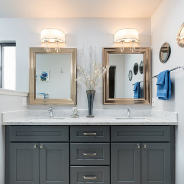
Large transitional master white tile and marble tile travertine floor and beige floor bathroom photo in Other with shaker cabinets, gray cabinets, a two-piece toilet, beige walls, an undermount sink, quartzite countertops and white countertops

 TKS Design Group
Free ebook, Creating the Ideal Kitchen. DOWNLOAD NOW
One of my favorite things to work on is older homes with a bit of history because I find it an interesting challenge to marry the historical architectural features of a home with modern design elements that work well for my client’s current lifestyle.
This home was particularly fun because it was the second kitchen we had done for this family and was quite a departure from the style of the first kitchen.
The before shot of the kitchen shows a view from the family room. See the dropped ceiling? We were curious, was this just part of the design or was the dropped ceiling there to hide mechanicals? Well we soon found out that it was mostly decorative (yay!), and with the exception of a little bit of work to some plumbing from an upstairs bathroom and rerouting of the ventilation system within the original floor joists, we were in the clear, phew! The shot of the completed kitchen from roughly the same vantage point shows how much taller the ceilings are. It makes a huge difference in the feel of the space. Dark and gloomy turned fresh and light!
Another serious consideration was what do we do with the skinny transom window above the refrigerator. After much back and forth, we decided to eliminate it and do some open shelving instead. This ended up being one of the nicest areas in the room. I am calling it the “fun zone” because it houses all the barware, wine cubbies and a bar fridge — the perfect little buffet spot for entertaining. It is flanked on either side by pull out pantries that I’m sure will get a ton of use. Since the neighboring room has literally three walls of almost full height windows, the kitchen gets plenty of light.
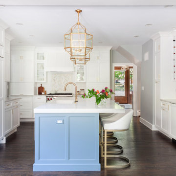
The gold shelving brackets, large pendant fixtures over the island and the tile mural behind the range all pay subtle homage to the home’s prairie style architecture and bring a bit of sparkle to the room.
Even though the room is quite large, the work triangle is very tight with the large Subzero fridge, sink and range all nearby for easy maneuvering during meal prep. There is seating for four at the island, and work aisles are generous.
Designed by: Susan Klimala, CKD, CBD
Photography by: LOMA Studios
For more information on kitchen and bath design ideas go to: www.kitchenstudio-ge.com
 Ellie Lillstrom Photography
Photo: A Darling Felicity Photography © 2015 Houzz
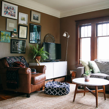
Living room - mid-sized eclectic enclosed medium tone wood floor living room idea in Seattle with brown walls and a tv stand
Living room - mid-sized eclectic enclosed medium tone wood floor living room idea in Seattle with brown walls and a tv stand
 Pool Environments, Inc.
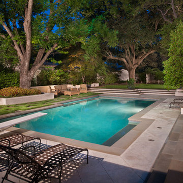
Originally designed by one of the most notable landscape architects in town, this once impressive project had faltered in recent years. The pool and spa still functioned well, and the client wanted to keep it intact. In addition, they wanted to keep as much of the existing landscaping as possible. The surrounding decks, walls, and steps were fair game. At first glance, one might think that our changes were simple material changes. Upon closer inspection, however, one can see the subtle, yet transformative changes that come together to update this classic pool in a tasteful, timeless manner, and improve the flow and usability of the deck areas, while softening the feel of the massive hardscape.
The subtle changes begin as soon as you walk out the back door of the house. The existing decking had a lot of what we call “tweeners”; areas that are overly generous walkways, yet not large enough to house furniture. The awkwardly small bluestone patio was expanded to accommodate a generous seating area, by pushing the step-down closer to the pool. Our talented stone mason carefully married the new bluestone into the existing, resulting in an imperceptible difference between the two. As you descend the new bluestone steps to the pool level, your bare feet will be thankful for the new smooth-finished limestone colored concrete, with a hand cut pattern carefully etched into its surface. The old red brick decking was so hot that the owners could not walk around the pool in bare feet. The brick coping was also replaced with an eased edge Pennsylvania Premier Stone which matches the new step treads throughout the project. Between the house and the pool, a large raised planter was reconfigured, giving additional space to the pool deck for a shaded lounge chair area.
Across the pool, a bank of rather tall painted brick retaining walls were cut down, shortened, and moved. This lessened the visual impact of the walls, which were rather overwhelming in the space, as well as opening up a new seating area, nestled under the arms of the massive pecan at the back of the property. Rather than continuing solid decking around the entire pool, the area near these walls has been transformed to large stone stepper pads set in a sea of beautiful St. Augustine lawn. This creates a visually softened area that is still suited to setting tables and chairs when the guest list calls for additional seating.
The spa area is quite possibly the most dramatic change on this project. Yet more raised planter walls divided this area into awkward spaces, unsuited to proper furniture placement. The planters were removed, new stone decks, once again expertly married into the existing, opening the area to house a large dining table and new built in bbq area. The spa itself was re-imagined with the bluestone coping, and painted brick veneer. The most impressive addition though is the new handmade glazed tiles that surround the existing cast stone water feature. This water feature was almost unnoticeable against the painted brick wall, but now the dramatic arch and pop of color draw the eye to this quaint little corner of the property.
 Ashley Campbell Interior Design
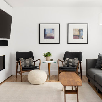
Example of a small trendy open concept living room design in Denver with a corner fireplace, a plaster fireplace and a wall-mounted tv
 TKS Design Group
Free ebook, Creating the Ideal Kitchen. DOWNLOAD NOW
One of my favorite things to work on is older homes with a bit of history because I find it an interesting challenge to marry the historical architectural features of a home with modern design elements that work well for my client’s current lifestyle.
This home was particularly fun because it was the second kitchen we had done for this family and was quite a departure from the style of the first kitchen.
The before shot of the kitchen shows a view from the family room. See the dropped ceiling? We were curious, was this just part of the design or was the dropped ceiling there to hide mechanicals? Well we soon found out that it was mostly decorative (yay!), and with the exception of a little bit of work to some plumbing from an upstairs bathroom and rerouting of the ventilation system within the original floor joists, we were in the clear, phew! The shot of the completed kitchen from roughly the same vantage point shows how much taller the ceilings are. It makes a huge difference in the feel of the space. Dark and gloomy turned fresh and light!
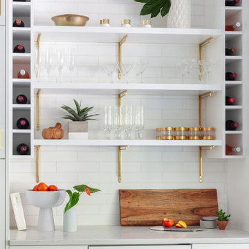
Another serious consideration was what do we do with the skinny transom window above the refrigerator. After much back and forth, we decided to eliminate it and do some open shelving instead. This ended up being one of the nicest areas in the room. I am calling it the “fun zone” because it houses all the barware, wine cubbies and a bar fridge — the perfect little buffet spot for entertaining. It is flanked on either side by pull out pantries that I’m sure will get a ton of use. Since the neighboring room has literally three walls of almost full height windows, the kitchen gets plenty of light.
The gold shelving brackets, large pendant fixtures over the island and the tile mural behind the range all pay subtle homage to the home’s prairie style architecture and bring a bit of sparkle to the room.
Even though the room is quite large, the work triangle is very tight with the large Subzero fridge, sink and range all nearby for easy maneuvering during meal prep. There is seating for four at the island, and work aisles are generous.
Designed by: Susan Klimala, CKD, CBD
Photography by: LOMA Studios
For more information on kitchen and bath design ideas go to: www.kitchenstudio-ge.com
 Ashley Campbell Interior Design
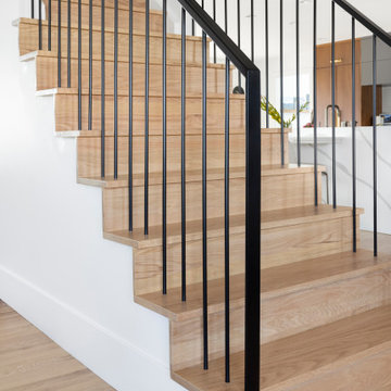
Staircase - mid-sized contemporary wooden straight metal railing staircase idea in Denver with wooden risers
 Studio McGee
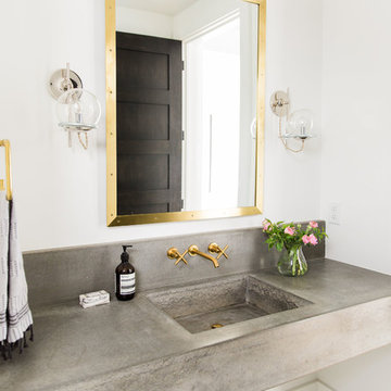
Shop the Look, See the Photo Tour here: https://www.studio-mcgee.com/studioblog/2016/4/4/modern-mountain-home-tour
Watch the Webisode: https://www.youtube.com/watch?v=JtwvqrNPjhU
Travis J Photography
 TKS Design Group
Free ebook, Creating the Ideal Kitchen. DOWNLOAD NOW
One of my favorite things to work on is older homes with a bit of history because I find it an interesting challenge to marry the historical architectural features of a home with modern design elements that work well for my client’s current lifestyle.
This home was particularly fun because it was the second kitchen we had done for this family and was quite a departure from the style of the first kitchen.
The before shot of the kitchen shows a view from the family room. See the dropped ceiling? We were curious, was this just part of the design or was the dropped ceiling there to hide mechanicals? Well we soon found out that it was mostly decorative (yay!), and with the exception of a little bit of work to some plumbing from an upstairs bathroom and rerouting of the ventilation system within the original floor joists, we were in the clear, phew! The shot of the completed kitchen from roughly the same vantage point shows how much taller the ceilings are. It makes a huge difference in the feel of the space. Dark and gloomy turned fresh and light!
Another serious consideration was what do we do with the skinny transom window above the refrigerator. After much back and forth, we decided to eliminate it and do some open shelving instead. This ended up being one of the nicest areas in the room. I am calling it the “fun zone” because it houses all the barware, wine cubbies and a bar fridge — the perfect little buffet spot for entertaining. It is flanked on either side by pull out pantries that I’m sure will get a ton of use. Since the neighboring room has literally three walls of almost full height windows, the kitchen gets plenty of light.
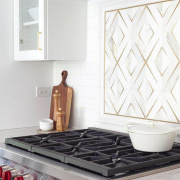
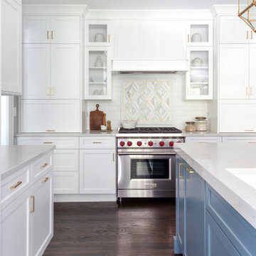
The gold shelving brackets, large pendant fixtures over the island and the tile mural behind the range all pay subtle homage to the home’s prairie style architecture and bring a bit of sparkle to the room.
Even though the room is quite large, the work triangle is very tight with the large Subzero fridge, sink and range all nearby for easy maneuvering during meal prep. There is seating for four at the island, and work aisles are generous.
Designed by: Susan Klimala, CKD, CBD
Photography by: LOMA Studios
For more information on kitchen and bath design ideas go to: www.kitchenstudio-ge.com
 TKS Design Group
Free ebook, Creating the Ideal Kitchen. DOWNLOAD NOW
One of my favorite things to work on is older homes with a bit of history because I find it an interesting challenge to marry the historical architectural features of a home with modern design elements that work well for my client’s current lifestyle.
This home was particularly fun because it was the second kitchen we had done for this family and was quite a departure from the style of the first kitchen.
The before shot of the kitchen shows a view from the family room. See the dropped ceiling? We were curious, was this just part of the design or was the dropped ceiling there to hide mechanicals? Well we soon found out that it was mostly decorative (yay!), and with the exception of a little bit of work to some plumbing from an upstairs bathroom and rerouting of the ventilation system within the original floor joists, we were in the clear, phew! The shot of the completed kitchen from roughly the same vantage point shows how much taller the ceilings are. It makes a huge difference in the feel of the space. Dark and gloomy turned fresh and light!
Another serious consideration was what do we do with the skinny transom window above the refrigerator. After much back and forth, we decided to eliminate it and do some open shelving instead. This ended up being one of the nicest areas in the room. I am calling it the “fun zone” because it houses all the barware, wine cubbies and a bar fridge — the perfect little buffet spot for entertaining. It is flanked on either side by pull out pantries that I’m sure will get a ton of use. Since the neighboring room has literally three walls of almost full height windows, the kitchen gets plenty of light.
The gold shelving brackets, large pendant fixtures over the island and the tile mural behind the range all pay subtle homage to the home’s prairie style architecture and bring a bit of sparkle to the room.
Even though the room is quite large, the work triangle is very tight with the large Subzero fridge, sink and range all nearby for easy maneuvering during meal prep. There is seating for four at the island, and work aisles are generous.
Designed by: Susan Klimala, CKD, CBD
Photography by: LOMA Studios
For more information on kitchen and bath design ideas go to: www.kitchenstudio-ge.com
 User
UserPhotos by Matthew Williams
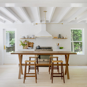
Example of a danish light wood floor kitchen design in New York with flat-panel cabinets, white cabinets, white backsplash, subway tile backsplash, stainless steel appliances, an island and white countertops
Example of a danish light wood floor kitchen design in New York with flat-panel cabinets, white cabinets, white backsplash, subway tile backsplash, stainless steel appliances, an island and white countertops
 Kimberley Bryan
Photo: Kimberley Bryan © 2013 Houzz
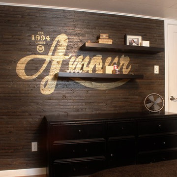
Inspiration for a contemporary bedroom remodel in Seattle
Inspiration for a contemporary bedroom remodel in Seattle
 TKS Design Group
Free ebook, Creating the Ideal Kitchen. DOWNLOAD NOW
One of my favorite things to work on is older homes with a bit of history because I find it an interesting challenge to marry the historical architectural features of a home with modern design elements that work well for my client’s current lifestyle.
This home was particularly fun because it was the second kitchen we had done for this family and was quite a departure from the style of the first kitchen.
The before shot of the kitchen shows a view from the family room. See the dropped ceiling? We were curious, was this just part of the design or was the dropped ceiling there to hide mechanicals? Well we soon found out that it was mostly decorative (yay!), and with the exception of a little bit of work to some plumbing from an upstairs bathroom and rerouting of the ventilation system within the original floor joists, we were in the clear, phew! The shot of the completed kitchen from roughly the same vantage point shows how much taller the ceilings are. It makes a huge difference in the feel of the space. Dark and gloomy turned fresh and light!
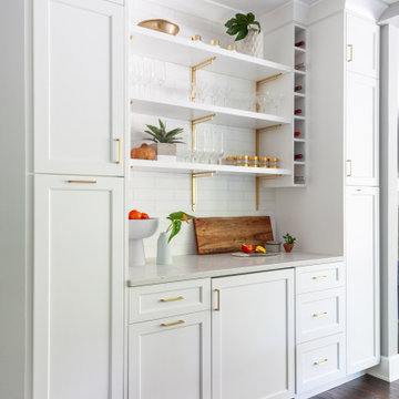
Another serious consideration was what do we do with the skinny transom window above the refrigerator. After much back and forth, we decided to eliminate it and do some open shelving instead. This ended up being one of the nicest areas in the room. I am calling it the “fun zone” because it houses all the barware, wine cubbies and a bar fridge — the perfect little buffet spot for entertaining. It is flanked on either side by pull out pantries that I’m sure will get a ton of use. Since the neighboring room has literally three walls of almost full height windows, the kitchen gets plenty of light.
The gold shelving brackets, large pendant fixtures over the island and the tile mural behind the range all pay subtle homage to the home’s prairie style architecture and bring a bit of sparkle to the room.
Even though the room is quite large, the work triangle is very tight with the large Subzero fridge, sink and range all nearby for easy maneuvering during meal prep. There is seating for four at the island, and work aisles are generous.
Designed by: Susan Klimala, CKD, CBD
Photography by: LOMA Studios
For more information on kitchen and bath design ideas go to: www.kitchenstudio-ge.com
 Windhill+Co.
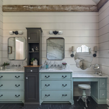
We gave this rather dated farmhouse some dramatic upgrades that brought together the feminine with the masculine, combining rustic wood with softer elements. In terms of style her tastes leaned toward traditional and elegant and his toward the rustic and outdoorsy. The result was the perfect fit for this family of 4 plus 2 dogs and their very special farmhouse in Ipswich, MA. Character details create a visual statement, showcasing the melding of both rustic and traditional elements without too much formality. The new master suite is one of the most potent examples of the blending of styles. The bath, with white carrara honed marble countertops and backsplash, beaded wainscoting, matching pale green vanities with make-up table offset by the black center cabinet expand function of the space exquisitely while the salvaged rustic beams create an eye-catching contrast that picks up on the earthy tones of the wood. The luxurious walk-in shower drenched in white carrara floor and wall tile replaced the obsolete Jacuzzi tub. Wardrobe care and organization is a joy in the massive walk-in closet complete with custom gliding library ladder to access the additional storage above. The space serves double duty as a peaceful laundry room complete with roll-out ironing center. The cozy reading nook now graces the bay-window-with-a-view and storage abounds with a surplus of built-ins including bookcases and in-home entertainment center. You can’t help but feel pampered the moment you step into this ensuite. The pantry, with its painted barn door, slate floor, custom shelving and black walnut countertop provide much needed storage designed to fit the family’s needs precisely, including a pull out bin for dog food. During this phase of the project, the powder room was relocated and treated to a reclaimed wood vanity with reclaimed white oak countertop along with custom vessel soapstone sink and wide board paneling. Design elements effectively married rustic and traditional styles and the home now has the character to match the country setting and the improved layout and storage the family so desperately needed. And did you see the barn? Photo credit: Eric Roth

 Kimberley Bryan
Photo: Kimberley Bryan © 2013 Houzz
Trendy kitchen photo in Seattle with flat-panel cabinets, white cabinets and white backsplash
Trendy kitchen photo in Seattle with flat-panel cabinets, white cabinets and white backsplash
 TKS Design Group
Free ebook, Creating the Ideal Kitchen. DOWNLOAD NOW
One of my favorite things to work on is older homes with a bit of history because I find it an interesting challenge to marry the historical architectural features of a home with modern design elements that work well for my client’s current lifestyle.
This home was particularly fun because it was the second kitchen we had done for this family and was quite a departure from the style of the first kitchen.
The before shot of the kitchen shows a view from the family room. See the dropped ceiling? We were curious, was this just part of the design or was the dropped ceiling there to hide mechanicals? Well we soon found out that it was mostly decorative (yay!), and with the exception of a little bit of work to some plumbing from an upstairs bathroom and rerouting of the ventilation system within the original floor joists, we were in the clear, phew! The shot of the completed kitchen from roughly the same vantage point shows how much taller the ceilings are. It makes a huge difference in the feel of the space. Dark and gloomy turned fresh and light!
Another serious consideration was what do we do with the skinny transom window above the refrigerator. After much back and forth, we decided to eliminate it and do some open shelving instead. This ended up being one of the nicest areas in the room. I am calling it the “fun zone” because it houses all the barware, wine cubbies and a bar fridge — the perfect little buffet spot for entertaining. It is flanked on either side by pull out pantries that I’m sure will get a ton of use. Since the neighboring room has literally three walls of almost full height windows, the kitchen gets plenty of light.
The gold shelving brackets, large pendant fixtures over the island and the tile mural behind the range all pay subtle homage to the home’s prairie style architecture and bring a bit of sparkle to the room.
Even though the room is quite large, the work triangle is very tight with the large Subzero fridge, sink and range all nearby for easy maneuvering during meal prep. There is seating for four at the island, and work aisles are generous.
Designed by: Susan Klimala, CKD, CBD
Photography by: LOMA Studios
For more information on kitchen and bath design ideas go to: www.kitchenstudio-ge.com
2