
Search results for "Master client" in Home Design Ideas
 Architectural Resource LLC
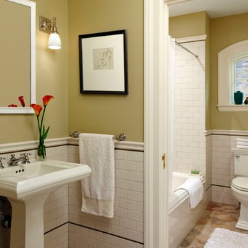
Our Clients, the proud owners of a landmark 1860’s era Italianate home, desired to greatly improve their daily ingress and egress experience. With a growing young family, the lack of a proper entry area and attached garage was something they wanted to address. They also needed a guest suite to accommodate frequent out-of-town guests and visitors. But in the homeowner’s own words, “He didn’t want to be known as the guy who ‘screwed up’ this beautiful old home”. Our design challenge was to provide the needed space of a significant addition, but do so in a manner that would respect the historic home. Our design solution lay in providing a “hyphen”: a multi-functional daily entry breezeway connector linking the main house with a new garage and in-law suite above.
 Alloy Architecture & Construction
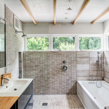
The clients approached us with an addition that was failing structurally and a 1950’s era kitchen that was in serious need of updating. Alloy created a new addition to accommodate a larger bathroom, a laundry room and a small mudroom. The addition also includes a portico that opens to the clients wonderful gardens in the back.
The kitchen was also opened up to the dining room creating more light and natural flow throughout the house. Our client, a landscape architect, wanted a view from the kitchen that looks into the gardens at the back of the house.
The bathroom has exposed joists and clerestory windows bathing the whole room in natural light while allowing for privacy. The same tile was used throughout but in multiple scales creating interesting textures while maintaining a cohesive palette and a serene ambiance.
Andrea Hubbel Photography
 Susan Brook Interiors
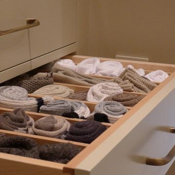
Organization has to be key in a dressing room as well as looking beautiful. This was achieved by form and function, just gorgeous.
Closet - transitional closet idea in Indianapolis
Closet - transitional closet idea in Indianapolis
Find the right local pro for your project
 TVL Creative Ltd.
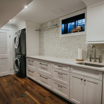
This project was such an incredible design opportunity, and instilled inspiration and excitement at every turn! Our amazing clients came to us with the challenge of converting their beloved family home into a welcoming haven for all members of the family. At the time that we met our clients, they were struggling with the difficult personal decision of the fate of the home. Their father/father-in-law had passed away and their mother/mother-in-law had recently been admitted into a nursing facility and was fighting Alzheimer’s. Resistant to loss of the home now that both parents were out of it, our clients purchased the home to keep in in the family. Despite their permanent home currently being in New Jersey, these clients dedicated themselves to keeping and revitalizing the house. We were moved by the story and became immediately passionate about bringing this dream to life.
The home was built by the parents of our clients and was only ever owned by them, making this a truly special space to the family. Our goal was to revitalize the home and to bring new energy into every room without losing the special characteristics that were original to the home when it was built. In this way, we were able to develop a house that maintains its own unique personality while offering a space of welcoming neutrality for all members of the family to enjoy over time.
The renovation touched every part of the home: the exterior, foyer, kitchen, living room, sun room, garage, six bedrooms, three bathrooms, the laundry room, and everything in between. The focus was to develop a style that carried consistently from space to space, but allowed for unique expression in the small details in every room.
Starting at the entry, we renovated the front door and entry point to offer more presence and to bring more of the mid-century vibe to the home’s exterior. We integrated a new modern front door, cedar shingle accents, new exterior paint, and gorgeous contemporary house numbers that really allow the home to stand out. Just inside the entry, we renovated the foyer to create a playful entry point worthy of attention. Cement look tile adorns the foyer floor, and we’ve added new lighting and upgraded the entry coat storage.
Upon entering the home, one will immediately be captivated by the stunning kitchen just off the entry. We transformed this space in just about every way. While the footprint of the home ultimately remained almost identical, the aesthetics were completely turned on their head. We re-worked the kitchen to maximize storage and to create an informal dining area that is great for casual hosting or morning coffee.
We removed the entry to the garage that was once in the informal dining, and created a peninsula in its place that offers a unique division between the kitchen/informal dining and the formal dining and living areas. The simple light warm light gray cabinetry offers a bit of traditional elegance, along with the marble backsplash and quartz countertops. We extended the original wood flooring into the kitchen and stained all floors to match for a warmth that truly resonates through all spaces. We upgraded appliances, added lighting everywhere, and finished the space with some gorgeous mid century furniture pieces.
In the formal dining and living room, we really focused on maintaining the original marble fireplace as a focal point. We cleaned the marble, repaired the mortar, and refinished the original fireplace screen to give a new sleek look in black. We then integrated a new gas insert for modern heating and painted the upper portion in a rich navy blue; an accent that is carried through the home consistently as a nod to our client’s love of the color.
The former entry into the old covered porch is now an elegant glass door leading to a stunning finished sunroom. This room was completely upgraded as well. We wrapped the entire space in cozy white shiplap to keep a casual feel with brightness. We tiled the floor with large format concrete look tile, and painted the old brick fireplace a bright white. We installed a new gas burning unit, and integrated transitional style lighting to bring warmth and elegance into the space. The new black-frame windows are adorned with decorative shades that feature hand-sketched bird prints, and we’ve created a dedicated garden-ware “nook” for our client who loves to work in the yard. The far end of this space is completed with two oversized chaise loungers and overhead lights…the most perfect little reading nook!
Just off the dining room, we created an entirely new space to the home: a mudroom. The clients lacked this space and desperately needed a landing spot upon entering the home from the garage. We uniquely planned existing space in the garage to utilize for this purpose, and were able to create a small but functional entry point without losing the ability to park cars in the garage. This new space features cement-look tile, gorgeous deep brown cabinetry, and plenty of storage for all the small items one might need to store while moving in and out of the home.
The remainder of the upstairs level includes massive renovations to the guest hall bathroom and guest bedroom, upstairs master bed/bath suite, and a third bedroom that we converted into a home office for the client.
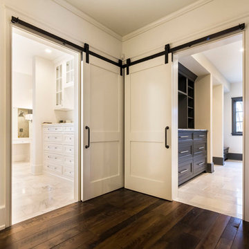
Some of the largest transformations were made in the basement, where unfinished space and lack of light were converted into gloriously lit, cozy, finished spaces. Our first task was to convert the massive basement living room into the new master bedroom for our clients. We removed existing built-ins, created an entirely new walk-in closet, painted the old brick fireplace, installed a new gas unit, added carpet, introduced new lighting, replaced windows, and upgraded every part of the aesthetic appearance. One of the most incredible features of this space is the custom double sliding barn door made by a Denver artisan. This space is truly a retreat for our clients!
We also completely transformed the laundry room, back storage room, basement master bathroom, and two bedrooms.
This home’s massive scope and ever-evolving challenges were thrilling and exciting to work with, and the result is absolutely amazing. At the end of the day, this home offers a look and feel that the clients love. Above all, though, the clients feel the spirit of their family home and have a welcoming environment for all members of the family to enjoy for years to come.
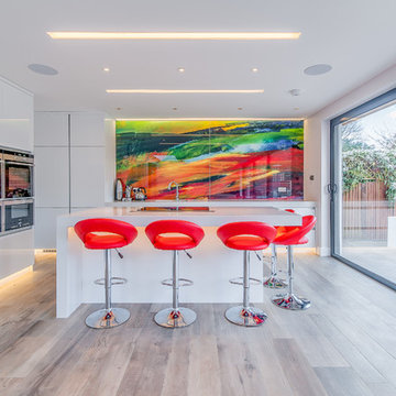
 50 Degrees North Architects
Overview
Whole house refurbishment, double storey wrap around extension and large loft conversion.
The Brief
Create a WOW factor space, add glamour and fun and give the house a street side and garden side, both different.
Our Solution
This project was exciting from the start, the client wanted to entertain in a WOW factor space, have a panoramic view of the garden (which was to be landscaped), add bedrooms and a great master suite.
We had some key elements to introduce such as an aquarium separating two rooms; double height spaces and a gloss kitchen, all of which manifest themselves in the completed scheme.
Architecture is a process taking a schedule of areas, some key desires and needs, mixing the functionality and creating space.
New spaces transform a house making it more valuable, giving it kerb appeal and making it feel like a different building. All of which happened at Ailsa Road.
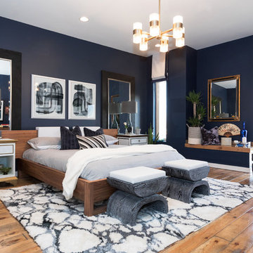
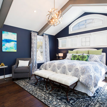
Example of a large minimalist master medium tone wood floor and brown floor bedroom design in Philadelphia with blue walls
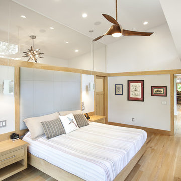
 iSpace, LLC
Our design concept for this new construction was to work closely with the architect and harmonize the architectural elements with the interior design. The goal was to give our client a simple arts & crafts influenced interior, while working with environmentally friendly products and materials.
Architect: Matthias J. Pearson, | Builder: Corby Bradt, | Photographer: Matt Feyerabend

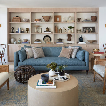
 KitchenLab Interiors
Coconut Grove is Southwest of Miami beach near coral gables and south of downtown. It’s a very lush and charming neighborhood. It’s one of the oldest neighborhoods and is protected historically. It hugs the shoreline of Biscayne Bay. The 10,000sft project was originally built
17 years ago and was purchased as a vacation home. Prior to the renovation the owners could not get past all the brown. He sails and they have a big extended family with 6 kids in between them. The clients wanted a comfortable and causal vibe where nothing is too precious. They wanted to be able to sit on anything in a bathing suit. KitchenLab interiors used lots of linen and indoor/outdoor fabrics to ensure durability. Much of the house is outside with a covered logia.
The design doctor ordered the 1st prescription for the house- retooling but not gutting. The clients wanted to be living and functioning in the home by November 1st with permits the construction began in August. The KitchenLab Interiors (KLI) team began design in May so it was a tight timeline! KLI phased the project and did a partial renovation on all guest baths. They waited to do the master bath until May. The home includes 7 bathrooms + the master. All existing plumbing fixtures were Waterworks so KLI kept those along with some tile but brought in Tabarka tile. The designers wanted to bring in vintage hacienda Spanish with a small European influence- the opposite of Miami modern. One of the ways they were able to accomplish this was with terracotta flooring that has patina. KLI set out to create a boutique hotel where each bath is similar but different. Every detail was designed with the guest in mind- they even designed a place for suitcases.
 Tracy deShazo Interiors
Bryan Chavez Photography
River City Custom Homes - RounTrey - 2015 Homearama
Farmhouse with a Modern Vibe
Gold Winner - Master Suite
Aware of the financial investment clients put into their homes, I combine my business and design expertise while working with each client to understand their taste, enhance their style and create spaces they will enjoy for years to come.
It’s been said that I have a “good” eye. I won’t discount that statement and I’d add I have an affinity to people, places and things that tell a story. My clients benefit from my passion and ability to turn their homes into finely curated spaces through the use of beautiful textiles, amazing lighting and furniture pieces that are as timeless as they are wonderfully unique. I enjoy the creative process and work with people who are building their dream homes, remodeling existing homes or desire a fresh take on a well lived-in space.
I see the client–designer relationship as a partnership with a desire to deliver an end result that exceeds my client’s expectations. I approach each project with professionalism, unparalleled excitement and a commitment for designing homes that are as livable as they are beautiful.
 Change Your Bathroom©
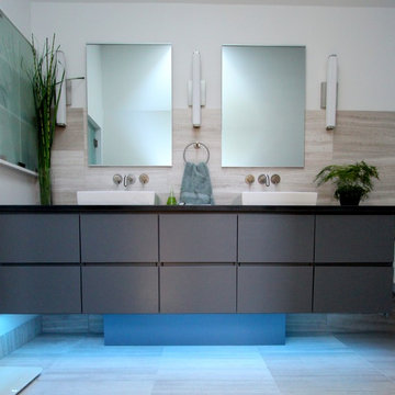
The goal of this project was to upgrade the builder grade finishes and create an ergonomic space that had a contemporary feel. This bathroom transformed from a standard, builder grade bathroom to a contemporary urban oasis. This was one of my favorite projects, I know I say that about most of my projects but this one really took an amazing transformation. By removing the walls surrounding the shower and relocating the toilet it visually opened up the space. Creating a deeper shower allowed for the tub to be incorporated into the wet area. Adding a LED panel in the back of the shower gave the illusion of a depth and created a unique storage ledge. A custom vanity keeps a clean front with different storage options and linear limestone draws the eye towards the stacked stone accent wall.
Houzz Write Up: https://www.houzz.com/magazine/inside-houzz-a-chopped-up-bathroom-goes-streamlined-and-swank-stsetivw-vs~27263720
The layout of this bathroom was opened up to get rid of the hallway effect, being only 7 foot wide, this bathroom needed all the width it could muster. Using light flooring in the form of natural lime stone 12x24 tiles with a linear pattern, it really draws the eye down the length of the room which is what we needed. Then, breaking up the space a little with the stone pebble flooring in the shower, this client enjoyed his time living in Japan and wanted to incorporate some of the elements that he appreciated while living there. The dark stacked stone feature wall behind the tub is the perfect backdrop for the LED panel, giving the illusion of a window and also creates a cool storage shelf for the tub. A narrow, but tasteful, oval freestanding tub fit effortlessly in the back of the shower. With a sloped floor, ensuring no standing water either in the shower floor or behind the tub, every thought went into engineering this Atlanta bathroom to last the test of time. With now adequate space in the shower, there was space for adjacent shower heads controlled by Kohler digital valves. A hand wand was added for use and convenience of cleaning as well. On the vanity are semi-vessel sinks which give the appearance of vessel sinks, but with the added benefit of a deeper, rounded basin to avoid splashing. Wall mounted faucets add sophistication as well as less cleaning maintenance over time. The custom vanity is streamlined with drawers, doors and a pull out for a can or hamper.
A wonderful project and equally wonderful client. I really enjoyed working with this client and the creative direction of this project.
Brushed nickel shower head with digital shower valve, freestanding bathtub, curbless shower with hidden shower drain, flat pebble shower floor, shelf over tub with LED lighting, gray vanity with drawer fronts, white square ceramic sinks, wall mount faucets and lighting under vanity. Hidden Drain shower system. Atlanta Bathroom.
 Nar Design Group
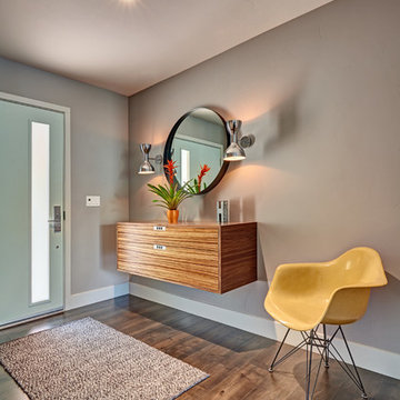
This client grew up in this 1950’s family home and has now become owner in his adult life. Designing and remodeling this childhood home that the client was very bonded and familiar with was a tall order. This modern twist of original mid-century style combined with an eclectic fusion of modern day materials and concepts fills the room with a powerful presence while maintaining its clean lined austerity and elegance. The kitchen was part of a grander complete home re-design and remodel.
A modern version of a mid-century His and Hers grand master bathroom was created to include all the amenities and nothing left behind! This bathroom has so much noticeable and hidden “POW” that commands its peaceful spa feeling with a lot of attitude. Maintaining ultra-clean lines yet delivering ample design interest at every detail, This bathroom is eclectically a one of a kind luxury statement.
The concept in the laundry room was to create a simple, easy to use and clean space with ample storage and a place removed from the central part of the home to house the necessity of the cats and their litter box needs. There was no need for glamour in the laundry room yet we were able to create a simple highly utilitarian space.
If there is one room in the home that requires frequent visitors to thoroughly enjoy with a huge element of surprise, it’s the powder room! This is a room where you know that eventually, every guest will visit. Knowing this, we created a bold statement with layers of intrigue that would leave ample room for fun conversation with your guests upon their prolonged exit. We kept the lights dim here for that intriguing experience of crafted elegance and created ambiance. The walls of peeling metallic rust are the welcoming gesture to a powder room experience of defiance and elegant mystical complexity.
It's a lucky house guest indeed who gets to stay in this newly remodeled home. This on-suite bathroom allows them their own space and privacy. Both Bedroom and Bathroom offer plenty of storage for an extended stay. Rift White Oak cabinets and sleek Silestone counters make a lovely combination in the bathroom while the bedroom showcases textured white cabinets with a dark walnut wrap.
Photo credit: Fred Donham of PhotographerLink
 Above & Beyond Building
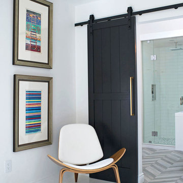
The renovation of this classic Muskoka cottage, focused around re-designing the living space to make the most of the incredible lake views. This update completely changed the flow of space, aligning the living areas with a more modern & luxurious living context.
In collaboration with the client, we envisioned a home in which clean lines, neutral tones, a variety of textures and patterns, and small yet luxurious details created a fresh, engaging space while seamlessly blending into the natural environment.
The main floor of this home was completely gutted to reveal the true beauty of the space. Main floor walls were re-engineered with custom windows to expand the client’s majestic view of the lake.
The dining area was highlighted with features including ceilings finished with Shadowline MDF, and enhanced with a custom coffered ceiling bringing dimension to the space.
Unobtrusive details and contrasting textures add richness and intrigue to the space, creating an energizing yet soothing interior with tactile depth.
 Deco Design
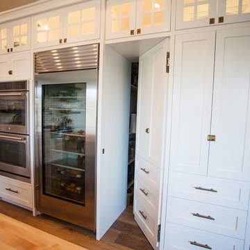
Closeup of the door to the hidden pantry. False panels and hardware to match the rest of the bank of cabinets.
We custom made all of the kitchen cabinetry and shelving. The kitchen was a small area so maximizing usable space with function and design was crucial.
The transitional design features a pantry wall with the Sub Zero all glass door refrigerator and oven cabinet centered and equal size pantry cabinets to either side with 3 large storage drawers below and rollout shelves and work surfaces behind the door cabinets above in each with a hidden walk-in pantry door next to the Sub Zero. The cabinets on the range wall all have large storage drawers with wood organizers in the top drawer for spices and utensils. The client also wanted floating shelves to either side of the steel hood which were made from re-sawn maple to look like cut pieces from an old beam, each shelf is lit from the underside with LED flush mounted puck lights.
The island was our biggest challenge. It needed to house several appliances of different size, a farmhouse sink and be able to have function from all 4 sides and still have room for seating space on the backside. The sink side has the farmhouse sink centered with storage drawers to the right that feature wood organizers and a double middle drawer to help hold all the small utensils and still maintain the 3 drawer look from the front view that matches the integrated dishwasher to the left. The right side contains both the integrated soft close trash unit and an icemaker with a third false panel door to maintain the size balance for all three. The left side houses the Sub Zero undercounter freezer. I wanted the face to look like six equal sized drawers, which left the integrated drawer fronts for the freezer overlapping the side panel for the dishwasher. The back of the island has storage tucked up under the seating space. The quartz countertop meets up against the maple butcher block to create a stunning island top. All in all the end result of this kitchen is a beautiful space with wonderful function.
We finished the false beams in our exclusive hand-rubbed cappuccino stain.
Photos: Kimball Ungerman

Sponsored
Sunbury, OH

J.Holderby - Renovations
Franklin County's Leading General Contractors - 2X Best of Houzz!
 Redo Home and Design
Aimee Mazzenga Photography
Design: Mitzi Maynard and Clare Kennedy
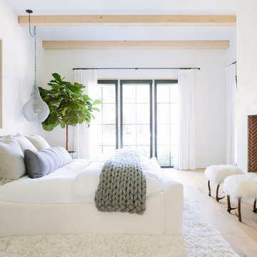
Beach style master light wood floor and beige floor bedroom photo in Nashville with white walls and a standard fireplace
Beach style master light wood floor and beige floor bedroom photo in Nashville with white walls and a standard fireplace
 Moore Design Works
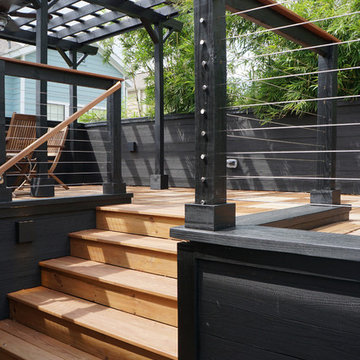
The roof deck reclaimed the outdoor space needed for the addition and provided new views for a client quickly being surrounded by tall, modern townhouses.
 Artistic Design And Remodeling
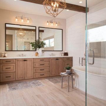
Light and Airy shiplap bathroom was the dream for this hard working couple. The goal was to totally re-create a space that was both beautiful, that made sense functionally and a place to remind the clients of their vacation time. A peaceful oasis. We knew we wanted to use tile that looks like shiplap. A cost effective way to create a timeless look. By cladding the entire tub shower wall it really looks more like real shiplap planked walls.
The center point of the room is the new window and two new rustic beams. Centered in the beams is the rustic chandelier.
Design by Signature Designs Kitchen Bath
Contractor ADR Design & Remodel
Photos by Gail Owens
 Tracey Stephens Design, LLC
Wing Wong, Memories TTL
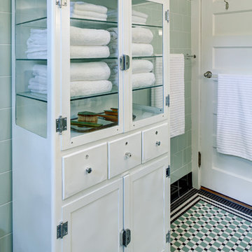
Example of an arts and crafts green tile and ceramic tile porcelain tile bathroom design in New York with green walls
Example of an arts and crafts green tile and ceramic tile porcelain tile bathroom design in New York with green walls



 Ward Jewell Architect AIA
These clients came to my office looking for an architect who could design their "empty nest" home that would be the focus of their soon to be extended family. A place where the kids and grand kids would want to hang out: with a pool, open family room/ kitchen, garden; but also one-story so there wouldn't be any unnecessary stairs to climb. They wanted the design to feel like "old Pasadena" with the coziness and attention to detail that the era embraced. My sensibilities led me to recall the wonderful classic mansions of San Marino, so I designed a manor house clad in trim Bluestone with a steep French slate roof and clean white entry, eave and dormer moldings that would blend organically with the future hardscape plan and thoughtfully landscaped grounds.
The site was a deep, flat lot that had been half of the old Joan Crawford estate; the part that had an abandoned swimming pool and small cabana. I envisioned a pavilion filled with natural light set in a beautifully planted park with garden views from all sides. Having a one-story house allowed for tall and interesting shaped ceilings that carved into the sheer angles of the roof. The most private area of the house would be the central loggia with skylights ensconced in a deep woodwork lattice grid and would be reminiscent of the outdoor “Salas” found in early Californian homes. The family would soon gather there and enjoy warm afternoons and the wonderfully cool evening hours together.
Working with interior designer Jeffrey Hitchcock, we designed an open family room/kitchen with high dark wood beamed ceilings, dormer windows for daylight, custom raised panel cabinetry, granite counters and a textured glass tile splash. Natural light and gentle breezes flow through the many French doors and windows located to accommodate not only the garden views, but the prevailing sun and wind as well. The graceful living room features a dramatic vaulted white painted wood ceiling and grand fireplace flanked by generous double hung French windows and elegant drapery. A deeply cased opening draws one into the wainscot paneled dining room that is highlighted by hand painted scenic wallpaper and a barrel vaulted ceiling. The walnut paneled library opens up to reveal the waterfall feature in the back garden. Equally picturesque and restful is the view from the rotunda in the master bedroom suite.
Architect: Ward Jewell Architect, AIA
Interior Design: Jeffrey Hitchcock Enterprises
Contractor: Synergy General Contractors, Inc.
Landscape Design: LZ Design Group, Inc.
Photography: Laura Hull
 Wiedemann Architects LLC
Photos © Anice HoachlanderOur client was drawn to the property in Wesley Heights as it was in an established neighborhood of stately homes, on a quiet street with views of park. They wanted a traditional home for their young family with great entertaining spaces that took full advantage of the site.
The site was the challenge. The natural grade of the site was far from traditional. The natural grade at the rear of the property was about thirty feet above the street level. Large mature trees provided shade and needed to be preserved.
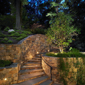
The solution was sectional. The first floor level was elevated from the street by 12 feet, with French doors facing the park. We created a courtyard at the first floor level that provide an outdoor entertaining space, with French doors that open the home to the courtyard.. By elevating the first floor level, we were able to allow on-grade parking and a private direct entrance to the lower level pub "Mulligans". An arched passage affords access to the courtyard from a shared driveway with the neighboring homes, while the stone fountain provides a focus.
A sweeping stone stair anchors one of the existing mature trees that was preserved and leads to the elevated rear garden. The second floor master suite opens to a sitting porch at the level of the upper garden, providing the third level of outdoor space that can be used for the children to play.
The home's traditional language is in context with its neighbors, while the design allows each of the three primary levels of the home to relate directly to the outside.
Builder: Peterson & Collins, Inc
Photos © Anice Hoachlander
 Casework Inter Design
When the homeowners first purchased the 1925 house, it was compartmentalized, outdated, and completely unfunctional for their growing family. Casework designed the owner's previous kitchen and family room and was brought in to lead up the creative direction for the project. Casework teamed up with architect Paul Crowther and brother sister team Ainslie Davis on the addition and remodel of the Colonial.
The existing kitchen and powder bath were demoed and walls expanded to create a new footprint for the home. This created a much larger, more open kitchen and breakfast nook with mudroom, pantry and more private half bath. In the spacious kitchen, a large walnut island perfectly compliments the homes existing oak floors without feeling too heavy. Paired with brass accents, Calcutta Carrera marble countertops, and clean white cabinets and tile, the kitchen feels bright and open - the perfect spot for a glass of wine with friends or dinner with the whole family.
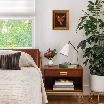
There was no official master prior to the renovations. The existing four bedrooms and one separate bathroom became two smaller bedrooms perfectly suited for the client’s two daughters, while the third became the true master complete with walk-in closet and master bath. There are future plans for a second story addition that would transform the current master into a guest suite and build out a master bedroom and bath complete with walk in shower and free standing tub.
Overall, a light, neutral palette was incorporated to draw attention to the existing colonial details of the home, like coved ceilings and leaded glass windows, that the homeowners fell in love with. Modern furnishings and art were mixed in to make this space an eclectic haven.
33