
Search results for "Master consists" in Home Design Ideas
 American Kitchens, Inc.
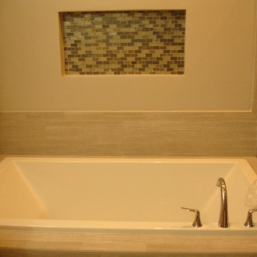
Master bath consists of waypoint cabinetry in a maple wood species with a linen finish.
Example of a large classic master gray tile bathroom design in Orlando with flat-panel cabinets
Example of a large classic master gray tile bathroom design in Orlando with flat-panel cabinets
 Hunter Tile & Construction, LLC
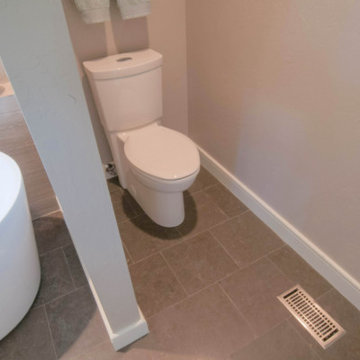
Remodeled master bathroom consisting of limestone tiles, heated stone floors, freestanding tub, and leathered granite countertops.
Freestanding bathtub - modern master black floor and limestone floor freestanding bathtub idea in Oklahoma City with a two-piece toilet
Freestanding bathtub - modern master black floor and limestone floor freestanding bathtub idea in Oklahoma City with a two-piece toilet

Find the right local pro for your project
 Hunter Tile & Construction, LLC
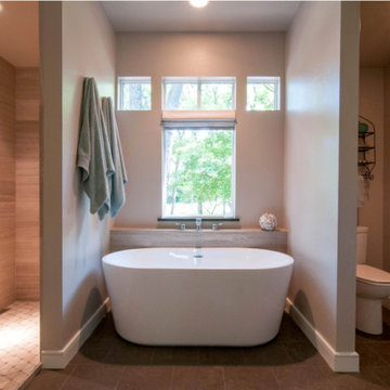
Remodeled master bathroom consisting of travertine shower tiles, heated stone floors, freestanding tub
Inspiration for a large modern master beige tile and travertine tile limestone floor bathroom remodel in Oklahoma City with a two-piece toilet
Inspiration for a large modern master beige tile and travertine tile limestone floor bathroom remodel in Oklahoma City with a two-piece toilet
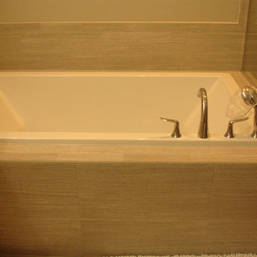 American Kitchens, Inc.
Master bath consists of waypoint cabinetry in a maple wood species with a linen finish.
Inspiration for a large timeless master gray tile bathroom remodel in Orlando with flat-panel cabinets
Inspiration for a large timeless master gray tile bathroom remodel in Orlando with flat-panel cabinets
 Design Shop Inc.
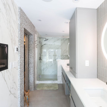
For the wall between ensuite and bedroom, we played with a small glass mosaic tile to create a transitional threshold. For contrasting scale, large stone butts into this detail which surrounds the fireplaces facing both bedroom and freestanding tub. Large scale, bright white marble is wrapped around the entire shower and is repeated on the fireplace wall. The double vanity in the master ensuite consists of integrated-handle drawers and a storage tower above, separating his and her spaces.
 Stone Creek Installations
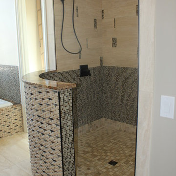
Custom home on the river! Master bathroom consists of 12x24 travertine on the floor, 6x24 travertine on the shower walls w/ glass accent. Outside of the curved wall and tub skirt is a basket weave pattern with stone & metal. The tub surround and vanity backsplash is a glass/stone mosaic. Schluter edging and granite finish this bathroom

Sponsored
Columbus, OH

Hope Restoration & General Contracting
Columbus Design-Build, Kitchen & Bath Remodeling, Historic Renovations
 CRAFT Architects
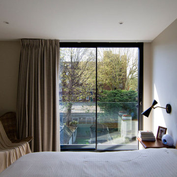
The new roof extension accommodates a ‘master floor’, consisting of a bedroom, shower room and a large walk-in wardrobe – a very important point on the client's ‘must have’ list.
The bedroom has a large floor-to-ceiling window with openable sliding panels. Its ultra-slim frames, and the glass balustrade outside, offer almost unobstructed views out.
 April Balliette
Photographer: Ryan Gamma
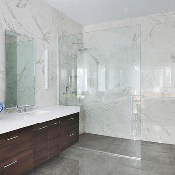
Example of a mid-sized minimalist master white tile and porcelain tile porcelain tile and gray floor bathroom design in Tampa with flat-panel cabinets, dark wood cabinets, a two-piece toilet, white walls, an undermount sink, quartz countertops and white countertops
Example of a mid-sized minimalist master white tile and porcelain tile porcelain tile and gray floor bathroom design in Tampa with flat-panel cabinets, dark wood cabinets, a two-piece toilet, white walls, an undermount sink, quartz countertops and white countertops

 Let's Remodel
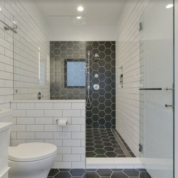
In this bathroom, the client wanted the contrast of the white subway tile and the black hexagon tile. We tiled up the walls and ceiling to create a wet room feeling.
 David Crosson Design Collective
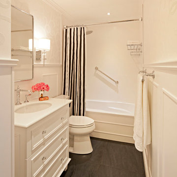
The client decided that she was in her "forever home" and wanted to create a space that felt clean and fresh but referenced elements of a vintage aesthetic. Panel molding, gently swooping paintable wallpaper, a high-contrast palette and gleaming fixtures from Kohler's Artifacts line all contributed to the look. "I'm never leaving this room," she said when we were done--and somehow I believe that might just be true!
Image shot by John Bilodeau
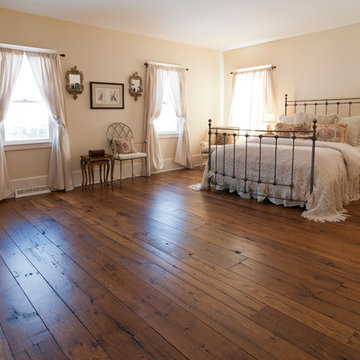
 Olde Wood Ltd.
Create a polished, more sophisticated image for your home with our clean-looking resawn oak hardwood flooring. Made from carefully dismantled barn siding, beams and joists, these hand-inspected, oak reclaimed wood flooring planks – available in red oak, white oak or a mixture of both – have been milled to remove a portion of the aged surface for a fresh, comparatively consistent golden color.

 Clark Design Build, LLC
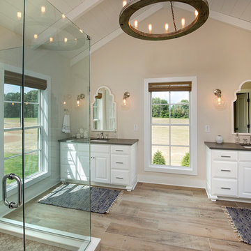
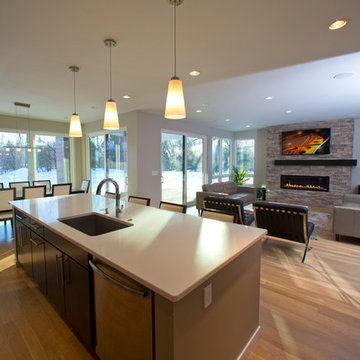
This home is located on a one acre parcel of land near the banks of the Milwaukee River in the older established subdivision of Sleepy Hollow Estates in Mequon, Wisconsin. The inspiration for this Glen Cove Residence was to bring the desired by many, contemporary and modern lifestyle of a down town loft and establish it in a neighborhood in the suburbs amongst traditional style homes.
Sleepy Hollow Estates like many older established neighborhoods throughout the North shore and Westside communities of Milwaukee had great local architects such as John Randall McDonald and Russell Barr Williamson, who built contemporary master pieces amongst very traditional style homes. This created diversity in the style of homes in these neighborhoods which for the people living in them and the people just passing by, an experience of harmony and cultural lifestyle.
Unfortunately today, many new neighborhood developments lack harmony and cultural lifestyle and don’t allow for homes such as this Glen Cove Residence to be built. And for that matter many of the homes built by John Randall McDonald and Russell Barr Williamson back in the 1950’s. When driving through these new developments, one would experience beautiful traditional style homes, but all the homes tend to look the same. There is no diversity in the styles of homes thus these neighborhoods lack the harmony and a cultural life style for the people who live there or what people are looking for when buying a home that reflects their lifestyle. This Glen Cove Residence is an example that a contemporary home which offers a modern lifestyle that many desires can be established amongst traditional homes while blending in with the neighborhood.
Don’t be fooled by the flat roof of this home, building technology has come a long way since Frank Lloyd Wright! The roof system on this home is more energy efficient than most roof systems builders are putting on traditional homes today and it doesn’t leak! This Glen Cove Residence was built using all traditional building materials that you would see in homes being built in new developments today. There is a misconception out there that modern homes are expensive to build. That is not true! This Glen Cove Residence was built for roughly $130 per square foot which is the same price one would pay for a similar builder’s model traditional style home with the same upgrades.
This Glen Cove Residence consists of three bedrooms and three and one half baths. All bedrooms are located on second floor with laundry, guest bath and a master suite. Located between the first and second floors off of the landing is an office/den space. The first floor is open concept with the kitchen, dining and living areas located at the rear of the home with expansive windows allowing a great connection to back yard area and outdoors. On the back of the home is a covered deck area allowing for outdoor entertaining without the worry of the elements. The first floor also offers a powder room, mudroom and walk-in pantry off the kitchen area. From the mudroom there is access to an attached four car tandem garage. From the first floor to the finished basement is an open stair allowing the basement area to feel as part of the house and not just a basement? The basement consists of a main living area, game area with wet bar, exercise room, kids play room with 14’ ceilings, full bathroom and mechanical room with storage closets throughout.
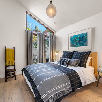
 JRP Design & Remodel
Our client had been living in her beautiful lakeside retreat for about 3 years. All around were stunning views of the lake and mountains, but the view from inside was minimal. It felt dark and closed off from the gorgeous waterfront mere feet away. She desired a bigger kitchen, natural light, and a contemporary look. Referred to JRP by a subcontractor our client walked into the showroom one day, took one look at the modern kitchen in our design center, and was inspired!
After talking about the frustrations of dark spaces and limitations when entertaining groups of friends, the homeowner and the JRP design team emerged with a new vision. Two walls between the living room and kitchen would be eliminated and structural revisions were needed for a common wall shared a wall with a neighbor. With the wall removals and the addition of multiple slider doors, the main level now has an open layout.
Everything in the home went from dark to luminous as sunlight could now bounce off white walls to illuminate both spaces. Our aim was to create a beautiful modern kitchen which fused the necessities of a functional space with the elegant form of the contemporary aesthetic. The kitchen playfully mixes frameless white upper with horizontal grain oak lower cabinets and a fun diagonal white tile backsplash. Gorgeous grey Cambria quartz with white veining meets them both in the middle. The large island with integrated barstool area makes it functional and a great entertaining space.
The master bedroom received a mini facelift as well. White never fails to give your bedroom a timeless look. The beautiful, bright marble shower shows what's possible when mixing tile shape, size, and color. The marble mosaic tiles in the shower pan are especially bold paired with black matte plumbing fixtures and gives the shower a striking visual.
Layers, light, consistent intention, and fun! - paired with beautiful, unique designs and a personal touch created this beautiful home that does not go unnoticed.
PROJECT DETAILS:
• Style: Contemporary
• Colors: Neutrals
• Countertops: Cambria Quartz, Luxury Series, Queen Anne
• Kitchen Cabinets: Slab, Overlay Frameless
Uppers: Blanco
Base: Horizontal Grain Oak
• Hardware/Plumbing Fixture Finish: Kitchen – Stainless Steel
• Lighting Fixtures:
• Flooring:
Hardwood: Siberian Oak with Fossil Stone finish
• Tile/Backsplash:
Kitchen Backsplash: White/Clear Glass
Master Bath Floor: Ann Sacks Benton Mosaics Marble
Master Bath Surround: Ann Sacks White Thassos Marble
Photographer: Andrew – Open House VC
 building Lab, inc.
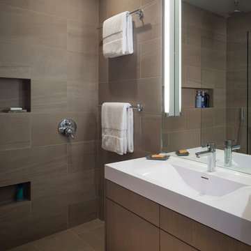
The remodeling of the kitchen and bathroom forms the core of this interior renovation.
The existing peninsula design and cabinetry broke up the ‘great room’ and stood the kitchen as a distinct element within the room. Our design strategy operates more on a principle of integration. As such, we created a galley condition with a spine of cabinetry and appliances that anchors to the long wall of the room. The feature design element is the solid Caesarstone backsplash which appears to be carved from the wall itself.
The particular challenge in the windowless bathroom was how to create an inviting, expanded sense of depth without a resulting cave-like feel. Removal of a half wall, soffit and tub unified the space overall. We reinforced the unification with the deployment of a single large format tile spec. Smaller details such as touch latch cabinetry hardware and flush conditions between tile, wall and mirror further the principle that simpler is bigger, deeper and more inviting.
We were also charged with elevating what was a pedestrian 1990’s townhouse to something more sophisticated and engaging. Our approach was to first remove builder grade detailing around windows and railings. Then, we introduced simplified profiles and glass guardrails that would extend a consistency established in the new kitchen and bathroom designs.
photo by Scott Hargis
 Coco Maison Design
We planned a thoughtful redesign of this beautiful home while retaining many of the existing features. We wanted this house to feel the immediacy of its environment. So we carried the exterior front entry style into the interiors, too, as a way to bring the beautiful outdoors in. In addition, we added patios to all the bedrooms to make them feel much bigger. Luckily for us, our temperate California climate makes it possible for the patios to be used consistently throughout the year.
The original kitchen design did not have exposed beams, but we decided to replicate the motif of the 30" living room beams in the kitchen as well, making it one of our favorite details of the house. To make the kitchen more functional, we added a second island allowing us to separate kitchen tasks. The sink island works as a food prep area, and the bar island is for mail, crafts, and quick snacks.
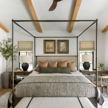
We designed the primary bedroom as a relaxation sanctuary – something we highly recommend to all parents. It features some of our favorite things: a cognac leather reading chair next to a fireplace, Scottish plaid fabrics, a vegetable dye rug, art from our favorite cities, and goofy portraits of the kids.
---
Project designed by Courtney Thomas Design in La Cañada. Serving Pasadena, Glendale, Monrovia, San Marino, Sierra Madre, South Pasadena, and Altadena.
For more about Courtney Thomas Design, see here: https://www.courtneythomasdesign.com/
To learn more about this project, see here:
https://www.courtneythomasdesign.com/portfolio/functional-ranch-house-design/

 Advance Design Studio, Ltd.
Jackie and Sean loved the Algonquin neighborhood they lived in with the peaceful neighborhood and the close proximity to work and school. What they didn’t love was how outdated their home had become. With a cramped kitchen and an unused dining room, they decided a remodel was the perfect solution to their problem. They would be able to continue to live in the area they loved, while at the same time they could have the dream home they envisioned.
After a thorough search, Jackie came across Advance Design Studio. She was impressed by all of the positive reviews she saw on the internet and saw herself identifying with all of the project stories she saw on the website. Once they met with designer Scott Christensen and owner Todd Jurs, they knew Advance Design was the right company to make their dreams a reality.
The project consisted of four main areas: the kitchen/dining/powder room, the laundry room, the master bathroom, and the kid’s bathroom. They wanted to expand the kitchen into the seldom used dining room and add a large island for hosting parties and family gatherings. They also wanted new hardwood flooring throughout the first level. The laundry room needed to be more functional, and all three bathrooms were in dire need of updating.
The closed off kitchen was opened up to create a sweeping space between the new eating area and the much larger kitchen. A handsome dry bar complete with a beverage refrigerator and lighted glass door cabinetry makes an elegant transition across from a peninsula area filled with storage. An additional decorative cabinet lighting up elegant dishware through the mullioned glass sits directly across from the drybar.
An expansive island was critical to the kitchen plans. Jackie, Sean and Scott worked closely together to create just the right details for their design. They wanted the island to be functional in addition to being the centerpiece of the room. Added storage for the kid’s school supplies was hidden behind cabinet doors so the children could do their schoolwork right at the island, and a microwave drawer glides open with the touch of a finger hidden inconspicuously within the island space. The easy to care for Cambria Britannica Quartz island top with its sweeping grey and white marble look perched atop hand-carved Craftsman corbels was absolutely what they were hoping for, blending both beauty and function perfectly.
Adding a nice contrast to the brightness of the quartz and the white cabinetry, Kodiak - Leather granite countertops were used to balance the light and dark tones of the space. Dura Supreme Classic White painted cabinets grace the perimeter, while Maple Poppy Seed stained cabinets with a beautiful soft grey woodgrain were used in the beverage center and island. The two tones compliment the large space balancing it out nicely creating interest and elegance with the simple Craftsman style full overlay doors.
A deep warm Barnwood White Oak flooring was added throughout the lower level. The new floor brings additional contrast to the bright kitchen and provides unity with the now open floorplan as it rolls in to the foyer and family room. Final details like the show-stopping lunar like duo light fixtures complete the space and intermix expertly with crisscross details of the glass door mullions, the island bar seating and even accessories in the space.
The small cluttered laundry room needed more space and more storage. With a busy family it seemed to overflow daily and did not have anywhere to hide the families “in and out stuff.” Scott designed the new space with a stackable washer and dryer and much more efficiently organized cabinetry. Doing laundry is now (almost!) a pleasure and keeping everyone’s “stuff” hidden, but readily accessible is now a snap.
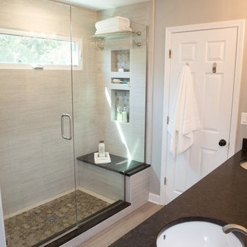
The master bath was not a place where the couple enjoyed spending time getting ready for their day. The tub almost never was used, so removing it made it possible to build an extra-large shower, replacing the small cramped cube of the previous shower they hated. Clean, horizontal lines softly draw your eye around the space with porcelain tile called Driftwood Sea spray. Full overlay cabinetry in a soft white vanity with double sinks makes getting ready for the day much more convenient for the busy couple.
Long floor planks made of porcelain tile mimic real hardwood floors in a soft grey to compliment the shower, but with the ease and care of a tile surface. Cambrian Black Granite counters with a matte finish and under mount porcelain sinks with handsome brushed chrome hardware complete the handsome space. A real bonus in any master bath; a custom built in storage nook was tucked in the corner of the space for linens and heavenly storage.
The kid’s bath was in sad shape because it was original to the house. To keep the budget in control, the tub which was in great condition was retained, but focus was on the new large brick style porcelain charcoal tile on the floor, crisp white new Craftsman style cabinetry with pretty furniture details on the corner base, a striking granite top with white under mount porcelain sinks and fresh hardware and faucets. Some beautiful soft grey wood mirrors to match mom and dads were custom sized and placed under new lighting, and 4 hooks were smartly arranged down the wall for kids’ towels.
This couple was determined not to move, and made their house their dream home. Not only does their home function greatly now, but Jackie says, “When the neighbors come to visit, they’re asking if they can “steal” the design”! The added functionality, elegance, and open floor plan were exactly what this family needed in order to stay.
Advance Design Studio, Joe Nowak
 Breathe Design Studio
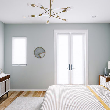
Completed in 2015, this project incorporates a Scandinavian vibe to enhance the modern architecture and farmhouse details. The vision was to create a balanced and consistent design to reflect clean lines and subtle rustic details, which creates a calm sanctuary. The whole home is not based on a design aesthetic, but rather how someone wants to feel in a space, specifically the feeling of being cozy, calm, and clean. This home is an interpretation of modern design without focusing on one specific genre; it boasts a midcentury master bedroom, stark and minimal bathrooms, an office that doubles as a music den, and modern open concept on the first floor. It’s the winner of the 2017 design award from the Austin Chapter of the American Institute of Architects and has been on the Tribeza Home Tour; in addition to being published in numerous magazines such as on the cover of Austin Home as well as Dwell Magazine, the cover of Seasonal Living Magazine, Tribeza, Rue Daily, HGTV, Hunker Home, and other international publications.
Featured on Dwell!
https://www.dwell.com/article/sustainability-is-the-centerpiece-of-this-new-austin-development-071e1a55
 Adrienne DeRosa
Photo: Adrienne DeRosa © 2015 Houzz
"We joke that our style is the Bryan and Catherine Mashup because it really is a compromise of both of our styles,' explains Catherine. "If Bryan were to do a house and I were to do a house, they would likely come out different."
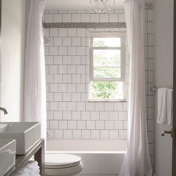
Gutted and completely redesigned, the bathroom is a perfect compromise between Bryan and Catherine's seemingly opposite design preferences. "I would say my style is more eclectic," Catherine explains. "I like curvy lines whereas Bryan likes things straight and sleek and clean."
By keeping the color scheme consistent throughout the space, the elements work together seamlessly. Plain square tiles exude a vintage vibe when offset into a subway pattern and set against dark grout, while stainless penny tiles and open storage lend an industrial quality to the room. The addition of a chandelier and flowy shower curtains soften the space, exemplifying the definition of their style.
26