
Search results for "Maximized" in Home Design Ideas
 Nina Farmer Interiors
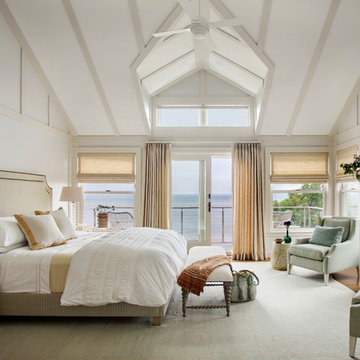
Beach style master beige floor and medium tone wood floor bedroom photo in Boston with white walls
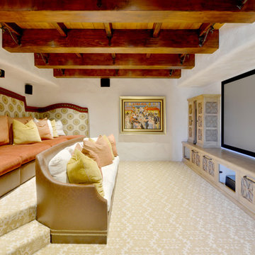
Inspiration for a large mediterranean enclosed carpeted and multicolored floor home theater remodel in San Diego with white walls and a projector screen
 Storie Collective
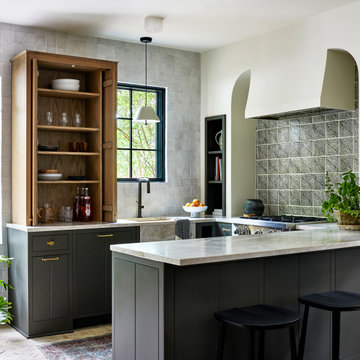
Boho meets Portuguese design in a stunning transformation of this Van Ness tudor in the upper northwest neighborhood of Washington, DC. Our team’s primary objectives were to fill space with natural light, period architectural details, and cohesive selections throughout the main level and primary suite. At the entry, new archways are created to maximize light and flow throughout the main level while ensuring the space feels intimate. A new kitchen layout along with a peninsula grounds the chef’s kitchen while securing its part in the everyday living space. Well-appointed dining and living rooms infuse dimension and texture into the home, and a pop of personality in the powder room round out the main level. Strong raw wood elements, rich tones, hand-formed elements, and contemporary nods make an appearance throughout the newly renovated main level and primary suite of the home.
Find the right local pro for your project
 Thomas Roszak Architecture, LLC
Photo credit: Scott McDonald @ Hedrich Blessing
7RR-Ecohome:
The design objective was to build a house for a couple recently married who both had kids from previous marriages. How to bridge two families together?
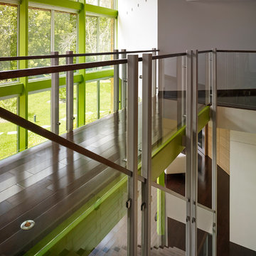
The design looks forward in terms of how people live today. The home is an experiment in transparency and solid form; removing borders and edges from outside to inside the house, and to really depict “flowing and endless space”. The house floor plan is derived by pushing and pulling the house’s form to maximize the backyard and minimize the public front yard while welcoming the sun in key rooms by rotating the house 45-degrees to true north. The angular form of the house is a result of the family’s program, the zoning rules, the lot’s attributes, and the sun’s path. We wanted to construct a house that is smart and efficient in terms of construction and energy, both in terms of the building and the user. We could tell a story of how the house is built in terms of the constructability, structure and enclosure, with a nod to Japanese wood construction in the method in which the siding is installed and the exposed interior beams are placed in the double height space. We engineered the house to be smart which not only looks modern but acts modern; every aspect of user control is simplified to a digital touch button, whether lights, shades, blinds, HVAC, communication, audio, video, or security. We developed a planning module based on a 6-foot square room size and a 6-foot wide connector called an interstitial space for hallways, bathrooms, stairs and mechanical, which keeps the rooms pure and uncluttered. The house is 6,200 SF of livable space, plus garage and basement gallery for a total of 9,200 SF. A large formal foyer celebrates the entry and opens up to the living, dining, kitchen and family rooms all focused on the rear garden. The east side of the second floor is the Master wing and a center bridge connects it to the kid’s wing on the west. Second floor terraces and sunscreens provide views and shade in this suburban setting. The playful mathematical grid of the house in the x, y and z axis also extends into the layout of the trees and hard-scapes, all centered on a suburban one-acre lot.
Many green attributes were designed into the home; Ipe wood sunscreens and window shades block out unwanted solar gain in summer, but allow winter sun in. Patio door and operable windows provide ample opportunity for natural ventilation throughout the open floor plan. Minimal windows on east and west sides to reduce heat loss in winter and unwanted gains in summer. Open floor plan and large window expanse reduces lighting demands and maximizes available daylight. Skylights provide natural light to the basement rooms. Durable, low-maintenance exterior materials include stone, ipe wood siding and decking, and concrete roof pavers. Design is based on a 2' planning grid to minimize construction waste. Basement foundation walls and slab are highly insulated. FSC-certified walnut wood flooring was used. Light colored concrete roof pavers to reduce cooling loads by as much as 15%. 2x6 framing allows for more insulation and energy savings. Super efficient windows have low-E argon gas filled units, and thermally insulated aluminum frames. Permeable brick and stone pavers reduce the site’s storm-water runoff. Countertops use recycled composite materials. Energy-Star rated furnaces and smart thermostats are located throughout the house to minimize duct runs and avoid energy loss. Energy-Star rated boiler that heats up both radiant floors and domestic hot water. Low-flow toilets and plumbing fixtures are used to conserve water usage. No VOC finish options and direct venting fireplaces maintain a high interior air quality. Smart home system controls lighting, HVAC, and shades to better manage energy use. Plumbing runs through interior walls reducing possibilities of heat loss and freezing problems. A large food pantry was placed next to kitchen to reduce trips to the grocery store. Home office reduces need for automobile transit and associated CO2 footprint. Plan allows for aging in place, with guest suite than can become the master suite, with no need to move as family members mature.

 Maxim Kashin
Photography: Dmitry Chebanenko
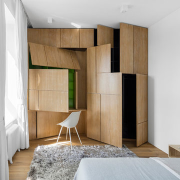
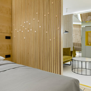
Inspiration for a contemporary master medium tone wood floor and brown floor bedroom remodel in Moscow with white walls
Inspiration for a contemporary master medium tone wood floor and brown floor bedroom remodel in Moscow with white walls


 Maxim Kashin
Photography: Dmitry Chebanenko
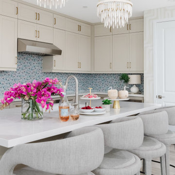
Example of a trendy master white floor bedroom design in Moscow
Example of a trendy master white floor bedroom design in Moscow
 Décor Aid
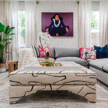
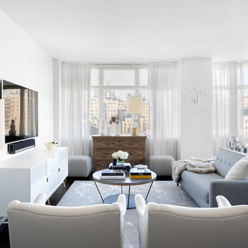
Sheer curtains maximize the light in this airy living room.
Living room - transitional dark wood floor living room idea in New York with white walls and a wall-mounted tv
Living room - transitional dark wood floor living room idea in New York with white walls and a wall-mounted tv
 JR INTERIOR DESIGNER
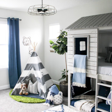
Example of a transitional boy carpeted and gray floor kids' bedroom design in New York with white walls
 PLANS
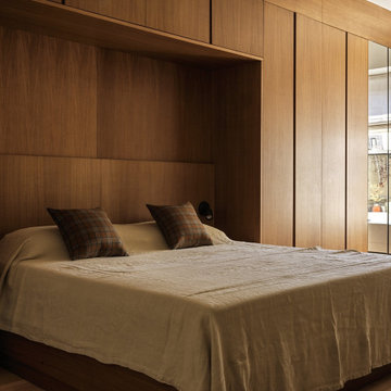
PLANSBedroom - industrial master medium tone wood floor and brown floor bedroom idea in New York with white walls
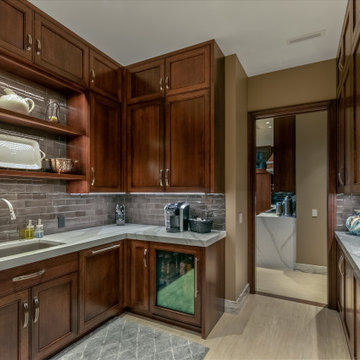
Example of a large trendy u-shaped porcelain tile and beige floor kitchen pantry design in Omaha with an undermount sink, shaker cabinets, dark wood cabinets, quartz countertops, gray backsplash, ceramic backsplash, paneled appliances, no island and white countertops

 Avalon Architectural, Inc.
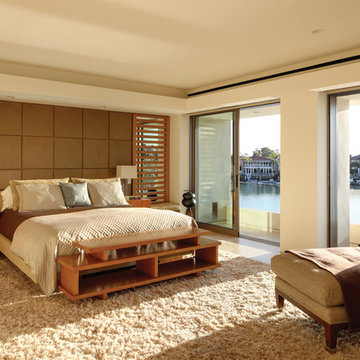
This master bedroom suite maximizes harbor views.
Example of a large trendy master brown floor and travertine floor bedroom design in Orange County with black walls and no fireplace
Example of a large trendy master brown floor and travertine floor bedroom design in Orange County with black walls and no fireplace
 JRP Design & Remodel
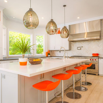
White herringbone backsplash adds a pop of texture to this modern kitchen redesign. Sleek Caesarstone countertops and gleaming stainless steel hood and appliances are as beautiful as they are functional. Storage is maximized with floor-to-ceiling DeWils shaker cabinets and a well-designed center island that seats five. The use of neutrals in the monochromatic color palette perfects the glamorous look of this unique kitchen.
Photographer Tom Clary
 Morrison Interiors
Photo by: Rod Foster
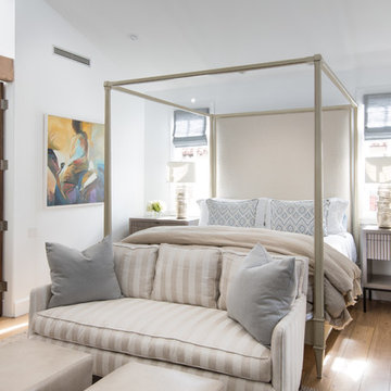
Inspiration for a large transitional medium tone wood floor bedroom remodel in Orange County with white walls and no fireplace
Inspiration for a large transitional medium tone wood floor bedroom remodel in Orange County with white walls and no fireplace
 TVL Creative Ltd.
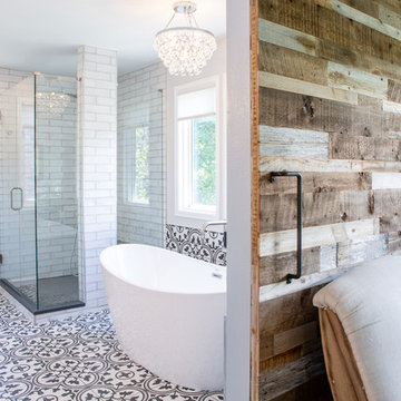
This project is an incredible transformation and the perfect example of successful style mixing! This client, and now a good friend of TVL (as they all become), is a wonderfully eclectic and adventurous one with immense interest in texture play, pops of color, and unique applications. Our scope in this home included a full kitchen renovation, main level powder room renovation, and a master bathroom overhaul. Taking just over a year to complete from the first design phases to final photos, this project was so insanely fun and packs an amazing amount of fun details and lively surprises. The original kitchen was large and fairly functional. However, the cabinetry was dated, the lighting was inefficient and frankly ugly, and the space was lacking personality in general. Our client desired maximized storage and a more personalized aesthetic. The existing cabinets were short and left the nice height of the space under-utilized. We integrated new gray shaker cabinets from Waypoint Living Spaces and ran them to the ceiling to really exaggerate the height of the space and to maximize usable storage as much as possible. The upper cabinets are glass and lit from within, offering display space or functional storage as the client needs. The central feature of this space is the large cobalt blue range from Viking as well as the custom made reclaimed wood range hood floating above. The backsplash along this entire wall is vertical slab of marble look quartz from Pental Surfaces. This matches the expanse of the same countertop that wraps the room. Flanking the range, we installed cobalt blue lantern penny tile from Merola Tile for a playful texture that adds visual interest and class to the entire room. We upgraded the lighting in the ceiling, under the cabinets, and within cabinets--we also installed accent sconces over each window on the sink wall to create cozy and functional illumination. The deep, textured front Whitehaven apron sink is a dramatic nod to the farmhouse aesthetic from KOHLER, and it's paired with the bold and industrial inspired Tournant faucet, also from Kohler. We finalized this space with other gorgeous appliances, a super sexy dining table and chair set from Room & Board, the Paxton dining light from Pottery Barn and a small bar area and pantry on the far end of the space. In the small powder room on the main level, we converted a drab builder-grade space into a super cute, rustic-inspired washroom. We utilized the Bonner vanity from Signature Hardware and paired this with the cute Ashfield faucet from Pfister. The most unique statements in this room include the water-drop light over the vanity from Shades Of Light, the copper-look porcelain floor tile from Pental Surfaces and the gorgeous Cashmere colored Tresham toilet from Kohler. Up in the master bathroom, elegance abounds. Using the same footprint, we upgraded everything in this space to reflect the client's desire for a more bright, patterned and pretty space. Starting at the entry, we installed a custom reclaimed plank barn door with bold large format hardware from Rustica Hardware. In the bathroom, the custom slate blue vanity from Tharp Cabinet Company is an eye catching statement piece. This is paired with gorgeous hardware from Amerock, vessel sinks from Kohler, and Purist faucets also from Kohler. We replaced the old built-in bathtub with a new freestanding soaker from Signature Hardware. The floor tile is a bold, graphic porcelain tile with a classic color scheme. The shower was upgraded with new tile and fixtures throughout: new clear glass, gorgeous distressed subway tile from the Castle line from TileBar, and a sophisticated shower panel from Vigo. We finalized the space with a small crystal chandelier and soft gray paint. This project is a stunning conversion and we are so thrilled that our client can enjoy these personalized spaces for years to come. Special thanks to the amazing Ian Burks of Burks Wurks Construction for bringing this to life!
 J.THOM Residential Design & Cabinetry
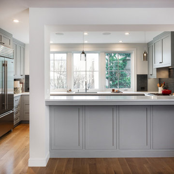
Our goal was to modernize an outdated spec kitchen by increasing the overall storage capacity and re-configuring the work-space to accommodate more use while increasing the natural light into the kitchen.
We collaborated with the Owners Architect and determined it was necessary to partially remove the wall between the kitchen and dining room. Two small windows along the rear wall were replaced with a new over-sized window bringing in massive amounts of natural light. We removed a breakfast table that previously crowded the kitchen circulation and replaced it with a breakfast counter facing the kitchen and new window.
The semi-open kitchen, delineated by the breakfast counter created a visual buffer for a busy kitchen and maximized the views and natural from the new window. By organizing every cabinet, we maximized the storage capacity and further increased the ergonomics of the kitchen using drawers for dishes and other items.
Jonathan Kolbe Photographer
124