
Search results for "Maximizing space" in Home Design Ideas
 Simply Home Decorating
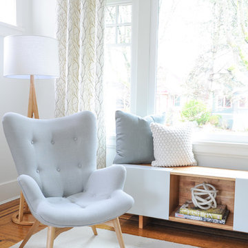
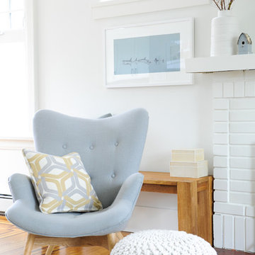
Our goal on this project was to make the main floor of this lovely early 20th century home in a popular Vancouver neighborhood work for a growing family of four. We opened up the space, both literally and aesthetically, with windows and skylights, an efficient layout, some carefully selected furniture pieces and a soft colour palette that lends a light and playful feel to the space. Our clients can hardly believe that their once small, dark, uncomfortable main floor has become a bright, functional and beautiful space where they can now comfortably host friends and hang out as a family. Interior Design by Lori Steeves of Simply Home Decorating Inc. Photos by Tracey Ayton Photography.
 Toronto Interior Design Group
Gillian Jackson
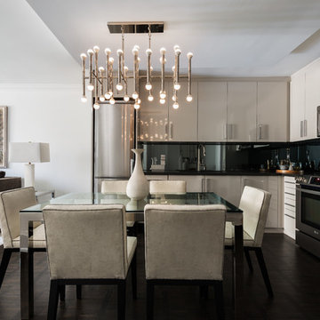
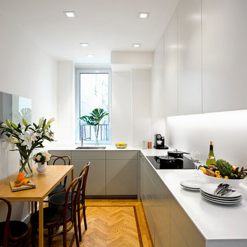
Inspiration for a small contemporary l-shaped dark wood floor and brown floor open concept kitchen remodel in Toronto with an undermount sink, flat-panel cabinets, gray cabinets, quartz countertops, stainless steel appliances, no island and black backsplash
Inspiration for a small contemporary l-shaped dark wood floor and brown floor open concept kitchen remodel in Toronto with an undermount sink, flat-panel cabinets, gray cabinets, quartz countertops, stainless steel appliances, no island and black backsplash
 Hingeworks
Back When Photography
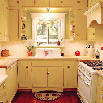
Small farmhouse u-shaped dark wood floor enclosed kitchen photo in Salt Lake City with yellow cabinets, wood countertops, white backsplash, white appliances, no island, a drop-in sink and shaker cabinets
Small farmhouse u-shaped dark wood floor enclosed kitchen photo in Salt Lake City with yellow cabinets, wood countertops, white backsplash, white appliances, no island, a drop-in sink and shaker cabinets
Find the right local pro for your project


 TKS Design Group
Download our free ebook, Creating the Ideal Kitchen. DOWNLOAD NOW
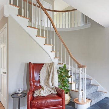
Lakefront property in the northwest suburbs of Chicago is hard to come by, so when we were hired by this young family with exactly that, we were immediately inspired by not just the unusually large footprint of this 1950’s colonial revival but also the lovely views of the manmade lake it was sited on. The large 5-bedroom home was solidly stuck in the 1980’s, but we saw tons of potential. We started out by updating the existing staircase with a fresh coat of paint and adding new herringbone slate to the entry hall.
The powder room off the entryway also got a refresh - new flooring, new cabinets and fixtures. We ran the new slate right through into this space for some consistency. A fun wallpaper and shiplap trim add a welcoming feel and set the tone for the home.
Next, we tackled the kitchen. Located away from the rest of the first floor, the kitchen felt a little isolated, so we immediately began planning for how to better connect it to the rest of the first floor. We landed on removing the wall between the kitchen and dining room and designed a modified galley style space with separate cooking and clean up zones. The cooking zone consists of the refrigerator, prep sink and cooktop, along with a nice long run of prep space at the island. The cleanup side of the kitchen consists of the main sink and dishwasher. Both areas are situated so that the user can view the lake during prep work and cleanup!
One of the home’s main puzzles was how to incorporate the mudroom and area in front of the patio doors at the back of the house. We already had a breakfast table area, so the space by the patio doors was a bit of a no man’s land. We decided to separate the kitchen proper from what became the new mudroom with a large set of barn doors. That way you can quickly hide any mudroom messes but have easy access to the light coming in through the patio doors as well as the outdoor grilling station. We also love the impact the barn doors add to the overall space.
The homeowners’ first words to us were “it’s time to ditch the brown,” so we did! We chose a lovely blue pallet that reflects the home’s location on the lake which is also vibrant yet easy on the eye. Countertops are white quartz, and the natural oak floor works well with the other honey accents. The breakfast table was given a refresh with new chairs, chandelier and window treatments that frame the gorgeous views of the lake out the back.
We coordinated the slate mudroom flooring with that used in the home’s main entrance for a consistent feel. The storage area consists of open and closed storage to allow for some clutter control as needed.
Next on our “to do” list was revamping the dated brown bar area in the neighboring dining room. We eliminated the clutter by adding some closed cabinets and did some easy updates to help the space feel more current. One snag we ran into here was the discovery of a beam above the existing open shelving that had to be modified with a smaller structural beam to allow for our new design to work. This was an unexpected surprise, but in the end we think it was well worth it!
We kept the colors here a bit more muted to blend with the homeowner’s existing furnishings. Open shelving and polished nickel hardware add some simple detail to the new entertainment zone which also looks out onto the lake!
Next we tackled the upstairs starting with the homeowner’s son’s bath. The bath originally had both a tub shower and a separate shower, so we decided to swap out the shower for a new laundry area. This freed up some space downstairs in what used to be the mudroom/laundry room and is much more convenient for daily laundry needs.
We continued the blue palette here with navy cabinetry and the navy tile in the shower. Porcelain floor tile and chrome fixtures keep maintenance to a minimum while matte black mirrors and lighting add some depth the design. A low maintenance runner adds some warmth underfoot and ties the whole space together.
We added a pocket door to the bathroom to minimize interference with the door swings. The left door of the laundry closet is on a 180 degree hinge to allow for easy full access to the machines. Next we tackled the master bath which is an en suite arrangement. The original was typical of the 1980’s with the vanity outside of the bathroom, situated near the master closet. And the brown theme continued here with multiple shades of brown.
Our first move was to segment off the bath and the closet from the master bedroom. We created a short hall from the bedroom to the bathroom with his and hers walk-in closets on the left and right as well as a separate toilet closet outside of the main bathroom for privacy and flexibility.
The original bathroom had a giant soaking tub with steps (dangerous!) as well as a small shower that did not work well for our homeowner who is 6’3”. With other bathtubs in the home, they decided to eliminate the tub and create an oversized shower which takes up the space where the old tub was located. The double vanity is on the opposite wall and a bench is located under the window for morning conversations and a place to set a couple of towels.
The pallet in here is light and airy with a mix of blond wood, creamy porcelain and marble tile, and brass accents. A simple roman shade adds some texture and it’s top-down mechanism allows for light and privacy.
This large whole house remodel gave our homeowners not only the ability to maximize the potential of their home but also created a lovely new frame from which to view their fabulous lake views.
Designed by: Susan Klimala, CKD, CBD
Photography by: Michael Kaskel
For more information on kitchen and bath design ideas go to: www.kitchenstudio-ge.com
 Fresh Start Interiors
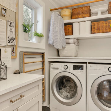
Antique Coastal farmhouse laundry room with floating shelves, quartz counters, wall mounted drying rack and custom storage cabinet. Rustic casual style.


 Kimberlee Marie Interiors
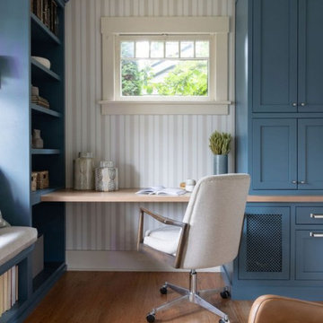
When our client came to us, she was stumped with how to turn her small living room into a cozy, useable family room. The living room and dining room blended together in a long and skinny open concept floor plan. It was difficult for our client to find furniture that fit the space well. It also left an awkward space between the living and dining areas that she didn’t know what to do with. She also needed help reimagining her office, which is situated right off the entry. She needed an eye-catching yet functional space to work from home.
In the living room, we reimagined the fireplace surround and added built-ins so she and her family could store their large record collection, games, and books. We did a custom sofa to ensure it fits the space and maximized the seating. We added texture and pattern through accessories and balanced the sofa with two warm leather chairs. We updated the dining room furniture and added a little seating area to help connect the spaces. Now there is a permanent home for their record player and a cozy spot to curl up in when listening to music.
For the office, we decided to add a pop of color, so it contrasted well with the neutral living space. The office also needed built-ins for our client’s large cookbook collection and a desk where she and her sons could rotate between work, homework, and computer games. We decided to add a bench seat to maximize space below the window and a lounge chair for additional seating.
 Curated Nest
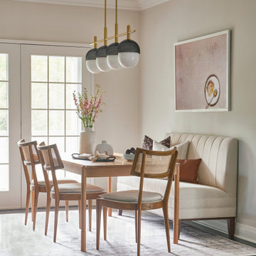
This eat in kitchen area / breakfast nook is designed to maximize space and traffic flow to the porch via the french doors. A dining banquette offers cozyness and rattan and oak chairs bring in warmth. The lighting brings in an unexpected element with the graphite shading over the globes. A custom white oak table is perfectly sized for the space and a performance rug sits below for easy maintenance.
 Lee Edwards - residential design
Situated on the west slope of Mt. Baker Ridge, this remodel takes a contemporary view on traditional elements to maximize space, lightness and spectacular views of downtown Seattle and Puget Sound. We were approached by Vertical Construction Group to help a client bring their 1906 craftsman into the 21st century. The original home had many redeeming qualities that were unfortunately compromised by an early 2000’s renovation. This left the new homeowners with awkward and unusable spaces. After studying numerous space plans and roofline modifications, we were able to create quality interior and exterior spaces that reflected our client’s needs and design sensibilities. The resulting master suite, living space, roof deck(s) and re-invented kitchen are great examples of a successful collaboration between homeowner and design and build teams.

 Think Outside Gardens
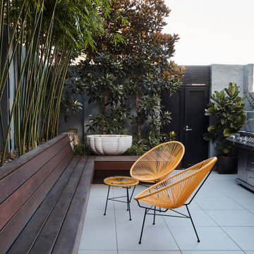
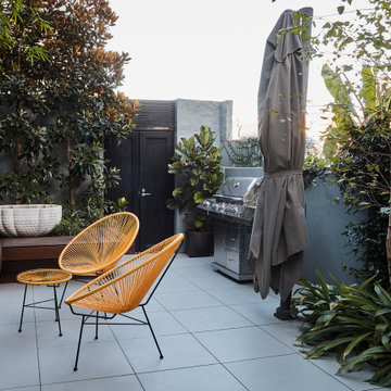
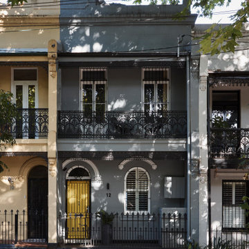
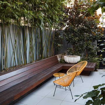
he brief for this Paddington terrace garden was to update an existing rundown courtyard in line with the modern interiors of the house. The design aimed to maintain neat clean lines, use a formal but interesting palette of material, maximise space for entertaining, retain access to the rear lane and deal with a sloping site.
Built in seating with a backrest allows for the change in levels – incorporating retaining and pushed up against the side boundary maximises space for entertaining. A delicate yet contrasting plant palette and water feature selection was chosen to match the house interiors and simple light grey large format tiles let these elements shine. The wrap around bench seat is semi floating to allow for a shadow line and the illusion of more space. It allows for casual seating – a pop of yellow in the Acapulco chairs is a welcome addition against the soft grey facade of the house.
A cluster of white pots on the timber porch adds to the composition and Bamboo and Magnolia Little Gems provide a green backdrop and screen of the neighbouring properties. A fixed outdoor umbrella offers shade over the seating areas.
The design and look of the garden compliments the architecture and interiors of the residence. It is a design that is sophisticated in its simplicity, with interesting materials and plants but also with functional space that perfectly suits the needs and entertaining requirements of its owners.
Sponsored
Columbus, OH

Structural Remodeling
Franklin County's Heavy Timber Specialists | Best of Houzz 2020!
 Think Outside Gardens
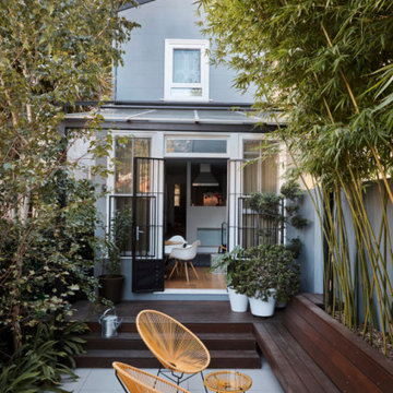
he brief for this Paddington terrace garden was to update an existing rundown courtyard in line with the modern interiors of the house. The design aimed to maintain neat clean lines, use a formal but interesting palette of material, maximise space for entertaining, retain access to the rear lane and deal with a sloping site.
Built in seating with a backrest allows for the change in levels – incorporating retaining and pushed up against the side boundary maximises space for entertaining. A delicate yet contrasting plant palette and water feature selection was chosen to match the house interiors and simple light grey large format tiles let these elements shine. The wrap around bench seat is semi floating to allow for a shadow line and the illusion of more space. It allows for casual seating – a pop of yellow in the Acapulco chairs is a welcome addition against the soft grey facade of the house.
A cluster of white pots on the timber porch adds to the composition and Bamboo and Magnolia Little Gems provide a green backdrop and screen of the neighbouring properties. A fixed outdoor umbrella offers shade over the seating areas.
The design and look of the garden compliments the architecture and interiors of the residence. It is a design that is sophisticated in its simplicity, with interesting materials and plants but also with functional space that perfectly suits the needs and entertaining requirements of its owners.
 Think Outside Gardens
he brief for this Paddington terrace garden was to update an existing rundown courtyard in line with the modern interiors of the house. The design aimed to maintain neat clean lines, use a formal but interesting palette of material, maximise space for entertaining, retain access to the rear lane and deal with a sloping site.
Built in seating with a backrest allows for the change in levels – incorporating retaining and pushed up against the side boundary maximises space for entertaining. A delicate yet contrasting plant palette and water feature selection was chosen to match the house interiors and simple light grey large format tiles let these elements shine. The wrap around bench seat is semi floating to allow for a shadow line and the illusion of more space. It allows for casual seating – a pop of yellow in the Acapulco chairs is a welcome addition against the soft grey facade of the house.
A cluster of white pots on the timber porch adds to the composition and Bamboo and Magnolia Little Gems provide a green backdrop and screen of the neighbouring properties. A fixed outdoor umbrella offers shade over the seating areas.
The design and look of the garden compliments the architecture and interiors of the residence. It is a design that is sophisticated in its simplicity, with interesting materials and plants but also with functional space that perfectly suits the needs and entertaining requirements of its owners.
 Think Outside Gardens
he brief for this Paddington terrace garden was to update an existing rundown courtyard in line with the modern interiors of the house. The design aimed to maintain neat clean lines, use a formal but interesting palette of material, maximise space for entertaining, retain access to the rear lane and deal with a sloping site.
Built in seating with a backrest allows for the change in levels – incorporating retaining and pushed up against the side boundary maximises space for entertaining. A delicate yet contrasting plant palette and water feature selection was chosen to match the house interiors and simple light grey large format tiles let these elements shine. The wrap around bench seat is semi floating to allow for a shadow line and the illusion of more space. It allows for casual seating – a pop of yellow in the Acapulco chairs is a welcome addition against the soft grey facade of the house.
A cluster of white pots on the timber porch adds to the composition and Bamboo and Magnolia Little Gems provide a green backdrop and screen of the neighbouring properties. A fixed outdoor umbrella offers shade over the seating areas.
The design and look of the garden compliments the architecture and interiors of the residence. It is a design that is sophisticated in its simplicity, with interesting materials and plants but also with functional space that perfectly suits the needs and entertaining requirements of its owners.
 Think Outside Gardens
he brief for this Paddington terrace garden was to update an existing rundown courtyard in line with the modern interiors of the house. The design aimed to maintain neat clean lines, use a formal but interesting palette of material, maximise space for entertaining, retain access to the rear lane and deal with a sloping site.
Built in seating with a backrest allows for the change in levels – incorporating retaining and pushed up against the side boundary maximises space for entertaining. A delicate yet contrasting plant palette and water feature selection was chosen to match the house interiors and simple light grey large format tiles let these elements shine. The wrap around bench seat is semi floating to allow for a shadow line and the illusion of more space. It allows for casual seating – a pop of yellow in the Acapulco chairs is a welcome addition against the soft grey facade of the house.
A cluster of white pots on the timber porch adds to the composition and Bamboo and Magnolia Little Gems provide a green backdrop and screen of the neighbouring properties. A fixed outdoor umbrella offers shade over the seating areas.
The design and look of the garden compliments the architecture and interiors of the residence. It is a design that is sophisticated in its simplicity, with interesting materials and plants but also with functional space that perfectly suits the needs and entertaining requirements of its owners.



 Simply Home Decorating
Our goal on this project was to make the main floor of this lovely early 20th century home in a popular Vancouver neighborhood work for a growing family of four. We opened up the space, both literally and aesthetically, with windows and skylights, an efficient layout, some carefully selected furniture pieces and a soft colour palette that lends a light and playful feel to the space. Our clients can hardly believe that their once small, dark, uncomfortable main floor has become a bright, functional and beautiful space where they can now comfortably host friends and hang out as a family. Interior Design by Lori Steeves of Simply Home Decorating Inc. Photos by Tracey Ayton Photography.
38