
Search results for "Maximizing space" in Home Design Ideas
 TKS Design Group
Free ebook, Creating the Ideal Kitchen. DOWNLOAD NOW
Our clients had been in their home since the early 1980’s and decided it was time for some updates. We took on the kitchen, two bathrooms and a powder room.
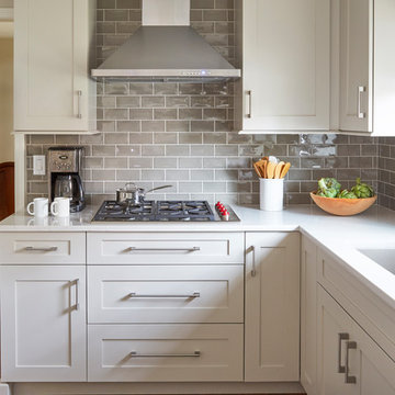
The layout in the kitchen was functional for them, so we kept that pretty much as is. Our client wanted a contemporary-leaning transitional look — nice clean lines with a gray and white palette. Light gray cabinets with a slightly darker gray subway tile keep the northern exposure light and airy. They also purchased some new furniture for their breakfast room and adjoining family room, so the whole space looks completely styled and new. The light fixtures are staggered and give a nice rhythm to the otherwise serene feel.
The homeowners were not 100% sold on the flooring choice for little powder room off the kitchen when I first showed it, but now they think it is one of the most interesting features of the design. I always try to “push” my clients a little bit because that’s when things can get really fun and this is what you are paying for after all, ideas that you may not come up with on your own.
We also worked on the two upstairs bathrooms. We started first on the hall bath which was basically just in need of a face lift. The floor is porcelain tile made to look like carrera marble. The vanity is white Shaker doors fitted with a white quartz top. We re-glazed the cast iron tub.
The master bath was a tub to shower conversion. We used a wood look porcelain plank on the main floor along with a Kohler Tailored vanity. The custom shower has a barn door shower door, and vinyl wallpaper in the sink area gives a rich textured look to the space. Overall, it’s a pretty sophisticated look for its smaller fooprint.
Designed by: Susan Klimala, CKD, CBD
Photography by: Michael Alan Kaskel
For more information on kitchen and bath design ideas go to: www.kitchenstudio-ge.com
 TVL Creative Ltd.
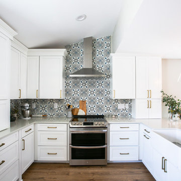
This kitchen took a tired, 80’s builder kitchen and revamped it into a personalized gathering space for our wonderful client. The existing space was split up by the dated configuration of eat-in kitchen table area to one side and cramped workspace on the other. It didn’t just under-serve our client’s needs; it flat out discouraged them from using the space. Our client desired an open kitchen with a central gathering space where family and friends could connect. To open things up, we removed the half wall separating the kitchen from the dining room and the wall that blocked sight lines to the family room and created a narrow hallway to the kitchen. The old oak cabinets weren't maximizing storage and were dated and dark. We used Waypoint Living Spaces cabinets in linen white to brighten up the room. On the east wall, we created a hutch-like stack that features an appliance garage that keeps often used countertop appliance on hand but out of sight. The hutch also acts as a transition from the cooking zone to the coffee and wine area. We eliminated the north window that looked onto the entry walkway and activated this wall as storage with refrigerator enclosure and pantry. We opted to leave the east window as-is and incorporated it into the new kitchen layout by creating a window well for growing plants and herbs. The countertops are Pental Quartz in Carrara. The sleek cabinet hardware is from our friends at Amerock in a gorgeous satin champagne bronze. One of the most striking features in the space is the pattern encaustic tile from Tile Shop. The pop of blue in the backsplash adds personality and contrast to the champagne accents. The reclaimed wood cladding surrounding the large east-facing window introduces a quintessential Colorado vibe, and the natural texture balances the crisp white cabinetry and geometric patterned tile. Minimalist modern lighting fixtures from Mitzi by Hudson Valley Lighting provide task lighting over the sink and at the wine/ coffee station. The visual lightness of the sink pendants maintains the openness and visual connection between the kitchen and dining room. Together the elements make for a sophisticated yet casual vibe-- a comfortable chic kitchen. We love the way this space turned out and are so happy that our clients now have such a bright and welcoming gathering space as the heart of their home!
 Drury Design
THE SETUP
Client Background: Our clients, a couple who have transitioned into the empty nest phase, have cherished their home for over three decades without undergoing any significant renovations. With a newfound desire to adapt their living space to better suit their current lifestyle, they’ve embarked on a journey to reimagine their kitchen — the heart of their home. Their aspiration is to cultivate a serene, neutral-toned sanctuary on the first floor that seamlessly merges with their family room, ensuring a harmonious and inviting environment.
Design Inspiration: The renovation is inspired by the couple’s penchant for soft, calming neutrals, using their cherished family room and the kitchen’s existing tile flooring as the cornerstone for the color scheme. This approach aims to foster a sense of warmth and tranquility throughout.
Design Objectives:
Harmonize the kitchen with the family room by adopting a soothing, neutral color scheme, ensuring a seamless flow across the first floor.
Enhance kitchen functionality with thoughtfully designed cabinetry, providing a designated place for every item and maximizing storage efficiency.
Cultivate an inviting and comfortable atmosphere that reflects the homeowners’ desire for a calm and relaxing space.
Design Challenges:
The homeowners wish to retain the existing kitchen tile flooring and integrate it into a refreshed, modern design.
Accommodating a dining area spacious enough for family visits without compromising the kitchen’s open feel or functional layout.
Despite liking the current placement of plumbing and appliances, the homeowners aspire for a more open floor plan to facilitate better movement and interaction.
The need to amplify natural light in the kitchen, especially around the sink area, where existing lighting is insufficient.
Preserving the half-wall between the kitchen and family room, a feature the homeowners want to keep, while ensuring it complements the new design.
THE RENEWED SPACE
Design Solutions:
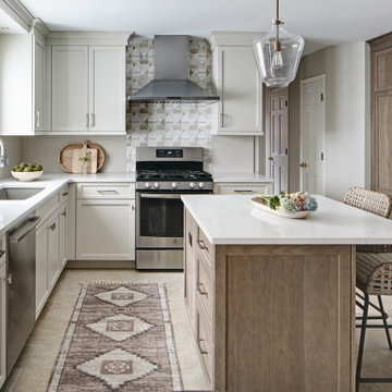
By choosing a neutral color palette that complements the existing tile, the design unifies the kitchen with the adjacent spaces. The tile’s grout was cleaned and restored, enhancing the floor’s appearance and integrating it seamlessly with the new kitchen aesthetic.
The inclusion of a larger island with seating for two, alongside maintaining a substantial dining table, was achieved by optimizing the spatial layout. This allowed for a sociable yet functional kitchen, accommodating large family gatherings without feeling crowded.
Minor adjustments to the kitchen’s layout maintained the preferred locations for plumbing and appliances while introducing an ‘open’ design concept. Strategic modifications, such as angling the pantry wall, improved the flow and accessibility within the space.
Replacing the garden window with a broader, standard window significantly increased natural light, transforming the sink area into a bright, welcoming space with enhanced views of the outdoors.
The decision to keep the half-wall was ingeniously leveraged to define the dining area while maintaining an open connection to the family room. This feature not only serves as a visual separator but also ties the two spaces together through the shared color scheme and design elements.
The homeowners are thrilled with their newly remodeled kitchen, which has become a hub of warmth and hospitality. Hosting a wedding shower and a birthday party, they have shared their renewed space with friends and family, who have been equally enamored. This remodel has not only met their functional and aesthetic desires but has also enriched their home with a fresh sense of serenity and joy.
The upstairs part of the home is shaping up nicely. Here’s their newly remodeled primary bathroom.
Find the right local pro for your project
 Gather and Spruce Design Remodel
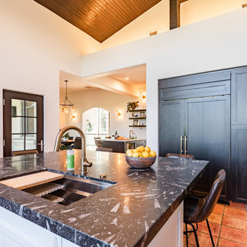
We wanted to maximize space and functional storage for this family of 5. We accomplished this by expanding the island to make it a more functional space for their family. We also created a feature wall for Wolf double ovens, Sub-Zero refrigeration, and a ton of pantry space! We opened the kitchen to the dining room to create a more unified space. The homeowners had an unusable desk area that we eliminated and maximized the space by adding a wet bar complete with wine refrigerator and built-in ice maker. The pantry wall behind the wet bar maximizes storage because, can you REALLY ever have too much storage? Swipe to see before.
 Studio McGee
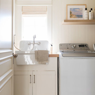
Inspiration for a small coastal galley ceramic tile and multicolored floor dedicated laundry room remodel in Salt Lake City
 Simply Home Decorating
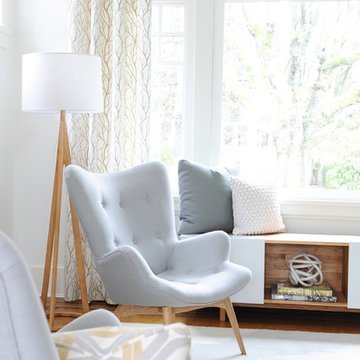
Our goal on this project was to make the main floor of this lovely early 20th century home in a popular Vancouver neighborhood work for a growing family of four. We opened up the space, both literally and aesthetically, with windows and skylights, an efficient layout, some carefully selected furniture pieces and a soft colour palette that lends a light and playful feel to the space. Our clients can hardly believe that their once small, dark, uncomfortable main floor has become a bright, functional and beautiful space where they can now comfortably host friends and hang out as a family. Interior Design by Lori Steeves of Simply Home Decorating Inc. Photos by Tracey Ayton Photography.
 Simply Home Decorating
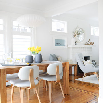
Our goal on this project was to make the main floor of this lovely early 20th century home in a popular Vancouver neighborhood work for a growing family of four. We opened up the space, both literally and aesthetically, with windows and skylights, an efficient layout, some carefully selected furniture pieces and a soft colour palette that lends a light and playful feel to the space. Our clients can hardly believe that their once small, dark, uncomfortable main floor has become a bright, functional and beautiful space where they can now comfortably host friends and hang out as a family. Interior Design by Lori Steeves of Simply Home Decorating Inc. Photos by Tracey Ayton Photography.

Sponsored
Columbus, OH
Free consultation for landscape design!

Peabody Landscape Group
Franklin County's Reliable Landscape Design & Contracting
 Lee Edwards - residential design
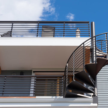
Situated on the west slope of Mt. Baker Ridge, this remodel takes a contemporary view on traditional elements to maximize space, lightness and spectacular views of downtown Seattle and Puget Sound. We were approached by Vertical Construction Group to help a client bring their 1906 craftsman into the 21st century. The original home had many redeeming qualities that were unfortunately compromised by an early 2000’s renovation. This left the new homeowners with awkward and unusable spaces. After studying numerous space plans and roofline modifications, we were able to create quality interior and exterior spaces that reflected our client’s needs and design sensibilities. The resulting master suite, living space, roof deck(s) and re-invented kitchen are great examples of a successful collaboration between homeowner and design and build teams.
 TKS Design Group
Free ebook, Creating the Ideal Kitchen. DOWNLOAD NOW
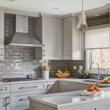
Our clients had been in their home since the early 1980’s and decided it was time for some updates. We took on the kitchen, two bathrooms and a powder room.
The layout in the kitchen was functional for them, so we kept that pretty much as is. Our client wanted a contemporary-leaning transitional look — nice clean lines with a gray and white palette. Light gray cabinets with a slightly darker gray subway tile keep the northern exposure light and airy. They also purchased some new furniture for their breakfast room and adjoining family room, so the whole space looks completely styled and new. The light fixtures are staggered and give a nice rhythm to the otherwise serene feel.
The homeowners were not 100% sold on the flooring choice for little powder room off the kitchen when I first showed it, but now they think it is one of the most interesting features of the design. I always try to “push” my clients a little bit because that’s when things can get really fun and this is what you are paying for after all, ideas that you may not come up with on your own.
We also worked on the two upstairs bathrooms. We started first on the hall bath which was basically just in need of a face lift. The floor is porcelain tile made to look like carrera marble. The vanity is white Shaker doors fitted with a white quartz top. We re-glazed the cast iron tub.
The master bath was a tub to shower conversion. We used a wood look porcelain plank on the main floor along with a Kohler Tailored vanity. The custom shower has a barn door shower door, and vinyl wallpaper in the sink area gives a rich textured look to the space. Overall, it’s a pretty sophisticated look for its smaller fooprint.
Designed by: Susan Klimala, CKD, CBD
Photography by: Michael Alan Kaskel
For more information on kitchen and bath design ideas go to: www.kitchenstudio-ge.com
 Mike Schaap Builders
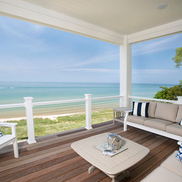
Captivated by South Haven’s natural charm and waterfront beauty, this storybook, waterfront abode is exceptionally true to its lakefront character.
Featuring over 3,600 square feet with five bedroom and three-and-a-half baths, the careful design of this open and charming layout paired with grand views from nearly every room, capture all the warmth and playfulness of lakefront living.
• A beach friendly fiber cement siding in a cheerful shade of blue blends seamlessly with the water backdrop, while contrasting white trim and darker blue window clad lend definition to the exterior.
• An impressive kitchen with stunning Ann Sachs tile backsplash, quartz countertops, richly stained bistro table and Viking Appliances overlook the generous, but clearly defined, living and dining rooms.
• Extensive built-ins with extra storage and workspace, such as a distinctive dining serving piece featuring quartz stone and a lake reflecting mirror, maximize space and make entertaining a breeze.
• Playful design elements like Thibaut wallpaper, braided hemp cabinet insets and white-washed European white oak floors complement the home’s coastal flair with nautical décor and warm hues.
• Fine finishes and rich trim details including wainscot, various painted ceilings, louvered doors on cabinetry, and fireplace surround with kitchen coordinating quartz stone, show off the intricate design gestures.
• Skillfully designed upstairs presents a restful master retreat with private balcony, two guest bedrooms, convenient laundry featuring sleek retractable doors and space maximizing built in bunk beds with ultra-clever steps that provide storage.
• The lower level’s extra guest quarters, additional laundry, full beach bath with top-to-bottom tiled shower, diligent kitchenette, beach-friendly stained concrete floors, outdoor shower that keeps sand at bay, and direct access to the sugary sands of Lake Michigan.
Photography by Chuck Heiney
 TKS Design Group
Free ebook, Creating the Ideal Kitchen. DOWNLOAD NOW
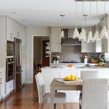
Our clients had been in their home since the early 1980’s and decided it was time for some updates. We took on the kitchen, two bathrooms and a powder room.
The layout in the kitchen was functional for them, so we kept that pretty much as is. Our client wanted a contemporary-leaning transitional look — nice clean lines with a gray and white palette. Light gray cabinets with a slightly darker gray subway tile keep the northern exposure light and airy. They also purchased some new furniture for their breakfast room and adjoining family room, so the whole space looks completely styled and new. The light fixtures are staggered and give a nice rhythm to the otherwise serene feel.
The homeowners were not 100% sold on the flooring choice for little powder room off the kitchen when I first showed it, but now they think it is one of the most interesting features of the design. I always try to “push” my clients a little bit because that’s when things can get really fun and this is what you are paying for after all, ideas that you may not come up with on your own.
We also worked on the two upstairs bathrooms. We started first on the hall bath which was basically just in need of a face lift. The floor is porcelain tile made to look like carrera marble. The vanity is white Shaker doors fitted with a white quartz top. We re-glazed the cast iron tub.
The master bath was a tub to shower conversion. We used a wood look porcelain plank on the main floor along with a Kohler Tailored vanity. The custom shower has a barn door shower door, and vinyl wallpaper in the sink area gives a rich textured look to the space. Overall, it’s a pretty sophisticated look for its smaller fooprint.
Designed by: Susan Klimala, CKD, CBD
Photography by: Michael Alan Kaskel
For more information on kitchen and bath design ideas go to: www.kitchenstudio-ge.com
 Black Lacquer Design
Photo by Eron Rauch
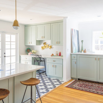
Inspiration for a transitional light wood floor eat-in kitchen remodel in Los Angeles with shaker cabinets, green cabinets, quartz countertops and black appliances
Inspiration for a transitional light wood floor eat-in kitchen remodel in Los Angeles with shaker cabinets, green cabinets, quartz countertops and black appliances
 VisionScapes
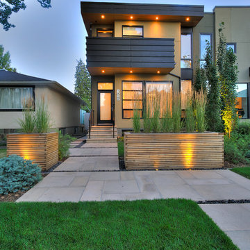
This garden is a perfect example of contemporary city design for a small space. Two custom built hardwood planters provide some height and depth to the narrow front yard. While the tile walkway is set on a stable concrete base ensuring safe passage in and out of the home in both summer and winter. The private back yard maximizes space by using a custom built hardwood table as both an architectural piece that defines the fire pit area, and an optional servery for larger dining parties.
Photo credit: Jamen Rhodes

Sponsored
Sunbury, OH

J.Holderby - Renovations
Franklin County's Leading General Contractors - 2X Best of Houzz!
 Simply Home Decorating
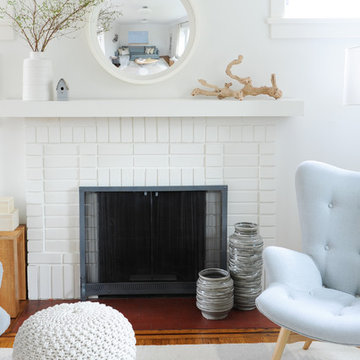
Our goal on this project was to make the main floor of this lovely early 20th century home in a popular Vancouver neighborhood work for a growing family of four. We opened up the space, both literally and aesthetically, with windows and skylights, an efficient layout, some carefully selected furniture pieces and a soft colour palette that lends a light and playful feel to the space. Our clients can hardly believe that their once small, dark, uncomfortable main floor has become a bright, functional and beautiful space where they can now comfortably host friends and hang out as a family. Interior Design by Lori Steeves of Simply Home Decorating Inc. Photos by Tracey Ayton Photography.
 Metzger Design
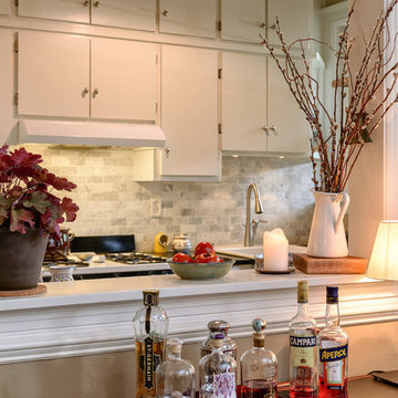
Some spaces are best understood before and after. Our Carytown Kitchen project demonstrates how a small space can be transformed for minimal expense.
First and foremost was maximizing space. With only 9 sf of built-in counter space we understood these work surfaces needed to be kept free of small appliances and clutter - and that meant extra storage. The introduction of high wall cabinets provides much needed storage for occasional use equipment and helps keep everything dust-free in the process.
Photograph by Stephen Barling.
 Allison Jaffe Interior Design LLC
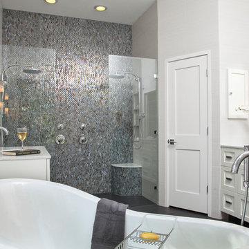
The focal point of the space is both the free standing club foot tub and the shower. The client had the tub custom painted. I designed the shower to accommodate two people with his and her sides. The linen tower was removed to free up space for the new water closet and shower. Each vanity was created to maximize space, so drawers were included in the middle portion of the cabinet. There is porcelain tile from floor to ceiling in the entire space for easy maintenance. Chrome was used as accents throughout the space as seen in the sinks, faucets and other fixtures. A wall of tile in the shower acts a focal point on the opposite end of the room.
Photographer: Brio Yiapon
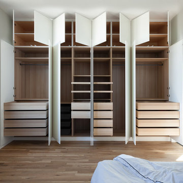
 Atelier Armbruster
Photography by Francesco Bertocci
Inspiration for a mid-sized contemporary home design remodel in New York
Inspiration for a mid-sized contemporary home design remodel in New York
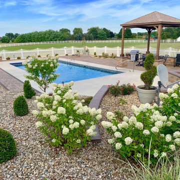

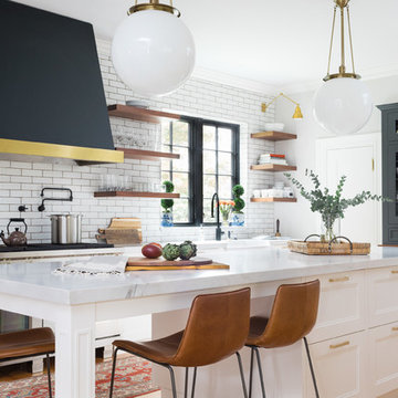
 Realm Interiors
Photography by Joyelle West Collaboration with Bespoke of Winchester
Example of a transitional medium tone wood floor and brown floor kitchen design in Boston with a farmhouse sink, recessed-panel cabinets, white cabinets, white backsplash, subway tile backsplash and an island
Example of a transitional medium tone wood floor and brown floor kitchen design in Boston with a farmhouse sink, recessed-panel cabinets, white cabinets, white backsplash, subway tile backsplash and an island
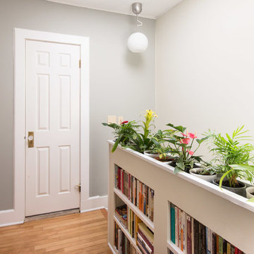
 shadiworks
Designer: Shadi Khadivi
Photography: Sebastien Barre
Example of a small classic hallway design in Boston with gray walls
Example of a small classic hallway design in Boston with gray walls
 Unique Environmental Landscapes
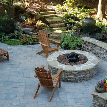
After Renovation - Maximize Space
Inspiration for a patio remodel in Atlanta
Inspiration for a patio remodel in Atlanta
39