
Search results for "Maximizing space" in Home Design Ideas
 Jonathan Raith Inc.
Nantucket Architectural Photography
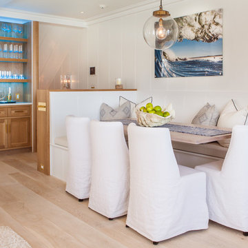
Beach style light wood floor and beige floor kitchen/dining room combo photo in Boston with white walls and no fireplace
Beach style light wood floor and beige floor kitchen/dining room combo photo in Boston with white walls and no fireplace

 Gelling & Judd Inc.
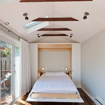
Inspiration for a contemporary guest dark wood floor bedroom remodel in San Francisco with white walls and no fireplace
Find the right local pro for your project
 Studio Revolution
Designed by: Studio Revolution
Photography by: Thomas Kuoh
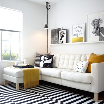
Family room - scandinavian carpeted family room idea in San Francisco with white walls
Family room - scandinavian carpeted family room idea in San Francisco with white walls

 Kitchen Design Concepts
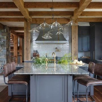
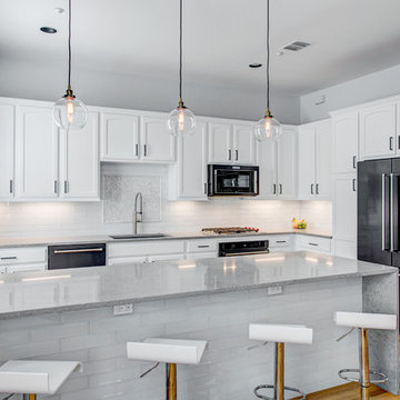
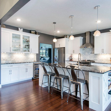
Before we remodeled this space, the kitchen cabinetry had a deep-dark stain, standard builder finishes, and could use a little makeover. Overall, the space lacked excitement, finesse, and good layout. So, in order to maximize the space to its full potential, we incorporated a new kitchen island which would give the space more storage, counter space, and we could include a wine unit! Win-win! Plus, the existing cabinetry on the perimeter was in great condition, so we could refinish those and have a little more fun with the other finishes of the space. Want to see what we did? Take a look below!
Cabinetry
As mentioned above, the cabinetry on the perimeter was refinished with white paint. The new island we installed cabinetry from WWWoods Shiloh, with a Heritage door style, and a finish of Arctic paint.
Countertops
The countertops feature a beautiful 3 cm Caesarstone Quartz in Symphony Grey. We also incorporated a waterfall on the edge, adding that extra element of design.
Backsplash
From the Glazzio Gemstone Series, we installed a Glacier Onyx 3” x 12” as the main backsplash tile and on the backside of the island. As a picture frame over the sink, we installed a Daltile Contempo White Polished marble pencil rail, with a Daltile Carrara White 1”x random marble Mosaic inside the frame.
Fixtures
From Blanco we have installed a Quatrus R0 Super Single Bowl sink, and a BLANCOCULINA semiprofessional kitchen faucet in satin nickel. The hardware cabinetry is the It Pull in Modern Bronze from Atlas.
Flooring
The new flooring is a hardwood oak, that’s been sanded and finished.
 Resolution: 4 Architecture
Photography by Emily Andrews
Trendy master light wood floor bedroom photo in New York with no fireplace
Trendy master light wood floor bedroom photo in New York with no fireplace

 Lee Edwards - residential design
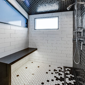
Situated on the west slope of Mt. Baker Ridge, this remodel takes a contemporary view on traditional elements to maximize space, lightness and spectacular views of downtown Seattle and Puget Sound. We were approached by Vertical Construction Group to help a client bring their 1906 craftsman into the 21st century. The original home had many redeeming qualities that were unfortunately compromised by an early 2000’s renovation. This left the new homeowners with awkward and unusable spaces. After studying numerous space plans and roofline modifications, we were able to create quality interior and exterior spaces that reflected our client’s needs and design sensibilities. The resulting master suite, living space, roof deck(s) and re-invented kitchen are great examples of a successful collaboration between homeowner and design and build teams.
 Décor Aid
Having a small child, loving to entertain and looking to declutter and kid-proof the gathering spaces of their home in the quaint village of Rockville Centre, Long Island, a stone’s throw from Manhattan, our client’s main objective was to have their living room and den transformed with a family friendly home makeover with mid-century modern tones boasting a formal, yet relaxed spirit
Stepping into the home we found their living room and den both architecturally well appointed yet in need of modern transitional furniture pieces and the pops of color our clients admired, as there was a substantial amount of cool, cold grays in the rooms.
Decor Aid designer Vivian C. approached the design and placement of the pieces sourced to be kid-friendly while remaining sophisticated and practical for entertaining.
“We played off of the clients love for blush pinks, mid-century modern and turquoise. We played with the use of gold and silver metals to mix it up.”
In the living room, we used the prominent bay window and its illuminating natural light as the main architectural focal point, while the fireplace and mantels soft white tone helped inform the minimalist color palette for which we styled the room around.
To add warmth to the living room we played off of the clients love for blush pinks and turquoise while elevating the room with flashes of gold and silver metallic pieces. For a sense of play and to tie the space together we punctuated the kid-friendly living room with an eclectic juxtaposition of colors and materials, from a beautifully patchworked geometric cowhide rug from All Modern, to a whimsical mirror placed over an unexpected, bold geometric credenza, to the blush velvet barrel chair and abstract blue watercolor pillows.
“When sourcing furniture and objects, we chose items that had rounded edges and were shatter proof as it was vital to keep each room’s decor childproof.” Vivian ads.
Their vision for the den remained chic, with comfort and practical functionality key to create an area for the young family to come together.
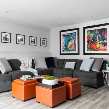
For the den, our main challenge was working around the pre-existing dark gray sectional sofa. To combat its chunkiness, we played off of the hues in the cubist framed prints placed above and focused on blue and orange accents which complement and play off of each other well. We selected orange storage ottomans in easy to clean, kid-friendly leather to maximize space and functionality. To personalize the appeal of the den we included black and white framed family photos. In the end, the result created a fun, relaxed space where our clients can enjoy family moments or watch a game while taking in the scenic view of their backyard.
For harmony between the rooms, the overall tone for each room is mid-century modern meets bold, yet classic contemporary through the use of mixed materials and fabrications including marble, stone, metals and plush velvet, creating a cozy yet sophisticated enough atmosphere for entertaining family and friends and raising a young children.
“The result od this family friendly room was really fantastic! Adding some greenery, more pillows and throws really made the space pop.” Vivian C. Decor Aid’s Designer
 Alair Homes Plano
Our clients came to us wanting to maximize the space they had. They were not planning on moving anytime soon, as they loved their neighborhood. They wanted to renovate the front of their house, which included the front atrium, living room, kitchen, and powder bath. They hated their kitchen because it was completely closed off, had low ceilings, was dark and outdated, not to mention the floors were different in each of these rooms! The pantry was in the breakfast area and the kitchen table became a junk catcher, being the first thing you see when coming in from the garage/laundry room. In their living room, they wanted the spaces on either side of the fireplace to be symmetrical, whether that be bookshelves, a wet bar or closed off. Both parents are working professionals with no time and/or desire to design, create and figure this out on their own. They needed help figuring out how to reconfigure their current space in order to maximize what they already had, as they could not see an obvious solution. They could not envision how it would look so the fact that our designers were able to show them their new kitchen in 3D was pertinent.
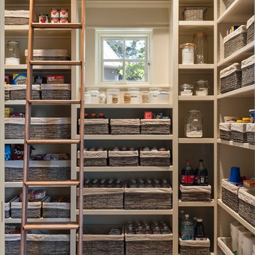
We removed the pass-through windows that surrounded the atrium and front dining room, as well as the entire kitchen wall, completely opening up those two rooms. We removed a hall that used to lead between the kitchen and the living room since it was a complete waste of space! The ceilings were raised to 10’ in the kitchen and we were able to leave the skylight, letting in that natural light they wanted. We were able to give them a much larger pantry with tons of shelving and increase the size of their laundry room by utilizing the space of their old breakfast nook.
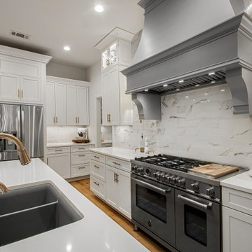
We relocated the door to the garage into their new elongated laundry room, built a wet bar across from their new larger pantry (with a pocket door) and the flow and functionality of these new spaces is just perfect! All new Waypoint cabinets were installed one two main kitchen surrounding walls painted Linen. Calacatta Bianco Polished Porcelain Tile 4x12 was used for the backsplash. A large eat-at island was installed, painted Stone, where the family can now gather for homework, meals, and mingling. The soft champagne bronze hardware and accent lighting really give this white and gray kitchen a soft classic look.
In the living room, we removed the built-in bookshelves to the left of the fireplace and closed off the wet-bar on the other side, giving them more space in their master suite. White Oak wood flooring, stained Putney, was installed throughout the entire new space, giving it the continuity they were looking for.
In the guest bathroom, Carrara white herringbone marble mosaic 12x12 tile was used on the shower floor and niche, while basic marble Bianco polished 12x24 porcelain tile was used on the walls. Luxart polished chrome traditional hardware gives this timeless bathroom the perfect shine.
Our clients are so happy with the new functionality and look of their space. It has definitely changed their lives in a way they could have never imagined!
 Allison Jaffe Interior Design LLC
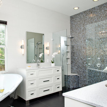
The focal point of the space is both the free standing club foot tub and the shower. The client had the tub custom painted. I designed the shower to accommodate two people with his and her sides. The linen tower was removed to free up space for the new water closet and shower. Each vanity was created to maximize space, so drawers were included in the middle portion of the cabinet. There is porcelain tile from floor to ceiling in the entire space for easy maintenance. Chrome was used as accents throughout the space as seen in the sinks, faucets and other fixtures. A wall of tile in the shower acts a focal point on the opposite end of the room.
Photographer: Brio Yiapon
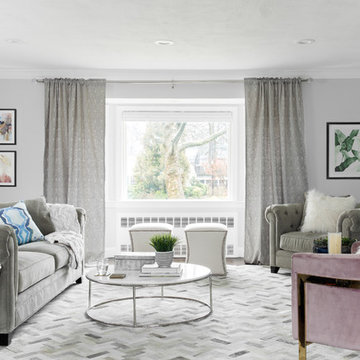 Décor Aid
Having a small child, loving to entertain and looking to declutter and kid-proof the gathering spaces of their home in the quaint village of Rockville Centre, Long Island, a stone’s throw from Manhattan, our client’s main objective was to have their living room and den transformed with a family friendly home makeover with mid-century modern tones boasting a formal, yet relaxed spirit
Stepping into the home we found their living room and den both architecturally well appointed yet in need of modern transitional furniture pieces and the pops of color our clients admired, as there was a substantial amount of cool, cold grays in the rooms.
Decor Aid designer Vivian C. approached the design and placement of the pieces sourced to be kid-friendly while remaining sophisticated and practical for entertaining.
“We played off of the clients love for blush pinks, mid-century modern and turquoise. We played with the use of gold and silver metals to mix it up.”
In the living room, we used the prominent bay window and its illuminating natural light as the main architectural focal point, while the fireplace and mantels soft white tone helped inform the minimalist color palette for which we styled the room around.
To add warmth to the living room we played off of the clients love for blush pinks and turquoise while elevating the room with flashes of gold and silver metallic pieces. For a sense of play and to tie the space together we punctuated the kid-friendly living room with an eclectic juxtaposition of colors and materials, from a beautifully patchworked geometric cowhide rug from All Modern, to a whimsical mirror placed over an unexpected, bold geometric credenza, to the blush velvet barrel chair and abstract blue watercolor pillows.
“When sourcing furniture and objects, we chose items that had rounded edges and were shatter proof as it was vital to keep each room’s decor childproof.” Vivian ads.
Their vision for the den remained chic, with comfort and practical functionality key to create an area for the young family to come together.
For the den, our main challenge was working around the pre-existing dark gray sectional sofa. To combat its chunkiness, we played off of the hues in the cubist framed prints placed above and focused on blue and orange accents which complement and play off of each other well. We selected orange storage ottomans in easy to clean, kid-friendly leather to maximize space and functionality. To personalize the appeal of the den we included black and white framed family photos. In the end, the result created a fun, relaxed space where our clients can enjoy family moments or watch a game while taking in the scenic view of their backyard.
For harmony between the rooms, the overall tone for each room is mid-century modern meets bold, yet classic contemporary through the use of mixed materials and fabrications including marble, stone, metals and plush velvet, creating a cozy yet sophisticated enough atmosphere for entertaining family and friends and raising a young children.
“The result od this family friendly room was really fantastic! Adding some greenery, more pillows and throws really made the space pop.” Vivian C. Decor Aid’s Designer
Sponsored
Columbus, OH
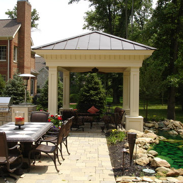
Free consultation for landscape design!

Peabody Landscape Group
Franklin County's Reliable Landscape Design & Contracting
 TKS Design Group
Free ebook, Creating the Ideal Kitchen. DOWNLOAD NOW
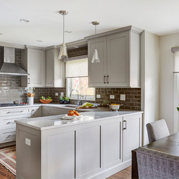
Our clients had been in their home since the early 1980’s and decided it was time for some updates. We took on the kitchen, two bathrooms and a powder room.
The layout in the kitchen was functional for them, so we kept that pretty much as is. Our client wanted a contemporary-leaning transitional look — nice clean lines with a gray and white palette. Light gray cabinets with a slightly darker gray subway tile keep the northern exposure light and airy. They also purchased some new furniture for their breakfast room and adjoining family room, so the whole space looks completely styled and new. The light fixtures are staggered and give a nice rhythm to the otherwise serene feel.
The homeowners were not 100% sold on the flooring choice for little powder room off the kitchen when I first showed it, but now they think it is one of the most interesting features of the design. I always try to “push” my clients a little bit because that’s when things can get really fun and this is what you are paying for after all, ideas that you may not come up with on your own.
We also worked on the two upstairs bathrooms. We started first on the hall bath which was basically just in need of a face lift. The floor is porcelain tile made to look like carrera marble. The vanity is white Shaker doors fitted with a white quartz top. We re-glazed the cast iron tub.
The master bath was a tub to shower conversion. We used a wood look porcelain plank on the main floor along with a Kohler Tailored vanity. The custom shower has a barn door shower door, and vinyl wallpaper in the sink area gives a rich textured look to the space. Overall, it’s a pretty sophisticated look for its smaller fooprint.
Designed by: Susan Klimala, CKD, CBD
Photography by: Michael Alan Kaskel
For more information on kitchen and bath design ideas go to: www.kitchenstudio-ge.com
 User
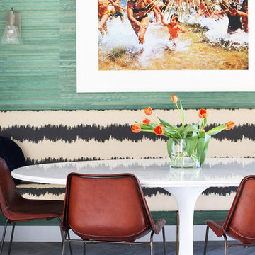
UserBright, colorful dining room with teal grasscloth, graphic banquette, marble dining table, leather sling chairs, and brass burst chandelier.
Photo Credit: Mary Costa
 DANIELLE Interior Design & Decor
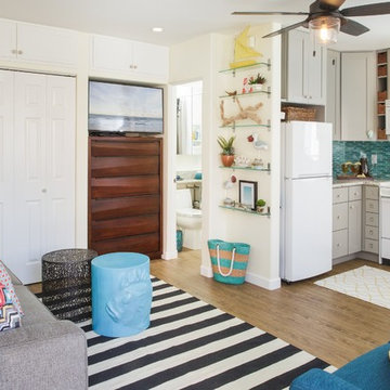
Accenting the teal glass backsplash tile with the vivid black and white rug is just what this small apartment needed. In this small spaces we tried to maximize space and organize effectively. We used minimal dicor and kept the tiny living room to the essentials.
Designed by Interior Designer Danielle Perkins @ DANIELLE Interior Design & Decor.
Photography by Taylor Abeel Photography.


 Twist Tours Real Estate and Portfolio Marketing
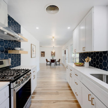
Example of a transitional galley light wood floor and beige floor kitchen design in Austin with an undermount sink, shaker cabinets, white cabinets, blue backsplash, stainless steel appliances, no island and white countertops
 MK Properties
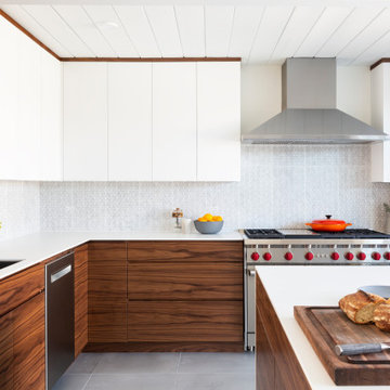
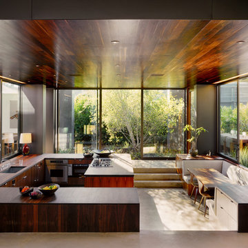
Example of a minimalist u-shaped concrete floor eat-in kitchen design in Los Angeles with an undermount sink, flat-panel cabinets, dark wood cabinets and stainless steel appliances
5