
Search results for "Metropolis" in Home Design Ideas
 Metropolis Drafting and Construction Inc
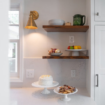
Like most homes that were built as part of a development project in Thousand oaks the kitchen in this home was extremely small and enclosed from all sides with only 2 small pathways leading to it.
The first think on the list was to remove the largest wall and opening the space to the living area.
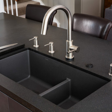
The kitchen is comprised from an L-shape gray cabinets and a 11' long peninsula from pewter colored cabinet and a fantastic black noir countertop.
The peninsula acts as a division between the living area and the kitchen.
a large window brings a lot of natural light into the space and the light pastel almost colored backsplash adds a light and bright contrast to the grays and black colors of the kitchen.
The large dark cabinet pulls tie together the two portions of the kitchen.
 Metropolis Drafting and Construction Inc
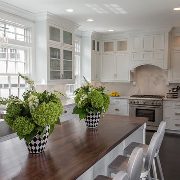
Arcadia is home to many great ranch homes. Many of these homes were built with many small rooms and areas divided by walls, doors and hallways.
In this project we took it upon ourselves to eliminate all these small compartments to create a great room in the center of the home.
In addition, we constructed a room-addition to include a parent’s suite on the opposite side of the great room so it will have the privacy our clients wished to have.
As part of the structural changes, we found that we need to completely redesign the back portion of the roof line to be higher and more unformal.
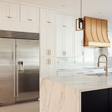
This gave us an opportunity to create a 10' ceiling for the proposed kitchen.
The extra space allowed us to build a second row of upper cabinets with some glass doors for showcasing our clients china collection.
The design is very traditional / traditional in nature.
Lots of neutral colors with white tones dominating the space.
The main contrast and addition of warmth were the hickory floors that added the much-needed contrast to the quick and cooler white tones.
Find the right local pro for your project
 Metropolis Drafting and Construction Inc
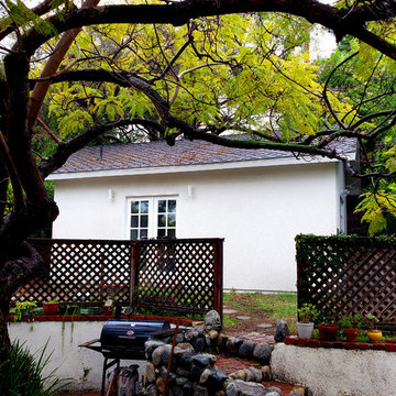
On a hillside property in Santa Monica hidden behind trees stands our brand new constructed from the grounds up guest unit. This unit is only 300sq. but the layout makes it feel as large as a small apartment.
Vaulted 12' ceilings and lots of natural light makes the space feel light and airy.
A small kitchenette gives you all you would need for cooking something for yourself, notice the baby blue color of the appliances contrasting against the clean white cabinets and counter top.
The wood flooring give warmth to the neutral white colored walls and ceilings.
A nice sized bathroom bosting a 3'x3' shower with a corner double door entrance with all the high quality finishes you would expect in a master bathroom.
The exterior of the unit was perfectly matched to the existing main house.
These ADU (accessory dwelling unit) also called guest units and the famous term "Mother in law unit" are becoming more and more popular in California and in LA in particular.
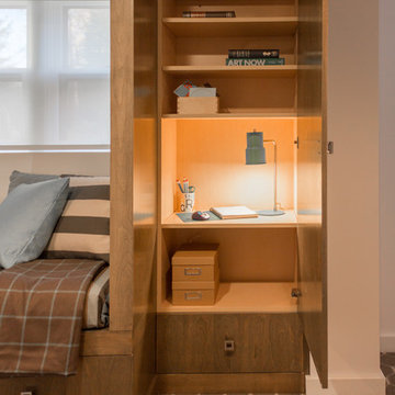
 Metropolis Design Group
A storage cabinet is set up for a mini home office center or can convert to store homeowner's items
Example of a trendy bedroom design in Minneapolis
Example of a trendy bedroom design in Minneapolis
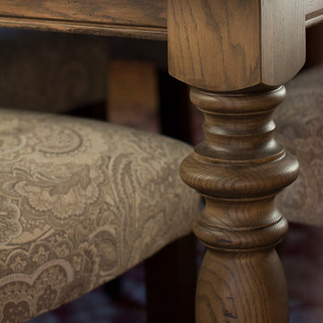
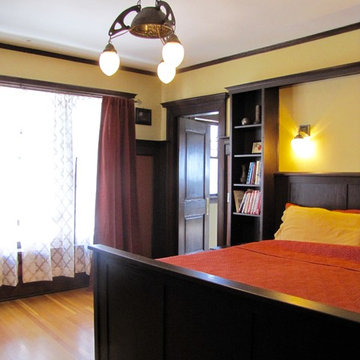
 Metropolis Construction
The master bedroom was originally the dining room for the second floor unit. The wainscot was retained and a custom bed and shelving unit built in our wood shop to perfectly fit the space. Sconces were added above the bed to provide a gentle light.
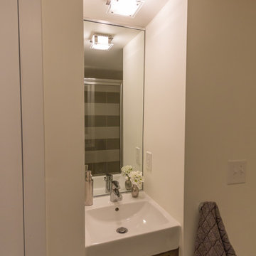 Metropolis Design Group
A patchwork tile floor and bands of contrasting tile in the shower create a playful yet neutral space in this lower level bathroom
Trendy bathroom photo in Minneapolis
Trendy bathroom photo in Minneapolis
 Metropolis Drafting and Construction Inc
What do you do when your master suite addition is limited in width. It is not an issue for the bedroom since it enjoys the full width of the 16' but what about the bathroom and closet that you need to be grand in design as well?
In this bathroom you can see the solution to this age-old question, how to make a narrow space look grand.
The end of this bathroom boosts a huge 9' wide by 6' deep shower wet area with a freestanding tub on one side and a bench, niche and window on the other.
The vaulted ceiling above has 3 large skylights with one of them directly above the shower area. The skylights provide a huge amount of natural light that cancels any need for artificial lighting to be used during the daytime.
The main wall is dark Pietra grigio porcelain book matched slabs, while the sides are 48"x48" off-white porcelain tiles. The plumbing fixtures are Kohler Anthem digital control for the minimalistic look.
Right before you get into the wet area you will have a niche with a built-in seating area the doubles as a storage/laundry cabinet and two thick shelves made of Alder wood to compliment the vanity, the beam and the water closet door.
A 10' vanity with a large 9.5' mirror is a great trick to create a sensation of space in the narrow 5' passageway.
The final touch is the hidden water closet, the space was taken from the Walk-in closet entry area to hide the toilet from the beautiful spa looking bathroom.
The last item to be mentioned is the heated floor that is controlled by a timer to make sure the flooring is warm to the touch on the cold winter nights.
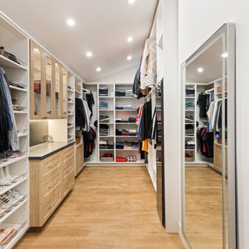
The walk-in closet was custom built to accommodate all the client’s storage requirements, the different deeper and shallower niches that were created by space added to the bathroom are used for shallow wall led mirror or a deeper suites hanger and the crown jewel of this closet the steam closet by LG that provide the capabilities of a steamer / dry-cleaning in your private closet space.
A center drawer cabinet with glass top cabinets with built-in LED strips and puck lights create a lovely ambient lighting if needed and show casing the different perfumes and handbags.
Talking about show casing, how about the his/hers shoes towers on each side of the cabinets in the middle?
The master bedroom is a bit more craftsman and cozy.
Whitewashed shiplap on the vaulted ceiling creates a more of a countryside look with vast number of windows and a sliding door to allow both eastern and western light to penetrate the room.
 Metropolis Drafting and Construction Inc
Creation of a new master bathroom, kids’ bathroom, toilet room and a WIC from a mid. size bathroom was a challenge but the results were amazing.
The master bathroom has a huge 5.5'x6' shower with his/hers shower heads.
The main wall of the shower is made from 2 book matched porcelain slabs, the rest of the walls are made from Thasos marble tile and the floors are slate stone.
The vanity is a double sink custom made with distress wood stain finish and its almost 10' long.
The vanity countertop and backsplash are made from the same porcelain slab that was used on the shower wall.
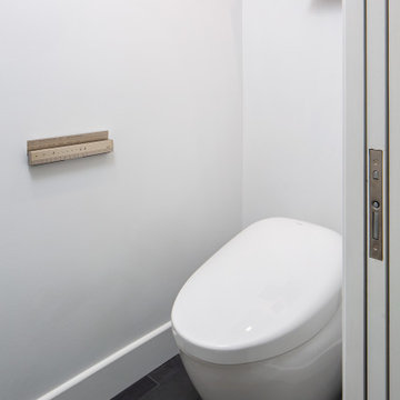
The two pocket doors on the opposite wall from the vanity hide the WIC and the water closet where a $6k toilet/bidet unit is warmed up and ready for her owner at any given moment.
Notice also the huge 100" mirror with built-in LED light, it is a great tool to make the relatively narrow bathroom to look twice its size.
 Metropolis Design Group
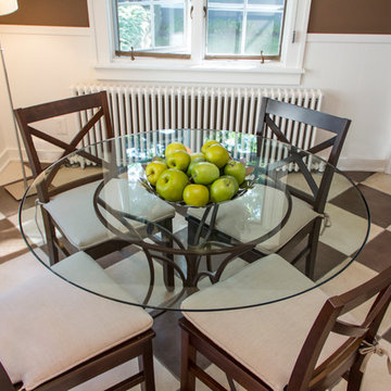
A glass top table in the eat in space keeps the visual scale light while accommodating several for dining in.
Photography by Craig Claeys
Inspiration for a transitional dining room remodel in Minneapolis
Inspiration for a transitional dining room remodel in Minneapolis
 Metropolis Drafting and Construction Inc
Today’s investment landscape in California features a surge in transforming single-family lots into vibrant multi-family residences, facilitated by recent SB9 and ADU laws. This project exemplifies how a modest 6,750-square-foot lot can accommodate a 1,500-square-foot primary home alongside a 2,500-square-foot duplex, seamlessly integrating design, functionality, and neighborhood aesthetics.
The primary residence underwent a meticulous interior transformation, evolving from a 3-bedroom, 1.5-bath layout into a spacious 4-bedroom, 2-bath home. Strategic reconfigurations centered around creating an expansive great room—an open-concept space adorned with vaulted ceilings—where the kitchen, dining, and living areas converge into a magnificent communal zone.
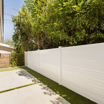
Exterior updates further distinguish the property. The front and side yards are enclosed with fencing and privacy hedges, linked by concrete pathways that enhance outdoor functionality while compensating for backyard space lost during renovations. The exterior façade was refreshed with darker tones, deliberately contrasting with the duplex to emphasize architectural separation.
Designed to preserve the suburban charm, the duplex visually mimics a single-family home from the street. Its facade creates an illusion of a two-story residence, maintaining harmony within the neighborhood fabric. The main unit, developed under SB9 guidelines, features three bedrooms and two bathrooms, with a luxurious parents’ suite situated upstairs. Downstairs, two bedrooms share a full bath, creating a balanced family-oriented layout.
The duplex’s interior boasts 9-foot ceilings throughout, elevating the sense of space and openness. The design thoughtfully places the kitchen at the front, inviting guests into the home, while stairs on the right lead to the private upstairs bedroom suite.
The ADU offers a two bedroom and two & half baths. the unit is accessible via a private side entrance with a dedicated walkway. Its layout includes a ground-floor living room, a galley kitchen, and a discreet powder room beneath the stairs, designed to contain guest traffic and maintain privacy upstairs. The upstairs bedrooms each feature luxurious bathrooms with expansive showers, adding an element of modern elegance.
Both units enjoy thoughtfully landscaped outdoor spaces—private patios, backyard areas, and gated front yards—creating welcoming environments for residents and visitors alike.
This project exemplifies innovative urban infill solutions, blending architectural elegance with legal compliance and community harmony—an inspiring blueprint for the future of residential development in California.
 Metropolis Drafting and Construction Inc
When our client bought this house, it was stuck in limbo between the traditional interior and a 90's modern structure.
The direction we took was a combination of calm beige color scheme with clean lines and smooth surfaces.
The continuation of the same materials throughout the house finally bonded all the different spaces into a singular home.
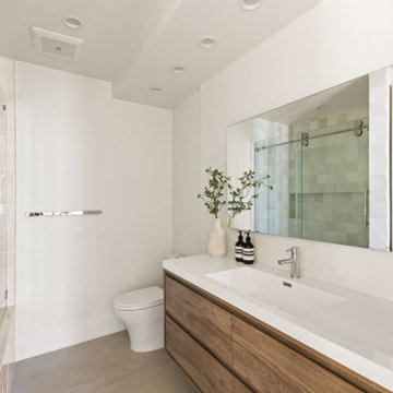
The two guest bathrooms were made with Cloe zellige style tiles and custom floating vanities made from white oak.
The same oak was used also for the built-in TV wall as floating shelves and base cabinets with a large, tiled center piece for the recessed TV and the electric fireplace.
The kitchen also received some of the white oak love in the form of the Island and the recessed cooking area.
The biggest issue with the kitchen space was the lack of proportions between the width and its length vs. the extreme height of the vaulted ceiling.
The solution I came up with was a secondary line of wall cabinets to be the same depth as the full height units to create a wrap around and make the space more proportionate.
Continuing to the master bathroom, here we have a true walk-in master bath suite, no door needed with this size of space.
All the walls received porcelain semi slab treatment. (72x36 porcelain tile) a lot of work went into selecting the correct tile pieces to give it the effect of a single slab installation but without the added cost.
All fixtures are by Kohler with their fantastic modern gold finish.
The result was a perfect flow of calm beige colors and warmth of natural wood throughout.
 Metropolis Design Group
Natural light floods this simple, classically appointed kitchen. The island with reclaimed wood top becomes the center focal point at gatherings
Kitchen - traditional kitchen idea in Minneapolis
Kitchen - traditional kitchen idea in Minneapolis
 Metropolis Drafting and Construction Inc
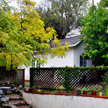
On a hillside property in Santa Monica hidden behind trees stands our brand new constructed from the grounds up guest unit. This unit is only 300sq. but the layout makes it feel as large as a small apartment.
Vaulted 12' ceilings and lots of natural light makes the space feel light and airy.
A small kitchenette gives you all you would need for cooking something for yourself, notice the baby blue color of the appliances contrasting against the clean white cabinets and counter top.
The wood flooring give warmth to the neutral white colored walls and ceilings.
A nice sized bathroom bosting a 3'x3' shower with a corner double door entrance with all the high quality finishes you would expect in a master bathroom.
The exterior of the unit was perfectly matched to the existing main house.
These ADU (accessory dwelling unit) also called guest units and the famous term "Mother in law unit" are becoming more and more popular in California and in LA in particular.
 Metropolis Drafting and Construction Inc
In a quest to gain additional living space on this Santa Monica corner lot, an ADU proved to be the most effective solution. A second-story addition above the existing garage was carefully designed to blend seamlessly with the home’s original architectural character, resulting in a natural and cohesive extension.
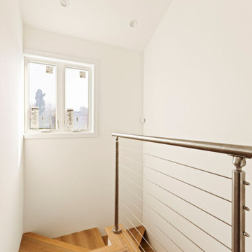
A small portion at the rear of the garage, previously used as a laundry area, was converted into a stairway leading to the upper level.
Upstairs, the bathroom also functions as a laundry area, featuring a Jack-and-Jill layout that connects the shower space to both the hallway and the vanity/laundry zone. The shower area similarly connects to the vanity and the bedroom through a Jack-and-Jill configuration.
Vaulted ceilings were a must, enhancing the sense of openness. The space is well insulated and finished with drywall throughout, creating a clean, minimalistic aesthetic across the living areas.
 Metropolis Drafting and Construction Inc
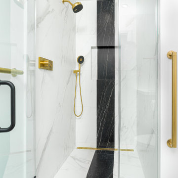
The Granada Hills ADU project was designed from the beginning to be a replacement home for the aging mother and father of this wonderful client.
The goal was to reach the max. allowed ADU size but at the same time to not affect the backyard with a pricey addition and not to build up and block the hillside view of the property.
The final trick was a combination of all 3 options!
We converted an extra-large 3 car garage, added about 300sq. half on the front and half on the back and the biggest trick was incorporating the existing main house guest bedroom and bath into the mix.
Final result was an amazingly large and open 1100+sq 2Br+2Ba with a dedicated laundry/utility room and huge vaulted ceiling open space for the kitchen, living room and dining area.
Since the parents were reaching an age where assistance will be required the entire home was done with ADA requirements in mind, both bathrooms are fully equipped with many helpful grab bars and both showers are curb less so no need to worry about a step.
It’s hard to notice by the photos by the roof is a hip roof, this means exposed beams, king post and huge rafter beams that were covered with real oak wood and stained to create a contrasting effect to the lighter and brighter wood floor and color scheme.
Systems wise we have a brand new electrical 3.5-ton AC unit, a 400 AMP new main panel with 2 new sub panels and of course my favorite an 80amp electrical tankless water heater and recirculation pump.
 Metropolis Design Group
Photography by Craig Claeys
Inspiration for a transitional bathroom remodel in Minneapolis
Inspiration for a transitional bathroom remodel in Minneapolis
 Metropolis Drafting and Construction Inc
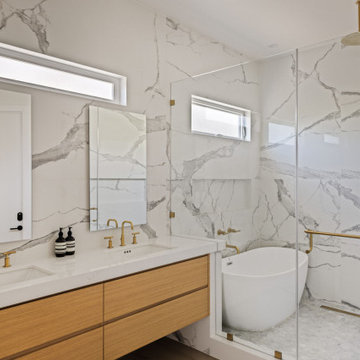
When our client bought this house, it was stuck in limbo between the traditional interior and a 90's modern structure.
The direction we took was a combination of calm beige color scheme with clean lines and smooth surfaces.
The continuation of the same materials throughout the house finally bonded all the different spaces into a singular home.
The two guest bathrooms were made with Cloe zellige style tiles and custom floating vanities made from white oak.
The same oak was used also for the built-in TV wall as floating shelves and base cabinets with a large, tiled center piece for the recessed TV and the electric fireplace.
The kitchen also received some of the white oak love in the form of the Island and the recessed cooking area.
The biggest issue with the kitchen space was the lack of proportions between the width and its length vs. the extreme height of the vaulted ceiling.
The solution I came up with was a secondary line of wall cabinets to be the same depth as the full height units to create a wrap around and make the space more proportionate.
Continuing to the master bathroom, here we have a true walk-in master bath suite, no door needed with this size of space.
All the walls received porcelain semi slab treatment. (72x36 porcelain tile) a lot of work went into selecting the correct tile pieces to give it the effect of a single slab installation but without the added cost.
All fixtures are by Kohler with their fantastic modern gold finish.
The result was a perfect flow of calm beige colors and warmth of natural wood throughout.
 Metropolis Drafting and Construction Inc
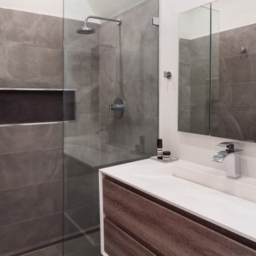
Originally hosting only 1 huge bathroom this design was not sufficient for our clients which had difference of opinion of how they wish their personal bathroom should look like.
Dividing the space into two bathrooms gave each one of our clients the ability to receive a fully personalized design.
Lady’s bathroom is a clean modern design with a wall mounted vanity, large gray tile on the walls and the floor.
A large recessed medicine cabinet was installed.
The wall mounted toilet gives a nice clean look and a modern touch.
The shower is a curb less walk in shower with the entire bathroom been constructed as a wet zone.
29