
Search results for "Mistake">mistake" in Home Design Ideas

 Kasper Custom Home Remodeling
Michael Hunter photography
Staircase - large contemporary wooden floating open staircase idea in Dallas
Staircase - large contemporary wooden floating open staircase idea in Dallas


 DESIGN SOLUTIONS
Grossman
Example of a mid-sized minimalist guest bedroom design in Miami with beige walls
Example of a mid-sized minimalist guest bedroom design in Miami with beige walls
Find the right local pro for your project

 Katie Hutchison Studio
With two small children and a third on the way, the owners of an original eighteenth century Cape were quickly out-growing it, but they had no desire to move away from the Cape Cod home and location they loved. They simply needed a reconfigured layout and more space. Their goals included repurposing some existing rooms, adding a new kitchen/family area plus screen porch on the first level, and creating a master suite and roof deck with an outdoor shower on the second level, connected by a new stair.
Our challenge was to improve the flow between existing spaces, and design the two-story addition without overwhelming the pint-sized original Cape. We took advantage of the lower grade at the rear of the property to step the first floor of the addition down two steps from the existing main level. This allowed us to align the second floor in the addition with the existing second floor, while gaining ceiling height in the new first-floor kitchen/family area. We composed a cross-gabled form for the addition to improve the second floor headroom, while maintaining the existing eave line. We then extended some existing shed dormers to gain headroom and enhance function. We also expanded the outdoor living area with privacy walls along the roof deck.
New, larger, double–hung windows that match the lite configuration of the existing windows, along with new side-wall shingles and trim which resemble the existing exterior treatment help to tie the new addition to the old Cape. Though there’s no mistaking the new for the old, the two are simpatico.
Katie Hutchison Studio collaborated with Geoffrey Koper Architect of Yarmouth Port, Mass. on the Yarmouth Port Antique Cape Renovation and Addition. Kitchen fit-out and interior finishes, fixtures, and furnishings by others.
photo by Katie Hutchison
 AMF construction LLC
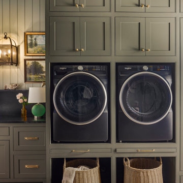
Laundry room - farmhouse brown floor and shiplap wall laundry room idea in Dallas with flat-panel cabinets, green cabinets, black backsplash, green walls, a side-by-side washer/dryer and black countertops
 Crewzz, Inc
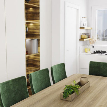
Modern dining room area
Example of a small eclectic porcelain tile and beige floor great room design in Los Angeles with white walls
Example of a small eclectic porcelain tile and beige floor great room design in Los Angeles with white walls
 Katie Hutchison Studio
With two small children and a third on the way, the owners of an original eighteenth century Cape were quickly out-growing it, but they had no desire to move away from the Cape Cod home and location they loved. They simply needed a reconfigured layout and more space. Their goals included repurposing some existing rooms, adding a new kitchen/family area plus screen porch on the first level, and creating a master suite and roof deck with an outdoor shower on the second level, connected by a new stair.
Our challenge was to improve the flow between existing spaces, and design the two-story addition without overwhelming the pint-sized original Cape. We took advantage of the lower grade at the rear of the property to step the first floor of the addition down two steps from the existing main level. This allowed us to align the second floor in the addition with the existing second floor, while gaining ceiling height in the new first-floor kitchen/family area. We composed a cross-gabled form for the addition to improve the second floor headroom, while maintaining the existing eave line. We then extended some existing shed dormers to gain headroom and enhance function. We also expanded the outdoor living area with privacy walls along the roof deck.
New, larger, double–hung windows that match the lite configuration of the existing windows, along with new side-wall shingles and trim which resemble the existing exterior treatment help to tie the new addition to the old Cape. Though there’s no mistaking the new for the old, the two are simpatico.
Katie Hutchison Studio collaborated with Geoffrey Koper Architect of Yarmouth Port, Mass. on the Yarmouth Port Antique Cape Renovation and Addition. Kitchen fit-out and interior finishes, fixtures, and furnishings by others.
photo by Katie Hutchison


 Bilotta Kitchen & Home
This expansive kitchen was done by Bilotta senior designer in collaboration with Nancy Epstein, founder and CEO of Artistic Tile, for Nancy’s son and daughter-in-law’s home. Frameless Rutt Regency cabinetry is featured in two different finishes: linen white paint on the perimeter and stained walnut on the island. Almost all surfaces are Calacatta Gold marble but in a variety of formats and finishes, obviously all by Artistic Tile. The backsplash, including the dramatic arched wall the houses the range and hood, features elongated brick tiles with a honed finish. The underside of the arch is lined with polished mosaics and the countertops are 2” thick slabs, polished. The flooring is the only surface in a different material – for that they used Artistic Tile’s “Vestige Ash”, a limestone with a brushed finish in a chevron pattern that creates texture and really shows the stone’s veining. In an article in Traditional Home, written by Amy Elbert, Nancy commented, “Everything has some weight, some girth to it. A common design mistake is making things too skinny. You want to feel the tile’s majesty and its beauty.” Rita added, “We always played with a delicate balance between contemporary and traditional elements.” The two stainless steel undermount sinks are Franke with Dornbracht faucets. There are various different work zones making it also a very functional space, aside from being sophisticated and elegant overall. There is the cooking area with the 36” range and custom hood on one wall; the island holds the main sink and a dishwasher; another wall houses the full height, 36” wide stainless steel refrigerator and freezer; and the sink wall (with a beautiful view to the backyard) has another dishwasher as well as refrigerator drawers. The circular dining table for six is by Zoffany and the chairs are “Normandie” by Artistic Frame with Duralee fabric.
Photo Credit Francesco Lagnese
 Katie Hutchison Studio
With two small children and a third on the way, the owners of an original eighteenth century Cape were quickly out-growing it, but they had no desire to move away from the Cape Cod home and location they loved. They simply needed a reconfigured layout and more space. Their goals included repurposing some existing rooms, adding a new kitchen/family area plus screen porch on the first level, and creating a master suite and roof deck with an outdoor shower on the second level, connected by a new stair.
Our challenge was to improve the flow between existing spaces, and design the two-story addition without overwhelming the pint-sized original Cape. We took advantage of the lower grade at the rear of the property to step the first floor of the addition down two steps from the existing main level. This allowed us to align the second floor in the addition with the existing second floor, while gaining ceiling height in the new first-floor kitchen/family area. We composed a cross-gabled form for the addition to improve the second floor headroom, while maintaining the existing eave line. We then extended some existing shed dormers to gain headroom and enhance function. We also expanded the outdoor living area with privacy walls along the roof deck.
New, larger, double–hung windows that match the lite configuration of the existing windows, along with new side-wall shingles and trim which resemble the existing exterior treatment help to tie the new addition to the old Cape. Though there’s no mistaking the new for the old, the two are simpatico.
Katie Hutchison Studio collaborated with Geoffrey Koper Architect of Yarmouth Port, Mass. on the Yarmouth Port Antique Cape Renovation and Addition. Kitchen fit-out and interior finishes, fixtures, and furnishings by others.
photo by Katie Hutchison
 Katie Hutchison Studio
With two small children and a third on the way, the owners of an original eighteenth century Cape were quickly out-growing it, but they had no desire to move away from the Cape Cod home and location they loved. They simply needed a reconfigured layout and more space. Their goals included repurposing some existing rooms, adding a new kitchen/family area plus screen porch on the first level, and creating a master suite and roof deck with an outdoor shower on the second level, connected by a new stair.
Our challenge was to improve the flow between existing spaces, and design the two-story addition without overwhelming the pint-sized original Cape. We took advantage of the lower grade at the rear of the property to step the first floor of the addition down two steps from the existing main level. This allowed us to align the second floor in the addition with the existing second floor, while gaining ceiling height in the new first-floor kitchen/family area. We composed a cross-gabled form for the addition to improve the second floor headroom, while maintaining the existing eave line. We then extended some existing shed dormers to gain headroom and enhance function. We also expanded the outdoor living area with privacy walls along the roof deck.
New, larger, double–hung windows that match the lite configuration of the existing windows, along with new side-wall shingles and trim which resemble the existing exterior treatment help to tie the new addition to the old Cape. Though there’s no mistaking the new for the old, the two are simpatico.
Katie Hutchison Studio collaborated with Geoffrey Koper Architect of Yarmouth Port, Mass. on the Yarmouth Port Antique Cape Renovation and Addition. Kitchen fit-out and interior finishes, fixtures, and furnishings by others.
photo by Katie Hutchison

 MAP Consultants, LLC
Listed by Lynn Porter, 505-304-6071 and Larry Hardman, 505-379-2524, ERA Sellers & Buyers.
Photos by Fotovan.com
Furniture provided by CORT Furniture Rental Albuquerque
 Katie Hutchison Studio
With two small children and a third on the way, the owners of an original eighteenth century Cape were quickly out-growing it, but they had no desire to move away from the Cape Cod home and location they loved. They simply needed a reconfigured layout and more space. Their goals included repurposing some existing rooms, adding a new kitchen/family area plus screen porch on the first level, and creating a master suite and roof deck with an outdoor shower on the second level, connected by a new stair.
Our challenge was to improve the flow between existing spaces, and design the two-story addition without overwhelming the pint-sized original Cape. We took advantage of the lower grade at the rear of the property to step the first floor of the addition down two steps from the existing main level. This allowed us to align the second floor in the addition with the existing second floor, while gaining ceiling height in the new first-floor kitchen/family area. We composed a cross-gabled form for the addition to improve the second floor headroom, while maintaining the existing eave line. We then extended some existing shed dormers to gain headroom and enhance function. We also expanded the outdoor living area with privacy walls along the roof deck.
New, larger, double–hung windows that match the lite configuration of the existing windows, along with new side-wall shingles and trim which resemble the existing exterior treatment help to tie the new addition to the old Cape. Though there’s no mistaking the new for the old, the two are simpatico.
Katie Hutchison Studio collaborated with Geoffrey Koper Architect of Yarmouth Port, Mass. on the Yarmouth Port Antique Cape Renovation and Addition. Kitchen fit-out and interior finishes, fixtures, and furnishings by others.
photo by Katie Hutchison

 BRADSHAW DESIGNS LLC
For a young couple who both love to cook! He likes to BarBQ on the balcony so he has his own scullery kitchen behind the kitchen! Perfect set up! Modern meets rustic meets dramatic!
 Katie Hutchison Studio
With two small children and a third on the way, the owners of an original eighteenth century Cape were quickly out-growing it, but they had no desire to move away from the Cape Cod home and location they loved. They simply needed a reconfigured layout and more space. Their goals included repurposing some existing rooms, adding a new kitchen/family area plus screen porch on the first level, and creating a master suite and roof deck with an outdoor shower on the second level, connected by a new stair.
Our challenge was to improve the flow between existing spaces, and design the two-story addition without overwhelming the pint-sized original Cape. We took advantage of the lower grade at the rear of the property to step the first floor of the addition down two steps from the existing main level. This allowed us to align the second floor in the addition with the existing second floor, while gaining ceiling height in the new first-floor kitchen/family area. We composed a cross-gabled form for the addition to improve the second floor headroom, while maintaining the existing eave line. We then extended some existing shed dormers to gain headroom and enhance function. We also expanded the outdoor living area with privacy walls along the roof deck.
New, larger, double–hung windows that match the lite configuration of the existing windows, along with new side-wall shingles and trim which resemble the existing exterior treatment help to tie the new addition to the old Cape. Though there’s no mistaking the new for the old, the two are simpatico.
Katie Hutchison Studio collaborated with Geoffrey Koper Architect of Yarmouth Port, Mass. on the Yarmouth Port Antique Cape Renovation and Addition. Kitchen fit-out and interior finishes, fixtures, and furnishings by others.
photo by Katie Hutchison

 DiGiacomo Homes & Renovation
With no windows or natural light, we used a combination of artificial light, open space, and white walls to brighten this master bath remodel. Over the white, we layered a sophisticated palette of finishes that embrace color, pattern, and texture: 1) long hex accent tile in “lemongrass” gold from Walker Zanger (mounted vertically for a new take on mid-century aesthetics); 2) large format slate gray floor tile to ground the room; 3) textured 2X10 glossy white shower field tile (can’t resist touching it); 4) rich walnut wraps with heavy graining to define task areas; and 5) dirty blue accessories to provide contrast and interest.
Photographer: Markert Photo, Inc.

 ACM Interiors
The formal living area in this Brooklyn brownstone once had an awful marble fireplace surround that didn't properly reflect the home's provenance. Sheetrock was peeled back to reveal the exposed brick chimney, we sourced a new mantel with dental molding from architectural salvage, and completed the surround with green marble tiles in an offset pattern. The chairs are Mid-Century Modern style and the love seat is custom-made in gray leather. Custom bookshelves and lower storage cabinets were also installed, overseen by antiqued-brass picture lights.

 Cabinets by RenewaBuild
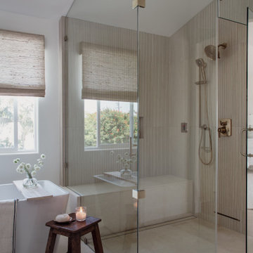
We removed the unused corner tub and replaced one window to match the size of the other, which allowed us to enlarge the shower. Tile wainscotting in the wet area helps to create a staging area for entering and exiting the shower. All new plumbing fixtures, mirrors and lighting finished this space nicely.
 Bilotta Kitchen & Home
This expansive kitchen was done by Bilotta senior designer in collaboration with Nancy Epstein, founder and CEO of Artistic Tile, for Nancy’s son and daughter-in-law’s home. Frameless Rutt Regency cabinetry is featured in two different finishes: linen white paint on the perimeter and stained walnut on the island. Almost all surfaces are Calacatta Gold marble but in a variety of formats and finishes, obviously all by Artistic Tile. The backsplash, including the dramatic arched wall the houses the range and hood, features elongated brick tiles with a honed finish. The underside of the arch is lined with polished mosaics and the countertops are 2” thick slabs, polished. The flooring is the only surface in a different material – for that they used Artistic Tile’s “Vestige Ash”, a limestone with a brushed finish in a chevron pattern that creates texture and really shows the stone’s veining. In an article in Traditional Home, written by Amy Elbert, Nancy commented, “Everything has some weight, some girth to it. A common design mistake is making things too skinny. You want to feel the tile’s majesty and its beauty.” Rita added, “We always played with a delicate balance between contemporary and traditional elements.” The two stainless steel undermount sinks are Franke with Dornbracht faucets. There are various different work zones making it also a very functional space, aside from being sophisticated and elegant overall. There is the cooking area with the 36” range and custom hood on one wall; the island holds the main sink and a dishwasher; another wall houses the full height, 36” wide stainless steel refrigerator and freezer; and the sink wall (with a beautiful view to the backyard) has another dishwasher as well as refrigerator drawers. The circular dining table for six is by Zoffany and the chairs are “Normandie” by Artistic Frame with Duralee fabric.
Photo Credit Francesco Lagnese
 Cosmic Design Studio
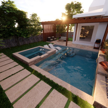
There are several advantages for homeowners to see 3D renderings of their pool outdoor projects before construction begins. Here are some of the key benefits:
Visualization: 3D renderings provide homeowners with a realistic visualization of their pool design. They can see how the design will look in their outdoor space from various angles, which helps them make informed decisions about the design.
Design Changes: If homeowners want to make changes to the pool design, 3D renderings make it easy to see how those changes will look in the final product. They can make adjustments to the design and see the results in real time, which saves time and money in the long run.
Cost-Efficiency: 3D renderings can help homeowners save money on their pool projects. They can make design changes before construction begins, which can prevent costly mistakes and delays.
Planning: 3D renderings allow homeowners to plan their outdoor space more efficiently. They can see how the pool design interacts with their landscaping, patio, and other outdoor features. This helps them plan the layout of their outdoor space and make informed decisions about other outdoor features.
Peace of Mind: 3D renderings provide homeowners with peace of mind. They can see the final product before construction begins, which reduces stress and anxiety about the project.
44