
Search results for "Monetary well being" in Home Design Ideas
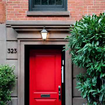
 DHD Architecture and Interior Design
Located in stylish Chelsea, this updated five-floor townhouse incorporates both a bold, modern aesthetic and sophisticated, polished taste. Palettes range from vibrant and playful colors in the family and kids’ spaces to softer, rich tones in the master bedroom and formal dining room. DHD interiors embraced the client’s adventurous taste, incorporating dynamic prints and striking wallpaper into each room, and a stunning floor-to-floor stair runner. Lighting became one of the most crucial elements as well, as ornate vintage fixtures and eye-catching sconces are featured throughout the home.
Photography: Emily Andrews
Architect: Robert Young Architecture
3 Bedrooms / 4,000 Square Feet
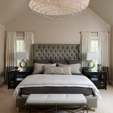
 Michelle Wenitsky Interior Design
Jeffrey Totaro Photography
Example of a transitional master carpeted bedroom design in Philadelphia with beige walls and no fireplace
Example of a transitional master carpeted bedroom design in Philadelphia with beige walls and no fireplace
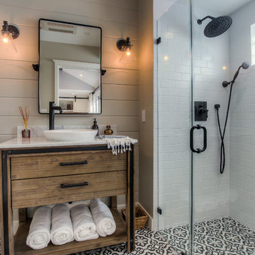
 Spazio LA
This beautiful bathroom features cement tiles (from Cement Tile Shop) on the floors with an infinity drain a custom frameless shower door and custom lighting. Vanity is Signature Hardware, and mirror is from Pottery Barn.
Find the right local pro for your project

 Metro Interiors
I first came to Mary Beth’s home to help with her living room. But that changed when we looked at the office, and started talking about how it wasn’t working. When I stepped it to take a look, I immediately noticed how heavy and cramped it felt. Too many large pieces and clutter created a feeling of overwhelm.
It needed to be redone. Since Mary Beth works full time from home, I wanted to help her make this a space where she could be productive, and feel good about being in for long periods of time.
The end result is an impressive transformation – and it was done very affordably. “Prior to the re-design, my office was a cluttered, disorganized mess that really said nothing about who I am. I tended to use it as a catch all for things I didn’t know where to put or what to do with,” tells Mary Beth. Now, she says it feels so much better working in there, and even got rave reviews from her family when they visited for the Holidays. “It’s now well-organized, bright and seems to flow in the way it’s laid out”.
To remove clutter and the “heavy” feeling, two large bookcases and the couch were removed, and lots of time was spent decluttering. A nicer bookcase was moved to a place that made more sense; together with a cozy rug and upholstered chair we created a lovely reading area, a place she can also relax.
A neutral green on the walls is also soothing, and brings an element of nature inside. Groupings of photos from her travels hang on the walls now, and a larger piece of art creates a focal point. A piece I was delighted to help her find – hand-painted but affordably priced – it makes Mary Beth feel happy, “The art above the desk is beautiful, and it showed me that big doesn’t have to be overwhelming”.
A new desk, relocated to the “command position” in the room (a more powerful placement) is also less weighty than what she had before, but functionally allows for more workspace. We upgraded her desk chair to a high-back leather one. In total, this setup was intentional, for an enhanced feeling of being in control. Mary Beth notes, “I love the desk and how it sits. I can either work by the window and look out at the garden and at the birds, which I love to do, or look out into the living room and be part of anything going on there”.
On the windows we replaced metal blinds with woven roman shades, also with a natural look. They’re cordless, so nothing hangs in front of the beautiful backyard view, and they feel lighter. With the new office design, we also gave Mary Beth plenty of places for storage. Now the things she does use and need don’t need to be out in plain sight, cluttering things up.
In the end, we accomplished our goal of creating a space for Mary Beth conducive to work and also enjoyable. She says, “My work attitude and feeling of what the office is has definitely changed – I like to be there even when I’m not working. It doesn’t feel only like an office but is actually a relaxing place to be”.

 ZeroEnergy Design
This LEED Platinum certified house reflects the homeowner's desire for an exceptionally healthy and comfortable living environment, within a traditional neighborhood.
INFILL SITE. The family, who moved from another area of Wellesley, sought out this property to be within walking distance of the high school and downtown area. An existing structure on the tight lot was removed to make way for the new home. 84% of the construction waste, from both the previous structure and the new home, was diverted from a landfill. ZED designed to preserve the existing mature trees on the perimeter of the property to minimize site impacts, and to maintain the character of the neighborhood as well as privacy on the site.
EXTERIOR EXPRESSION. The street facade of the home relates to the local New England vernacular. The rear uses contemporary language, a nod to the family’s Californian roots, to incorporate a roof deck, solar panels, outdoor living space, and the backyard swimming pool. ZED’s careful planning avoided to the need to face the garage doors towards the street, a common syndrome of a narrow lot.
THOUGHTFUL SPACE. Homes with dual entries can often result in duplicate and unused spaces. In this home, the everyday and formal entry areas are one and the same; the front and garage doors share the entry program of coat closets, mudroom storage with bench for removing your shoes, and a laundry room with generous closets for the children's sporting equipment. The entry area leads directly to the living space, encompassing the kitchen, dining and sitting area areas in an L-shaped open plan arrangement. The kitchen is placed at the south-west corner of the space to allow for a strong connection to the dining, sitting and outdoor living spaces. A fire pit on the deck satisfies the family’s desire for an open flame while a sealed gas fireplace is used indoors - ZED’s preference after omitting gas burning appliances completely from an airtight home. A small study, with a window seat, is conveniently located just off of the living space. A first floor guest bedroom includes an accessible bathroom for aging visitors and can be used as a master suite to accommodate aging in place.
HEALTHY LIVING. The client requested a home that was easy to clean and would provide a respite from seasonal allergies and common contaminants that are found in many indoor spaces. ZED selected easy to clean solid surface flooring throughout, provided ample space for cleaning supplies on each floor, and designed a mechanical system with ventilation that provides a constant supply of fresh outdoor air. ZED selected durable materials, finishes, cabinetry, and casework with low or no volatile organic compounds (VOCs) and no added urea formaldehyde.
YEAR-ROUND COMFORT. The home is super insulated and air-tight, paired with high performance triple-paned windows, to ensure it is draft-free throughout the winter (even when in front of the large windows and doors). ZED designed a right-sized heating and cooling system to pair with the thermally improved building enclosure to ensure year-round comfort. The glazing on the home maximizes passive solar gains, and facilitates cross ventilation and daylighting.
ENERGY EFFICIENT. As one of the most energy efficient houses built to date in Wellesley, the home highlights a practical solution for Massachusetts. First, the building enclosure reduces the largest energy requirement for typical houses (heating). Super-insulation, exceptional air sealing, a thermally broken wall assembly, triple pane windows, and passive solar gain combine for a sizable heating load reduction. Second, within the house only efficient systems consume energy. These include an air source heat pump for heating & cooling, a heat pump hot water heater, LED lighting, energy recovery ventilation, and high efficiency appliances. Lastly, photovoltaics provide renewable energy help offset energy consumption. The result is an 89% reduction in energy use compared to a similar brand new home built to code requirements.
RESILIENT. The home will fare well in extreme weather events. During a winter power outage, heat loss will be very slow due to the super-insulated and airtight envelope– taking multiple days to drop to 60 degrees even with no heat source. An engineered drainage system, paired with careful the detailing of the foundation, will help to keep the finished basement dry. A generator will provide full operation of the all-electric house during a power outage.
OVERALL. The home is a reflection of the family goals and an expression of their values, beautifully enabling health, comfort, safety, resilience, and utility, all while respecting the planet.
ZED - Architect & Mechanical Designer
Bevilacqua Builders Inc - Contractor
Creative Land & Water Engineering - Civil Engineering
Barbara Peterson Landscape - Landscape Design
Nest & Company - Interior Furnishings
Eric Roth Photography - Photography
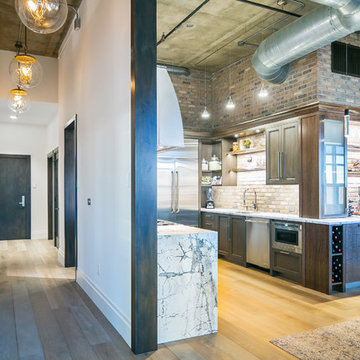
 Robeson Design
Entering this downtown Denver loft,
you get a pretty amazing first impression!
Without showing you the before photos of this condo, it’s hard to imagine the transformation that took place in just 6 short months.
The client wanted a hip, modern vibe to her new home and reached out to San Diego Interior Designer, Rebecca Robeson. Rebecca had a vision for what could be... Rebecca created a 3D model to convey the possibilities and they were off to the races.
The design races that is.
Rebecca’s 3D model captured the heart of her new client and the project took off.
With only 6 short months to completely gut and transform the space, it was essential Robeson Design connect with the right people in Denver. Rebecca searched HOUZZ for Denver General Contractors.
Ryan Coats of Earthwood Custom Remodeling lead a team of highly qualified sub-contractors throughout the project and over the finish line. 8" wide hardwood planks of white oak replaced low quality wood floors, 6'8" French doors were upgraded to 8' solid wood and frosted glass doors, used brick veneer and barn wood walls were added as well as new lighting throughout. The outdated Kitchen was gutted along with Bathrooms and new 8" baseboards were installed. All new tile walls and backsplashes as well as intricate tile flooring patterns were brought in while every countertop was updated and replaced. All new plumbing and appliances were included as well as hardware and fixtures. Closet systems were designed by Robeson Design and executed to perfection. State of the art sound system, entertainment package and smart home technology was integrated by Ryan Coats and his team.
Exquisite Kitchen Design, (Denver Colorado) headed up the custom cabinetry throughout the home including the Kitchen, Lounge feature wall, Bathroom vanities and the Living Room entertainment piece boasting a 9' slab of Fumed White Oak with a live edge. Paul Anderson of EKD worked closely with the team at Robeson Design on Rebecca's vision to insure every detail was built to perfection.
The project was completed on time and the homeowner is thrilled...
Earthwood Custom Remodeling, Inc.
Exquisite Kitchen Design
Rocky Mountain Hardware
Tech Lighting - Black Whale Lighting
Photos by Ryan Garvin Photography
 Middlefork Luxury Home Builders
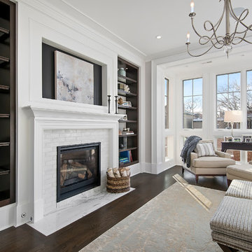
This six-bedroom home — all with en-suite bathrooms — is a brand new home on one of Lincoln Park's most desirable streets. The neo-Georgian, brick and limestone façade features well-crafted detailing both inside and out. The lower recreation level is expansive, with 9-foot ceilings throughout. The first floor houses elegant living and dining areas, as well as a large kitchen with attached great room, and the second floor holds an expansive master suite with a spa bath and vast walk-in closets. A grand, elliptical staircase ascends throughout the home, concluding in a sunlit penthouse providing access to an expansive roof deck and sweeping views of the city..
Nathan Kirkman

 Middlefork Luxury Home Builders
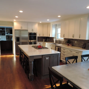
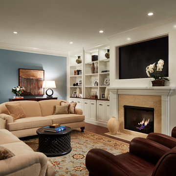
Designed and built in conjunction with Freemont #2, this home pays homage to surrounding architecture, including that of St. James Lutheran Church. The home is comprised of stately, well-proportioned rooms; significant architectural detailing; appropriate spaces for today's active family; and sophisticated wiring to service any HD video, audio, lighting, HVAC and / or security needs.
The focal point of the first floor is the sweeping curved staircase, ascending through all three floors of the home and topped with skylights. Surrounding this staircase on the main floor are the formal living and dining rooms, as well as the beautifully-detailed Butler's Pantry. A gourmet kitchen and great room, designed to receive considerable eastern light, is at the rear of the house, connected to the lower level family room by a rear staircase.
Four bedrooms (two en-suite) make up the second floor, with a fifth bedroom on the third floor and a sixth bedroom in the lower level. A third floor recreation room is at the top of the staircase, adjacent to the 400SF roof deck.
A connected, heated garage is accessible from the rear staircase of the home, as well as the rear yard and garage roof deck.
This home went under contract after being on the MLS for one day.
Steve Hall, Hedrich Blessing
 CAP Carpet & Flooring
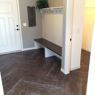
This trendy Herringbone pattern is matched with a rustic-looking wood to create vintage charm in the modern home.
CAP Carpet & Flooring is the leading provider of flooring & area rugs in the Twin Cities. CAP Carpet & Flooring is a locally owned and operated company, and we pride ourselves on helping our customers feel welcome from the moment they walk in the door. We are your neighbors. We work and live in your community and understand your needs. You can expect the very best personal service on every visit to CAP Carpet & Flooring and value and warranties on every flooring purchase. Our design team has worked with homeowners, contractors and builders who expect the best. With over 30 years combined experience in the design industry, Angela, Sandy, Sunnie,Maria, Caryn and Megan will be able to help whether you are in the process of building, remodeling, or re-doing. Our design team prides itself on being well versed and knowledgeable on all the up to date products and trends in the floor covering industry as well as countertops, paint and window treatments. Their passion and knowledge is abundant, and we're confident you'll be nothing short of impressed with their expertise and professionalism. When you love your job, it shows: the enthusiasm and energy our design team has harnessed will bring out the best in your project. Make CAP Carpet & Flooring your first stop when considering any type of home improvement project- we are happy to help you every single step of the way.
 Stalburg Design
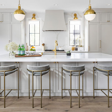
This stylish, family friendly kitchen is also an entertainer’s dream! This young family desired a bright, spacious kitchen that would function just as well for the family of 4 everyday, as it would for hosting large events (in a non-covid world). Apart from these programmatic goals, our aesthetic goal was to accommodate all the function and mess into the design so everything would be neatly hidden away behind beautiful cabinetry and panels.
The navy, bifold buffet area serves as an everyday breakfast and coffee bar, and transforms into a beautiful buffet spread during parties (we’ve been there!). The fridge drawers are great for housing milk and everyday items during the week, and both kid and adult beverages during parties while keeping the guests out of the main cooking zone. Just around the corner you’ll find the high gloss navy bar offering additional beverages, ice machine, and barware storage – cheers!
Super durable quartz with a marbled look keeps the kitchen looking neat and bright, while withstanding everyday wear and tear without a problem. The practical waterfall ends at the island offer additional damage control in bringing that hard surface all the way down to the beautiful white oak floors.
Underneath three large window walls, a built-in banquette and custom table provide a comfortable, intimate dining nook for the family and a few guests while the stunning chandelier ties in nicely with the other brass accents in the kitchen. The thin black window mullions offer a sharp, clean contrast to the crisp white walls and coordinate well with the dark banquette.
Thin, tall windows on either side of the range beautifully frame the stunningly simple, double curvature custom hood, and large windows in the bar/butler’s pantry allow additional light to really flood the space and keep and airy feel. The textured wallpaper in the bar area adds a touch of warmth, drama and interest while still keeping things simple.
 HRS BUILD
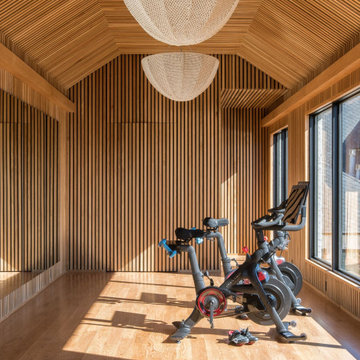
Meditation, dance room looking at hidden doors with a Red Bed healing space
Home yoga studio - mid-sized contemporary medium tone wood floor, brown floor and wood ceiling home yoga studio idea in Dallas
Home yoga studio - mid-sized contemporary medium tone wood floor, brown floor and wood ceiling home yoga studio idea in Dallas
 Marvin
Architect: Portuondo Perotti Architects
Photography: Carlos Domenech
“This is well detailed and consistent inside and out. It is a classic Mediterranean Revival in the Floridian tradition of Mizner.”
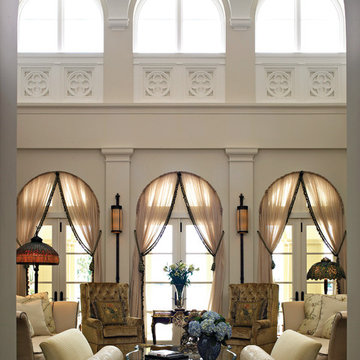
This single-family residential home in Gables Estates, Coral Gables, Florida, successfully pays respect to the architecture of the Mediterranean and Renaissance Italian styles. From the use of courtyards to the high level of detailing, this project emphasizes the most picturesque and expressive qualities of these styles. The residence reflects the visions of two of Coral Gables’ first architects, who designed beautiful and timeless architecture in this garden city to become a lasting piece in the landscape. This project not only captures the breathtaking views of Biscayne Bay, but with timeless style and lush landscaping, it creates a centerpiece for the view from the bay to Coral Gables.
The home is designed as a long gallery, with spaces connected by courtyards and public realms. Another large inspiration for this project was the idea of the garden and landscape. With Coral Gables as a garden city, landscape became an integral part of the conception and design.
The durability of Marvin products, their ability to stand up to the South Florida climate, as well as the Marvin attention to detail and proportion, made them the perfect choice to employ in a project of such high standards. The range of products allowed the freedom of design to explore all possibilities and turn visions into reality. The result was a lasting piece of architecture that would reflect a level of detail in every part of its structure.
MARVIN PRODUCTS USED:
Marvin Round Top Window
Marvin Ultimate Arch Top French Door
Marvin Ultimate Swinging French Door
Marvin Ultimate Venting Picture Window
Marvin Casemaster
 Mirabello Interiors
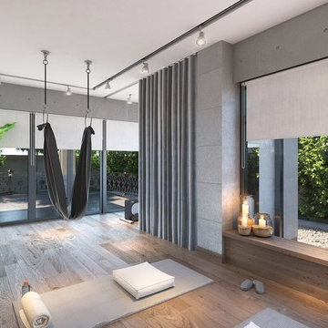
The area with yoga mats, yoga balls, and yoga equipment overlooking the balcony.
Inspiration for a large contemporary light wood floor and brown floor home yoga studio remodel in Other with gray walls
Inspiration for a large contemporary light wood floor and brown floor home yoga studio remodel in Other with gray walls

Sponsored
Columbus, OH

Hope Restoration & General Contracting
Columbus Design-Build, Kitchen & Bath Remodeling, Historic Renovations
 Gilmans Kitchens and Baths
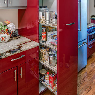
With this homeowner being a geologist, they were looking for a very earthy, stone-based feel. The stone for the countertop was selected first, and then a bright color was found to match the rusted stone esthetic. The window was also opened to give life to the owner’s beautiful view and grey upper-cabinets were used to tie the appliances into the rest of the design. Under-cabinet lighting was added as well to keep the space bright and functional throughout the evening.
Treve Johnson Photography

 Milgard Windows & Doors
The Kiguchi family moved into their Austin, Texas home in 1994. Built in the 1980’s as part of a neighborhood development, they happily raised their family here but longed for something more contemporary. Once they became empty nesters, they decided it was time for a major remodel. After spending many years visiting Austin AIA Home Tours that highlight contemporary residential architecture, they had a lot of ideas and in 2013 were ready to interview architects and get their renovation underway.
The project turned into a major remodel due to an unstable foundation. Architects Ben Arbib and Ed Hughey, of Arbib Hughey Design were hired to solve the structural issue and look for inspiration in the bones of the house, which sat on top of a hillside and was surrounded by great views.
Unfortunately, with the old floor plan, the beautiful views were hidden by small windows that were poorly placed. In order to bring more natural light into the house the window sizes and configurations had to be addressed, all while keeping in mind the homeowners desire for a modern look and feel.
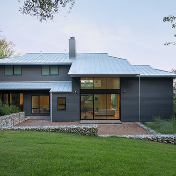
To achieve a more contemporary and sophisticated front of house, a new entry was designed that included removing a two-story bay window and porch. The entrance of the home also became more integrated with the landscape creating a template for new foliage to be planted. Older exterior materials were updated to incorporate a more muted palette of colors with a metal roof, dark grey siding in the back and white stucco in the front. Deep eaves were added over many of the new large windows for clean lines and sun protection.
“Inside it was about opening up the floor plan, expanding the views throughout the house, and updating the material palette to get a modern look that was also warm and inviting,” said Ben from Arbib Hughey Design. “Prior to the remodel, the house had the typical separation of rooms. We removed the walls between them and changed all of the windows to Milgard Thermally Improved Aluminum to connect the inside with the outside. No matter where you are you get nice views and natural light.”
The architects wanted to create some drama, which they accomplished with the window placement and opening up the interior floor plan to an open concept approach. Cabinetry was used to help delineate intimate spaces. To add warmth to an all-white living room, white-washed oak wood floors were installed and pine planks were used around the fireplace. The large windows served as artwork bringing the color of nature into the space.
An octagon shaped, elevated dining room, (named “the turret”), had a big impact on the design of the house. They architects rounded the corners and added larger window openings overlooking a new sunken garden. The great room was also softened by rounding out the corners and that circular theme continued throughout the house, being picked up in skylight wells and kitchen cabinetry. A staircase leading to a catwalk was added and the result was a two-story window wall that flooded the home with natural light.
When asked why Milgard® Thermally Improved Aluminum windows were selected, the architectural team listed many reasons:
1) Aesthetics: “We liked the slim profiles and narrow sightlines. The window frames never get in the way of the view and that was important to us. They also have a very contemporary look that went well with our design.”
2) Options: “We liked that we could get large sliding doors that matched the windows, giving us a very cohesive look and feel throughout the project.”
3) Cost Effective: “Milgard windows are affordable. You get a good product at a good price.”
4) Custom Sizes: “Milgard windows are customizable, which allowed us to get the right window for each location.”
Ready to take on your own traditional to modern home remodeling project? Arbib Hughey Design advises, “Work with a good architect. That means picking a team that is creative, communicative, listens well and is responsive. We think it’s important for an architect to listen to their clients and give them something they want, not something the architect thinks they should have. At the same time you want an architect who is willing and able to think outside the box and offer up design options that you may not have considered. Design is about a lot of back and forth, trying out ideas, getting feedback and trying again.”
The home was completely transformed into a unique, contemporary house perfectly integrated with its site. Internally the home has a natural flow for the occupants and externally it is integrated with the surroundings taking advantage of great natural light. As a side note, it was highly praised as part of the Austin AIA homes tour.
 Welling Construction
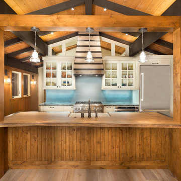
An outdated 1960’s home with smaller rooms typical of this period was completely transformed into a timeless lakefront retreat that embraces the client’s traditions and memories. Anchoring it firmly in the present are modern appliances, extensive use of natural light, and a restructured floor plan that appears both spacious and intimate.
Sponsored
Columbus, OH
Hope Restoration & General Contracting
Columbus Design-Build, Kitchen & Bath Remodeling, Historic Renovations
 Klopf Architecture
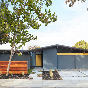
Klopf Architecture completely remodeled this once dark Eichler house in Palo Alto creating a more open, bright and functional family home. The reconfigured great room with new full height windows and sliding glass doors blends the indoors with the newly landscaped patio and seating areas outside. The former galley kitchen was relocated and was opened up to have clear sight lines through the great room and out to the patios and yard, including a large island and a beautiful walnut bar countertop with seating. An integrated small front addition was added allowing for a more spacious master bath and hall bath layouts. With the removal of the old brick fireplace, larger sliding glass doors and multiple skylights now flood the home with natural light.
The goals were to work within the Eichler style while creating a more open, indoor-outdoor flow and functional spaces, as well as a more efficient building envelope including a well insulated roof, providing solutions that many Eichler homeowners appreciate. The original entryway lacked unique details; the clients desired a more gracious front approach. The historic Eichler color palette was used to create a modern updated front facade.
Durable grey porcelain floor tiles unify the entire home, creating a continuous flow. They, along with white walls, provide a backdrop for the unique elements and materials to stand on their own, such as the brightly colored mosaic tiles, the walnut bar and furniture, and stained ceiling boards. A secondary living space was extended out to the patio with the addition of a bench and additional seating.
This Single family Eichler 4 bedroom 2 bath remodel is located in the heart of the Silicon Valley.
Klopf Architecture Project Team: John Klopf, Klara Kevane, and Ethan Taylor
Contractor: Coast to Coast Construction
Landscape Contractor: Discelli
Structural Engineer: Brian Dotson Consulting Engineer
Photography ©2018 Mariko Reed
Location: Palo Alto, CA
Year completed: 2017
 CONTENT Architecture
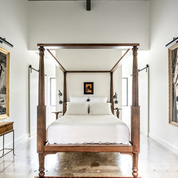
This project encompasses the renovation of two aging metal warehouses located on an acre just North of the 610 loop. The larger warehouse, previously an auto body shop, measures 6000 square feet and will contain a residence, art studio, and garage. A light well puncturing the middle of the main residence brightens the core of the deep building. The over-sized roof opening washes light down three masonry walls that define the light well and divide the public and private realms of the residence. The interior of the light well is conceived as a serene place of reflection while providing ample natural light into the Master Bedroom. Large windows infill the previous garage door openings and are shaded by a generous steel canopy as well as a new evergreen tree court to the west. Adjacent, a 1200 sf building is reconfigured for a guest or visiting artist residence and studio with a shared outdoor patio for entertaining. Photo by Peter Molick, Art by Karin Broker
 TKS Design Group
Free ebook, Creating the Ideal Kitchen. DOWNLOAD NOW
One of my favorite things to work on is older homes with a bit of history because I find it an interesting challenge to marry the historical architectural features of a home with modern design elements that work well for my client’s current lifestyle.
This home was particularly fun because it was the second kitchen we had done for this family and was quite a departure from the style of the first kitchen.
The before shot of the kitchen shows a view from the family room. See the dropped ceiling? We were curious, was this just part of the design or was the dropped ceiling there to hide mechanicals? Well we soon found out that it was mostly decorative (yay!), and with the exception of a little bit of work to some plumbing from an upstairs bathroom and rerouting of the ventilation system within the original floor joists, we were in the clear, phew! The shot of the completed kitchen from roughly the same vantage point shows how much taller the ceilings are. It makes a huge difference in the feel of the space. Dark and gloomy turned fresh and light!
Another serious consideration was what do we do with the skinny transom window above the refrigerator. After much back and forth, we decided to eliminate it and do some open shelving instead. This ended up being one of the nicest areas in the room. I am calling it the “fun zone” because it houses all the barware, wine cubbies and a bar fridge — the perfect little buffet spot for entertaining. It is flanked on either side by pull out pantries that I’m sure will get a ton of use. Since the neighboring room has literally three walls of almost full height windows, the kitchen gets plenty of light.
The gold shelving brackets, large pendant fixtures over the island and the tile mural behind the range all pay subtle homage to the home’s prairie style architecture and bring a bit of sparkle to the room.
Even though the room is quite large, the work triangle is very tight with the large Subzero fridge, sink and range all nearby for easy maneuvering during meal prep. There is seating for four at the island, and work aisles are generous.
Designed by: Susan Klimala, CKD, CBD
Photography by: LOMA Studios
For more information on kitchen and bath design ideas go to: www.kitchenstudio-ge.com
10