
Search results for "Much needed" in Home Design Ideas
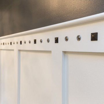
 New England Design Elements
Seacoast RE Photography
Example of a large transitional home design design in Manchester
Example of a large transitional home design design in Manchester
 Progressive Design Build
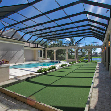
An extreme makeover turns an unassuming lanai deck into an outdoor oasis. These Bonita Bay homeowners loved the location of their home, but needed it to fit their current lifestyle. Because they love to entertain, they wanted to maximize their outdoor space—one that would accommodate a large family and lots of guests.
Working with Progressive Design Build, Mike Spreckelmeier helped the homeowners formulate a list of ideas about what they wanted to achieve in the renovation; then, guided them through the process of planning their remodel.
The renovation focused on reconfiguring the layout to extend the outdoor kitchen and living area—to include a new outdoor kitchen, dining area, sitting area and fireplace. Finishing details comprised a beautiful wood ceiling, cast stone accents, and porcelain tile. The lanai was also expanded to include a full size bocce ball court, which was fully encased in a beautiful custom colonnade and screen enclosure.
With the extension of the outdoor space came a need to connect the living area to the existing pool and deck. The pool and spa were refinished; and a well thought-out low voltage remote-control relay system was installed for easy control of all of the outdoor and landscape lighting, ceiling fans, and hurricane shutters.
This outdoor kitchen project turned out so well, the Bonita Bay homeowners hired Progressive Design Build to remodel the front of their home as well.
To create much needed space, Progressive Design Build tore down an existing two-car garage and designed and built a brand new 2.5-car garage with a family suite above. The family suite included three bedrooms, two bathrooms, additional air conditioned storage, a beautiful custom made stair system, and a sitting area. Also part of the project scope, we enlarged a separate one-car garage to a two-car garage (totaling 4.5 garages), and build a 4,000 sq. ft. driveway, complete with landscape design and installation.
 IDF Studio
Photo by Christopher Stark.
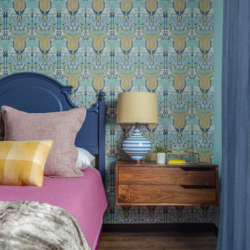
Bedroom - mid-sized eclectic guest dark wood floor bedroom idea in San Francisco with blue walls
Bedroom - mid-sized eclectic guest dark wood floor bedroom idea in San Francisco with blue walls
Find the right local pro for your project
 Amy Pearson Design
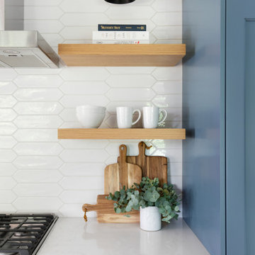
Relocating to Portland, Oregon from California, this young family immediately hired Amy to redesign their newly purchased home to better fit their needs. The project included updating the kitchen, hall bath, and adding an en suite to their master bedroom. Removing a wall between the kitchen and dining allowed for additional counter space and storage along with improved traffic flow and increased natural light to the heart of the home. This galley style kitchen is focused on efficiency and functionality through custom cabinets with a pantry boasting drawer storage topped with quartz slab for durability, pull-out storage accessories throughout, deep drawers, and a quartz topped coffee bar/ buffet facing the dining area. The master bath and hall bath were born out of a single bath and a closet. While modest in size, the bathrooms are filled with functionality and colorful design elements. Durable hex shaped porcelain tiles compliment the blue vanities topped with white quartz countertops. The shower and tub are both tiled in handmade ceramic tiles, bringing much needed texture and movement of light to the space. The hall bath is outfitted with a toe-kick pull-out step for the family’s youngest member!


 Progressive Design Build
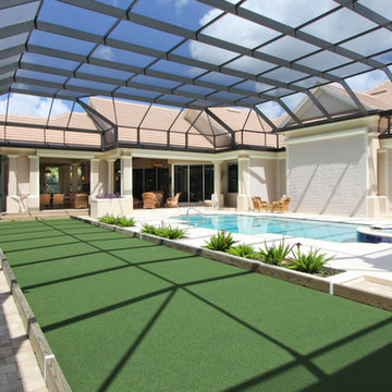
An extreme makeover turns an unassuming lanai deck into an outdoor oasis. These Bonita Bay homeowners loved the location of their home, but needed it to fit their current lifestyle. Because they love to entertain, they wanted to maximize their outdoor space—one that would accommodate a large family and lots of guests.
Working with Progressive Design Build, Mike Spreckelmeier helped the homeowners formulate a list of ideas about what they wanted to achieve in the renovation; then, guided them through the process of planning their remodel.
The renovation focused on reconfiguring the layout to extend the outdoor kitchen and living area—to include a new outdoor kitchen, dining area, sitting area and fireplace. Finishing details comprised a beautiful wood ceiling, cast stone accents, and porcelain tile. The lanai was also expanded to include a full size bocce ball court, which was fully encased in a beautiful custom colonnade and screen enclosure.
With the extension of the outdoor space came a need to connect the living area to the existing pool and deck. The pool and spa were refinished; and a well thought-out low voltage remote-control relay system was installed for easy control of all of the outdoor and landscape lighting, ceiling fans, and hurricane shutters.
This outdoor kitchen project turned out so well, the Bonita Bay homeowners hired Progressive Design Build to remodel the front of their home as well.
To create much needed space, Progressive Design Build tore down an existing two-car garage and designed and built a brand new 2.5-car garage with a family suite above. The family suite included three bedrooms, two bathrooms, additional air conditioned storage, a beautiful custom made stair system, and a sitting area. Also part of the project scope, we enlarged a separate one-car garage to a two-car garage (totaling 4.5 garages), and build a 4,000 sq. ft. driveway, complete with landscape design and installation.
Sponsored
Fredericksburg, OH

High Point Cabinets
Columbus' Experienced Custom Cabinet Builder | 4x Best of Houzz Winner

 June Scott Design
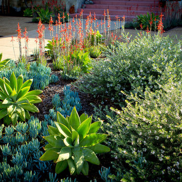
This front garden echoes the classic lines and Mediterranean feel of the home’s architecture. A thirsty lawn was replaced with vibrant aloes, agaves, and low water shrubs. An area of decomposed granite doubles as an informal play court.
Photo by Daniel Bosler
 Arise Art Group
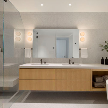
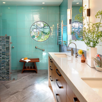
These clients have a high sense of design and have always built their own homes. They just downsized into a typical town home and needed this new space to stand out but also be accommodating of aging in place. The client, Jim, has a handful of challenges ahead of him with dealing with Parkinson and all of it symptoms. We optimized the shower, enlarging it by eliminating the tub and not using a shower door. We were able to do a curbless shower, reducing the likelihood of falling. We used larger tiles in the bathroom and shower but added the anti slip porcelain. I included a built-in seat in the shower and a stand-alone bench on the other side. We used a separate hand shower and easy to grab handles.
A natural palette peppered with some aqua and green breathes fresh, new life into a re-imagined UTC town home. Choosing materials and finishes that have higher contrast helps make the change from flooring to wall, as well as cabinet to counter, more obvious. Large glass wall tiles make the bathroom seem much larger. A flush installation of drywall to tile is easy on the eye while showing the attention to detail.
A modern custom floating vanity allows for walker wheels if needed. Personal touches like adding a filter faucet at the sink makes his trips to take medicine a bit easier.
One of my favorite things in design for any project is lighting. Not only can lighting add to the look and feel of the space, but it can also create a safer environment. Installing different types of lighting, including scones on either side of the mirror, recessed can lights both inside and outside of the shower, and LED strip lighting under the floating vanity, keep this modern bathroom current and very functional. Because of the skylight and the round window, light is allowed in to play with the different colors in the glass and the shapes around the room, which created a bright and playful bathroom.
It is not often that I get to play with stain-glass, but this existing circular window, that we could NOT change, needed some love. We used a local craftsman that allowed us to design a playful stain-glass piece for the inside of the bathroom window, reminding them of their front door in their custom home years ago.
 Renovisions
Our clients needed a much larger kitchen to accommodate their growing family and better functionality for their dream culinary haven.
They did not give it a moments notice to contact Cathy and Ed at Renovisions who designed and built a few recent projects and they were delighted with the overall experience. A design of an open floor plan in mind with relocated appliances totally transformed this kitchen space. Space was borrowed from the dining room allowing a much needed work flow and eat-in area for their two small children.
White painted cabinetry that boasts plenty of storage, deep drawers, pull-out trash drawer provided more functional space and the glass mullion doors created an attractive view. The stainless appliances, including a slim Meile hood, along with the stainless steel decorative diamond pattern backsplash reflected a sleek and contemporary style that the clients love for their transitional style home.
Soapstone with white veining countertops compliments the dark wood island with white marble Carrera-look quartz no-maintenance countertops.
The warmth of the hardwood flooring is stunning in contrast to the white painted kitchen cabinets and exudes a comfortable and most welcome feel when you enter the space.
These homeowners now enjoy more natural light from their existing dining room windows and beautiful views of their gardens from their table. This newly remodeled top notch kitchen is a delight for this homeowner’s top notch culinary skills.
 Advance Design Studio, Ltd.
Jackie and Sean loved the Algonquin neighborhood they lived in with the peaceful neighborhood and the close proximity to work and school. What they didn’t love was how outdated their home had become. With a cramped kitchen and an unused dining room, they decided a remodel was the perfect solution to their problem. They would be able to continue to live in the area they loved, while at the same time they could have the dream home they envisioned.
After a thorough search, Jackie came across Advance Design Studio. She was impressed by all of the positive reviews she saw on the internet and saw herself identifying with all of the project stories she saw on the website. Once they met with designer Scott Christensen and owner Todd Jurs, they knew Advance Design was the right company to make their dreams a reality.
The project consisted of four main areas: the kitchen/dining/powder room, the laundry room, the master bathroom, and the kid’s bathroom. They wanted to expand the kitchen into the seldom used dining room and add a large island for hosting parties and family gatherings. They also wanted new hardwood flooring throughout the first level. The laundry room needed to be more functional, and all three bathrooms were in dire need of updating.
The closed off kitchen was opened up to create a sweeping space between the new eating area and the much larger kitchen. A handsome dry bar complete with a beverage refrigerator and lighted glass door cabinetry makes an elegant transition across from a peninsula area filled with storage. An additional decorative cabinet lighting up elegant dishware through the mullioned glass sits directly across from the drybar.
An expansive island was critical to the kitchen plans. Jackie, Sean and Scott worked closely together to create just the right details for their design. They wanted the island to be functional in addition to being the centerpiece of the room. Added storage for the kid’s school supplies was hidden behind cabinet doors so the children could do their schoolwork right at the island, and a microwave drawer glides open with the touch of a finger hidden inconspicuously within the island space. The easy to care for Cambria Britannica Quartz island top with its sweeping grey and white marble look perched atop hand-carved Craftsman corbels was absolutely what they were hoping for, blending both beauty and function perfectly.
Adding a nice contrast to the brightness of the quartz and the white cabinetry, Kodiak - Leather granite countertops were used to balance the light and dark tones of the space. Dura Supreme Classic White painted cabinets grace the perimeter, while Maple Poppy Seed stained cabinets with a beautiful soft grey woodgrain were used in the beverage center and island. The two tones compliment the large space balancing it out nicely creating interest and elegance with the simple Craftsman style full overlay doors.
A deep warm Barnwood White Oak flooring was added throughout the lower level. The new floor brings additional contrast to the bright kitchen and provides unity with the now open floorplan as it rolls in to the foyer and family room. Final details like the show-stopping lunar like duo light fixtures complete the space and intermix expertly with crisscross details of the glass door mullions, the island bar seating and even accessories in the space.
The small cluttered laundry room needed more space and more storage. With a busy family it seemed to overflow daily and did not have anywhere to hide the families “in and out stuff.” Scott designed the new space with a stackable washer and dryer and much more efficiently organized cabinetry. Doing laundry is now (almost!) a pleasure and keeping everyone’s “stuff” hidden, but readily accessible is now a snap.
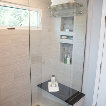
The master bath was not a place where the couple enjoyed spending time getting ready for their day. The tub almost never was used, so removing it made it possible to build an extra-large shower, replacing the small cramped cube of the previous shower they hated. Clean, horizontal lines softly draw your eye around the space with porcelain tile called Driftwood Sea spray. Full overlay cabinetry in a soft white vanity with double sinks makes getting ready for the day much more convenient for the busy couple.
Long floor planks made of porcelain tile mimic real hardwood floors in a soft grey to compliment the shower, but with the ease and care of a tile surface. Cambrian Black Granite counters with a matte finish and under mount porcelain sinks with handsome brushed chrome hardware complete the handsome space. A real bonus in any master bath; a custom built in storage nook was tucked in the corner of the space for linens and heavenly storage.
The kid’s bath was in sad shape because it was original to the house. To keep the budget in control, the tub which was in great condition was retained, but focus was on the new large brick style porcelain charcoal tile on the floor, crisp white new Craftsman style cabinetry with pretty furniture details on the corner base, a striking granite top with white under mount porcelain sinks and fresh hardware and faucets. Some beautiful soft grey wood mirrors to match mom and dads were custom sized and placed under new lighting, and 4 hooks were smartly arranged down the wall for kids’ towels.
This couple was determined not to move, and made their house their dream home. Not only does their home function greatly now, but Jackie says, “When the neighbors come to visit, they’re asking if they can “steal” the design”! The added functionality, elegance, and open floor plan were exactly what this family needed in order to stay.
Advance Design Studio, Joe Nowak
 Sheila Rich Interiors, LLC
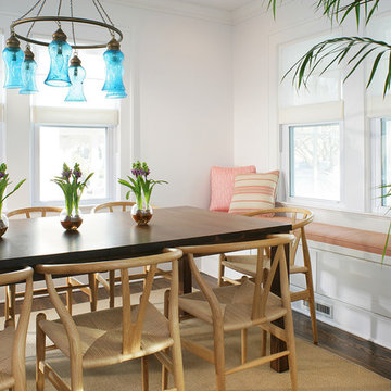
New window seats add seating and storage to the space. We added thick new moldings for architectural interest; dark hardwood floors provide additional warmth. The vintage chandelier draws color from the nearby ocean and adds a spark of color and interest.
Solid wood Parsons dining table and bent wood chairs provide an interesting mix of geometric shapes and textures. The sisal rug grounds the area and adds another natural element.
Window seats were added to create much-needed additional seating and extra storage space.

Sponsored
Columbus, OH

Hope Restoration & General Contracting
Columbus Design-Build, Kitchen & Bath Remodeling, Historic Renovations
 Coddington Design
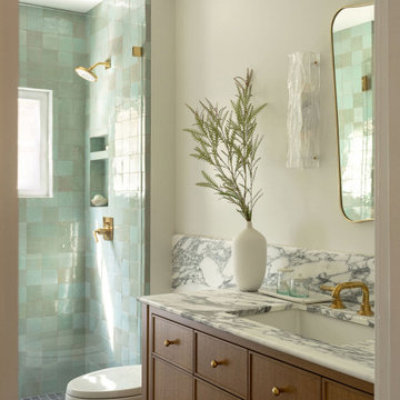
Transitional blue tile and mosaic tile single-sink bathroom photo in San Francisco with medium tone wood cabinets, beige walls, marble countertops, white countertops, a niche and a freestanding vanity
 Homes by Tradition
All of our homes are professionally staged by Ambiance at Home staging. For information regarding the furniture in these photos, please reach out to Ambiance directly at (952) 440-6757.
 Paintzen, Inc.
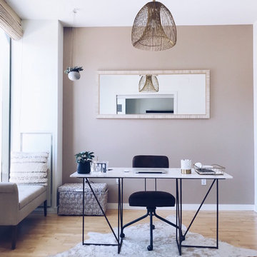
When it comes to finding inspiration for your house or apartment design, there are a variety of routes you can take. For some, it is important to dive into the latest trends in fashion and art, using only the most popular decor pieces and embracing the color palettes seen on runways or in home and garden magazines. But for others, it’s simply about discovering what feels most like “home.”
Ashley Steele, the creator of A Styled Affair, was part of the latter group. “Since my husband and I were moving into a space that was previously owned, I needed a way to make it feel like it was truly ours, and unique to us,” she told our team.
A Styled Affair sprang from Ashley’s passion for fashion, and need for a creative outlet. But it soon became more than that. She developed a following, and it quickly became a place where she could share her personal style, travel adventures, and lifestyle tips. “While the blogging industry has become overwhelmed with people sharing their favorite home decor or make-up tips, I think what sets A Styled Affair apart is my commitment to stay true to my unique taste. I have always marched to the beat of my own drum – and that carries through in the clothes I wear, the decor I select for our home, and the travels I plan.”
Paintzen connected with Ashley as she was settling into her new home in Boston’s Seaport District. Although she and her husband have lived in Boston for almost 8 years, they were used to smaller, more traditional spaces. Their new home is much bigger, and more modern, than any place they lived before. “I wanted to select colors of comfort, simplicity, and sophistication so we could elevate the space and make it feel more like a home.” Ashley also accurately pointed out that new construction can sometimes feel a little cold and sterile, almost industrial. “I wanted our home to feel like a peaceful oasis after coming in from the bustling city.”
Ashley chose soft white paint for her walls to bring a sense of comfort and zen. With lots of wall decor, art work and carefully selected furniture, the walls serve as a clean and comfortable palette, and allowed her more freedom when making her other design decisions throughout the space. Ashley kept the overall palette fairly neutral, and incorporated “modern bohemian” inspired decor throughout the home; the final product was clean and simple, and catered to her style.
We asked Ashley what she was most excited for now. “I’m most excited to continue to find new decor pieces to compliment the paint colors and decor we’ve already found for the space. We have been really patient with decorating and selected each piece really careful to make sure it is cohesive and flows from room to room. I’m looking forward to enjoying the space with my husband and dog, and entertaining friends and family in the spring and summer!”
A few final questions for Ashley on her experience with Paintzen:
“I would highly recommend Paintzen to anyone, especially those that live in the city. There are so many different paint companies and contractors to choose from but going through Paintzen simplified the process and made me feel comfortable that we had the right team working on our space. Their platform for booking services and choosing paint colors made the process seamless and was a great way to keep track of what we booked and chose for colors. Most importantly, the customer service team was outstanding whenever we had a question or needed to make an adjustment.”
And advice she would give someone repainting their home:
“Patience. I would recommend taking your time and doing your research before selecting paint colors. Lighting changes every color so make sure to bring paint swatches and samples into the space and look at it throughout the day to see the different tones that the light will pick up. I would also recommend researching color trends and recommendations for colors in the family you are looking for. We found our living room color through a blog post listing top-used colors by interior designers and it looks amazing.”
 Advance Design Studio, Ltd.
After six years of living in their Huntley IL home, Chris and Meghan were tired of their dark, dingy, outdated kitchen and it was finally time for a long-anticipated change. “The kitchen is the place where we live, it’s where we do everything,” Meghan said. “It was important that it be a space where we wanted to be.” Meghan loves cooking and enjoys including their girls in healthy meal prepping, this led them to want a brighter, more enjoyable kitchen with increased functionality and improved storage.
For Chris especially, the laundry room was an entirely dysfunctional eyesore. “We had a washer and a dryer, but it was all kind-of cobbled together!” Chris said. “There were always laundry piles everywhere, we weren’t really sure what we wanted to do in there, but it was time for us to make a change.” The mess of the space was stressful every time they walked in the door from the garage each day. Kids’ backpacks and shoes piled up haphazardly in the makeshift boot-bench closet left the family feeling disorganized and stressed. They needed space for folding clothes and locker cubbies to help keep the family organized.
Having known Christine and Todd in the Huntley community for years, Chris and Meghan were familiar with their work. “We already trusted them personally and having seen their projects for years we knew they did top notch work. After we reviewed the initial round of designs, we knew that hiring them was definitely the right choice,” Meghan and Chris said. Although Chris had done a lot of work in their home himself, the kitchen and laundry room renovation was such a large undertaking that he didn’t want to steal time away from his family to spend what would surely be many long weekends doing the job himself. “That would not have been a wise choice for us,” Chris laughed.
“Our designer, Michelle was very, very, easy to work with; anything we wanted to see or weren’t sure about, she went above and beyond to make this easy for us. She was easy to get hold of and always quick to respond,” the couple said. Michelle pulled ideas that mirrored the couple’s taste and style and was adept at directing the couple to limited choices that didn’t overwhelm them and kept the process moving. “I have a hard time making decisions. Michelle made the decision-making process so easy. I loved how she listened to what I liked and then presented three great options for me to choose from,” Meghan said.
The main objectives for the kitchen were better storage solutions, they wanted the space to reflect their lifestyle and taste, and they wanted it to last for years with low maintenance. One of the first steps in creating a more functional kitchen was relocating the refrigerator, creating an improved workflow for the busy family.
“We didn’t know that we could even move the refrigerator to a new location where it is now, that was something that we never would have thought of,” Chris said. “The new refrigerator location makes the kitchen feel so much bigger. We didn’t add any space, but our whole kitchen with the new design just seems like it’s so much larger than before!” Meghan said.
The perimeter mist colored cabinets helped warm and brighten the entire room, while the graphite colored cabinets on the island added contrast. Using this fresh, clean color palette satisfied the couple’s desire for a bright space that was the exact opposite of what they had before. Organization accessories were also added to the cabinets such as a spice drawer tray and roll outs to create hidden convenience.
“I absolutely love the hidden spices – it makes cooking so much more enjoyable!” Chris said. “And all the pull outs, and the double trash bin, who would think you could get so excited about organization!” the couple said in unison.
One thing they hated in their original kitchen was how dark the space felt. Added lighting on the ceiling with the new light fixtures combined with the lighter cabinetry colors throughout solved this problem. “Our new kitchen has this warm, almost cozy feeling that our old kitchen never had, it’s just a space that I love spending my time in now,” Meghan said. The light airy feeling was accentuated with the use of floating white shelves on either side of the decorative range hood. “We have so much cabinetry space, the new design is amazing we actually have more storage space than we will ever need,” Meghan said.
The island was extended to create more work surface and added space for stool seating. “The new island changes how we live. Now the kids can be in the kitchen with us, doing homework, eating breakfast, and the three of us have special dinners there when Chris is working late,” Meghan said.
The Carrara Marmi Quartz countertops were chosen because they are, not only beautiful, but are made from hard-working material that doesn’t require maintenance. The white subway tile backsplash that wraps to the ceiling behind the focal point cooktop range/hood compliments the crisp white countertops perfectly, while brushed brass hardware and light fixtures keep the design fresh and new.
The couple had a few fears at the beginning of the project, as most homeowners do. Their biggest fear was being out of their kitchen and laundry room for an extended time. The crew made it very easy for the family to work in a limited space keeping the washer and dryer hooked up the majority of the time, and also getting appliances working with minimal downtime.
“They above and beyond accommodated us to get us through the process,” Meghan said. “They did a great job making sure we were as comfortable as possible throughout the process,” Chris added.
“Our project manager DJ did a great job. He was very good at updating us on schedule changes, getting guys in as quickly as possible. Everyone that stepped in the house was nice and did great work,” said Chris. They thought Advance’s carpenter was phenomenal and were impressed when he took a conceptual idea from a photograph and worked with designer Michelle to create a one of a kind range/hood that has become the topic of conversation with friends and family who visit the new kitchen. “He was in our house literally every day for several weeks. He was easy to work with and good at what he did,” Meghan and Chris said.
The focal point of the kitchen; a hand-crafted, custom-built ventilation hood was clad with handpicked reclaimed barnwood. Advance Design’s carpenter built the framework and the cladding to create a one-of-a-kind design element that the couple loves.
“I think it was especially fun for him to create something unique from scratch, showcasing his talent in this area,” Meghan said. “I love that my kitchen is not like everyone else’s. I got to pick out the wood on my hood and watch it being built and was able to choose what pieces of wood went where on it. It’s totally unique.”
Red Oak flooring was toothed-in throughout the kitchen and the rest of the first floor anywhere changes were made. Then the whole floor was refinished to tone down the orange undertones in the existing floor stain, ultimately changing the color complexion of the entire first floor. The result is a completely new feeling to the entire home.
Renovating the laundry room was extremely important to Meghan and Chris, but they had trouble visualizing what the possibilities were for the seemingly small space. Michelle produced beautiful 3D illustrations that helped them envision the space in a whole new way.
“I must have told Michelle 100 times that I am a visual person, seeing the designs in 3D made it so easy to make decisions and see what we could really do with our space,” Meghan said.
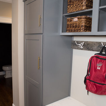
A dividing wall and doorway were removed between the existing laundry room and hallway formerly containing a coat closet, providing space to design specialized graphite colored cabinetry matching the kitchen island to house custom storage cubbies for each family member. Adding the tall utility cabinetry in the new laundry area helped solve the storage issue, tucking away cleaning supplies, household items, and even the cat got its own cubby.
“I love how everything is now hidden in its own space. I can’t tell you how much I hated coming home and seeing everything sitting around on counters,” Chris said.
Electrical outlets were planned for the inside of utility cabinets, so devices could charge in hidden locations. Stacking the washer and dryer allowed for wider countertop space to provide a folding area and a special space for clothes to hang. “The way I do laundry has been completely transformed! I can actually fold clothes and hang them now right out of the washer and dryer,” Meghan said.
“The end result in the kitchen and the laundry/mud room was an updated light and bright space, with a smarter work flow that better meets the needs of this family,” Michelle said.
“I would totally recommend Advance Design,” Meghan said. “Sometimes I sit and just look at my kitchen and laundry room and think ‘Wow, I can’t believe I get to live here!’ It’s an understatement to say we love our new space.”
Sponsored
Columbus, OH
Hope Restoration & General Contracting
Columbus Design-Build, Kitchen & Bath Remodeling, Historic Renovations
 Stephanie Charest Interior Design
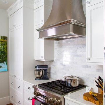
My client contacted me to update the kitchen and main bathroom of her 1912 home in Calgary, located in Elbow Park - one of the oldest communities in the city. The previous owners had done an addition on the back of the house and installed a kitchen that looked more suitable for a 1980’s garage than a home built in 1912. The challenge was to update the look and incorporate modern elements, yet retain the feel and character of a home from that era.
Timeless details were added like marble quartz countertops, Shaker style cabinets and a much more symmetrical layout that positioned the sink under the window, instead of the opposite wall. The 9’-0” ceilings allowed us to design the cabinets to the full ceiling height, giving the home owner much needed storage space. Even though the space has been modernized, it beautifully flows from the living spaces and no longer looks like an after thought, like the previous kitchen did. Check out that custom hood we designed! It’s so killer - I die!
Photography by Lori Andrews
 12/12 Architects & Planners
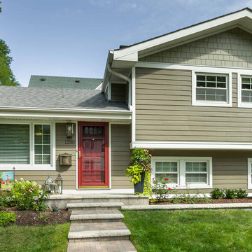
This 1960s split-level home desperately needed a change - not bigger space, just better. We removed the walls between the kitchen, living, and dining rooms to create a large open concept space that still allows a clear definition of space, while offering sight lines between spaces and functions. Homeowners preferred an open U-shape kitchen rather than an island to keep kids out of the cooking area during meal-prep, while offering easy access to the refrigerator and pantry. Green glass tile, granite countertops, shaker cabinets, and rustic reclaimed wood accents highlight the unique character of the home and family. The mix of farmhouse, contemporary and industrial styles make this house their ideal home.
Outside, new lap siding with white trim, and an accent of shake shingles under the gable. The new red door provides a much needed pop of color. Landscaping was updated with a new brick paver and stone front stoop, walk, and landscaping wall.
 Alair Homes Plano
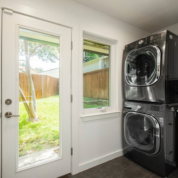
Our clients purchased this 1950 ranch style cottage knowing it needed to be updated. They fell in love with the location, being within walking distance to White Rock Lake. They wanted to redesign the layout of the house to improve the flow and function of the spaces while maintaining a cozy feel. They wanted to explore the idea of opening up the kitchen and possibly even relocating it. A laundry room and mudroom space needed to be added to that space, as well. Both bathrooms needed a complete update and they wanted to enlarge the master bath if possible, to have a double vanity and more efficient storage. With two small boys and one on the way, they ideally wanted to add a 3rd bedroom to the house within the existing footprint but were open to possibly designing an addition, if that wasn’t possible.
In the end, we gave them everything they wanted, without having to put an addition on to the home. They absolutely love the openness of their new kitchen and living spaces and we even added a small bar! They have their much-needed laundry room and mudroom off the back patio, so their “drop zone” is out of the way. We were able to add storage and double vanity to the master bathroom by enclosing what used to be a coat closet near the entryway and using that sq. ft. in the bathroom. The functionality of this house has completely changed and has definitely changed the lives of our clients for the better!
55