
Search results for "Neighboring" in Home Design Ideas
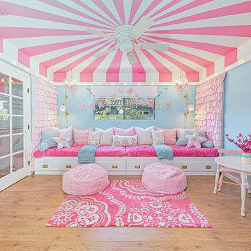
 Kati Yee Studios
This industrial chic open floor plan home in Pasadena's coveted Historic Highlands was given a complete modern farmhouse makeover with shiplap siding, wide planked floors and barn doors. No detail was overlooked by the interior designer home owner. Welcome guests into the vaulted ceiling great room as you gather your friends and family at the 10' farmhouse table after some community cooking in this entertainer's dream kitchen. The 14' island peninsula, individual fridge and freezers, induction cooktop, double ovens, 3 sinks, 2 dishwashers, butler's pantry with yet another sink, and hands free trash receptacle make prep and cleanup a breeze. Stroll down 2 blocks to local shops like Millie's, Be Pilates, and Lark Cake Shop, grabbing a latte from Lavender & Honey. Then walk back to enjoy some apple pie and lemonade from your own fruit trees on your charming 40' porch as you unwind on the porch swing smelling the lavender and rosemary in your newly landscaped yards and waving to the friendly neighbors in this last remaining Norman Rockwell neighborhood. End your day in the polished nickel master bath, relaxing in the wet room with a steam shower and soak in the Jason Microsilk tub. This is modern farmhouse living at its best. Welcome home!
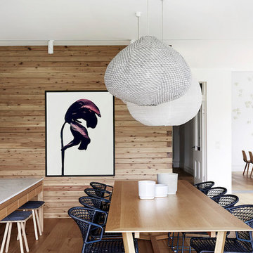
 Whiting Architects
Photo: Sharyn Cairns
Inspiration for a contemporary light wood floor and beige floor great room remodel in Melbourne with brown walls
Inspiration for a contemporary light wood floor and beige floor great room remodel in Melbourne with brown walls
 Dynamic Garage Door
Getting your homeowner's association board to approve your new custom garage doors can seem daunting. Dynamic Garage Door as a custom design and manufacturing firm has come across this situation quite frequently with a phenomenal success approval rate!
In order to get approval for your custom garage door approval there are a few basic points you must understand. First off, your HOA is committed to preserving the neighborhood's curb appeal integrity by focusing on the impact your new custom garage doors might have on your house and the houses of your neighbors. It is important to understand that your curb appeal decisions will impact your home and neighborhood alike. Too many companies offer semi-custom wood doors without the true understanding of the client's need and the essence of their home's architectural style. The garage door design you choose needs to comply with neighborhood regulations while complement your home's architecture. At Dynamic Garage Door, our designers are well-rounded in the garage door industry and so we can suggest or develop designs that will reinforce the natural appearance of your home's style. If you can prove to your HOA that you've done your homework and that the garage door design you chose will complement not only your home but the neighborhood you'll be surprised when your proposal is marked with the approval stamp!
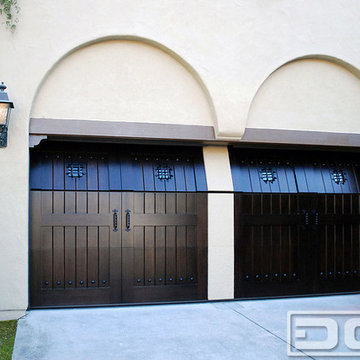
This garage door is actually a single double-car door not two as it appears. The reason is that this garage used to have two separate doors with a post in the middle. The post in the middle made it difficult to use the garage on a daily basis so the post was removed to facilitate the use of the garage. The HOA wasn't too happy about the removal of the post as it was an essential part of the arches located right above the garage doors. You can clearly see how that would have been disruptive if the homeowner went with a regular wood door and not one custom designed and manufactured by Dynamic Garage Door.
This garage door was specifically designed to address the HOA's concern about the center post removal and the effect it would have on the curb appeal of the home with the incomplete double arch look. So we addressed this by crafting the door with a false center post in the middle that was textured and painted the same color of the house to give off that illusion that the post is still there. Overall, it gives the home a complete finished appearance with two independent-looking doors and original post. The homeowner got the entire width of the opening to use at the push of a button so having a larger car won't be a problem anymore. The neighbors are all happy and no one seems to notice the center post is actually fake!
Got an interesting garage door project you want our designers to review and price out for you? Give us a call at (855) 343-DOOR
Find the right local pro for your project
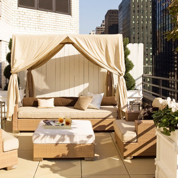
 Mary-Lynn Ring Design, LLC
Eric Piasecki
Transitional tile patio container garden photo in New York with no cover
Transitional tile patio container garden photo in New York with no cover
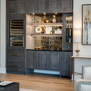
 Rutt Quality Cabinetry
"This beautiful design started with a clean open slate and lots of design opportunities. The homeowner was looking for a large oversized spacious kitchen designed for easy meal prep for multiple cooks and room for entertaining a large oversized family.
The architect’s plans had a single island with large windows on both main walls. The one window overlooked the unattractive side of a neighbor’s house while the other was not large enough to see the beautiful large back yard. The kitchen entry location made the mudroom extremely small and left only a few design options for the kitchen layout. The almost 14’ high ceilings also gave lots of opportunities for a unique design, but care had to be taken to still make the space feel warm and cozy.
After drawing four design options, one was chosen that relocated the entry from the mudroom, making the mudroom a lot more accessible. A prep island across from the range and an entertaining island were included. The entertaining island included a beverage refrigerator for guests to congregate around and to help them stay out of the kitchen work areas. The small island appeared to be floating on legs and incorporates a sink and single dishwasher drawer for easy clean up of pots and pans.
The end result was a stunning spacious room for this large extended family to enjoy."
- Drury Design
Features cabinetry from Rutt
 LSH Architects
© Edward Caldwell Photography, All Rights Reserved.
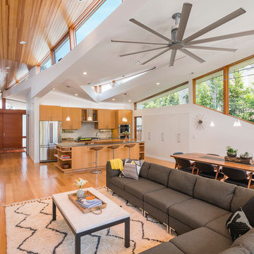
Example of a trendy open concept light wood floor living room design in San Francisco with white walls, a ribbon fireplace, a metal fireplace and no tv
Example of a trendy open concept light wood floor living room design in San Francisco with white walls, a ribbon fireplace, a metal fireplace and no tv

 Margot Hartford Photography
Photo: Margot Hartford © 2016 Houzz
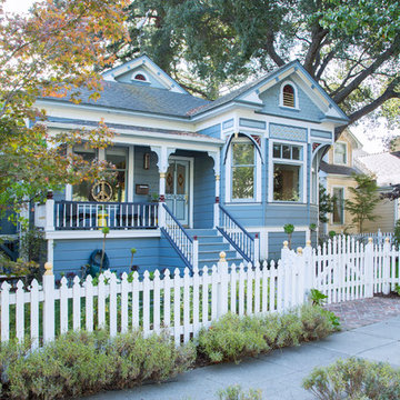
Inspiration for an exterior home remodel in San Francisco
Inspiration for an exterior home remodel in San Francisco
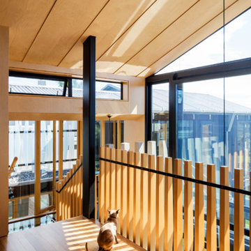
 Strachan Group Architects
Patrick Reynolds
Hallway - contemporary medium tone wood floor hallway idea in Auckland
Hallway - contemporary medium tone wood floor hallway idea in Auckland

 TOMHILL STUDIO
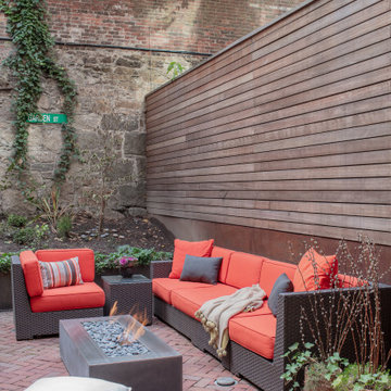
Brick pavers in a herringbone pattern are a nod to this homes historic past. Corten steel retaining walls and horizontal wood screen are the modern materials that give the homeowner the contemporary garden experience they hoped for. The back stone wall is original.
 kimberly peck architect
photos by Pedro Marti
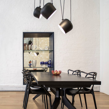
This large light-filled open loft in the Tribeca neighborhood of New York City was purchased by a growing family to make into their family home. The loft, previously a lighting showroom, had been converted for residential use with the standard amenities but was entirely open and therefore needed to be reconfigured. One of the best attributes of this particular loft is its extremely large windows situated on all four sides due to the locations of neighboring buildings. This unusual condition allowed much of the rear of the space to be divided into 3 bedrooms/3 bathrooms, all of which had ample windows. The kitchen and the utilities were moved to the center of the space as they did not require as much natural lighting, leaving the entire front of the loft as an open dining/living area. The overall space was given a more modern feel while emphasizing it’s industrial character. The original tin ceiling was preserved throughout the loft with all new lighting run in orderly conduit beneath it, much of which is exposed light bulbs. In a play on the ceiling material the main wall opposite the kitchen was clad in unfinished, distressed tin panels creating a focal point in the home. Traditional baseboards and door casings were thrown out in lieu of blackened steel angle throughout the loft. Blackened steel was also used in combination with glass panels to create an enclosure for the office at the end of the main corridor; this allowed the light from the large window in the office to pass though while creating a private yet open space to work. The master suite features a large open bath with a sculptural freestanding tub all clad in a serene beige tile that has the feel of concrete. The kids bath is a fun play of large cobalt blue hexagon tile on the floor and rear wall of the tub juxtaposed with a bright white subway tile on the remaining walls. The kitchen features a long wall of floor to ceiling white and navy cabinetry with an adjacent 15 foot island of which half is a table for casual dining. Other interesting features of the loft are the industrial ladder up to the small elevated play area in the living room, the navy cabinetry and antique mirror clad dining niche, and the wallpapered powder room with antique mirror and blackened steel accessories.
 Wiedemann Architects LLC
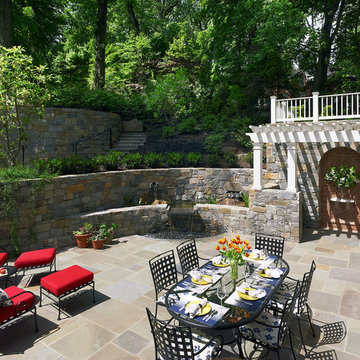
Our client was drawn to the property in Wesley Heights as it was in an established neighborhood of stately homes, on a quiet street with views of park. They wanted a traditional home for their young family with great entertaining spaces that took full advantage of the site.
The site was the challenge. The natural grade of the site was far from traditional. The natural grade at the rear of the property was about thirty feet above the street level. Large mature trees provided shade and needed to be preserved.
The solution was sectional. The first floor level was elevated from the street by 12 feet, with French doors facing the park. We created a courtyard at the first floor level that provide an outdoor entertaining space, with French doors that open the home to the courtyard.. By elevating the first floor level, we were able to allow on-grade parking and a private direct entrance to the lower level pub "Mulligans". An arched passage affords access to the courtyard from a shared driveway with the neighboring homes, while the stone fountain provides a focus.
A sweeping stone stair anchors one of the existing mature trees that was preserved and leads to the elevated rear garden. The second floor master suite opens to a sitting porch at the level of the upper garden, providing the third level of outdoor space that can be used for the children to play.
The home's traditional language is in context with its neighbors, while the design allows each of the three primary levels of the home to relate directly to the outside.
Builder: Peterson & Collins, Inc
Photos © Anice Hoachlander

 Pro-Land Landscape Construction Inc.
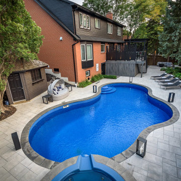
The client wanted a better flow throughout their landscape, as well as introduce straight lines to a space to modernize the irregular shaped pool.
Their upper deck was where they did a majority of their entertaining so ensuring this space was large enough for both dining and lounge was the starting point of the design. Introducing privacy from the many on looking neighbours, without completely blocking it off from the rest of their own yard was important. Laser cut privacy screens added this filtered privacy.
A round hot tub was added to the back corner of the property, which otherwise seemed like wasted space. Highlighted by the privacy panels in the same pattern used on the deck to create some consistency.
Trees were both maintained and added where needs along the property to add greenery and privacy. The entire space now feels open within the backyard, but private from neighbours.
 Pro-Land Landscape Construction Inc.
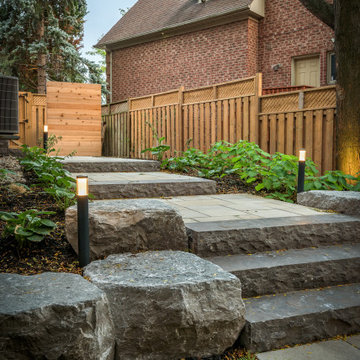
The client wanted a better flow throughout their landscape, as well as introduce straight lines to a space to modernize the irregular shaped pool.
Their upper deck was where they did a majority of their entertaining so ensuring this space was large enough for both dining and lounge was the starting point of the design. Introducing privacy from the many on looking neighbours, without completely blocking it off from the rest of their own yard was important. Laser cut privacy screens added this filtered privacy.
A round hot tub was added to the back corner of the property, which otherwise seemed like wasted space. Highlighted by the privacy panels in the same pattern used on the deck to create some consistency.
Trees were both maintained and added where needs along the property to add greenery and privacy. The entire space now feels open within the backyard, but private from neighbours.
 TKS Design Group
Download our free ebook, Creating the Ideal Kitchen. DOWNLOAD NOW
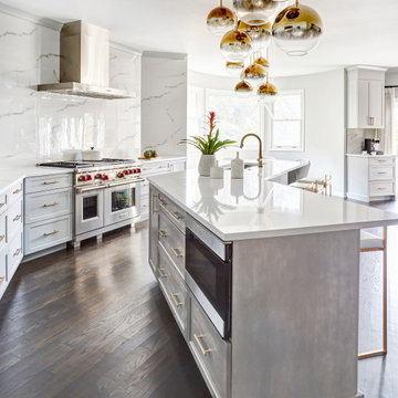
This client was referred to us from a past client. They are a busy 2-career household with young children and enjoy entertaining friends and family in their home. They have a beautiful open concept home but unfortunately the kitchen was not fitting for the rest of the home. They were not quite sure what to do with the space. We talked about trying to refresh it or do more of a minor remodel, but in the end they decided a full gut would get them to where they wanted to be.
One problem was there was no place for guests to hang out other than the large and awkward banquette area. The brick wall and tiled hood area were feeling a bit dated and tired. The space was just not functional for their lifestyle. There was no prep space near the cooktop and no landing area for items coming out of the ovens or refrigerator, plus a big dead zone in the center of the room.
Banquettes, like the one they previously had in the space, are great for small spaces, but when they get really large like this one, it makes getting in and out of the seating area awkward and uncomfortable. Plus, there was room for a large table, so we eliminated the awkward built in.
We started by removing the faux brick wall between the kitchen and back entry. We relocated the entry to the garage over a couple feet in order to get every last inch out of the new kitchen. We also made the decision to close up the primary window that faced the pretty ho hum brick wall of the neighbor’s house. There was plenty of light coming in from the seating area, so we just didn’t feel the window was adding much to the room.
Construction went smoothy. There was a bit of rework with electrical, flooring and HVAC, but in the end, we think it was well worth it.
The clients really wanted a sleek contemporary look, and we originally had planned for a full height slab backsplash, but due to it’s size, it was a budget buster. Instead, we got creative and settled on large format porcelain tiles that have a similar feel but were a fraction of the cost. We made sure the wall was plumb and level so that the fit and finish would mimic that of slab material.
The final space was quite a change. A large prep sink sits directly across from the new pro-style range with plenty additional prep space on the large island. The refrigerator and ovens now have miles of landing space, and a nice tight work triangle makes cooking a breeze.
Since we wanted a more contemporary feel, not many wall cabinets were included. Instead, we outfitted some of the drawers for dish storage with a peg system. Two large pantries flanking the refrigerator hold baking supplies and small appliances. Large drawers by the cooktop hold pots and pans, and an appliance garage tucked away to the left of the range hides away miscellaneous items. The large island also houses a microwave drawer and tons of storage, most of which is drawers offering maximum convenience.
The island now seats 5-6 people comfortably along with the new table in the seating area which can seat up to 8. Entertaining will be a breeze in this space. With such a clean backdrop, we knew we would need some drama with the lighting, so we chose two sets of staggered pendants, which we adjusted for the right visual balance above the island.
We also included a small coffee station to the right of the main kitchen, which helps keep the coffee clutter out of the kitchen proper. Two tones of complimentary gray are featured in this kitchen. The perimeter is a light gray that reads almost white. The island is a gray stain that adds some depth and interest with the visible wood texture. The countertops are clean white quartz, and the hardware, barstools and light fixtures add warm brass tones. I see lots of cooking and entertaining with family and friends in the near future in this bright and airy new space.
Designed by: Susan Klimala, CKD, CBD
Photography by: Michael Kaskel
For more information on kitchen and bath design ideas go to: www.kitchenstudio-ge.com
 Granit Architects + Interiors
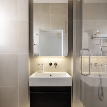
Our clients for this project are a professional couple with a young family. They approached us to help with extending and improving their home in London SW2 to create an enhanced space both aesthetically and functionally for their growing family. We were appointed to provide a full architectural and interior design service, including the design of some bespoke furniture too.
A core element of the brief was to design a kitchen living and dining space that opened into the garden and created clear links from inside to out. This new space would provide a large family area they could enjoy all year around. We were also asked to retain the good bits of the current period living spaces while creating a more modern day area in an extension to the rear.
It was also a key requirement to refurbish the upstairs bathrooms while the extension and refurbishment works were underway.
The solution was a 21m2 extension to the rear of the property that mirrored the neighbouring property in shape and size. However, we added some additional features, such as the projecting glass box window seat. The new kitchen features a large island unit to create a workspace with storage, but also room for seating that is perfect for entertaining friends, or homework when the family gets to that age.
The sliding folding doors, paired with floor tiling that ran from inside to out, created a clear link from the garden to the indoor living space. Exposed brick blended with clean white walls creates a very contemporary finish throughout the extension, while the period features have been retained in the original parts of the house.

108