
Search results for "Neighboring" in Home Design Ideas

 SV Design
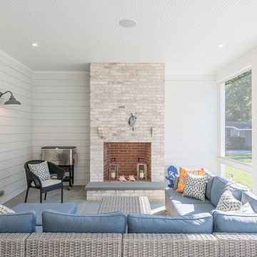
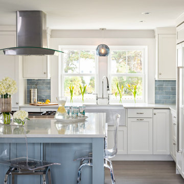
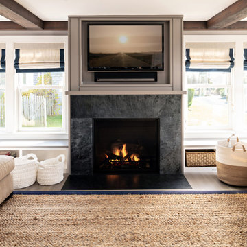
The challenge: take a run-of-the mill colonial-style house and turn it into a vibrant, Cape Cod beach home. The creative and resourceful crew at SV Design rose to the occasion and rethought the box. Given a coveted location and cherished ocean view on a challenging lot, SV’s architects looked for the best bang for the buck to expand where possible and open up the home inside and out. Windows were added to take advantage of views and outdoor spaces—also maximizing water-views were added in key locations.
The result: a home that causes the neighbors to stop the new owners and express their appreciation for making such a stunning improvement. A home to accommodate everyone and many years of enjoyment to come.
 SALA Architects
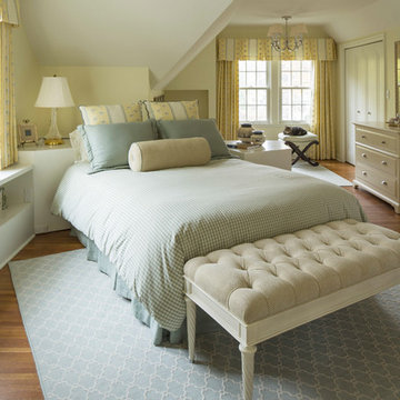
Set within a beautiful city neighborhood off West River Road, this 1940’s cottage was completely updated, remodeled and added to, resulting in a “new house” for the enjoyment of its long-term owners, who plans to remain in the home indefinitely. Each room in the house was restored and refreshed and new spaces were added including kitchen, family room, mudroom, guest bedroom and studio. A new detached garage was sited to provide a screen from the alley and to create a courtyard for a more private backyard. Careful consideration was given to the streetscape and neighboring houses on both the front and back elevations to assure that massing, new materials and exterior details complemented the existing house, street and neighborhood. Finally a new covered porch was added to protect from the elements and present a more welcoming entry from the street.
Construction by Flynn Construction, Inc.
Landscape Architecture by Tupper and Associates
Interior Design by InUnison Design
Photographs by Troy Thies
Find the right local pro for your project


 SV Design
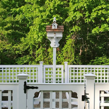
The challenge: take a run-of-the mill colonial-style house and turn it into a vibrant, Cape Cod beach home. The creative and resourceful crew at SV Design rose to the occasion and rethought the box. Given a coveted location and cherished ocean view on a challenging lot, SV’s architects looked for the best bang for the buck to expand where possible and open up the home inside and out. Windows were added to take advantage of views and outdoor spaces—also maximizing water-views were added in key locations.
The result: a home that causes the neighbors to stop the new owners and express their appreciation for making such a stunning improvement. A home to accommodate everyone and many years of enjoyment to come.
 Shuler Architecture
Here's one of our most recent projects that was completed in 2011. This client had just finished a major remodel of their house in 2008 and were about to enjoy Christmas in their new home. At the time, Seattle was buried under several inches of snow (a rarity for us) and the entire region was paralyzed for a few days waiting for the thaw. Our client decided to take advantage of this opportunity and was in his driveway sledding when a neighbor rushed down the drive yelling that his house was on fire. Unfortunately, the house was already engulfed in flames. Equally unfortunate was the snowstorm and the delay it caused the fire department getting to the site. By the time they arrived, the house and contents were a total loss of more than $2.2 million.
Here's one of our most recent projects that was completed in 2011. This client had just finished a major remodel of their house in 2008 and were about to enjoy Christmas in their new home. At the time, Seattle was buried under several inches of snow (a rarity for us) and the entire region was paralyzed for a few days waiting for the thaw. Our client decided to take advantage of this opportunity and was in his driveway sledding when a neighbor rushed down the drive yelling that his house was on fire. Unfortunately, the house was already engulfed in flames. Equally unfortunate was the snowstorm and the delay it caused the fire department getting to the site. By the time they arrived, the house and contents were a total loss of more than $2.2 million.
Our role in the reconstruction of this home was two-fold. The first year of our involvement was spent working with a team of forensic contractors gutting the house, cleansing it of all particulate matter, and then helping our client negotiate his insurance settlement. Once we got over these hurdles, the design work and reconstruction started. Maintaining the existing shell, we reworked the interior room arrangement to create classic great room house with a contemporary twist. Both levels of the home were opened up to take advantage of the waterfront views and flood the interiors with natural light. On the lower level, rearrangement of the walls resulted in a tripling of the size of the family room while creating an additional sitting/game room. The upper level was arranged with living spaces bookended by the Master Bedroom at one end the kitchen at the other. The open Great Room and wrap around deck create a relaxed and sophisticated living and entertainment space that is accentuated by a high level of trim and tile detail on the interior and by custom metal railings and light fixtures on the exterior.
 Flavin Architects
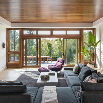
This new house is located in a quiet residential neighborhood developed in the 1920’s, that is in transition, with new larger homes replacing the original modest-sized homes. The house is designed to be harmonious with its traditional neighbors, with divided lite windows, and hip roofs. The roofline of the shingled house steps down with the sloping property, keeping the house in scale with the neighborhood. The interior of the great room is oriented around a massive double-sided chimney, and opens to the south to an outdoor stone terrace and garden. Photo by: Nat Rea Photography
 TKS Design Group
Download our free ebook, Creating the Ideal Kitchen. DOWNLOAD NOW
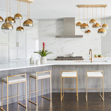
This client was referred to us from a past client. They are a busy 2-career household with young children and enjoy entertaining friends and family in their home. They have a beautiful open concept home but unfortunately the kitchen was not fitting for the rest of the home. They were not quite sure what to do with the space. We talked about trying to refresh it or do more of a minor remodel, but in the end they decided a full gut would get them to where they wanted to be.
One problem was there was no place for guests to hang out other than the large and awkward banquette area. The brick wall and tiled hood area were feeling a bit dated and tired. The space was just not functional for their lifestyle. There was no prep space near the cooktop and no landing area for items coming out of the ovens or refrigerator, plus a big dead zone in the center of the room.
Banquettes, like the one they previously had in the space, are great for small spaces, but when they get really large like this one, it makes getting in and out of the seating area awkward and uncomfortable. Plus, there was room for a large table, so we eliminated the awkward built in.
We started by removing the faux brick wall between the kitchen and back entry. We relocated the entry to the garage over a couple feet in order to get every last inch out of the new kitchen. We also made the decision to close up the primary window that faced the pretty ho hum brick wall of the neighbor’s house. There was plenty of light coming in from the seating area, so we just didn’t feel the window was adding much to the room.
Construction went smoothy. There was a bit of rework with electrical, flooring and HVAC, but in the end, we think it was well worth it.
The clients really wanted a sleek contemporary look, and we originally had planned for a full height slab backsplash, but due to it’s size, it was a budget buster. Instead, we got creative and settled on large format porcelain tiles that have a similar feel but were a fraction of the cost. We made sure the wall was plumb and level so that the fit and finish would mimic that of slab material.
The final space was quite a change. A large prep sink sits directly across from the new pro-style range with plenty additional prep space on the large island. The refrigerator and ovens now have miles of landing space, and a nice tight work triangle makes cooking a breeze.
Since we wanted a more contemporary feel, not many wall cabinets were included. Instead, we outfitted some of the drawers for dish storage with a peg system. Two large pantries flanking the refrigerator hold baking supplies and small appliances. Large drawers by the cooktop hold pots and pans, and an appliance garage tucked away to the left of the range hides away miscellaneous items. The large island also houses a microwave drawer and tons of storage, most of which is drawers offering maximum convenience.
The island now seats 5-6 people comfortably along with the new table in the seating area which can seat up to 8. Entertaining will be a breeze in this space. With such a clean backdrop, we knew we would need some drama with the lighting, so we chose two sets of staggered pendants, which we adjusted for the right visual balance above the island.
We also included a small coffee station to the right of the main kitchen, which helps keep the coffee clutter out of the kitchen proper. Two tones of complimentary gray are featured in this kitchen. The perimeter is a light gray that reads almost white. The island is a gray stain that adds some depth and interest with the visible wood texture. The countertops are clean white quartz, and the hardware, barstools and light fixtures add warm brass tones. I see lots of cooking and entertaining with family and friends in the near future in this bright and airy new space.
Designed by: Susan Klimala, CKD, CBD
Photography by: Michael Kaskel
For more information on kitchen and bath design ideas go to: www.kitchenstudio-ge.com

 Studio Steinbomer
Example of a mid-sized mid-century modern white two-story brick exterior home design in Austin with a metal roof and a gray roof
 Mark Brand Architecture
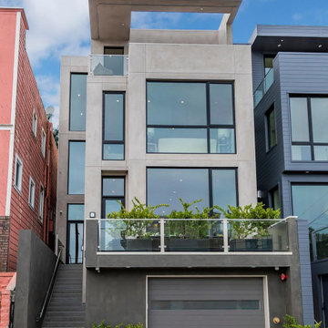
We were approached by a San Francisco firefighter to design a place for him and his girlfriend to live while also creating additional units he could sell to finance the project. He grew up in the house that was built on this site in approximately 1886. It had been remodeled repeatedly since it was first built so that there was only one window remaining that showed any sign of its Victorian heritage. The house had become so dilapidated over the years that it was a legitimate candidate for demolition. Furthermore, the house straddled two legal parcels, so there was an opportunity to build several new units in its place. At our client’s suggestion, we developed the left building as a duplex of which they could occupy the larger, upper unit and the right building as a large single-family residence. In addition to design, we handled permitting, including gathering support by reaching out to the surrounding neighbors and shepherding the project through the Planning Commission Discretionary Review process. The Planning Department insisted that we develop the two buildings so they had different characters and could not be mistaken for an apartment complex. The duplex design was inspired by Albert Frey’s Palm Springs modernism but clad in fibre cement panels and the house design was to be clad in wood. Because the site was steeply upsloping, the design required tall, thick retaining walls that we incorporated into the design creating sunken patios in the rear yards. All floors feature generous 10 foot ceilings and large windows with the upper, bedroom floors featuring 11 and 12 foot ceilings. Open plans are complemented by sleek, modern finishes throughout.

 ZeroEnergy Design
ZeroEnergy Design (ZED) created this modern home for a progressive family in the desirable community of Lexington.
Thoughtful Land Connection. The residence is carefully sited on the infill lot so as to create privacy from the road and neighbors, while cultivating a side yard that captures the southern sun. The terraced grade rises to meet the house, allowing for it to maintain a structured connection with the ground while also sitting above the high water table. The elevated outdoor living space maintains a strong connection with the indoor living space, while the stepped edge ties it back to the true ground plane. Siting and outdoor connections were completed by ZED in collaboration with landscape designer Soren Deniord Design Studio.
Exterior Finishes and Solar. The exterior finish materials include a palette of shiplapped wood siding, through-colored fiber cement panels and stucco. A rooftop parapet hides the solar panels above, while a gutter and site drainage system directs rainwater into an irrigation cistern and dry wells that recharge the groundwater.
Cooking, Dining, Living. Inside, the kitchen, fabricated by Henrybuilt, is located between the indoor and outdoor dining areas. The expansive south-facing sliding door opens to seamlessly connect the spaces, using a retractable awning to provide shade during the summer while still admitting the warming winter sun. The indoor living space continues from the dining areas across to the sunken living area, with a view that returns again to the outside through the corner wall of glass.
Accessible Guest Suite. The design of the first level guest suite provides for both aging in place and guests who regularly visit for extended stays. The patio off the north side of the house affords guests their own private outdoor space, and privacy from the neighbor. Similarly, the second level master suite opens to an outdoor private roof deck.
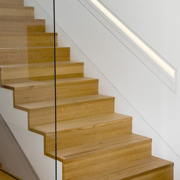
Light and Access. The wide open interior stair with a glass panel rail leads from the top level down to the well insulated basement. The design of the basement, used as an away/play space, addresses the need for both natural light and easy access. In addition to the open stairwell, light is admitted to the north side of the area with a high performance, Passive House (PHI) certified skylight, covering a six by sixteen foot area. On the south side, a unique roof hatch set flush with the deck opens to reveal a glass door at the base of the stairwell which provides additional light and access from the deck above down to the play space.
Energy. Energy consumption is reduced by the high performance building envelope, high efficiency mechanical systems, and then offset with renewable energy. All windows and doors are made of high performance triple paned glass with thermally broken aluminum frames. The exterior wall assembly employs dense pack cellulose in the stud cavity, a continuous air barrier, and four inches exterior rigid foam insulation. The 10kW rooftop solar electric system provides clean energy production. The final air leakage testing yielded 0.6 ACH 50 - an extremely air tight house, a testament to the well-designed details, progress testing and quality construction. When compared to a new house built to code requirements, this home consumes only 19% of the energy.
Architecture & Energy Consulting: ZeroEnergy Design
Landscape Design: Soren Deniord Design
Paintings: Bernd Haussmann Studio
Photos: Eric Roth Photography

 Debi Weber Design, LLC
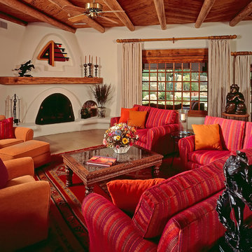
Southwest brown floor living room photo in Phoenix with white walls and a standard fireplace
 Drewett Works
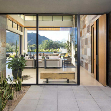
With adjacent neighbors within a fairly dense section of Paradise Valley, Arizona, C.P. Drewett sought to provide a tranquil retreat for a new-to-the-Valley surgeon and his family who were seeking the modernism they loved though had never lived in. With a goal of consuming all possible site lines and views while maintaining autonomy, a portion of the house — including the entry, office, and master bedroom wing — is subterranean. This subterranean nature of the home provides interior grandeur for guests but offers a welcoming and humble approach, fully satisfying the clients requests.
While the lot has an east-west orientation, the home was designed to capture mainly north and south light which is more desirable and soothing. The architecture’s interior loftiness is created with overlapping, undulating planes of plaster, glass, and steel. The woven nature of horizontal planes throughout the living spaces provides an uplifting sense, inviting a symphony of light to enter the space. The more voluminous public spaces are comprised of stone-clad massing elements which convert into a desert pavilion embracing the outdoor spaces. Every room opens to exterior spaces providing a dramatic embrace of home to natural environment.
Grand Award winner for Best Interior Design of a Custom Home
The material palette began with a rich, tonal, large-format Quartzite stone cladding. The stone’s tones gaveforth the rest of the material palette including a champagne-colored metal fascia, a tonal stucco system, and ceilings clad with hemlock, a tight-grained but softer wood that was tonally perfect with the rest of the materials. The interior case goods and wood-wrapped openings further contribute to the tonal harmony of architecture and materials.
Grand Award Winner for Best Indoor Outdoor Lifestyle for a Home This award-winning project was recognized at the 2020 Gold Nugget Awards with two Grand Awards, one for Best Indoor/Outdoor Lifestyle for a Home, and another for Best Interior Design of a One of a Kind or Custom Home.
At the 2020 Design Excellence Awards and Gala presented by ASID AZ North, Ownby Design received five awards for Tonal Harmony. The project was recognized for 1st place – Bathroom; 3rd place – Furniture; 1st place – Kitchen; 1st place – Outdoor Living; and 2nd place – Residence over 6,000 square ft. Congratulations to Claire Ownby, Kalysha Manzo, and the entire Ownby Design team.
Tonal Harmony was also featured on the cover of the July/August 2020 issue of Luxe Interiors + Design and received a 14-page editorial feature entitled “A Place in the Sun” within the magazine.
 Mom's Design Build
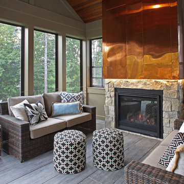
The bold, raised seam copper shroud and stone veneer surround heighten the visual impact of gas fireplace insert.
Half windows preserve privacy from neighbors while an existing door continues to provide access from the house.
 Kelly Hohla Interiors
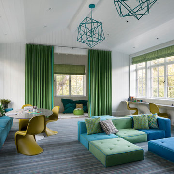
Transitional Kid's Playroom and Study
Photography by Paul Dyer
Example of a large transitional gender-neutral carpeted, shiplap ceiling, vaulted ceiling and shiplap wall kids' room design in San Francisco with white walls
Example of a large transitional gender-neutral carpeted, shiplap ceiling, vaulted ceiling and shiplap wall kids' room design in San Francisco with white walls
 Forward Design Build Remodel
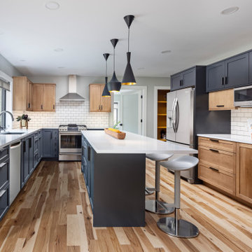
Our plan was to create an addition on the north and east side of the house to increase the kitchen footprint, add a family room, mudroom, powder room and first floor laundry.
We also added a new second floor addition with three bedrooms and two full bathrooms over the existing living room and kitchen addition below. We built a large two car garage attached by the new mudroom.
In order to maximize the footprint and add a modern element to the design, the garage was designed parallel to the property line. We created a large front porch where they could gather and hangout with their neighbors, which was important to them.
106