
Search results for "Neutral color palette" in Home Design Ideas

 TKS Design Group
Download our free ebook, Creating the Ideal Kitchen. DOWNLOAD NOW
For many, extra time at home during COVID left them wanting more from their homes. Whether you realized the shortcomings of your space or simply wanted to combat boredom, a well-designed and functional home was no longer a want, it became a need. Tina found herself wanting more from her Old Irving Park home and reached out to The Kitchen Studio about adding function to her kitchen to make the most of the available real estate.
At the end of the day, there is nothing better than returning home to a bright and happy space you love. And this kitchen wasn’t that for Tina. Dark and dated, with a palette from the past and features that didn’t make the most of the available square footage, this remodel required vision and a fresh approach to the space. Lead designer, Stephanie Cole’s main design goal was better flow, while adding greater functionality with organized storage, accessible open shelving, and an overall sense of cohesion with the adjoining family room.
The original kitchen featured a large pizza oven, which was rarely used, yet its footprint limited storage space. The nearby pantry had become a catch-all, lacking the organization needed in the home. The initial plan was to keep the pizza oven, but eventually Tina realized she preferred the design possibilities that came from removing this cumbersome feature, with the goal of adding function throughout the upgraded and elevated space. Eliminating the pantry added square footage and length to the kitchen for greater function and more storage. This redesigned space reflects how she lives and uses her home, as well as her love for entertaining.
The kitchen features a classic, clean, and timeless palette. White cabinetry, with brass and bronze finishes, contrasts with rich wood flooring, and lets the large, deep blue island in Woodland’s custom color Harbor – a neutral, yet statement color – draw your eye.
The kitchen was the main priority. In addition to updating and elevating this space, Tina wanted to maximize what her home had to offer. From moving the location of the patio door and eliminating a window to removing an existing closet in the mudroom and the cluttered pantry, the kitchen footprint grew. Once the floorplan was set, it was time to bring cohesion to her home, creating connection between the kitchen and surrounding spaces.
The color palette carries into the mudroom, where we added beautiful new cabinetry, practical bench seating, and accessible hooks, perfect for guests and everyday living. The nearby bar continues the aesthetic, with stunning Carrara marble subway tile, hints of brass and bronze, and a design that further captures the vibe of the kitchen.
Every home has its unique design challenges. But with a fresh perspective and a bit of creativity, there is always a way to give the client exactly what they want [and need]. In this particular kitchen, the existing soffits and high slanted ceilings added a layer of complexity to the lighting layout and upper perimeter cabinets.
While a space needs to look good, it also needs to function well. This meant making the most of the height of the room and accounting for the varied ceiling features, while also giving Tina everything she wanted and more. Pendants and task lighting paired with an abundance of natural light amplify the bright aesthetic. The cabinetry layout and design compliments the soffits with subtle profile details that bring everything together. The tile selections add visual interest, drawing the eye to the focal area above the range. Glass-doored cabinets further customize the space and give the illusion of even more height within the room.
While her family may be grown and out of the house, Tina was focused on adding function without sacrificing a stunning aesthetic and dreamy finishes that make the kitchen the gathering place of any home. It was time to love her kitchen again, and if you’re wondering what she loves most, it’s the niche with glass door cabinetry and open shelving for display paired with the marble mosaic backsplash over the range and complimenting hood. Each of these features is a stunning point of interest within the kitchen – both brag-worthy additions to a perimeter layout that previously felt limited and lacking.
Whether your remodel is the result of special needs in your home or simply the excitement of focusing your energy on creating a fun new aesthetic, we are here for it. We love a good challenge because there is always a way to make a space better – adding function and beauty simultaneously.
 User
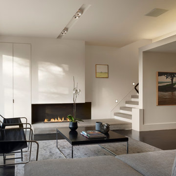
UserA 1980's townhouse located in the Fitler Square neighborhood of Philadelphia was in need of an upgrade. The project that resulted included substantial interior renovation to the four-story townhome overlooking the Schuylkill River.
The Owners desired a fresh interpretation of their existing space, more suited for entertaining and uncluttered modern living. This led to a reinvention of the modern master suite and a refocusing of architectural elements and materials throughout the home.
Originally comprised of a divided master bedroom, bathroom and office, the fourth floor was entirely redesigned to create a contemporary, open-plan master suite. The bedroom, now located in the center of the floor plan, is composed with custom built-in furniture and includes a glass terrarium and a wet bar. It is flanked by a dressing room on one side and a luxurious bathroom on the other, all open to one another both visually and by circulation. The bathroom includes a free-standing tub, glass shower, custom wood vanity, eco-conscious fireplace, and an outdoor terrace. The open plan allows for great breadth and a wealth of natural light, atypical of townhouse living.
The main entertaining floor houses the kitchen, dining area and living room. A sculptural ceiling defines the open dining area, while a long, low concrete hearth connects the new modern fireplace with the concrete stair treads leading up. The bright, neutral color palette of the walls and finishes contrasts against the blackened wood floors. Sleek but comfortable furnishing, dramatic recessed lighting, and a full-home speaker system complete the entertaining space.
Barry Halkin and Todd Mason Photography
 Colorful Concepts Interior Design
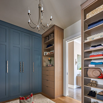
Large beach style gender-neutral light wood floor and beige floor walk-in closet photo in Wilmington with shaker cabinets and blue cabinets
Find the right local pro for your project
 Nicholas Carl Design
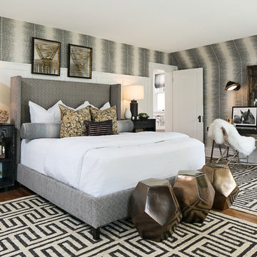
This Master Bedroom was designed with a Neutral color palette and layers of pattern and texture. Black, white, and gold was our color reference.
Inspiration for a transitional master medium tone wood floor and brown floor bedroom remodel in Milwaukee with gray walls
Inspiration for a transitional master medium tone wood floor and brown floor bedroom remodel in Milwaukee with gray walls
 Amy Pearson Design
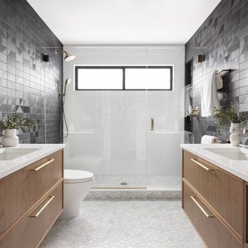
The primary bedroom and bathroom are the showstoppers of this phase! Unused and awkwardly located closets in both the bedroom and bathroom were removed to make way for additional square-footage in the bath and replaced with a sizable and functional reach-in closet in the bedroom. A dated and cramped shower stall was removed in favor for an expansive step in shower spanning the width of the bathroom and a new transom window washes the room in natural light. While the previous bathroom was only able to accommodate a single vanity, the new layout allowed us to create double matching vanities mirrored across from each other - a much appreciated addition for a primary bath. Floating walnut vanities boast impressive storage and are capped with tower cabinets with hidden outlets for charging and storing electronic bathroom tools. While the color palette is restrained - black, white, gray, and brown - the result is a timelessly modern and masculine space that is at once striking and warm. Modern geometric patterns play with each other throughout the material selections.
 JRP Design & Remodel
To spotlight the owners’ worldly decor, this remodel quietly complements the furniture and art textures, colors, and patterns abundant in this beautiful home.
The original master bath had a 1980s style in dire need of change. By stealing an adjacent bedroom for the new master closet, the bath transformed into an artistic and spacious space. The jet-black herringbone-patterned floor adds visual interest to highlight the freestanding soaking tub. Schoolhouse-style shell white sconces flank the matching his and her vanities. The new generous master shower features polished nickel dual shower heads and hand shower and is wrapped in Bedrosian Porcelain Manifica Series in Luxe White with satin finish.
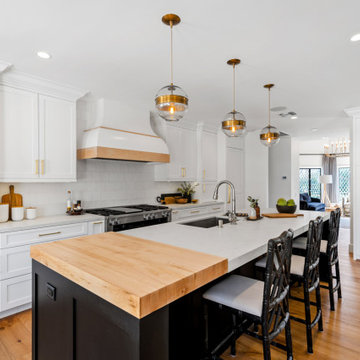
The kitchen started as dated and isolated. To add flow and more natural light, the wall between the bar and the kitchen was removed, along with exterior windows, which allowed for a complete redesign. The result is a streamlined, open, and light-filled kitchen that flows into the adjacent family room and bar areas – perfect for quiet family nights or entertaining with friends.
Crystal Cabinets in white matte sheen with satin brass pulls, and the white matte ceramic backsplash provides a sleek and neutral palette. The newly-designed island features Calacutta Royal Leather Finish quartz and Kohler sink and fixtures. The island cabinets are finished in black sheen to anchor this seating and prep area, featuring round brass pendant fixtures. One end of the island provides the perfect prep and cut area with maple finish butcher block to match the stove hood accents. French White Oak flooring warms the entire area. The Miele 48” Dual Fuel Range with Griddle offers the perfect features for simple or gourmet meal preparation. A new dining nook makes for picture-perfect seating for night or day dining.
Welcome to artful living in Worldly Heritage style.
Photographer: Andrew - OpenHouse VC
 Altura Architects
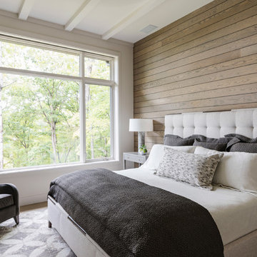
Calm and neutral color palette is the master bedroom at the modern farmhouse in Mill Spring, NC. A gray chair with matching patterned throw pillow creates a relaxing sitting area in the master suite.
Photography by Todd Crawford.
Sponsored
Sunbury, OH

J.Holderby - Renovations
Franklin County's Leading General Contractors - 2X Best of Houzz!
 Siobhan's Outdoor Transformations
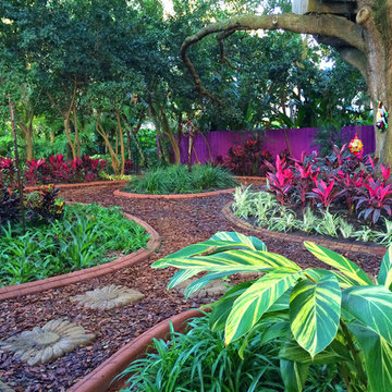
A no-grass solution, where big trees make it hard to grow grass. This garden has close to no flowers, but tons of color, provided by uniquely colored foliage. The border is custom concrete curbing.
 TKS Design Group
Download our free ebook, Creating the Ideal Kitchen. DOWNLOAD NOW
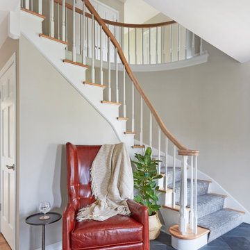
Lakefront property in the northwest suburbs of Chicago is hard to come by, so when we were hired by this young family with exactly that, we were immediately inspired by not just the unusually large footprint of this 1950’s colonial revival but also the lovely views of the manmade lake it was sited on. The large 5-bedroom home was solidly stuck in the 1980’s, but we saw tons of potential. We started out by updating the existing staircase with a fresh coat of paint and adding new herringbone slate to the entry hall.
The powder room off the entryway also got a refresh - new flooring, new cabinets and fixtures. We ran the new slate right through into this space for some consistency. A fun wallpaper and shiplap trim add a welcoming feel and set the tone for the home.
Next, we tackled the kitchen. Located away from the rest of the first floor, the kitchen felt a little isolated, so we immediately began planning for how to better connect it to the rest of the first floor. We landed on removing the wall between the kitchen and dining room and designed a modified galley style space with separate cooking and clean up zones. The cooking zone consists of the refrigerator, prep sink and cooktop, along with a nice long run of prep space at the island. The cleanup side of the kitchen consists of the main sink and dishwasher. Both areas are situated so that the user can view the lake during prep work and cleanup!
One of the home’s main puzzles was how to incorporate the mudroom and area in front of the patio doors at the back of the house. We already had a breakfast table area, so the space by the patio doors was a bit of a no man’s land. We decided to separate the kitchen proper from what became the new mudroom with a large set of barn doors. That way you can quickly hide any mudroom messes but have easy access to the light coming in through the patio doors as well as the outdoor grilling station. We also love the impact the barn doors add to the overall space.
The homeowners’ first words to us were “it’s time to ditch the brown,” so we did! We chose a lovely blue pallet that reflects the home’s location on the lake which is also vibrant yet easy on the eye. Countertops are white quartz, and the natural oak floor works well with the other honey accents. The breakfast table was given a refresh with new chairs, chandelier and window treatments that frame the gorgeous views of the lake out the back.
We coordinated the slate mudroom flooring with that used in the home’s main entrance for a consistent feel. The storage area consists of open and closed storage to allow for some clutter control as needed.
Next on our “to do” list was revamping the dated brown bar area in the neighboring dining room. We eliminated the clutter by adding some closed cabinets and did some easy updates to help the space feel more current. One snag we ran into here was the discovery of a beam above the existing open shelving that had to be modified with a smaller structural beam to allow for our new design to work. This was an unexpected surprise, but in the end we think it was well worth it!
We kept the colors here a bit more muted to blend with the homeowner’s existing furnishings. Open shelving and polished nickel hardware add some simple detail to the new entertainment zone which also looks out onto the lake!
Next we tackled the upstairs starting with the homeowner’s son’s bath. The bath originally had both a tub shower and a separate shower, so we decided to swap out the shower for a new laundry area. This freed up some space downstairs in what used to be the mudroom/laundry room and is much more convenient for daily laundry needs.
We continued the blue palette here with navy cabinetry and the navy tile in the shower. Porcelain floor tile and chrome fixtures keep maintenance to a minimum while matte black mirrors and lighting add some depth the design. A low maintenance runner adds some warmth underfoot and ties the whole space together.
We added a pocket door to the bathroom to minimize interference with the door swings. The left door of the laundry closet is on a 180 degree hinge to allow for easy full access to the machines. Next we tackled the master bath which is an en suite arrangement. The original was typical of the 1980’s with the vanity outside of the bathroom, situated near the master closet. And the brown theme continued here with multiple shades of brown.
Our first move was to segment off the bath and the closet from the master bedroom. We created a short hall from the bedroom to the bathroom with his and hers walk-in closets on the left and right as well as a separate toilet closet outside of the main bathroom for privacy and flexibility.
The original bathroom had a giant soaking tub with steps (dangerous!) as well as a small shower that did not work well for our homeowner who is 6’3”. With other bathtubs in the home, they decided to eliminate the tub and create an oversized shower which takes up the space where the old tub was located. The double vanity is on the opposite wall and a bench is located under the window for morning conversations and a place to set a couple of towels.
The pallet in here is light and airy with a mix of blond wood, creamy porcelain and marble tile, and brass accents. A simple roman shade adds some texture and it’s top-down mechanism allows for light and privacy.
This large whole house remodel gave our homeowners not only the ability to maximize the potential of their home but also created a lovely new frame from which to view their fabulous lake views.
Designed by: Susan Klimala, CKD, CBD
Photography by: Michael Kaskel
For more information on kitchen and bath design ideas go to: www.kitchenstudio-ge.com
 colorific
Pierre Galant
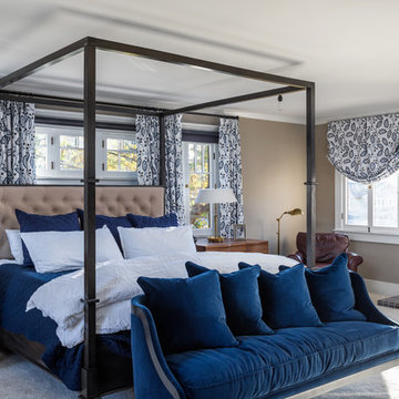
Example of a mid-sized arts and crafts master carpeted and white floor bedroom design in Los Angeles with brown walls and a standard fireplace
Example of a mid-sized arts and crafts master carpeted and white floor bedroom design in Los Angeles with brown walls and a standard fireplace
 Copper Sky Design + Remodel
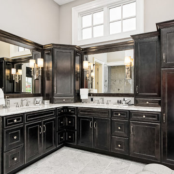
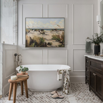
Located in Ansley Park, this 1928 historic home underwent a primary bathroom transformation, relocating it from the second story to the main level of the home. The renovated bathroom boasts a large dark wood stained double vanity, freestanding soaker tub, and luxurious walk-in shower with a rain showerhead. Copper Sky Design + Remodel achieved a traditional style with subtle finishes by using a neutral color palette and incorporating polished nickel accents. This newly renovated bathroom exemplifies an inviting spa-like aesthetic.
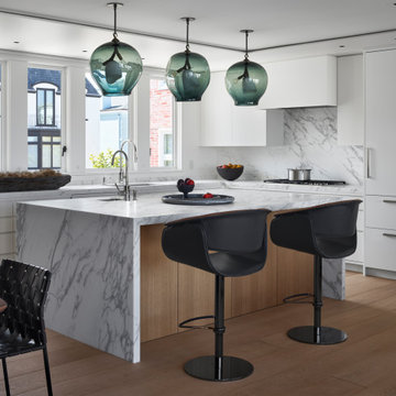
 Ann Lowengart Interiors
For this classic San Francisco William Wurster house, we complemented the iconic modernist architecture, urban landscape, and Bay views with contemporary silhouettes and a neutral color palette. We subtly incorporated the wife's love of all things equine and the husband's passion for sports into the interiors. The family enjoys entertaining, and the multi-level home features a gourmet kitchen, wine room, and ample areas for dining and relaxing. An elevator conveniently climbs to the top floor where a serene master suite awaits.
Sponsored
Delaware, OH

Buckeye Basements, Inc.
Central Ohio's Basement Finishing ExpertsBest Of Houzz '13-'21
 Halcyon Interiors Co.
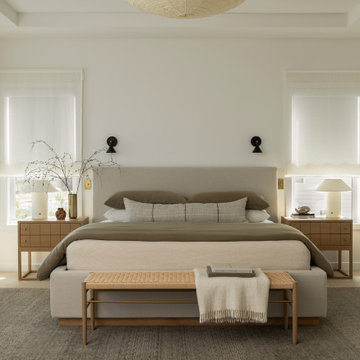
Green is the New Neutral
We combined white oak in a natural finish with a neutral palette of green, cream, and taupe to create a minimal and tranquil primary bedroom. The end result is an easeful space that soothes and restores.
SCOPE OF SERVICES
Interior Architecture & Design, Project Management, Custom Millwork and Built-In Design and Elevation DrawingsSpace Planning, Furniture, Lighting, Window Treatments, Textiles, and Decor Sourcing and Procurement, Art Curation, and final Styling to deliver a fully realized space.
 Robeson Design
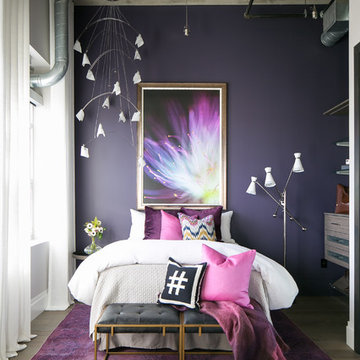
Small Bedroom decorating ideas! Interior Designer Rebecca Robeson began this Bedroom remodel with Benjamin Moore's 2017 color of the year… “Shadow” 2117-30
Rebecca wanted a bold statement color for this small Bedroom. Something that would say WOW. Her next step was to find a bold statement piece of art to create the color palette for the rest of the room. From the art piece came bedding choices, a fabulous over-died antique area rug (Aja Rugs) randomly collected throw pillows and furniture pieces that would provide a comfortable Bedroom but not fill the space unnecessarily. Rebecca had white linen, custom window treatments made and chose white bedding to ground the space, keeping it light and airy. Playing up the 13' concrete ceilings, Rebecca used modern light fixtures with white shades to pop off the purple wall creating an exciting first... and lasting, impression!
Black Whale Lighting
Photos by Ryan Garvin Photography
 Marie Flanigan Interiors
Julie Soefer Photography
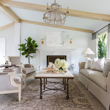
Inspiration for a coastal living room remodel in Houston with white walls, a standard fireplace and no tv
Inspiration for a coastal living room remodel in Houston with white walls, a standard fireplace and no tv
 Villa Decor
Ashley Avila
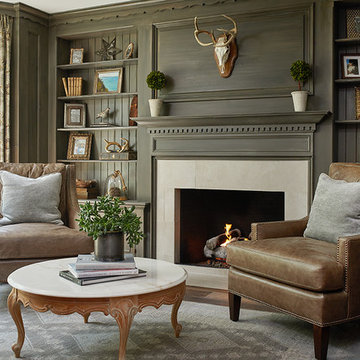
Family room library - large traditional medium tone wood floor family room library idea in Grand Rapids with gray walls, a standard fireplace and a tile fireplace
Family room library - large traditional medium tone wood floor family room library idea in Grand Rapids with gray walls, a standard fireplace and a tile fireplace

 Kristen Elizabeth Design
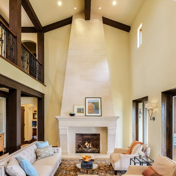
This inviting living space features a neutral color palette that allows for future flexibility in choosing accent pieces.
Shutter Avenue Photography
Living room - mid-sized mediterranean formal beige floor living room idea in Sacramento with yellow walls, a standard fireplace, a stone fireplace and no tv
Living room - mid-sized mediterranean formal beige floor living room idea in Sacramento with yellow walls, a standard fireplace, a stone fireplace and no tv
 User
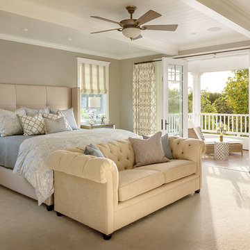
UserThis traditional family home in the Coronado community has both charm and function. White beadboard ceilings, crown molding and a beautifully selected neutral color palette create the ultimate timeless beauty.
 Ann Lowengart Interiors
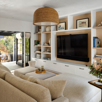
The three-level Mediterranean revival home started as a 1930s summer cottage that expanded downward and upward over time. We used a clean, crisp white wall plaster with bronze hardware throughout the interiors to give the house continuity. A neutral color palette and minimalist furnishings create a sense of calm restraint. Subtle and nuanced textures and variations in tints add visual interest. The stair risers from the living room to the primary suite are hand-painted terra cotta tile in gray and off-white. We used the same tile resource in the kitchen for the island's toe kick.
2