
Search results for "Neutral color palette" in Home Design Ideas
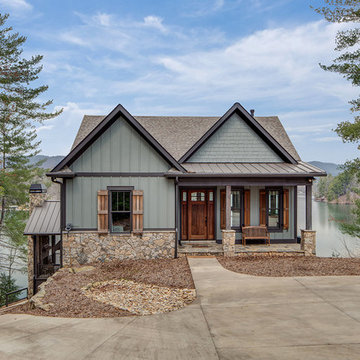
 Alair Homes Clemson
Classic meets modern in this custom lake home. High vaulted ceilings and floor-to-ceiling windows give the main living space a bright and open atmosphere. Rustic finishes and wood contrasts well with the more modern, neutral color palette.
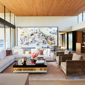
 Bradshaw Construction
This 6,500-square-foot one-story vacation home overlooks a golf course with the San Jacinto mountain range beyond. The house has a light-colored material palette—limestone floors, bleached teak ceilings—and ample access to outdoor living areas.
Builder: Bradshaw Construction
Architect: Marmol Radziner
Interior Design: Sophie Harvey
Landscape: Madderlake Designs
Photography: Roger Davies
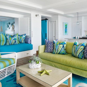
 Kala Interior Design
The breathtaking ocean views influenced the dramatic redesign of this water-front Poipu condo. The outdated condo was completely remodeled to allow full appreciation of the surrounding views, bring in a fresh new color palette, and modernize and update everything from the electrical wiring to the new luxury bath towels. The clients wanted the condo to feel “fun, happy, and cheerful,” and to stand apart from the typical vacation rental on Kauai. They wanted to turn this condo into the ultimate “beach house” that felt just as luxurious as the gorgeous natural surroundings.
Fresh white ship-lap walls set the backdrop for this modern beach style, which is further enhanced with bold stripes, natural textures, and ocean-themed decor. The palette of cobalt, aqua and lichen green is fresh and vibrant against the neutral backdrop. Trina Turk’s “Peacock Print” was the inspiration fabric for the living and dining room. The print is so lively, colorful, and modern, and was the perfect place to start.
Every custom detail was thoughtfully chosen to bring a sense of luxury and originality to the space. While some elements are whimsical, such as the playful octopus art & fish-themed fabric, other elements are sophisticated and classic, to help keep the design grounded.
Special features include a custom-made “Moroccan Fish Scale” tile backsplash in the kitchen, crushed marble counter tops with oyster shells and float glass, and blue glass pendant lights, reminiscent of water bubbles.
Find the right local pro for your project
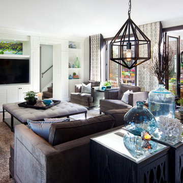
 Robeson Design
This beautiful family room has a neutral palette with coastal pops of color added in throughout to keep it fresh. Adding to the coastal feel, the modern geometric pendant lights add an element of structure but keep an atmospheric feeling. The space connects to bright and cheery outdoor courtyard outfitted for gathering and entertaining. This is indoor outdoor living at its finest!
 Morr Interiors
Shelly Harrison Photography
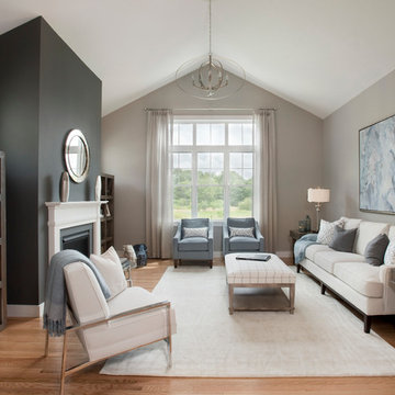
Inspiration for a mid-sized transitional formal and open concept light wood floor living room remodel in Boston with gray walls, a standard fireplace, a plaster fireplace and no tv
Inspiration for a mid-sized transitional formal and open concept light wood floor living room remodel in Boston with gray walls, a standard fireplace, a plaster fireplace and no tv
 Paintzen, Inc.
When we imagine the homes of our favorite actors, we often think of picturesque kitchens, artwork hanging on the walls, luxurious furniture, and pristine conditions 24/7. But for celebrities with children, sometimes that last one isn’t always accurate! Kids will be kids – which means there may be messy bedrooms, toys strewn across their play area, and maybe even some crayon marks or finger-paints on walls or floors.
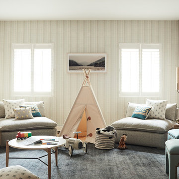
Lucy Liu recently partnered with One Kings Lane and Paintzen to redesign her son Rockwell’s playroom in their Manhattan apartment for that reason. Previously, Lucy had decided not to focus too much on the layout or color of the space – it was simply a room to hold all of Rockwell’s toys. There wasn’t much of a design element to it and very little storage.
Lucy was ready to change that – and transform the room into something more sophisticated and tranquil for both Rockwell and for guests (especially those with kids!). And to really bring that transformation to life, one of the things that needed to change was the lack of color and texture on the walls.
When selecting the color palette, Lucy and One Kings Lane designer Nicole Fisher decided on a more neutral, contemporary style. They chose to avoid the primary colors, which are too often utilized in children’s rooms and playrooms.
Instead, they chose to have Paintzen paint the walls in a cozy gray with warm beige undertones. (Try PPG ‘Slate Pebble’ for a similar look!) It created a perfect backdrop for the decor selected for the room, which included a tepee for Rockwell, some Tribal-inspired artwork, Moroccan woven baskets, and some framed artwork.
To add texture to the space, Paintzen also installed wallpaper on two of the walls. The wallpaper pattern involved muted blues and grays to add subtle color and a slight contrast to the rest of the walls. Take a closer look at this smartly designed space, featuring a beautiful neutral color palette and lots of exciting textures!
 Lorraine G Vale, ASID Allied
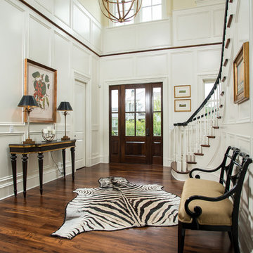
The wainscoting and wood trim assists with the light infused paint palette, accentuating the rich; hand scraped walnut floors and sophisticated furnishings. Black is used as an accent throughout the foyer to accentuate the detailed moldings. Judges paneling reaches from floor to to the second floor, bringing your eye to the elegant curves of the brass chandelier.
Photography by John Carrington

Sponsored
Sunbury, OH

J.Holderby - Renovations
Franklin County's Leading General Contractors - 2X Best of Houzz!
 The Green Room Interiors
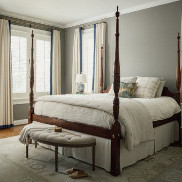
Chattanooga, TN interior design project with overall goal to update the primary bedroom with a neutral color palette to create a calm sanctuary.
Large elegant master medium tone wood floor bedroom photo in Other with gray walls, a standard fireplace and a stone fireplace
Large elegant master medium tone wood floor bedroom photo in Other with gray walls, a standard fireplace and a stone fireplace
 Drury Design
THE SETUP
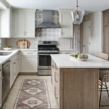
Client Background: Our clients, a couple who have transitioned into the empty nest phase, have cherished their home for over three decades without undergoing any significant renovations. With a newfound desire to adapt their living space to better suit their current lifestyle, they’ve embarked on a journey to reimagine their kitchen — the heart of their home. Their aspiration is to cultivate a serene, neutral-toned sanctuary on the first floor that seamlessly merges with their family room, ensuring a harmonious and inviting environment.
Design Inspiration: The renovation is inspired by the couple’s penchant for soft, calming neutrals, using their cherished family room and the kitchen’s existing tile flooring as the cornerstone for the color scheme. This approach aims to foster a sense of warmth and tranquility throughout.
Design Objectives:
Harmonize the kitchen with the family room by adopting a soothing, neutral color scheme, ensuring a seamless flow across the first floor.
Enhance kitchen functionality with thoughtfully designed cabinetry, providing a designated place for every item and maximizing storage efficiency.
Cultivate an inviting and comfortable atmosphere that reflects the homeowners’ desire for a calm and relaxing space.
Design Challenges:
The homeowners wish to retain the existing kitchen tile flooring and integrate it into a refreshed, modern design.
Accommodating a dining area spacious enough for family visits without compromising the kitchen’s open feel or functional layout.
Despite liking the current placement of plumbing and appliances, the homeowners aspire for a more open floor plan to facilitate better movement and interaction.
The need to amplify natural light in the kitchen, especially around the sink area, where existing lighting is insufficient.
Preserving the half-wall between the kitchen and family room, a feature the homeowners want to keep, while ensuring it complements the new design.
THE RENEWED SPACE
Design Solutions:
By choosing a neutral color palette that complements the existing tile, the design unifies the kitchen with the adjacent spaces. The tile’s grout was cleaned and restored, enhancing the floor’s appearance and integrating it seamlessly with the new kitchen aesthetic.
The inclusion of a larger island with seating for two, alongside maintaining a substantial dining table, was achieved by optimizing the spatial layout. This allowed for a sociable yet functional kitchen, accommodating large family gatherings without feeling crowded.
Minor adjustments to the kitchen’s layout maintained the preferred locations for plumbing and appliances while introducing an ‘open’ design concept. Strategic modifications, such as angling the pantry wall, improved the flow and accessibility within the space.
Replacing the garden window with a broader, standard window significantly increased natural light, transforming the sink area into a bright, welcoming space with enhanced views of the outdoors.
The decision to keep the half-wall was ingeniously leveraged to define the dining area while maintaining an open connection to the family room. This feature not only serves as a visual separator but also ties the two spaces together through the shared color scheme and design elements.
The homeowners are thrilled with their newly remodeled kitchen, which has become a hub of warmth and hospitality. Hosting a wedding shower and a birthday party, they have shared their renewed space with friends and family, who have been equally enamored. This remodel has not only met their functional and aesthetic desires but has also enriched their home with a fresh sense of serenity and joy.
The upstairs part of the home is shaping up nicely. Here’s their newly remodeled primary bathroom.
 Alair Homes Clemson
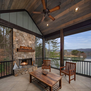
Classic meets modern in this custom lake home. High vaulted ceilings and floor-to-ceiling windows give the main living space a bright and open atmosphere. Rustic finishes and wood contrasts well with the more modern, neutral color palette.
 Wellborn Cabinet, Inc.
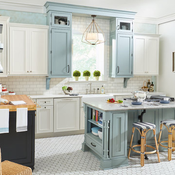
Along with the current white kitchen trend, this kitchen fits in perfectly with its twist on the blue color palette. This kitchen is an updated version of an old idea, with traditional subway tiles and color play on the blue tones. As part of Wellborn’s Estate Series, this kitchen combines a unique twist of an old French Café and modern elements; making the aesthetic design of this kitchen guaranteed to leave you in awe. In this kitchen by Wellborn Cabinet is a blend of Full Overlay and Beaded Inset cabinetry. The upper and lower cabinetry includes full overlay Lexington doors painted in our newly launched Oyster White color with smooth close drawer guides and door hinges. The upper center and island cabinets are Hanover Beaded Inset accented with oil rubbed Bronze barrel hinges and finished in Wellborn’s newly launched Aqua paint.
 ONYX + ALABASTER
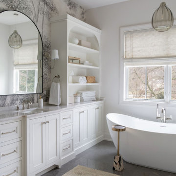
A serene soaking tub anchors the bathroom, positioned beneath expansive windows to capture natural light and views beyond. Soft, neutral finishes and clean-lined cabinetry create a spa-like retreat that feels both timeless and restorative.

 TKS Design Group
Download our free ebook, Creating the Ideal Kitchen. DOWNLOAD NOW
For many, extra time at home during COVID left them wanting more from their homes. Whether you realized the shortcomings of your space or simply wanted to combat boredom, a well-designed and functional home was no longer a want, it became a need. Tina found herself wanting more from her Old Irving Park home and reached out to The Kitchen Studio about adding function to her kitchen to make the most of the available real estate.
At the end of the day, there is nothing better than returning home to a bright and happy space you love. And this kitchen wasn’t that for Tina. Dark and dated, with a palette from the past and features that didn’t make the most of the available square footage, this remodel required vision and a fresh approach to the space. Lead designer, Stephanie Cole’s main design goal was better flow, while adding greater functionality with organized storage, accessible open shelving, and an overall sense of cohesion with the adjoining family room.
The original kitchen featured a large pizza oven, which was rarely used, yet its footprint limited storage space. The nearby pantry had become a catch-all, lacking the organization needed in the home. The initial plan was to keep the pizza oven, but eventually Tina realized she preferred the design possibilities that came from removing this cumbersome feature, with the goal of adding function throughout the upgraded and elevated space. Eliminating the pantry added square footage and length to the kitchen for greater function and more storage. This redesigned space reflects how she lives and uses her home, as well as her love for entertaining.
The kitchen features a classic, clean, and timeless palette. White cabinetry, with brass and bronze finishes, contrasts with rich wood flooring, and lets the large, deep blue island in Woodland’s custom color Harbor – a neutral, yet statement color – draw your eye.
The kitchen was the main priority. In addition to updating and elevating this space, Tina wanted to maximize what her home had to offer. From moving the location of the patio door and eliminating a window to removing an existing closet in the mudroom and the cluttered pantry, the kitchen footprint grew. Once the floorplan was set, it was time to bring cohesion to her home, creating connection between the kitchen and surrounding spaces.
The color palette carries into the mudroom, where we added beautiful new cabinetry, practical bench seating, and accessible hooks, perfect for guests and everyday living. The nearby bar continues the aesthetic, with stunning Carrara marble subway tile, hints of brass and bronze, and a design that further captures the vibe of the kitchen.
Every home has its unique design challenges. But with a fresh perspective and a bit of creativity, there is always a way to give the client exactly what they want [and need]. In this particular kitchen, the existing soffits and high slanted ceilings added a layer of complexity to the lighting layout and upper perimeter cabinets.
While a space needs to look good, it also needs to function well. This meant making the most of the height of the room and accounting for the varied ceiling features, while also giving Tina everything she wanted and more. Pendants and task lighting paired with an abundance of natural light amplify the bright aesthetic. The cabinetry layout and design compliments the soffits with subtle profile details that bring everything together. The tile selections add visual interest, drawing the eye to the focal area above the range. Glass-doored cabinets further customize the space and give the illusion of even more height within the room.
While her family may be grown and out of the house, Tina was focused on adding function without sacrificing a stunning aesthetic and dreamy finishes that make the kitchen the gathering place of any home. It was time to love her kitchen again, and if you’re wondering what she loves most, it’s the niche with glass door cabinetry and open shelving for display paired with the marble mosaic backsplash over the range and complimenting hood. Each of these features is a stunning point of interest within the kitchen – both brag-worthy additions to a perimeter layout that previously felt limited and lacking.
Whether your remodel is the result of special needs in your home or simply the excitement of focusing your energy on creating a fun new aesthetic, we are here for it. We love a good challenge because there is always a way to make a space better – adding function and beauty simultaneously.

Sponsored
Sunbury, OH
J.Holderby - Renovations
Franklin County's Leading General Contractors - 2X Best of Houzz!
 Colorful Concepts Interior Design
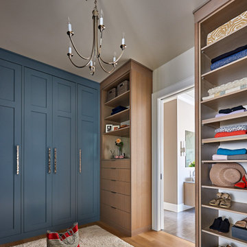
Large beach style gender-neutral light wood floor and beige floor walk-in closet photo in Wilmington with shaker cabinets and blue cabinets
 Amy Pearson Design
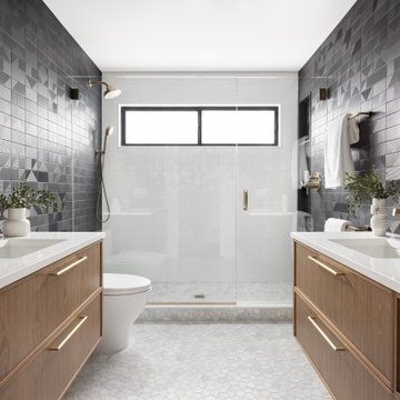
The primary bedroom and bathroom are the showstoppers of this phase! Unused and awkwardly located closets in both the bedroom and bathroom were removed to make way for additional square-footage in the bath and replaced with a sizable and functional reach-in closet in the bedroom. A dated and cramped shower stall was removed in favor for an expansive step in shower spanning the width of the bathroom and a new transom window washes the room in natural light. While the previous bathroom was only able to accommodate a single vanity, the new layout allowed us to create double matching vanities mirrored across from each other - a much appreciated addition for a primary bath. Floating walnut vanities boast impressive storage and are capped with tower cabinets with hidden outlets for charging and storing electronic bathroom tools. While the color palette is restrained - black, white, gray, and brown - the result is a timelessly modern and masculine space that is at once striking and warm. Modern geometric patterns play with each other throughout the material selections.
 JRP Design & Remodel
To spotlight the owners’ worldly decor, this remodel quietly complements the furniture and art textures, colors, and patterns abundant in this beautiful home.
The original master bath had a 1980s style in dire need of change. By stealing an adjacent bedroom for the new master closet, the bath transformed into an artistic and spacious space. The jet-black herringbone-patterned floor adds visual interest to highlight the freestanding soaking tub. Schoolhouse-style shell white sconces flank the matching his and her vanities. The new generous master shower features polished nickel dual shower heads and hand shower and is wrapped in Bedrosian Porcelain Manifica Series in Luxe White with satin finish.
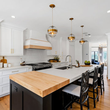
The kitchen started as dated and isolated. To add flow and more natural light, the wall between the bar and the kitchen was removed, along with exterior windows, which allowed for a complete redesign. The result is a streamlined, open, and light-filled kitchen that flows into the adjacent family room and bar areas – perfect for quiet family nights or entertaining with friends.
Crystal Cabinets in white matte sheen with satin brass pulls, and the white matte ceramic backsplash provides a sleek and neutral palette. The newly-designed island features Calacutta Royal Leather Finish quartz and Kohler sink and fixtures. The island cabinets are finished in black sheen to anchor this seating and prep area, featuring round brass pendant fixtures. One end of the island provides the perfect prep and cut area with maple finish butcher block to match the stove hood accents. French White Oak flooring warms the entire area. The Miele 48” Dual Fuel Range with Griddle offers the perfect features for simple or gourmet meal preparation. A new dining nook makes for picture-perfect seating for night or day dining.
Welcome to artful living in Worldly Heritage style.
Photographer: Andrew - OpenHouse VC
 SV Design
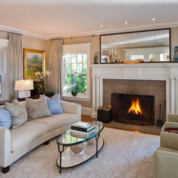
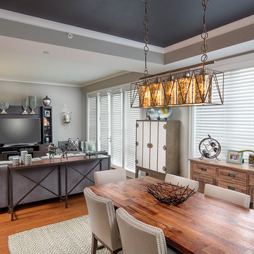
A desire for a more modern and zen-like environment in a historical, turn of the century stone and stucco house was the drive and challenge for this sophisticated Siemasko + Verbridge Interiors project. Along with a fresh color palette, new furniture is woven with antiques, books, and artwork to enliven the space. Carefully selected finishes enhance the openness of the glass pool structure, without competing with the grand ocean views. Thoughtfully designed cabinetry and family friendly furnishings, including a kitchenette, billiard area, and home theater, were designed for both kids and adults.

 Altura Architects
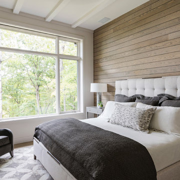
Calm and neutral color palette is the master bedroom at the modern farmhouse in Mill Spring, NC. A gray chair with matching patterned throw pillow creates a relaxing sitting area in the master suite.
Photography by Todd Crawford.
 McKee & Company
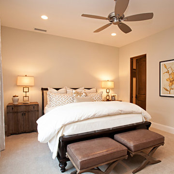
Example of a mid-sized transitional guest carpeted bedroom design in Los Angeles with beige walls and no fireplace
 DANE AUSTIN INTERIOR DESIGN Boston & Cambridge
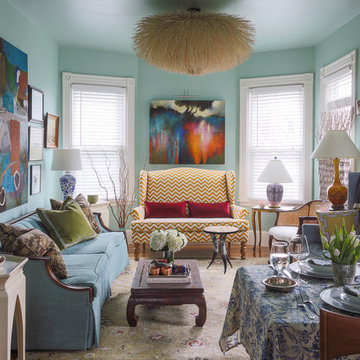
A nostalgic but modern hue covers the walls and ceiling of the living room. The oil painting centered over the heirloom chevron settee offers a chance to pull color for a painterly palette. The ceiling fixture is made of twigs.
Photograph © Eric Roth Photography.
A love of blues and greens and a desire to feel connected to family were the key elements requested to be reflected in this home.
Project designed by Boston interior design studio Dane Austin Design. They serve Boston, Cambridge, Hingham, Cohasset, Newton, Weston, Lexington, Concord, Dover, Andover, Gloucester, as well as surrounding areas.
For more about Dane Austin Design, click here: https://daneaustindesign.com/
To learn more about this project, click here:
https://daneaustindesign.com/roseclair-residence
1