
Search results for "Objective showcase" in Home Design Ideas
 Drury Design
Our clients were ready to update their kitchen with soft and subtle colors to blend in with the home’s recently updated interior. It was also time to improve the layout. The kitchen needed to be reconfigured in order to facilitate a three-generation family and occasional entertaining.
Design Objectives
-Brighten up to blend with the home’s interior and flow into the adjacent family room area
-Incorporate specific storage for pantry items like bulk ingredients and small appliances
-Designate areas for a coffee bar, multiple prep areas and seating while highlighting a dry bar for display
-Keep clutter off of counters for a seamless design that facilitates visual flow through the entire area
Design Challenges
-Make a subtle statement with contrasting cabinets and countertops
-Incorporate a stand-alone, statement-making dry bar just outside the main kitchen space
-Design a statement hood that serves as a focal point without interrupting visual flow
-Update and add lighting to add more task, accent and overhead brightness.
-Have the space be usable for different tasks by different family members at the same time
-Create a space that looks classy and formal but is still inviting.
Design Solutions
-A soft grey stain and white paint were used on all the cabinets. On only the wall cabinets flanking the window was the grey introduced on the frame to make a pop against the white paint.
-The white-painted refrigerator and freezer door panel style is a custom reeded look that adds a soft contrasting detail against the main door style. Along with the open grey-stained interior cabinet above, it looks like a piece of furniture.
-The same soft tones were used for the countertops and a full, high backsplash of Chamonix quartzite that tied everything together. It’s an elegant backdrop for the hood.
-The Dry Bar, even though showcasing a dark stained cabinet, stays open and bright with a full mirror backsplash, wood retained glass floating shelves and glass wall cabinet doors. Brushed brass trim details and a fun light fixture add a pop of character.
-The same reeded door style as the refrigerator was used on the base doors of the dry bar to tie in with the kitchen.
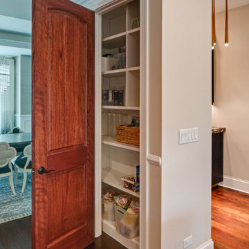
-About 2/3 of the existing walk-in pantry was carved out for the new dry bar footprint while still keeping a shallow-depth pantry space for storage.
-The homeowners wanted a beautiful hood but didn’t want it to dominate the design. We kept the lines of the hood simple. The soft stainless steel body has a bottom accent that incorporates both the grey stain and white-painted cabinet colors.
-Even though the Kitchen had a lot of natural light from the large window, it was important to have task and subtle feature lighting. Recessed cans provide overall lighting while clear pendants shine down on the 2nd level of the seating area on the island.
-The circular clear chandelier is the statement piece over the main island while the pendants flanking the hood emphasize the quartzite backsplash and add as accent lighting in the evening along with the interior cabinet lights.
With three generations living in the home it was important to have areas that multiple family members could use at the same time without being in each other’s way. The design incorporates different zones like the coffee bar, charging station, dry bar and refrigerator drawers.
The softness of the colors and classic feel of the wood floor keep kitchen is inviting and calming.
 Advance Design Studio, Ltd.
After six years of living in their Huntley IL home, Chris and Meghan were tired of their dark, dingy, outdated kitchen and it was finally time for a long-anticipated change. “The kitchen is the place where we live, it’s where we do everything,” Meghan said. “It was important that it be a space where we wanted to be.” Meghan loves cooking and enjoys including their girls in healthy meal prepping, this led them to want a brighter, more enjoyable kitchen with increased functionality and improved storage.
For Chris especially, the laundry room was an entirely dysfunctional eyesore. “We had a washer and a dryer, but it was all kind-of cobbled together!” Chris said. “There were always laundry piles everywhere, we weren’t really sure what we wanted to do in there, but it was time for us to make a change.” The mess of the space was stressful every time they walked in the door from the garage each day. Kids’ backpacks and shoes piled up haphazardly in the makeshift boot-bench closet left the family feeling disorganized and stressed. They needed space for folding clothes and locker cubbies to help keep the family organized.
Having known Christine and Todd in the Huntley community for years, Chris and Meghan were familiar with their work. “We already trusted them personally and having seen their projects for years we knew they did top notch work. After we reviewed the initial round of designs, we knew that hiring them was definitely the right choice,” Meghan and Chris said. Although Chris had done a lot of work in their home himself, the kitchen and laundry room renovation was such a large undertaking that he didn’t want to steal time away from his family to spend what would surely be many long weekends doing the job himself. “That would not have been a wise choice for us,” Chris laughed.
“Our designer, Michelle was very, very, easy to work with; anything we wanted to see or weren’t sure about, she went above and beyond to make this easy for us. She was easy to get hold of and always quick to respond,” the couple said. Michelle pulled ideas that mirrored the couple’s taste and style and was adept at directing the couple to limited choices that didn’t overwhelm them and kept the process moving. “I have a hard time making decisions. Michelle made the decision-making process so easy. I loved how she listened to what I liked and then presented three great options for me to choose from,” Meghan said.
The main objectives for the kitchen were better storage solutions, they wanted the space to reflect their lifestyle and taste, and they wanted it to last for years with low maintenance. One of the first steps in creating a more functional kitchen was relocating the refrigerator, creating an improved workflow for the busy family.
“We didn’t know that we could even move the refrigerator to a new location where it is now, that was something that we never would have thought of,” Chris said. “The new refrigerator location makes the kitchen feel so much bigger. We didn’t add any space, but our whole kitchen with the new design just seems like it’s so much larger than before!” Meghan said.
The perimeter mist colored cabinets helped warm and brighten the entire room, while the graphite colored cabinets on the island added contrast. Using this fresh, clean color palette satisfied the couple’s desire for a bright space that was the exact opposite of what they had before. Organization accessories were also added to the cabinets such as a spice drawer tray and roll outs to create hidden convenience.
“I absolutely love the hidden spices – it makes cooking so much more enjoyable!” Chris said. “And all the pull outs, and the double trash bin, who would think you could get so excited about organization!” the couple said in unison.
One thing they hated in their original kitchen was how dark the space felt. Added lighting on the ceiling with the new light fixtures combined with the lighter cabinetry colors throughout solved this problem. “Our new kitchen has this warm, almost cozy feeling that our old kitchen never had, it’s just a space that I love spending my time in now,” Meghan said. The light airy feeling was accentuated with the use of floating white shelves on either side of the decorative range hood. “We have so much cabinetry space, the new design is amazing we actually have more storage space than we will ever need,” Meghan said.
The island was extended to create more work surface and added space for stool seating. “The new island changes how we live. Now the kids can be in the kitchen with us, doing homework, eating breakfast, and the three of us have special dinners there when Chris is working late,” Meghan said.
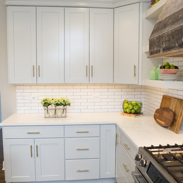
The Carrara Marmi Quartz countertops were chosen because they are, not only beautiful, but are made from hard-working material that doesn’t require maintenance. The white subway tile backsplash that wraps to the ceiling behind the focal point cooktop range/hood compliments the crisp white countertops perfectly, while brushed brass hardware and light fixtures keep the design fresh and new.
The couple had a few fears at the beginning of the project, as most homeowners do. Their biggest fear was being out of their kitchen and laundry room for an extended time. The crew made it very easy for the family to work in a limited space keeping the washer and dryer hooked up the majority of the time, and also getting appliances working with minimal downtime.
“They above and beyond accommodated us to get us through the process,” Meghan said. “They did a great job making sure we were as comfortable as possible throughout the process,” Chris added.
“Our project manager DJ did a great job. He was very good at updating us on schedule changes, getting guys in as quickly as possible. Everyone that stepped in the house was nice and did great work,” said Chris. They thought Advance’s carpenter was phenomenal and were impressed when he took a conceptual idea from a photograph and worked with designer Michelle to create a one of a kind range/hood that has become the topic of conversation with friends and family who visit the new kitchen. “He was in our house literally every day for several weeks. He was easy to work with and good at what he did,” Meghan and Chris said.
The focal point of the kitchen; a hand-crafted, custom-built ventilation hood was clad with handpicked reclaimed barnwood. Advance Design’s carpenter built the framework and the cladding to create a one-of-a-kind design element that the couple loves.
“I think it was especially fun for him to create something unique from scratch, showcasing his talent in this area,” Meghan said. “I love that my kitchen is not like everyone else’s. I got to pick out the wood on my hood and watch it being built and was able to choose what pieces of wood went where on it. It’s totally unique.”
Red Oak flooring was toothed-in throughout the kitchen and the rest of the first floor anywhere changes were made. Then the whole floor was refinished to tone down the orange undertones in the existing floor stain, ultimately changing the color complexion of the entire first floor. The result is a completely new feeling to the entire home.
Renovating the laundry room was extremely important to Meghan and Chris, but they had trouble visualizing what the possibilities were for the seemingly small space. Michelle produced beautiful 3D illustrations that helped them envision the space in a whole new way.
“I must have told Michelle 100 times that I am a visual person, seeing the designs in 3D made it so easy to make decisions and see what we could really do with our space,” Meghan said.
A dividing wall and doorway were removed between the existing laundry room and hallway formerly containing a coat closet, providing space to design specialized graphite colored cabinetry matching the kitchen island to house custom storage cubbies for each family member. Adding the tall utility cabinetry in the new laundry area helped solve the storage issue, tucking away cleaning supplies, household items, and even the cat got its own cubby.
“I love how everything is now hidden in its own space. I can’t tell you how much I hated coming home and seeing everything sitting around on counters,” Chris said.
Electrical outlets were planned for the inside of utility cabinets, so devices could charge in hidden locations. Stacking the washer and dryer allowed for wider countertop space to provide a folding area and a special space for clothes to hang. “The way I do laundry has been completely transformed! I can actually fold clothes and hang them now right out of the washer and dryer,” Meghan said.
“The end result in the kitchen and the laundry/mud room was an updated light and bright space, with a smarter work flow that better meets the needs of this family,” Michelle said.
“I would totally recommend Advance Design,” Meghan said. “Sometimes I sit and just look at my kitchen and laundry room and think ‘Wow, I can’t believe I get to live here!’ It’s an understatement to say we love our new space.”
 Drewett Works
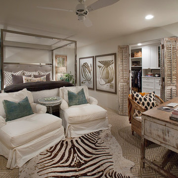
This Paradise Valley stunner was a down-to-the-studs renovation. The owner, a successful business woman and owner of Bungalow Scottsdale -- a fabulous furnishings store, had a very clear vision. DW's mission was to re-imagine the 1970's solid block home into a modern and open place for a family of three. The house initially was very compartmentalized including lots of small rooms and too many doors to count. With a mantra of simplify, simplify, simplify, Architect CP Drewett began to look for the hidden order to craft a space that lived well.
This residence is a Moroccan world of white topped with classic Morrish patterning and finished with the owner's fabulous taste. The kitchen was established as the home's center to facilitate the owner's heart and swagger for entertaining. The public spaces were reimagined with a focus on hospitality. Practicing great restraint with the architecture set the stage for the owner to showcase objects in space. Her fantastic collection includes a glass-top faux elephant tusk table from the set of the infamous 80's television series, Dallas.
It was a joy to create, collaborate, and now celebrate this amazing home.
Project Details:
Architecture: C.P. Drewett, AIA, NCARB; Drewett Works, Scottsdale, AZ
Interior Selections: Linda Criswell, Bungalow Scottsdale, Scottsdale, AZ
Photography: Dino Tonn, Scottsdale, AZ
Featured in: Phoenix Home and Garden, June 2015, "Eclectic Remodel", page 87.
Find the right local pro for your project
 Modern Citi Group: Renovations & Remodeling
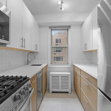
Modern Citi Group helped Jane in remodeling her alcove studio in Midtown East. This comprehensive renovation project included a full remodel of the bathroom and kitchen, as well as updates to all rooms and closets.
The primary objective was to modernize the apartment while aligning it with the family's lifestyle and needs. The design challenge was to deliver modern aesthetics and functionality while keeping the project within budget.
The construction team completely revamped the kitchen, which featured new two-tone cabinetry, stainless steel appliances, elegant Vivid White quartz countertops, and Aria tile backsplash and flooring. Kitchen design finishes echoed the ones in the bathroom creating a cohesive modern look.
Bathroom remodel included converting the tub to a shower, installing a modern wall-mounted vanity, and replacing all fixtures. The shower area showcased an accent black & white Astoria wall tile, perfectly complemented by the subtle stone-looking Aria Ice porcelain tile on the floors and walls in the rest of the bathroom.
In just eight weeks, Jane and her family received a beautifully renovated, modern apartment with a cohesive style and finishes that fit their lifestyle and expectations.
 Interiors by Popov
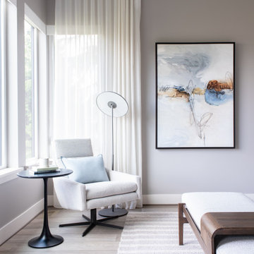
Furniture curation focused on the augmentation of a spectacular water and mountain range view.
Each home office was designed to reflect the owners’ personalities, as well as showcase their treasured objects and collectibles
Clients wanted a calm yet inspiring and memorable space. The careful selection of subtle patterns, textures, and fabrics has resulted in a rich yet sanctuary-like space.
The home was designed around the existing art collection with the addition of new original pieces to create a true Art Collector’s home.
 Amy Lau Design
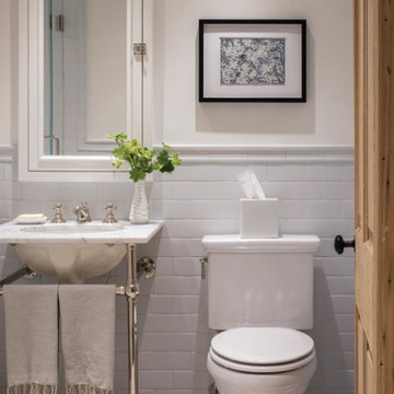
Symmetry and detail distinguish this charming Amsterdam-inspired townhouse in a historic enclave of Northwestern Brooklyn. When it came to renovation we collaborated with Michael Schmitt Architect to carry out one mission for our clients: to carefully restore and artfully embellish the home with their personality, to create a modern family-friendly dwelling worthy of showcasing their impressive collection of art, furniture and objects.
 Charles River Wine Cellars
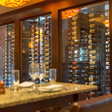
The objective was to create a working wine room for staff, while showcasing the extensive Italian wine collection to diners. Cooling integration ensures an optimum environment for the aging of the collection.
Sponsored
Columbus, OH
Transforming Spaces in Columbus

Daniel Home
Premier Interior Design Team Transforming Spaces in Franklin Co, Ohio
 Beth Dotolo, ASID, RID, NCIDQ
design by Pulp Design Studios | http://pulpdesignstudios.com/
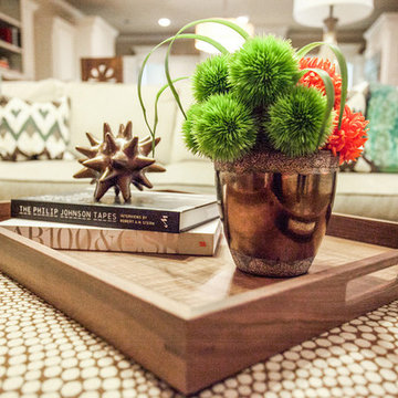
This home was designed with a casual lifestyle and multiple kids in mind. Furnishings in the open concept living areas are functional as well as relaxing. Earth tones and natural finishes provide the perfect backdrop to showcase the clients’ mementos from travels to Asia and Africa.
 First Hand Custom Woodworks
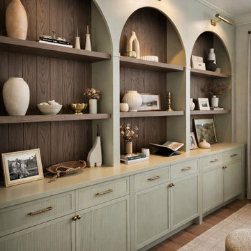
These custom arched built-in cabinets were designed and handcrafted by First Hand Custom Woodworks in Jacksonville, Florida to create a warm and functional living room feature wall.
The cabinetry combines painted built-ins with white oak shelving and paneled oak back panels, adding depth and contrast to the design. Three architectural arches frame the display shelving, creating a balanced focal point while showcasing decorative objects and artwork.
Integrated brass gallery lighting highlights the shelving and brings warmth to the oak interior panels. Below the display area, custom storage cabinets and drawers provide concealed storage while maintaining clean lines and symmetry across the entire wall.
The cabinetry features reeded panel doors, solid wood drawer fronts, and brass hardware, combining traditional craftsmanship with modern styling. The painted cabinetry pairs beautifully with the natural oak shelving to create a timeless living room built-in that feels both architectural and furniture-like.
Every piece was custom designed, built, and installed locally in Jacksonville to perfectly fit the space and the homeowner’s style.
 Drewett Works
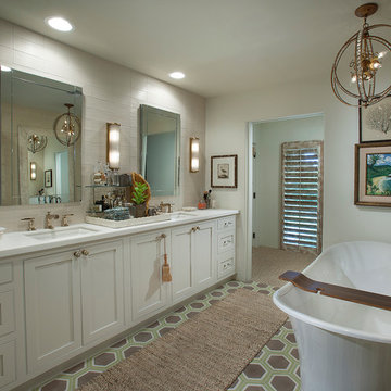
This Paradise Valley stunner was a down-to-the-studs renovation. The owner, a successful business woman and owner of Bungalow Scottsdale -- a fabulous furnishings store, had a very clear vision. DW's mission was to re-imagine the 1970's solid block home into a modern and open place for a family of three. The house initially was very compartmentalized including lots of small rooms and too many doors to count. With a mantra of simplify, simplify, simplify, Architect CP Drewett began to look for the hidden order to craft a space that lived well.
This residence is a Moroccan world of white topped with classic Morrish patterning and finished with the owner's fabulous taste. The kitchen was established as the home's center to facilitate the owner's heart and swagger for entertaining. The public spaces were reimagined with a focus on hospitality. Practicing great restraint with the architecture set the stage for the owner to showcase objects in space. Her fantastic collection includes a glass-top faux elephant tusk table from the set of the infamous 80's television series, Dallas.
It was a joy to create, collaborate, and now celebrate this amazing home.
Project Details:
Architecture: C.P. Drewett, AIA, NCARB; Drewett Works, Scottsdale, AZ
Interior Selections: Linda Criswell, Bungalow Scottsdale, Scottsdale, AZ
Photography: Dino Tonn, Scottsdale, AZ
Featured in: Phoenix Home and Garden, June 2015, "Eclectic Remodel", page 87.
 Dunagan Diverio Design Group
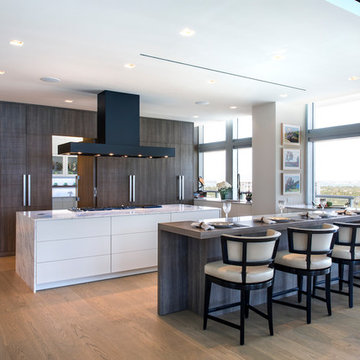
We took advantage of the penthouse’s long, continual wall to showcase the couple’s treasured art collection in a gallery-like setting with recessed architectural lighting.
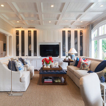
 Carolyn Reyes
Photo: Carolyn Reyes © 2016 Houzz
Family Room
Example of a transitional family room design in Los Angeles
Example of a transitional family room design in Los Angeles
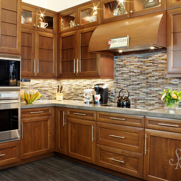
 Showcase Kitchens
The ceiling was raised for added space to display the 3 whimsical Ricky Bernstein sculptures; painted glass and aluminum, acrylic and oil paint, mixed media objects. “Love Muffin” is over the ovens. “Full House” is to the right and not shown is “Zippety-Do-Dah” over the refrigerator/freezer.
Tim Cree/Creepwalk Media
Sponsored
Columbus, OH
Transforming Spaces in Columbus
Daniel Home
Premier Interior Design Team Transforming Spaces in Franklin Co, Ohio
 Oleksandr
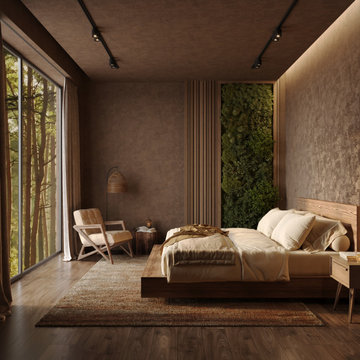
Project Objective
The goal of this project was to deliver a highly realistic 3D visualization of a bedroom overlooking the forest, where contemporary comfort is seamlessly combined with natural serenity. The intention was to create not only a functional interior but also an atmosphere that reflects the calm and restorative qualities of the surrounding landscape.
Approach & Process
- Spatial Planning: The layout was developed with a strong focus on ergonomics and user experience, ensuring optimal proportions and flow.
- Materials & Lighting: Natural textures, such as wood and soft textiles, were paired with a warm, diffused lighting scheme to evoke a peaceful and immersive ambiance.
- Camera Work: Each camera angle was strategically chosen to emphasize the interplay between interior details and the expansive forest views, showcasing both design precision and emotional impact.
Outcome
The final visualization demonstrates a refined balance between aesthetics and practicality. Attention to detail — from fabric textures to the way light shifts across surfaces — allowed for the creation of an atmosphere that is not only visually convincing but also emotionally resonant. This project reflects my ability to translate design concepts into immersive, photorealistic visual experiences.
 Pangaea Interior Design, Portland, OR
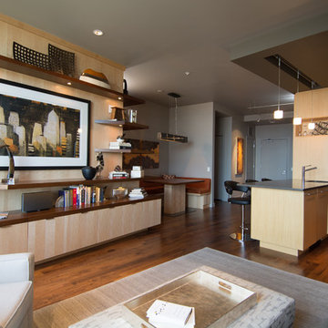
Instead of a TV this client chose to highlight art, books, and objects in his modern living room.
Jeffrey Freeman Photography
Example of a trendy living room design in Portland
Example of a trendy living room design in Portland
 Drury Design
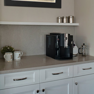
Our clients were ready to update their kitchen with soft and subtle colors to blend in with the home’s recently updated interior. It was also time to improve the layout. The kitchen needed to be reconfigured in order to facilitate a three-generation family and occasional entertaining.
Design Objectives
-Brighten up to blend with the home’s interior and flow into the adjacent family room area
-Incorporate specific storage for pantry items like bulk ingredients and small appliances
-Designate areas for a coffee bar, multiple prep areas and seating while highlighting a dry bar for display
-Keep clutter off of counters for a seamless design that facilitates visual flow through the entire area
Design Challenges
-Make a subtle statement with contrasting cabinets and countertops
-Incorporate a stand-alone, statement-making dry bar just outside the main kitchen space
-Design a statement hood that serves as a focal point without interrupting visual flow
-Update and add lighting to add more task, accent and overhead brightness.
-Have the space be usable for different tasks by different family members at the same time
-Create a space that looks classy and formal but is still inviting.
Design Solutions
-A soft grey stain and white paint were used on all the cabinets. On only the wall cabinets flanking the window was the grey introduced on the frame to make a pop against the white paint.
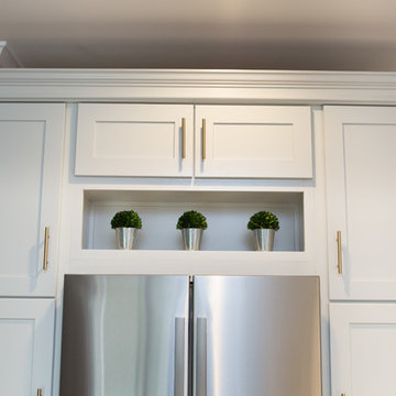
-The white-painted refrigerator and freezer door panel style is a custom reeded look that adds a soft contrasting detail against the main door style. Along with the open grey-stained interior cabinet above, it looks like a piece of furniture.
-The same soft tones were used for the countertops and a full, high backsplash of Chamonix quartzite that tied everything together. It’s an elegant backdrop for the hood.
-The Dry Bar, even though showcasing a dark stained cabinet, stays open and bright with a full mirror backsplash, wood retained glass floating shelves and glass wall cabinet doors. Brushed brass trim details and a fun light fixture add a pop of character.
-The same reeded door style as the refrigerator was used on the base doors of the dry bar to tie in with the kitchen.
-About 2/3 of the existing walk-in pantry was carved out for the new dry bar footprint while still keeping a shallow-depth pantry space for storage.
-The homeowners wanted a beautiful hood but didn’t want it to dominate the design. We kept the lines of the hood simple. The soft stainless steel body has a bottom accent that incorporates both the grey stain and white-painted cabinet colors.
-Even though the Kitchen had a lot of natural light from the large window, it was important to have task and subtle feature lighting. Recessed cans provide overall lighting while clear pendants shine down on the 2nd level of the seating area on the island.
-The circular clear chandelier is the statement piece over the main island while the pendants flanking the hood emphasize the quartzite backsplash and add as accent lighting in the evening along with the interior cabinet lights.
With three generations living in the home it was important to have areas that multiple family members could use at the same time without being in each other’s way. The design incorporates different zones like the coffee bar, charging station, dry bar and refrigerator drawers.
The softness of the colors and classic feel of the wood floor keep kitchen is inviting and calming.
 Amy Lau Design
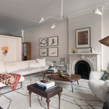
Symmetry and detail distinguish this charming Amsterdam-inspired townhouse in a historic enclave of Northwestern Brooklyn. When it came to renovation we collaborated with Michael Schmitt Architect to carry out one mission for our clients: to carefully restore and artfully embellish the home with their personality, to create a modern family-friendly dwelling worthy of showcasing their impressive collection of art, furniture and objects.
Sponsored
Columbus, OH
Transforming Spaces in Columbus
Daniel Home
Premier Interior Design Team Transforming Spaces in Franklin Co, Ohio
 Advance Design Studio, Ltd.
After six years of living in their Huntley IL home, Chris and Meghan were tired of their dark, dingy, outdated kitchen and it was finally time for a long-anticipated change. “The kitchen is the place where we live, it’s where we do everything,” Meghan said. “It was important that it be a space where we wanted to be.” Meghan loves cooking and enjoys including their girls in healthy meal prepping, this led them to want a brighter, more enjoyable kitchen with increased functionality and improved storage.
For Chris especially, the laundry room was an entirely dysfunctional eyesore. “We had a washer and a dryer, but it was all kind-of cobbled together!” Chris said. “There were always laundry piles everywhere, we weren’t really sure what we wanted to do in there, but it was time for us to make a change.” The mess of the space was stressful every time they walked in the door from the garage each day. Kids’ backpacks and shoes piled up haphazardly in the makeshift boot-bench closet left the family feeling disorganized and stressed. They needed space for folding clothes and locker cubbies to help keep the family organized.
Having known Christine and Todd in the Huntley community for years, Chris and Meghan were familiar with their work. “We already trusted them personally and having seen their projects for years we knew they did top notch work. After we reviewed the initial round of designs, we knew that hiring them was definitely the right choice,” Meghan and Chris said. Although Chris had done a lot of work in their home himself, the kitchen and laundry room renovation was such a large undertaking that he didn’t want to steal time away from his family to spend what would surely be many long weekends doing the job himself. “That would not have been a wise choice for us,” Chris laughed.
“Our designer, Michelle was very, very, easy to work with; anything we wanted to see or weren’t sure about, she went above and beyond to make this easy for us. She was easy to get hold of and always quick to respond,” the couple said. Michelle pulled ideas that mirrored the couple’s taste and style and was adept at directing the couple to limited choices that didn’t overwhelm them and kept the process moving. “I have a hard time making decisions. Michelle made the decision-making process so easy. I loved how she listened to what I liked and then presented three great options for me to choose from,” Meghan said.
The main objectives for the kitchen were better storage solutions, they wanted the space to reflect their lifestyle and taste, and they wanted it to last for years with low maintenance. One of the first steps in creating a more functional kitchen was relocating the refrigerator, creating an improved workflow for the busy family.
“We didn’t know that we could even move the refrigerator to a new location where it is now, that was something that we never would have thought of,” Chris said. “The new refrigerator location makes the kitchen feel so much bigger. We didn’t add any space, but our whole kitchen with the new design just seems like it’s so much larger than before!” Meghan said.
The perimeter mist colored cabinets helped warm and brighten the entire room, while the graphite colored cabinets on the island added contrast. Using this fresh, clean color palette satisfied the couple’s desire for a bright space that was the exact opposite of what they had before. Organization accessories were also added to the cabinets such as a spice drawer tray and roll outs to create hidden convenience.
“I absolutely love the hidden spices – it makes cooking so much more enjoyable!” Chris said. “And all the pull outs, and the double trash bin, who would think you could get so excited about organization!” the couple said in unison.
One thing they hated in their original kitchen was how dark the space felt. Added lighting on the ceiling with the new light fixtures combined with the lighter cabinetry colors throughout solved this problem. “Our new kitchen has this warm, almost cozy feeling that our old kitchen never had, it’s just a space that I love spending my time in now,” Meghan said. The light airy feeling was accentuated with the use of floating white shelves on either side of the decorative range hood. “We have so much cabinetry space, the new design is amazing we actually have more storage space than we will ever need,” Meghan said.
The island was extended to create more work surface and added space for stool seating. “The new island changes how we live. Now the kids can be in the kitchen with us, doing homework, eating breakfast, and the three of us have special dinners there when Chris is working late,” Meghan said.
The Carrara Marmi Quartz countertops were chosen because they are, not only beautiful, but are made from hard-working material that doesn’t require maintenance. The white subway tile backsplash that wraps to the ceiling behind the focal point cooktop range/hood compliments the crisp white countertops perfectly, while brushed brass hardware and light fixtures keep the design fresh and new.
The couple had a few fears at the beginning of the project, as most homeowners do. Their biggest fear was being out of their kitchen and laundry room for an extended time. The crew made it very easy for the family to work in a limited space keeping the washer and dryer hooked up the majority of the time, and also getting appliances working with minimal downtime.
“They above and beyond accommodated us to get us through the process,” Meghan said. “They did a great job making sure we were as comfortable as possible throughout the process,” Chris added.
“Our project manager DJ did a great job. He was very good at updating us on schedule changes, getting guys in as quickly as possible. Everyone that stepped in the house was nice and did great work,” said Chris. They thought Advance’s carpenter was phenomenal and were impressed when he took a conceptual idea from a photograph and worked with designer Michelle to create a one of a kind range/hood that has become the topic of conversation with friends and family who visit the new kitchen. “He was in our house literally every day for several weeks. He was easy to work with and good at what he did,” Meghan and Chris said.
The focal point of the kitchen; a hand-crafted, custom-built ventilation hood was clad with handpicked reclaimed barnwood. Advance Design’s carpenter built the framework and the cladding to create a one-of-a-kind design element that the couple loves.
“I think it was especially fun for him to create something unique from scratch, showcasing his talent in this area,” Meghan said. “I love that my kitchen is not like everyone else’s. I got to pick out the wood on my hood and watch it being built and was able to choose what pieces of wood went where on it. It’s totally unique.”
Red Oak flooring was toothed-in throughout the kitchen and the rest of the first floor anywhere changes were made. Then the whole floor was refinished to tone down the orange undertones in the existing floor stain, ultimately changing the color complexion of the entire first floor. The result is a completely new feeling to the entire home.
Renovating the laundry room was extremely important to Meghan and Chris, but they had trouble visualizing what the possibilities were for the seemingly small space. Michelle produced beautiful 3D illustrations that helped them envision the space in a whole new way.
“I must have told Michelle 100 times that I am a visual person, seeing the designs in 3D made it so easy to make decisions and see what we could really do with our space,” Meghan said.
A dividing wall and doorway were removed between the existing laundry room and hallway formerly containing a coat closet, providing space to design specialized graphite colored cabinetry matching the kitchen island to house custom storage cubbies for each family member. Adding the tall utility cabinetry in the new laundry area helped solve the storage issue, tucking away cleaning supplies, household items, and even the cat got its own cubby.
“I love how everything is now hidden in its own space. I can’t tell you how much I hated coming home and seeing everything sitting around on counters,” Chris said.
Electrical outlets were planned for the inside of utility cabinets, so devices could charge in hidden locations. Stacking the washer and dryer allowed for wider countertop space to provide a folding area and a special space for clothes to hang. “The way I do laundry has been completely transformed! I can actually fold clothes and hang them now right out of the washer and dryer,” Meghan said.
“The end result in the kitchen and the laundry/mud room was an updated light and bright space, with a smarter work flow that better meets the needs of this family,” Michelle said.
“I would totally recommend Advance Design,” Meghan said. “Sometimes I sit and just look at my kitchen and laundry room and think ‘Wow, I can’t believe I get to live here!’ It’s an understatement to say we love our new space.”
 THE Remodel Group
Creating a personal wellness retreat doesn't always mean starting from scratch. Through thoughtful design-build solutions, this Portland metro primary bathroom renovation showcases how reimagining your existing space can deliver extraordinary results.
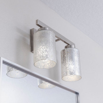
Nestled into the side of Cooper Mountain, this stunning remodel artfully balances bold neutrality with warm, natural elegance. The centerpiece of the transformation—a spacious cedar-clad sauna—connects harmoniously with the expanded double shower, where biophilic accent tile reflects in the striking wall tile like dappled sunlight on water. The refined vanity area, featuring expertly repainted cabinetry and luminous countertops, ties the space together with subtle sophistication.
The success of this luxury renovation stems from strategic space planning and custom craftsmanship. By removing the existing oversized tub and deck—elements that weren't serving the homeowners' needs—we created space for a fully custom two-person sauna. The shower expansion, though modest at 12 inches, significantly enhanced the comfort and functionality for two users, demonstrating how thoughtful design can maximize every square foot.
What sets this project apart is its fully integrated design-build approach. Rather than relying on prefabricated solutions, the custom sauna was designed and constructed from the ground up. This complex undertaking required seamless coordination among electrical, plumbing, and HVAC trades across the Portland Metro Area, all working together to transform a standard bathroom into a high-performance wellness retreat.
Client collaboration played a pivotal role in the project's success. Through detailed 3D renderings, curated photo books, and hands-on material samples, the homeowners could confidently visualize and participate in design decisions. Every element—from the rich cedar sauna cladding to the plumbing fixtures—was carefully selected to create a perfect balance of aesthetics, performance, and budget considerations.
Speaking of budget, strategic decisions helped prioritize the homeowners' main objectives: a comfortable two-person sauna and an expanded shower. Instead of complete replacement, the existing cabinetry received a professional refinishing, maintaining a fresh, cohesive look while reducing material costs. By thoughtfully retaining elements like plumbing fixtures, electrical wiring, and the toilet location, we avoided unnecessary expenses while upgrading lighting with efficient LED fixtures where needed.
This primary bathroom and sauna project exemplifies how a collaborative design-build approach can transform your vision into reality. By combining strategic space planning, custom craftsmanship, and budget-conscious decisions, we created a personalized wellness retreat that delivers both luxury and functionality.
 Southern Pro-Vision Landscape Construction
This project showcases a bold, architectural approach to a large-scale residential landscape, emphasizing clean lines and high-contrast materials to create a truly high-end outdoor experience.
The Design Vision:
The objective was to transform this expansive estate into a series of functional "outdoor rooms" that maintain a sleek, minimalist aesthetic. We focused on precision masonry and a neutral palette to allow the structural elements of the design to take center stage.
Key Features:
Architectural Hardscaping: We utilized large-scale, custom concrete pavers in a "floating" layout, creating a rhythmic and structured pathway that guides movement through the estate.
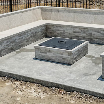
The Sunken Fire Lounge: A primary focal point, the sunken fire pit area features a custom-built, L-shaped bench with integrated stone backing. The use of sleek, light-toned stone veneer and smooth concrete surfaces creates a sophisticated space for evening entertainment.
Lush, Low-Maintenance Greenery: Vibrant, emerald artificial turf provides a stark, clean contrast against the cool gray tones of the concrete and stone. To add texture, we integrated native agave and yucca plantings set within dark basalt gravel beds, anchored by large natural boulders.
Structural Definition: The entire space is framed by clean-lined black ornamental fencing and multi-level concrete retaining walls, which manage the site's grade while adding to the modern, tiered look of the property.
The final result is a seamless blend of luxury and functionality, offering a refined Texas Modern aesthetic that is built for both high-impact visual appeal and effortless living.
6