
Search results for "Older" in Home Design Ideas
 Klopf Architecture
Built for the Bluff, A Sea Ranch Home is Remade from the Inside Out
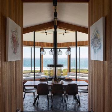
The house had always been grounded, on an ocean bluff at The Sea Ranch. It sits unencumbered, adjacent to one of the most dramatic stretches of the Sonoma coast with protected commons meadow to the east, uninterrupted Pacific views to the west, and a bluff trail running alongside. What it lacked was the feeling of home, one that could hold up its own against the natural landscape.
The owners are entrepreneurs with deep involvement across tech, real estate, and development and they know how things are built. The Sea Ranch house had been in their lives for years, a second residence and a place for family to gather. Built for a different time, it felt more compromising than comfortable. Sitting in a closed off nook, the kitchen fit one cook at a time and turned its back on the rest of the house. The entry was dim and compressed, divided by a structural column that presented itself at exactly the wrong moment. The primary suite was small relative to the view outside it. A large rear bedroom sat behind a lowered ceiling with a bathroom that had never been added. The house was certainly worth the trouble of doing it right.
What followed was not one project but four, each with its own design challenge, each addressed over a period of time.
Where the House Meets the Ocean
The most complex piece of the project, in both structural and spatial terms, was the kitchen expansion. The existing room was a single-person galley squeezed in as an afterthought with no meaningful connection to the dining room, the living space, or the deck outside. To make it useful for a family that cooks and gathers, it needed to grow outward into an existing patio and flow into the rooms around it.
A big challenge was the roofline. Several planes at different pitches and angles converged directly where additional volume was needed. A new form had to join that geometry without reading as a correction. The solution found the simplest possible connection between the existing angles, a roofline that from outside the structure, appears entirely original. From the bluff trail where the addition is visible, there is no discernible seam.
Inside, the kitchen is now open to the living and dining rooms without interruption. A large sliding glass door connects the space onto the rear deck. The deck itself was expanded and oriented so that the body of the house shields it from the coastal wind which is a common consideration that determines whether outdoor space at The Sea Ranch actually gets used. The result is a room that works for large family gatherings where no one feels cutoff, and one that makes the boundary between being inside and outside easy to ignore.
Welcoming Light
A structural column stood at the convergence of eight distinct roof planes in the entry. It was load-bearing, but it was also the reason the entry had always felt like a hallway rather than a welcoming arrival.
With the structural engineer, a custom steel connector was designed to receive beams from six separate directions, redistributing the load through a single new continuous beam. The column was surgically removed. Three triangular skylights were then cut into the roof above, their shapes drawn from the
existing geometry of the planes around them. The entry is now bright and open. The skylights feel native to the structure because they follow the logic already present in the roof.
Two Suites, Two Views
At opposite ends of the house, the two bedroom suites were each reconfigured, and each found a different way to introduce more of the landscape into the room.
An addition to the primary suite extended the structure outward to create a wraparound plan with a loop from the bedroom through bath and closet that had not been possible before. The expansion opened a slot view from the tub and shower toward the ocean. The view is precise and private. The ocean view is present and deliberate.
The rear bedroom absorbed an adjacent storage room to transform it into a full second suite with a vaulted ceiling, a large bathroom with a tub, a shower, and a sauna. A private fenced garden courtyard sits just beyond the glass bringing the outdoors inside. The tub was placed so that, looking past the courtyard and through the bedroom beyond, the ocean is visible at the far end. It is a long view and it makes the room feel larger and more settled than its footprint would suggest.
Glass on Four Sides, Fire at the Center
The main living and gathering room had always been caught between two competing facts: glass on four sides meant exceptional views but at The Sea Ranch, it also meant a cold room. A 360-degree cylindrical fireplace was added at the center on a raised stone base, providing radiant heat in every direction and giving the room a focal point around which a group naturally orients itself, whether that means two people at the end of the day or the whole family after dinner.
Owners Who Picked Up the Tools
The owner was not a passive client. they came with construction knowledge, specific ideas, and the desire to be an active part of the process, a dynamic that other architects may had found difficult, which Klopf Architecture accepted as an asset. They took it upon themselves to complete some of the work during construction, including the installation of a new radiant heating system beneath the floors.
The radiant system added to the older and less-desirable forced-air setup. At The Sea Ranch, that change matters as the house sits close enough to the ocean and moving air competes with the sound of it, where radiant heat does not. Solar panels were added to the roof as part of the new system. Insulation was upgraded throughout the walls, roof, and crawl space. The house that had always had the right setting now holds warmth the way a house on the bluff should.
They were also deeply involved in the design and selections throughout, and the finished house reflects both of them in ways that are specific rather than generic. The process took longer and moved through more iterations than a more arms-length relationship might have allowed. The result is more defined and personal because of it.
The Landscape Holds Priority
Every exterior decision was shaped by The Sea Ranch Design Standards, which require that buildings defer to the landscape around them rather than compete with it. Because this house sits on the bluff and is visible from the public trail, the additions faced a close review. Existing materials were matched. Geometries were resolved. The additions had to become indistinguishable from the original building.
From the trail, the house reads exactly as it always has — low, cedar-clad, secondary to the meadow and the water. The setting holds priority. Inside, the house has been remade.
Klopf Architecture Project Team: Geoff Campen and Trenton Jewett
Contractor: Shawn Bettega Construction
Photography: ©2025 Mariko Reed
Year Completed: 2023
Location: The Sea Ranch, CA
 Mia Rao Design
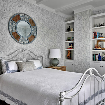
One of the older kids bedroom is covered in a soft muted slate blue. The room features a custom built-in bookcase and storage with clean lines, painted in a crisp white. The open shelving provides a stylish way to display books and decorative objects. The floral wallpaper from Galbraith and Paul in a soft grey and white palette wraps the room, adding an artisan touch that feels both classic and rejuvenating.
 Smith & Sons Coldstream General Contractors
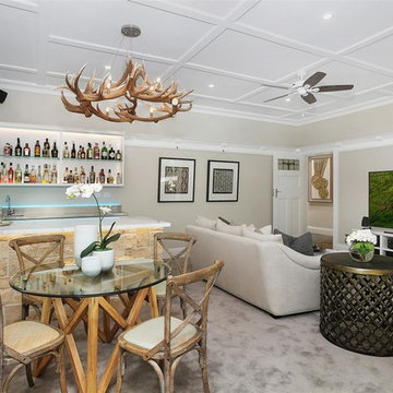
Beautifully simple & subtle in colour. This gorgeous french modern country home renovation has given this home all the warmth of a family home and incorporates all the best parts of french, modern & country decor. Lovely interior brick walls, wood burning fire places & french doors give this home all the character of a much older home with all the fresh brightness of a new one.
- Smith & Sons Remodelling Experts Canada
Find the right local pro for your project
 Fergus Garber Architects
Sometimes, all it takes is a fresh perspective. This was the case for FGA’s Atherton clients, empty-nesters, who were eager to reimagine their home of many years as they embarked on their next chapter: hosting grandchildren. To start, FGA kept a few outer walls to preserve the home's more expansive footprint, while opening up and reimagining the layout. The new home with a grand entry hall is oriented to highlight the long garden view. Stylistically, the goal was to lend the new home an older aesthetic that suited the surrounding neighborhood - a home that “felt like the oldest house on the block,” in the words of the client. The structure also recalls the iconic style of Bernard Maybeck who designed the husband’s childhood home. FGA studied Maybeck’s methods for intricately layering rafters, outriggers, and brackets to create a sense of familiarity and ruggedness, but modified elements to feel modern and refined. The heavy timber was specially sourced, carefully measured, cut and numbered offsite, and then meticulously reassembled on the premises. The earthy exteriors with bright cedar shingles, deep dark green trim, and textured red brick are balanced with a crisp interior palette.
White cerused oak, mustard yellow library-dining millwork, a black marble bar, and copper hardware details are playfully contemporary. Recalling the exterior masonry, a handsome brick fireplace anchors the generous living room and neighboring office. From the living, dining, and kitchen, tall steel and glass French doors open onto a deep porch for easy entertaining and breezy backyard views.
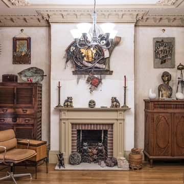
 Cobblestone Group Inc.
Mid-sized eclectic enclosed medium tone wood floor and brown floor living room photo in Boston with beige walls, a standard fireplace, a brick fireplace and no tv
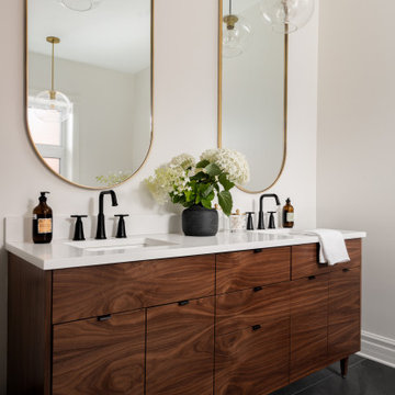
 Laurie Yapp Design
Bathroom - large contemporary master gray tile and ceramic tile slate floor, gray floor and double-sink bathroom idea in Montreal with flat-panel cabinets, medium tone wood cabinets, a one-piece toilet, white walls, an undermount sink, quartz countertops, white countertops and a freestanding vanity
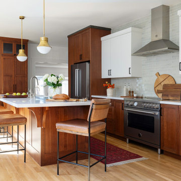
 Urbana Design Studio
This was an adorable kitchen remodel in an older Arts & Crafts home. We strove to maintain the charm while modernizing the space for a family of four. We used cherry cabinetry in keeping with a more craftsman feel, while mixing them painted uppers. Cambria countertops are durable and practical for their young kids. We incorporated a full-height backsplash of Pratt & Larson subway tile. We also created a beautiful Craftsman style pantry that mimics a piece of furniture.
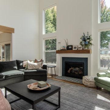
 Reliable Home Improvement
This new kitchen remodel transformed the older home into a more expansive kitchen that expanded into the new living room and home addition.
Inspiration for a large transitional kitchen remodel in Chicago
Inspiration for a large transitional kitchen remodel in Chicago
 Breathe Design Studio: San Francisco
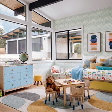
Our Austin studio decided to go bold with this project by ensuring that each space had a unique identity in the Mid-Century Modern style bathroom, butler's pantry, and mudroom. We covered the bathroom walls and flooring with stylish beige and yellow tile that was cleverly installed to look like two different patterns. The mint cabinet and pink vanity reflect the mid-century color palette. The stylish knobs and fittings add an extra splash of fun to the bathroom.
The butler's pantry is located right behind the kitchen and serves multiple functions like storage, a study area, and a bar. We went with a moody blue color for the cabinets and included a raw wood open shelf to give depth and warmth to the space. We went with some gorgeous artistic tiles that create a bold, intriguing look in the space.
In the mudroom, we used siding materials to create a shiplap effect to create warmth and texture – a homage to the classic Mid-Century Modern design. We used the same blue from the butler's pantry to create a cohesive effect. The large mint cabinets add a lighter touch to the space.
 123 Remodeling Inc.
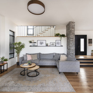
This 1952 home on Logan Square required a complete renovation. 123 Remodeling team gutted the whole place, changed room layouts, updated electrics to fit more appliances and better lighting, demolished kitchen wall to create an open concept. We've used a transitional style to incorporate older homes' charm with organic elements. A few grey shades, a white backsplash, and natural drops — this Chicago kitchen balances design beautifully.
The project was designed by the Chicago renovation company, 123 Remodeling - general contractors, kitchen & bathroom remodelers, and interior designers. Find out more works and schedule a free consultation and estimate on https://123remodeling.com/
 LiLu Interiors
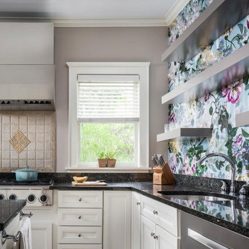
Our socially engaged, active client transplanted from the East Coast found a charming older home in Minneapolis that provided a home base in a new city. While the home had its charm, the dark interior didn’t provide the uplifting respite she desired. With a busy travel schedule and calendar full of after-hours social events, she was looking for a space to unwind at the end of a long day. She wanted to maximize her time at home, and a place to host friends pre-gala. We transformed an extra bedroom into a happy-hour type lounge with upholstered chairs and bar cart along with her Grandmother’s vanity and privacy screen for the ultimate pre-gala experience. In the kitchen, we replaced the dark cabinetry with open painted shelves to lighten the space and provide convenient access to her glassware, adding sparkle to the room. And perhaps most importantly, her bedroom is now a quiet, peaceful refuge with luxurious details that wrap her in warmth and relaxation.
----
Project designed by Minneapolis interior design studio LiLu Interiors. They serve the Minneapolis-St. Paul area including Wayzata, Edina, and Rochester, and they travel to the far-flung destinations that their upscale clientele own second homes in.
----
For more about LiLu Interiors, click here: https://www.liluinteriors.com/
----
To learn more about this project, click here:
https://www.liluinteriors.com/blog/portfolio-items/deco-boutique-kitchen/

 Tom Bassett-Dilley Architect, Ltd.
Photography by Natalie Marotta
Bungalows are lovable homes, but how can they be better? Along with many of our clients, we find that older (early 20th c.) homes have a lot of character and a comfortable scale, but are leaky, damp (especially in the basement), have fair to poor air quality, and use unconscionable amounts of fossil fuels to heat. The owners of this bungalow were ready to change that, and wanted to do so with minimal upfront carbon emissions as well.
The gut renovation included replacing the basement slab and providing capillary breaks and insulation continuously below grade. The brick structure was treated with a fluid-applied air and water barrier from the interior and insulated entirely with cellulose, a carbon-storing insulation. The roof used HFO-blown spray foam to provide sufficient insulation while allowing headroom for bedrooms, bathrooms, and laundry.
One great benefit of a full renovation is the possibility of reconfiguring spaces to suit the family’s lifestyle, and to make the best of indoor-outdoor connections. We opened up the main rooms on the first floor, creating a family gathering spot with a view to the back yard, and a spacious kitchen that supports the family’s commitment to cooking for healthy eating. The stair uses a north-facing skylight to bring light from above into the middle of the home, where it was previously dark.
As a decarbonization retrofit, the inefficient furnace was replaced with two small ducted heat pump systems, water heating and clothes drying are powered by air-source heat pumps, and cooking uses an induction cooktop plus electric ovens. Energy recovery ventilation provides filtered fresh air continuous exhaust from the kitchen, baths, and laundry, and supplies fresh, highly filtered air to bedrooms and living spaces.
The Better Bungalow now makes sense for the 21st century–it now fits the owners’ life-patterns, is super comfortable, has great air quality, and uses a fraction of the energy it did before, greatly lowering the demand on the utility grid. In the near future, when solar PV is installed, it can achieve net zero or near net zero emissions, and with battery backup, can provide great resilience in the event of power outages.
 Stalburg Design
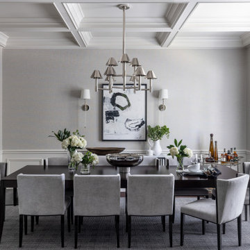
As the first room you see upon entering our client’s Birmingham, MI home, their Dining Room needed to “wow” guests and visitors alike. Completed in September 2023, the previous dining space was painted dark, filled with old furniture used for crafts and multi-family gatherings, and had a dated chandelier from the prior homeowner. Our client really wanted this space to evolve, and “grow up”, now that their kids are older, and she envisioned a more dressed up space for entertaining.
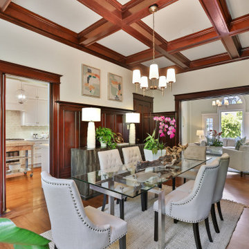
We lightened up the walls with a textured, shimmery wallcovering, refreshed the paneled wainscoting base, installed new wall sconces to provide more layered, dramatic lighting. We added a bold chrome chandelier with striking metal shades to act as the focal point of the space. With custom coffered ceilings, each surface of the room provides interest and sophistication. For the finishing touches, we laid the foundation of the room with a tailored, sophisticated Missoni area rug. We furnished the space with a semi-gloss lacquered dining table, stunning custom fabric dining chairs and eye-catching artwork! Our homeowners are now ready to entertain and host regular dinner parties and family gatherings.
 Wanda Ely Architect Inc.
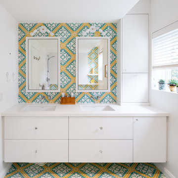
A vibrant, patterned cement tile of teal and gold tones is contrasted with classic white subway tile in the kid’s 2nd floor bathroom. This contrast creates a bold statement while feeling light, fresh, and contemporary, while still referencing some classic, older-world notions of pattern.
 Craftsman Design and Renovation
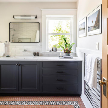
After years of renting out the house, the owners of this 1916 Craftsman were ready to make it their forever home. Both enthusiastic cooks, an updated kitchen was at the top of the list. Updating the fireplace, as well as two bathrooms in the house were also important. The homeowners passion for honoring the age of home, while also updating it, was at the forefront of our design. The end result beautifully blends the older elements with the new.
 Fergus Garber Architects
Sometimes, all it takes is a fresh perspective. This was the case for FGA’s Atherton clients, empty-nesters, who were eager to reimagine their home of many years as they embarked on their next chapter: hosting grandchildren. To start, FGA kept a few outer walls to preserve the home's more expansive footprint, while opening up and reimagining the layout. The new home with a grand entry hall is oriented to highlight the long garden view. Stylistically, the goal was to lend the new home an older aesthetic that suited the surrounding neighborhood - a home that “felt like the oldest house on the block,” in the words of the client. The structure also recalls the iconic style of Bernard Maybeck who designed the husband’s childhood home. FGA studied Maybeck’s methods for intricately layering rafters, outriggers, and brackets to create a sense of familiarity and ruggedness, but modified elements to feel modern and refined. The heavy timber was specially sourced, carefully measured, cut and numbered offsite, and then meticulously reassembled on the premises. The earthy exteriors with bright cedar shingles, deep dark green trim, and textured red brick are balanced with a crisp interior palette.
White cerused oak, mustard yellow library-dining millwork, a black marble bar, and copper hardware details are playfully contemporary. Recalling the exterior masonry, a handsome brick fireplace anchors the generous living room and neighboring office. From the living, dining, and kitchen, tall steel and glass French doors open onto a deep porch for easy entertaining and breezy backyard views.
 Sustainable Sedona
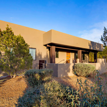
An older exterior style was update to a contemporary southwest style.
Inspiration for a southwestern brown one-story exterior home remodel in Phoenix
Inspiration for a southwestern brown one-story exterior home remodel in Phoenix
 CITYDESKSTUDIO, Inc.
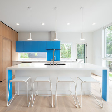
Aspect 221 is a multi-experiential home designed for a multi-generational family. Set on a sloping corner property in a 1960's Golden Valley neighborhood, this home offers a variety of ways to connect to the immediate landscapes and distant views. The house itself is divided vertically with interaction between families occurring through the centrally located sculptural stair. Horizontal movement in each direction leads to distinct environments provided for the families; multiple habitats offering variety of space, light, and privacy.
Expanding towards the west, the property takes advantage of the sweeping views and provides a perfect opportunity for a walk-out lower level and tuck under garage. The young family occupies the middle and upper floors, while the parents occupy the lower level. Each family has their own private entry and dedicated outdoor space. The home has 4 distinct outdoor spaces; a north shade deck and south sun deck, as well as an upper east lawn and lower west lawn. These spaces provide multiple habitats for the families to come together or move apart, offering variety and privacy.
We designed Aspect 221 with a nod to the various “aspects” offered by the site and its natural context. The base of the house is a black monolithic plinth anchored into the hillside, containing the garage and older parent’s home. This allows the upper two floors, enclosed in a fractured white and wood box, to remain humanly scaled and to move and gesture freely by twisting the middle floor off axis, and then twisting the upper floor off axis again. Each level offers views in varied directions revealing the site in different ways as you rise in elevation.
Location: Golden Valley, MN
Project Team:
Ben Awes, AIA, Principal-In-Charge
Chris Bach
Nate Dodge


88