
Search results for "Older" in Home Design Ideas
 123 Remodeling Inc.
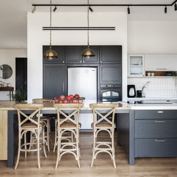
This 1952 home on Logan Square required a complete renovation. 123 Remodeling team gutted the whole place, changed room layouts, updated electrics to fit more appliances and better lighting, demolished kitchen wall to create an open concept. We've used a transitional style to incorporate older homes' charm with organic elements. A few grey shades, a white backsplash, and natural drops — this Chicago kitchen balances design beautifully.
The project was designed by the Chicago renovation company, 123 Remodeling - general contractors, kitchen & bathroom remodelers, and interior designers. Find out more works and schedule a free consultation and estimate on https://123remodeling.com/
 Mia Rao Design
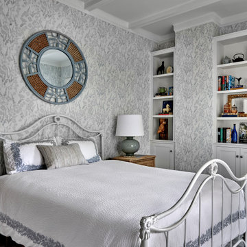
One of the older kids bedroom is covered in a soft muted slate blue. The room features a custom built-in bookcase and storage with clean lines, painted in a crisp white. The open shelving provides a stylish way to display books and decorative objects. The floral wallpaper from Galbraith and Paul in a soft grey and white palette wraps the room, adding an artisan touch that feels both classic and rejuvenating.
 Klopf Architecture
Built for the Bluff, A Sea Ranch Home is Remade from the Inside Out
The house had always been grounded, on an ocean bluff at The Sea Ranch. It sits unencumbered, adjacent to one of the most dramatic stretches of the Sonoma coast with protected commons meadow to the east, uninterrupted Pacific views to the west, and a bluff trail running alongside. What it lacked was the feeling of home, one that could hold up its own against the natural landscape.
The owners are entrepreneurs with deep involvement across tech, real estate, and development and they know how things are built. The Sea Ranch house had been in their lives for years, a second residence and a place for family to gather. Built for a different time, it felt more compromising than comfortable. Sitting in a closed off nook, the kitchen fit one cook at a time and turned its back on the rest of the house. The entry was dim and compressed, divided by a structural column that presented itself at exactly the wrong moment. The primary suite was small relative to the view outside it. A large rear bedroom sat behind a lowered ceiling with a bathroom that had never been added. The house was certainly worth the trouble of doing it right.
What followed was not one project but four, each with its own design challenge, each addressed over a period of time.
Where the House Meets the Ocean
The most complex piece of the project, in both structural and spatial terms, was the kitchen expansion. The existing room was a single-person galley squeezed in as an afterthought with no meaningful connection to the dining room, the living space, or the deck outside. To make it useful for a family that cooks and gathers, it needed to grow outward into an existing patio and flow into the rooms around it.
A big challenge was the roofline. Several planes at different pitches and angles converged directly where additional volume was needed. A new form had to join that geometry without reading as a correction. The solution found the simplest possible connection between the existing angles, a roofline that from outside the structure, appears entirely original. From the bluff trail where the addition is visible, there is no discernible seam.
Inside, the kitchen is now open to the living and dining rooms without interruption. A large sliding glass door connects the space onto the rear deck. The deck itself was expanded and oriented so that the body of the house shields it from the coastal wind which is a common consideration that determines whether outdoor space at The Sea Ranch actually gets used. The result is a room that works for large family gatherings where no one feels cutoff, and one that makes the boundary between being inside and outside easy to ignore.
Welcoming Light
A structural column stood at the convergence of eight distinct roof planes in the entry. It was load-bearing, but it was also the reason the entry had always felt like a hallway rather than a welcoming arrival.
With the structural engineer, a custom steel connector was designed to receive beams from six separate directions, redistributing the load through a single new continuous beam. The column was surgically removed. Three triangular skylights were then cut into the roof above, their shapes drawn from the
existing geometry of the planes around them. The entry is now bright and open. The skylights feel native to the structure because they follow the logic already present in the roof.
Two Suites, Two Views
At opposite ends of the house, the two bedroom suites were each reconfigured, and each found a different way to introduce more of the landscape into the room.
An addition to the primary suite extended the structure outward to create a wraparound plan with a loop from the bedroom through bath and closet that had not been possible before. The expansion opened a slot view from the tub and shower toward the ocean. The view is precise and private. The ocean view is present and deliberate.
The rear bedroom absorbed an adjacent storage room to transform it into a full second suite with a vaulted ceiling, a large bathroom with a tub, a shower, and a sauna. A private fenced garden courtyard sits just beyond the glass bringing the outdoors inside. The tub was placed so that, looking past the courtyard and through the bedroom beyond, the ocean is visible at the far end. It is a long view and it makes the room feel larger and more settled than its footprint would suggest.
Glass on Four Sides, Fire at the Center
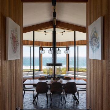
The main living and gathering room had always been caught between two competing facts: glass on four sides meant exceptional views but at The Sea Ranch, it also meant a cold room. A 360-degree cylindrical fireplace was added at the center on a raised stone base, providing radiant heat in every direction and giving the room a focal point around which a group naturally orients itself, whether that means two people at the end of the day or the whole family after dinner.
Owners Who Picked Up the Tools
The owner was not a passive client. they came with construction knowledge, specific ideas, and the desire to be an active part of the process, a dynamic that other architects may had found difficult, which Klopf Architecture accepted as an asset. They took it upon themselves to complete some of the work during construction, including the installation of a new radiant heating system beneath the floors.
The radiant system added to the older and less-desirable forced-air setup. At The Sea Ranch, that change matters as the house sits close enough to the ocean and moving air competes with the sound of it, where radiant heat does not. Solar panels were added to the roof as part of the new system. Insulation was upgraded throughout the walls, roof, and crawl space. The house that had always had the right setting now holds warmth the way a house on the bluff should.
They were also deeply involved in the design and selections throughout, and the finished house reflects both of them in ways that are specific rather than generic. The process took longer and moved through more iterations than a more arms-length relationship might have allowed. The result is more defined and personal because of it.
The Landscape Holds Priority
Every exterior decision was shaped by The Sea Ranch Design Standards, which require that buildings defer to the landscape around them rather than compete with it. Because this house sits on the bluff and is visible from the public trail, the additions faced a close review. Existing materials were matched. Geometries were resolved. The additions had to become indistinguishable from the original building.
From the trail, the house reads exactly as it always has — low, cedar-clad, secondary to the meadow and the water. The setting holds priority. Inside, the house has been remade.
Klopf Architecture Project Team: Geoff Campen and Trenton Jewett
Contractor: Shawn Bettega Construction
Photography: ©2025 Mariko Reed
Year Completed: 2023
Location: The Sea Ranch, CA
Find the right local pro for your project
 Greg D. Fisher, Architect, PLLC
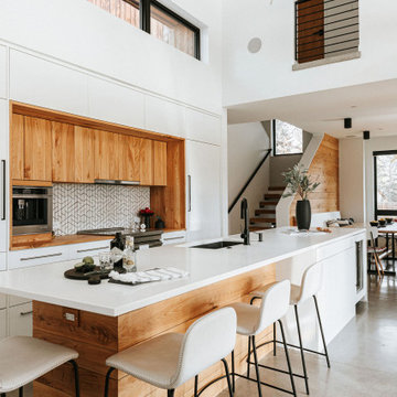
While being the new kid on the block, this home was designed to be a good neighbor to it's older surroundings. Progressive in materiality, fenestration and detailing but sympathetic in scale and form. It provides the homeowners privacy from the street but is very open to the backyard and the southern sun exposure afforded there. While the home is not certified, it subscribes to many Passive House principles which means it provides a very comfortable environment with good indoor air quality as well as reducing energy consumption. To further tread lightly on the planet, the home is all electric thereby directly excluding the use of fossil fuels. Alternative energy is provided by geothermal and solar photovoltaic systems. The homeowners are also big proponents of local bike culture and have prioritized bike use with an attached bike garage that also serves as a space for training and repairs, and a small bike trail looping the urban property.
 Smith & Sons Coldstream General Contractors
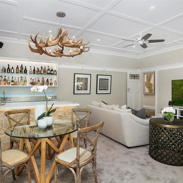
Beautifully simple & subtle in colour. This gorgeous french modern country home renovation has given this home all the warmth of a family home and incorporates all the best parts of french, modern & country decor. Lovely interior brick walls, wood burning fire places & french doors give this home all the character of a much older home with all the fresh brightness of a new one.
- Smith & Sons Remodelling Experts Canada
 Crespo Design Group
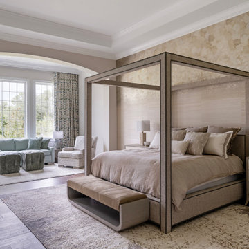
This luxurious primary bedroom is a perfect example of timeless interior design that balances elegance, comfort, and sophisticated craftsmanship. Designed by Crespo Design Group, this serene retreat features a custom upholstered canopy bed, soft neutral tones, layered textures, and refined finishes that create a calming yet luxurious atmosphere. Rich wall coverings, custom drapery, designer lighting, and bespoke furnishings work together to produce a space that feels both inviting and effortlessly elegant.
The spacious sitting area enhances the room's functionality, offering a private sanctuary for reading, relaxing, or enjoying morning coffee while taking in the natural light from expansive windows. Every detail was carefully selected to create a harmonious blend of luxury bedroom design, modern transitional interiors, and custom residential interior design.
As a leading luxury interior design firm in Tampa, Florida, Crespo Design Group specializes in creating custom homes that reflect each client's lifestyle while delivering exceptional beauty, comfort, and functionality. From luxury primary suites and custom furnishings to complete home renovations and new construction interiors, every project is thoughtfully designed to become a timeless reflection of its owner.
 Fergus Garber Architects
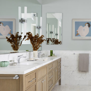
Sometimes, all it takes is a fresh perspective. This was the case for FGA’s Atherton clients, empty-nesters, who were eager to reimagine their home of many years as they embarked on their next chapter: hosting grandchildren. To start, FGA kept a few outer walls to preserve the home's more expansive footprint, while opening up and reimagining the layout. The new home with a grand entry hall is oriented to highlight the long garden view. Stylistically, the goal was to lend the new home an older aesthetic that suited the surrounding neighborhood - a home that “felt like the oldest house on the block,” in the words of the client. The structure also recalls the iconic style of Bernard Maybeck who designed the husband’s childhood home. FGA studied Maybeck’s methods for intricately layering rafters, outriggers, and brackets to create a sense of familiarity and ruggedness, but modified elements to feel modern and refined. The heavy timber was specially sourced, carefully measured, cut and numbered offsite, and then meticulously reassembled on the premises. The earthy exteriors with bright cedar shingles, deep dark green trim, and textured red brick are balanced with a crisp interior palette.
White cerused oak, mustard yellow library-dining millwork, a black marble bar, and copper hardware details are playfully contemporary. Recalling the exterior masonry, a handsome brick fireplace anchors the generous living room and neighboring office. From the living, dining, and kitchen, tall steel and glass French doors open onto a deep porch for easy entertaining and breezy backyard views.

 Cobblestone Group Inc.
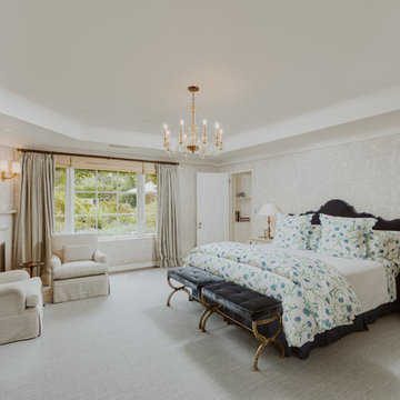
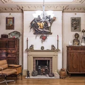
Mid-sized eclectic enclosed medium tone wood floor and brown floor living room photo in Boston with beige walls, a standard fireplace, a brick fireplace and no tv


 KraftMaster Renovations
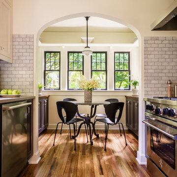
The dark wood tones in this space compliment the older nature of the home along with the brass hardware. The black faucet and mixed metal combination are a touch of modern in the space.
 O’Hara Interiors
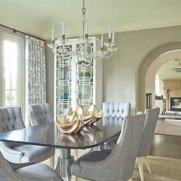
Martha O'Hara Interiors, Interior Design | John Kraemer & Sons, Builder | Troy Thies, Photography | Shannon Gale, Photo Styling
Dining room - contemporary dining room idea in Minneapolis
Dining room - contemporary dining room idea in Minneapolis




 Hardwood Bargains
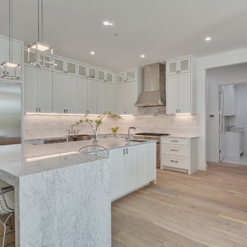
Walk on sunshine with Skyline Floorscapes' Ivory White Oak. This smooth operator of floors adds charm to any room. Its delightfully light tones will have you whistling while you work, play, or relax at home.
This amazing reclaimed wood style is a perfect environmentally-friendly statement for a modern space, or it will match the design of an older house with its vintage style. The ivory color will brighten up any room.
This engineered wood is extremely strong with nine layers and a 3mm wear layer of White Oak on top. The wood is handscraped, adding to the lived-in quality of the wood. This will make it look like it has been in your home all along.
Each piece is 7.5-in. wide by 71-in. long by 5/8-in. thick in size. It comes with a 35-year finish warranty and a lifetime structural warranty.
This is a real wood engineered flooring product made from white oak. It has a beautiful ivory color with hand scraped, reclaimed planks that are finished in oil. The planks have a tongue & groove construction that can be floated, glued or nailed down.
 Case Architects & Remodelers
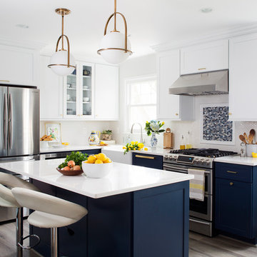
Designer Elena Eskandari
http://www.houzz.com/pro/eeskandari/elena-eskandari-case-design-remodeling-inc
Photography by Stacy Zarin Goldberg
 Terri Sears, Kitchen and Bath Designer
Melissa Mills photography
http://melissammills.weebly.com/
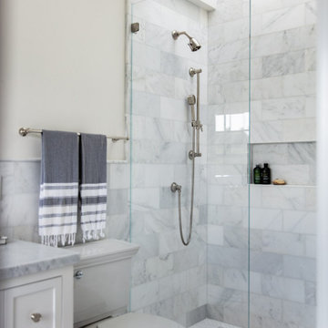
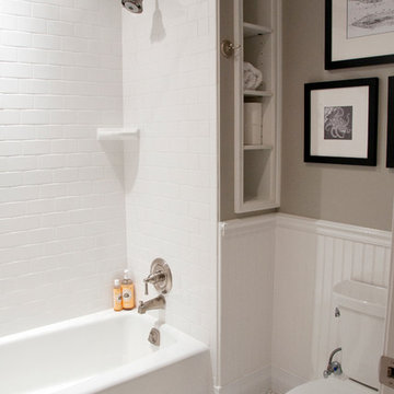
Large elegant kids' white tile and ceramic tile ceramic tile bathroom photo in Nashville with an undermount sink, a two-piece toilet and gray walls
Large elegant kids' white tile and ceramic tile ceramic tile bathroom photo in Nashville with an undermount sink, a two-piece toilet and gray walls
 TKS Design Group
Free ebook, Creating the Ideal Kitchen. DOWNLOAD NOW
One of my favorite things to work on is older homes with a bit of history because I find it an interesting challenge to marry the historical architectural features of a home with modern design elements that work well for my client’s current lifestyle.
This home was particularly fun because it was the second kitchen we had done for this family and was quite a departure from the style of the first kitchen.
The before shot of the kitchen shows a view from the family room. See the dropped ceiling? We were curious, was this just part of the design or was the dropped ceiling there to hide mechanicals? Well we soon found out that it was mostly decorative (yay!), and with the exception of a little bit of work to some plumbing from an upstairs bathroom and rerouting of the ventilation system within the original floor joists, we were in the clear, phew! The shot of the completed kitchen from roughly the same vantage point shows how much taller the ceilings are. It makes a huge difference in the feel of the space. Dark and gloomy turned fresh and light!
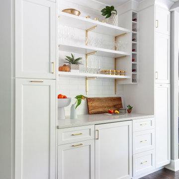
Another serious consideration was what do we do with the skinny transom window above the refrigerator. After much back and forth, we decided to eliminate it and do some open shelving instead. This ended up being one of the nicest areas in the room. I am calling it the “fun zone” because it houses all the barware, wine cubbies and a bar fridge — the perfect little buffet spot for entertaining. It is flanked on either side by pull out pantries that I’m sure will get a ton of use. Since the neighboring room has literally three walls of almost full height windows, the kitchen gets plenty of light.
The gold shelving brackets, large pendant fixtures over the island and the tile mural behind the range all pay subtle homage to the home’s prairie style architecture and bring a bit of sparkle to the room.
Even though the room is quite large, the work triangle is very tight with the large Subzero fridge, sink and range all nearby for easy maneuvering during meal prep. There is seating for four at the island, and work aisles are generous.
Designed by: Susan Klimala, CKD, CBD
Photography by: LOMA Studios
For more information on kitchen and bath design ideas go to: www.kitchenstudio-ge.com
 StoneWorks, Inc.
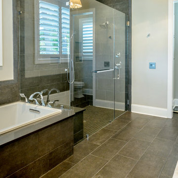
Large master bath features a great drop-in soaker tub with a gorgeous deck using Caesarstone Raven Quartz. The tub skirt and shower wall are both covered with 12 x 24 porcelain tile in a Smoke Brown color for a very contemporary look. Following the contempo look, the edges on the tub deck and the shower seat are both inverted at a 50 degree angle...a newer, contemporary look. The master bath flooring is the same as the shower walls, 12 x 24 porcelain tile in Smoke Brown. The shower floor is also the same stone as the walls, in a smaller, mosaic pattern and polished - again for the contempo look. Nice, very nice.
90