
Search results for "Optimal balance" in Home Design Ideas
 In Detail Interiors
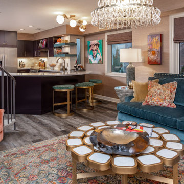
Small coastal condo gets a new life!
This project started as a consultation that really focused on whether or not it was feasible to maximize functionality out of a tight kitchen area in a condo on the beach. The cabinetry was sort of dated but not terrible terrible.
Refresh or total gut of this small kitchen
The client wanted to give it a refresh worked but we had worked with her before…so she could not quite decide how far to go. Maybe just repaint the existing cabinets? She needed some furniture. She wanted a little more ambiance and pizazz. And she wanted the Cheryl magic.
Ok finally, decision made. Kitchen had to go@!
Decision made- a new kitchen to go with the new living!
After further review on site with her during the consult meeting, and pitching a few inquiries around for bids on cabinetry and countertops – she ultimately decided to gut and re-do the whole layout. And man-oh-man what a difference some well executed design makes!!
This layout was unique and truly optimized every inch we could muster from the kitchen. (Working around that spiral staircase and navigating the soffit that wrapped the entire kitchen and adjacent living room!!) Colors needed to be bold while still feeling fresh so we paired a deep aubergine and a sort of “matte” Caribbean blue which laid the groundwork for a stunning living area palette.
Tough layout to enlarge much
There were a lot of other “givens” in this space that made the execution of the design a highly strategized process. We knew we had to work around the large wall space that starts the kitchen because it had the laundry room hiding on the other side… the awkward nook with windows on all sides that was a small breakfast area before the remodel… oh, and did we mention that dang spiral staircase?! Multiple site visits to plot the cabinetry and countertop curve paid off all said and done, though!
Living space that work with the open floor plan kitchen
Designing the furnishings then became the fun part! With a smaller living space flanked by windows and sliders – but one that needed to balance the kitchen in substance – we had to break a few preferred design rules to make up the amount of seating desired.
The deep grape-y purple barrel swivels were the perfect “transition” piece by the slider offering access to the views while being versatile enough to still afford safe use of the slider and passage outside. Adding some graphic punch with the droplet shaped, stone and brass cocktail table and bold multicolored rug we love the balance of these weightier aesthetic choices with the adjacent kitchen.
Signature pieces make all the difference
Carrying through little pops of that blue green between the counter stools (I die! Seriously! SO GORGEOUS) and the sofa (with those brass nails!) — these colors really created a sturdy but eclectic tonal feel that the client was just over the moon for. The art and grasscloth on the walls throughout developed the architecture of the space in an overall structure that was really lacking – it feels warm, inviting, comfortable – BEAUTIFUL – but not too priss and pomp.
Now if we could just keep the pup off the sofa!
 HouseHome
Parris Place | Centennial, CO | Kitchen Remodel
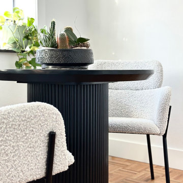
This kitchen embodies a clean, modern aesthetic with a focus on simplicity and balance. Light finishes, soft textures, and natural materials come together to create a space that feels calm and inviting.
 TVL Creative Ltd.
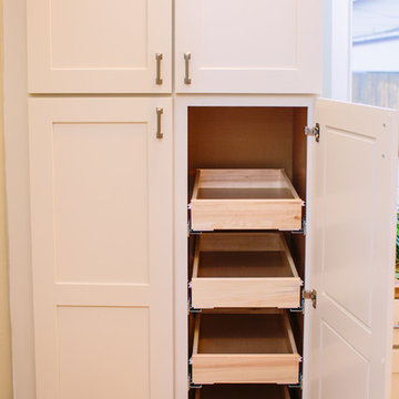
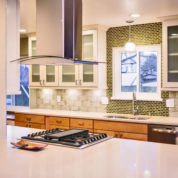
This remodel took an extremely dark & dated kitchen and transformed it into a bright and airy happy place for our client. The existing conditions created a dark, hall-like kitchen that greatly lacked in function and did little to optimize storage. Realizing the potential of this truly massive space, we created a design that utilizes every inch of the kitchen and creates functional cooking and prep space as well as pantry storage and work nooks. Our first order of business was to demo out the blocky corner that separated the kitchen from the living room. This involved removing an existing fireplace, re-structuring a wall, and having an entirely new furnace installed in the basement to eliminate a duct running right through the corner we hoped to eliminate. After opening up the space, we focused on highlighting and brightening the room. New NuCore flooring was installed to give the kitchen a fresh look while offering optimal function and cleanability. Two-toned cabinets in a honey maple and painted silk were used to create a warm and comfortable balance throughout the space. New quartz countertops in MSI's canvas were installed, and butcher block was installed on the two desk areas to offer a warm visual relief and casual work surface. The color palette for the kitchen is reminiscent of a cozy apothecary; we utilized fresh greens with Sherwin Williams paint on the walls and Treviso Gray Sage glazed subway tiles on the backsplash. Over the sink, we designed a playful highlight with counter-to-ceiling mini brick mosaic in a dark crackle green. We introduced additional lighting throughout including new recessed lights, over-sink light, and under-cabinet lights. New appliances were introduced to the space as well, and we complimented the stainless steel of these fixtures to the transitional nickel hardware on the cabinets. This space now feels open and inviting, and is visible from the second you enter the front door! We are so proud of this result and so happy that our clients can enjoy this gorgeous kitchen for years to come.
Find the right local pro for your project
 KCBR Design | Remodel
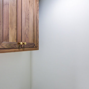
This project showcases a thoughtfully designed space blending modern functionality with timeless elegance. The Savoy Azula 12x24 Flooring provides a striking foundation, complemented by LATICRETE Frosty Grout for a seamless finish. Helix Quartz accents and Niche Shelves and Walls offer stylish and practical storage options. Fixtures like the Lumicoat Shower Head and Brilliance Polished Nickel Faucet bring a sleek, modern aesthetic, while Honey Bronze Fixtures and Knobs add warmth and sophistication. Features such as the Beveled Mirror, Shower Bench, and Marble Gem Tile enhance the space with classic touches and luxurious materials. The addition of Venetian Plaster adds texture and depth to the walls, while the Water Closet Wall Cabinet Elevation and Vanity Elevation with Mirror and Lighting optimize storage and functionality. The result is a refined, well-balanced design that combines comfort, style, and efficiency.
 Swatch Design Group
As a part of a larger transformation, the kitchen served as an anchor for rethinking how the home could feel and function. The goal was to create a space that felt truly integrated, flowed naturally within itself, and connected seamlessly to the outdoors. Storage was a top priority, with an emphasis on keeping countertops clean and the space feeling calm and open. Flow was equally important. What began as a layout optimized for entertaining evolved into a more intentional approach, where every sightline and transition was thoughtfully considered. The clients also needed the kitchen to work hard for their lifestyle, with a commercial-size refrigerator and freezer, generous prep space, and room to gather. The challenge was to bring purpose and polish to a space that didn’t quite feel like it belonged. The result is a kitchen that’s not only highly functional but finally feels like part of the home.
Project challenges:
- Maximizing storage was a primary challenge, especially with the inclusion of a commercial-sized fridge and freezer that occupied valuable cabinetry space.
- The need for clean, uninterrupted lines throughout the kitchen required thoughtful detailing, especially around cabinetry transitions and appliance integration.
- The oversized island design required two stone slabs and waterfall edges on both sides which posed both visual and logistical challenges.
- Incorporating electrical outlets into the island in a way that felt intentional and unobtrusive demanded creative problem-solving.
- The unique rooflines created strong visual angles that required a considered design approach to ensure the space felt cohesive rather than disjointed.
- Balancing symmetry and flow in a kitchen with structural constraints required precise layout planning to maintain a cohesive visual rhythm.
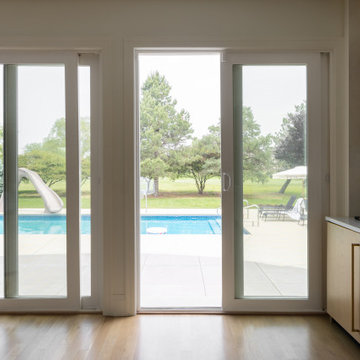
- Creating an intentional indoor/outdoor living flow, especially in the transitional space between the sliding doors to the backyard and the kitchen.
Project solutions:
- To balance the visual weight of the commercial-grade fridge and freezer, we flanked the range and hood with full-height pocket cabinetry, which created symmetry while reclaiming storage space. We also took a look into internal organization and carefully mapped out where every kitchen item would live. This allowed us to make informed decisions about drawer versus door configurations, and when to incorporate features like roll-out shelving to maximize accessibility and function.
- Linear light fixtures above the island were chosen for their low visual impact, allowing sightlines to remain clear and emphasizing the thoughtful spatial layout.
- The oversized island was carefully executed using two coordinated slabs, with a subtle brass inlay detail between them to turn a logistical challenge into a design feature.
- Pop-up electrical outlets were integrated into the island to keep surfaces clutter-free while maintaining easy access, which combined form and function seamlessly.
- With multiple focal points and a peaked vaulted ceiling, layout precision was key. The island, hood, and adjacent staircase were all perfectly centered on the vault, creating a sense of alignment across the open space.
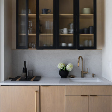
- In the transitional area between kitchen and backyard, we added a wet bar that visually and functionally connects the indoor space with the outdoors. This addition provides extra storage and creates a dedicated entertainment spot for guests, enhancing the overall flow and usability of the home.
 Novu Designs
Our goal is to make your kitchen remodel as comfortable as possible. After establishing rapport with our client, we used our ingenuity to redesign and build their ideal kitchen in this stunning 10-foot-ceiling Brooklyn home. The warm tones of wood, quartz, and rich greens strike the ideal balance in creating this appealing design.
How did we achieve this look?
The Backsplash
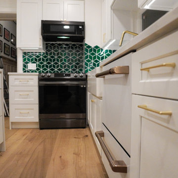
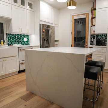
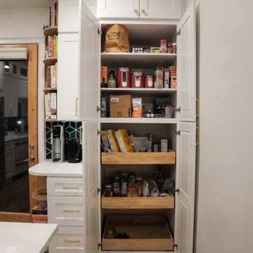
Our client wanted a simple kitchen remodel in the shaker design, but she also wanted to include green. Initially, we proposed green cabinets to create a bold green look in the kitchen. The main objective was to incorporate our complimenting colors while keeping a feeling of lightness. After going through a number of ideas and 3D prototypes, installing as many cabinets as we could without overpowering the kitchen was our goal of optimizing space. We determined that the best way to brighten the space would be to install white shaker cabinets in addition to higher lumen recessed LED lighting. We decided that finding exquisite green backsplash tiles would be the best way to give it the desired green pop. After numerous searches, we came across a company called Mercury Mosaics.
While there were many green backsplash tiles to choose from, we opted for the mercury mosaics bluegrass diamond tiles. We loved these tiles because its created an illusion of cubes but at times, diamonds. The pattern is an art of illusion and its really gave us the personality we were looking for.
The Flooring of Choice
The flooring of choice was made by our client. We wanted the floors to feel soft and natural while capturing every bit of warmth to balance the whites and the greens and bring them together. While we could’ve opted for wood look tiles or luxury vinyl plank flooring, we ended up going with a premium slightly distressed white oak engineered hardwood flooring from Floor and Decor.
Accents
Although the flooring and the backsplash brought most of the kitchen together, we were still missing the cherry on top. The hardware and maybe something else?
We decided on thin profiled brushed brass hardware to give us that luxurious feel we were looking for every time we opened the cabinet. The cherry on top for us were the hand made quarter round oak shelves which really tied in the floors and cabinets together and gave us that final pop we were looking for. It truly added the perfect character for our client who is also a teen-fiction author of multiple books.
 Novu Designs
Our goal is to make your kitchen remodel as comfortable as possible. After establishing rapport with our client, we used our ingenuity to redesign and build their ideal kitchen in this stunning 10-foot-ceiling Brooklyn home. The warm tones of wood, quartz, and rich greens strike the ideal balance in creating this appealing design.
How did we achieve this look?
The Backsplash
Our client wanted a simple kitchen remodel in the shaker design, but she also wanted to include green. Initially, we proposed green cabinets to create a bold green look in the kitchen. The main objective was to incorporate our complimenting colors while keeping a feeling of lightness. After going through a number of ideas and 3D prototypes, installing as many cabinets as we could without overpowering the kitchen was our goal of optimizing space. We determined that the best way to brighten the space would be to install white shaker cabinets in addition to higher lumen recessed LED lighting. We decided that finding exquisite green backsplash tiles would be the best way to give it the desired green pop. After numerous searches, we came across a company called Mercury Mosaics.
While there were many green backsplash tiles to choose from, we opted for the mercury mosaics bluegrass diamond tiles. We loved these tiles because its created an illusion of cubes but at times, diamonds. The pattern is an art of illusion and its really gave us the personality we were looking for.
The Flooring of Choice
The flooring of choice was made by our client. We wanted the floors to feel soft and natural while capturing every bit of warmth to balance the whites and the greens and bring them together. While we could’ve opted for wood look tiles or luxury vinyl plank flooring, we ended up going with a premium slightly distressed white oak engineered hardwood flooring from Floor and Decor.
Accents
Although the flooring and the backsplash brought most of the kitchen together, we were still missing the cherry on top. The hardware and maybe something else?
We decided on thin profiled brushed brass hardware to give us that luxurious feel we were looking for every time we opened the cabinet. The cherry on top for us were the hand made quarter round oak shelves which really tied in the floors and cabinets together and gave us that final pop we were looking for. It truly added the perfect character for our client who is also a teen-fiction author of multiple books.
Sponsored
Sunbury, OH

J.Holderby - Renovations
Franklin County's Leading General Contractors - 2X Best of Houzz!
 House Of Suris Interior Design
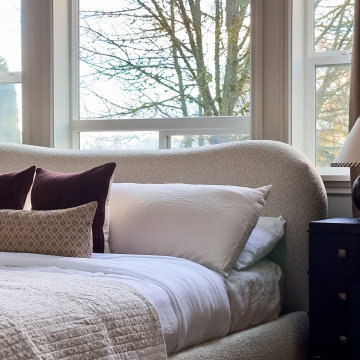
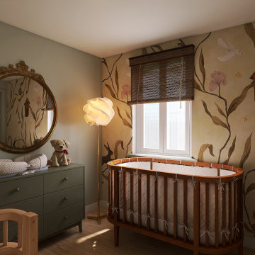
This project reimagines a 1940s Maple Leaf residence for a young family of four—transforming it into a modern transitional home that feels timeless, warm, and truly lived in. The goal was to balance character with comfort, creating spaces that support daily family life while remaining refined and enduring in design.
Our approach focused on optimizing the space plan to improve flow, storage, and functionality throughout the home. Every decision was guided by how the family lives, works, and gathers, ensuring each room feels intuitive, comfortable, and purposeful without sacrificing beauty.
A cohesive, nature-inspired palette ties the home together. Warm whites and oak tones form a calm foundation, layered with greens and soft blues for depth and balance. From the serene, color-drenched primary bedroom to the playful nursery and the productivity-focused home office anchored by a landscape mural, each space was designed to elevate everyday living while feeling effortlessly welcoming.
 TVL Creative Ltd.
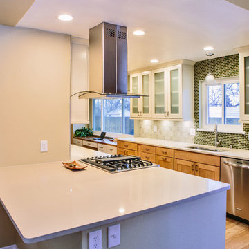
This remodel took an extremely dark & dated kitchen and transformed it into a bright and airy happy place for our client. The existing conditions created a dark, hall-like kitchen that greatly lacked in function and did little to optimize storage. Realizing the potential of this truly massive space, we created a design that utilizes every inch of the kitchen and creates functional cooking and prep space as well as pantry storage and work nooks. Our first order of business was to demo out the blocky corner that separated the kitchen from the living room. This involved removing an existing fireplace, re-structuring a wall, and having an entirely new furnace installed in the basement to eliminate a duct running right through the corner we hoped to eliminate. After opening up the space, we focused on highlighting and brightening the room. New NuCore flooring was installed to give the kitchen a fresh look while offering optimal function and cleanability. Two-toned cabinets in a honey maple and painted silk were used to create a warm and comfortable balance throughout the space. New quartz countertops in MSI's canvas were installed, and butcher block was installed on the two desk areas to offer a warm visual relief and casual work surface. The color palette for the kitchen is reminiscent of a cozy apothecary; we utilized fresh greens with Sherwin Williams paint on the walls and Treviso Gray Sage glazed subway tiles on the backsplash. Over the sink, we designed a playful highlight with counter-to-ceiling mini brick mosaic in a dark crackle green. We introduced additional lighting throughout including new recessed lights, over-sink light, and under-cabinet lights. New appliances were introduced to the space as well, and we complimented the stainless steel of these fixtures to the transitional nickel hardware on the cabinets. This space now feels open and inviting, and is visible from the second you enter the front door! We are so proud of this result and so happy that our clients can enjoy this gorgeous kitchen for years to come.
 KCBR Design | Remodel
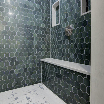
This project showcases a thoughtfully designed space blending modern functionality with timeless elegance. The Savoy Azula 12x24 Flooring provides a striking foundation, complemented by LATICRETE Frosty Grout for a seamless finish. Helix Quartz accents and Niche Shelves and Walls offer stylish and practical storage options. Fixtures like the Lumicoat Shower Head and Brilliance Polished Nickel Faucet bring a sleek, modern aesthetic, while Honey Bronze Fixtures and Knobs add warmth and sophistication. Features such as the Beveled Mirror, Shower Bench, and Marble Gem Tile enhance the space with classic touches and luxurious materials. The addition of Venetian Plaster adds texture and depth to the walls, while the Water Closet Wall Cabinet Elevation and Vanity Elevation with Mirror and Lighting optimize storage and functionality. The result is a refined, well-balanced design that combines comfort, style, and efficiency.
 KCBR Design | Remodel
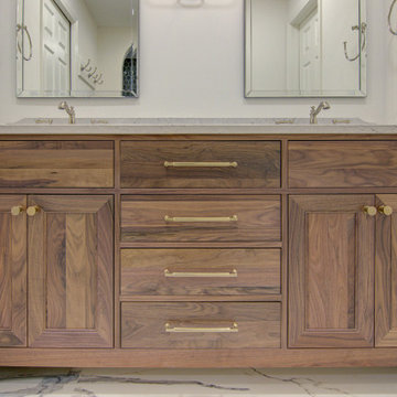
This project showcases a thoughtfully designed space blending modern functionality with timeless elegance. The Savoy Azula 12x24 Flooring provides a striking foundation, complemented by LATICRETE Frosty Grout for a seamless finish. Helix Quartz accents and Niche Shelves and Walls offer stylish and practical storage options. Fixtures like the Lumicoat Shower Head and Brilliance Polished Nickel Faucet bring a sleek, modern aesthetic, while Honey Bronze Fixtures and Knobs add warmth and sophistication. Features such as the Beveled Mirror, Shower Bench, and Marble Gem Tile enhance the space with classic touches and luxurious materials. The addition of Venetian Plaster adds texture and depth to the walls, while the Water Closet Wall Cabinet Elevation and Vanity Elevation with Mirror and Lighting optimize storage and functionality. The result is a refined, well-balanced design that combines comfort, style, and efficiency.
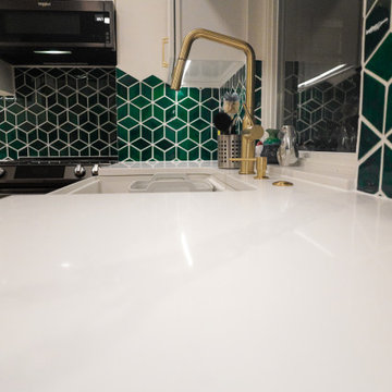 Novu Designs
Our goal is to make your kitchen remodel as comfortable as possible. After establishing rapport with our client, we used our ingenuity to redesign and build their ideal kitchen in this stunning 10-foot-ceiling Brooklyn home. The warm tones of wood, quartz, and rich greens strike the ideal balance in creating this appealing design.
How did we achieve this look?
The Backsplash
Our client wanted a simple kitchen remodel in the shaker design, but she also wanted to include green. Initially, we proposed green cabinets to create a bold green look in the kitchen. The main objective was to incorporate our complimenting colors while keeping a feeling of lightness. After going through a number of ideas and 3D prototypes, installing as many cabinets as we could without overpowering the kitchen was our goal of optimizing space. We determined that the best way to brighten the space would be to install white shaker cabinets in addition to higher lumen recessed LED lighting. We decided that finding exquisite green backsplash tiles would be the best way to give it the desired green pop. After numerous searches, we came across a company called Mercury Mosaics.
While there were many green backsplash tiles to choose from, we opted for the mercury mosaics bluegrass diamond tiles. We loved these tiles because its created an illusion of cubes but at times, diamonds. The pattern is an art of illusion and its really gave us the personality we were looking for.
The Flooring of Choice
The flooring of choice was made by our client. We wanted the floors to feel soft and natural while capturing every bit of warmth to balance the whites and the greens and bring them together. While we could’ve opted for wood look tiles or luxury vinyl plank flooring, we ended up going with a premium slightly distressed white oak engineered hardwood flooring from Floor and Decor.
Accents
Although the flooring and the backsplash brought most of the kitchen together, we were still missing the cherry on top. The hardware and maybe something else?
We decided on thin profiled brushed brass hardware to give us that luxurious feel we were looking for every time we opened the cabinet. The cherry on top for us were the hand made quarter round oak shelves which really tied in the floors and cabinets together and gave us that final pop we were looking for. It truly added the perfect character for our client who is also a teen-fiction author of multiple books.
 TVL Creative Ltd.
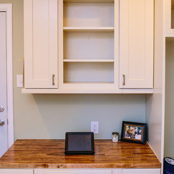
This remodel took an extremely dark & dated kitchen and transformed it into a bright and airy happy place for our client. The existing conditions created a dark, hall-like kitchen that greatly lacked in function and did little to optimize storage. Realizing the potential of this truly massive space, we created a design that utilizes every inch of the kitchen and creates functional cooking and prep space as well as pantry storage and work nooks. Our first order of business was to demo out the blocky corner that separated the kitchen from the living room. This involved removing an existing fireplace, re-structuring a wall, and having an entirely new furnace installed in the basement to eliminate a duct running right through the corner we hoped to eliminate. After opening up the space, we focused on highlighting and brightening the room. New NuCore flooring was installed to give the kitchen a fresh look while offering optimal function and cleanability. Two-toned cabinets in a honey maple and painted silk were used to create a warm and comfortable balance throughout the space. New quartz countertops in MSI's canvas were installed, and butcher block was installed on the two desk areas to offer a warm visual relief and casual work surface. The color palette for the kitchen is reminiscent of a cozy apothecary; we utilized fresh greens with Sherwin Williams paint on the walls and Treviso Gray Sage glazed subway tiles on the backsplash. Over the sink, we designed a playful highlight with counter-to-ceiling mini brick mosaic in a dark crackle green. We introduced additional lighting throughout including new recessed lights, over-sink light, and under-cabinet lights. New appliances were introduced to the space as well, and we complimented the stainless steel of these fixtures to the transitional nickel hardware on the cabinets. This space now feels open and inviting, and is visible from the second you enter the front door! We are so proud of this result and so happy that our clients can enjoy this gorgeous kitchen for years to come.
Sponsored
Sunbury, OH
J.Holderby - Renovations
Franklin County's Leading General Contractors - 2X Best of Houzz!
 Schumacher Homes
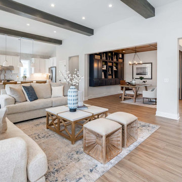
Built by Schumacher Homes, America's Largest Custom Home Builder, this stunning Heritage Coastal model home in Charleston, South Carolina, effortlessly balances classic coastal architecture with contemporary modern design. Perfect for active families who love to entertain, this spacious floor plan features an expansive, light-filled open-concept living space designed to host large family gatherings and holiday parties. The heart of the home is anchored by an airy great room where traditional wood-stained exposed ceiling beams arranged in two distinct architectural patterns draw the eye upward, adding rustic warmth and character. To maximize functionality for the modern hybrid workforce, a dedicated flex room has been expertly converted into a private home office, complete with custom built-in cabinets and open shelving for optimal organization. This coastal-inspired home also showcases elevated interior design details through statement accent walls that add depth and texture throughout the space.
Serving as the ultimate homeowner's oasis, the luxury primary suite (owner's retreat) features elegant, classic wainscoting wall paneling for a sophisticated, upscale feel. In contrast, a secondary bedroom utilizes a contemporary dimensional pattern accent wall to bring modern geometric dimension to the kids' or guests' quarters. Extending the living space into the outdoors, an optional covered porch offers a seamless indoor-outdoor transition, providing the perfect shaded patio area for kicking back, relaxing, and enjoying low-country breezes. Combining high-end architectural features with everyday practicality, this coastal custom home is designed for families to build and treasure a lifetime of memories.
 House Of Suris Interior Design
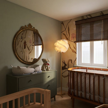
This project reimagines a 1940s Maple Leaf residence for a young family of four—transforming it into a modern transitional home that feels timeless, warm, and truly lived in. The goal was to balance character with comfort, creating spaces that support daily family life while remaining refined and enduring in design.
Our approach focused on optimizing the space plan to improve flow, storage, and functionality throughout the home. Every decision was guided by how the family lives, works, and gathers, ensuring each room feels intuitive, comfortable, and purposeful without sacrificing beauty.
A cohesive, nature-inspired palette ties the home together. Warm whites and oak tones form a calm foundation, layered with greens and soft blues for depth and balance. From the serene, color-drenched primary bedroom to the playful nursery and the productivity-focused home office anchored by a landscape mural, each space was designed to elevate everyday living while feeling effortlessly welcoming.
 TVL Creative Ltd.
This remodel took an extremely dark & dated kitchen and transformed it into a bright and airy happy place for our client. The existing conditions created a dark, hall-like kitchen that greatly lacked in function and did little to optimize storage. Realizing the potential of this truly massive space, we created a design that utilizes every inch of the kitchen and creates functional cooking and prep space as well as pantry storage and work nooks. Our first order of business was to demo out the blocky corner that separated the kitchen from the living room. This involved removing an existing fireplace, re-structuring a wall, and having an entirely new furnace installed in the basement to eliminate a duct running right through the corner we hoped to eliminate. After opening up the space, we focused on highlighting and brightening the room. New NuCore flooring was installed to give the kitchen a fresh look while offering optimal function and cleanability. Two-toned cabinets in a honey maple and painted silk were used to create a warm and comfortable balance throughout the space. New quartz countertops in MSI's canvas were installed, and butcher block was installed on the two desk areas to offer a warm visual relief and casual work surface. The color palette for the kitchen is reminiscent of a cozy apothecary; we utilized fresh greens with Sherwin Williams paint on the walls and Treviso Gray Sage glazed subway tiles on the backsplash. Over the sink, we designed a playful highlight with counter-to-ceiling mini brick mosaic in a dark crackle green. We introduced additional lighting throughout including new recessed lights, over-sink light, and under-cabinet lights. New appliances were introduced to the space as well, and we complimented the stainless steel of these fixtures to the transitional nickel hardware on the cabinets. This space now feels open and inviting, and is visible from the second you enter the front door! We are so proud of this result and so happy that our clients can enjoy this gorgeous kitchen for years to come.
 Novu Designs
Our goal is to make your kitchen remodel as comfortable as possible. After establishing rapport with our client, we used our ingenuity to redesign and build their ideal kitchen in this stunning 10-foot-ceiling Brooklyn home. The warm tones of wood, quartz, and rich greens strike the ideal balance in creating this appealing design.
How did we achieve this look?
The Backsplash
Our client wanted a simple kitchen remodel in the shaker design, but she also wanted to include green. Initially, we proposed green cabinets to create a bold green look in the kitchen. The main objective was to incorporate our complimenting colors while keeping a feeling of lightness. After going through a number of ideas and 3D prototypes, installing as many cabinets as we could without overpowering the kitchen was our goal of optimizing space. We determined that the best way to brighten the space would be to install white shaker cabinets in addition to higher lumen recessed LED lighting. We decided that finding exquisite green backsplash tiles would be the best way to give it the desired green pop. After numerous searches, we came across a company called Mercury Mosaics.
While there were many green backsplash tiles to choose from, we opted for the mercury mosaics bluegrass diamond tiles. We loved these tiles because its created an illusion of cubes but at times, diamonds. The pattern is an art of illusion and its really gave us the personality we were looking for.
The Flooring of Choice
The flooring of choice was made by our client. We wanted the floors to feel soft and natural while capturing every bit of warmth to balance the whites and the greens and bring them together. While we could’ve opted for wood look tiles or luxury vinyl plank flooring, we ended up going with a premium slightly distressed white oak engineered hardwood flooring from Floor and Decor.
Accents
Although the flooring and the backsplash brought most of the kitchen together, we were still missing the cherry on top. The hardware and maybe something else?
We decided on thin profiled brushed brass hardware to give us that luxurious feel we were looking for every time we opened the cabinet. The cherry on top for us were the hand made quarter round oak shelves which really tied in the floors and cabinets together and gave us that final pop we were looking for. It truly added the perfect character for our client who is also a teen-fiction author of multiple books.


 House Of Suris Interior Design
This project reimagines a 1940s Maple Leaf residence for a young family of four—transforming it into a modern transitional home that feels timeless, warm, and truly lived in. The goal was to balance character with comfort, creating spaces that support daily family life while remaining refined and enduring in design.
Our approach focused on optimizing the space plan to improve flow, storage, and functionality throughout the home. Every decision was guided by how the family lives, works, and gathers, ensuring each room feels intuitive, comfortable, and purposeful without sacrificing beauty.
A cohesive, nature-inspired palette ties the home together. Warm whites and oak tones form a calm foundation, layered with greens and soft blues for depth and balance. From the serene, color-drenched primary bedroom to the playful nursery and the productivity-focused home office anchored by a landscape mural, each space was designed to elevate everyday living while feeling effortlessly welcoming.
 Swatch Design Group
As a part of a larger transformation, the kitchen served as an anchor for rethinking how the home could feel and function. The goal was to create a space that felt truly integrated, flowed naturally within itself, and connected seamlessly to the outdoors. Storage was a top priority, with an emphasis on keeping countertops clean and the space feeling calm and open. Flow was equally important. What began as a layout optimized for entertaining evolved into a more intentional approach, where every sightline and transition was thoughtfully considered. The clients also needed the kitchen to work hard for their lifestyle, with a commercial-size refrigerator and freezer, generous prep space, and room to gather. The challenge was to bring purpose and polish to a space that didn’t quite feel like it belonged. The result is a kitchen that’s not only highly functional but finally feels like part of the home.
Project challenges:
- Maximizing storage was a primary challenge, especially with the inclusion of a commercial-sized fridge and freezer that occupied valuable cabinetry space.
- The need for clean, uninterrupted lines throughout the kitchen required thoughtful detailing, especially around cabinetry transitions and appliance integration.
- The oversized island design required two stone slabs and waterfall edges on both sides which posed both visual and logistical challenges.
- Incorporating electrical outlets into the island in a way that felt intentional and unobtrusive demanded creative problem-solving.
- The unique rooflines created strong visual angles that required a considered design approach to ensure the space felt cohesive rather than disjointed.
- Balancing symmetry and flow in a kitchen with structural constraints required precise layout planning to maintain a cohesive visual rhythm.
- Creating an intentional indoor/outdoor living flow, especially in the transitional space between the sliding doors to the backyard and the kitchen.
Project solutions:
- To balance the visual weight of the commercial-grade fridge and freezer, we flanked the range and hood with full-height pocket cabinetry, which created symmetry while reclaiming storage space. We also took a look into internal organization and carefully mapped out where every kitchen item would live. This allowed us to make informed decisions about drawer versus door configurations, and when to incorporate features like roll-out shelving to maximize accessibility and function.
- Linear light fixtures above the island were chosen for their low visual impact, allowing sightlines to remain clear and emphasizing the thoughtful spatial layout.
- The oversized island was carefully executed using two coordinated slabs, with a subtle brass inlay detail between them to turn a logistical challenge into a design feature.
- Pop-up electrical outlets were integrated into the island to keep surfaces clutter-free while maintaining easy access, which combined form and function seamlessly.
- With multiple focal points and a peaked vaulted ceiling, layout precision was key. The island, hood, and adjacent staircase were all perfectly centered on the vault, creating a sense of alignment across the open space.
- In the transitional area between kitchen and backyard, we added a wet bar that visually and functionally connects the indoor space with the outdoors. This addition provides extra storage and creates a dedicated entertainment spot for guests, enhancing the overall flow and usability of the home.
 George Ranalli Architect
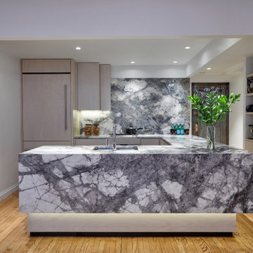
The kitchen redesign was a testament to the perfect balance between style, functionality, and safety. Every detail was carefully considered, from the choice of high-end appliances such as the Sub-zero refrigerator, electric range, convention oven, and microwave, and Miele dishwasher, to the thoughtfully designed 180-cubic-feet of under-the-counter storage, outfitted with Hefele appliances and magic-corners, allowing for maximum efficiency and ease of use.
The space planning was equally impressive, with a focus on optimizing every inch of the kitchen. A prime example of this was the vertical, touch-latch storage drawers for tableware built into an existing display niche, just within arm's length from the dishwasher, and hidden behind a beautiful pocket door. The result was a seamless design that combines practicality and aesthetics effortlessly.
The pantry was another key element of the redesign, with a petite yet functional space set into a small area off the kitchen, just steps from the apartment entrance. The design ensured that every inch of the pantry was optimized, providing ample storage while still being visually pleasing.
Overall, the kitchen redesign was a masterclass in balancing form and function, resulting in a space that is as beautiful as it is functional. With a focus on safety, efficiency, and organization, this kitchen is a joy to use and a testament to thoughtful design.
6