
Search results for "Optimal balance" in Home Design Ideas
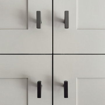
 Drury Design
The Setup
The homeowners of this Barrington Hills residence approached Drury Design with a clear vision: transform their existing kitchen into a space that would better serve their active family of four. With two young children who are homeschooled and love to bake with their mom, plus two dogs, this kitchen needed to function as the true heart of the home.
The existing kitchen was functional but didn’t maximize the potential of the beautiful natural light and scenic views available through the floor-to-ceiling windows. The space was locked between the dining room and family room, which limited structural modifications, but the homeowners wanted to create a more family-friendly environment that would complement the warm walnut built-ins and furnishings in the adjacent dining room while staying true to the home’s overall aesthetic.
Design Objectives:
Create a highly functional workspace that accommodates multiple family members cooking and gathering simultaneously
Maximize the connection to the beautiful outdoor scenery and natural light through thoughtful design choices
Establish a cohesive color palette that complements the existing walnut elements in the adjacent dining room without becoming too tone-on-tone (aka “matchy matchy”)
Improve the seating arrangement to take advantage of the stunning views (rather than facing away from the windows)
Work within the existing architectural constraints, including a curved soffit that could not be removed
Increase storage capacity while maintaining clean, uncluttered sightlines throughout the space
Design Challenges:
The curved soffit presented a design dilemma of whether to echo the curve throughout the kitchen or work with it in a more subtle way
The relatively low ceiling height required careful consideration to avoid making the space feel cramped or cave-like
The existing hardwood floor could not be refinished, which meant the new kitchen footprint had to match or exceed the original layout exactly
Finding the right balance of warm and neutral tones to complement both the existing walnut elements nearby and the natural outdoor views proved challenging
The refrigerator placement was constrained by door swing requirements, which affected the entire layout and prevented centering the sink on the back wall
Rethinking the original seating, which faced inward toward the kitchen (turning backs to the beautiful windows and outdoor views)
Pendant lighting from the previous kitchen obstructed views to the outdoors despite the abundant natural light available
The Renewed Space
Design Solutions:
The curved soffit was embraced subtly through the full slab backsplash, which echoes the curve without requiring curved cabinetry or architectural elements that might feel forced
Low ceiling challenges were addressed by using lighter painted cabinets for some tall elements, including the double oven, pantries, and refrigerator area, creating an airy feel while reserving the darker stained walnut for the center section and island
The floor constraint was managed by designing the new layout to cover all previously unfinished areas while maintaining the exact footprint, with only minor touch-ups needed in a few areas
The color palette balances warm walnut stain (harmonizing with the dining room built-ins) with soft, neutral painted cabinets – avoiding stark white that wouldn’t complement the home’s warm aesthetic
Refrigerator placement was optimized with a slim pullout pantry to the left, allowing proper door clearance while maintaining the desired layout flow and enabling the main pantry to be positioned adjacently
The seating was completely reimagined with a built-in banquette facing the windows, allowing diners to enjoy the outdoor views while providing flexible seating for two to four people
Decorative pendant lighting was eliminated in favor of recessed can lights, preserving the unobstructed views to the beautiful outdoor scenery
This kitchen transformation demonstrates how thoughtful design can dramatically improve functionality for a busy family while honoring existing architectural elements. The children immediately began cooking and baking with their mother in the new space, and the window-facing banquette has become a favorite gathering spot where the family can enjoy both meals and the beautiful outdoor views.
 Drury Design
The Setup
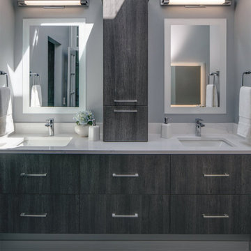
After 25+ years in their home, these long-time clients were ready to upgrade their outdated primary bath into something more modern, functional, and reflective of their personal taste. The original space had all the hallmarks of a ’90s builder-grade bathroom — bulky built-in tub, undersized shower, and a layout that wasn’t making the most of the square footage. With the kids grown and a successful kitchen remodel already under their belt, the couple returned to Drury Design for a complete bathroom transformation.
Design objectives:
Create a contemporary, personalized retreat with clean lines and a calming palette
Incorporate the husband’s favorite color (blue) in a bold but tasteful way
Add more efficient storage, including a long-desired linen closet
Improve lighting and ventilation
Make better use of space, especially in the old tub-and-shower zone
Maintain dual sinks and a dedicated makeup area
Add heated floors for extra comfort
The Remodel
Design challenges to be solved:
Reimagine a large but awkward separate shower/tub room to feel more intentional and spa-like
Integrate bold color in a way that felt stylish, not overpowering
Combine two previously separate sinks into one shared vanity without losing the “his and hers” feel
Maintain a sense of flow and cohesion across two adjoining zones of the bathroom
Create a makeup area that feels set apart without breaking design continuity
Maximize comfort in winter without dramatically inflating the project budget
The Renewed Space
Design solutions:
Shifted the location of the tub and expanded the shower to reconfigure the secondary room into a functional spa space; introduced floating shelves and a linen cabinet to tie it all together
Let the rich blue shower tile take center stage as a statement piece while keeping the rest of the palette subdued and modern with layered grays
Centered a tall cabinet between the two sinks to provide extra storage and gently divide the shared vanity wall into his-and-hers zones
Chose a freestanding-style tub that installs flush against the wall—preserving the aesthetic while optimizing space and maximizing flow between rooms
Added subtle glam touches — like jewelry-inspired drawer pulls — at the makeup station to give it identity without disrupting the flow
Installed heated floors with programmable settings, offering hotel-level comfort without blowing the budget
Final Thoughts:
The finished space is a stylish blend of utility and serenity. Clean lines, modern finishes, and pops of bold color reflect the homeowners’ taste without overwhelming the design. What was once a dated, underused space is now a calm, contemporary retreat with thoughtful details throughout – from the integrated makeup zone to the just-right splash of color and the luxurious heated floors. Another successful collaboration with Drury Design, this project proves that remodeling isn’t just about resale — it’s about finally getting the space you’ve always wanted, and loving it every day.
 Swatch Design Group
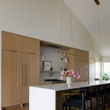
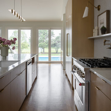
As a part of a larger transformation, the kitchen served as an anchor for rethinking how the home could feel and function. The goal was to create a space that felt truly integrated, flowed naturally within itself, and connected seamlessly to the outdoors. Storage was a top priority, with an emphasis on keeping countertops clean and the space feeling calm and open. Flow was equally important. What began as a layout optimized for entertaining evolved into a more intentional approach, where every sightline and transition was thoughtfully considered. The clients also needed the kitchen to work hard for their lifestyle, with a commercial-size refrigerator and freezer, generous prep space, and room to gather. The challenge was to bring purpose and polish to a space that didn’t quite feel like it belonged. The result is a kitchen that’s not only highly functional but finally feels like part of the home.
Project challenges:
- Maximizing storage was a primary challenge, especially with the inclusion of a commercial-sized fridge and freezer that occupied valuable cabinetry space.
- The need for clean, uninterrupted lines throughout the kitchen required thoughtful detailing, especially around cabinetry transitions and appliance integration.
- The oversized island design required two stone slabs and waterfall edges on both sides which posed both visual and logistical challenges.
- Incorporating electrical outlets into the island in a way that felt intentional and unobtrusive demanded creative problem-solving.
- The unique rooflines created strong visual angles that required a considered design approach to ensure the space felt cohesive rather than disjointed.
- Balancing symmetry and flow in a kitchen with structural constraints required precise layout planning to maintain a cohesive visual rhythm.
- Creating an intentional indoor/outdoor living flow, especially in the transitional space between the sliding doors to the backyard and the kitchen.
Project solutions:
- To balance the visual weight of the commercial-grade fridge and freezer, we flanked the range and hood with full-height pocket cabinetry, which created symmetry while reclaiming storage space. We also took a look into internal organization and carefully mapped out where every kitchen item would live. This allowed us to make informed decisions about drawer versus door configurations, and when to incorporate features like roll-out shelving to maximize accessibility and function.
- Linear light fixtures above the island were chosen for their low visual impact, allowing sightlines to remain clear and emphasizing the thoughtful spatial layout.
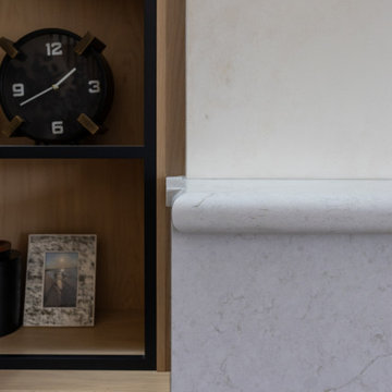
- The oversized island was carefully executed using two coordinated slabs, with a subtle brass inlay detail between them to turn a logistical challenge into a design feature.
- Pop-up electrical outlets were integrated into the island to keep surfaces clutter-free while maintaining easy access, which combined form and function seamlessly.
- With multiple focal points and a peaked vaulted ceiling, layout precision was key. The island, hood, and adjacent staircase were all perfectly centered on the vault, creating a sense of alignment across the open space.
- In the transitional area between kitchen and backyard, we added a wet bar that visually and functionally connects the indoor space with the outdoors. This addition provides extra storage and creates a dedicated entertainment spot for guests, enhancing the overall flow and usability of the home.
Find the right local pro for your project
 Swatch Design Group
As a part of a larger transformation, the kitchen served as an anchor for rethinking how the home could feel and function. The goal was to create a space that felt truly integrated, flowed naturally within itself, and connected seamlessly to the outdoors. Storage was a top priority, with an emphasis on keeping countertops clean and the space feeling calm and open. Flow was equally important. What began as a layout optimized for entertaining evolved into a more intentional approach, where every sightline and transition was thoughtfully considered. The clients also needed the kitchen to work hard for their lifestyle, with a commercial-size refrigerator and freezer, generous prep space, and room to gather. The challenge was to bring purpose and polish to a space that didn’t quite feel like it belonged. The result is a kitchen that’s not only highly functional but finally feels like part of the home.
Project challenges:
- Maximizing storage was a primary challenge, especially with the inclusion of a commercial-sized fridge and freezer that occupied valuable cabinetry space.
- The need for clean, uninterrupted lines throughout the kitchen required thoughtful detailing, especially around cabinetry transitions and appliance integration.
- The oversized island design required two stone slabs and waterfall edges on both sides which posed both visual and logistical challenges.
- Incorporating electrical outlets into the island in a way that felt intentional and unobtrusive demanded creative problem-solving.
- The unique rooflines created strong visual angles that required a considered design approach to ensure the space felt cohesive rather than disjointed.
- Balancing symmetry and flow in a kitchen with structural constraints required precise layout planning to maintain a cohesive visual rhythm.
- Creating an intentional indoor/outdoor living flow, especially in the transitional space between the sliding doors to the backyard and the kitchen.
Project solutions:
- To balance the visual weight of the commercial-grade fridge and freezer, we flanked the range and hood with full-height pocket cabinetry, which created symmetry while reclaiming storage space. We also took a look into internal organization and carefully mapped out where every kitchen item would live. This allowed us to make informed decisions about drawer versus door configurations, and when to incorporate features like roll-out shelving to maximize accessibility and function.
- Linear light fixtures above the island were chosen for their low visual impact, allowing sightlines to remain clear and emphasizing the thoughtful spatial layout.
- The oversized island was carefully executed using two coordinated slabs, with a subtle brass inlay detail between them to turn a logistical challenge into a design feature.
- Pop-up electrical outlets were integrated into the island to keep surfaces clutter-free while maintaining easy access, which combined form and function seamlessly.
- With multiple focal points and a peaked vaulted ceiling, layout precision was key. The island, hood, and adjacent staircase were all perfectly centered on the vault, creating a sense of alignment across the open space.
- In the transitional area between kitchen and backyard, we added a wet bar that visually and functionally connects the indoor space with the outdoors. This addition provides extra storage and creates a dedicated entertainment spot for guests, enhancing the overall flow and usability of the home.
 Swatch Design Group
As a part of a larger transformation, the kitchen served as an anchor for rethinking how the home could feel and function. The goal was to create a space that felt truly integrated, flowed naturally within itself, and connected seamlessly to the outdoors. Storage was a top priority, with an emphasis on keeping countertops clean and the space feeling calm and open. Flow was equally important. What began as a layout optimized for entertaining evolved into a more intentional approach, where every sightline and transition was thoughtfully considered. The clients also needed the kitchen to work hard for their lifestyle, with a commercial-size refrigerator and freezer, generous prep space, and room to gather. The challenge was to bring purpose and polish to a space that didn’t quite feel like it belonged. The result is a kitchen that’s not only highly functional but finally feels like part of the home.
Project challenges:
- Maximizing storage was a primary challenge, especially with the inclusion of a commercial-sized fridge and freezer that occupied valuable cabinetry space.
- The need for clean, uninterrupted lines throughout the kitchen required thoughtful detailing, especially around cabinetry transitions and appliance integration.
- The oversized island design required two stone slabs and waterfall edges on both sides which posed both visual and logistical challenges.
- Incorporating electrical outlets into the island in a way that felt intentional and unobtrusive demanded creative problem-solving.
- The unique rooflines created strong visual angles that required a considered design approach to ensure the space felt cohesive rather than disjointed.
- Balancing symmetry and flow in a kitchen with structural constraints required precise layout planning to maintain a cohesive visual rhythm.
- Creating an intentional indoor/outdoor living flow, especially in the transitional space between the sliding doors to the backyard and the kitchen.
Project solutions:
- To balance the visual weight of the commercial-grade fridge and freezer, we flanked the range and hood with full-height pocket cabinetry, which created symmetry while reclaiming storage space. We also took a look into internal organization and carefully mapped out where every kitchen item would live. This allowed us to make informed decisions about drawer versus door configurations, and when to incorporate features like roll-out shelving to maximize accessibility and function.
- Linear light fixtures above the island were chosen for their low visual impact, allowing sightlines to remain clear and emphasizing the thoughtful spatial layout.
- The oversized island was carefully executed using two coordinated slabs, with a subtle brass inlay detail between them to turn a logistical challenge into a design feature.
- Pop-up electrical outlets were integrated into the island to keep surfaces clutter-free while maintaining easy access, which combined form and function seamlessly.
- With multiple focal points and a peaked vaulted ceiling, layout precision was key. The island, hood, and adjacent staircase were all perfectly centered on the vault, creating a sense of alignment across the open space.
- In the transitional area between kitchen and backyard, we added a wet bar that visually and functionally connects the indoor space with the outdoors. This addition provides extra storage and creates a dedicated entertainment spot for guests, enhancing the overall flow and usability of the home.
 HouseHome
Parris Place | Centennial, CO | Kitchen Remodel
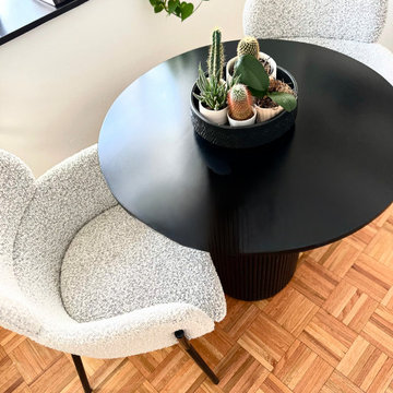
This kitchen embodies a clean, modern aesthetic with a focus on simplicity and balance. Light finishes, soft textures, and natural materials come together to create a space that feels calm and inviting.
 TVL Creative Ltd.
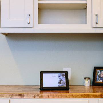
This remodel took an extremely dark & dated kitchen and transformed it into a bright and airy happy place for our client. The existing conditions created a dark, hall-like kitchen that greatly lacked in function and did little to optimize storage. Realizing the potential of this truly massive space, we created a design that utilizes every inch of the kitchen and creates functional cooking and prep space as well as pantry storage and work nooks. Our first order of business was to demo out the blocky corner that separated the kitchen from the living room. This involved removing an existing fireplace, re-structuring a wall, and having an entirely new furnace installed in the basement to eliminate a duct running right through the corner we hoped to eliminate. After opening up the space, we focused on highlighting and brightening the room. New NuCore flooring was installed to give the kitchen a fresh look while offering optimal function and cleanability. Two-toned cabinets in a honey maple and painted silk were used to create a warm and comfortable balance throughout the space. New quartz countertops in MSI's canvas were installed, and butcher block was installed on the two desk areas to offer a warm visual relief and casual work surface. The color palette for the kitchen is reminiscent of a cozy apothecary; we utilized fresh greens with Sherwin Williams paint on the walls and Treviso Gray Sage glazed subway tiles on the backsplash. Over the sink, we designed a playful highlight with counter-to-ceiling mini brick mosaic in a dark crackle green. We introduced additional lighting throughout including new recessed lights, over-sink light, and under-cabinet lights. New appliances were introduced to the space as well, and we complimented the stainless steel of these fixtures to the transitional nickel hardware on the cabinets. This space now feels open and inviting, and is visible from the second you enter the front door! We are so proud of this result and so happy that our clients can enjoy this gorgeous kitchen for years to come.
Sponsored
Sunbury, OH

J.Holderby - Renovations
Franklin County's Leading General Contractors - 2X Best of Houzz!
 Shefer Builder Inc
Modern Warmth Meets Sleek Functionality
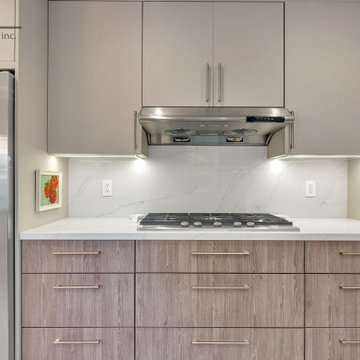
This kitchen remodel by Shefer Builder Inc. blends modern design with natural warmth for a timeless, functional space. The layout features two-tone cabinetry—soft matte gray uppers paired with textured wood base cabinets—creating depth and balance.
Stainless steel appliances bring a sleek, contemporary touch, while white quartz countertops and a matching backsplash maintain a clean, seamless flow throughout. The space is flooded with natural light from a large bay window, which not only brightens the kitchen but also creates a cozy spot with a beautiful view of the outdoors.
A built-in wine fridge, optimized storage, and a thoughtful work triangle make this kitchen as practical as it is beautiful. Elegant LED lighting and a sculptural modern chandelier complete the look, adding both sophistication and warmth.
The result is a welcoming kitchen that perfectly balances modern aesthetics, functionality, and comfort — ideal for both everyday living and entertaining.
 KCBR Design | Remodel
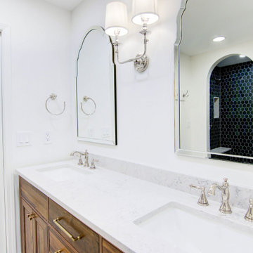
This project showcases a thoughtfully designed space blending modern functionality with timeless elegance. The Savoy Azula 12x24 Flooring provides a striking foundation, complemented by LATICRETE Frosty Grout for a seamless finish. Helix Quartz accents and Niche Shelves and Walls offer stylish and practical storage options. Fixtures like the Lumicoat Shower Head and Brilliance Polished Nickel Faucet bring a sleek, modern aesthetic, while Honey Bronze Fixtures and Knobs add warmth and sophistication. Features such as the Beveled Mirror, Shower Bench, and Marble Gem Tile enhance the space with classic touches and luxurious materials. The addition of Venetian Plaster adds texture and depth to the walls, while the Water Closet Wall Cabinet Elevation and Vanity Elevation with Mirror and Lighting optimize storage and functionality. The result is a refined, well-balanced design that combines comfort, style, and efficiency.
 KCBR Design | Remodel
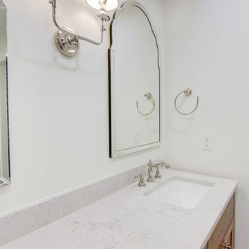
This project showcases a thoughtfully designed space blending modern functionality with timeless elegance. The Savoy Azula 12x24 Flooring provides a striking foundation, complemented by LATICRETE Frosty Grout for a seamless finish. Helix Quartz accents and Niche Shelves and Walls offer stylish and practical storage options. Fixtures like the Lumicoat Shower Head and Brilliance Polished Nickel Faucet bring a sleek, modern aesthetic, while Honey Bronze Fixtures and Knobs add warmth and sophistication. Features such as the Beveled Mirror, Shower Bench, and Marble Gem Tile enhance the space with classic touches and luxurious materials. The addition of Venetian Plaster adds texture and depth to the walls, while the Water Closet Wall Cabinet Elevation and Vanity Elevation with Mirror and Lighting optimize storage and functionality. The result is a refined, well-balanced design that combines comfort, style, and efficiency.
 TVL Creative Ltd.
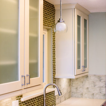
This remodel took an extremely dark & dated kitchen and transformed it into a bright and airy happy place for our client. The existing conditions created a dark, hall-like kitchen that greatly lacked in function and did little to optimize storage. Realizing the potential of this truly massive space, we created a design that utilizes every inch of the kitchen and creates functional cooking and prep space as well as pantry storage and work nooks. Our first order of business was to demo out the blocky corner that separated the kitchen from the living room. This involved removing an existing fireplace, re-structuring a wall, and having an entirely new furnace installed in the basement to eliminate a duct running right through the corner we hoped to eliminate. After opening up the space, we focused on highlighting and brightening the room. New NuCore flooring was installed to give the kitchen a fresh look while offering optimal function and cleanability. Two-toned cabinets in a honey maple and painted silk were used to create a warm and comfortable balance throughout the space. New quartz countertops in MSI's canvas were installed, and butcher block was installed on the two desk areas to offer a warm visual relief and casual work surface. The color palette for the kitchen is reminiscent of a cozy apothecary; we utilized fresh greens with Sherwin Williams paint on the walls and Treviso Gray Sage glazed subway tiles on the backsplash. Over the sink, we designed a playful highlight with counter-to-ceiling mini brick mosaic in a dark crackle green. We introduced additional lighting throughout including new recessed lights, over-sink light, and under-cabinet lights. New appliances were introduced to the space as well, and we complimented the stainless steel of these fixtures to the transitional nickel hardware on the cabinets. This space now feels open and inviting, and is visible from the second you enter the front door! We are so proud of this result and so happy that our clients can enjoy this gorgeous kitchen for years to come.
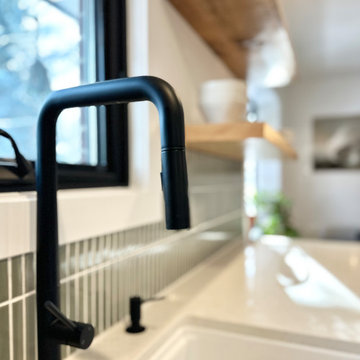
 Swatch Design Group
As a part of a larger transformation, the kitchen served as an anchor for rethinking how the home could feel and function. The goal was to create a space that felt truly integrated, flowed naturally within itself, and connected seamlessly to the outdoors. Storage was a top priority, with an emphasis on keeping countertops clean and the space feeling calm and open. Flow was equally important. What began as a layout optimized for entertaining evolved into a more intentional approach, where every sightline and transition was thoughtfully considered. The clients also needed the kitchen to work hard for their lifestyle, with a commercial-size refrigerator and freezer, generous prep space, and room to gather. The challenge was to bring purpose and polish to a space that didn’t quite feel like it belonged. The result is a kitchen that’s not only highly functional but finally feels like part of the home.
Project challenges:
- Maximizing storage was a primary challenge, especially with the inclusion of a commercial-sized fridge and freezer that occupied valuable cabinetry space.
- The need for clean, uninterrupted lines throughout the kitchen required thoughtful detailing, especially around cabinetry transitions and appliance integration.
- The oversized island design required two stone slabs and waterfall edges on both sides which posed both visual and logistical challenges.
- Incorporating electrical outlets into the island in a way that felt intentional and unobtrusive demanded creative problem-solving.
- The unique rooflines created strong visual angles that required a considered design approach to ensure the space felt cohesive rather than disjointed.
- Balancing symmetry and flow in a kitchen with structural constraints required precise layout planning to maintain a cohesive visual rhythm.
- Creating an intentional indoor/outdoor living flow, especially in the transitional space between the sliding doors to the backyard and the kitchen.
Project solutions:
- To balance the visual weight of the commercial-grade fridge and freezer, we flanked the range and hood with full-height pocket cabinetry, which created symmetry while reclaiming storage space. We also took a look into internal organization and carefully mapped out where every kitchen item would live. This allowed us to make informed decisions about drawer versus door configurations, and when to incorporate features like roll-out shelving to maximize accessibility and function.
- Linear light fixtures above the island were chosen for their low visual impact, allowing sightlines to remain clear and emphasizing the thoughtful spatial layout.
- The oversized island was carefully executed using two coordinated slabs, with a subtle brass inlay detail between them to turn a logistical challenge into a design feature.
- Pop-up electrical outlets were integrated into the island to keep surfaces clutter-free while maintaining easy access, which combined form and function seamlessly.
- With multiple focal points and a peaked vaulted ceiling, layout precision was key. The island, hood, and adjacent staircase were all perfectly centered on the vault, creating a sense of alignment across the open space.
- In the transitional area between kitchen and backyard, we added a wet bar that visually and functionally connects the indoor space with the outdoors. This addition provides extra storage and creates a dedicated entertainment spot for guests, enhancing the overall flow and usability of the home.
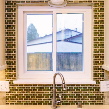 TVL Creative Ltd.
This remodel took an extremely dark & dated kitchen and transformed it into a bright and airy happy place for our client. The existing conditions created a dark, hall-like kitchen that greatly lacked in function and did little to optimize storage. Realizing the potential of this truly massive space, we created a design that utilizes every inch of the kitchen and creates functional cooking and prep space as well as pantry storage and work nooks. Our first order of business was to demo out the blocky corner that separated the kitchen from the living room. This involved removing an existing fireplace, re-structuring a wall, and having an entirely new furnace installed in the basement to eliminate a duct running right through the corner we hoped to eliminate. After opening up the space, we focused on highlighting and brightening the room. New NuCore flooring was installed to give the kitchen a fresh look while offering optimal function and cleanability. Two-toned cabinets in a honey maple and painted silk were used to create a warm and comfortable balance throughout the space. New quartz countertops in MSI's canvas were installed, and butcher block was installed on the two desk areas to offer a warm visual relief and casual work surface. The color palette for the kitchen is reminiscent of a cozy apothecary; we utilized fresh greens with Sherwin Williams paint on the walls and Treviso Gray Sage glazed subway tiles on the backsplash. Over the sink, we designed a playful highlight with counter-to-ceiling mini brick mosaic in a dark crackle green. We introduced additional lighting throughout including new recessed lights, over-sink light, and under-cabinet lights. New appliances were introduced to the space as well, and we complimented the stainless steel of these fixtures to the transitional nickel hardware on the cabinets. This space now feels open and inviting, and is visible from the second you enter the front door! We are so proud of this result and so happy that our clients can enjoy this gorgeous kitchen for years to come.


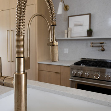
 HouseHome
Parris Place | Centennial, CO | Kitchen Remodel
This kitchen embodies a clean, modern aesthetic with a focus on simplicity and balance. Light finishes, soft textures, and natural materials come together to create a space that feels calm and inviting.
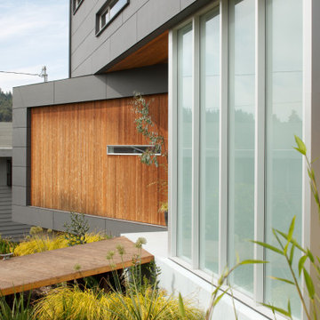
 Milgard Windows & Doors
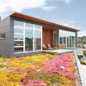
On top of many other considerations, sound was a significant factor – in more ways than one – when it came time for prentiss+balance+wickline ARCHITECTS to design Seattle’s “Ballard Cut” house. In fact, it was particularly relevant to the home’s fenestration.
Situated on a patch of ground that offered gorgeous views of Puget Sound on one side but a railroad cutback on the other, Ballard Cut presented a unique challenge. To address this conundrum, the designers at prentiss+balance+wickline wanted windows with optimal sightlines to augment the inlet-side views and proper sound absorption to negate the roar of the trains.
After considering many options, prentiss+balance+wickline ultimately found what they were seeking in Milgard Windows & Doors’ aluminum windows.
Read full story: https://www.milgard.com/blog/aluminum-windows-milgard-ensure-fabulous-views-seattle
 Novu Designs
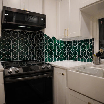
Our goal is to make your kitchen remodel as comfortable as possible. After establishing rapport with our client, we used our ingenuity to redesign and build their ideal kitchen in this stunning 10-foot-ceiling Brooklyn home. The warm tones of wood, quartz, and rich greens strike the ideal balance in creating this appealing design.
How did we achieve this look?
The Backsplash
Our client wanted a simple kitchen remodel in the shaker design, but she also wanted to include green. Initially, we proposed green cabinets to create a bold green look in the kitchen. The main objective was to incorporate our complimenting colors while keeping a feeling of lightness. After going through a number of ideas and 3D prototypes, installing as many cabinets as we could without overpowering the kitchen was our goal of optimizing space. We determined that the best way to brighten the space would be to install white shaker cabinets in addition to higher lumen recessed LED lighting. We decided that finding exquisite green backsplash tiles would be the best way to give it the desired green pop. After numerous searches, we came across a company called Mercury Mosaics.
While there were many green backsplash tiles to choose from, we opted for the mercury mosaics bluegrass diamond tiles. We loved these tiles because its created an illusion of cubes but at times, diamonds. The pattern is an art of illusion and its really gave us the personality we were looking for.
The Flooring of Choice
The flooring of choice was made by our client. We wanted the floors to feel soft and natural while capturing every bit of warmth to balance the whites and the greens and bring them together. While we could’ve opted for wood look tiles or luxury vinyl plank flooring, we ended up going with a premium slightly distressed white oak engineered hardwood flooring from Floor and Decor.
Accents
Although the flooring and the backsplash brought most of the kitchen together, we were still missing the cherry on top. The hardware and maybe something else?
We decided on thin profiled brushed brass hardware to give us that luxurious feel we were looking for every time we opened the cabinet. The cherry on top for us were the hand made quarter round oak shelves which really tied in the floors and cabinets together and gave us that final pop we were looking for. It truly added the perfect character for our client who is also a teen-fiction author of multiple books.
 Drury Design
The Setup
The homeowners of this Barrington Hills residence approached Drury Design with a clear vision: transform their existing kitchen into a space that would better serve their active family of four. With two young children who are homeschooled and love to bake with their mom, plus two dogs, this kitchen needed to function as the true heart of the home.
The existing kitchen was functional but didn’t maximize the potential of the beautiful natural light and scenic views available through the floor-to-ceiling windows. The space was locked between the dining room and family room, which limited structural modifications, but the homeowners wanted to create a more family-friendly environment that would complement the warm walnut built-ins and furnishings in the adjacent dining room while staying true to the home’s overall aesthetic.
Design Objectives:
Create a highly functional workspace that accommodates multiple family members cooking and gathering simultaneously
Maximize the connection to the beautiful outdoor scenery and natural light through thoughtful design choices
Establish a cohesive color palette that complements the existing walnut elements in the adjacent dining room without becoming too tone-on-tone (aka “matchy matchy”)
Improve the seating arrangement to take advantage of the stunning views (rather than facing away from the windows)
Work within the existing architectural constraints, including a curved soffit that could not be removed
Increase storage capacity while maintaining clean, uncluttered sightlines throughout the space
Design Challenges:
The curved soffit presented a design dilemma of whether to echo the curve throughout the kitchen or work with it in a more subtle way
The relatively low ceiling height required careful consideration to avoid making the space feel cramped or cave-like
The existing hardwood floor could not be refinished, which meant the new kitchen footprint had to match or exceed the original layout exactly
Finding the right balance of warm and neutral tones to complement both the existing walnut elements nearby and the natural outdoor views proved challenging
The refrigerator placement was constrained by door swing requirements, which affected the entire layout and prevented centering the sink on the back wall
Rethinking the original seating, which faced inward toward the kitchen (turning backs to the beautiful windows and outdoor views)
Pendant lighting from the previous kitchen obstructed views to the outdoors despite the abundant natural light available
The Renewed Space
Design Solutions:
The curved soffit was embraced subtly through the full slab backsplash, which echoes the curve without requiring curved cabinetry or architectural elements that might feel forced
Low ceiling challenges were addressed by using lighter painted cabinets for some tall elements, including the double oven, pantries, and refrigerator area, creating an airy feel while reserving the darker stained walnut for the center section and island
The floor constraint was managed by designing the new layout to cover all previously unfinished areas while maintaining the exact footprint, with only minor touch-ups needed in a few areas
The color palette balances warm walnut stain (harmonizing with the dining room built-ins) with soft, neutral painted cabinets – avoiding stark white that wouldn’t complement the home’s warm aesthetic
Refrigerator placement was optimized with a slim pullout pantry to the left, allowing proper door clearance while maintaining the desired layout flow and enabling the main pantry to be positioned adjacently
The seating was completely reimagined with a built-in banquette facing the windows, allowing diners to enjoy the outdoor views while providing flexible seating for two to four people
Decorative pendant lighting was eliminated in favor of recessed can lights, preserving the unobstructed views to the beautiful outdoor scenery
This kitchen transformation demonstrates how thoughtful design can dramatically improve functionality for a busy family while honoring existing architectural elements. The children immediately began cooking and baking with their mother in the new space, and the window-facing banquette has become a favorite gathering spot where the family can enjoy both meals and the beautiful outdoor views.
Sponsored
Sunbury, OH
J.Holderby - Renovations
Franklin County's Leading General Contractors - 2X Best of Houzz!
 Milgard Windows & Doors
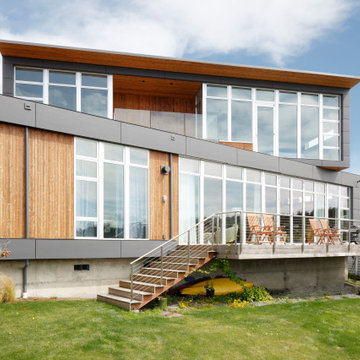
On top of many other considerations, sound was a significant factor – in more ways than one – when it came time for prentiss+balance+wickline ARCHITECTS to design Seattle’s “Ballard Cut” house. In fact, it was particularly relevant to the home’s fenestration.
Situated on a patch of ground that offered gorgeous views of Puget Sound on one side but a railroad cutback on the other, Ballard Cut presented a unique challenge. To address this conundrum, the designers at prentiss+balance+wickline wanted windows with optimal sightlines to augment the inlet-side views and proper sound absorption to negate the roar of the trains.
After considering many options, prentiss+balance+wickline ultimately found what they were seeking in Milgard Windows & Doors’ aluminum windows.
Read full story: https://www.milgard.com/blog/aluminum-windows-milgard-ensure-fabulous-views-seattle
 Milgard Windows & Doors
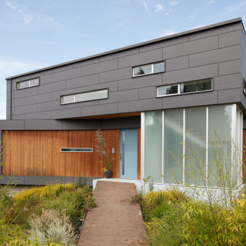
On top of many other considerations, sound was a significant factor – in more ways than one – when it came time for prentiss+balance+wickline ARCHITECTS to design Seattle’s “Ballard Cut” house. In fact, it was particularly relevant to the home’s fenestration.
Situated on a patch of ground that offered gorgeous views of Puget Sound on one side but a railroad cutback on the other, Ballard Cut presented a unique challenge. To address this conundrum, the designers at prentiss+balance+wickline wanted windows with optimal sightlines to augment the inlet-side views and proper sound absorption to negate the roar of the trains.
After considering many options, prentiss+balance+wickline ultimately found what they were seeking in Milgard Windows & Doors’ aluminum windows.
Read full story: https://www.milgard.com/blog/aluminum-windows-milgard-ensure-fabulous-views-seattle
 Milgard Windows & Doors
On top of many other considerations, sound was a significant factor – in more ways than one – when it came time for prentiss+balance+wickline ARCHITECTS to design Seattle’s “Ballard Cut” house. In fact, it was particularly relevant to the home’s fenestration.
Situated on a patch of ground that offered gorgeous views of Puget Sound on one side but a railroad cutback on the other, Ballard Cut presented a unique challenge. To address this conundrum, the designers at prentiss+balance+wickline wanted windows with optimal sightlines to augment the inlet-side views and proper sound absorption to negate the roar of the trains.
After considering many options, prentiss+balance+wickline ultimately found what they were seeking in Milgard Windows & Doors’ aluminum windows.
Read full story: https://www.milgard.com/blog/aluminum-windows-milgard-ensure-fabulous-views-seattle
9