
Search results for "Overpower" in Home Design Ideas
 The Cabination
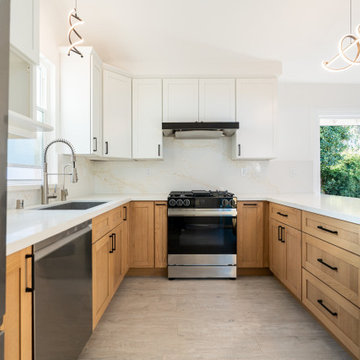
This bright and airy transitional kitchen combines timeless elegance with exceptional functionality, featuring Premium RTA Kitchen Cabinets by The Cabination. The clean lines of the sleek white upper cabinetry are beautifully contrasted with the warm wood tones of the lower cabinets, creating a refined yet welcoming atmosphere. With ample natural light flooding the space, the kitchen feels expansive and open, perfect for family gatherings or casual entertaining.
Designed to be as functional as it is stylish, the spacious kitchen island offers plenty of room for meal prep and serves as an additional seating area. The premium stone countertops with subtle veining enhance the luxury feel, while the top-of-the-line stainless steel appliances maintain a modern, seamless aesthetic. The warm oak accents add character without overpowering the sleek design, creating a harmonious and balanced look.
For homeowners who value both beauty and practicality, this kitchen maximizes space, storage, and flow, all while keeping your home stylish and welcoming. Let The Cabination elevate your kitchen with high-quality, ready-to-assemble cabinetry designed for a sophisticated, modern lifestyle.
 Drury Design
The Setup:
After purchasing this home, the homeowners faced a unique opportunity to reimagine their kitchen and nearby spaces. Water damage from a burst pipe had left much of the home’s interior in need of repair, and while the existing kitchen was functional and in relatively good shape, it didn’t align with the family’s vision for their new home. The layout included a peninsula that wasn’t ideal, and there were some druthers with the nearby pantry.
Since the space needed to be rebuilt anyway, the homeowners saw this as a chance to create a kitchen that was both highly functional for their four young children and timeless in its design. The project also included a refresh of the adjacent message center and dining room — spaces that play key roles in the family’s daily life. The goal was to create a cohesive flow between these areas, balancing modern functionality with the craftsman-inspired character of the rest of the home.
Design Objectives:
- Replace the outdated peninsula with a large island to maximize counter space and create new seating options.
- Open up the space visually by removing soffits and rethinking the cabinetry layout.
Incorporate concealed refrigeration and freezer units to provide significant storage for the family while maintaining a streamlined aesthetic.
- Integrate black cabinetry into the design without making the space feel harsh or heavy.
- Ensure the lighting plan balances functional task lighting with ambient accent lighting.
- Avoid visual clutter in the cabinetry design while still giving a nod to the craftsman aesthetic.
- Incorporate a slab backsplash as a key design feature.
Design Challenges:
- The outdated peninsula left dead space in the kitchen and lacked sufficient seating for the family.
- The cooktop wall was cramped, with small cabinets flanking the hood, limited storage, and soffits that made the space feel closed-in.
- The family needed significant refrigeration space (two refrigerators and a freezer) but wanted to avoid a cluttered look with visible stainless steel appliances.
- Adding black cabinetry risked making the space feel too dark or heavy.
- The original lighting plan was insufficient, particularly over the dining table where a decorative fixture proved too dim.
- The family wanted shaker-style drawer fronts to match the home’s arts-and-crafts design but worried that too much shaker cabinetry might look overly busy.
- Prioritizing a slab backsplash in the wish list priority planning.
The Renewed Space
Design Solutions:
- A functional island: The peninsula was replaced with a large island that provides continuous countertop space for prepping and serving. The island also features seating for four people, creating a central hub for informal meals and activities.
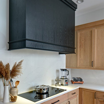
- Streamlined cooktop wall: The soffits were removed, and the upper cabinets on the cooktop wall were eliminated to create a more open, streamlined design. A custom oversized hood became the focal point of the wall, with the blower unit offset inside it to align with the cooktop while maintaining exterior visual symmetry.
- Concealed refrigeration: Two column refrigerators and one freezer were integrated into the cabinetry, concealing them behind wood paneling that blends seamlessly with the overall design.
- Warm black cabinetry: The black cabinetry was crafted from hickory with a visible grain, softening its appearance and adding warmth. The grain detail gives the cabinetry a rich, textured look that avoids feeling stark or overpowering.
- Additional lighting: In the dining area, recessed can lights were added during an additional installation phase to supplement the gorgeous decorative fixture’s dim output. The new lighting plan creates a layered effect, combining functional task lighting with softer ambient lighting.
- Simplified cabinetry details: Slab drawer fronts were used on the upper drawers, while five-piece shaker fronts (with slightly less prominent rail and stile pieces) were reserved for the middle and lower drawers. This approach simplified the overall look while maintaining the craftsman-inspired aesthetic.
- Slab backsplash priority: The slab backsplash was prioritized by making thoughtful adjustments elsewhere, like opting not to extend cabinetry to the ceiling, which also helped visually prioritize the gorgeous slab backsplash. This decision also enhanced the kitchen’s furniture-like feel, aligning with the home’s craftsman character.
- This kitchen perfectly balances practicality with timeless style. By addressing the family’s functional needs — ample seating, smart storage, and effective lighting — while incorporating thoughtful design elements like warm black cabinetry and a striking slab backsplash, Alicia created a space that works beautifully for a busy household. The result is a cohesive, inviting kitchen that honors the home’s craftsman roots and will serve the family well for years to come.
 Angeline Tellerman
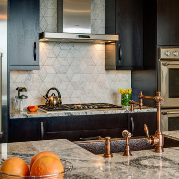
The geometric tile pattern complements the Cambrea Sea Grove counter top without overpowering the space.
Eat-in kitchen - mid-sized eat-in kitchen idea in San Francisco with a farmhouse sink, flat-panel cabinets, dark wood cabinets, stainless steel appliances and an island
Eat-in kitchen - mid-sized eat-in kitchen idea in San Francisco with a farmhouse sink, flat-panel cabinets, dark wood cabinets, stainless steel appliances and an island
Find the right local pro for your project
 AVRS Furniture
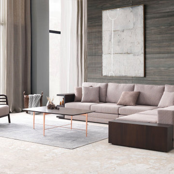
Size matters, and Pavon is packing plenty of seating. But thanks to its corner style, it’ll fit snugly in your room without overpowering the space. And here's an amazing surprise-this large corner sofa features bookshelves and side table with one drawer.This fantastic addition creates maximum comfort and modern layout. It will match easily to any scheme.
 Floor Decor
✨ Seamless Luxury from Countertop to Ceiling ✨
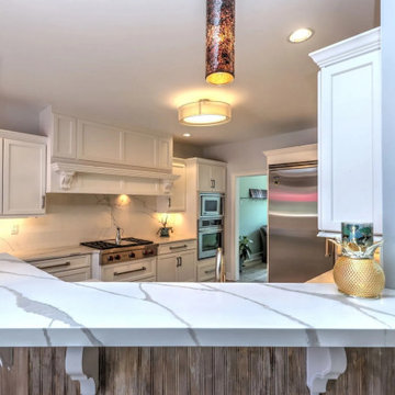
This stunning kitchen transformation showcases the beauty of Alleanza Quartz – Calacatta Bettogli Honed paired with a breathtaking Neolith Estatuario slab backsplash for a truly seamless, high-end look.
By extending the slab backsplash throughout the space, we created clean lines, minimal grout joints, and a sophisticated flow that elevates the entire kitchen. The soft veining in both materials complements one another beautifully, delivering a timeless design that feels elegant without being overpowering.
✔ Alleanza Quartz Calacatta Bettogli Honed countertops
✔ Neolith Estatuario slab backsplash
✔ Precision templating and fabrication
✔ Expert installation for a flawless fit and finish
✔ Low-maintenance luxury designed to last
From initial measurements and templating to fabrication and final installation, every detail was carefully planned to ensure a precise, seamless result.
Thinking about updating your kitchen? Let us help bring your vision to life with custom countertops, slab backsplashes, flooring, tile, and more.
? 203-403-6364
? FloorDecorCT.com
 Maria Aureli
The client wanted to update the home for modern living while complimenting the original Victorian details. The new kitchen is functional, gracious and understated.
The client wanted to update the home for modern living while complimenting the original Victorian details.
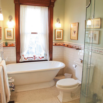
The bathroom tub is original to the home while the glass shower is a functional necessity that does not overpower the room. The client wanted to display many treasures, hence the floating shelves throughout.
 SGDI - Sarah Gallop Design Inc.
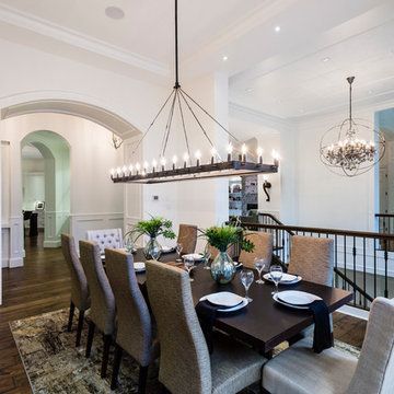
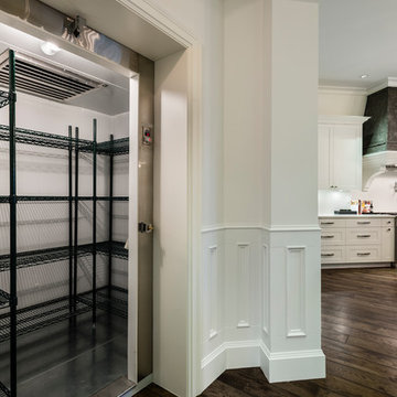
Spectacularly designed home in Langley, BC is customized in every way. Considerations were taken to personalization of every space to the owners' aesthetic taste and their lifestyle. The home features beautiful barrel vault ceilings and a vast open concept floor plan for entertaining. Oversized applications of scale throughout ensure that the special features get the presence they deserve without overpowering the spaces.
Photos: Paul Grdina Photography
 Studio Riche Designs
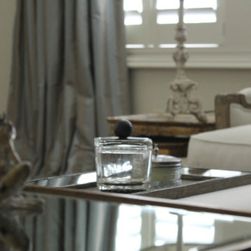
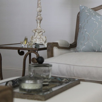
This reading area was designed around the beautiful blue bibliothèque, which is undoubtedly the focal point of the room. The furnishings around it were chosen with a neutral palette so as to not overpower the focal point. Yet, they have gracious lines and finishes found in French furnishings and interiors.
 Hammerdown Home Reno. & General Construction Inc.
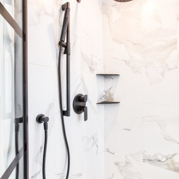
This fresh and modern ensuite makes use of high contrast finishes for a dramatic effect. Blessed with great lighting, this bright room lets the matte black fixtures stand out without overpowering the space. The original room had a good layout but was lacking functionality, we increased the size of the shower to bring it into proper scale for the size of room, and upgraded the vanity storage with deep notched drawers for no wasted space! Layered lighting is the finishing touch to bring this ensuite up to date with a luxe edge.
 Amy Greenberg Real Estate
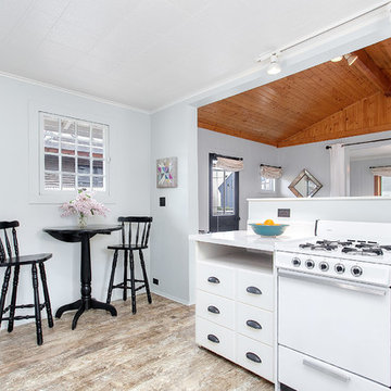
My real estate client, Anne, wanted to sell her floating home on Seattle's Portage Bay. After years of being a rental it needed a facelift.
The quaint living room was overpowered by a big, black woodstove. The stove took up a quarter of the space, the stovepipe put a hole in the vaulted ceiling, and it was an eyesore as well. It had to go! The flooring broke up the space by having five different materials, so we unified the space with Bella by Shaw Flooring everywhere except the bath where we installed Sky Blue Marmoleum.
The kitchen counters were stained, chipped marble tiles, mounted on top of a top-mounted sink to make it look like an under-mount! The counters were replaced with a quartz sheet and a true under-mount sink. The oil rubbed bronze wall-mounted faucet and recycled glass tiles from Bedrock Industries complete the new design.
The bathroom was updated in the 1980's and was due for an update. The oak vanity, mirror and light fixture were painted and the vanity got a new counter to match the kitchen quartz and a new deep under-mounted porcelain sink. New faucet, door pulls and knobs, light bulbs and paint completed the lift.
The back of the house was once used as a darkroom and sticky tape was left around the windows and door to mount black-out material. There were shelves and flooring that didn't fit the feeling we were after. All the sticky tape was removed, sanded, and painted, shelves removed and the floor replaced. With all that gone, the existing windows shine and let the light in to the now functional flex space.
The washer/dryer and water heater were just "hanging out" in the laundry area and are now housed in their own enclosures.
The bedroom got a new light fixture, and the whole house got new paint, minor repairs and the new flooring.
Outside, the deck was cleaned, and trim and doors were painted.
Designer and artist, Shannon Buckner of Bent Productions, selected the color palate, flooring, and staging, bringing an early 1900's house up to date for a modern lifestyle.
 Amy Greenberg Real Estate
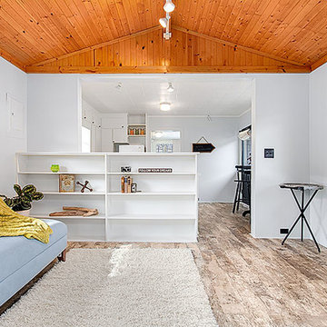
My real estate client, Anne, wanted to sell her floating home on Seattle's Portage Bay. After years of being a rental it needed a facelift.
The quaint living room was overpowered by a big, black woodstove. The stove took up a quarter of the space, the stovepipe put a hole in the vaulted ceiling, and it was an eyesore as well. It had to go! The flooring broke up the space by having five different materials, so we unified the space with Bella by Shaw Flooring everywhere except the bath where we installed Sky Blue Marmoleum.
The kitchen counters were stained, chipped marble tiles, mounted on top of a top-mounted sink to make it look like an under-mount! The counters were replaced with a quartz sheet and a true under-mount sink. The oil rubbed bronze wall-mounted faucet and recycled glass tiles from Bedrock Industries complete the new design.
The bathroom was updated in the 1980's and was due for an update. The oak vanity, mirror and light fixture were painted and the vanity got a new counter to match the kitchen quartz and a new deep under-mounted porcelain sink. New faucet, door pulls and knobs, light bulbs and paint completed the lift.
The back of the house was once used as a darkroom and sticky tape was left around the windows and door to mount black-out material. There were shelves and flooring that didn't fit the feeling we were after. All the sticky tape was removed, sanded, and painted, shelves removed and the floor replaced. With all that gone, the existing windows shine and let the light in to the now functional flex space.
The washer/dryer and water heater were just "hanging out" in the laundry area and are now housed in their own enclosures.
The bedroom got a new light fixture, and the whole house got new paint, minor repairs and the new flooring.
Outside, the deck was cleaned, and trim and doors were painted.
Designer and artist, Shannon Buckner of Bent Productions, selected the color palate, flooring, and staging, bringing an early 1900's house up to date for a modern lifestyle.
 Calming Spaces Interiors, Design & Remodeling
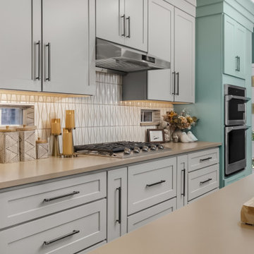
Custom cabinetry, quartz countertops, and a softly textured backsplash bring depth and warmth to the kitchen without overpowering the design.
Kitchen - mid-sized transitional ceramic tile kitchen idea in Austin with an undermount sink, shaker cabinets, quartz countertops, ceramic backsplash, stainless steel appliances and an island
Kitchen - mid-sized transitional ceramic tile kitchen idea in Austin with an undermount sink, shaker cabinets, quartz countertops, ceramic backsplash, stainless steel appliances and an island
 King Visual Design Inc.
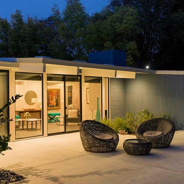
This side patio shows the new concrete pad which replaced the original, crumbling aggregate pad. Perimeter under eave L.E.D. lighting can be seen as well as the new bronze finish, aluminum Low E windows which replaced the original glazing. A new cooling system can be seen on the roof with a decorative surround for aesthetics. A fresh Dutch blue and white paint scheme helps this home stand out without being overpowering in a neighborhood filled with Eicher homes.
 Drury Design
The Setup:
After purchasing this home, the homeowners faced a unique opportunity to reimagine their kitchen and nearby spaces. Water damage from a burst pipe had left much of the home’s interior in need of repair, and while the existing kitchen was functional and in relatively good shape, it didn’t align with the family’s vision for their new home. The layout included a peninsula that wasn’t ideal, and there were some druthers with the nearby pantry.
Since the space needed to be rebuilt anyway, the homeowners saw this as a chance to create a kitchen that was both highly functional for their four young children and timeless in its design. The project also included a refresh of the adjacent message center and dining room — spaces that play key roles in the family’s daily life. The goal was to create a cohesive flow between these areas, balancing modern functionality with the craftsman-inspired character of the rest of the home.
Design Objectives:
- Replace the outdated peninsula with a large island to maximize counter space and create new seating options.
- Open up the space visually by removing soffits and rethinking the cabinetry layout.
Incorporate concealed refrigeration and freezer units to provide significant storage for the family while maintaining a streamlined aesthetic.
- Integrate black cabinetry into the design without making the space feel harsh or heavy.
- Ensure the lighting plan balances functional task lighting with ambient accent lighting.
- Avoid visual clutter in the cabinetry design while still giving a nod to the craftsman aesthetic.
- Incorporate a slab backsplash as a key design feature.
Design Challenges:
- The outdated peninsula left dead space in the kitchen and lacked sufficient seating for the family.
- The cooktop wall was cramped, with small cabinets flanking the hood, limited storage, and soffits that made the space feel closed-in.
- The family needed significant refrigeration space (two refrigerators and a freezer) but wanted to avoid a cluttered look with visible stainless steel appliances.
- Adding black cabinetry risked making the space feel too dark or heavy.
- The original lighting plan was insufficient, particularly over the dining table where a decorative fixture proved too dim.
- The family wanted shaker-style drawer fronts to match the home’s arts-and-crafts design but worried that too much shaker cabinetry might look overly busy.
- Prioritizing a slab backsplash in the wish list priority planning.
The Renewed Space
Design Solutions:
- A functional island: The peninsula was replaced with a large island that provides continuous countertop space for prepping and serving. The island also features seating for four people, creating a central hub for informal meals and activities.
- Streamlined cooktop wall: The soffits were removed, and the upper cabinets on the cooktop wall were eliminated to create a more open, streamlined design. A custom oversized hood became the focal point of the wall, with the blower unit offset inside it to align with the cooktop while maintaining exterior visual symmetry.
- Concealed refrigeration: Two column refrigerators and one freezer were integrated into the cabinetry, concealing them behind wood paneling that blends seamlessly with the overall design.
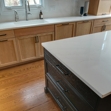
- Warm black cabinetry: The black cabinetry was crafted from hickory with a visible grain, softening its appearance and adding warmth. The grain detail gives the cabinetry a rich, textured look that avoids feeling stark or overpowering.
- Additional lighting: In the dining area, recessed can lights were added during an additional installation phase to supplement the gorgeous decorative fixture’s dim output. The new lighting plan creates a layered effect, combining functional task lighting with softer ambient lighting.
- Simplified cabinetry details: Slab drawer fronts were used on the upper drawers, while five-piece shaker fronts (with slightly less prominent rail and stile pieces) were reserved for the middle and lower drawers. This approach simplified the overall look while maintaining the craftsman-inspired aesthetic.
- Slab backsplash priority: The slab backsplash was prioritized by making thoughtful adjustments elsewhere, like opting not to extend cabinetry to the ceiling, which also helped visually prioritize the gorgeous slab backsplash. This decision also enhanced the kitchen’s furniture-like feel, aligning with the home’s craftsman character.
- This kitchen perfectly balances practicality with timeless style. By addressing the family’s functional needs — ample seating, smart storage, and effective lighting — while incorporating thoughtful design elements like warm black cabinetry and a striking slab backsplash, Alicia created a space that works beautifully for a busy household. The result is a cohesive, inviting kitchen that honors the home’s craftsman roots and will serve the family well for years to come.
 VRA Interiors, LLC
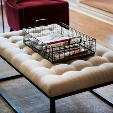
Gorgeous blues, reds, and greys make a statement in this Buckhead renovation, leaving our clients with an updated home with plenty of character! We wanted to keep the design cohesive, which is why we incorporated similar color schemes throughout while playing with the saturation and hues, and preventing the home from looking monotonous or overpowered by color.
We upgraded all of the client's furniture, artwork, accessories, lighting, and window treatments as well as installed new hardwood floors. The new floors paired with the newly painted walls and warm-colored textiles, came together beautifully, offering our clients a timeless design.
Home located in Buckhead, Atlanta. Designed by interior design firm, VRA Interiors, who serve the entire Atlanta metropolitan area including Dunwoody, Sandy Springs, Cobb County, and North Fulton County.
For more about VRA Interior Design, click here: https://www.vrainteriors.com/
To learn more about this project, click here: https://www.vrainteriors.com/portfolio/wieuca-road-buckhead-townhome/
 aplusdesign
Designing the space impels a décor that needs to appeal to varied tastes. This apartment in Surat, Gujarat redefines the concept of a designer home, using color accents in otherwise light interior décor. It’s a simple functional house with all minimal requirements and less maintenance house.
As a part of interest our client was fond of paintings to be displayed so it played major role in designing aspect.
As we enter the passage area the use of wooden slatted main door with Smoke grey PU finished walls, soft finishes and clean lines dominate these, with metallic gold text ‘MODI’S” representing with iconic design symbol carved in MDF with touch of green makes it more welcoming.
Living space has an overpowering feature as the wooden cladded wall which highlights the space and marks the continuation into the dining area.
The palette of the project is simple, defining the three main elements that make it up: Italian marble flooring changing as per the functionality of the space, Ash Wood defining the objects, and grey finish.
The materials hold the space strongly with a particular color palette. On skinny metal legs, the furniture in this living room seems to be floating above the floor, bringing a sense of weightlessness to the space. This unique living space features Ash wood slatted panels on walls with a velvety finish rug matching the center table just right.
The design of the furniture in wood and metal is tradition but is executed in a modern minimalist way. The Indian swing seating makes it as divider to the space between informal seating and dining area yet comprising the space equally.
Bespoke furniture elements kept according to the client’s need.The furniture is a mix of contemporary with different design elements by our studio, which creates a classic and cozy atmosphere. The ash wood and the grey hue finish become the leaders of the colours and textures palette. The curved shaped edge ceiling designed according to functionality & also plays aesthetic role.The importance of them, almost visible from every spot.
The deep sea velvety sofa makes an argument to this palette by focusing attention to it.
A nonchalant elegance best describes the soul of the house. In order to make a dialogue between the contemporary with different textures, patterns and uniform colors have been used throughout the house.
The parallel shaped kitchen with a high spec modern technologies and artificial stone counter top with fresh furniture in white and grey and sleek open breakfast counter is designed to be a light space that beautifully blends in.
This volume integrates the access to the private area –bedroom, wash area and bathroom-, segregating this way the day area living and dining area.
The Master Bedroom layout remodeled in accordance with contemporary trends and the client’s needs. The paintings which is inspired from the well-known artist and as strong believer in vaastu by the clients it has been displayed in right position which reflects good vibes.
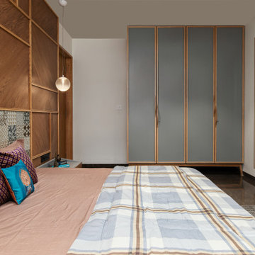
The seamless panel running through bed back having grooves on them which forms symmetrical pattern on wood. Using the same material by forming the side tables in circular pattern with round shaped metal supports.
The Son’s bedroom is integrated with closet, TV unit and dressing table. The entire ceiling is connected with wood stripes panels running on the walls which starts from main door of the room and ends on the full height closet and subdivided by lime plaster in grey with grooves on it.
The graphics now a days plays major role in every design aspect, so we tried customized different athlete position in game play captured in frames and be part of the focal point in room.
Each details speaks the entire space is crafted with a confluence of contemporary art presented in a modern palette. You’ll find them throughout the home, right from the color, furniture selection, to the wall paneling style teamed up with modern artworks and artefacts.
Each bedroom has a character of its own based on the user. This room was designed with a picturesque composition was made to create a backdrop to compliment the minimalistic furniture in entire space.
The backdrop of the bed panel is veneer cladded in frame box placed in the form of Tetris. The geometric patchwork mosaic tiles placed in between the cladding so that it’s easy to maintain.
Sleek handle details with full height closet and fine thin leg supports makes it more classic and modern.
Thus, the apartment gained a contemporary atmosphere and it is ready to receive a new lifestyle, of a new generation and new values.
 Studio Riche Designs
This reading area was designed around the beautiful blue bibliothèque, which is undoubtedly the focal point of the room. The furnishings around it were chosen with a neutral palette so as to not overpower the focal point. Yet, they have gracious lines and finishes found in French furnishings and interiors.
 AIBD - American Institute of Building Design
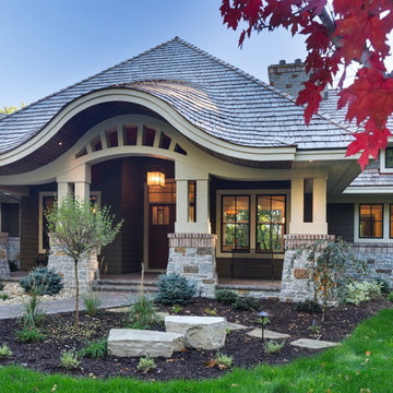
The client wanted a dramatic entryway that would not overpower this single-story design, and the designer complied with this unique portico. On this beautiful wooded site, the organic nature of Arts and Crafts style influences the design, taking it to the next level with an eyebrow-shaped pediment that resembles an upscale earthen dwelling. The shallower curve of the transom echoes the roofline. Paired columns on stone piers, brick accents, and a wood ceiling complete the picture.
An ARDA for Design Details goes to
Royal Oaks Design
Designer: Kieran Liebl
From: Oakdale, Minnesota
 SGDI - Sarah Gallop Design Inc.
Spectacularly designed home in Langley, BC is customized in every way. Considerations were taken to personalization of every space to the owners' aesthetic taste and their lifestyle. The home features beautiful barrel vault ceilings and a vast open concept floor plan for entertaining. Oversized applications of scale throughout ensure that the special features get the presence they deserve without overpowering the spaces.
Photos: Paul Grdina Photography
 Pro-Land Landscape Construction Inc.
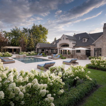
Each feature is designed with clean, contemporary details and materials which are timeless. This high-end landscape is an expansive space, so breaking up the patio with planting creates separate functional, multi-purpose spaces. Planting also added life to each space while not overpowering it with colour, a green and white colour palette add elegance.
37