
Search results for "Overpower" in Home Design Ideas
 SGDI - Sarah Gallop Design Inc.
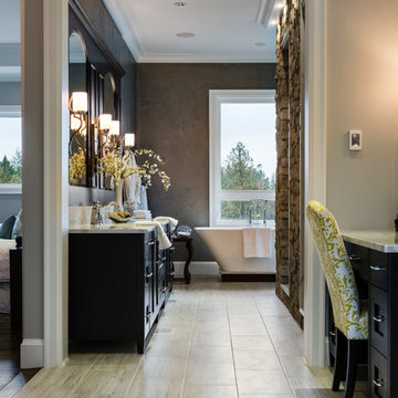
Spectacularly designed home in Langley, BC is customized in every way. Considerations were taken to personalization of every space to the owners' aesthetic taste and their lifestyle. The home features beautiful barrel vault ceilings and a vast open concept floor plan for entertaining. Oversized applications of scale throughout ensure that the special features get the presence they deserve without overpowering the spaces.
Photos: Paul Grdina Photography
 Robin's Nest Interiors
Updated Spec Home: The Bathrooms
The last stop on the main level of this Updated Spec Home are the Bathrooms. Every surface of the Guest Bath and Master Bath was touched- even some renovations in the Master bedroom. All I can say is thank goodness these two love wallpaper – we selected classic patterns for each bath that will stand the test of time!
Guest Bathroom
The Guest Bath also doubles as my mom’s bath. The footprint remained the same but we updated everything. A new vanity was chosen to give her that furniture look while still providing some storage – although there is a linen closet located just outside the bath. We topped it off with a beautiful mirror with great detail and an equally great light fixture. Also, we mixed the finishes in the bath between nickel and champagne, i.e., gold/silver mix. Mixing metals is perfectly acceptable and quite frankly way more interesting the everything matching. Updated Spec Home Bathrooms - Robin's Nest Interiors
Updated Spec Home Bathrooms - Robin's Nest Interiors
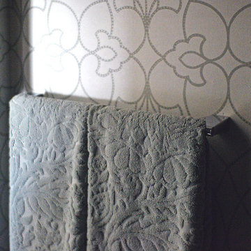
We found this amazing wallpaper with its subtle colors and pattern and selected a large square tile to coordinate for the floor. Yes, you can do a large tile in a small bath because it actually makes the space feel larger. For finishing touches, we had this gorgeous shower curtain made. Above the new toilet, we added interesting abstract artwork framed in a large mat so it would not clash with the wallpaper.
Master Bathroom
Originally, the Master Bath had a large garden tub as the focal point and a tiny stand up shower in the corner. We removed the garden tub, moved the shower to this area as the focal point and turned the tiny shower into a much needed linen closet. At this point, I know you are thinking, what about resale with no tub? There is a tub in the Guest Bath so the house will still be appealing to young families or bath lovers alike.
© 2016 RealTourCast | Tim Furlong Jr.
Tile selections came first – my sister fell in love with this gorgeous dark greige glass tile. We used it in the upper half of the shower while keeping the lower half light with this plank tile in a striated pattern. We carried the plank tile onto the floor for a seamless look.
Updated Spec Home Bathrooms - Robin's Nest Interiors
We replaced the two vanities with stock cabinetry that looks custom in a rich wood stain. Also, we found a gorgeous granite remnant for the countertop and finished off the vanity area with oversized mirrors, sleek lighting, and striking hardware.Updated Spec Home Bathrooms - Robin's Nest Interiors
The wallpaper is absolutely perfect for this space – it adds an interesting backdrop without overpowering the room. Her fantastic artwork was able to fit in the niche next to the new toilet. This is one gorgeous bath!
Updated Spec Home Bathrooms - Robin's Nest Interiors
Coming Soon
Spoiler Alert – my mom and sister have decided to update their Basement Family Room and add a small Powder Bath so look for Season 2 of the Updated Spec Home series!
See the rest of this house through these links! Foyer & Great Room, Kitchen & Breakfast Area, Bedrooms, Guest Bedroom.
 Wisconsin Building Supply
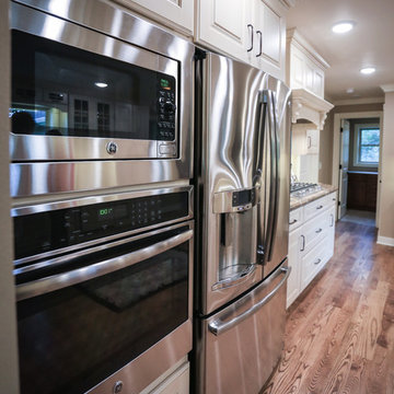
The owner was renovating the family homestead on a large farm and wanted a French Country kitchen that was warm and inviting.
We selected and antique white with Espresso glaze and used Dura Supreme’s Nob Hill door style to accomplish this. We were able to enlarge the original kitchen by taking out the hallway behind it and incorporating that space into the kitchen which allows room for a center eat-in table. The pull out fillers with decorative pilasters, corbels on the wood hood, fluted clipped corners with decorator ends all add to the French Country design while providing the functions of unique storage and traffic flow thru the space.
The mullion doors by the sink make it feel more airy and open and tie in with built in hutch cabinetry at the end of the room proudly displaying the family antique dinnerware. The subway tile with the simple decorative design behind the cooktop provide durability without being overpowering to the cabinetry details.
Cabinets: Dura Supreme Crestwood - Nob Hill doors style
- Antique white w/ Espresso glaze on maple
- Flex Crown molding above
Countertops: Crescent edged in 1875 - K - 35
- Summer Carnival
- Stainless steel under mount kitchen sink
Find the right local pro for your project
 Kitchen Solvers of McCook
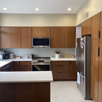
This kitchen remodel was all about honoring the home’s beautiful midcentury modern character while giving the space a fresh, updated feel. The homeowners wanted an upgrade that felt seamless with the rest of their home — not trendy, not overdone, but perfectly in tune with the original architecture. We installed new cabinetry in rich cherry wood using the Scandia door style in a warm Caramel finish. The clean lines and natural wood tones stay true to midcentury design while adding depth and warmth to the space. A Newport quartz countertop brings durability and a subtle, modern elegance, while the Souvenir Faro backsplash adds texture and visual interest without overpowering the aesthetic. The result is a kitchen that feels refined, cohesive, and completely at home in its midcentury setting — thoughtfully updated while respecting the original style.
 Verona Quartz Surfaces
Imagine a modern, sleek kitchen with a perfect blend of natural warmth and contemporary elegance. The lower cabinets are crafted from white oak, their light, natural wood grain adding a touch of organic beauty to the space. The white oak's soft, warm tones bring a sense of calm and balance, grounding the kitchen with a natural feel.
Above, the upper cabinets create a striking contrast in a matte black finish. The matte texture adds a sophisticated, understated elegance, allowing the rich black hue to stand out without overpowering the room. This combination of black and white oak offers a timeless appeal, bridging the gap between modern and rustic design elements.
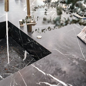
The countertops and backsplash are adorned with porcelain slabs that perfectly mimic the look of natural marble. These slabs feature delicate veining in shades of gray and subtle touches of gold, flowing gracefully across a pristine white background. The marble-like porcelain brings a sense of luxury and refinement to the kitchen while offering the practicality and durability that porcelain provides.
This two-tone kitchen design is a harmonious blend of natural materials and modern aesthetics, creating a space that is both inviting and sophisticated. The white oak adds warmth and texture, the matte black introduces bold contrast, and the marble-like porcelain ties everything together with a touch of timeless elegance.
 Custom Wallcovering with Leo
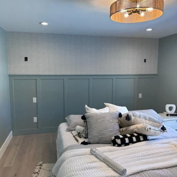
Bedroom wallpaper installation – South Miami, FL. A mix of vintage and tropical elements inspired the eclectic wallpaper we installed here — large leaves in faded tones stretch across one full wall. The print blends well with mid-century nightstands and linen bedding, adding warmth and personality without being overpowering.

 ornamental land design
A warm copper sculpture rests against the trellis, gradually woven into the climbing jasmine. Its geometric form contrasts the soft white blooms and glossy leaves, adding a touch of artistry without overpowering the natural growth. Subtle details like this create layers of interest, offering unexpected focal points as the garden reveals itself.
 DJK Custom Homes
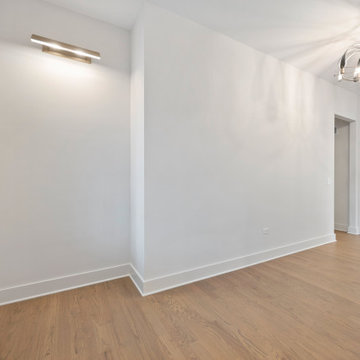
This modern luxury entryway sets a refined tone the moment you step inside. A warm wood front door creates a striking contrast against crisp white walls, while wide plank hardwood flooring adds natural texture and continuity throughout the space. Thoughtfully selected brass lighting, including a sleek wall sconce and contemporary chandelier, brings warmth and visual interest without overpowering the clean, minimalist design. The open layout and tall ceilings enhance natural light flow, creating an inviting and sophisticated first impression that reflects the craftsmanship and attention to detail found throughout this custom home.
 SGDI - Sarah Gallop Design Inc.
Spectacularly designed home in Langley, BC is customized in every way. Considerations were taken to personalization of every space to the owners' aesthetic taste and their lifestyle. The home features beautiful barrel vault ceilings and a vast open concept floor plan for entertaining. Oversized applications of scale throughout ensure that the special features get the presence they deserve without overpowering the spaces.
Photos: Paul Grdina Photography
 Open Door Furniture
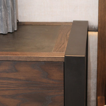
We worked with the talented Katie Porter of KP Design studio to help bring her design of this bedroom set to life.
The hallmark of this mini collection is the intersection of wood and metal to create something that is unique, beautiful and functional with heirloom durability. The first thing that the eye is drawn to are the steel legs that wrap all the way around the case. These function as as support of the case and the leg base. The tops are laminated steel with a patina applied to give a nice subtle visual interest without being overpowering or distracting. The added benefit to the steel is that the client will not have to worry about their guests using coasters for drinks!
Finally, to ensure that we controlled for any seasonal wood movement that would cause issues inside of the steel wrapping, we created our own shop sawn veneers to wrap all of the cases and drawer fronts. This keeps the pieces stable and contains wood movement while giving allowing us to create grain patterns that are pleasing to the eye and flow through the piece.
This Ash wood of this collection was finished with a rich dark brown which is a lovely contrast to the lighter colors in the finished space.
We hope that you enjoy looking at them as much as we enjoyed building them!
 WORLD CUSTOM TABLE
Every custom piece we create begins with a conversation, and this table is a perfect example of how thoughtful design can balance beauty and everyday practicality.
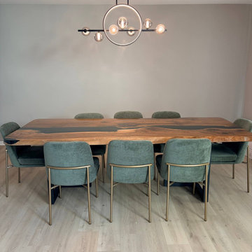
Our client was immediately drawn to the natural character of a live edge black walnut table. The organic lines, rich grain, and unique silhouette bring a sense of warmth and artistry that simply cannot be replicated. However, with young children at home, safety quickly became an important consideration. The client shared their concern that the original live edge, while beautiful, might be too sharp for a family setting.
After carefully discussing their needs, our team proposed a refined solution. We preserved the essence of the live edge, maintaining its natural flow and character, while softening the overall form. The corners were gently rounded, and the edges were skillfully smoothed and reshaped to eliminate sharpness without losing the authentic, organic look.
From material selection to final finishing, every step was handled with precision. We selected premium black walnut slabs with deep, consistent grain and carefully paired them to create a harmonious surface. The resin was poured seamlessly to enhance the wood’s natural beauty, resulting in a clean, elegant river that complements rather than overpowers the walnut.
The final result is a 98” x 40” dining table that feels both sophisticated and welcoming. It retains the charm of a live edge design while offering a safer, more comfortable experience for everyday family use. This project reflects our commitment to not only craftsmanship and quality, but also to truly understanding how our clients live and use their furniture.
A table should do more than look beautiful, it should fit seamlessly into life.
 by Design Furniture and Interior Design
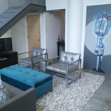
Laura Beeler: I recently took a call from a customer looking for a designer. The mission was to help him create a wonderful, new living space in his downtown Des Moines loft. Matt & I had an instant connection. Since he had been in by Design before, we quickly set up a house call. An additional challenge was time — he was hosting a big party in 4 weeks! We chose the Tristan sofa for it’s retro look. We love how it appears to “float” over the stainless sleigh base. (Light & airy pieces were important as we didn’t want to overpower the intimate space). We anchored the room with a deep pile, chunky shag rug and topped it with a large storage ottoman. The two George chairs can span the decades and certainly have a personality all their own. The repetition of the metal and tufting in all of the pieces gives continuity to the design – an important consideration when designing a space this eclectic. The open shelving offered more storage as well as giving a great silhouette against the original white brick wall. I think the end result suits him to a tee, whether he is relaxing or entertaining. The best part was that we had it all in place in the allotted time frame.
 UpScapers: Landscape, Elevated
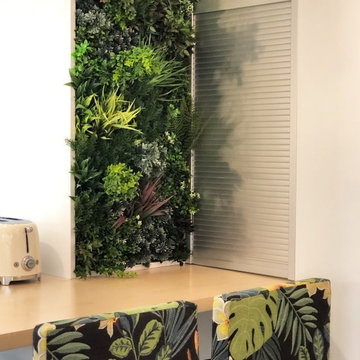
With kitchen Design, sometimes less is more, and in this case study from a private client’s home, it is very clear that Vistafolia® can transform any space, regardless of whether it be a vast expanse of wall, or something very simplistic. They say the kitchen is the heart of the home, so why wouldn’t you want to add your own piece of luxury to the most important room without breaking the bank?
This client requested that a small area be covered using the panels to add a stunning burst of greenery that is neither looked bland and fake, nor overpowered the simple minimalist scheme already in place. By having just a few panels installed to cover the wall, Vistafolia® Privacy Screening achieved an attractive aesthetic that enhanced the space and offered a low-maintenance, realistic green wall to be enjoyed by all the family.
 Drury Design
The Setup:
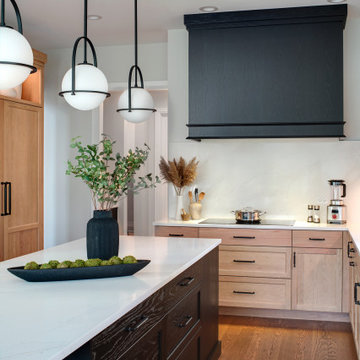
After purchasing this home, the homeowners faced a unique opportunity to reimagine their kitchen and nearby spaces. Water damage from a burst pipe had left much of the home’s interior in need of repair, and while the existing kitchen was functional and in relatively good shape, it didn’t align with the family’s vision for their new home. The layout included a peninsula that wasn’t ideal, and there were some druthers with the nearby pantry.
Since the space needed to be rebuilt anyway, the homeowners saw this as a chance to create a kitchen that was both highly functional for their four young children and timeless in its design. The project also included a refresh of the adjacent message center and dining room — spaces that play key roles in the family’s daily life. The goal was to create a cohesive flow between these areas, balancing modern functionality with the craftsman-inspired character of the rest of the home.
Design Objectives:
- Replace the outdated peninsula with a large island to maximize counter space and create new seating options.
- Open up the space visually by removing soffits and rethinking the cabinetry layout.
Incorporate concealed refrigeration and freezer units to provide significant storage for the family while maintaining a streamlined aesthetic.
- Integrate black cabinetry into the design without making the space feel harsh or heavy.
- Ensure the lighting plan balances functional task lighting with ambient accent lighting.
- Avoid visual clutter in the cabinetry design while still giving a nod to the craftsman aesthetic.
- Incorporate a slab backsplash as a key design feature.
Design Challenges:
- The outdated peninsula left dead space in the kitchen and lacked sufficient seating for the family.
- The cooktop wall was cramped, with small cabinets flanking the hood, limited storage, and soffits that made the space feel closed-in.
- The family needed significant refrigeration space (two refrigerators and a freezer) but wanted to avoid a cluttered look with visible stainless steel appliances.
- Adding black cabinetry risked making the space feel too dark or heavy.
- The original lighting plan was insufficient, particularly over the dining table where a decorative fixture proved too dim.
- The family wanted shaker-style drawer fronts to match the home’s arts-and-crafts design but worried that too much shaker cabinetry might look overly busy.
- Prioritizing a slab backsplash in the wish list priority planning.
The Renewed Space
Design Solutions:
- A functional island: The peninsula was replaced with a large island that provides continuous countertop space for prepping and serving. The island also features seating for four people, creating a central hub for informal meals and activities.
- Streamlined cooktop wall: The soffits were removed, and the upper cabinets on the cooktop wall were eliminated to create a more open, streamlined design. A custom oversized hood became the focal point of the wall, with the blower unit offset inside it to align with the cooktop while maintaining exterior visual symmetry.
- Concealed refrigeration: Two column refrigerators and one freezer were integrated into the cabinetry, concealing them behind wood paneling that blends seamlessly with the overall design.
- Warm black cabinetry: The black cabinetry was crafted from hickory with a visible grain, softening its appearance and adding warmth. The grain detail gives the cabinetry a rich, textured look that avoids feeling stark or overpowering.
- Additional lighting: In the dining area, recessed can lights were added during an additional installation phase to supplement the gorgeous decorative fixture’s dim output. The new lighting plan creates a layered effect, combining functional task lighting with softer ambient lighting.
- Simplified cabinetry details: Slab drawer fronts were used on the upper drawers, while five-piece shaker fronts (with slightly less prominent rail and stile pieces) were reserved for the middle and lower drawers. This approach simplified the overall look while maintaining the craftsman-inspired aesthetic.
- Slab backsplash priority: The slab backsplash was prioritized by making thoughtful adjustments elsewhere, like opting not to extend cabinetry to the ceiling, which also helped visually prioritize the gorgeous slab backsplash. This decision also enhanced the kitchen’s furniture-like feel, aligning with the home’s craftsman character.
- This kitchen perfectly balances practicality with timeless style. By addressing the family’s functional needs — ample seating, smart storage, and effective lighting — while incorporating thoughtful design elements like warm black cabinetry and a striking slab backsplash, Alicia created a space that works beautifully for a busy household. The result is a cohesive, inviting kitchen that honors the home’s craftsman roots and will serve the family well for years to come.
 Jennifer Gilmer Kitchen & Bath
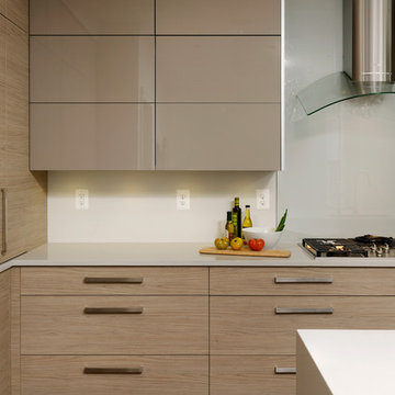
Washington D.C. - Contemporary - Kitchen Design by #PaulBentham4JenniferGilmer. All the wall cabinets reach almost to the ceiling and are accented with a slim ¾” recessed negative detail to add visual interest while keeping them from overpowering the room. Pairing the smoky woodgrain melamine and high gloss brown/gray PET gave the room a warm yet unmistakably European feel without being too stark and provides easy maintenance. Photography by Bob Narod. http://www.gilmerkitchens.com/
 MC Wallpaper Hanging
Bathroom wallpaper installation – Austin, TX – Contemporary
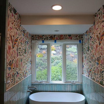
For this modern bathroom in Austin, we installed 3D-textured vinyl wallpaper rated for high-moisture zones. The goal was to add subtle dimension without overpowering the space. Applied behind the vanity and freestanding tub, the pattern blends with contemporary fixtures and reflects soft LED lighting. Seam alignment and edge sealing were key to long-term durability.
 Staged For Upsell
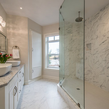
Doorless shower - large contemporary master white tile marble floor doorless shower idea in Other with shaker cabinets, white cabinets, a one-piece toilet, white walls, a vessel sink and marble countertops
 Robin Daly Color & Design
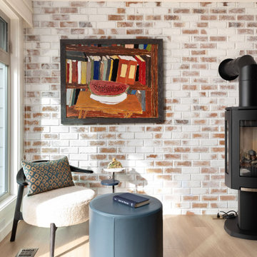
German schmear treatment on brick fireplace to allow warmth of brick to show without overpowering the space.
Propane free-standing fireplace adds modern charm.
LVP flooring for durability and fade resistance.
Custom-made dining table.
 SGDI - Sarah Gallop Design Inc.
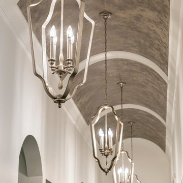
Spectacularly designed home in Langley, BC is customized in every way. Considerations were taken to personalization of every space to the owners' aesthetic taste and their lifestyle. The home features beautiful barrel vault ceilings and a vast open concept floor plan for entertaining. Oversized applications of scale throughout ensure that the special features get the presence they deserve without overpowering the spaces.
Photos: Paul Grdina Photography
 Ghiordes Knot
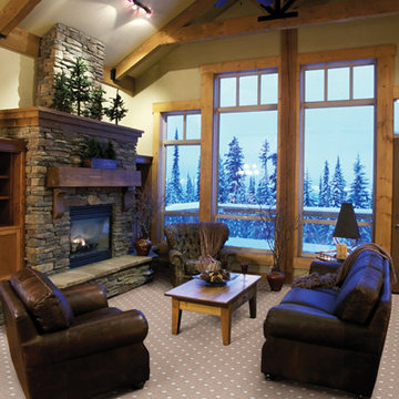
The neutral palette of Famoso adds interest to the room without overpowering other decor.
Large elegant open concept carpeted and multicolored floor living room photo in Detroit with beige walls, a standard fireplace and a stone fireplace
Large elegant open concept carpeted and multicolored floor living room photo in Detroit with beige walls, a standard fireplace and a stone fireplace
33