
Search results for "People decide" in Home Design Ideas
 Kitchen Solvers of Grayslake
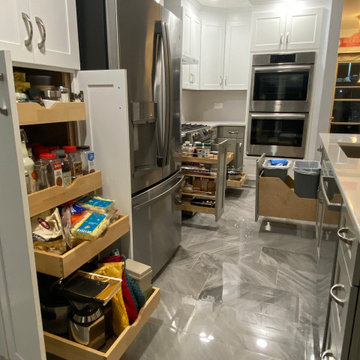
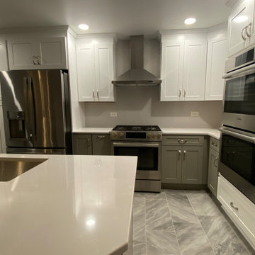
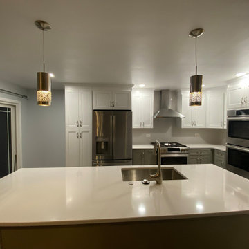
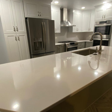
Our homeowners love to cook, bake, and entertain. They were dealing with the original builder grade cabinets that were falling apart and coming off the walls. They initially reached out to consider refacing, but realized a remodel was what they needed to reimagine the kitchen space and achieve the functionality they were looking for. We went to work understanding how they use their kitchen creating a design for the chef to be able to work while keeping people engaged and out of her workspace. They decided on a two-toned kitchen with Polar White and Pebble Gray cabinets. The countertops were done in Smoked Pearl quartz with a matching full splash creating a clean and continuous flow. We removed the existing peninsula and built a large island/prep area. Their guests can now walk directly into the living area without having to go through the kitchen. We also added seating on two sides of the island. To provide more functionality and storage, we relocated the refrigerator and added a double oven and pantry cabinets, rollout shelves, and various pullout storage solutions. Now our homeowners have the kitchen they never thought they could have. We are glad we could solve this kitchen for them!
 Kitchen Solvers of Grayslake
Our homeowners love to cook, bake, and entertain. They were dealing with the original builder grade cabinets that were falling apart and coming off the walls. They initially reached out to consider refacing, but realized a remodel was what they needed to reimagine the kitchen space and achieve the functionality they were looking for. We went to work understanding how they use their kitchen creating a design for the chef to be able to work while keeping people engaged and out of her workspace. They decided on a two-toned kitchen with Polar White and Pebble Gray cabinets. The countertops were done in Smoked Pearl quartz with a matching full splash creating a clean and continuous flow. We removed the existing peninsula and built a large island/prep area. Their guests can now walk directly into the living area without having to go through the kitchen. We also added seating on two sides of the island. To provide more functionality and storage, we relocated the refrigerator and added a double oven and pantry cabinets, rollout shelves, and various pullout storage solutions. Now our homeowners have the kitchen they never thought they could have. We are glad we could solve this kitchen for them!
 Kitchen Solvers of Grayslake
Our homeowners love to cook, bake, and entertain. They were dealing with the original builder grade cabinets that were falling apart and coming off the walls. They initially reached out to consider refacing, but realized a remodel was what they needed to reimagine the kitchen space and achieve the functionality they were looking for. We went to work understanding how they use their kitchen creating a design for the chef to be able to work while keeping people engaged and out of her workspace. They decided on a two-toned kitchen with Polar White and Pebble Gray cabinets. The countertops were done in Smoked Pearl quartz with a matching full splash creating a clean and continuous flow. We removed the existing peninsula and built a large island/prep area. Their guests can now walk directly into the living area without having to go through the kitchen. We also added seating on two sides of the island. To provide more functionality and storage, we relocated the refrigerator and added a double oven and pantry cabinets, rollout shelves, and various pullout storage solutions. Now our homeowners have the kitchen they never thought they could have. We are glad we could solve this kitchen for them!
Find the right local pro for your project
 Kitchen Solvers of Grayslake
Our homeowners love to cook, bake, and entertain. They were dealing with the original builder grade cabinets that were falling apart and coming off the walls. They initially reached out to consider refacing, but realized a remodel was what they needed to reimagine the kitchen space and achieve the functionality they were looking for. We went to work understanding how they use their kitchen creating a design for the chef to be able to work while keeping people engaged and out of her workspace. They decided on a two-toned kitchen with Polar White and Pebble Gray cabinets. The countertops were done in Smoked Pearl quartz with a matching full splash creating a clean and continuous flow. We removed the existing peninsula and built a large island/prep area. Their guests can now walk directly into the living area without having to go through the kitchen. We also added seating on two sides of the island. To provide more functionality and storage, we relocated the refrigerator and added a double oven and pantry cabinets, rollout shelves, and various pullout storage solutions. Now our homeowners have the kitchen they never thought they could have. We are glad we could solve this kitchen for them!
 Kitchen Solvers of Grayslake
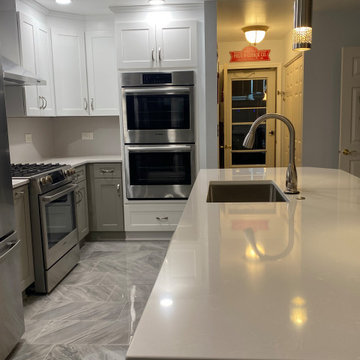
Our homeowners love to cook, bake, and entertain. They were dealing with the original builder grade cabinets that were falling apart and coming off the walls. They initially reached out to consider refacing, but realized a remodel was what they needed to reimagine the kitchen space and achieve the functionality they were looking for. We went to work understanding how they use their kitchen creating a design for the chef to be able to work while keeping people engaged and out of her workspace. They decided on a two-toned kitchen with Polar White and Pebble Gray cabinets. The countertops were done in Smoked Pearl quartz with a matching full splash creating a clean and continuous flow. We removed the existing peninsula and built a large island/prep area. Their guests can now walk directly into the living area without having to go through the kitchen. We also added seating on two sides of the island. To provide more functionality and storage, we relocated the refrigerator and added a double oven and pantry cabinets, rollout shelves, and various pullout storage solutions. Now our homeowners have the kitchen they never thought they could have. We are glad we could solve this kitchen for them!

 Dura Supreme Cabinetry
This fun and stylish bathroom features Sherwin-Williams “Lemon Meringue” SW 7561 on Dura Supreme's Homestead door style. This off-white color warms up a space like bright yellow sun rays on a summer’s day. This color was selected for Dura Supreme’s 2017-2018 Curated Color Collection. Dura Supreme’s Curated Color Collection is a collection of cabinet paint colors that are always fresh, current and reflective of popular color trends for home interiors and cabinetry. This offering of colors is continuously updated as color trends shift.
Painted cabinetry is more popular than ever before and the color you select for your home should be a reflection of your personal taste and style. Our Personal Paint Match Program offers the entire Sherwin-William’s paint palette and Benjamin Moore’s paint palette, over 5,000 colors, for your new kitchen or bath cabinetry.
Color is a highly personal preference for most people and although there are specific colors that are considered “on trend” or fashionable, color choices should ultimately be based on what appeals to you personally. Homeowners often ask about color trends and how to incorporate them into newly designed or renovated interiors. And although trends and fashion should be taken into consideration, that should not be the only deciding factor. If you love a specific shade of green, select complementing neutrals and coordinating colors to create an entire palette that will remain an everlasting classic. It could be something as simple as being able to select the perfect shade of white that complements the countertop and tile and works well in a specific lighting situation. Our new Personal Paint Match system makes that process so much easier.
Request a FREE Dura Supreme Brochure Packet:
http://www.durasupreme.com/request-brochure
 Kitchen Solvers of Grayslake
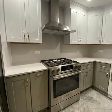
Our homeowners love to cook, bake, and entertain. They were dealing with the original builder grade cabinets that were falling apart and coming off the walls. They initially reached out to consider refacing, but realized a remodel was what they needed to reimagine the kitchen space and achieve the functionality they were looking for. We went to work understanding how they use their kitchen creating a design for the chef to be able to work while keeping people engaged and out of her workspace. They decided on a two-toned kitchen with Polar White and Pebble Gray cabinets. The countertops were done in Smoked Pearl quartz with a matching full splash creating a clean and continuous flow. We removed the existing peninsula and built a large island/prep area. Their guests can now walk directly into the living area without having to go through the kitchen. We also added seating on two sides of the island. To provide more functionality and storage, we relocated the refrigerator and added a double oven and pantry cabinets, rollout shelves, and various pullout storage solutions. Now our homeowners have the kitchen they never thought they could have. We are glad we could solve this kitchen for them!
Sponsored
Columbus, OH

Wannemacher Interiors
Customized Award-Winning Interior Design Solutions in Franklin Cnty OH
 Kitchen Solvers of Grayslake
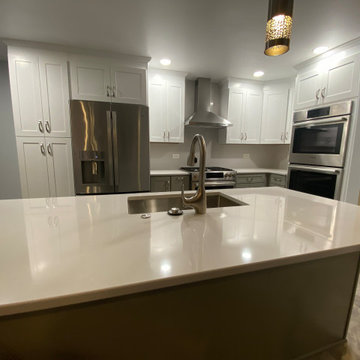
Our homeowners love to cook, bake, and entertain. They were dealing with the original builder grade cabinets that were falling apart and coming off the walls. They initially reached out to consider refacing, but realized a remodel was what they needed to reimagine the kitchen space and achieve the functionality they were looking for. We went to work understanding how they use their kitchen creating a design for the chef to be able to work while keeping people engaged and out of her workspace. They decided on a two-toned kitchen with Polar White and Pebble Gray cabinets. The countertops were done in Smoked Pearl quartz with a matching full splash creating a clean and continuous flow. We removed the existing peninsula and built a large island/prep area. Their guests can now walk directly into the living area without having to go through the kitchen. We also added seating on two sides of the island. To provide more functionality and storage, we relocated the refrigerator and added a double oven and pantry cabinets, rollout shelves, and various pullout storage solutions. Now our homeowners have the kitchen they never thought they could have. We are glad we could solve this kitchen for them!

 Fiorito Interior Design
Finding a home is not easy in a seller’s market, but when my clients discovered one—even though it needed a bit of work—in a beautiful area of the Santa Cruz Mountains, they decided to jump in. Surrounded by old-growth redwood trees and a sense of old-time history, the house’s location informed the design brief for their desired remodel work. Yet I needed to balance this with my client’s preference for clean-lined, modern style.
Suffering from a previous remodel, the galley-like bathroom in the master suite was long and dank. My clients were willing to completely redesign the layout of the suite, so the bathroom became the walk-in closet. We borrowed space from the bedroom to create a new, larger master bathroom which now includes a separate tub and shower.
The look of the room nods to nature with organic elements like a pebbled shower floor and vertical accent tiles of honed green slate. A custom vanity of blue weathered wood and a ceiling that recalls the look of pressed tin evoke a time long ago when people settled this mountain region. At the same time, the hardware in the room looks to the future with sleek, modular shapes in a chic matte black finish. Harmonious, serene, with personality: just what my clients wanted.
Photo: Bernardo Grijalva


 User
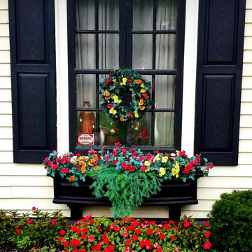
Every home improvement project can feel like going into battle, but the sweet taste of victory is enough to make it worthwhile. If you ever feel intimidated by homes and gardens in magazines, don’t fret – you can turn your home into a beautiful beacon with easy curb appeal updates! Kevin and Annette Klingel are some of our favorite weekend warriors, and their latest project proves that anything is possible when it comes to dressing up your front garden. The Klingels recently gave their home and front garden a major renovation and entered their photos in the Window Box Contest. When we saw the gorgeous before and after pictures, we knew we had to get the inside scoop on their process and uncover their best curb appeal ideas.
Curb Appeal – Before and After
Before the renovation, the Klingels had a charming South Bend, Indiana rambler that was tidy and traditional, if a little unassuming. Deciding it was time for a much-needed update, the Klingels replaced their old green roof with a black barrel roof to match the style of their home. They also made a needed replacement and changed out the sidewalk and front stoop to a new version in classic black.
After those dramatic changes, the Klingels just couldn’t stop! Loving the contrast between the new black roof and stoop and their cream house, they painted their shutters black. And here’s where we come in – Annette wanted to incorporate her love of flowers into the new home design and found the perfect planters and window boxes to match the shutters. They purchased ten black window boxes in a classic and chic design to put around their outside windows. The Klingels also used tall black planters around the entrance to the house. The window boxes and planters each received the same plant treatment – red, yellow, and orange impatiens with flowing ferns for a bright punch of color. Paired with hanging baskets and a few other accents, the Klingels house is now a masterpiece.
From Drab to Fab
The Klingels love their warm and inviting new front entrance, and the neighbors do too. Instead of getting overlooked, their house now stands out and is the star of their busy street, where it is seen by lots of people everyday. They have received tons of compliments about their new look – a crisp and clean front garden that stays true to the style of the home and neighborhood.
The Klingels’ curb appeal update wasn’t without its challenges, but the end product is amazing, and as Annette says, definitely worth the time. The Klingels recommend starting with the necessary replacements and finding beautiful matching pieces to add curb appeal. With a little patience, elbow grease, and the help of a great garden supply store like Hooks & Lattice, you too can have the home of your dreams.
Photos: Kevin & Annette Klingel

 Dream Kitchens
The kitchen in this contemporary style home seemed to be an afterthought. While the rest of the house is open and expansive, the kitchen was small and detached, especially for a couple who loves to entertain. The very large and adjacent dining room seemed a more likely location for a kitchen, but they resisted the thought of swapping the two spaces. So their designer created a layout that allowed for a second – and larger – opening to the dining room and the expansive, light-filled living space beyond.
A peninsula attaches to the wall that remained between the two openings. There the sink is located so that during food preparation or cleanup there is a view through the windows and the opportunity to socialize with people gathered at the countertop. The seating area is curved to encourage people to gather and chat. The granite countertop choice was a case of love at first sight for this homeowner since it brought his favorite shade of blue into the kitchen.
The cooking center is spread out along the wall at the back of the house. There the eye-catching stainless steel hood creates a focal point above the sleek, low-profile cooktop. Glass tile pulls color from the countertops onto the wall where it glimmers in the light. One oven combined with a microwave/convection oven meet their cooking needs and the stainless steel adds brightness to the room.
The stainless steel refrigerator is just a few steps away from the work center and the seating area and is easily accessible from other parts of the house. The original kitchen featured only one small window in addition to the sliding glass doors. Since it was almost new and the house had been resided, a second window was joined to the first, and cabinetry beneath them anchors them in the space. A tall pantry cabinet completes the kitchen, providing high quality storage and visual balance in this redesign.
Sleek cherry cabinets give this kitchen a decidedly contemporary style. They were stained just enough to add warmth and color and are enhanced with oversized stainless steel pulls.
From this redesigned space you can see into the main house and see out through the many windows there. When combined with a new layout that provides better traffic flow, there’s a new feeling of spaciousness to the kitchen. It’s no longer an afterthought. It’s an integral part of this home’s living space, enhancing the home and the lifestyle of its owners.
Photography By Scott Sherman

 Bilotta Kitchen & Home
Designed by Randy O’Kane of Bilotta Kitchens, the inspiration for this project was an industrial farmhouse-chic look – it’s the theme throughout the client’s whole house. The client (a mother of four, running a busy household) wanted a real oasis for bathing and showering – an escape from reality. She and her husband are the type of people who actually use their tub so that was carefully selected from Victoria + Albert Baths. The existing structure of the original master bathroom included the high vaulted ceiling. Randy decided to add the reclaimed wood beams to give the room shape and bring in more of that farmhouse element. She selected a trough sink from Decolav as a contemporary twist on a horse trough. Even the porcelain floor, selected from Rye Ridge Tile, looks like wood that you would see in a barn. The countertop is Caesartstone’s Calacatta Nuvo honed. The overall palette is a contrasting mix of soothing neutrals and much darker browns and black. All fixtures are in a matte black finish, including the trim on the shower enclosure, providing a nod to the industrial side; the brushed brass lighting touches on the elegant side. The two walls with the chevron tile are really the feature of the room. The Vanity is Bilotta Collection Cabinetry in a 1” thick door in Rift Cut White Oak with Smokey Oak Stain.
Sponsored
Columbus, OH
Wannemacher Interiors
Customized Award-Winning Interior Design Solutions in Franklin Cnty OH
 Bilotta Kitchen & Home
Designed by Randy O’Kane of Bilotta Kitchens, the inspiration for this project was an industrial farmhouse-chic look – it’s the theme throughout the client’s whole house. The client (a mother of four, running a busy household) wanted a real oasis for bathing and showering – an escape from reality. She and her husband are the type of people who actually use their tub so that was carefully selected from Victoria + Albert Baths. The existing structure of the original master bathroom included the high vaulted ceiling. Randy decided to add the reclaimed wood beams to give the room shape and bring in more of that farmhouse element. She selected a trough sink from Decolav as a contemporary twist on a horse trough. Even the porcelain floor, selected from Rye Ridge Tile, looks like wood that you would see in a barn. The countertop is Caesartstone’s Calacatta Nuvo honed. The overall palette is a contrasting mix of soothing neutrals and much darker browns and black. All fixtures are in a matte black finish, including the trim on the shower enclosure, providing a nod to the industrial side; the brushed brass lighting touches on the elegant side. The two walls with the chevron tile are really the feature of the room. The Vanity is Bilotta Collection Cabinetry in a 1” thick door in Rift Cut White Oak with Smokey Oak Stain.
 Prime Construction & Remodeling LLC
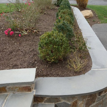
The first goal for this client in Chatham was to give them a front walk and entrance that was beautiful and grande. We decided to use natural blue bluestone tiles of random sizes. We integrated a custom cut 6" x 9" bluestone border and ran it continuous throughout. Our second goal was to give them walking access from their driveway to their front door. Because their driveway was considerably lower than the front of their home, we needed to cut in a set of steps through their driveway retaining wall, include a number of turns and bridge the walkways with multiple landings. While doing this, we wanted to keep continuity within the building products of choice. We used real stone veneer to side all walls and stair risers to match what was already on the house. We used 2" thick bluestone caps for all stair treads and retaining wall caps. We installed the matching real stone veneer to the face and sides of the retaining wall. All of the bluestone caps were custom cut to seamlessly round all turns. We are very proud of this finished product. We are also very proud to have had the opportunity to work for this family. What amazing people. #GreatWorkForGreatPeople
As a side note regarding this phase - throughout the construction, numerous local builders stopped at our job to take pictures of our work. #UltimateCompliment #PrimeIsInTheLead

 Shilpa Mankikar
We wanted to update our home, which had been a brown-colored mountain escape since 1985. Since it had been a depressing year with covid19, we decided against the popular gray. We thought people will be over that trend now. The Black House trend was too severe for our taste. So we picked Sherwin Williams Natural Tan for the walls. We picked Naval Blue (SW Color of the Year 2020) for the Garage doors and upstairs windows. This gives light and dark depth to the color. For the door, we went with an unconventional Clay from SW's 2021 collection. This brought together all the colors in the original stone on the door. It also matched our beautiful Japanese Maple Trees in the front yard. The roof is red, and the solar panels we've had for 5 years - are blue. So we needed to bring together the warmth of the Woods with the warm colors that we couldn't change. The Trim of the gutters is White Dove. The Window trim is gray. The Foundation is white, which made the space look much bigger. We happened to finish painting the house on Election Day, and it looks red, white, & blue -adjacent, but that wasn't intentional. Just a funny touch for our warm home. We have wonderful blue jays and orange oriole birds in our yard in the summer, so we were inspired by nature around us.
 Dream Kitchens
The kitchen in this contemporary style home seemed to be an afterthought. While the rest of the house is open and expansive, the kitchen was small and detached, especially for a couple who loves to entertain. The very large and adjacent dining room seemed a more likely location for a kitchen, but they resisted the thought of swapping the two spaces. So their designer created a layout that allowed for a second – and larger – opening to the dining room and the expansive, light-filled living space beyond.
A peninsula attaches to the wall that remained between the two openings. There the sink is located so that during food preparation or cleanup there is a view through the windows and the opportunity to socialize with people gathered at the countertop. The seating area is curved to encourage people to gather and chat. The granite countertop choice was a case of love at first sight for this homeowner since it brought his favorite shade of blue into the kitchen.
The cooking center is spread out along the wall at the back of the house. There the eye-catching stainless steel hood creates a focal point above the sleek, low-profile cooktop. Glass tile pulls color from the countertops onto the wall where it glimmers in the light. One oven combined with a microwave/convection oven meet their cooking needs and the stainless steel adds brightness to the room.
The stainless steel refrigerator is just a few steps away from the work center and the seating area and is easily accessible from other parts of the house. The original kitchen featured only one small window in addition to the sliding glass doors. Since it was almost new and the house had been resided, a second window was joined to the first, and cabinetry beneath them anchors them in the space. A tall pantry cabinet completes the kitchen, providing high quality storage and visual balance in this redesign.
Sleek cherry cabinets give this kitchen a decidedly contemporary style. They were stained just enough to add warmth and color and are enhanced with oversized stainless steel pulls.
From this redesigned space you can see into the main house and see out through the many windows there. When combined with a new layout that provides better traffic flow, there’s a new feeling of spaciousness to the kitchen. It’s no longer an afterthought. It’s an integral part of this home’s living space, enhancing the home and the lifestyle of its owners.
Photography By Scott Sherman
Sponsored
Columbus, OH

Hope Restoration & General Contracting
Columbus Design-Build, Kitchen & Bath Remodeling, Historic Renovations
 Bilotta Kitchen & Home
Designed by Randy O’Kane of Bilotta Kitchens, the inspiration for this project was an industrial farmhouse-chic look – it’s the theme throughout the client’s whole house. The client (a mother of four, running a busy household) wanted a real oasis for bathing and showering – an escape from reality. She and her husband are the type of people who actually use their tub so that was carefully selected from Victoria + Albert Baths. The existing structure of the original master bathroom included the high vaulted ceiling. Randy decided to add the reclaimed wood beams to give the room shape and bring in more of that farmhouse element. She selected a trough sink from Decolav as a contemporary twist on a horse trough. Even the porcelain floor, selected from Rye Ridge Tile, looks like wood that you would see in a barn. The countertop is Caesartstone’s Calacatta Nuvo honed. The overall palette is a contrasting mix of soothing neutrals and much darker browns and black. All fixtures are in a matte black finish, including the trim on the shower enclosure, providing a nod to the industrial side; the brushed brass lighting touches on the elegant side. The two walls with the chevron tile are really the feature of the room. The Vanity is Bilotta Collection Cabinetry in a 1” thick door in Rift Cut White Oak with Smokey Oak Stain.
 Bilotta Kitchen & Home
Designed by Randy O’Kane of Bilotta Kitchens, the inspiration for this project was an industrial farmhouse-chic look – it’s the theme throughout the client’s whole house. The client (a mother of four, running a busy household) wanted a real oasis for bathing and showering – an escape from reality. She and her husband are the type of people who actually use their tub so that was carefully selected from Victoria + Albert Baths. The existing structure of the original master bathroom included the high vaulted ceiling. Randy decided to add the reclaimed wood beams to give the room shape and bring in more of that farmhouse element. She selected a trough sink from Decolav as a contemporary twist on a horse trough. Even the porcelain floor, selected from Rye Ridge Tile, looks like wood that you would see in a barn. The countertop is Caesartstone’s Calacatta Nuvo honed. The overall palette is a contrasting mix of soothing neutrals and much darker browns and black. All fixtures are in a matte black finish, including the trim on the shower enclosure, providing a nod to the industrial side; the brushed brass lighting touches on the elegant side. The two walls with the chevron tile are really the feature of the room. The Vanity is Bilotta Collection Cabinetry in a 1” thick door in Rift Cut White Oak with Smokey Oak Stain.

 Amber Freda Landscape Design
This Boerum Hill, Brooklyn rooftop terrace garden features a zinc fountain flanked by corten steel planters, custom-built ipe wood planters, bench seating, and a bed of Mexican beach stones. Many people enjoy outdoor fountains for the relaxing sound they provide, which can also help to drown out noises from A/C units or other jarring sounds of the city. We also designed these beautiful ipe (pronounced e-pay) wood planters and a comfortable built-in bench with storage under the seats. Check out the before photo at www.amberfreda.com.
26