
Search results for "Perfecting changing" in Home Design Ideas
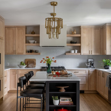

 Pro-Land Landscape Construction Inc.
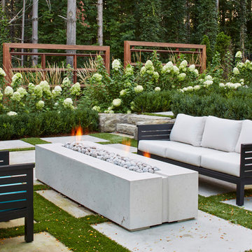
With a lengthy list of ideas about how to transform their backyard, the clients were excited to see what we could do. Existing features on site needed to be updated and in-cooperated within the design. The view from each angle of the property was already outstanding and we didn't want the design to feel out of place. We had to make the grade changes work to our advantage, each separate space had to have a purpose. The client wanted to use the property for charity events, so a large flat turf area was constructed at the back of the property, perfect for setting up tables, chairs and a stage if needed. It also created the perfect look out point into the back of the property, dropping off into a ravine. A lot of focus throughout the project was the plant selection. With a large amount of garden beds, we wanted to maintain a clean and formal look, while still offering seasonal interest. We did this by edging the beds with boxwoods, adding white hydrangeas throughout the beds for constant colour, and subtle pops of purple and yellow. This along with the already breathtaking natural backdrop of the space, is more than enough to make this project stand out.
Photographer: Jason Hartog Photography
 Simply Home Decorating
This beautiful North Vancouver home belongs to a nature-loving and health-conscious couple, Emma and Vince (names changed), their two young children, and their dog, Jasper. When they contacted us about renovating and furnishing their kitchen and family room, we walked in and saw a world of potential waiting to be uncovered.
Before: Larkhall Crescent Home:
Like many original North Vancouver homes, the interior was definitely dated. We encountered late ‘80s finishes in powder pink and teal green, old carpet, and a kitchen that wasn’t maximized to suit this family’s modern-day lifestyle. However, the size of the rooms offered us a ton of space with which to get creative.
Knowing our clients’ love of cooking, need for work spaces (Emma and Vince both work remotely), and growing family, we developed a design concept that would increase usable space, optimize storage, and create intimacy in this large area. As for the style, we were inspired by their European roots, inventing a new and modern take on “Belgian Farmhouse” style. Now, the home is truly one-of-a-kind.
After: Warm & Cozy Family Room:
Fresh, bright, and comfortable, this living area has been transformed! We started with the fireplace as a focal point, selecting aged brick tiles for added texture and a crisp wood mantle. The taupe-coloured sectional infuses the room with visual warmth and serves the added purpose of separating the family room from the kitchen.
Emma and Vince were also keen on using non-toxic materials in their home, and we were happy to oblige. To meet their needs, we sourced natural wood elements and sought out Canadian-made products - that adhere to high health standards - whenever possible.
Look closer at the elements of this space, and you will find this stunning, honeycomb-patterned rug in earthy gold, beige, and charcoal tones. It’s plush to the touch and full of visual texture that brings this room’s colour palette together. We sourced these two-tone chairs with caning, petrified wood side table, black sconces, and botanical prints in greyscale from local artist, Heather Johnston.
We topped off the space with this dark wood and rattan console that offers storage facing the kitchen and presents an opportunity to display cherished items. The result is a cozy lounging space brimming with comfort and functionality. It’s perfect for enjoying quality family time, or Emma can simply slide the coffee table away to make room for her morning yoga practice.
Now, let’s turn around and give some attention to the kitchen. Do you remember what the original kitchen looked like? If not, scroll back up, because the transformation is shocking…
Moody & Welcoming Kitchen for Healthy Living:
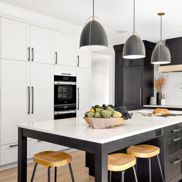
This kitchen looks very different from how it started, right? Though we didn’t touch any walls, the kitchen has almost doubled in usable space! We created a long, extended island with storage, an outlet for small appliances, and seating for comfortable prep, after-school snacking, or mingling among friends.
On the other side of the island, the family has even more storage and an integrated dishwasher within easy reach of the sink, perfect for quick clean-up. From this angle, you can also see the expansive custom Shaker cabinetry in white and the integrated double ovens. These facilitate their cooking experience and gave us the opportunity to add an additional surprise…
A coffee garage station and more hidden storage! Keeping these items located along the perimeter allows them to be accessed by the family or their guests without someone getting under the cook’s feet. These are the little details that make everyday life easier and more enjoyable.
Moving deeper into the kitchen, the seamless induction cooktop topped with a freestanding concealed hood fan commands attention in a soft yet prominent way. The natural wood accent mirrors the fireplace mantle, and the choice of off-black wood-grain cabinets not only continues our black-and-white colour palette but adds a sense of depth and contrast. The corner sink is located to the right and perfectly positioned with a view of their thriving backyard.
To invite more of this family’s character into the space, we mixed metals for interest — matte black, dark pewter, and warm brass — and created open shelves in white oak for their plants and decor. You can also glimpse the tumbled edge of the backsplash tile, which echoes the rustic brick of the fireplace. It adds that farmhouse charm while still feeling timeless and sophisticated.
Last but not least, we designed this dining banquette in the bay window (with integrated bench storage, of course), where the family can share a meal together, the kids can do homework, or Emma and Vince can work and enjoy a change of scenery from their offices. Like the other spaces in the home, it was designed to be beautiful, multi-functional, and long-lasting.
Praise from Our Clients:
It is clear that we love this home, but what did our clients have to say?
“Lori is a visionary and masters execution to the finest detail all at the same time. When she first met us to know more about who we are and how we live, she could right away envision how we could use the space in our kitchen and living room…The results exceeded our expectations.
Lori and her team were also a delight to work with — coordination with all the trades, fast problem-solving, regular updates, professional and friendly attitude of her entire team — made it the dream team. Thank you SHD for making our space so beautiful!”
In turn, we are so grateful for this family’s trust, their open communication, and for being wonderful people with whom to work. (So, thank you!)
Find the right local pro for your project
 Emily Griffin Design
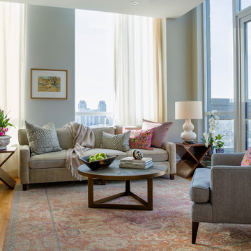
Photo by Joy von Tiedemann
Example of a classic medium tone wood floor and brown floor living room design in Toronto with white walls
Example of a classic medium tone wood floor and brown floor living room design in Toronto with white walls
 Steffanie Danby Interiors
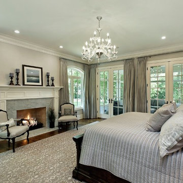
The home's first floor master bedroom is tranquil and serene in a light grey color palette.
Elegant master dark wood floor bedroom photo in Chicago with gray walls, a standard fireplace and a stone fireplace
Elegant master dark wood floor bedroom photo in Chicago with gray walls, a standard fireplace and a stone fireplace
 Copper Sky Design + Remodel
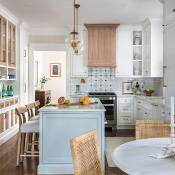
A quintessential 1925 bungalow located in the charming neighborhood of Virginia Highland in Atlanta, this project included a renovation of the kitchen, family room and powder room on the first floor, and the laundry and primary bath on the second. The Copper Sky Design + Remodel team reconfigured the first floor to better accommodate additional cabinetry and an island in the kitchen by borrowing space from what was a full bathroom and converting it to a half bath. Upstairs, unfinished attic space was converted to a roomy laundry room while the 200 square foot primary bath remained in its original footprint.
 kPd Studios | Kristine Pivarnik Design, LLC
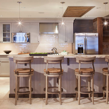
Mountain style kitchen photo in Denver with beige cabinets and a peninsula

Sponsored
Columbus, OH
Free consultation for landscape design!

Peabody Landscape Group
Franklin County's Reliable Landscape Design & Contracting
 McGrath II
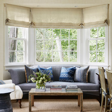
This is the wife's home office which gets used on the weekends. Right off the kitchen and family room, it's the perfect place to get some work done while still feeling a part of what's going on in the heart of the home. The custom made sofa was made to fit the bay windows perfectly. The walls are covered in a subtle grasscloth. The coffee table is a vintage piece found at an antique shop.
 Jerry B Smith Photography
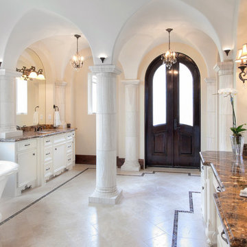
Example of a tuscan freestanding bathtub design in Houston with an undermount sink and white cabinets
 Save home
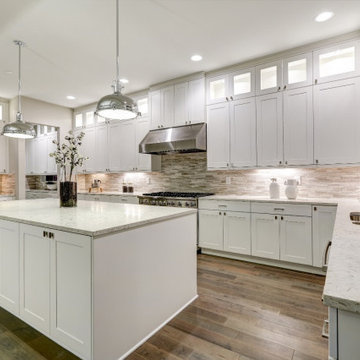
Why are White Shaker Cabinets Still Considered a Classic?
Every few years, if you remodel your kitchen because it feels old, then white shaker cabinets are what you need. Most homeowners feel the need to revamp their kitchen not because the cabinets have worn out but because the interior is a bit old-fashioned. One of the best solutions to this issue is to utilize white shaker cabinets. These are classic, timeless kitchen elements that last longer complements everything, and rarely make your kitchen look outdated.
For this reason, in this article, we have discussed why you need white shaker cabinets in your kitchen and how you can style them.
What is a White Shaker Cabinet?
White shaker cabinets are not new. In fact, these cabinets date back to 1700 when this style was found in every home. These cabinets have a classic look because of recessed door panels, a five-piece door, and a traditional look of pine, maple, or chestnut. Of course. white shaker cabinets are unique and attractive at the same time.
The material used to make these cabinets also makes them durable. You can easily purchase it in less pricing than other wood cabinets, and you can clean it easily. The simplistic structure of white shaker cabinets also makes them complement every type of kitchen; modern or traditional. You can find these cabinets in other light finishes as well, such as peach, off-white, brown, wood brown, etc. The reason we are focusing on white is that this color is timeless and the design of the shaker cabinet is too, which together makes the best combination. You can perfectly strike a chord between every kitchen element if you pair it with white shaker cabinets .
Why White?
The color which is always in style is white. It is highly unlikely to ruin your interior with this color if well-coordinated and properly lit. This is why white shaker cabinets are highly preferred by users.
Here are some reasons to choose white shaker cabinets over other options:
Timeless
Over years, our idea of perfect design changes, and our understanding of the interior also modify. This changes the way we want our kitchen interiors. Hence, if you select vibrant kitchen cabinets and off colors for your countertop, flooring, and paint, then you may end up changing it every few years.
To avoid that from happening, just use white shaker cabinets. In multiple decades, white shaker cabinets have never ceased being classic. White is timeless and it never goes out of trend. Even when you need to change the paint or fittings, you can reduce the cost of cabinets for multiple years.
Versatile
White shaker cabinets are versatile because you have an array of options. You can incorporate multiple elements in your kitchen and tweak color coding and design of countertop, flooring, and paint. For instance, with white shaker cabinets, you can pair white textured back tiles. You can even pair your white cabinets with a black marble countertop; two timeless interior elements together!
Clean
White is the color of clean. In hospitals, bathrooms, and hotel rooms, we find a lot of white because it is clean, fresh, and peaceful. This is why everyone is automatically attracted to this color; it looks clean.
However, you may actually have to make efforts to keep these white shaker cabinets clean from dust and dirt.
Complements Everything
Since cabinets form a big portion of your kitchen, it is necessary to make cabinets complement other interior elements. With white shaker cabinets, you don’t even need to worry about that. White compliments every choice of appliance, countertop, artwork, and flooring. If you decide to get marble grey flooring with white cabinets, you can make that work. If you want colorful kitchen furniture, white complements that too. If you wish to use artwork or warm lighting in your kitchen, white automatically goes well with it.
How to Style White Shaker Cabinets?
If you are styling your kitchen with new white shaker cabinets, here’s what you should keep in mind:
• If your kitchen is small, then white is definitely your color. It reflects more light, hence, makes your space look larger and shinier.
• When you have an open kitchen, you need to follow the same theme to the adjoining rooms and slowly phase it out. This consistency won’t make anything look odd.
• If the rest of the house is filled with artwork and colors, you need the same for your kitchen as well. All white may steal away the classic of shaker cabinets.
• Pair your wall textures and flooring choices with appliances, white cabinets, knobs, and other elements for the best look.
• If the theme for the rest of the house is subtle, then you can even design an all-white kitchen with white shaker cabinets.
Conclusion
Whether you are planning to revamp your kitchen/house or sell your property, white shaker cabinets are always classic. They make a statement in your kitchen and offer a new and clean look all the time. Just focus on coordinating other interior elements of your kitchen and stop worrying about cabinets. White shaker cabinets are durable, beautiful, and timeless! Purchase these classic units now.
For this reason, in this article, we have discussed why you need white shaker cabinets in your kitchen and how you can style them.
What is a White Shaker Cabinet?
White shaker cabinets are not new. In fact, these cabinets date back to 1700 when this style was found in every home. These cabinets have a classic look because of recessed door panels, a five-piece door, and a traditional look of pine, maple, or chestnut. Of course. white shaker cabinets are unique and attractive at the same time.
The material used to make these cabinets also makes them durable. You can easily purchase it in less pricing than other wood cabinets, and you can clean it easily. The simplistic structure of white shaker cabinets also makes them complement every type of kitchen; modern or traditional. You can find these cabinets in other light finishes as well, such as peach, off-white, brown, wood brown, etc. The reason we are focusing on white is that this color is timeless and the design of the shaker cabinet is too, which together makes the best combination. You can perfectly strike a chord between every kitchen element if you pair it with white shaker cabinets .
Why White?
The color which is always in style is white. It is highly unlikely to ruin your interior with this color if well-coordinated and properly lit. This is why white shaker cabinets are highly preferred by users.
Here are some reasons to choose white shaker cabinets over other options:
Timeless
Over years, our idea of perfect design changes, and our understanding of the interior also modify. This changes the way we want our kitchen interiors. Hence, if you select vibrant kitchen cabinets and off colors for your countertop, flooring, and paint, then you may end up changing it every few years.
To avoid that from happening, just use white shaker cabinets. In multiple decades, white shaker cabinets have never ceased being classic. White is timeless and it never goes out of trend. Even when you need to change the paint or fittings, you can reduce the cost of cabinets for multiple years.
Versatile
White shaker cabinets are versatile because you have an array of options. You can incorporate multiple elements in your kitchen and tweak color coding and design of countertop, flooring, and paint. For instance, with white shaker cabinets, you can pair white textured back tiles. You can even pair your white cabinets with a black marble countertop; two timeless interior elements together!
Clean
White is the color of clean. In hospitals, bathrooms, and hotel rooms, we find a lot of white because it is clean, fresh, and peaceful. This is why everyone is automatically attracted to this color; it looks clean.
However, you may actually have to make efforts to keep these white shaker cabinets clean from dust and dirt.
Complements Everything
Since cabinets form a big portion of your kitchen, it is necessary to make cabinets complement other interior elements. With white shaker cabinets, you don’t even need to worry about that. White compliments every choice of appliance, countertop, artwork, and flooring. If you decide to get marble grey flooring with white cabinets, you can make that work. If you want colorful kitchen furniture, white complements that too. If you wish to use artwork or warm lighting in your kitchen, white automatically goes well with it.
How to Style White Shaker Cabinets?
If you are styling your kitchen with new white shaker cabinets, here’s what you should keep in mind:
• If your kitchen is small, then white is definitely your color. It reflects more light, hence, makes your space look larger and shinier.
• When you have an open kitchen, you need to follow the same theme to the adjoining rooms and slowly phase it out. This consistency won’t make anything look odd.
• If the rest of the house is filled with artwork and colors, you need the same for your kitchen as well. All white may steal away the classic of shaker cabinets.
• Pair your wall textures and flooring choices with appliances, white cabinets, knobs, and other elements for the best look.
• If the theme for the rest of the house is subtle, then you can even design an all-white kitchen with white shaker cabinets.
Conclusion
Whether you are planning to revamp your kitchen/house or sell your property, white shaker cabinets are always classic. They make a statement in your kitchen and offer a new and clean look all the time. Just focus on coordinating other interior elements of your kitchen and stop worrying about cabinets. White shaker cabinets are durable, beautiful, and timeless! Purchase these classic units now.
 Bee's Knees Design, LLC
Kyle Caldwell
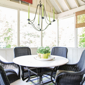
Mid-sized farmhouse carpeted sunroom photo in Boston with a standard ceiling
Mid-sized farmhouse carpeted sunroom photo in Boston with a standard ceiling
 Cummings Architecture + Interiors
Mathew and his team at Cummings Architects have a knack for being able to see the perfect vision for a property. They specialize in identifying a building’s missing elements and crafting designs that simultaneously encompass the large scale, master plan and the myriad details that make a home special. For this Winchester home, the vision included a variety of complementary projects that all came together into a single architectural composition.
Starting with the exterior, the single-lane driveway was extended and a new carriage garage that was designed to blend with the overall context of the existing home. In addition to covered parking, this building also provides valuable new storage areas accessible via large, double doors that lead into a connected work area.
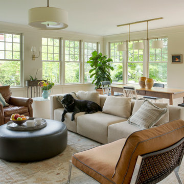
For the interior of the house, new moldings on bay windows, window seats, and two paneled fireplaces with mantles dress up previously nondescript rooms. The family room was extended to the rear of the house and opened up with the addition of generously sized, wall-to-wall windows that served to brighten the space and blur the boundary between interior and exterior.
The family room, with its intimate sitting area, cozy fireplace, and charming breakfast table (the best spot to enjoy a sunlit start to the day) has become one of the family’s favorite rooms, offering comfort and light throughout the day. In the kitchen, the layout was simplified and changes were made to allow more light into the rear of the home via a connected deck with elongated steps that lead to the yard and a blue-stone patio that’s perfect for entertaining smaller, more intimate groups.
From driveway to family room and back out into the yard, each detail in this beautiful design complements all the other concepts and details so that the entire plan comes together into a unified vision for a spectacular home.
Photos By: Eric Roth
 Curated Nest
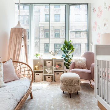
This nursery began in an empty white-box room with incredible natural light, the challenge being to give it warmth and add multi-functionality. Through floral motifs and hints of gold, we created a boho glam room perfect for a little girl. We played with texture to give depth to the soft color palette. The upholstered crib is convertible to a toddler bed, and the daybed can serve as a twin bed, offering a nursery that can grow with baby. The changing table doubles as a dresser, while the hanging canopy play area serves as a perfect play and reading nook.
Sponsored
Fredericksburg, OH

High Point Cabinets
Columbus' Experienced Custom Cabinet Builder | 4x Best of Houzz Winner
 FormAndField
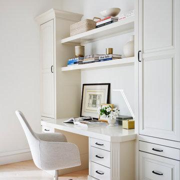
Example of a small classic built-in desk light wood floor and brown floor home office design in San Francisco with white walls
 Paintzen, Inc.
When we imagine the homes of our favorite actors, we often think of picturesque kitchens, artwork hanging on the walls, luxurious furniture, and pristine conditions 24/7. But for celebrities with children, sometimes that last one isn’t always accurate! Kids will be kids – which means there may be messy bedrooms, toys strewn across their play area, and maybe even some crayon marks or finger-paints on walls or floors.
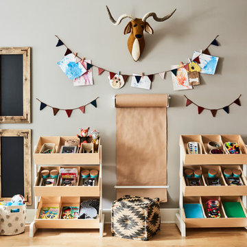
Lucy Liu recently partnered with One Kings Lane and Paintzen to redesign her son Rockwell’s playroom in their Manhattan apartment for that reason. Previously, Lucy had decided not to focus too much on the layout or color of the space – it was simply a room to hold all of Rockwell’s toys. There wasn’t much of a design element to it and very little storage.
Lucy was ready to change that – and transform the room into something more sophisticated and tranquil for both Rockwell and for guests (especially those with kids!). And to really bring that transformation to life, one of the things that needed to change was the lack of color and texture on the walls.
When selecting the color palette, Lucy and One Kings Lane designer Nicole Fisher decided on a more neutral, contemporary style. They chose to avoid the primary colors, which are too often utilized in children’s rooms and playrooms.
Instead, they chose to have Paintzen paint the walls in a cozy gray with warm beige undertones. (Try PPG ‘Slate Pebble’ for a similar look!) It created a perfect backdrop for the decor selected for the room, which included a tepee for Rockwell, some Tribal-inspired artwork, Moroccan woven baskets, and some framed artwork.
To add texture to the space, Paintzen also installed wallpaper on two of the walls. The wallpaper pattern involved muted blues and grays to add subtle color and a slight contrast to the rest of the walls. Take a closer look at this smartly designed space, featuring a beautiful neutral color palette and lots of exciting textures!

Sponsored
Columbus, OH
Free consultation for landscape design!
Peabody Landscape Group
Franklin County's Reliable Landscape Design & Contracting
 Jules Duffy Designs
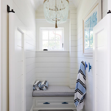
Pool House Changing Room
Laura Moss Photography
Example of a beach style pool design in New York
Example of a beach style pool design in New York
 User
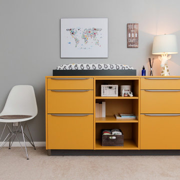
Userthis custom designed changing dresser in mango yellow was made to fit the perfect needs of a newborn baby, and have enough storage area for diapers, changing utensils, bigger and smaller items. two narrow drawers and four pull outs give practical use of the space. the rounded aluminum handles give an optimum of handling and the rounded shape prevent from unwanted bumps along the way. the furniture can be re used as regular storage cabinet for toys and the parents once baby grows up.
 Jennifer Wundrow Interior Design, Inc.
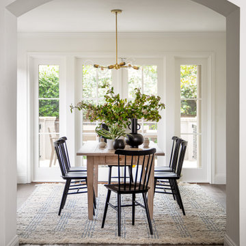
Inspiration for a transitional dining room remodel in San Francisco
11