
Search results for "Perfecting changing" in Home Design Ideas
 Jennifer Wundrow Interior Design, Inc.
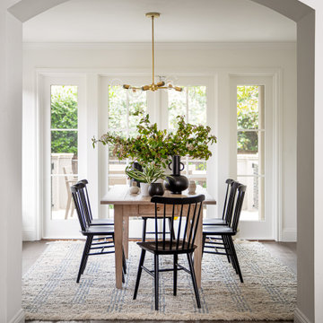
Inspiration for a transitional dining room remodel in San Francisco
 KuDa Photography
Photo by KuDa Photography
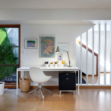
Inspiration for a large contemporary freestanding desk home office remodel in Portland with white walls
Inspiration for a large contemporary freestanding desk home office remodel in Portland with white walls
 CHRISTOPHER LEE FOTO
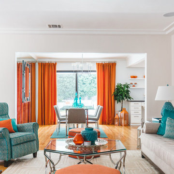
Example of an eclectic enclosed medium tone wood floor game room design in Los Angeles with white walls
Find the right local pro for your project
 Thompson Remodeling
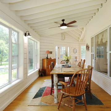
The owners of this beautiful historic farmhouse had been painstakingly restoring it bit by bit. One of the last items on their list was to create a wrap-around front porch to create a more distinct and obvious entrance to the front of their home.
Aside from the functional reasons for the new porch, our client also had very specific ideas for its design. She wanted to recreate her grandmother’s porch so that she could carry on the same wonderful traditions with her own grandchildren someday.
Key requirements for this front porch remodel included:
- Creating a seamless connection to the main house.
- A floorplan with areas for dining, reading, having coffee and playing games.
- Respecting and maintaining the historic details of the home and making sure the addition felt authentic.
Upon entering, you will notice the authentic real pine porch decking.
Real windows were used instead of three season porch windows which also have molding around them to match the existing home’s windows.
The left wing of the porch includes a dining area and a game and craft space.
Ceiling fans provide light and additional comfort in the summer months. Iron wall sconces supply additional lighting throughout.
Exposed rafters with hidden fasteners were used in the ceiling.
Handmade shiplap graces the walls.
On the left side of the front porch, a reading area enjoys plenty of natural light from the windows.
The new porch blends perfectly with the existing home much nicer front facade. There is a clear front entrance to the home, where previously guests weren’t sure where to enter.
We successfully created a place for the client to enjoy with her future grandchildren that’s filled with nostalgic nods to the memories she made with her own grandmother.
"We have had many people who asked us what changed on the house but did not know what we did. When we told them we put the porch on, all of them made the statement that they did not notice it was a new addition and fit into the house perfectly.”
– Homeowner
 Dorian Bolick
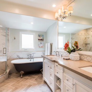
Elegant white tile brown floor bathroom photo in Los Angeles with recessed-panel cabinets, white cabinets, gray walls, an undermount sink, a hinged shower door and beige countertops
 Paula Coldiron
Graham Yelton for B-Metro
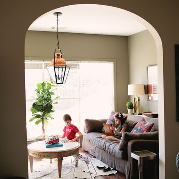
Inspiration for an eclectic enclosed living room remodel in Birmingham with beige walls
Inspiration for an eclectic enclosed living room remodel in Birmingham with beige walls

Sponsored
Fredericksburg, OH

High Point Cabinets
Columbus' Experienced Custom Cabinet Builder | 4x Best of Houzz Winner
 Klopf Architecture
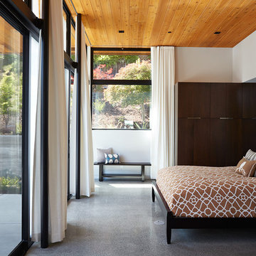
Klopf Architecture, Arterra Landscape Architects and Henry Calvert of Calvert Ventures Designed and built a new warm, modern, Eichler-inspired, open, indoor-outdoor home on a deeper-than-usual San Mateo Highlands property where an original Eichler house had burned to the ground.
The owners wanted multi-generational living and larger spaces than the original home offered, but all parties agreed that the house should respect the neighborhood and blend in stylistically with the other Eichlers. At first the Klopf team considered re-using what little was left of the original home and expanding on it. But after discussions with the owner and builder, all parties agreed that the last few remaining elements of the house were not practical to re-use, so Klopf Architecture designed a new home that pushes the Eichler approach in new directions.
One disadvantage of Eichler production homes is that the house designs were not optimized for each specific lot. A new custom home offered the team a chance to start over. In this case, a longer house that opens up sideways to the south fit the lot better than the original square-ish house that used to open to the rear (west). Accordingly, the Klopf team designed an L-shaped “bar” house with a large glass wall with large sliding glass doors that faces sideways instead of to the rear like a typical Eichler. This glass wall opens to a pool and landscaped yard designed by Arterra Landscape Architects.
Driving by the house, one might assume at first glance it is an Eichler because of the horizontality, the overhanging flat roof eaves, the dark gray vertical siding, and orange solid panel front door, but the house is designed for the 21st Century and is not meant to be a “Likeler.” You won't see any posts and beams in this home. Instead, the ceiling decking is a western red cedar that covers over all the beams. Like Eichlers, this cedar runs continuously from inside to out, enhancing the indoor / outdoor feeling of the house, but unlike Eichlers it conceals a cavity for lighting, wiring, and insulation. Ceilings are higher, rooms are larger and more open, the master bathroom is light-filled and more generous, with a separate tub and shower and a separate toilet compartment, and there is plenty of storage. The garage even easily fits two of today's vehicles with room to spare.
A massive 49-foot by 12-foot wall of glass and the continuity of materials from inside to outside enhance the inside-outside living concept, so the owners and their guests can flow freely from house to pool deck to BBQ to pool and back.
During construction in the rough framing stage, Klopf thought the front of the house appeared too tall even though the house had looked right in the design renderings (probably because the house is uphill from the street). So Klopf Architecture paid the framer to change the roofline from how we had designed it to be lower along the front, allowing the home to blend in better with the neighborhood. One project goal was for people driving up the street to pass the home without immediately noticing there is an "imposter" on this lot, and making that change was essential to achieve that goal.
This 2,606 square foot, 3 bedroom, 3 bathroom Eichler-inspired new house is located in San Mateo in the heart of the Silicon Valley.
Klopf Architecture Project Team: John Klopf, AIA, Klara Kevane
Landscape Architect: Arterra Landscape Architects
Contractor: Henry Calvert of Calvert Ventures
Photography ©2016 Mariko Reed
Location: San Mateo, CA
Year completed: 2016

 Advance Design Studio, Ltd.
After six years of living in their Huntley IL home, Chris and Meghan were tired of their dark, dingy, outdated kitchen and it was finally time for a long-anticipated change. “The kitchen is the place where we live, it’s where we do everything,” Meghan said. “It was important that it be a space where we wanted to be.” Meghan loves cooking and enjoys including their girls in healthy meal prepping, this led them to want a brighter, more enjoyable kitchen with increased functionality and improved storage.
For Chris especially, the laundry room was an entirely dysfunctional eyesore. “We had a washer and a dryer, but it was all kind-of cobbled together!” Chris said. “There were always laundry piles everywhere, we weren’t really sure what we wanted to do in there, but it was time for us to make a change.” The mess of the space was stressful every time they walked in the door from the garage each day. Kids’ backpacks and shoes piled up haphazardly in the makeshift boot-bench closet left the family feeling disorganized and stressed. They needed space for folding clothes and locker cubbies to help keep the family organized.
Having known Christine and Todd in the Huntley community for years, Chris and Meghan were familiar with their work. “We already trusted them personally and having seen their projects for years we knew they did top notch work. After we reviewed the initial round of designs, we knew that hiring them was definitely the right choice,” Meghan and Chris said. Although Chris had done a lot of work in their home himself, the kitchen and laundry room renovation was such a large undertaking that he didn’t want to steal time away from his family to spend what would surely be many long weekends doing the job himself. “That would not have been a wise choice for us,” Chris laughed.
“Our designer, Michelle was very, very, easy to work with; anything we wanted to see or weren’t sure about, she went above and beyond to make this easy for us. She was easy to get hold of and always quick to respond,” the couple said. Michelle pulled ideas that mirrored the couple’s taste and style and was adept at directing the couple to limited choices that didn’t overwhelm them and kept the process moving. “I have a hard time making decisions. Michelle made the decision-making process so easy. I loved how she listened to what I liked and then presented three great options for me to choose from,” Meghan said.
The main objectives for the kitchen were better storage solutions, they wanted the space to reflect their lifestyle and taste, and they wanted it to last for years with low maintenance. One of the first steps in creating a more functional kitchen was relocating the refrigerator, creating an improved workflow for the busy family.
“We didn’t know that we could even move the refrigerator to a new location where it is now, that was something that we never would have thought of,” Chris said. “The new refrigerator location makes the kitchen feel so much bigger. We didn’t add any space, but our whole kitchen with the new design just seems like it’s so much larger than before!” Meghan said.
The perimeter mist colored cabinets helped warm and brighten the entire room, while the graphite colored cabinets on the island added contrast. Using this fresh, clean color palette satisfied the couple’s desire for a bright space that was the exact opposite of what they had before. Organization accessories were also added to the cabinets such as a spice drawer tray and roll outs to create hidden convenience.
“I absolutely love the hidden spices – it makes cooking so much more enjoyable!” Chris said. “And all the pull outs, and the double trash bin, who would think you could get so excited about organization!” the couple said in unison.
One thing they hated in their original kitchen was how dark the space felt. Added lighting on the ceiling with the new light fixtures combined with the lighter cabinetry colors throughout solved this problem. “Our new kitchen has this warm, almost cozy feeling that our old kitchen never had, it’s just a space that I love spending my time in now,” Meghan said. The light airy feeling was accentuated with the use of floating white shelves on either side of the decorative range hood. “We have so much cabinetry space, the new design is amazing we actually have more storage space than we will ever need,” Meghan said.
The island was extended to create more work surface and added space for stool seating. “The new island changes how we live. Now the kids can be in the kitchen with us, doing homework, eating breakfast, and the three of us have special dinners there when Chris is working late,” Meghan said.
The Carrara Marmi Quartz countertops were chosen because they are, not only beautiful, but are made from hard-working material that doesn’t require maintenance. The white subway tile backsplash that wraps to the ceiling behind the focal point cooktop range/hood compliments the crisp white countertops perfectly, while brushed brass hardware and light fixtures keep the design fresh and new.
The couple had a few fears at the beginning of the project, as most homeowners do. Their biggest fear was being out of their kitchen and laundry room for an extended time. The crew made it very easy for the family to work in a limited space keeping the washer and dryer hooked up the majority of the time, and also getting appliances working with minimal downtime.
“They above and beyond accommodated us to get us through the process,” Meghan said. “They did a great job making sure we were as comfortable as possible throughout the process,” Chris added.
“Our project manager DJ did a great job. He was very good at updating us on schedule changes, getting guys in as quickly as possible. Everyone that stepped in the house was nice and did great work,” said Chris. They thought Advance’s carpenter was phenomenal and were impressed when he took a conceptual idea from a photograph and worked with designer Michelle to create a one of a kind range/hood that has become the topic of conversation with friends and family who visit the new kitchen. “He was in our house literally every day for several weeks. He was easy to work with and good at what he did,” Meghan and Chris said.
The focal point of the kitchen; a hand-crafted, custom-built ventilation hood was clad with handpicked reclaimed barnwood. Advance Design’s carpenter built the framework and the cladding to create a one-of-a-kind design element that the couple loves.
“I think it was especially fun for him to create something unique from scratch, showcasing his talent in this area,” Meghan said. “I love that my kitchen is not like everyone else’s. I got to pick out the wood on my hood and watch it being built and was able to choose what pieces of wood went where on it. It’s totally unique.”
Red Oak flooring was toothed-in throughout the kitchen and the rest of the first floor anywhere changes were made. Then the whole floor was refinished to tone down the orange undertones in the existing floor stain, ultimately changing the color complexion of the entire first floor. The result is a completely new feeling to the entire home.
Renovating the laundry room was extremely important to Meghan and Chris, but they had trouble visualizing what the possibilities were for the seemingly small space. Michelle produced beautiful 3D illustrations that helped them envision the space in a whole new way.
“I must have told Michelle 100 times that I am a visual person, seeing the designs in 3D made it so easy to make decisions and see what we could really do with our space,” Meghan said.
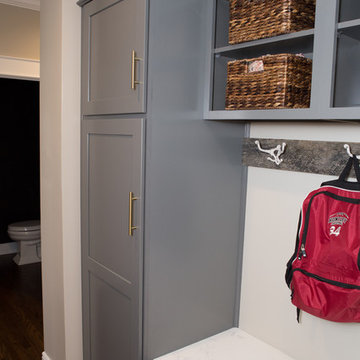
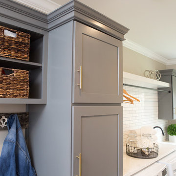
A dividing wall and doorway were removed between the existing laundry room and hallway formerly containing a coat closet, providing space to design specialized graphite colored cabinetry matching the kitchen island to house custom storage cubbies for each family member. Adding the tall utility cabinetry in the new laundry area helped solve the storage issue, tucking away cleaning supplies, household items, and even the cat got its own cubby.
“I love how everything is now hidden in its own space. I can’t tell you how much I hated coming home and seeing everything sitting around on counters,” Chris said.
Electrical outlets were planned for the inside of utility cabinets, so devices could charge in hidden locations. Stacking the washer and dryer allowed for wider countertop space to provide a folding area and a special space for clothes to hang. “The way I do laundry has been completely transformed! I can actually fold clothes and hang them now right out of the washer and dryer,” Meghan said.
“The end result in the kitchen and the laundry/mud room was an updated light and bright space, with a smarter work flow that better meets the needs of this family,” Michelle said.
“I would totally recommend Advance Design,” Meghan said. “Sometimes I sit and just look at my kitchen and laundry room and think ‘Wow, I can’t believe I get to live here!’ It’s an understatement to say we love our new space.”
 Alair Homes Plano
Our clients came to us wanting to maximize the space they had. They were not planning on moving anytime soon, as they loved their neighborhood. They wanted to renovate the front of their house, which included the front atrium, living room, kitchen, and powder bath. They hated their kitchen because it was completely closed off, had low ceilings, was dark and outdated, not to mention the floors were different in each of these rooms! The pantry was in the breakfast area and the kitchen table became a junk catcher, being the first thing you see when coming in from the garage/laundry room. In their living room, they wanted the spaces on either side of the fireplace to be symmetrical, whether that be bookshelves, a wet bar or closed off. Both parents are working professionals with no time and/or desire to design, create and figure this out on their own. They needed help figuring out how to reconfigure their current space in order to maximize what they already had, as they could not see an obvious solution. They could not envision how it would look so the fact that our designers were able to show them their new kitchen in 3D was pertinent.
We removed the pass-through windows that surrounded the atrium and front dining room, as well as the entire kitchen wall, completely opening up those two rooms. We removed a hall that used to lead between the kitchen and the living room since it was a complete waste of space! The ceilings were raised to 10’ in the kitchen and we were able to leave the skylight, letting in that natural light they wanted. We were able to give them a much larger pantry with tons of shelving and increase the size of their laundry room by utilizing the space of their old breakfast nook.
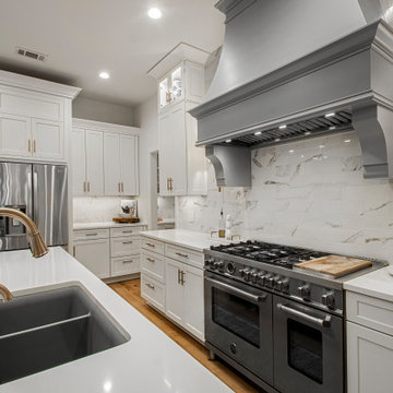
We relocated the door to the garage into their new elongated laundry room, built a wet bar across from their new larger pantry (with a pocket door) and the flow and functionality of these new spaces is just perfect! All new Waypoint cabinets were installed one two main kitchen surrounding walls painted Linen. Calacatta Bianco Polished Porcelain Tile 4x12 was used for the backsplash. A large eat-at island was installed, painted Stone, where the family can now gather for homework, meals, and mingling. The soft champagne bronze hardware and accent lighting really give this white and gray kitchen a soft classic look.
In the living room, we removed the built-in bookshelves to the left of the fireplace and closed off the wet-bar on the other side, giving them more space in their master suite. White Oak wood flooring, stained Putney, was installed throughout the entire new space, giving it the continuity they were looking for.
In the guest bathroom, Carrara white herringbone marble mosaic 12x12 tile was used on the shower floor and niche, while basic marble Bianco polished 12x24 porcelain tile was used on the walls. Luxart polished chrome traditional hardware gives this timeless bathroom the perfect shine.
Our clients are so happy with the new functionality and look of their space. It has definitely changed their lives in a way they could have never imagined!
 Signature Designs Kitchen | Bath | Interiors
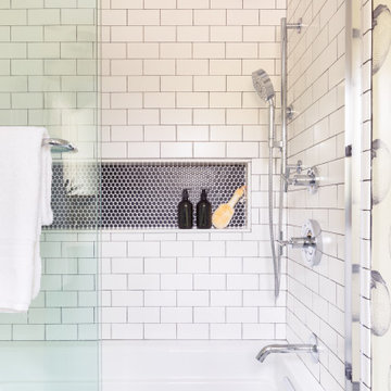
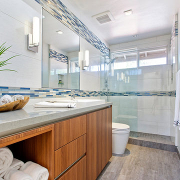
Guest bathroom makeover with accent tile paired with white linen tile. Wall sconces are a perfect fit flanking the mirror to give the client just the right amount of light. The cool light tones are the perfect backdrop to the rich walnut vanity cabinets top with quartz countertops.
 Thyme & Place Design LLC
The existing kitchen was in a word, "stuck" between the family room, mudroom and the rest of the house. The client has renovated most of the home but did not know what to do with the kitchen. The space was visually cut off from the family room, had underwhelming storage capabilities, and could not accommodate family gatherings at the table. Access to the recently redesigned backyard was down a step and through the mud room.
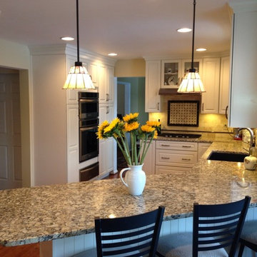
We began by relocating the access to the yard into the kitchen with a French door. The remaining space was converted into a walk-in pantry accessible from the kitchen. Next, we opened a window to the family room, so the children were visible from the kitchen side. The old peninsula plan was replaced with a beautiful blue painted island with seating for 4. The outdated appliances received a major upgrade with Sub Zero Wolf cooking and food preservation products.
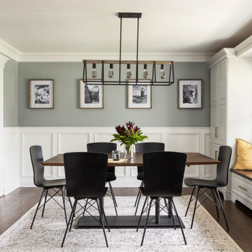
The visual beauty of the vaulted ceiling is enhanced by long pendants and oversized crown molding. A hard-working wood tile floor grounds the blue and white colorway. The colors are repeated in a lovely blue and white screened marble tile. White porcelain subway tiles frame the feature. The biggest and possibly the most appreciated change to the space was when we opened the wall from the kitchen into the dining room to connect the disjointed spaces. Now the family has experienced a new appreciation for their home. Rooms which were previously storage areas and now integrated into the family lifestyle. The open space is so conducive to entertaining visitors frequently just "drop in”.
In the dining area, we designed custom cabinets complete with a window seat, the perfect spot for additional diners or a perch for the family cat. The tall cabinets store all the china and crystal once stored in a back closet. Now it is always ready to be used. The last repurposed space is now home to a refreshment center. Cocktails and coffee are easily stored and served convenient to the kitchen but out of the main cooking area.
How do they feel about their new space? It has changed the way they live and use their home. The remodel has created a new environment to live, work and play at home. They could not be happier.

 Advance Design Studio, Ltd.
After six years of living in their Huntley IL home, Chris and Meghan were tired of their dark, dingy, outdated kitchen and it was finally time for a long-anticipated change. “The kitchen is the place where we live, it’s where we do everything,” Meghan said. “It was important that it be a space where we wanted to be.” Meghan loves cooking and enjoys including their girls in healthy meal prepping, this led them to want a brighter, more enjoyable kitchen with increased functionality and improved storage.
For Chris especially, the laundry room was an entirely dysfunctional eyesore. “We had a washer and a dryer, but it was all kind-of cobbled together!” Chris said. “There were always laundry piles everywhere, we weren’t really sure what we wanted to do in there, but it was time for us to make a change.” The mess of the space was stressful every time they walked in the door from the garage each day. Kids’ backpacks and shoes piled up haphazardly in the makeshift boot-bench closet left the family feeling disorganized and stressed. They needed space for folding clothes and locker cubbies to help keep the family organized.
Having known Christine and Todd in the Huntley community for years, Chris and Meghan were familiar with their work. “We already trusted them personally and having seen their projects for years we knew they did top notch work. After we reviewed the initial round of designs, we knew that hiring them was definitely the right choice,” Meghan and Chris said. Although Chris had done a lot of work in their home himself, the kitchen and laundry room renovation was such a large undertaking that he didn’t want to steal time away from his family to spend what would surely be many long weekends doing the job himself. “That would not have been a wise choice for us,” Chris laughed.
“Our designer, Michelle was very, very, easy to work with; anything we wanted to see or weren’t sure about, she went above and beyond to make this easy for us. She was easy to get hold of and always quick to respond,” the couple said. Michelle pulled ideas that mirrored the couple’s taste and style and was adept at directing the couple to limited choices that didn’t overwhelm them and kept the process moving. “I have a hard time making decisions. Michelle made the decision-making process so easy. I loved how she listened to what I liked and then presented three great options for me to choose from,” Meghan said.
The main objectives for the kitchen were better storage solutions, they wanted the space to reflect their lifestyle and taste, and they wanted it to last for years with low maintenance. One of the first steps in creating a more functional kitchen was relocating the refrigerator, creating an improved workflow for the busy family.
“We didn’t know that we could even move the refrigerator to a new location where it is now, that was something that we never would have thought of,” Chris said. “The new refrigerator location makes the kitchen feel so much bigger. We didn’t add any space, but our whole kitchen with the new design just seems like it’s so much larger than before!” Meghan said.
The perimeter mist colored cabinets helped warm and brighten the entire room, while the graphite colored cabinets on the island added contrast. Using this fresh, clean color palette satisfied the couple’s desire for a bright space that was the exact opposite of what they had before. Organization accessories were also added to the cabinets such as a spice drawer tray and roll outs to create hidden convenience.
“I absolutely love the hidden spices – it makes cooking so much more enjoyable!” Chris said. “And all the pull outs, and the double trash bin, who would think you could get so excited about organization!” the couple said in unison.
One thing they hated in their original kitchen was how dark the space felt. Added lighting on the ceiling with the new light fixtures combined with the lighter cabinetry colors throughout solved this problem. “Our new kitchen has this warm, almost cozy feeling that our old kitchen never had, it’s just a space that I love spending my time in now,” Meghan said. The light airy feeling was accentuated with the use of floating white shelves on either side of the decorative range hood. “We have so much cabinetry space, the new design is amazing we actually have more storage space than we will ever need,” Meghan said.
The island was extended to create more work surface and added space for stool seating. “The new island changes how we live. Now the kids can be in the kitchen with us, doing homework, eating breakfast, and the three of us have special dinners there when Chris is working late,” Meghan said.
The Carrara Marmi Quartz countertops were chosen because they are, not only beautiful, but are made from hard-working material that doesn’t require maintenance. The white subway tile backsplash that wraps to the ceiling behind the focal point cooktop range/hood compliments the crisp white countertops perfectly, while brushed brass hardware and light fixtures keep the design fresh and new.
The couple had a few fears at the beginning of the project, as most homeowners do. Their biggest fear was being out of their kitchen and laundry room for an extended time. The crew made it very easy for the family to work in a limited space keeping the washer and dryer hooked up the majority of the time, and also getting appliances working with minimal downtime.
“They above and beyond accommodated us to get us through the process,” Meghan said. “They did a great job making sure we were as comfortable as possible throughout the process,” Chris added.
“Our project manager DJ did a great job. He was very good at updating us on schedule changes, getting guys in as quickly as possible. Everyone that stepped in the house was nice and did great work,” said Chris. They thought Advance’s carpenter was phenomenal and were impressed when he took a conceptual idea from a photograph and worked with designer Michelle to create a one of a kind range/hood that has become the topic of conversation with friends and family who visit the new kitchen. “He was in our house literally every day for several weeks. He was easy to work with and good at what he did,” Meghan and Chris said.
The focal point of the kitchen; a hand-crafted, custom-built ventilation hood was clad with handpicked reclaimed barnwood. Advance Design’s carpenter built the framework and the cladding to create a one-of-a-kind design element that the couple loves.
“I think it was especially fun for him to create something unique from scratch, showcasing his talent in this area,” Meghan said. “I love that my kitchen is not like everyone else’s. I got to pick out the wood on my hood and watch it being built and was able to choose what pieces of wood went where on it. It’s totally unique.”
Red Oak flooring was toothed-in throughout the kitchen and the rest of the first floor anywhere changes were made. Then the whole floor was refinished to tone down the orange undertones in the existing floor stain, ultimately changing the color complexion of the entire first floor. The result is a completely new feeling to the entire home.
Renovating the laundry room was extremely important to Meghan and Chris, but they had trouble visualizing what the possibilities were for the seemingly small space. Michelle produced beautiful 3D illustrations that helped them envision the space in a whole new way.
“I must have told Michelle 100 times that I am a visual person, seeing the designs in 3D made it so easy to make decisions and see what we could really do with our space,” Meghan said.
A dividing wall and doorway were removed between the existing laundry room and hallway formerly containing a coat closet, providing space to design specialized graphite colored cabinetry matching the kitchen island to house custom storage cubbies for each family member. Adding the tall utility cabinetry in the new laundry area helped solve the storage issue, tucking away cleaning supplies, household items, and even the cat got its own cubby.
“I love how everything is now hidden in its own space. I can’t tell you how much I hated coming home and seeing everything sitting around on counters,” Chris said.
Electrical outlets were planned for the inside of utility cabinets, so devices could charge in hidden locations. Stacking the washer and dryer allowed for wider countertop space to provide a folding area and a special space for clothes to hang. “The way I do laundry has been completely transformed! I can actually fold clothes and hang them now right out of the washer and dryer,” Meghan said.
“The end result in the kitchen and the laundry/mud room was an updated light and bright space, with a smarter work flow that better meets the needs of this family,” Michelle said.
“I would totally recommend Advance Design,” Meghan said. “Sometimes I sit and just look at my kitchen and laundry room and think ‘Wow, I can’t believe I get to live here!’ It’s an understatement to say we love our new space.”
 Simply Home Decorating
This beautiful North Vancouver home belongs to a nature-loving and health-conscious couple, Emma and Vince (names changed), their two young children, and their dog, Jasper. When they contacted us about renovating and furnishing their kitchen and family room, we walked in and saw a world of potential waiting to be uncovered.
Before: Larkhall Crescent Home:
Like many original North Vancouver homes, the interior was definitely dated. We encountered late ‘80s finishes in powder pink and teal green, old carpet, and a kitchen that wasn’t maximized to suit this family’s modern-day lifestyle. However, the size of the rooms offered us a ton of space with which to get creative.
Knowing our clients’ love of cooking, need for work spaces (Emma and Vince both work remotely), and growing family, we developed a design concept that would increase usable space, optimize storage, and create intimacy in this large area. As for the style, we were inspired by their European roots, inventing a new and modern take on “Belgian Farmhouse” style. Now, the home is truly one-of-a-kind.
After: Warm & Cozy Family Room:
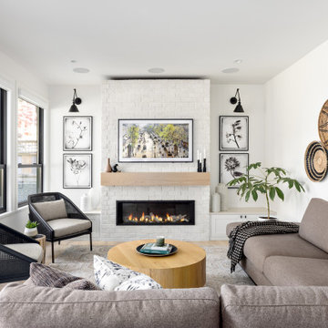
Fresh, bright, and comfortable, this living area has been transformed! We started with the fireplace as a focal point, selecting aged brick tiles for added texture and a crisp wood mantle. The taupe-coloured sectional infuses the room with visual warmth and serves the added purpose of separating the family room from the kitchen.
Emma and Vince were also keen on using non-toxic materials in their home, and we were happy to oblige. To meet their needs, we sourced natural wood elements and sought out Canadian-made products - that adhere to high health standards - whenever possible.
Look closer at the elements of this space, and you will find this stunning, honeycomb-patterned rug in earthy gold, beige, and charcoal tones. It’s plush to the touch and full of visual texture that brings this room’s colour palette together. We sourced these two-tone chairs with caning, petrified wood side table, black sconces, and botanical prints in greyscale from local artist, Heather Johnston.
We topped off the space with this dark wood and rattan console that offers storage facing the kitchen and presents an opportunity to display cherished items. The result is a cozy lounging space brimming with comfort and functionality. It’s perfect for enjoying quality family time, or Emma can simply slide the coffee table away to make room for her morning yoga practice.
Now, let’s turn around and give some attention to the kitchen. Do you remember what the original kitchen looked like? If not, scroll back up, because the transformation is shocking…
Moody & Welcoming Kitchen for Healthy Living:
This kitchen looks very different from how it started, right? Though we didn’t touch any walls, the kitchen has almost doubled in usable space! We created a long, extended island with storage, an outlet for small appliances, and seating for comfortable prep, after-school snacking, or mingling among friends.
On the other side of the island, the family has even more storage and an integrated dishwasher within easy reach of the sink, perfect for quick clean-up. From this angle, you can also see the expansive custom Shaker cabinetry in white and the integrated double ovens. These facilitate their cooking experience and gave us the opportunity to add an additional surprise…
A coffee garage station and more hidden storage! Keeping these items located along the perimeter allows them to be accessed by the family or their guests without someone getting under the cook’s feet. These are the little details that make everyday life easier and more enjoyable.
Moving deeper into the kitchen, the seamless induction cooktop topped with a freestanding concealed hood fan commands attention in a soft yet prominent way. The natural wood accent mirrors the fireplace mantle, and the choice of off-black wood-grain cabinets not only continues our black-and-white colour palette but adds a sense of depth and contrast. The corner sink is located to the right and perfectly positioned with a view of their thriving backyard.
To invite more of this family’s character into the space, we mixed metals for interest — matte black, dark pewter, and warm brass — and created open shelves in white oak for their plants and decor. You can also glimpse the tumbled edge of the backsplash tile, which echoes the rustic brick of the fireplace. It adds that farmhouse charm while still feeling timeless and sophisticated.
Last but not least, we designed this dining banquette in the bay window (with integrated bench storage, of course), where the family can share a meal together, the kids can do homework, or Emma and Vince can work and enjoy a change of scenery from their offices. Like the other spaces in the home, it was designed to be beautiful, multi-functional, and long-lasting.
Praise from Our Clients:
It is clear that we love this home, but what did our clients have to say?
“Lori is a visionary and masters execution to the finest detail all at the same time. When she first met us to know more about who we are and how we live, she could right away envision how we could use the space in our kitchen and living room…The results exceeded our expectations.
Lori and her team were also a delight to work with — coordination with all the trades, fast problem-solving, regular updates, professional and friendly attitude of her entire team — made it the dream team. Thank you SHD for making our space so beautiful!”
In turn, we are so grateful for this family’s trust, their open communication, and for being wonderful people with whom to work. (So, thank you!)
 Dyer Studio Inc.
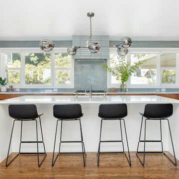
The most significant change of the Bridlemile Midcentury project took place here in the kitchen. We united what were previously three separate spaces (laundry/mudroom, kitchen, and nook) into one grand cooking and entertainment space.
As much as we love and respect the original 1954 vision, times have changed- especially when it comes to household activities such as cooking, cleaning, and laundry.
In addition to knocking down the mudroom/laundry walls, we expanded the opening between kitchen and dining spaces to showcase the southern view and maximize daylight. Incorporating a large island enabled us to centralize the sink to face the dining area, yard, and view beyond. And [as a reflection of our era] we achieved a more proportional balance between the kitchen, dining, and living room volumes.
 Paintzen, Inc.
When we imagine the homes of our favorite actors, we often think of picturesque kitchens, artwork hanging on the walls, luxurious furniture, and pristine conditions 24/7. But for celebrities with children, sometimes that last one isn’t always accurate! Kids will be kids – which means there may be messy bedrooms, toys strewn across their play area, and maybe even some crayon marks or finger-paints on walls or floors.
Lucy Liu recently partnered with One Kings Lane and Paintzen to redesign her son Rockwell’s playroom in their Manhattan apartment for that reason. Previously, Lucy had decided not to focus too much on the layout or color of the space – it was simply a room to hold all of Rockwell’s toys. There wasn’t much of a design element to it and very little storage.
Lucy was ready to change that – and transform the room into something more sophisticated and tranquil for both Rockwell and for guests (especially those with kids!). And to really bring that transformation to life, one of the things that needed to change was the lack of color and texture on the walls.
When selecting the color palette, Lucy and One Kings Lane designer Nicole Fisher decided on a more neutral, contemporary style. They chose to avoid the primary colors, which are too often utilized in children’s rooms and playrooms.
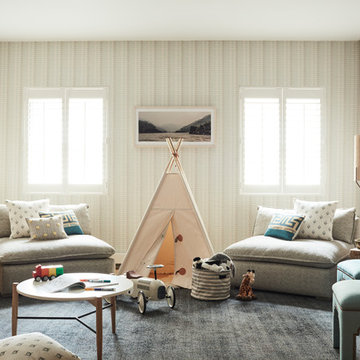
Instead, they chose to have Paintzen paint the walls in a cozy gray with warm beige undertones. (Try PPG ‘Slate Pebble’ for a similar look!) It created a perfect backdrop for the decor selected for the room, which included a tepee for Rockwell, some Tribal-inspired artwork, Moroccan woven baskets, and some framed artwork.
To add texture to the space, Paintzen also installed wallpaper on two of the walls. The wallpaper pattern involved muted blues and grays to add subtle color and a slight contrast to the rest of the walls. Take a closer look at this smartly designed space, featuring a beautiful neutral color palette and lots of exciting textures!

Sponsored
Columbus, OH
Free consultation for landscape design!

Peabody Landscape Group
Franklin County's Reliable Landscape Design & Contracting
 Paintzen, Inc.
When we imagine the homes of our favorite actors, we often think of picturesque kitchens, artwork hanging on the walls, luxurious furniture, and pristine conditions 24/7. But for celebrities with children, sometimes that last one isn’t always accurate! Kids will be kids – which means there may be messy bedrooms, toys strewn across their play area, and maybe even some crayon marks or finger-paints on walls or floors.
Lucy Liu recently partnered with One Kings Lane and Paintzen to redesign her son Rockwell’s playroom in their Manhattan apartment for that reason. Previously, Lucy had decided not to focus too much on the layout or color of the space – it was simply a room to hold all of Rockwell’s toys. There wasn’t much of a design element to it and very little storage.
Lucy was ready to change that – and transform the room into something more sophisticated and tranquil for both Rockwell and for guests (especially those with kids!). And to really bring that transformation to life, one of the things that needed to change was the lack of color and texture on the walls.
When selecting the color palette, Lucy and One Kings Lane designer Nicole Fisher decided on a more neutral, contemporary style. They chose to avoid the primary colors, which are too often utilized in children’s rooms and playrooms.
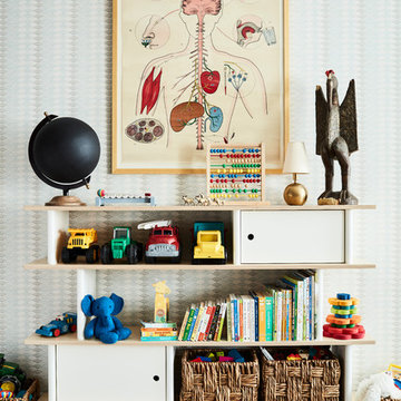
Instead, they chose to have Paintzen paint the walls in a cozy gray with warm beige undertones. (Try PPG ‘Slate Pebble’ for a similar look!) It created a perfect backdrop for the decor selected for the room, which included a tepee for Rockwell, some Tribal-inspired artwork, Moroccan woven baskets, and some framed artwork.
To add texture to the space, Paintzen also installed wallpaper on two of the walls. The wallpaper pattern involved muted blues and grays to add subtle color and a slight contrast to the rest of the walls. Take a closer look at this smartly designed space, featuring a beautiful neutral color palette and lots of exciting textures!
 Cummings Architecture + Interiors
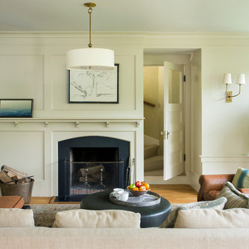
Mathew and his team at Cummings Architects have a knack for being able to see the perfect vision for a property. They specialize in identifying a building’s missing elements and crafting designs that simultaneously encompass the large scale, master plan and the myriad details that make a home special. For this Winchester home, the vision included a variety of complementary projects that all came together into a single architectural composition.
Starting with the exterior, the single-lane driveway was extended and a new carriage garage that was designed to blend with the overall context of the existing home. In addition to covered parking, this building also provides valuable new storage areas accessible via large, double doors that lead into a connected work area.
For the interior of the house, new moldings on bay windows, window seats, and two paneled fireplaces with mantles dress up previously nondescript rooms. The family room was extended to the rear of the house and opened up with the addition of generously sized, wall-to-wall windows that served to brighten the space and blur the boundary between interior and exterior.
The family room, with its intimate sitting area, cozy fireplace, and charming breakfast table (the best spot to enjoy a sunlit start to the day) has become one of the family’s favorite rooms, offering comfort and light throughout the day. In the kitchen, the layout was simplified and changes were made to allow more light into the rear of the home via a connected deck with elongated steps that lead to the yard and a blue-stone patio that’s perfect for entertaining smaller, more intimate groups.
From driveway to family room and back out into the yard, each detail in this beautiful design complements all the other concepts and details so that the entire plan comes together into a unified vision for a spectacular home.
Photos By: Eric Roth
 User
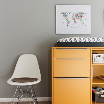
Userthis custom designed changing dresser in mango yellow was made to fit the perfect needs of a newborn baby, and have enough storage area for diapers, changing utensils, bigger and smaller items. two narrow drawers and four pull outs give practical use of the space. the rounded aluminum handles give an optimum of handling and the rounded shape prevent from unwanted bumps along the way. the furniture can be re used as regular storage cabinet for toys and the parents once baby grows up.
12