
Search results for "Physically" in Home Design Ideas

 MCDW + Architecture
Kitchen Cube 1
Upper East- Residence
Work: Full Gut renovation- 2 apartments- in the same ‘S’ line
Size: 650 Sq Ft of space in both apartments, 5S and 4S
Using the Frankfurt Kitchen of 1926 for inspiration, Ms.Cianfaglione began asking herself how the typology of the NYC kitchenette for her building, in the ‘S’ line, needed to be upgraded to fit today’s physical and aesthetic needs. The Frankfurt Kitchen was the forerunner of modern fitted kitchens and had an unified concept to enable efficient work, consolidating a woman’s efforts and allowing her more time to spend else ware. But unlike the Frankfurt kitchen, Ms. Cianfaglione wanted to take this a step further and open it up rather than concealing it, and its user, inside a room. This would showcase the designer’s evolved notion of “cooking”,that would now become an orchestrated dance to be put on display.
Ms. Cianfaglione had a typical NYC kitchenette, a small room with an air grille for ventilation, and in this case, there was a small window that was currently blocked by a refrigerator. There was also the problem of the foyer space, which was just a waste in an apartment this small, and the structural wall that could not be removed. Ms. Cianfaglione responded to these conditions by designing the kitchen to become a wrap around condition, in an ‘L’ shape, that would use the foyer more effectively and at the same time, face the living area, and all the while concealing the structural wall that separates them.
The interesting thing about the ‘L’ shape was that it allows for a beautifully orchestrated flow that makes cooking look like a beautiful dance that moves back and forth along the’ L.’
The appliances are designed within the cabinetry to give a tailored look that does not allow for distraction, and you instead focus on the user. This renovation made the otherwise small, unused foyer and ineffective kitchen, now a focal point that dictates movement throughout. The kitchen has unified and designed an otherwise standard one bedroom apartment and seeks to become a new standard in this building’s typology.

 Montana Timber Products
This featured project utilizes Montana Timber Products' ranchwood™ reclaimed barn wood alternative siding, our flagship product. ranchwood™ is a reclaimed barn wood alternative that it is milled from new, rough stock, kiln dried, chemical free wood.
ranchwood™ is put through a texturizing and coloring process to create the aesthetic beauty of rustic wood siding. Authentic reclaimed barn wood and reclaimed barn wood alternatives are both great choices for your next home project.
Typically less expensive than authentic reclaimed barn wood, ranchwood™ offers an uncompromising rustic wood beauty.
Vintage wood, reclaimed barn wood and reclaimed barn wood alternatives are very popular building materials due to their aesthetic beauty, traditional look, and chemical free finish.
If the environmentally friendly aspect of natural wood siding is important to you, be sure to do your homework when choosing your siding, interior accents, trim, timbers, or other wood siding products. Some companies choose to use degenerative chemicals to achieve the desired look and texture of rustic wood siding. This is not the case with Montana Timber Products.
Montana Timber Product's most commonly seen rustic siding texture options are Circle Sawn and Wire Brushed.
The Circle Sawn texture commonly seen on rustic reclaimed barn wood is created from the large circular saw blades used in more traditional milling practices. The Wire Brushed option, like the Circle Sawn, adds physical and aesthetic depth to the wood grain. In addition to the aesthetic beauty added from the texturing process, greater surface area is created, which allows the Seal-Once, 100% NO VOC waterproofer to more effectively penetrate the wood.
Whether you are looking for siding, beams, flooring, or interior accents, Montana Timber Products offers a solution for your rustic needs. All Montana Timber Products’ prefinished wood siding utilizes Seal-Once, a 100% NO VOC waterproofer with a 10 year limited warranty against water ingress.
 Montana Timber Products
This featured project utilizes Montana Timber Products' ranchwood™ reclaimed barn wood alternative siding, our flagship product. ranchwood™ is a reclaimed barn wood alternative that it is milled from new, rough stock, kiln dried, chemical free wood.
ranchwood™ is put through a texturizing and coloring process to create the aesthetic beauty of rustic wood siding. Authentic reclaimed barn wood and reclaimed barn wood alternatives are both great choices for your next home project.
Typically less expensive than authentic reclaimed barn wood, ranchwood™ offers an uncompromising rustic wood beauty.
Vintage wood, reclaimed barn wood and reclaimed barn wood alternatives are very popular building materials due to their aesthetic beauty, traditional look, and chemical free finish.
If the environmentally friendly aspect of natural wood siding is important to you, be sure to do your homework when choosing your siding, interior accents, trim, timbers, or other wood siding products. Some companies choose to use degenerative chemicals to achieve the desired look and texture of rustic wood siding. This is not the case with Montana Timber Products.
Montana Timber Product's most commonly seen rustic siding texture options are Circle Sawn and Wire Brushed.
The Circle Sawn texture commonly seen on rustic reclaimed barn wood is created from the large circular saw blades used in more traditional milling practices. The Wire Brushed option, like the Circle Sawn, adds physical and aesthetic depth to the wood grain. In addition to the aesthetic beauty added from the texturing process, greater surface area is created, which allows the Seal-Once, 100% NO VOC waterproofer to more effectively penetrate the wood.
Whether you are looking for siding, beams, flooring, or interior accents, Montana Timber Products offers a solution for your rustic needs. All Montana Timber Products’ prefinished wood siding utilizes Seal-Once, a 100% NO VOC waterproofer with a 10 year limited warranty against water ingress.
Find the right local pro for your project
 Almesedoors
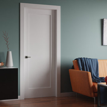
THE DOOR NAME ORIGIN - "SHAKER STYLE 1 PANEL"
How many panels should your interior door have? Well! If you’re looking for a truly no-frills product that is nonetheless elegant, this is an interior door you should consider first. This one-panel model is a truly minimal shaker-style design. While just as reliable as the interior doors in our other collections, these interior doors cost less. A lot less, in fact. Again, if simplicity is your thing, do consider this model. The original Shakers (or Shaking Quackers, as they were styled back in the Nineteenth Century) would be immensely pleased to have this product, as it most certainly adheres to their principle of utter simplicity combined with reliability. In its heyday, the community was highly influential when it came to matters of taste, not just in the United States, but in many other countries. The Baroque period that emphasized and worshipped unapologetic, insolent luxury had come to an end. Austere clas... Show more!
FINISH: WHITE
This is a bit tricky. Isn’t White the default finish that would look great on any interior door? Well, not quite.
W. is the color most often associated with perfection, honesty, cleanliness, newness, neutrality, and exactitude. The pigment has been known and used by humans since prehistoric times. In ancient Egypt, W. symbolized purity. Roman patricians paraded around in W. togas to distinguish themselves from the common folk. It was the color of choice of French monarchs. Architects of all epochs used W., with considerable enthusiasm, in various projects and for various reasons. In the United States, architects favored it when designing churches, capitols, and municipal buildings – which is, in fact, a tradition they inherited from classical and Renaissance architecture. According to some experts, most of the buildings in the celebrated Forum were either made of, or clad in, W. marble. In Taoism, it represents the yang or masculine energy, one of the two complementary natures of the universe. Many authors, both classical and contemporary, have referred to W. as a sign of purity, either physical (like William Shakespeare, whose treacherous usurper monarch wishes a heavenly rain would cleanse his blood-stained hand, washing it “white as snow”) or spiritual (like Tennessee Williams, who named his lead character Blanche (derived, incidentally, from the Germanic word blanc)) as a symbol of her innocent child-like spirit, perceptible from the moment she makes her first entrance (through the interior door stage-left).
Back in the Seventeenth Century, Sir Isaac Newton discovered that sunlight is composed of light with wavelengths across the visible spectrum which the human eye perceives as W. It is the lightest of the spectrum, and achromatic (hue-less) to boot, because it fully reflects and scatters all visible wavelengths of light, absorbing none. W. objects stand out in the dark. Depending on the surroundings, an interior door with W. finish might come off as emphatic or tactful, dominant or complementary. It blends seamlessly into most types of decor and, once the owner’s needs and disposition are taken into account, can symbolize - oh, so many different things, while bringing back a myriad memories: from those glorious snowy Alpine slopes and peaks to the fluffy tops of the wayward herd of cumulus cloud heap over the horizon on a balmy afternoon in the Caribbean. Tropical sand beaches are W. due to the high quantity of calcium carbonate they get from tiny bits of seashells ground to powder by the waves. In a number of cultures W. can also symbolize festivity, and be used lavishly to brighten up weddings, birthdays, and anniversaries. It is beautiful. Make sure it goes well with your interior door model, though.
 Granit Architects + Interiors
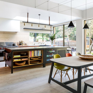
We are delighted to have completed the radical transformation of a tired detached property in South Croydon.
When they appointed Granit, our clients were living in the property which had previously been divided into a number of flats.
The historic sub-division had resulted in an extremely poor use of space with redundant staircases, kitchens and bathrooms throughout.
Our clients sought to reconfigure the property back into a single dwelling for his growing family.
Our client had an eye for design and was keen to balance contemporary design whilst maintaining as much of the character of the original house.
Maximising natural light, space and establishing a visual and physical connection were also key drivers for the design. Owing to the size of the property, it became apparent that reconfiguration rather than extension provided the solution to meet the brief.
A metal clad ‘intervention’ was introduced to the rear facade. This created a strong horizontal element creating a visual balance with the vertical nature of the three storey gable.
The metal cladding specified echoed the colour of the red brick string courses tying old with new. Slender frame sliding doors provide access and views of the large garden.
The central circulation space was transformed by the introduction of a double height glazed slot wrapping up the rear facade and onto the roof. This allows daylight to permeate into the heart of the otherwise dark deep floor plan. The staircase was reconfigured into a series of landings looking down over the main void space below and out towards the tree canopies at the rear of the garden.
The introduction of double pocket doors throughout the ground floor creates a series of interconnected spaces and the whitewashed Larch flooring flows seamlessly from room to room. A bold palette of colours and materials lends character and texture throughout the property.
The end result is a spacious yet cosy environment for the family to inhabit for years to come.
 Sosna Inc
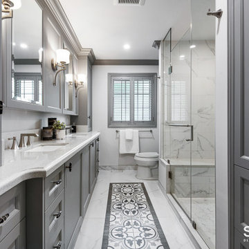
ouble the bathroom trouble in this 1990’s home … solved with this Sosna renovation!
Our clients, empty-nesters desiring the peace and ease of retirement, were instead frustrated and exhausted with leaky bathroom plumbing from a previous renovation that would just not go away.
Their Shared Bathroom, renovated by their friend years ago, was not done correctly, causing repetitive leaking with damage to their Kitchen ceiling below. They had had enough of trying to fix it themselves. To say this couple was leery of hiring another renovator was an understatement.
But they also knew it was time to fix this problem and decided to update their Master Bathroom while they were at it.
Our initial plan included minimal demolition by re-organizing the walls between the 2 Bathrooms and keeping the existing plumbing rough-ins in place, while updating the fixtures.
However, unwelcome surprises are sometimes inevitable in renovations. Even though we conducted a thorough investigation during the planning stage, we were faced with plumbing in the Shared Bathroom that was not done correctly and may even have been illegal.
Because of this, relocating the rough-ins in the Shared Bathroom were necessary after all, which then meant re-planning the walls in between the 2 Bathrooms.
These are exactly the kinds of problems we love to solve. Why? Because we know that we’re not just fixing the physical problems that can be seen; we know we are also restoring this family’s faith in quality craftsmanship and good service, and that it’s possible to enjoy the renovation process.
This is why we don’t vary from our tried and true Renovating the Sosna Way™ process.
Because it works. For everyone.
For the Masons, we ended up renovating two bathrooms and completing a number of smaller projects that were causing them great pain to find a renovator for.
At the end of the day, we have another happy client. The Masons have two new bathrooms that better fit their life stage and style, and the “Honey-Do” list is empty!
When you and your home are ready for an upgrade, we're the Renovator You Can Count On™. It's our promise. Contact us to get started!
 Montana Timber Products
This featured project utilizes Montana Timber Products' ranchwood™ reclaimed barn wood alternative siding, our flagship product. ranchwood™ is a reclaimed barn wood alternative that it is milled from new, rough stock, kiln dried, chemical free wood.
ranchwood™ is put through a texturizing and coloring process to create the aesthetic beauty of rustic wood siding. Authentic reclaimed barn wood and reclaimed barn wood alternatives are both great choices for your next home project.
Typically less expensive than authentic reclaimed barn wood, ranchwood™ offers an uncompromising rustic wood beauty.
Vintage wood, reclaimed barn wood and reclaimed barn wood alternatives are very popular building materials due to their aesthetic beauty, traditional look, and chemical free finish.
If the environmentally friendly aspect of natural wood siding is important to you, be sure to do your homework when choosing your siding, interior accents, trim, timbers, or other wood siding products. Some companies choose to use degenerative chemicals to achieve the desired look and texture of rustic wood siding. This is not the case with Montana Timber Products.
Montana Timber Product's most commonly seen rustic siding texture options are Circle Sawn and Wire Brushed.
The Circle Sawn texture commonly seen on rustic reclaimed barn wood is created from the large circular saw blades used in more traditional milling practices. The Wire Brushed option, like the Circle Sawn, adds physical and aesthetic depth to the wood grain. In addition to the aesthetic beauty added from the texturing process, greater surface area is created, which allows the Seal-Once, 100% NO VOC waterproofer to more effectively penetrate the wood.
Whether you are looking for siding, beams, flooring, or interior accents, Montana Timber Products offers a solution for your rustic needs. All Montana Timber Products’ prefinished wood siding utilizes Seal-Once, a 100% NO VOC waterproofer with a 10 year limited warranty against water ingress.

Sponsored
Sunbury, OH

J.Holderby - Renovations
Franklin County's Leading General Contractors - 2X Best of Houzz!

 Natural Stone Institute
Tucker Design Awards celebrate the innovation and vision that designers bring to their projects through the specification and use of natural stone materials. For members of the Natural Stone Institute, acknowledgment as a contributor to a Tucker Design Awards winning project is a genuine tribute to their traditional values, physicality of work, and dedication to precise specifications required in the realization of such accomplished architectural design.
Landscape Architect
Design Workshop, Aspen, CO
Landscape Contractor/
Installer
Landscape Workshop, Carbondale, CO
Stone Installer
JD Masonry, Arvada, CO
Stone Suppliers
Coldspring, Cold Spring, MN
Gallegos Corporation, Vail, CO
Through a collective dialogue between landscape, architecture and interior design, a new vision reimagines the disturbed site into a livable landscape, emblematic of our American West. The residence – an ensemble of structures designed in a modern ranch vernacular – is effortlessly unified through layered, interconnected outdoor gathering spaces and regional materials that elaborates upon the experience of moving between structures, heightening and renewing one’s sense of place. Upon entering the courtyard, one is immediately aware of seamless and unfolding relationships between architecture and landscape through a sophisticated, regional palette of natural stone, water, and plants. Set upon architectural focal points, two perpendicular sandstone paths descend into the space and converge upon a monolithic, hand-carved granite fountain. The design of the fountain is purposefully quiet, both in its detailing and operation. The feature includes a recessed interior, allowing water to become still before it reaches the surface, with lightly cleft sides, allowing the water to delicately bounce as it descends into the geometric lower granite basin. The landscape architect’s selection of various stone material extends the tones of the home’s granite walls and contextual surroundings into the garden, but also be detailed in a manner that balances rural and modern qualities. The majority of the paving is constructed of rectilinear gray sandstone with a natural finish and snapped edges, laid in a staggered running bond organization. Throughout the garden, thoughtful attention was also given to the configuration and layout of terraces, pathways, and steps. In doing so, this ensured that the edges of the terrace and its interface to other elements were designed so that no “leftover” stone paver pieces would be found. Within the central courtyard, split-faced stone stairs descend into a rectilinear plinth of lawn, punctuated by a carved granite fire pit. Leveraging the property’s existing topographic relief, a shallow infinity-edge dipping pool abstracts the transparent and cavity-like pools found throughout the Rocky Mountains. The design purposefully achieves the illusion of a larger water feature with the distant pond and offers a refreshing recreational element. Containing the infinity edge, a designed granite escarpment emerges from the meadow, juxtaposing the geometric water feature and providing informal seating ledges. The site’s prior use required the landscape architect to incorporate a highly technical and complex sub-surface structural system. The initial geotechnical report identified the building envelopes rested on 12 feet of man-placed fill. Assuming a 1 percent settlement, the team faced concerns that the terraces would settle up to 12 inches. In response, a grid of structural micro-piles provides the necessary foundation for the construction of terraces immediately outside of the architecture, under the water features and site walls. The solution enabled the crisp detailing and design resolution of the architectural structures to seamlessly connect with the horizontal stone terraces.

 Aquatica Plumbing Group
Coletta freestanding stone bathtub was designed with easy access as the principle advantage. The low profile walls of only 19.75” in height make it easier for older and physically challenged bathers such as those suffering from arthritis, to get in and out of the bathtub easily. Combining the low height feature and our firm yet smooth Aquatex material, the Coletta is a unique low step-in bathtub which puts it far ahead of the flimsy and obsolete looking competitor models found on the market.
Coletta – a charming bathtub of contrasts:
The Coletta freestanding bathtub is a wonderful paradox of contrasts. Large-scale capacity combines with elegance thanks to the carefully designed, fluid transition of the bath rim from very narrow to usefully wide. Its charm is further enhanced by the slightly tapered, narrower bath base, which looks delicate yet is very much in harmony with the rest of the design.
A small wooden masterpiece for a great number of Aquatica tubs
A stunning take on the traditional bathtub tray, this new bathtub tray incorporates the rich, warm tones of pure, solid, natural wood crafted in a very modern, uber chic design that exudes style. This is the ideal accessory for the most of Aquatica's bathtubs, as it reflects the same interpretation of the function in cleverly designed and beautifully rendered form. The solid wood balance and excellent strength. The overall size - 36.25 "x 8.25" (92 x 21 cm) gives you plenty of room to put all your bathing essentials right at hand. The wood used for this bathtub tray is 100% natural and has been treated with a teak oil to ensure waterproof impermeability and long life. It drains and self-dries freely. Can be made of Teak or Iroko wood upon request.
Integrated slot overflow brings sleek minimalistic design appeal, increased water depth, improved ergonomics, simpler and lower cost maintenance.

 User
Werner Straube
Inspiration for a transitional master light wood floor bedroom remodel in Chicago with blue walls
Inspiration for a transitional master light wood floor bedroom remodel in Chicago with blue walls

 AoDK Inc.
A couple wanted a weekend retreat without spending a majority of their getaway in an automobile. Therefore, a lot was purchased along the Rocky River with the vision of creating a nearby escape less than five miles away from their home. This 1,300 sf 24’ x 24’ dwelling is divided into a four square quadrant with the goal to create a variety of interior and exterior experiences while maintaining a rather small footprint.
Typically, when going on a weekend retreat one has the drive time to decompress. However, without this, the goal was to create a procession from the car to the house to signify such change of context. This concept was achieved through the use of a wood slatted screen wall which must be passed through. After winding around a collection of poured concrete steps and walls one comes to a wood plank bridge and crosses over a Japanese garden leaving all the stresses of the daily world behind.
The house is structured around a nine column steel frame grid, which reinforces the impression one gets of the four quadrants. The two rear quadrants intentionally house enclosed program space but once passed through, the floor plan completely opens to long views down to the mouth of the river into Lake Erie.
On the second floor the four square grid is stacked with one quadrant removed for the two story living area on the first floor to capture heightened views down the river. In a move to create complete separation there is a one quadrant roof top office with surrounding roof top garden space. The rooftop office is accessed through a unique approach by exiting onto a steel grated staircase which wraps up the exterior facade of the house. This experience provides an additional retreat within their weekend getaway, and serves as the apex of the house where one can completely enjoy the views of Lake Erie disappearing over the horizon.
Visually the house extends into the riverside site, but the four quadrant axis also physically extends creating a series of experiences out on the property. The Northeast kitchen quadrant extends out to become an exterior kitchen & dining space. The two-story Northwest living room quadrant extends out to a series of wrap around steps and lounge seating. A fire pit sits in this quadrant as well farther out in the lawn. A fruit and vegetable garden sits out in the Southwest quadrant in near proximity to the shed, and the entry sequence is contained within the Southeast quadrant extension. Internally and externally the whole house is organized in a simple and concise way and achieves the ultimate goal of creating many different experiences within a rationally sized footprint.
 AoDK Inc.
A couple wanted a weekend retreat without spending a majority of their getaway in an automobile. Therefore, a lot was purchased along the Rocky River with the vision of creating a nearby escape less than five miles away from their home. This 1,300 sf 24’ x 24’ dwelling is divided into a four square quadrant with the goal to create a variety of interior and exterior experiences while maintaining a rather small footprint.
Typically, when going on a weekend retreat one has the drive time to decompress. However, without this, the goal was to create a procession from the car to the house to signify such change of context. This concept was achieved through the use of a wood slatted screen wall which must be passed through. After winding around a collection of poured concrete steps and walls one comes to a wood plank bridge and crosses over a Japanese garden leaving all the stresses of the daily world behind.
The house is structured around a nine column steel frame grid, which reinforces the impression one gets of the four quadrants. The two rear quadrants intentionally house enclosed program space but once passed through, the floor plan completely opens to long views down to the mouth of the river into Lake Erie.
On the second floor the four square grid is stacked with one quadrant removed for the two story living area on the first floor to capture heightened views down the river. In a move to create complete separation there is a one quadrant roof top office with surrounding roof top garden space. The rooftop office is accessed through a unique approach by exiting onto a steel grated staircase which wraps up the exterior facade of the house. This experience provides an additional retreat within their weekend getaway, and serves as the apex of the house where one can completely enjoy the views of Lake Erie disappearing over the horizon.
Visually the house extends into the riverside site, but the four quadrant axis also physically extends creating a series of experiences out on the property. The Northeast kitchen quadrant extends out to become an exterior kitchen & dining space. The two-story Northwest living room quadrant extends out to a series of wrap around steps and lounge seating. A fire pit sits in this quadrant as well farther out in the lawn. A fruit and vegetable garden sits out in the Southwest quadrant in near proximity to the shed, and the entry sequence is contained within the Southeast quadrant extension. Internally and externally the whole house is organized in a simple and concise way and achieves the ultimate goal of creating many different experiences within a rationally sized footprint.
Photo: Sergiu Stoian
 Granit Architects + Interiors
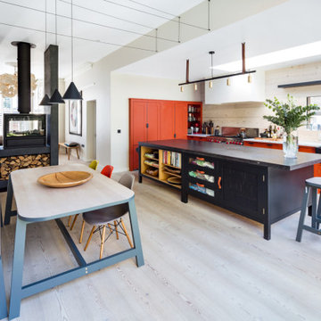
We are delighted to have completed the radical transformation of a tired detached property in South Croydon.
When they appointed Granit, our clients were living in the property which had previously been divided into a number of flats.
The historic sub-division had resulted in an extremely poor use of space with redundant staircases, kitchens and bathrooms throughout.
Our clients sought to reconfigure the property back into a single dwelling for his growing family.
Our client had an eye for design and was keen to balance contemporary design whilst maintaining as much of the character of the original house.
Maximising natural light, space and establishing a visual and physical connection were also key drivers for the design. Owing to the size of the property, it became apparent that reconfiguration rather than extension provided the solution to meet the brief.
A metal clad ‘intervention’ was introduced to the rear facade. This created a strong horizontal element creating a visual balance with the vertical nature of the three storey gable.
The metal cladding specified echoed the colour of the red brick string courses tying old with new. Slender frame sliding doors provide access and views of the large garden.
The central circulation space was transformed by the introduction of a double height glazed slot wrapping up the rear facade and onto the roof. This allows daylight to permeate into the heart of the otherwise dark deep floor plan. The staircase was reconfigured into a series of landings looking down over the main void space below and out towards the tree canopies at the rear of the garden.
The introduction of double pocket doors throughout the ground floor creates a series of interconnected spaces and the whitewashed Larch flooring flows seamlessly from room to room. A bold palette of colours and materials lends character and texture throughout the property.
The end result is a spacious yet cosy environment for the family to inhabit for years to come.
Sponsored
Sunbury, OH
J.Holderby - Renovations
Franklin County's Leading General Contractors - 2X Best of Houzz!
 O'Hanlon Kitchen & Bath
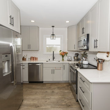
Nothing says "I love you" more than a kitchen renovation! These homeowners decided to celebrate their nuptials in the best possible way- with a new kitchen! We love how elegant the space is with the Pewter finish by Wolf Cabinetry, the classic white quartz, and herringbone tile backsplash. We wish you many years of beautiful memories- enjoy!
Cabinets: Wolf Classic Dartmouth 5 piece in Pewter.
Countertop: Calacatta Verona Q Stone
Backsplash: Herringbone- Emma White 3X6 Subway
Flooring: Mannington Vinyl plank- AduraMax Lakeview/Treeline MAX093
Additional project notes: Wolf soft close rollout, double trash pullout, wire tray divider
Thoughts from the customers:
1. What were you looking for in your remodel?
We were looking to completely redo the space. We knew we needed a new layout to accommodate the need for more storage, but also to update the extremely outdated cabinets, flooring, etc. to bring it out of 1960 and into 2020.
2. What do you love most about your remodel?
I obviously love that everything is brand new. My favorite physical feature is definitely the new backsplash and countertops that we chose! I also have never had soft close drawers so those are spectacular!
3. What was your main concern when deciding on a remodeling company?
We really just didn’t want it to take a long time! We were at home during the whole thing because of the pandemic, so it was not realistic to live without a kitchen for months.
4. What made you choose O’Hanlon Kitchens? Would you recommend O’Hanlon Kitchens?
Tracy was a great designer, and we ultimately went with O’Hanlon because she discovered some details about the kitchen and it’s functional space that others overlooked and even we didn’t notice. She was then able to render a very nice drawing of what we could expect our kitchen to look like, which was helpful. Yes, I would recommend O’Hanlon!
Photos & Video: Julia Transue
www.facebook.com/ThePhotoHouse.Art
www.thephotohouse.net
thephotohouse@comcast.net
 Coco Atelier
TER won an honorary mention as a part of the YAC’s Calamity Atelier Competition, in addition to the prestigious A' Design Award for Interior Space & Exhibition Design 2019-2020.
The Calamity Atelier competition was based in the art forest of Arte Sella in northern Italy that was in recent years destroyed by a storm. The focus was to bring back life to the forest through the design of a number of spaces.
Design concept description:
Stability is a universal value one seeks to reach in their lifetime.
Given the recent events that shook the core of Art Sella, the basis of its recovery should be in the form of a stable foundation.
The design concept of TER, Malga Costa’s new restaurant expansion, derives from 3 main ideas:
1. What does a “stable” space feel like? Psychologically and physically.
2. The connection between the forest land and the food that is served at the restaurant.
3. How to integrate this space harmoniously into the forest in a way in which it will live cohesively with the neighboring artwork, nature, and people.
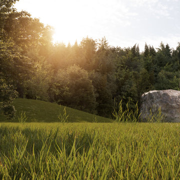
The idea of stability is translated through mass, shape, and materials. Different from most of the forest’s artwork, TER looks like a massive boulder rearing in the forest. The stone exterior makes up the majority of the interior as well, acting as its base material.
With the materials, there is a clear balance of old and new. The old acts as the foundation and pays homage to the area’s roots whereas the new alludes to a burgeoning future. Together, they play a game of layering and develop throughout the space.
The connection between the land and the food comes through the method of cooking in the restaurant- which is campfire cooking. In the center of the plan, there is an open outdoor space that is used to cook foods on an open fire. The plan is designed in a circular motion around the open space in order to fully commit to this concept. Everyone in the four areas of the restaurant can view and enjoy the chefs at work, creating a seemingly interactive dining experience.
The restaurant blends into its surroundings by acting as another rock in the landscape. It is differentiated by the smoke arising from its center, which creates a sense of allure and intrigue. It’s a sight that draws people in toward the center – reestablishing the core essence of Art Sella.

 Granit Architects + Interiors
We are delighted to have completed the radical transformation of a tired detached property in South Croydon.
When they appointed Granit, our clients were living in the property which had previously been divided into a number of flats.
The historic sub-division had resulted in an extremely poor use of space with redundant staircases, kitchens and bathrooms throughout.
Our clients sought to reconfigure the property back into a single dwelling for his growing family.
Our client had an eye for design and was keen to balance contemporary design whilst maintaining as much of the character of the original house.
Maximising natural light, space and establishing a visual and physical connection were also key drivers for the design. Owing to the size of the property, it became apparent that reconfiguration rather than extension provided the solution to meet the brief.
A metal clad ‘intervention’ was introduced to the rear facade. This created a strong horizontal element creating a visual balance with the vertical nature of the three storey gable.
The metal cladding specified echoed the colour of the red brick string courses tying old with new. Slender frame sliding doors provide access and views of the large garden.
The central circulation space was transformed by the introduction of a double height glazed slot wrapping up the rear facade and onto the roof. This allows daylight to permeate into the heart of the otherwise dark deep floor plan. The staircase was reconfigured into a series of landings looking down over the main void space below and out towards the tree canopies at the rear of the garden.
The introduction of double pocket doors throughout the ground floor creates a series of interconnected spaces and the whitewashed Larch flooring flows seamlessly from room to room. A bold palette of colours and materials lends character and texture throughout the property.
The end result is a spacious yet cosy environment for the family to inhabit for years to come.
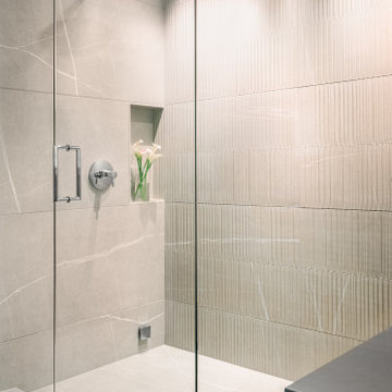
 M.O.Daby Design
Zen enSuite Bath + Steam Shower
Portland, OR
type: remodel
credits
design: Matthew O. Daby - m.o.daby design
interior design: Angela Mechaley - m.o.daby design
construction: Hayes Brothers Construction
photography: Kenton Waltz - KLIK Concepts
While the floorplan of their primary bath en-suite functioned well, the clients desired a private, spa-like retreat & finishes that better reflected their taste. Guided by existing Japanese & mid-century elements of their home, the materials and rhythm were chosen to contribute to a contemplative and relaxing environment.
One of the major upgrades was incorporating a steam shower to lend to their spa experience. Existing dark, drab cabinets that protruded into the room too deep, were replaced with a custom, white oak slatted vanity & matching linen cabinet. The lighter wood & the additional few inches gained in the walkway opened the space up visually & physically. The slatted rhythm provided visual interest through texture & depth. Custom concrete countertops with integrated, ramp sinks were selected for their wabi-sabi, textural quality & ability to have a single-material, seamless transition from countertop to sink basin with no presence of a traditional drain. The darker grey color was chosen to contrast with the cabinets but also to recede from the
darker patination of the backsplash tile & matched to the grout. A pop of color highlights the backsplash pulling green from the canopy of trees seen out the window. The tile offers subtle texture & pattern reminiscent of a raked, zen, sand garden (karesansui gardens). XL format tile in a warm, sandy tone with stone effect was selected for all floor & shower wall tiles, minimizing grout lines. A deeper, textured tile accents the back shower wall, highlighted with wall-wash recessed lighting.
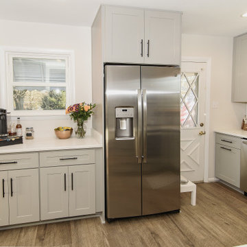 O'Hanlon Kitchen & Bath
Nothing says "I love you" more than a kitchen renovation! These homeowners decided to celebrate their nuptials in the best possible way- with a new kitchen! We love how elegant the space is with the Pewter finish by Wolf Cabinetry, the classic white quartz, and herringbone tile backsplash. We wish you many years of beautiful memories- enjoy!
Cabinets: Wolf Classic Dartmouth 5 piece in Pewter.
Countertop: Calacatta Verona Q Stone
Backsplash: Herringbone- Emma White 3X6 Subway
Flooring: Mannington Vinyl plank- AduraMax Lakeview/Treeline MAX093
Additional project notes: Wolf soft close rollout, double trash pullout, wire tray divider
Thoughts from the customers:
1. What were you looking for in your remodel?
We were looking to completely redo the space. We knew we needed a new layout to accommodate the need for more storage, but also to update the extremely outdated cabinets, flooring, etc. to bring it out of 1960 and into 2020.
2. What do you love most about your remodel?
I obviously love that everything is brand new. My favorite physical feature is definitely the new backsplash and countertops that we chose! I also have never had soft close drawers so those are spectacular!
3. What was your main concern when deciding on a remodeling company?
We really just didn’t want it to take a long time! We were at home during the whole thing because of the pandemic, so it was not realistic to live without a kitchen for months.
4. What made you choose O’Hanlon Kitchens? Would you recommend O’Hanlon Kitchens?
Tracy was a great designer, and we ultimately went with O’Hanlon because she discovered some details about the kitchen and it’s functional space that others overlooked and even we didn’t notice. She was then able to render a very nice drawing of what we could expect our kitchen to look like, which was helpful. Yes, I would recommend O’Hanlon!
Photos & Video: Julia Transue
www.facebook.com/ThePhotoHouse.Art
www.thephotohouse.net
thephotohouse@comcast.net
 MCDW + Architecture
Kitchen Cube 1
Upper East- Residence
Work: Full Gut renovation- 2 apartments- in the same ‘S’ line
Size: 650 Sq Ft of space in both apartments, 5S and 4S
Using the Frankfurt Kitchen of 1926 for inspiration, Ms.Cianfaglione began asking herself how the typology of the NYC kitchenette for her building, in the ‘S’ line, needed to be upgraded to fit today’s physical and aesthetic needs. The Frankfurt Kitchen was the forerunner of modern fitted kitchens and had an unified concept to enable efficient work, consolidating a woman’s efforts and allowing her more time to spend else ware. But unlike the Frankfurt kitchen, Ms. Cianfaglione wanted to take this a step further and open it up rather than concealing it, and its user, inside a room. This would showcase the designer’s evolved notion of “cooking”,that would now become an orchestrated dance to be put on display.
Ms. Cianfaglione had a typical NYC kitchenette, a small room with an air grille for ventilation, and in this case, there was a small window that was currently blocked by a refrigerator. There was also the problem of the foyer space, which was just a waste in an apartment this small, and the structural wall that could not be removed. Ms. Cianfaglione responded to these conditions by designing the kitchen to become a wrap around condition, in an ‘L’ shape, that would use the foyer more effectively and at the same time, face the living area, and all the while concealing the structural wall that separates them.
The interesting thing about the ‘L’ shape was that it allows for a beautifully orchestrated flow that makes cooking look like a beautiful dance that moves back and forth along the’ L.’
The appliances are designed within the cabinetry to give a tailored look that does not allow for distraction, and you instead focus on the user. This renovation made the otherwise small, unused foyer and ineffective kitchen, now a focal point that dictates movement throughout. The kitchen has unified and designed an otherwise standard one bedroom apartment and seeks to become a new standard in this building’s typology.
111