
Search results for "Physically" in Home Design Ideas

 Natural Stone Institute
Traditional Thai homes are usually built as a cluster of physically separated rooms arranged around a large central terrace. Interpreting the traditional typology of the Thai houses, the Residence Navathani consists in two parallel wings, separated by a large garden and a swimming pool. The objective of the stone architecture is to give a sense of unity and blend the building with trees, plants and other natural landscape. Trees are often allowed to grow in the central area of the traditional Thai house with plants always featured prominently to create a strong relationship with nature.
The choice of Thai travertine as the main stone for the building stems from the following objectives: first, the stone must display a strong natural character with contrasting color hues and crystalline veins, which contribute to blending the architecture into the
landscape. Second, the design of the stone provides a sense of unity to the building. The façade of each wing displays an array of columns of various widths and spacings and there is an alignment of the columns between the two wings. The texture is rough on the outside face of the columns and honed on the sides as it
continues through the window to the inside of the house. The two wings are connected by a long screen wall that separates the drop-off area from the private areas. This wall is pierced with square openings which helps to show a relationship between the two areas. The façade facing the entrance features stone in contrasting but related ways: the right hand wing is clad with honed stone on top of a large window, while the opposite wing displays
a chiseled stone wall on the bottom with a large window on top. The architecture extends to the outside of the right-hand wing with a private theater of a modern contemporary design. The stone featured on the façade changes to a minimalist grey basalt while continuing the column concept with the alternate textures grooved on the facing and honed on the sides.
 Mark Hammer Construction LTD.
Architectural Ceiling Enhancement with Modern Painted Beams
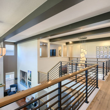
Our team expanded the design impact of this home remodel by bringing structured geometric lines into the open-concept main living areas. Designed by Interior Settings Ltd with significant pre-fabrication done by the custom built in experts at Urban Grain Custom Cabinetry, we installed a continuous series of custom structural-style painted ceiling beams that bridge the upper-level hallway loft and the dramatic, two-story vaulted great room.
• Material & Finish: Precision-crafted box beams painted in a bold, matte charcoal black/deep espresso finish. The smooth, painted texture delivers a clean, architectural look that mimics high-end steel or premium finished wood.
• Spatial Continuity & Layout: The parallel beam configuration physically and visually connects the spaces. They run seamlessly above the modern horizontal metal stair railing and extend over the open-concept living area below, emphasizing the home's impressive vertical scale.
• Lighting & Integration: Cleverly designed to integrate recessed LED pot lighting along the hallway walkway, while perfectly framing the large, modern transitional pendant chandeliers hanging over the main living room.
• Complementary Design Elements: The dark, painted ceiling features provide a crisp, high-contrast anchor against the bright white walls, wide-plank light oak hardwood floors, and abundant natural light coming from the upper clerestory windows.

 AoDK Inc.
A couple wanted a weekend retreat without spending a majority of their getaway in an automobile. Therefore, a lot was purchased along the Rocky River with the vision of creating a nearby escape less than five miles away from their home. This 1,300 sf 24’ x 24’ dwelling is divided into a four square quadrant with the goal to create a variety of interior and exterior experiences while maintaining a rather small footprint.
Typically, when going on a weekend retreat one has the drive time to decompress. However, without this, the goal was to create a procession from the car to the house to signify such change of context. This concept was achieved through the use of a wood slatted screen wall which must be passed through. After winding around a collection of poured concrete steps and walls one comes to a wood plank bridge and crosses over a Japanese garden leaving all the stresses of the daily world behind.
The house is structured around a nine column steel frame grid, which reinforces the impression one gets of the four quadrants. The two rear quadrants intentionally house enclosed program space but once passed through, the floor plan completely opens to long views down to the mouth of the river into Lake Erie.
On the second floor the four square grid is stacked with one quadrant removed for the two story living area on the first floor to capture heightened views down the river. In a move to create complete separation there is a one quadrant roof top office with surrounding roof top garden space. The rooftop office is accessed through a unique approach by exiting onto a steel grated staircase which wraps up the exterior facade of the house. This experience provides an additional retreat within their weekend getaway, and serves as the apex of the house where one can completely enjoy the views of Lake Erie disappearing over the horizon.
Visually the house extends into the riverside site, but the four quadrant axis also physically extends creating a series of experiences out on the property. The Northeast kitchen quadrant extends out to become an exterior kitchen & dining space. The two-story Northwest living room quadrant extends out to a series of wrap around steps and lounge seating. A fire pit sits in this quadrant as well farther out in the lawn. A fruit and vegetable garden sits out in the Southwest quadrant in near proximity to the shed, and the entry sequence is contained within the Southeast quadrant extension. Internally and externally the whole house is organized in a simple and concise way and achieves the ultimate goal of creating many different experiences within a rationally sized footprint.
Photo: Sergiu Stoian
Find the right local pro for your project

 Panda Windows & Doors
The Belfast Residence in Ohio is a new construction, custom modern house situated on a 150 acre farm. Panda solved the challenge of extending the intimate space of the kitchen into the expansiveness of the backyard by installing fully retractable TS.60 All Aluminum Thermally Broken Folding Door Systems. Custom designed for this space, this elegant and durable folding door system spans the entire wall of the kitchen. This door system uses cutting-edge aluminum extrusions with a polyamide bar to connect the frame together while reducing heat or cold transfer. When closed, this Bi-Fold door system provides a protective barrier that lowers u-factors, limits condensation, increases energy performance, and most of all reduces thermal conductivity.
The architectural firm, Drawing Dept. designed a cantilevered roof reaching out over the pool on axis with a sunken fire pit, drawing the geometry of the house further out into the landscape. As a result, the heart of the home unrestrictedly extends toward the fire pit for optimal physical and visual connection.
Impressive architectural design intertwined with Panda’s custom Bi-Fold doors can create unimaginable opportunities. No wonder this home was awarded the 2013 Merit Award from the American Institute of Architects (AIA) Cincinnati and the 2013 Honor Award from the CDA + Cincinnati Magazine for its exterior space!
Panda’s custom designed Bi-Fold Doors ensure that a homeowner can equally and cohesively enjoy their interior and exterior spaces. Views from the house and views of the house should hold equal merit.
To view more of Panda’s Bi-Fold Doors, please check out our gallery http://www.panda-windows.com/products/by-type/folding-doors.
Architect: Drawing Dept.
Contractor: Camery Hensley Construction
Photography: Ross Van Pelt
 Panda Windows & Doors
The Belfast Residence in Ohio is a new construction, custom modern house situated on a 150 acre farm. Panda solved the challenge of extending the intimate space of the kitchen into the expansiveness of the backyard by installing fully retractable TS.60 All Aluminum Thermally Broken Folding Door Systems. Custom designed for this space, this elegant and durable folding door system spans the entire wall of the kitchen. This door system uses cutting-edge aluminum extrusions with a polyamide bar to connect the frame together while reducing heat or cold transfer. When closed, this Bi-Fold door system provides a protective barrier that lowers u-factors, limits condensation, increases energy performance, and most of all reduces thermal conductivity.
The architectural firm, Drawing Dept. designed a cantilevered roof reaching out over the pool on axis with a sunken fire pit, drawing the geometry of the house further out into the landscape. As a result, the heart of the home unrestrictedly extends toward the fire pit for optimal physical and visual connection.
Impressive architectural design intertwined with Panda’s custom Bi-Fold doors can create unimaginable opportunities. No wonder this home was awarded the 2013 Merit Award from the American Institute of Architects (AIA) Cincinnati and the 2013 Honor Award from the CDA + Cincinnati Magazine for its exterior space!
Panda’s custom designed Bi-Fold Doors ensure that a homeowner can equally and cohesively enjoy their interior and exterior spaces. Views from the house and views of the house should hold equal merit.
To view more of Panda’s Bi-Fold Doors, please check out our gallery http://www.panda-windows.com/products/by-type/folding-doors.
Architect: Drawing Dept.
Contractor: Camery Hensley Construction
Photography: Ross Van Pelt

 MCDW + Architecture
Kitchen Cube 1
Upper East- Residence
Work: Full Gut renovation- 2 apartments- in the same ‘S’ line
Size: 650 Sq Ft of space in both apartments, 5S and 4S
Using the Frankfurt Kitchen of 1926 for inspiration, Ms.Cianfaglione began asking herself how the typology of the NYC kitchenette for her building, in the ‘S’ line, needed to be upgraded to fit today’s physical and aesthetic needs. The Frankfurt Kitchen was the forerunner of modern fitted kitchens and had an unified concept to enable efficient work, consolidating a woman’s efforts and allowing her more time to spend else ware. But unlike the Frankfurt kitchen, Ms. Cianfaglione wanted to take this a step further and open it up rather than concealing it, and its user, inside a room. This would showcase the designer’s evolved notion of “cooking”,that would now become an orchestrated dance to be put on display.
Ms. Cianfaglione had a typical NYC kitchenette, a small room with an air grille for ventilation, and in this case, there was a small window that was currently blocked by a refrigerator. There was also the problem of the foyer space, which was just a waste in an apartment this small, and the structural wall that could not be removed. Ms. Cianfaglione responded to these conditions by designing the kitchen to become a wrap around condition, in an ‘L’ shape, that would use the foyer more effectively and at the same time, face the living area, and all the while concealing the structural wall that separates them.
The interesting thing about the ‘L’ shape was that it allows for a beautifully orchestrated flow that makes cooking look like a beautiful dance that moves back and forth along the’ L.’
The appliances are designed within the cabinetry to give a tailored look that does not allow for distraction, and you instead focus on the user. This renovation made the otherwise small, unused foyer and ineffective kitchen, now a focal point that dictates movement throughout. The kitchen has unified and designed an otherwise standard one bedroom apartment and seeks to become a new standard in this building’s typology.
 M.O.Daby Design
Zen enSuite Bath + Steam Shower
Portland, OR
type: remodel
credits
design: Matthew O. Daby - m.o.daby design
interior design: Angela Mechaley - m.o.daby design
construction: Hayes Brothers Construction
photography: Kenton Waltz - KLIK Concepts
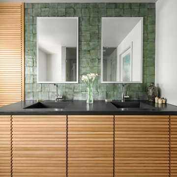
While the floorplan of their primary bath en-suite functioned well, the clients desired a private, spa-like retreat & finishes that better reflected their taste. Guided by existing Japanese & mid-century elements of their home, the materials and rhythm were chosen to contribute to a contemplative and relaxing environment.
One of the major upgrades was incorporating a steam shower to lend to their spa experience. Existing dark, drab cabinets that protruded into the room too deep, were replaced with a custom, white oak slatted vanity & matching linen cabinet. The lighter wood & the additional few inches gained in the walkway opened the space up visually & physically. The slatted rhythm provided visual interest through texture & depth. Custom concrete countertops with integrated, ramp sinks were selected for their wabi-sabi, textural quality & ability to have a single-material, seamless transition from countertop to sink basin with no presence of a traditional drain. The darker grey color was chosen to contrast with the cabinets but also to recede from the
darker patination of the backsplash tile & matched to the grout. A pop of color highlights the backsplash pulling green from the canopy of trees seen out the window. The tile offers subtle texture & pattern reminiscent of a raked, zen, sand garden (karesansui gardens). XL format tile in a warm, sandy tone with stone effect was selected for all floor & shower wall tiles, minimizing grout lines. A deeper, textured tile accents the back shower wall, highlighted with wall-wash recessed lighting.

Sponsored
Sunbury, OH

J.Holderby - Renovations
Franklin County's Leading General Contractors - 2X Best of Houzz!
 MCDW + Architecture
Kitchen Cube 1
Upper East- Residence
Work: Full Gut renovation- 2 apartments- in the same ‘S’ line
Size: 650 Sq Ft of space in both apartments, 5S and 4S
Using the Frankfurt Kitchen of 1926 for inspiration, Ms.Cianfaglione began asking herself how the typology of the NYC kitchenette for her building, in the ‘S’ line, needed to be upgraded to fit today’s physical and aesthetic needs. The Frankfurt Kitchen was the forerunner of modern fitted kitchens and had an unified concept to enable efficient work, consolidating a woman’s efforts and allowing her more time to spend else ware. But unlike the Frankfurt kitchen, Ms. Cianfaglione wanted to take this a step further and open it up rather than concealing it, and its user, inside a room. This would showcase the designer’s evolved notion of “cooking”,that would now become an orchestrated dance to be put on display.
Ms. Cianfaglione had a typical NYC kitchenette, a small room with an air grille for ventilation, and in this case, there was a small window that was currently blocked by a refrigerator. There was also the problem of the foyer space, which was just a waste in an apartment this small, and the structural wall that could not be removed. Ms. Cianfaglione responded to these conditions by designing the kitchen to become a wrap around condition, in an ‘L’ shape, that would use the foyer more effectively and at the same time, face the living area, and all the while concealing the structural wall that separates them.
The interesting thing about the ‘L’ shape was that it allows for a beautifully orchestrated flow that makes cooking look like a beautiful dance that moves back and forth along the’ L.’
The appliances are designed within the cabinetry to give a tailored look that does not allow for distraction, and you instead focus on the user. This renovation made the otherwise small, unused foyer and ineffective kitchen, now a focal point that dictates movement throughout. The kitchen has unified and designed an otherwise standard one bedroom apartment and seeks to become a new standard in this building’s typology.


 AoDK Inc.
A couple wanted a weekend retreat without spending a majority of their getaway in an automobile. Therefore, a lot was purchased along the Rocky River with the vision of creating a nearby escape less than five miles away from their home. This 1,300 sf 24’ x 24’ dwelling is divided into a four square quadrant with the goal to create a variety of interior and exterior experiences while maintaining a rather small footprint.
Typically, when going on a weekend retreat one has the drive time to decompress. However, without this, the goal was to create a procession from the car to the house to signify such change of context. This concept was achieved through the use of a wood slatted screen wall which must be passed through. After winding around a collection of poured concrete steps and walls one comes to a wood plank bridge and crosses over a Japanese garden leaving all the stresses of the daily world behind.
The house is structured around a nine column steel frame grid, which reinforces the impression one gets of the four quadrants. The two rear quadrants intentionally house enclosed program space but once passed through, the floor plan completely opens to long views down to the mouth of the river into Lake Erie.
On the second floor the four square grid is stacked with one quadrant removed for the two story living area on the first floor to capture heightened views down the river. In a move to create complete separation there is a one quadrant roof top office with surrounding roof top garden space. The rooftop office is accessed through a unique approach by exiting onto a steel grated staircase which wraps up the exterior facade of the house. This experience provides an additional retreat within their weekend getaway, and serves as the apex of the house where one can completely enjoy the views of Lake Erie disappearing over the horizon.
Visually the house extends into the riverside site, but the four quadrant axis also physically extends creating a series of experiences out on the property. The Northeast kitchen quadrant extends out to become an exterior kitchen & dining space. The two-story Northwest living room quadrant extends out to a series of wrap around steps and lounge seating. A fire pit sits in this quadrant as well farther out in the lawn. A fruit and vegetable garden sits out in the Southwest quadrant in near proximity to the shed, and the entry sequence is contained within the Southeast quadrant extension. Internally and externally the whole house is organized in a simple and concise way and achieves the ultimate goal of creating many different experiences within a rationally sized footprint.
 O'Hanlon Kitchen & Bath
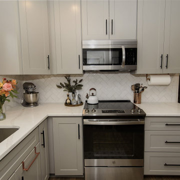
Nothing says "I love you" more than a kitchen renovation! These homeowners decided to celebrate their nuptials in the best possible way- with a new kitchen! We love how elegant the space is with the Pewter finish by Wolf Cabinetry, the classic white quartz, and herringbone tile backsplash. We wish you many years of beautiful memories- enjoy!
Cabinets: Wolf Classic Dartmouth 5 piece in Pewter.
Countertop: Calacatta Verona Q Stone
Backsplash: Herringbone- Emma White 3X6 Subway
Flooring: Mannington Vinyl plank- AduraMax Lakeview/Treeline MAX093
Additional project notes: Wolf soft close rollout, double trash pullout, wire tray divider
Thoughts from the customers:
1. What were you looking for in your remodel?
We were looking to completely redo the space. We knew we needed a new layout to accommodate the need for more storage, but also to update the extremely outdated cabinets, flooring, etc. to bring it out of 1960 and into 2020.
2. What do you love most about your remodel?
I obviously love that everything is brand new. My favorite physical feature is definitely the new backsplash and countertops that we chose! I also have never had soft close drawers so those are spectacular!
3. What was your main concern when deciding on a remodeling company?
We really just didn’t want it to take a long time! We were at home during the whole thing because of the pandemic, so it was not realistic to live without a kitchen for months.
4. What made you choose O’Hanlon Kitchens? Would you recommend O’Hanlon Kitchens?
Tracy was a great designer, and we ultimately went with O’Hanlon because she discovered some details about the kitchen and it’s functional space that others overlooked and even we didn’t notice. She was then able to render a very nice drawing of what we could expect our kitchen to look like, which was helpful. Yes, I would recommend O’Hanlon!
Photos & Video: Julia Transue
www.facebook.com/ThePhotoHouse.Art
www.thephotohouse.net
thephotohouse@comcast.net
 Canyon Design Build
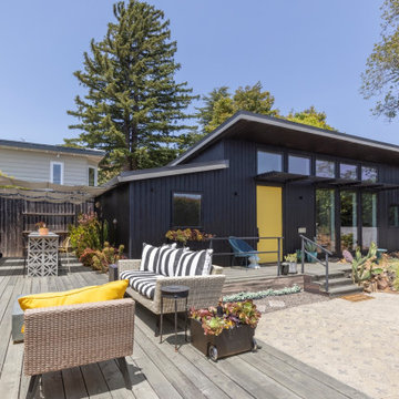
 created this Corte Madera, CA ADU as a private, accessible living space for an aging parent—complete with a full kitchen, vaulted ceilings, warm mid-century style, and a shared deck that connects the family while honoring independence.

 Montana Timber Products
This Colorado home feature's Montana Timber Products prefinished ranchwood™ natural rustic siding, as epitomized by this charming residence.
-
Montana Timber Products' flagship product, ranchwood™, is a reclaimed barnwood alternative milled from new, kiln dried, chemical free, rough stock wood.
Put through a colorizing and texturizing process, ranchwood™ is an aesthetically pleasing authentic reclaimed barn wood, rustic wood siding.
ranchwood™ offers uncompromising rustic wood beauty typically less expensive than antique reclaimed barnwood.
-
Montana Timber Products is a custom millwork shop as shown with this application of a vertically installed shiplap milled with a 1/4" reveal. This reveal creates nice shadow lines and a multi-dimensional aesthetic to the finish of this siding.
Wire Brushed and Circle Sawn are Montana Timber Products typical texturizing options. Circle Sawn texture seen on Montana Timber Products natural wood siding is created by large circular saw blades used in more traditional milling practices. Added physical and aesthetic depth to the wood grain is available as the Wire Brushed option.
Greater surface area is added during the texturizing process, allowing Seal-Once, 100% NO VOC waterfproofer to more effectively penetrate the wood.
Seal-Once is guaranteed for ten years from water ingress and is safe for exterior and interior use, pets and children.
-
Montana Timber Products does not use degenerative chemicals like some companies do to achieve texture and color. Environmentally responsible, Montana Timber Products produces wood siding, interior accents, flooring, reclaimed wood, beams, barn wood alternatives with environmentally friendly manufacturing techniques.
Sponsored
Sunbury, OH
J.Holderby - Renovations
Franklin County's Leading General Contractors - 2X Best of Houzz!
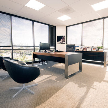
 Cantoni Dallas
A prominent entrepreneur and developer looks to Cantoni design consultant Nicole George for a workspace as inventive and statement-making as his projects. Read the full story here: http://cantoni.com/interior-design-services/projects/a-modern-workplace/
Photo by David Deleon

 David Barashi
Dale Tu
Inspiration for a large contemporary wooden floating open staircase remodel in Seattle
Inspiration for a large contemporary wooden floating open staircase remodel in Seattle

 Alykhan Velji Design
Inspiration for a contemporary gray floor bathroom remodel in Calgary with flat-panel cabinets, white cabinets, white walls, an undermount sink and white countertops
 M.O.Daby Design
Zen enSuite Bath + Steam Shower
Portland, OR
type: remodel
credits
design: Matthew O. Daby - m.o.daby design
interior design: Angela Mechaley - m.o.daby design
construction: Hayes Brothers Construction
photography: Kenton Waltz - KLIK Concepts
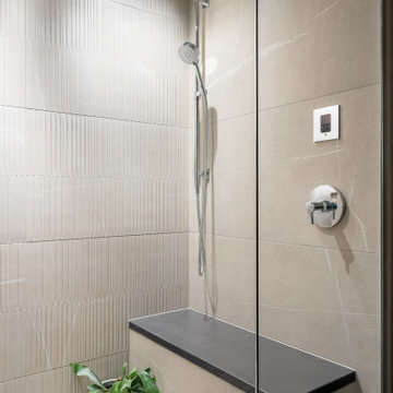
While the floorplan of their primary bath en-suite functioned well, the clients desired a private, spa-like retreat & finishes that better reflected their taste. Guided by existing Japanese & mid-century elements of their home, the materials and rhythm were chosen to contribute to a contemplative and relaxing environment.
One of the major upgrades was incorporating a steam shower to lend to their spa experience. Existing dark, drab cabinets that protruded into the room too deep, were replaced with a custom, white oak slatted vanity & matching linen cabinet. The lighter wood & the additional few inches gained in the walkway opened the space up visually & physically. The slatted rhythm provided visual interest through texture & depth. Custom concrete countertops with integrated, ramp sinks were selected for their wabi-sabi, textural quality & ability to have a single-material, seamless transition from countertop to sink basin with no presence of a traditional drain. The darker grey color was chosen to contrast with the cabinets but also to recede from the
darker patination of the backsplash tile & matched to the grout. A pop of color highlights the backsplash pulling green from the canopy of trees seen out the window. The tile offers subtle texture & pattern reminiscent of a raked, zen, sand garden (karesansui gardens). XL format tile in a warm, sandy tone with stone effect was selected for all floor & shower wall tiles, minimizing grout lines. A deeper, textured tile accents the back shower wall, highlighted with wall-wash recessed lighting.
 O'Hanlon Kitchen & Bath
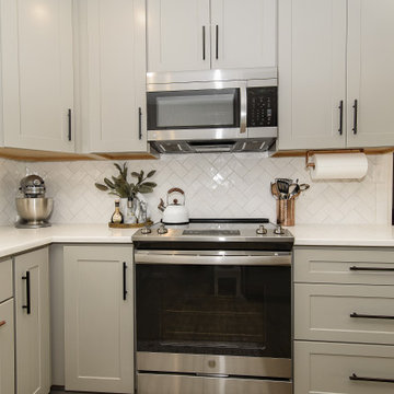
Nothing says "I love you" more than a kitchen renovation! These homeowners decided to celebrate their nuptials in the best possible way- with a new kitchen! We love how elegant the space is with the Pewter finish by Wolf Cabinetry, the classic white quartz, and herringbone tile backsplash. We wish you many years of beautiful memories- enjoy!
Cabinets: Wolf Classic Dartmouth 5 piece in Pewter.
Countertop: Calacatta Verona Q Stone
Backsplash: Herringbone- Emma White 3X6 Subway
Flooring: Mannington Vinyl plank- AduraMax Lakeview/Treeline MAX093
Additional project notes: Wolf soft close rollout, double trash pullout, wire tray divider
Thoughts from the customers:
1. What were you looking for in your remodel?
We were looking to completely redo the space. We knew we needed a new layout to accommodate the need for more storage, but also to update the extremely outdated cabinets, flooring, etc. to bring it out of 1960 and into 2020.
2. What do you love most about your remodel?
I obviously love that everything is brand new. My favorite physical feature is definitely the new backsplash and countertops that we chose! I also have never had soft close drawers so those are spectacular!
3. What was your main concern when deciding on a remodeling company?
We really just didn’t want it to take a long time! We were at home during the whole thing because of the pandemic, so it was not realistic to live without a kitchen for months.
4. What made you choose O’Hanlon Kitchens? Would you recommend O’Hanlon Kitchens?
Tracy was a great designer, and we ultimately went with O’Hanlon because she discovered some details about the kitchen and it’s functional space that others overlooked and even we didn’t notice. She was then able to render a very nice drawing of what we could expect our kitchen to look like, which was helpful. Yes, I would recommend O’Hanlon!
Photos & Video: Julia Transue
www.facebook.com/ThePhotoHouse.Art
www.thephotohouse.net
thephotohouse@comcast.net
 MCDW + Architecture
Kitchen Cube 1
Upper East- Residence
Work: Full Gut renovation- 2 apartments- in the same ‘S’ line
Size: 650 Sq Ft of space in both apartments, 5S and 4S
Using the Frankfurt Kitchen of 1926 for inspiration, Ms.Cianfaglione began asking herself how the typology of the NYC kitchenette for her building, in the ‘S’ line, needed to be upgraded to fit today’s physical and aesthetic needs. The Frankfurt Kitchen was the forerunner of modern fitted kitchens and had an unified concept to enable efficient work, consolidating a woman’s efforts and allowing her more time to spend else ware. But unlike the Frankfurt kitchen, Ms. Cianfaglione wanted to take this a step further and open it up rather than concealing it, and its user, inside a room. This would showcase the designer’s evolved notion of “cooking”,that would now become an orchestrated dance to be put on display.
Ms. Cianfaglione had a typical NYC kitchenette, a small room with an air grille for ventilation, and in this case, there was a small window that was currently blocked by a refrigerator. There was also the problem of the foyer space, which was just a waste in an apartment this small, and the structural wall that could not be removed. Ms. Cianfaglione responded to these conditions by designing the kitchen to become a wrap around condition, in an ‘L’ shape, that would use the foyer more effectively and at the same time, face the living area, and all the while concealing the structural wall that separates them.
The interesting thing about the ‘L’ shape was that it allows for a beautifully orchestrated flow that makes cooking look like a beautiful dance that moves back and forth along the’ L.’
The appliances are designed within the cabinetry to give a tailored look that does not allow for distraction, and you instead focus on the user. This renovation made the otherwise small, unused foyer and ineffective kitchen, now a focal point that dictates movement throughout. The kitchen has unified and designed an otherwise standard one bedroom apartment and seeks to become a new standard in this building’s typology.

110