
Search results for "Physically" in Home Design Ideas

 Montana Timber Products
 ranchwood™ siding is the perfect choice for this home that pays homage to the rustic settler's roots of the great state of Idaho.
ranchwood™ Tackroom and Eastern colors blend into and affirm the sage country of the high Idaho chaparrel.
Montana Timber Products' flagship product, ranchwood™ is a reclaimed barnwood alternative milled from new, kiln dried, chemical free, rough stock wood.
Put through a production process, ranchwood™ is an aesthetically pleasing authentic reclaimed barn wood, rustic wood siding; an ideal reclaimed lumber alternative.
ranchwood™ offers uncompromising rustic wood beauty typically less expensive than antique reclaimed barnwood.
ranchwood™ Circle Sawn texture frames the door for a grand entrance.
Wire Brushed and Circle Sawn are Montana Timber Products typical texturizing options, but Montana Timber Products is a custom millwork shop that caters to our customer's needs.
Circle Sawn texture seen on Montana Timber Products natural wood siding is created by large circular saw blades used in more traditional milling practices.
Added physical and aesthetic depth to the wood grain is available as the Wire Brushed option.
Greater surface area is added during the texturizing process, allowing Seal-Once, 100% NO VOC waterproofer to more effectively penetrate the wood.
Seal-Once is guaranteed for ten years from water ingress and is safe for exterior and interior use, pets and children.
Shiplap installation of our ranchwood™ produces a cozy warmth the counters even the coldest of winter's days.
If the environment is important to you, Montana Timber Products natural wood siding, trim, interior accents, timbers -- all of our wood products -- do not use degenerative chemicals as some other companies do to achieve desired effects.
 Granit Architects + Interiors
We are delighted to have completed the radical transformation of a tired detached property in South Croydon.
When they appointed Granit, our clients were living in the property which had previously been divided into a number of flats.
The historic sub-division had resulted in an extremely poor use of space with redundant staircases, kitchens and bathrooms throughout.
Our clients sought to reconfigure the property back into a single dwelling for his growing family.
Our client had an eye for design and was keen to balance contemporary design whilst maintaining as much of the character of the original house.
Maximising natural light, space and establishing a visual and physical connection were also key drivers for the design. Owing to the size of the property, it became apparent that reconfiguration rather than extension provided the solution to meet the brief.
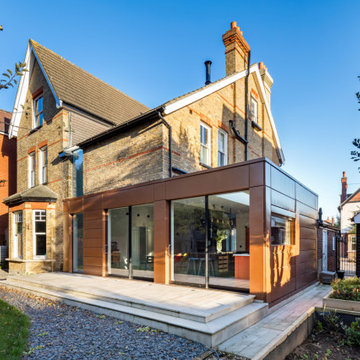
A metal clad ‘intervention’ was introduced to the rear facade. This created a strong horizontal element creating a visual balance with the vertical nature of the three storey gable.
The metal cladding specified echoed the colour of the red brick string courses tying old with new. Slender frame sliding doors provide access and views of the large garden.
The central circulation space was transformed by the introduction of a double height glazed slot wrapping up the rear facade and onto the roof. This allows daylight to permeate into the heart of the otherwise dark deep floor plan. The staircase was reconfigured into a series of landings looking down over the main void space below and out towards the tree canopies at the rear of the garden.
The introduction of double pocket doors throughout the ground floor creates a series of interconnected spaces and the whitewashed Larch flooring flows seamlessly from room to room. A bold palette of colours and materials lends character and texture throughout the property.
The end result is a spacious yet cosy environment for the family to inhabit for years to come.
 Donald Lococo Architects
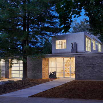
Designed in 1970 for an art collector, the existing referenced 70’s architectural principles. With its cadence of ‘70’s brick masses punctuated by a garage and a 4-foot-deep entrance recess. This recess, however, didn’t convey to the interior, which was occupied by disjointed service spaces. To solve, service spaces are moved and reorganized in open void in the garage. (See plan) This also organized the home: Service & utility on the left, reception central, and communal living spaces on the right.
To maintain clarity of the simple one-story 70’s composition, the second story add is recessive. A flex-studio/extra bedroom and office are designed ensuite creating a slender form and orienting them front to back and setting it back allows the add recede. Curves create a definite departure from the 70s home and by detailing it to "hover like a thought" above the first-floor roof and mentally removable sympathetic add.Existing unrelenting interior walls and a windowless entry, although ideal for fine art was unconducive for the young family of three. Added glass at the front recess welcomes light view and the removal of interior walls not only liberate rooms to communicate with each other but also reinform the cleared central entry space as a hub.
Even though the renovation reinforms its relationship with art, the joy and appreciation of art was not dismissed. A metal sculpture lost in the corner of the south side yard bumps the sculpture at the front entrance to the kitchen terrace over an added pedestal. (See plans) Since the roof couldn’t be railed without compromising the one-story '70s composition, the sculpture garden remains physically inaccessible however mirrors flanking the chimney allow the sculptures to be appreciated in three dimensions. The mirrors also afford privacy from the adjacent Tudor's large master bedroom addition 16-feet away.
Find the right local pro for your project
 Granit Architects + Interiors
We are delighted to have completed the radical transformation of a tired detached property in South Croydon.
When they appointed Granit, our clients were living in the property which had previously been divided into a number of flats.
The historic sub-division had resulted in an extremely poor use of space with redundant staircases, kitchens and bathrooms throughout.
Our clients sought to reconfigure the property back into a single dwelling for his growing family.
Our client had an eye for design and was keen to balance contemporary design whilst maintaining as much of the character of the original house.
Maximising natural light, space and establishing a visual and physical connection were also key drivers for the design. Owing to the size of the property, it became apparent that reconfiguration rather than extension provided the solution to meet the brief.
A metal clad ‘intervention’ was introduced to the rear facade. This created a strong horizontal element creating a visual balance with the vertical nature of the three storey gable.
The metal cladding specified echoed the colour of the red brick string courses tying old with new. Slender frame sliding doors provide access and views of the large garden.
The central circulation space was transformed by the introduction of a double height glazed slot wrapping up the rear facade and onto the roof. This allows daylight to permeate into the heart of the otherwise dark deep floor plan. The staircase was reconfigured into a series of landings looking down over the main void space below and out towards the tree canopies at the rear of the garden.
The introduction of double pocket doors throughout the ground floor creates a series of interconnected spaces and the whitewashed Larch flooring flows seamlessly from room to room. A bold palette of colours and materials lends character and texture throughout the property.
The end result is a spacious yet cosy environment for the family to inhabit for years to come.
 Granit Architects + Interiors
We are delighted to have completed the radical transformation of a tired detached property in South Croydon.
When they appointed Granit, our clients were living in the property which had previously been divided into a number of flats.
The historic sub-division had resulted in an extremely poor use of space with redundant staircases, kitchens and bathrooms throughout.
Our clients sought to reconfigure the property back into a single dwelling for his growing family.
Our client had an eye for design and was keen to balance contemporary design whilst maintaining as much of the character of the original house.
Maximising natural light, space and establishing a visual and physical connection were also key drivers for the design. Owing to the size of the property, it became apparent that reconfiguration rather than extension provided the solution to meet the brief.
A metal clad ‘intervention’ was introduced to the rear facade. This created a strong horizontal element creating a visual balance with the vertical nature of the three storey gable.
The metal cladding specified echoed the colour of the red brick string courses tying old with new. Slender frame sliding doors provide access and views of the large garden.
The central circulation space was transformed by the introduction of a double height glazed slot wrapping up the rear facade and onto the roof. This allows daylight to permeate into the heart of the otherwise dark deep floor plan. The staircase was reconfigured into a series of landings looking down over the main void space below and out towards the tree canopies at the rear of the garden.
The introduction of double pocket doors throughout the ground floor creates a series of interconnected spaces and the whitewashed Larch flooring flows seamlessly from room to room. A bold palette of colours and materials lends character and texture throughout the property.
The end result is a spacious yet cosy environment for the family to inhabit for years to come.
 Donald Lococo Architects
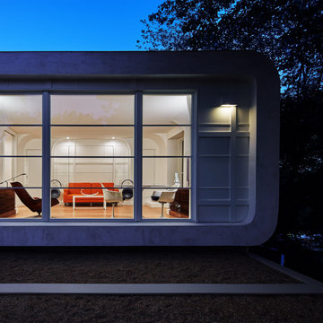
Designed in 1970 for an art collector, the existing referenced 70’s architectural principles. With its cadence of ‘70’s brick masses punctuated by a garage and a 4-foot-deep entrance recess. This recess, however, didn’t convey to the interior, which was occupied by disjointed service spaces. To solve, service spaces are moved and reorganized in open void in the garage. (See plan) This also organized the home: Service & utility on the left, reception central, and communal living spaces on the right.
To maintain clarity of the simple one-story 70’s composition, the second story add is recessive. A flex-studio/extra bedroom and office are designed ensuite creating a slender form and orienting them front to back and setting it back allows the add recede. Curves create a definite departure from the 70s home and by detailing it to "hover like a thought" above the first-floor roof and mentally removable sympathetic add.Existing unrelenting interior walls and a windowless entry, although ideal for fine art was unconducive for the young family of three. Added glass at the front recess welcomes light view and the removal of interior walls not only liberate rooms to communicate with each other but also reinform the cleared central entry space as a hub.
Even though the renovation reinforms its relationship with art, the joy and appreciation of art was not dismissed. A metal sculpture lost in the corner of the south side yard bumps the sculpture at the front entrance to the kitchen terrace over an added pedestal. (See plans) Since the roof couldn’t be railed without compromising the one-story '70s composition, the sculpture garden remains physically inaccessible however mirrors flanking the chimney allow the sculptures to be appreciated in three dimensions. The mirrors also afford privacy from the adjacent Tudor's large master bedroom addition 16-feet away.

 Natural Stone Institute
Tucker Design Awards celebrate the innovation and vision that designers bring to their projects through the specification and use of natural stone materials. For members of the Natural Stone Institute, acknowledgment as a contributor to a Tucker Design Awards winning project is a genuine tribute to their traditional values, physicality of work, and dedication to precise specifications required in the realization of such accomplished architectural design.
Landscape Architect
Design Workshop, Aspen, CO
Landscape Contractor/
Installer
Landscape Workshop, Carbondale, CO
Stone Installer
JD Masonry, Arvada, CO
Stone Suppliers
Coldspring, Cold Spring, MN
Gallegos Corporation, Vail, CO
Through a collective dialogue between landscape, architecture and interior design, a new vision reimagines the disturbed site into a livable landscape, emblematic of our American West. The residence – an ensemble of structures designed in a modern ranch vernacular – is effortlessly unified through layered, interconnected outdoor gathering spaces and regional materials that elaborates upon the experience of moving between structures, heightening and renewing one’s sense of place. Upon entering the courtyard, one is immediately aware of seamless and unfolding relationships between architecture and landscape through a sophisticated, regional palette of natural stone, water, and plants. Set upon architectural focal points, two perpendicular sandstone paths descend into the space and converge upon a monolithic, hand-carved granite fountain. The design of the fountain is purposefully quiet, both in its detailing and operation. The feature includes a recessed interior, allowing water to become still before it reaches the surface, with lightly cleft sides, allowing the water to delicately bounce as it descends into the geometric lower granite basin. The landscape architect’s selection of various stone material extends the tones of the home’s granite walls and contextual surroundings into the garden, but also be detailed in a manner that balances rural and modern qualities. The majority of the paving is constructed of rectilinear gray sandstone with a natural finish and snapped edges, laid in a staggered running bond organization. Throughout the garden, thoughtful attention was also given to the configuration and layout of terraces, pathways, and steps. In doing so, this ensured that the edges of the terrace and its interface to other elements were designed so that no “leftover” stone paver pieces would be found. Within the central courtyard, split-faced stone stairs descend into a rectilinear plinth of lawn, punctuated by a carved granite fire pit. Leveraging the property’s existing topographic relief, a shallow infinity-edge dipping pool abstracts the transparent and cavity-like pools found throughout the Rocky Mountains. The design purposefully achieves the illusion of a larger water feature with the distant pond and offers a refreshing recreational element. Containing the infinity edge, a designed granite escarpment emerges from the meadow, juxtaposing the geometric water feature and providing informal seating ledges. The site’s prior use required the landscape architect to incorporate a highly technical and complex sub-surface structural system. The initial geotechnical report identified the building envelopes rested on 12 feet of man-placed fill. Assuming a 1 percent settlement, the team faced concerns that the terraces would settle up to 12 inches. In response, a grid of structural micro-piles provides the necessary foundation for the construction of terraces immediately outside of the architecture, under the water features and site walls. The solution enabled the crisp detailing and design resolution of the architectural structures to seamlessly connect with the horizontal stone terraces.

Sponsored
Sunbury, OH

J.Holderby - Renovations
Franklin County's Leading General Contractors - 2X Best of Houzz!
 Donald Lococo Architects
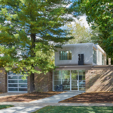
Designed in 1970 for an art collector, the existing referenced 70’s architectural principles. With its cadence of ‘70’s brick masses punctuated by a garage and a 4-foot-deep entrance recess. This recess, however, didn’t convey to the interior, which was occupied by disjointed service spaces. To solve, service spaces are moved and reorganized in open void in the garage. (See plan) This also organized the home: Service & utility on the left, reception central, and communal living spaces on the right.
To maintain clarity of the simple one-story 70’s composition, the second story add is recessive. A flex-studio/extra bedroom and office are designed ensuite creating a slender form and orienting them front to back and setting it back allows the add recede. Curves create a definite departure from the 70s home and by detailing it to "hover like a thought" above the first-floor roof and mentally removable sympathetic add.Existing unrelenting interior walls and a windowless entry, although ideal for fine art was unconducive for the young family of three. Added glass at the front recess welcomes light view and the removal of interior walls not only liberate rooms to communicate with each other but also reinform the cleared central entry space as a hub.
Even though the renovation reinforms its relationship with art, the joy and appreciation of art was not dismissed. A metal sculpture lost in the corner of the south side yard bumps the sculpture at the front entrance to the kitchen terrace over an added pedestal. (See plans) Since the roof couldn’t be railed without compromising the one-story '70s composition, the sculpture garden remains physically inaccessible however mirrors flanking the chimney allow the sculptures to be appreciated in three dimensions. The mirrors also afford privacy from the adjacent Tudor's large master bedroom addition 16-feet away.
 katherine
Office Workstations and Cubicles: The Unsung Heroes of Efficient Team Environments
In today's fast-paced business world, the hum of productivity is the sweetest sound an office can produce. But what fuels this symphony of efficiency?
While leadership and strategy are crucial, the physical environment in which a team operates plays a role that is just as vital. The debate between open-plan offices and traditional cubicles has raged for years, yet the truth is that a well-designed space incorporating both office workstations cubicles can be the key to unlocking a team's full potential. This isn't just about furniture; it's about creating a habitat for success.
The Evolution of the Workspace: Beyond the Beige Box
Gone are the days of monotonous rows of identical, soul-crushing cubicles. Modern office design has embraced a more nuanced understanding of worker needs. The contemporary workstation is a far cry from its predecessors, offering flexibility, ergonomic support, and a nod to aesthetic appeal. This evolution recognizes that a one-size-fits-all approach stifles creativity and productivity.
Fostering Focus in a Sea of Collaboration
While collaboration is a cornerstone of modern business, the need for individual, focused work remains paramount. This is where the modern cubicle shines. It provides a sanctuary from the constant distractions of a completely open office, allowing employees to delve deep into tasks that require concentration. This dedicated space minimizes interruptions, leading to higher quality work and reduced stress levels.
The Power of Personalization and Ownership
Giving employees a degree of control over their immediate environment can have a profound impact on morale and engagement. Modern workstations and cubicles that allow for personalization be it through adjustable shelving, pinboards for personal items, or even the choice of chair foster a sense of ownership. This small act of empowerment can translate into a greater sense of belonging and commitment to the organization.
Ergonomics: The Foundation of Employee Well-being and Productivity
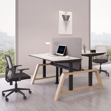
A comfortable employee is a productive employee. Ergonomics is not a luxury; it's a fundamental necessity in any office environment. Poorly designed workstations can lead to a host of musculoskeletal issues, from back pain to carpal tunnel syndrome, resulting in increased absenteeism and decreased efficiency. Investing in ergonomic chairs, adjustable-height desks, and properly positioned monitors is an investment in the long-term health and performance of your team.
Designing for Synergy: The Strategic office layout design
The arrangement of workstations and cubicles is as important as the furniture itself. A strategic office layout design can facilitate seamless communication and collaboration while still providing pockets of privacy for focused work. This involves creating "neighborhoods" for different teams, placing collaborative zones in central, easily accessible areas, and ensuring that high-traffic pathways don't cut through quiet work zones.
Breaking Down Barriers with Hybrid Designs
The most effective office environments often feature a hybrid approach. This might involve clusters of cubicles for focused work, interspersed with open, collaborative "huddle spaces" equipped with whiteboards and comfortable seating. This variety allows employees to choose the environment that best suits the task at hand, offering the best of both worlds.
The Role of Acoustics in a Thriving Workplace
Noise is one of the biggest complaints in open-plan offices. Well-designed cubicles with sound-dampening panels can significantly mitigate this issue. Furthermore, incorporating acoustic solutions throughout the office, such as sound-absorbing materials on walls and ceilings, can create a more pleasant and productive auditory environment for everyone.
Integrating Technology for a Seamless Workflow
In the digital age, technology is the lifeblood of any business. Modern office workstations are designed with this in mind, featuring integrated power and data ports, cable management systems, and ample space for multiple monitors. This seamless integration of technology ensures that employees have the tools they need to work efficiently and without frustration.
Choosing the Right Partner for Your Office Environment
The task of outfitting an office can be daunting. Partnering with a knowledgeable and reputable Meet&Co commercial furniture supplier is crucial to creating an environment that is both functional and inspiring. A good supplier will not only offer a wide range of high-quality products but will also provide expert advice on space planning and ergonomic best practices, ensuring that your investment yields the best possible return.
The Future of the Office: Flexibility and Adaptability
The world of work is constantly evolving, and office design must evolve with it. The future lies in creating flexible and adaptable spaces that can be easily reconfigured to meet the changing needs of a business. Modular furniture and movable partitions are key components of this future-proof approach, allowing organizations to scale and adapt without the need for costly and disruptive renovations.
Conclusion: A Strategic Investment in Your Greatest Asset
Ultimately, the design of your office is a direct reflection of your company's culture and values. By investing in high-quality, ergonomic, and well-designed office workstations and cubicles, you are sending a clear message to your employees: their well-being and productivity matter. This strategic investment in your physical workspace is, in fact, an investment in your most valuable asset your people. The result is a more engaged, efficient, and innovative team, ready to tackle the challenges of tomorrow.
 Granit Architects + Interiors
We are delighted to have completed the radical transformation of a tired detached property in South Croydon.
When they appointed Granit, our clients were living in the property which had previously been divided into a number of flats.
The historic sub-division had resulted in an extremely poor use of space with redundant staircases, kitchens and bathrooms throughout.
Our clients sought to reconfigure the property back into a single dwelling for his growing family.
Our client had an eye for design and was keen to balance contemporary design whilst maintaining as much of the character of the original house.
Maximising natural light, space and establishing a visual and physical connection were also key drivers for the design. Owing to the size of the property, it became apparent that reconfiguration rather than extension provided the solution to meet the brief.
A metal clad ‘intervention’ was introduced to the rear facade. This created a strong horizontal element creating a visual balance with the vertical nature of the three storey gable.
The metal cladding specified echoed the colour of the red brick string courses tying old with new. Slender frame sliding doors provide access and views of the large garden.
The central circulation space was transformed by the introduction of a double height glazed slot wrapping up the rear facade and onto the roof. This allows daylight to permeate into the heart of the otherwise dark deep floor plan. The staircase was reconfigured into a series of landings looking down over the main void space below and out towards the tree canopies at the rear of the garden.
The introduction of double pocket doors throughout the ground floor creates a series of interconnected spaces and the whitewashed Larch flooring flows seamlessly from room to room. A bold palette of colours and materials lends character and texture throughout the property.
The end result is a spacious yet cosy environment for the family to inhabit for years to come.
 Tile Doctor Ltd
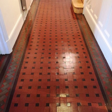
This fantastic Victorian tiled hallway floor in Oxford was in good physical condition for its age; however like any sealed floor the sealer had worn down with use and with dirt becoming trapped in the pores of the tile it was now becoming difficult to clean effectively and had become dull and un-inviting. It was now due a really good deep clean and re-seal. Oxford as I’m sure your aware has a rich history and is home to one of the world’s best universities, so not surprisingly many houses here have interesting floors such as this one.
Upon my arrival at the house, my first task was to protect the skirting boards, as well as the wooden floors leading into the other rooms. I then mixed a solution of Tile Doctor Pro-Clean, a versatile, high alkaline cleaner combined 50:50 with Tile Doctor NanoTech HBU, a particularly strong cleaner that utilises nano-sized particles to penetrate into areas of the stone that standard products simply cannot reach.
I applied the solution to the surface and allowed it to soak for thirty minutes, allowing it to get to work on the ingrained dirt so it could be easily removed. Following this, I agitated the solution with a soft brush attached to a rotary scrubbing machine. I then applied more solution and left it for a further thirty minutes, before scrubbing this into the tiles using a black pad fitted to the rotary machine.
After the clean had been completed, I rinsed the entire floor multiple times and vacuumed up the resulting slurry using a wet-vac machine.
I left the floor overnight, allowing the surface enough time to dry and returned then next day to seal the floor, checking first to ensure the tiles had dried. To seal the floor I used several coatings of Tile Doctor Seal & Go. Seal & Go which is a water-based, topical sealer that is suitable for use on unsealed, porous surfaces such as Victorian tile, textured Quarry, Slate, and Sandstone; being water based you don’t get the smell so it’s much more pleasant to work with.
As you can see from the before and after photos, the result was an aesthetically pleasing and – most importantly – clean, Victorian tiled floor. Needless to say, my client was extremely pleased with my work.
Barry Woodward
Oxfordshire Tile Doctor
 Granit Architects + Interiors
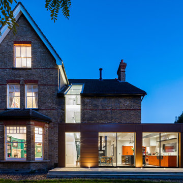
We are delighted to have completed the radical transformation of a tired detached property in South Croydon.
When they appointed Granit, our clients were living in the property which had previously been divided into a number of flats.
The historic sub-division had resulted in an extremely poor use of space with redundant staircases, kitchens and bathrooms throughout.
Our clients sought to reconfigure the property back into a single dwelling for his growing family.
Our client had an eye for design and was keen to balance contemporary design whilst maintaining as much of the character of the original house.
Maximising natural light, space and establishing a visual and physical connection were also key drivers for the design. Owing to the size of the property, it became apparent that reconfiguration rather than extension provided the solution to meet the brief.
A metal clad ‘intervention’ was introduced to the rear facade. This created a strong horizontal element creating a visual balance with the vertical nature of the three storey gable.
The metal cladding specified echoed the colour of the red brick string courses tying old with new. Slender frame sliding doors provide access and views of the large garden.
The central circulation space was transformed by the introduction of a double height glazed slot wrapping up the rear facade and onto the roof. This allows daylight to permeate into the heart of the otherwise dark deep floor plan. The staircase was reconfigured into a series of landings looking down over the main void space below and out towards the tree canopies at the rear of the garden.
The introduction of double pocket doors throughout the ground floor creates a series of interconnected spaces and the whitewashed Larch flooring flows seamlessly from room to room. A bold palette of colours and materials lends character and texture throughout the property.
The end result is a spacious yet cosy environment for the family to inhabit for years to come.
 Donald Lococo Architects
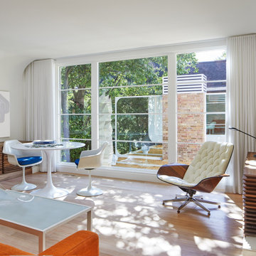
Designed in 1970 for an art collector, the existing referenced 70’s architectural principles. With its cadence of ‘70’s brick masses punctuated by a garage and a 4-foot-deep entrance recess. This recess, however, didn’t convey to the interior, which was occupied by disjointed service spaces. To solve, service spaces are moved and reorganized in open void in the garage. (See plan) This also organized the home: Service & utility on the left, reception central, and communal living spaces on the right.
To maintain clarity of the simple one-story 70’s composition, the second story add is recessive. A flex-studio/extra bedroom and office are designed ensuite creating a slender form and orienting them front to back and setting it back allows the add recede. Curves create a definite departure from the 70s home and by detailing it to "hover like a thought" above the first-floor roof and mentally removable sympathetic add.Existing unrelenting interior walls and a windowless entry, although ideal for fine art was unconducive for the young family of three. Added glass at the front recess welcomes light view and the removal of interior walls not only liberate rooms to communicate with each other but also reinform the cleared central entry space as a hub.
Even though the renovation reinforms its relationship with art, the joy and appreciation of art was not dismissed. A metal sculpture lost in the corner of the south side yard bumps the sculpture at the front entrance to the kitchen terrace over an added pedestal. (See plans) Since the roof couldn’t be railed without compromising the one-story '70s composition, the sculpture garden remains physically inaccessible however mirrors flanking the chimney allow the sculptures to be appreciated in three dimensions. The mirrors also afford privacy from the adjacent Tudor's large master bedroom addition 16-feet away.
Sponsored
Sunbury, OH
J.Holderby - Renovations
Franklin County's Leading General Contractors - 2X Best of Houzz!
 Natural Stone Institute
Traditional Thai homes are usually built as a cluster of physically separated rooms arranged around a large central terrace. Interpreting the traditional typology of the Thai houses, the Residence Navathani consists in two parallel wings, separated by a large garden and a swimming pool. The objective of the stone architecture is to give a sense of unity and blend the building with trees, plants and other natural landscape. Trees are often allowed to grow in the central area of the traditional Thai house with plants always featured prominently to create a strong relationship with nature.
The choice of Thai travertine as the main stone for the building stems from the following objectives: first, the stone must display a strong natural character with contrasting color hues and crystalline veins, which contribute to blending the architecture into the
landscape. Second, the design of the stone provides a sense of unity to the building. The façade of each wing displays an array of columns of various widths and spacings and there is an alignment of the columns between the two wings. The texture is rough on the outside face of the columns and honed on the sides as it
continues through the window to the inside of the house. The two wings are connected by a long screen wall that separates the drop-off area from the private areas. This wall is pierced with square openings which helps to show a relationship between the two areas. The façade facing the entrance features stone in contrasting but related ways: the right hand wing is clad with honed stone on top of a large window, while the opposite wing displays
a chiseled stone wall on the bottom with a large window on top. The architecture extends to the outside of the right-hand wing with a private theater of a modern contemporary design. The stone featured on the façade changes to a minimalist grey basalt while continuing the column concept with the alternate textures grooved on the facing and honed on the sides.
 O'Hanlon Kitchen & Bath
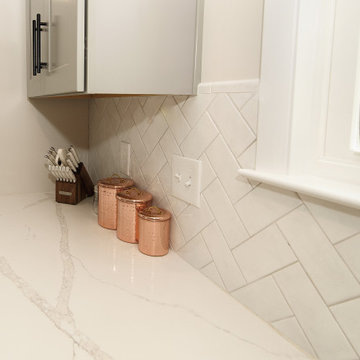
Nothing says "I love you" more than a kitchen renovation! These homeowners decided to celebrate their nuptials in the best possible way- with a new kitchen! We love how elegant the space is with the Pewter finish by Wolf Cabinetry, the classic white quartz, and herringbone tile backsplash. We wish you many years of beautiful memories- enjoy!
Cabinets: Wolf Classic Dartmouth 5 piece in Pewter.
Countertop: Calacatta Verona Q Stone
Backsplash: Herringbone- Emma White 3X6 Subway
Flooring: Mannington Vinyl plank- AduraMax Lakeview/Treeline MAX093
Additional project notes: Wolf soft close rollout, double trash pullout, wire tray divider
Thoughts from the customers:
1. What were you looking for in your remodel?
We were looking to completely redo the space. We knew we needed a new layout to accommodate the need for more storage, but also to update the extremely outdated cabinets, flooring, etc. to bring it out of 1960 and into 2020.
2. What do you love most about your remodel?
I obviously love that everything is brand new. My favorite physical feature is definitely the new backsplash and countertops that we chose! I also have never had soft close drawers so those are spectacular!
3. What was your main concern when deciding on a remodeling company?
We really just didn’t want it to take a long time! We were at home during the whole thing because of the pandemic, so it was not realistic to live without a kitchen for months.
4. What made you choose O’Hanlon Kitchens? Would you recommend O’Hanlon Kitchens?
Tracy was a great designer, and we ultimately went with O’Hanlon because she discovered some details about the kitchen and it’s functional space that others overlooked and even we didn’t notice. She was then able to render a very nice drawing of what we could expect our kitchen to look like, which was helpful. Yes, I would recommend O’Hanlon!
Photos & Video: Julia Transue
www.facebook.com/ThePhotoHouse.Art
www.thephotohouse.net
thephotohouse@comcast.net
 Donald Lococo Architects
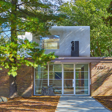
Designed in 1970 for an art collector, the existing referenced 70’s architectural principles. With its cadence of ‘70’s brick masses punctuated by a garage and a 4-foot-deep entrance recess. This recess, however, didn’t convey to the interior, which was occupied by disjointed service spaces. To solve, service spaces are moved and reorganized in open void in the garage. (See plan) This also organized the home: Service & utility on the left, reception central, and communal living spaces on the right.
To maintain clarity of the simple one-story 70’s composition, the second story add is recessive. A flex-studio/extra bedroom and office are designed ensuite creating a slender form and orienting them front to back and setting it back allows the add recede. Curves create a definite departure from the 70s home and by detailing it to "hover like a thought" above the first-floor roof and mentally removable sympathetic add.Existing unrelenting interior walls and a windowless entry, although ideal for fine art was unconducive for the young family of three. Added glass at the front recess welcomes light view and the removal of interior walls not only liberate rooms to communicate with each other but also reinform the cleared central entry space as a hub.
Even though the renovation reinforms its relationship with art, the joy and appreciation of art was not dismissed. A metal sculpture lost in the corner of the south side yard bumps the sculpture at the front entrance to the kitchen terrace over an added pedestal. (See plans) Since the roof couldn’t be railed without compromising the one-story '70s composition, the sculpture garden remains physically inaccessible however mirrors flanking the chimney allow the sculptures to be appreciated in three dimensions. The mirrors also afford privacy from the adjacent Tudor's large master bedroom addition 16-feet away.
 Montana Timber Products
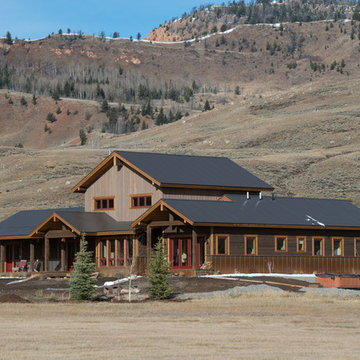
This Wyoming home feature's Montana Timber Products prefinished ranchwood™ Eastern square edge lap wood siding and ranchwood™ Yellowstone reverse board and batten siding.
-
As the sun moves across the horizon, light beautifully contrasts with the vertical installation of ranchwood Yellowstone with the lower installation of ranchwood™ Eastern, blending seamlessly into the gorgeous Wyoming landscape.
-
Montana Timber Products' flagship product, ranchwood™, is a reclaimed barnwood alternative milled from new, kiln dried, chemical free, rough stock wood.
Put through a colorizing and texturizing process, ranchwood™ is an aesthetically pleasing authentic reclaimed barn wood, rustic wood siding.
ranchwood™ offers uncompromising rustic wood beauty typically less expensive than antique reclaimed barnwood.
-
Contrasting square edge lap profile with the reverse board batten profile extenuates the rich color of ranchwood™ Eastern, providing depth to the the siding with a 3-dimensional exposure.
-
Montana Timber Products is a custom millwork shop as shown with this application of a vertically installed shiplap milled with a 1/4" reveal. This reveal creates nice shadow lines and a multi-dimensional aesthetic to the finish of this siding.
Wire Brushed and Circle Sawn are Montana Timber Products typical texturizing options. Circle Sawn texture seen on Montana Timber Products natural wood siding is created by large circular saw blades used in more traditional milling practices. Added physical and aesthetic depth to the wood grain is available as the Wire Brushed option.
Greater surface area is added during the texturizing process, allowing Seal-Once, 100% NO VOC waterfproofer to more effectively penetrate the wood.
Seal-Once is guaranteed for ten years from water ingress and is safe for exterior and interior use, pets and children.
-
The Yellowstone color is the lighter color, vertically installed on the top levels. Yellowstone’s lighter tones of gray — representing weathering through long windswept days — are perhaps one of the most treasured colors utilized from the feel of the old barn pallet.
-
Montana Timber Products does not use degenerative chemicals like some companies do to achieve texture and color. Environmentally responsible, Montana Timber Products produces wood siding, interior accents, flooring, reclaimed wood, beams, barn wood alternatives with environmentally friendly manufacturing techniques.

 Robin Amorello, CKD CAPS - Atmoscaper Design
Photos by Robin Amorello, CKD CAPS
Open concept kitchen - mid-sized contemporary l-shaped light wood floor open concept kitchen idea in Portland Maine with an undermount sink, shaker cabinets, dark wood cabinets, granite countertops, gray backsplash, glass tile backsplash, stainless steel appliances and an island
Open concept kitchen - mid-sized contemporary l-shaped light wood floor open concept kitchen idea in Portland Maine with an undermount sink, shaker cabinets, dark wood cabinets, granite countertops, gray backsplash, glass tile backsplash, stainless steel appliances and an island
 Granit Architects + Interiors
We are delighted to have completed the radical transformation of a tired detached property in South Croydon.
When they appointed Granit, our clients were living in the property which had previously been divided into a number of flats.
The historic sub-division had resulted in an extremely poor use of space with redundant staircases, kitchens and bathrooms throughout.
Our clients sought to reconfigure the property back into a single dwelling for his growing family.
Our client had an eye for design and was keen to balance contemporary design whilst maintaining as much of the character of the original house.
Maximising natural light, space and establishing a visual and physical connection were also key drivers for the design. Owing to the size of the property, it became apparent that reconfiguration rather than extension provided the solution to meet the brief.
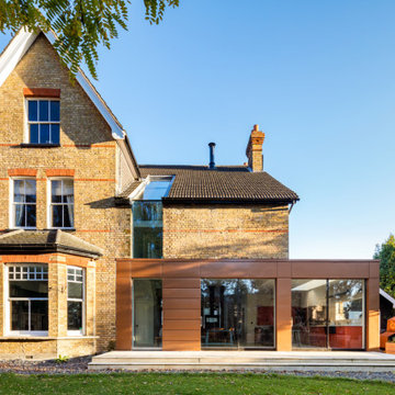
A metal clad ‘intervention’ was introduced to the rear facade. This created a strong horizontal element creating a visual balance with the vertical nature of the three storey gable.
The metal cladding specified echoed the colour of the red brick string courses tying old with new. Slender frame sliding doors provide access and views of the large garden.
The central circulation space was transformed by the introduction of a double height glazed slot wrapping up the rear facade and onto the roof. This allows daylight to permeate into the heart of the otherwise dark deep floor plan. The staircase was reconfigured into a series of landings looking down over the main void space below and out towards the tree canopies at the rear of the garden.
The introduction of double pocket doors throughout the ground floor creates a series of interconnected spaces and the whitewashed Larch flooring flows seamlessly from room to room. A bold palette of colours and materials lends character and texture throughout the property.
The end result is a spacious yet cosy environment for the family to inhabit for years to come.
 Granit Architects + Interiors
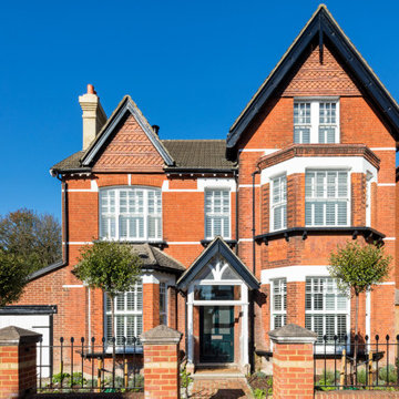
We are delighted to have completed the radical transformation of a tired detached property in South Croydon.
When they appointed Granit, our clients were living in the property which had previously been divided into a number of flats.
The historic sub-division had resulted in an extremely poor use of space with redundant staircases, kitchens and bathrooms throughout.
Our clients sought to reconfigure the property back into a single dwelling for his growing family.
Our client had an eye for design and was keen to balance contemporary design whilst maintaining as much of the character of the original house.
Maximising natural light, space and establishing a visual and physical connection were also key drivers for the design. Owing to the size of the property, it became apparent that reconfiguration rather than extension provided the solution to meet the brief.
A metal clad ‘intervention’ was introduced to the rear facade. This created a strong horizontal element creating a visual balance with the vertical nature of the three storey gable.
The metal cladding specified echoed the colour of the red brick string courses tying old with new. Slender frame sliding doors provide access and views of the large garden.
The central circulation space was transformed by the introduction of a double height glazed slot wrapping up the rear facade and onto the roof. This allows daylight to permeate into the heart of the otherwise dark deep floor plan. The staircase was reconfigured into a series of landings looking down over the main void space below and out towards the tree canopies at the rear of the garden.
The introduction of double pocket doors throughout the ground floor creates a series of interconnected spaces and the whitewashed Larch flooring flows seamlessly from room to room. A bold palette of colours and materials lends character and texture throughout the property.
The end result is a spacious yet cosy environment for the family to inhabit for years to come.
113