
Search results for "Piece problem" in Home Design Ideas
 Persona Kitchen & Bath Solutions, LLC
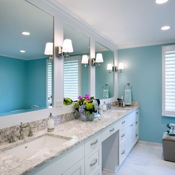
A look across the expansive double vanity where elbow room is not a problem.
Mid-sized elegant master white tile and porcelain tile porcelain tile freestanding bathtub photo in Wichita with recessed-panel cabinets, white cabinets, a two-piece toilet, blue walls, an undermount sink and quartz countertops
Mid-sized elegant master white tile and porcelain tile porcelain tile freestanding bathtub photo in Wichita with recessed-panel cabinets, white cabinets, a two-piece toilet, blue walls, an undermount sink and quartz countertops
 Alair Homes Plano
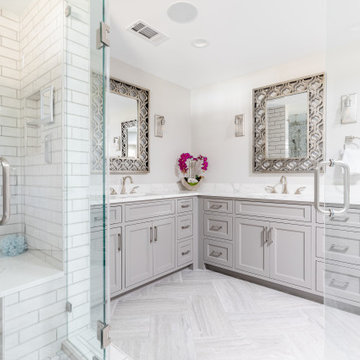
This 1964 Preston Hollow home was in the perfect location and had great bones but was not perfect for this family that likes to entertain. They wanted to open up their kitchen up to the den and entry as much as possible, as it was small and completely closed off. They needed significant wine storage and they did want a bar area but not where it was currently located. They also needed a place to stage food and drinks outside of the kitchen. There was a formal living room that was not necessary and a formal dining room that they could take or leave. Those spaces were opened up, the previous formal dining became their new home office, which was previously in the master suite. The master suite was completely reconfigured, removing the old office, and giving them a larger closet and beautiful master bathroom. The game room, which was converted from the garage years ago, was updated, as well as the bathroom, that used to be the pool bath. The closet space in that room was redesigned, adding new built-ins, and giving us more space for a larger laundry room and an additional mudroom that is now accessible from both the game room and the kitchen! They desperately needed a pool bath that was easily accessible from the backyard, without having to walk through the game room, which they had to previously use. We reconfigured their living room, adding a full bathroom that is now accessible from the backyard, fixing that problem. We did a complete overhaul to their downstairs, giving them the house they had dreamt of!
As far as the exterior is concerned, they wanted better curb appeal and a more inviting front entry. We changed the front door, and the walkway to the house that was previously slippery when wet and gave them a more open, yet sophisticated entry when you walk in. We created an outdoor space in their backyard that they will never want to leave! The back porch was extended, built a full masonry fireplace that is surrounded by a wonderful seating area, including a double hanging porch swing. The outdoor kitchen has everything they need, including tons of countertop space for entertaining, and they still have space for a large outdoor dining table. The wood-paneled ceiling and the mix-matched pavers add a great and unique design element to this beautiful outdoor living space. Scapes Incorporated did a fabulous job with their backyard landscaping, making it a perfect daily escape. They even decided to add turf to their entire backyard, keeping minimal maintenance for this busy family. The functionality this family now has in their home gives the true meaning to Living Better Starts Here™.
 Kathleen Jennison
An Arts & Crafts Bungalow is one of my favorite styles of homes. We have quite a few of them in our Stockton Mid-Town area. And when C&L called us to help them remodel their 1923 American Bungalow, I was beyond thrilled.
As per usual, when we get a new inquiry, we quickly Google the project location while we are talking to you on the phone. My excitement escalated when I saw the Google Earth Image of the sweet Sage Green bungalow in Mid-Town Stockton. "Yes, we would be interested in working with you," I said trying to keep my cool.
But what made it even better was meeting C&L and touring their home, because they are the nicest young couple, eager to make their home period perfect. Unfortunately, it had been slightly molested by some bad house-flippers, and we needed to bring the bathroom back to it "roots."
We knew we had to banish the hideous brown tile and cheap vanity quickly. But C&L complained about the condensation problems and the constant fight with mold. This immediately told me that improper remodeling had occurred and we needed to remedy that right away.
The Before: Frustrations with a Botched Remodel
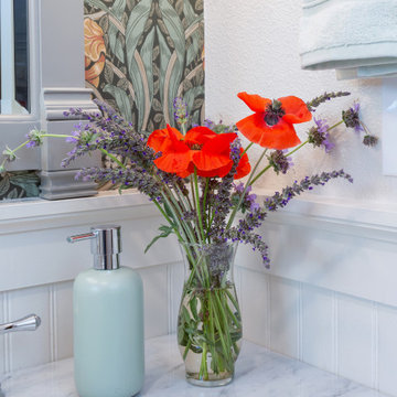
The bathroom needed to be brought back to period appropriate design with all the functionality of a modern bathroom. We thought of things like marble countertop, white mosaic floor tiles, white subway tile, board and batten molding, and of course a fabulous wallpaper.
This small (and only) bathroom on a tight budget required a little bit of design sleuthing to figure out how we could get the proper look and feel. Our goal was to determine where to splurge and where to economize and how to complete the remodel as quickly as possible because C&L would have to move out while construction was going on.
The Process: Hard Work to Remedy Design and Function
During our initial design study, (which included 2 hours in the owners’ home), we noticed framed images of William Morris Arts and Crafts textile patterns and knew this would be our design inspiration. We presented C&L with three options and they quickly selected the Pimpernel Design Concept.
We had originally selected the Black and Olive colors with a black vanity, mirror, and black and white floor tile. C&L liked it but weren’t quite sure about the black, We went back to the drawing board and decided the William & Co Pimpernel Wallpaper in Bayleaf and Manilla color with a softer gray painted vanity and mirror and white floor tile was more to their liking.
After the Design Concept was approved, we went to work securing the building permit, procuring all the elements, and scheduling our trusted tradesmen to perform the work.
We did uncover some shoddy work by the flippers such as live electrical wires hidden behind the wall, plumbing venting cut-off and buried in the walls (hence the constant dampness), the tub barely balancing on two fence boards across the floor joist, and no insulation on the exterior wall.
All of the previous blunders were fixed and the bathroom put back to its previous glory. We could feel the house thanking us for making it pretty again.
The After Reveal: Cohesive Design Decisions
We selected a simple white subway tile for the tub/shower. This is always classic and in keeping with the style of the house.
We selected a pre-fab vanity and mirror, but they look rich with the quartz countertop. There is much more storage in this small vanity than you would think.
The Transformation: A Period Perfect Refresh
We began the remodel just as the pandemic reared and stay-in-place orders went into effect. As C&L were already moved out and living with relatives, we got the go-ahead from city officials to get the work done (after all, how can you shelter in place without a bathroom?).
All our tradesmen were scheduled to work so that only one crew was on the job site at a time. We stayed on the original schedule with only a one week delay.
The end result is the sweetest little bathroom I've ever seen (and I can't wait to start work on C&L's kitchen next).
Thank you for joining me in this project transformation. I hope this inspired you to think about being creative with your design projects, determining what works best in keeping with the architecture of your space, and carefully assessing how you can have the best life in your home.
Find the right local pro for your project
 Advance Design Studio, Ltd.
Jackie and Sean loved the Algonquin neighborhood they lived in with the peaceful neighborhood and the close proximity to work and school. What they didn’t love was how outdated their home had become. With a cramped kitchen and an unused dining room, they decided a remodel was the perfect solution to their problem. They would be able to continue to live in the area they loved, while at the same time they could have the dream home they envisioned.
After a thorough search, Jackie came across Advance Design Studio. She was impressed by all of the positive reviews she saw on the internet and saw herself identifying with all of the project stories she saw on the website. Once they met with designer Scott Christensen and owner Todd Jurs, they knew Advance Design was the right company to make their dreams a reality.
The project consisted of four main areas: the kitchen/dining/powder room, the laundry room, the master bathroom, and the kid’s bathroom. They wanted to expand the kitchen into the seldom used dining room and add a large island for hosting parties and family gatherings. They also wanted new hardwood flooring throughout the first level. The laundry room needed to be more functional, and all three bathrooms were in dire need of updating.
The closed off kitchen was opened up to create a sweeping space between the new eating area and the much larger kitchen. A handsome dry bar complete with a beverage refrigerator and lighted glass door cabinetry makes an elegant transition across from a peninsula area filled with storage. An additional decorative cabinet lighting up elegant dishware through the mullioned glass sits directly across from the drybar.
An expansive island was critical to the kitchen plans. Jackie, Sean and Scott worked closely together to create just the right details for their design. They wanted the island to be functional in addition to being the centerpiece of the room. Added storage for the kid’s school supplies was hidden behind cabinet doors so the children could do their schoolwork right at the island, and a microwave drawer glides open with the touch of a finger hidden inconspicuously within the island space. The easy to care for Cambria Britannica Quartz island top with its sweeping grey and white marble look perched atop hand-carved Craftsman corbels was absolutely what they were hoping for, blending both beauty and function perfectly.
Adding a nice contrast to the brightness of the quartz and the white cabinetry, Kodiak - Leather granite countertops were used to balance the light and dark tones of the space. Dura Supreme Classic White painted cabinets grace the perimeter, while Maple Poppy Seed stained cabinets with a beautiful soft grey woodgrain were used in the beverage center and island. The two tones compliment the large space balancing it out nicely creating interest and elegance with the simple Craftsman style full overlay doors.
A deep warm Barnwood White Oak flooring was added throughout the lower level. The new floor brings additional contrast to the bright kitchen and provides unity with the now open floorplan as it rolls in to the foyer and family room. Final details like the show-stopping lunar like duo light fixtures complete the space and intermix expertly with crisscross details of the glass door mullions, the island bar seating and even accessories in the space.
The small cluttered laundry room needed more space and more storage. With a busy family it seemed to overflow daily and did not have anywhere to hide the families “in and out stuff.” Scott designed the new space with a stackable washer and dryer and much more efficiently organized cabinetry. Doing laundry is now (almost!) a pleasure and keeping everyone’s “stuff” hidden, but readily accessible is now a snap.
The master bath was not a place where the couple enjoyed spending time getting ready for their day. The tub almost never was used, so removing it made it possible to build an extra-large shower, replacing the small cramped cube of the previous shower they hated. Clean, horizontal lines softly draw your eye around the space with porcelain tile called Driftwood Sea spray. Full overlay cabinetry in a soft white vanity with double sinks makes getting ready for the day much more convenient for the busy couple.
Long floor planks made of porcelain tile mimic real hardwood floors in a soft grey to compliment the shower, but with the ease and care of a tile surface. Cambrian Black Granite counters with a matte finish and under mount porcelain sinks with handsome brushed chrome hardware complete the handsome space. A real bonus in any master bath; a custom built in storage nook was tucked in the corner of the space for linens and heavenly storage.
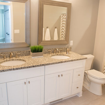
The kid’s bath was in sad shape because it was original to the house. To keep the budget in control, the tub which was in great condition was retained, but focus was on the new large brick style porcelain charcoal tile on the floor, crisp white new Craftsman style cabinetry with pretty furniture details on the corner base, a striking granite top with white under mount porcelain sinks and fresh hardware and faucets. Some beautiful soft grey wood mirrors to match mom and dads were custom sized and placed under new lighting, and 4 hooks were smartly arranged down the wall for kids’ towels.
This couple was determined not to move, and made their house their dream home. Not only does their home function greatly now, but Jackie says, “When the neighbors come to visit, they’re asking if they can “steal” the design”! The added functionality, elegance, and open floor plan were exactly what this family needed in order to stay.
Advance Design Studio, Joe Nowak
 Solace Construction, LLC
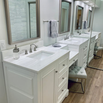
Bathroom - large traditional master white tile and ceramic tile marble floor, white floor and double-sink bathroom idea in Indianapolis with beaded inset cabinets, white cabinets, a two-piece toilet, white walls, an undermount sink, quartz countertops, white countertops and a freestanding vanity
 TTC Enterprises, LLC
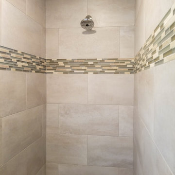
The client had a shower space without a visual showing of damage until you looked at the ceiling in the kitchen. The project was exploratory after all other measures failed to find the leak. The client went with a new look after discovering the problems in the construction of the existing shower base and waterproofing process.
 REL Interiors
David Dadekian
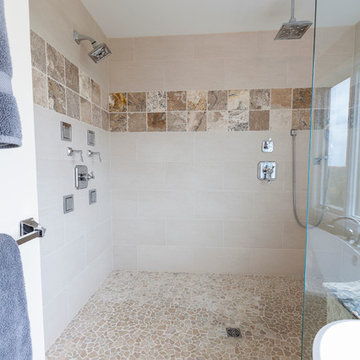
Example of a large trendy master beige tile and porcelain tile pebble tile floor and gray floor bathroom design in New York with raised-panel cabinets, brown cabinets, a two-piece toilet, yellow walls, a vessel sink and onyx countertops
Example of a large trendy master beige tile and porcelain tile pebble tile floor and gray floor bathroom design in New York with raised-panel cabinets, brown cabinets, a two-piece toilet, yellow walls, a vessel sink and onyx countertops


 Simply Baths & Kitchens
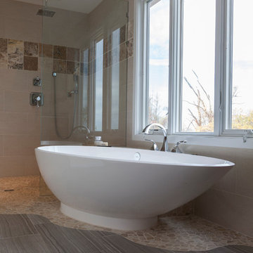
Tired of their cramped master bath, this CT couple wanted more room, an enlarged shower, a bathtub, and a natural aesthetic. With 40 square feet added from the adjacent closet, the stage was set for Rachel Peterson, of Simply Baths, Inc., to transform the space. Outfitted with nature-inspired beauty and luxury comforts, this bathroom is now a relaxing retreat.
 Modern In Mind
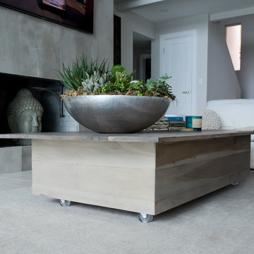
modern over-sized coffee table made from solid oak and poplar. Any dimensions, finish colors, wood species are not a problem!
Example of a minimalist family room design in Miami
Example of a minimalist family room design in Miami
 Chester County Kitchen & Bath
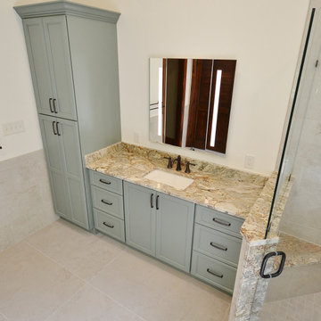
Large West Chester PA Master bath remodel. The clients wanted more storage, his and hers vanities, and no tub. A linen closet, plenty of drawers, and additional cabinetry storage were designed to solve that problem. Fieldstone cabinetry in the Moss Green painted finish really looks sharp. The floor was tiled in large 4’x4’ tiles for a clean look with minimal grout lines. The wainscoting and shower tile were also simple large tiles in a natural tone that tie in nicely with the beautiful granite countertops and shower wall caps. New trims, louvered toilet room and pocket entry door were added and stained to match the original trim throughout the home. ( Perfect match by our finisher ) Frameless glass shower surround, new lighted vanity mirrors, and additional recessed ceiling lights finish out the new look. Another awesome bathroom with happy clients.
 Bennett Design Co.
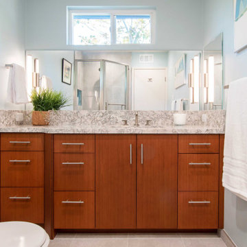
This couple's long-term water leak left their downstairs guest bathroom in disarray. It had gotten so bad that the toilet would actually rock due to the sub-floor deterioration. After the remodel, this small but mighty bathroom leaves a memorable impression on its guests, primarily because of its efficient footprint and bold use of color.
This project became necessary after a long- term water leak left the floor tile broken and the subfloor deteriorating.
Once underway, we set out to determine what other problems we could help solve in this guest bathroom. We explored several different floorplans for this space, but we ultimately decided that the general location of the fixtures worked well for these homeowners.
One of the primary concerns was to determine how we could include as much vanity storage as possible. Their old vanity included a shallow section next to the toilet, but it only had two shallow top drawers, making the bulk of the storage awkward and hard to access.
Although they liked the size of their old shower stall, the plastic insert was corroding. They also didn't have anywhere to place their shower products, and there was no place to hang a towel. We opted for a tiled shower and included a shampoo niche for their bath products. We also included a horizontal shower door handle, which doubles as a towel bar.
 S & S Homes, Inc.
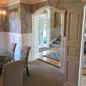
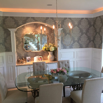
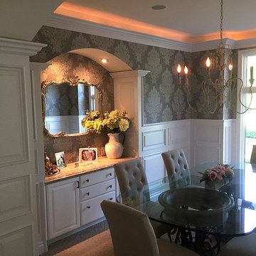
This room encompasses one of the most technical examples of woodwork we’ve seen in a long time. Normally, to create a raised panel wainscot wall, pieces of 1x wood are cut and used to create the boxes, and panel moldings are installed inside the frames to finish off the look. This can be done by typical finish carpenters. The problem is that over time, the numerous joints separate and look bad. In the case of this project, we wanted to avoid that pitfall and do something exquisite AND long-lasting. Over several days, each section of the wall was laid out to determine the appropriate size of each panel. Electrical outlets or switch plates that weren’t centered were moved. Each panel was then specially made at the shop out of 3/4” MDF because its smooth surface is ideal for painting. The raised panels (the pieces that go into each square opening) as well as the panel mouldings (the pieces that frame out each interior panel) were fabricated off site at the shop. Between the set-up, fabrication and the installation, two skilled craftsmen required three solid weeks to make each aspect absolutely perfect. Other finishing details including using a “Back Band” moulding to cap the top of the wainscot and using matching moldings (base, window casings and crown moldings) in areas that needed it for continuity of design.
This room’s woodwork is an exquisite example of true craftsmanship. Words and pictures cannot describe the level of skill required for this project. Once everything was completed, it was sprayed with white enamel paint and wallpaper was installed above the wood wainscot to finish off the room. In a nutshell, each wall panel was constructed like a custom made high end cabinet. Literally.
 S & S Homes, Inc.
This room encompasses one of the most technical examples of woodwork we’ve seen in a long time. Normally, to create a raised panel wainscot wall, pieces of 1x wood are cut and used to create the boxes, and panel moldings are installed inside the frames to finish off the look. This can be done by typical finish carpenters. The problem is that over time, the numerous joints separate and look bad. In the case of this project, we wanted to avoid that pitfall and do something exquisite AND long-lasting. Over several days, each section of the wall was laid out to determine the appropriate size of each panel. Electrical outlets or switch plates that weren’t centered were moved. Each panel was then specially made at the shop out of 3/4” MDF because its smooth surface is ideal for painting. The raised panels (the pieces that go into each square opening) as well as the panel mouldings (the pieces that frame out each interior panel) were fabricated off site at the shop. Between the set-up, fabrication and the installation, two skilled craftsmen required three solid weeks to make each aspect absolutely perfect. Other finishing details including using a “Back Band” moulding to cap the top of the wainscot and using matching moldings (base, window casings and crown moldings) in areas that needed it for continuity of design.
This room’s woodwork is an exquisite example of true craftsmanship. Words and pictures cannot describe the level of skill required for this project. Once everything was completed, it was sprayed with white enamel paint and wallpaper was installed above the wood wainscot to finish off the room. In a nutshell, each wall panel was constructed like a custom made high end cabinet. Literally.

 Bridges Const.
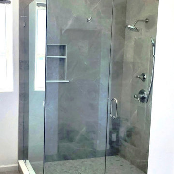
Complete M. Bath makeover, We also replaced windows that failed and solved an ongoing ext. leak problem in the stucco.
Features: New Shaker cabinetry by KCD, Quartz countertops, A dated fiberglass tub and shower enclosure was replaced with a custom shower that included a shampoo niche, frameless glass enclosure and complimentedwith new tile flooring. All new exhaust venting, Led recessed cans and Led mirrors were installed. Before and after pictures tell it all!
 Spring Creek Design
Tim & Elissa have a beautiful home in the most desirable Wyomissing neighborhood. Broad sidewalks under stately oaks, with nearby parks makes it a perfect place to raise a growing family. But their 2-bedroom mid-century rancher was becoming a squeeze. They asked Spring Creek Design to come up with a cost-effective solution to their space problem, while also tackling some of the home’s aged infrastructure.
Design Criteria:
- Increase living space by adding a new 2nd storey Master Suite.
- Enhance livability with an open floorplan on the first floor.
- Improve the connection to the outdoors.
- Update basics systems with new windows, HVAC and insulation.
- Update interior with paint & refinished floors.
Special Features:
- Bright, mid-century modern design is true to the home’s vintage.
- Custom steel cable railings at both stairways.
- New open plan creates strong connections between kitchen, living room, dining room and deck.
- High-performance Pella windows throughout, including a new triple-panel slider to the deck.
 Pinnacle Design & Remodeling
Another referral from one of our favorite clients!
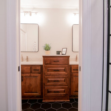
The clients wanted to update their teenage son's bathroom which had a few wear and tear issues.
There was talk to paint or replace cabinetry as the client had a vision and the current stain seemed to be in the way of that. They also wanted to be cost-effective, so we designed around the existing stained cabinetry.
Tschida Construction helped with the execution and helped with some creative behind-the-scenes problems that popped up. Having a design-build team that works together is so important and Nick and his team are awesome.
Photographer- Height Advantages
 Mjk Design, llc
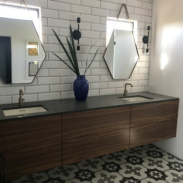
This newly remodeled bathroom was actually a closet before Mjk Design re-imagined the space. The 2 existing windows made for a bright space in a master bathroom, but were only a problem when they were in the closet (covered with towels to save the clothes within.) The homeowners now have a beautiful, bright space to start their day.
 One Kings Lane
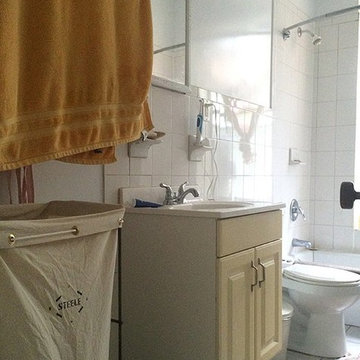
The Bathroom BEFORE: When I first saw the space this summer I knew it had potential. By focusing on a few simple upgrades, I was able to transform the space without the bathroom ever being out of commission or breaking the bank. See how this contractor-free renovation went down in a matter of days with a little planning and some creative problem-solving.
Photo by Manuel Rodriguez
 S & S Homes, Inc.
This room encompasses one of the most technical examples of woodwork we’ve seen in a long time. Normally, to create a raised panel wainscot wall, pieces of 1x wood are cut and used to create the boxes, and panel moldings are installed inside the frames to finish off the look. This can be done by typical finish carpenters. The problem is that over time, the numerous joints separate and look bad. In the case of this project, we wanted to avoid that pitfall and do something exquisite AND long-lasting. Over several days, each section of the wall was laid out to determine the appropriate size of each panel. Electrical outlets or switch plates that weren’t centered were moved. Each panel was then specially made at the shop out of 3/4” MDF because its smooth surface is ideal for painting. The raised panels (the pieces that go into each square opening) as well as the panel mouldings (the pieces that frame out each interior panel) were fabricated off site at the shop. Between the set-up, fabrication and the installation, two skilled craftsmen required three solid weeks to make each aspect absolutely perfect. Other finishing details including using a “Back Band” moulding to cap the top of the wainscot and using matching moldings (base, window casings and crown moldings) in areas that needed it for continuity of design.
This room’s woodwork is an exquisite example of true craftsmanship. Words and pictures cannot describe the level of skill required for this project. Once everything was completed, it was sprayed with white enamel paint and wallpaper was installed above the wood wainscot to finish off the room. In a nutshell, each wall panel was constructed like a custom made high end cabinet. Literally.
 Alair Homes Plano
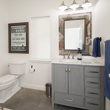
Our clients had a few things on their wish list when they called us. They want to update their kitchen, but one problem.....the husband works from home, so where is he going to work when the kitchen is being remodeled? They had discussed building a separate storage/office/guest house, so that's what we did. We built a small cottage behind their main home that is just perfect for them! On the weekends, the kids have sleepovers and love the rustic built bunk beds and giant flat screen for video games and during the week, our client has a quiet work space. Everyone is happy!
Design/Remodel by Hatfield Builders & Remodelers | Photography by Versatile Imaging #hbdallas #hatfielddesignbuild #hatfieldbuildersandremodelers #fairviewcottage #guesthouse #homeofficeaddition #addition
26