
Search results for "Piece problem" in Home Design Ideas
 Lagois Design Build Renovate
New windows, floors, powder room and basement:
We gave the home new windows, new hardwood floors, and paint throughout. We created a new main floor powder room and a new finished basement containing a living area, three-piece bathroom and new bedroom with egress (tilt and turn) windows.
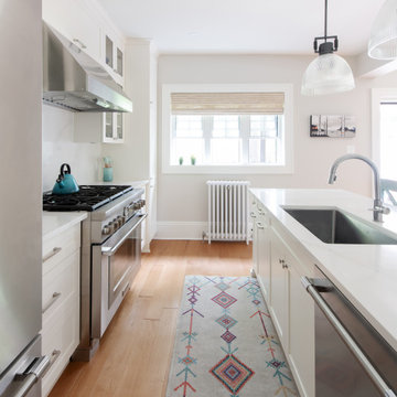
Flipped around and redesigned kitchen:
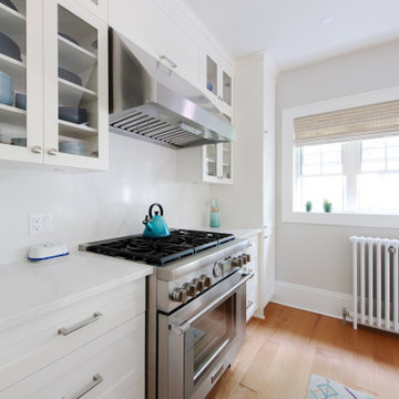
We created a new kitchen. The footprint of the kitchen stayed the same, but we flipped it around and redesigned it. Now it has a walk-in pantry area and more floorspace going in and out, which optimized the flow of traffic. We replaced the old non-functioning mudroom with a new one.
Disappearing balcony and drafty door:
To create a new space using a balcony in a bedroom, we extended the second storey out to line up with the first floor, and this increased the square footage. In that room we turned a drafty door into a window.
We reinstated the rear deck, using as many of the original pieces as we could:
There was a leaking roof problem because the original roof pitches were causing ice damming. We designed a new roof to prevent that in the future.
New windows, stucco, and the challenge of asbestos:
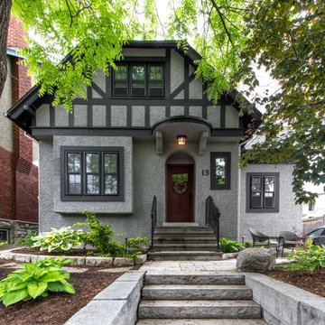
Another challenge was installing new windows in the original stucco finish, which contained asbestos. We waterproofed those properly, future proofing them from leaks.
We solved the situation by installing a 5-inch trim around the perimeter of the window. Specialists cut the asbestos back (we had to set up a containment perimeter around each window), and then we placed windows that are five inches wider than the window frames. We used special flashing tapes and sealed them all up behind the stucco.
 Lagois Design Build Renovate
New windows, floors, powder room and basement:
We gave the home new windows, new hardwood floors, and paint throughout. We created a new main floor powder room and a new finished basement containing a living area, three-piece bathroom and new bedroom with egress (tilt and turn) windows.
Flipped around and redesigned kitchen:
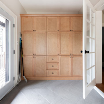
We created a new kitchen. The footprint of the kitchen stayed the same, but we flipped it around and redesigned it. Now it has a walk-in pantry area and more floorspace going in and out, which optimized the flow of traffic. We replaced the old non-functioning mudroom with a new one.
Disappearing balcony and drafty door:
To create a new space using a balcony in a bedroom, we extended the second storey out to line up with the first floor, and this increased the square footage. In that room we turned a drafty door into a window.
We reinstated the rear deck, using as many of the original pieces as we could:
There was a leaking roof problem because the original roof pitches were causing ice damming. We designed a new roof to prevent that in the future.
New windows, stucco, and the challenge of asbestos:
Another challenge was installing new windows in the original stucco finish, which contained asbestos. We waterproofed those properly, future proofing them from leaks.
We solved the situation by installing a 5-inch trim around the perimeter of the window. Specialists cut the asbestos back (we had to set up a containment perimeter around each window), and then we placed windows that are five inches wider than the window frames. We used special flashing tapes and sealed them all up behind the stucco.
 Annie Santulli Designs
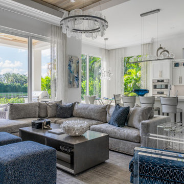
We completely remade this luxury home’s interior by tearing everything down to its studs and rebuilding it to create soft, contemporary spaces throughout that invite and fascinate.
This space was filled with heavy ornate architectural features inside and outside, including a dated chunky wooden staircase that weighed down the entire front of the home. By reformatting and replacing the fully exposed staircase and loft railing with glass, we were able to open the space and brighten the two-story living room. The oversized diamond-dropping chandelier over the entry doesn’t hurt either! The dining area appears much larger and contemporary with squared-off moldings, metallic wallpaper, unique light fixture, and bold artwork.
Bold exciting choices were made in both bathrooms when choosing tiles and slabs. These stone pieces are focal points and statement pieces garnering attention from everyone who enters. And, speaking of bold stone choices, the 10ft. book-matched porcelain slab installation in the living room is nothing less than a striking work of art.
Our client gave us a 7-month deadline. No problem we love a challenge and as you can see, we delivered and on budget!
Find the right local pro for your project
 Lagois Design Build Renovate
New windows, floors, powder room and basement:
We gave the home new windows, new hardwood floors, and paint throughout. We created a new main floor powder room and a new finished basement containing a living area, three-piece bathroom and new bedroom with egress (tilt and turn) windows.
Flipped around and redesigned kitchen:
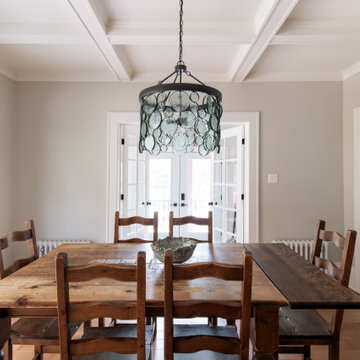
We created a new kitchen. The footprint of the kitchen stayed the same, but we flipped it around and redesigned it. Now it has a walk-in pantry area and more floorspace going in and out, which optimized the flow of traffic. We replaced the old non-functioning mudroom with a new one.
Disappearing balcony and drafty door:
To create a new space using a balcony in a bedroom, we extended the second storey out to line up with the first floor, and this increased the square footage. In that room we turned a drafty door into a window.
We reinstated the rear deck, using as many of the original pieces as we could:
There was a leaking roof problem because the original roof pitches were causing ice damming. We designed a new roof to prevent that in the future.
New windows, stucco, and the challenge of asbestos:
Another challenge was installing new windows in the original stucco finish, which contained asbestos. We waterproofed those properly, future proofing them from leaks.
We solved the situation by installing a 5-inch trim around the perimeter of the window. Specialists cut the asbestos back (we had to set up a containment perimeter around each window), and then we placed windows that are five inches wider than the window frames. We used special flashing tapes and sealed them all up behind the stucco.
 Phoenix Home Remodeling
Lisa & Juan guest bathroom struggled to meet the needs of their children, guest, and became a problem with its age. The dated fixtures and the lack of space for organization was a big problem for them.
They hired us for a solution to improve and help to make the space more functional. First, we literally went to the drawing board to design a custom vanity that will help in the storage area.
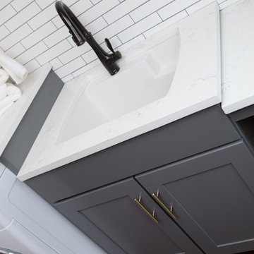
The vanity is dark grey with a white quartz countertop. A rectangular undermount sink were installed. All plumbing fixtures are from Delta Faucet and in Matte Black.
New lighting and mirrors were also installed to modernize the room and support the overall design style.
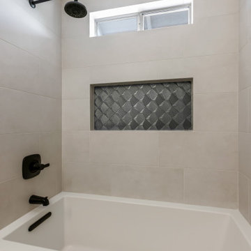
After that shifted our focus to the tub and shower. They wanted a clean, contemporary, and functional space that was low maintenance but stylish.
A new Kohler tub was installed. This tub is wider and taller for a better bathing experience. We installed a new floor as well which contrast nicely with the tub. The floor tile is called Unica Stone from Arizona Tile.
The Shower walls are called Cemento Rasato Bianco from Arizona Tile. The niche tile is a large format tile called Box Silver. This tile is 18X35 and is installed as one piece in the niche which eliminates any grout in the niche back wall.
 Lagois Design Build Renovate
New windows, floors, powder room and basement:
We gave the home new windows, new hardwood floors, and paint throughout. We created a new main floor powder room and a new finished basement containing a living area, three-piece bathroom and new bedroom with egress (tilt and turn) windows.
Flipped around and redesigned kitchen:
We created a new kitchen. The footprint of the kitchen stayed the same, but we flipped it around and redesigned it. Now it has a walk-in pantry area and more floorspace going in and out, which optimized the flow of traffic. We replaced the old non-functioning mudroom with a new one.
Disappearing balcony and drafty door:
To create a new space using a balcony in a bedroom, we extended the second storey out to line up with the first floor, and this increased the square footage. In that room we turned a drafty door into a window.
We reinstated the rear deck, using as many of the original pieces as we could:
There was a leaking roof problem because the original roof pitches were causing ice damming. We designed a new roof to prevent that in the future.
New windows, stucco, and the challenge of asbestos:
Another challenge was installing new windows in the original stucco finish, which contained asbestos. We waterproofed those properly, future proofing them from leaks.
We solved the situation by installing a 5-inch trim around the perimeter of the window. Specialists cut the asbestos back (we had to set up a containment perimeter around each window), and then we placed windows that are five inches wider than the window frames. We used special flashing tapes and sealed them all up behind the stucco.
 Lagois Design Build Renovate
New windows, floors, powder room and basement:
We gave the home new windows, new hardwood floors, and paint throughout. We created a new main floor powder room and a new finished basement containing a living area, three-piece bathroom and new bedroom with egress (tilt and turn) windows.
Flipped around and redesigned kitchen:
We created a new kitchen. The footprint of the kitchen stayed the same, but we flipped it around and redesigned it. Now it has a walk-in pantry area and more floorspace going in and out, which optimized the flow of traffic. We replaced the old non-functioning mudroom with a new one.
Disappearing balcony and drafty door:
To create a new space using a balcony in a bedroom, we extended the second storey out to line up with the first floor, and this increased the square footage. In that room we turned a drafty door into a window.
We reinstated the rear deck, using as many of the original pieces as we could:
There was a leaking roof problem because the original roof pitches were causing ice damming. We designed a new roof to prevent that in the future.
New windows, stucco, and the challenge of asbestos:
Another challenge was installing new windows in the original stucco finish, which contained asbestos. We waterproofed those properly, future proofing them from leaks.
We solved the situation by installing a 5-inch trim around the perimeter of the window. Specialists cut the asbestos back (we had to set up a containment perimeter around each window), and then we placed windows that are five inches wider than the window frames. We used special flashing tapes and sealed them all up behind the stucco.


 Annie Santulli Designs
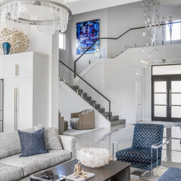
We completely remade this luxury home’s interior by tearing everything down to its studs and rebuilding it to create soft, contemporary spaces throughout that invite and fascinate.
This space was filled with heavy ornate architectural features inside and outside, including a dated chunky wooden staircase that weighed down the entire front of the home. By reformatting and replacing the fully exposed staircase and loft railing with glass, we were able to open the space and brighten the two-story living room. The oversized diamond-dropping chandelier over the entry doesn’t hurt either! The dining area appears much larger and contemporary with squared-off moldings, metallic wallpaper, unique light fixture, and bold artwork.
Bold exciting choices were made in both bathrooms when choosing tiles and slabs. These stone pieces are focal points and statement pieces garnering attention from everyone who enters. And, speaking of bold stone choices, the 10ft. book-matched porcelain slab installation in the living room is nothing less than a striking work of art.
Our client gave us a 7-month deadline. No problem we love a challenge and as you can see, we delivered and on budget!
 Advance Design Studio, Ltd.
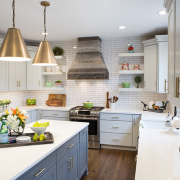
After six years of living in their Huntley IL home, Chris and Meghan were tired of their dark, dingy, outdated kitchen and it was finally time for a long-anticipated change. “The kitchen is the place where we live, it’s where we do everything,” Meghan said. “It was important that it be a space where we wanted to be.” Meghan loves cooking and enjoys including their girls in healthy meal prepping, this led them to want a brighter, more enjoyable kitchen with increased functionality and improved storage.
For Chris especially, the laundry room was an entirely dysfunctional eyesore. “We had a washer and a dryer, but it was all kind-of cobbled together!” Chris said. “There were always laundry piles everywhere, we weren’t really sure what we wanted to do in there, but it was time for us to make a change.” The mess of the space was stressful every time they walked in the door from the garage each day. Kids’ backpacks and shoes piled up haphazardly in the makeshift boot-bench closet left the family feeling disorganized and stressed. They needed space for folding clothes and locker cubbies to help keep the family organized.
Having known Christine and Todd in the Huntley community for years, Chris and Meghan were familiar with their work. “We already trusted them personally and having seen their projects for years we knew they did top notch work. After we reviewed the initial round of designs, we knew that hiring them was definitely the right choice,” Meghan and Chris said. Although Chris had done a lot of work in their home himself, the kitchen and laundry room renovation was such a large undertaking that he didn’t want to steal time away from his family to spend what would surely be many long weekends doing the job himself. “That would not have been a wise choice for us,” Chris laughed.
“Our designer, Michelle was very, very, easy to work with; anything we wanted to see or weren’t sure about, she went above and beyond to make this easy for us. She was easy to get hold of and always quick to respond,” the couple said. Michelle pulled ideas that mirrored the couple’s taste and style and was adept at directing the couple to limited choices that didn’t overwhelm them and kept the process moving. “I have a hard time making decisions. Michelle made the decision-making process so easy. I loved how she listened to what I liked and then presented three great options for me to choose from,” Meghan said.
The main objectives for the kitchen were better storage solutions, they wanted the space to reflect their lifestyle and taste, and they wanted it to last for years with low maintenance. One of the first steps in creating a more functional kitchen was relocating the refrigerator, creating an improved workflow for the busy family.
“We didn’t know that we could even move the refrigerator to a new location where it is now, that was something that we never would have thought of,” Chris said. “The new refrigerator location makes the kitchen feel so much bigger. We didn’t add any space, but our whole kitchen with the new design just seems like it’s so much larger than before!” Meghan said.
The perimeter mist colored cabinets helped warm and brighten the entire room, while the graphite colored cabinets on the island added contrast. Using this fresh, clean color palette satisfied the couple’s desire for a bright space that was the exact opposite of what they had before. Organization accessories were also added to the cabinets such as a spice drawer tray and roll outs to create hidden convenience.
“I absolutely love the hidden spices – it makes cooking so much more enjoyable!” Chris said. “And all the pull outs, and the double trash bin, who would think you could get so excited about organization!” the couple said in unison.
One thing they hated in their original kitchen was how dark the space felt. Added lighting on the ceiling with the new light fixtures combined with the lighter cabinetry colors throughout solved this problem. “Our new kitchen has this warm, almost cozy feeling that our old kitchen never had, it’s just a space that I love spending my time in now,” Meghan said. The light airy feeling was accentuated with the use of floating white shelves on either side of the decorative range hood. “We have so much cabinetry space, the new design is amazing we actually have more storage space than we will ever need,” Meghan said.
The island was extended to create more work surface and added space for stool seating. “The new island changes how we live. Now the kids can be in the kitchen with us, doing homework, eating breakfast, and the three of us have special dinners there when Chris is working late,” Meghan said.
The Carrara Marmi Quartz countertops were chosen because they are, not only beautiful, but are made from hard-working material that doesn’t require maintenance. The white subway tile backsplash that wraps to the ceiling behind the focal point cooktop range/hood compliments the crisp white countertops perfectly, while brushed brass hardware and light fixtures keep the design fresh and new.
The couple had a few fears at the beginning of the project, as most homeowners do. Their biggest fear was being out of their kitchen and laundry room for an extended time. The crew made it very easy for the family to work in a limited space keeping the washer and dryer hooked up the majority of the time, and also getting appliances working with minimal downtime.
“They above and beyond accommodated us to get us through the process,” Meghan said. “They did a great job making sure we were as comfortable as possible throughout the process,” Chris added.
“Our project manager DJ did a great job. He was very good at updating us on schedule changes, getting guys in as quickly as possible. Everyone that stepped in the house was nice and did great work,” said Chris. They thought Advance’s carpenter was phenomenal and were impressed when he took a conceptual idea from a photograph and worked with designer Michelle to create a one of a kind range/hood that has become the topic of conversation with friends and family who visit the new kitchen. “He was in our house literally every day for several weeks. He was easy to work with and good at what he did,” Meghan and Chris said.
The focal point of the kitchen; a hand-crafted, custom-built ventilation hood was clad with handpicked reclaimed barnwood. Advance Design’s carpenter built the framework and the cladding to create a one-of-a-kind design element that the couple loves.
“I think it was especially fun for him to create something unique from scratch, showcasing his talent in this area,” Meghan said. “I love that my kitchen is not like everyone else’s. I got to pick out the wood on my hood and watch it being built and was able to choose what pieces of wood went where on it. It’s totally unique.”
Red Oak flooring was toothed-in throughout the kitchen and the rest of the first floor anywhere changes were made. Then the whole floor was refinished to tone down the orange undertones in the existing floor stain, ultimately changing the color complexion of the entire first floor. The result is a completely new feeling to the entire home.
Renovating the laundry room was extremely important to Meghan and Chris, but they had trouble visualizing what the possibilities were for the seemingly small space. Michelle produced beautiful 3D illustrations that helped them envision the space in a whole new way.
“I must have told Michelle 100 times that I am a visual person, seeing the designs in 3D made it so easy to make decisions and see what we could really do with our space,” Meghan said.
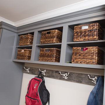
A dividing wall and doorway were removed between the existing laundry room and hallway formerly containing a coat closet, providing space to design specialized graphite colored cabinetry matching the kitchen island to house custom storage cubbies for each family member. Adding the tall utility cabinetry in the new laundry area helped solve the storage issue, tucking away cleaning supplies, household items, and even the cat got its own cubby.
“I love how everything is now hidden in its own space. I can’t tell you how much I hated coming home and seeing everything sitting around on counters,” Chris said.
Electrical outlets were planned for the inside of utility cabinets, so devices could charge in hidden locations. Stacking the washer and dryer allowed for wider countertop space to provide a folding area and a special space for clothes to hang. “The way I do laundry has been completely transformed! I can actually fold clothes and hang them now right out of the washer and dryer,” Meghan said.
“The end result in the kitchen and the laundry/mud room was an updated light and bright space, with a smarter work flow that better meets the needs of this family,” Michelle said.
“I would totally recommend Advance Design,” Meghan said. “Sometimes I sit and just look at my kitchen and laundry room and think ‘Wow, I can’t believe I get to live here!’ It’s an understatement to say we love our new space.”

 Advance Design Studio, Ltd.
Our clients in Tower Lakes, IL, needed more storage and functionality from their kitchen. They were primarily focused on finding the right combination of cabinets, shelves, and drawers that fit all their cookware, flatware, and appliances. They wanted a brighter, bigger space with a natural cooking flow and plenty of storage. Soffits and crown molding needed to be removed to make the kitchen feel larger. Redesign elements included: relocating the fridge, adding a baking station and coffee bar, and placing the microwave in the kitchen island.
Advance Design Studio’s Claudia Pop offered functional, creative, and unique solutions to the homeowners’ problems. Our clients wanted a unique kitchen that was not completely white, a balance of design and function. Claudia offered functional, creative, and unique solutions to Chad and Karen’s kitchen design challenges. The first thing to go was soffits. Today, most kitchens can benefit from the added height and space; removing soffits is nearly always step one. Steely gray-blue was the color of choice for a freshly unique look bringing a sophisticated-looking space to wrap around the fresh new kitchen. Cherry cabinetry in a true brown stain compliments the stormy accents with sharp contrasting white Cambria quartz top balancing out the space with a dramatic flair.
“We wanted something unique and special in this space, something none of the neighbors would have,” said Claudia.
The dramatic veined Cambria countertops continue upward into a backsplash behind three complimentary open shelves. These countertops provide visual texture and movement in the kitchen. The kitchen includes two larder cabinets for both the coffee bar and baking station. The kitchen is now functional and unique in design.
“When we design a new kitchen space, as designers, we are always looking for ways to balance interesting design elements with practical functionality,” Claudia said. “This kitchen’s new design is not only way more functional but is stunning in a way a piece of art can catch one’s attention.”
Decorative mullions with mirrored inserts sit atop dual sentinel pantries flanking the new refrigerator, while a 48″ dual fuel Wolf range replaced the island cooktop and double oven. The new microwave is cleverly hidden within the island, eliminating the cluttered counter and attention-grabbing wall of stainless steel from the previous space.
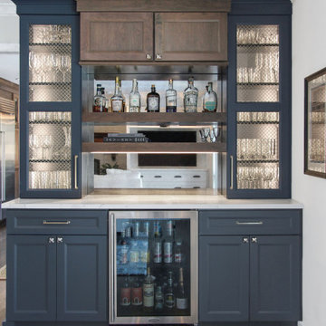
The family room was completely renovated, including a beautifully functional entertainment bar with the same combination of woods and stone as the kitchen and coffee bar. Mesh inserts instead of plain glass add visual texture while revealing pristine glassware. Handcrafted built-ins surround the fireplace.
The beautiful and efficient design created by designer Claudia transitioned directly to the installation team seamlessly, much like the basement project experience Chad and Karen enjoyed previously.
“We definitely will and have recommended Advance Design Studio to friends who are looking to embark on a project small or large,” Karen said.
“Everything that was designed and built exactly how we envisioned it, and we are really enjoying it to its full potential,” Karen said.
Our award-winning design team would love to create a beautiful, functional, and spacious place for you and your family. With our “Common Sense Remodeling” approach, the process of renovating your home has never been easier. Contact us today at 847-665-1711 or schedule an appointment.
 Paul Lopa Designs
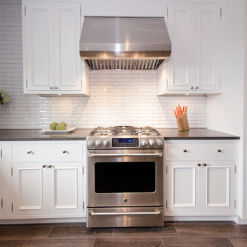
Traditional Kitchen Renovation & Design Of A First Floor Ranch.
See what our client say about Paul Lopa Designs:
It went as smooth as it possibly could go. The only bumps in the road was with what we found during demolition, you never know what your gonna run into when all the walls,floors and fixtures come out. Paul had explained to us that depending on what we found under all the out dated stuff it might take a little longer. Paul was there doing the work with his workers he showed up on time and finished on schedule. It was no problem being in touch with Paul because he answered his phone or got back to us in a timely fashion. He has an excellent sense of design he knows what goes well together and makes the house flow with comfort and usability.
(R)Haw Ron
 William Hoffman Architect
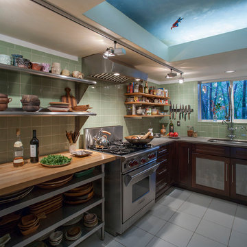
What simply started out as the purchase of a 30” Wolf gas stove to replace the old, turned into a complete kitchen renovation. The original intent was to replace the existing stove with the new. The new Wolf came other issues one being installing an adequate exhaust system to meet the needs of the stove. One thing led to the next and with that a new kitchen. The renovation included removing all existing fixtures, cabinetry and lighting. The existing tile floor remained the same but with some added area that was previously under existing base cabinets.
The goal of the project, once the decision was made to do a complete renovation, was to update the kitchen creating an eclectic aesthetic with all new fixtures of the best quality that could be afforded. Listed below are the changes that were made. All fixtures remained in their existing locations other than removing small piece of wall that allowed an extended length of the new bakers table to extend 24” into the existing dining and living room space to pull the spaces together and provide a small eating bar with adjoining bar stools. One stool was a custom design and fabrication (Marlin Stool)
Fixtures
1. Existing gas stove replaced with new 30” gas Wolf stove.
2. Existing Refrigerator replace with new 36” stainless steel Jen-Air refrigerator with bottom freezer.
3. Existing Dishwasher replace with new Jen-Air stainless steel interior and exterior dishwasher.
4. Existing base cabinets replaced with a combination of open and closed tables and cabinets. Two stainless steel commercial kitchen tables with an open bases and shelving. One with a stainless steel top the other a bakers table with a wood butcher block top. The cabinets were Kraft Made traditional wood base cabinets with a Kaffe finish and Fireslate counter surface. These cabinets were customized with stainless steel perforated door inserts and Mockett stainless steel drawer and door pulls.
5. Surface counter and table material included wood butcher block, stainless steel and Fireslate.
6. Overhead shelving included open commercial kitchen stainless steel shelves and open Appleply wood shelves with Rakks aluminum shelf brackets.
7. Existing lighting was replaced with Zumtobel track lighting with Ushio lamps, Lutron dimmers and an up lighted coffered ceiling (see Superman).
8. Existing kitchen sink was replaced with a large single compartment sink from Kindred with an In-Sinkerator Evolution garbage disposal. Filter water tap was added that connects to an Everprue water filter system.
9. Walls were tiled with Bottle Green 4 1/4” x 4 1/4” Daltile to staying consistent with existing original house tile.
10. The ceiling was reworked as required with a plaster finish
11. Marine grade caulk was used as required.
12. A soffit with up lighting was added to the periphery of kitchen facing the adjoining living and dining rooms.
13. Silver Masonite peg board storage wall adjacent to refrigerator.
Credits:
• Little Pete the Parakeet.....for being there
• Catalina Aguirre.....pots
• Many Friends....pots
• David D’Imperio.....Sputnik lamp
• Jose Maria Concha Sali.....painting
• Ron Meyers.....Plates on wall
• Bill Sanders.....Bunny screen painting
• William Hoffman....Beverly lamp
• William Hoffman.....marlin stool
• William Hoffman.....Gulfstream side chair
• William Hoffman.....Gulfstream dining table
• William Hoffman.....5 from 1 plywood chair
Problems
• A custom fabricated exhaust duct was required due to existing soffit framing conditions.
• The ceiling was not parallel to the floor so the intended full wall tile installation was held short of the ceiling.
• Return Air duct to A/C air handler required relocation
Project cost
• +/- $22,000
Fixtures, materials and appliances
Selection of fixtures, materials and fixtures were made based on quality, aesthetic and cost. Extensive research was done to find the best quality at a price point that was affordable. Items that were splurged on were the Wolf stove and Jen-Air refrigerator and dishwasher and the Zumtobel lighting
Bill Sanders Photography

Sponsored
Sunbury, OH

J.Holderby - Renovations
Franklin County's Leading General Contractors - 2X Best of Houzz!
 Kitchen Associates
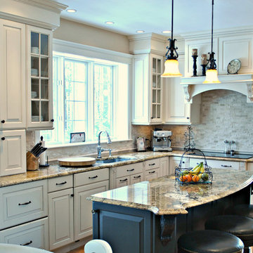
This kitchen remodel in Hopkinton, MA features Brookhaven custom cabinetry with a Winfield Raised door style. The main cabinets are Antique White on Maple with Charcoal Glaze and the island is Cottage Black with distressing. The countertop is Golden Beach granite. Design and installation by Kitchen Associates. Photo by Aaron Sponenberg.
 Advance Design Studio, Ltd.
After six years of living in their Huntley IL home, Chris and Meghan were tired of their dark, dingy, outdated kitchen and it was finally time for a long-anticipated change. “The kitchen is the place where we live, it’s where we do everything,” Meghan said. “It was important that it be a space where we wanted to be.” Meghan loves cooking and enjoys including their girls in healthy meal prepping, this led them to want a brighter, more enjoyable kitchen with increased functionality and improved storage.
For Chris especially, the laundry room was an entirely dysfunctional eyesore. “We had a washer and a dryer, but it was all kind-of cobbled together!” Chris said. “There were always laundry piles everywhere, we weren’t really sure what we wanted to do in there, but it was time for us to make a change.” The mess of the space was stressful every time they walked in the door from the garage each day. Kids’ backpacks and shoes piled up haphazardly in the makeshift boot-bench closet left the family feeling disorganized and stressed. They needed space for folding clothes and locker cubbies to help keep the family organized.
Having known Christine and Todd in the Huntley community for years, Chris and Meghan were familiar with their work. “We already trusted them personally and having seen their projects for years we knew they did top notch work. After we reviewed the initial round of designs, we knew that hiring them was definitely the right choice,” Meghan and Chris said. Although Chris had done a lot of work in their home himself, the kitchen and laundry room renovation was such a large undertaking that he didn’t want to steal time away from his family to spend what would surely be many long weekends doing the job himself. “That would not have been a wise choice for us,” Chris laughed.
“Our designer, Michelle was very, very, easy to work with; anything we wanted to see or weren’t sure about, she went above and beyond to make this easy for us. She was easy to get hold of and always quick to respond,” the couple said. Michelle pulled ideas that mirrored the couple’s taste and style and was adept at directing the couple to limited choices that didn’t overwhelm them and kept the process moving. “I have a hard time making decisions. Michelle made the decision-making process so easy. I loved how she listened to what I liked and then presented three great options for me to choose from,” Meghan said.
The main objectives for the kitchen were better storage solutions, they wanted the space to reflect their lifestyle and taste, and they wanted it to last for years with low maintenance. One of the first steps in creating a more functional kitchen was relocating the refrigerator, creating an improved workflow for the busy family.
“We didn’t know that we could even move the refrigerator to a new location where it is now, that was something that we never would have thought of,” Chris said. “The new refrigerator location makes the kitchen feel so much bigger. We didn’t add any space, but our whole kitchen with the new design just seems like it’s so much larger than before!” Meghan said.
The perimeter mist colored cabinets helped warm and brighten the entire room, while the graphite colored cabinets on the island added contrast. Using this fresh, clean color palette satisfied the couple’s desire for a bright space that was the exact opposite of what they had before. Organization accessories were also added to the cabinets such as a spice drawer tray and roll outs to create hidden convenience.
“I absolutely love the hidden spices – it makes cooking so much more enjoyable!” Chris said. “And all the pull outs, and the double trash bin, who would think you could get so excited about organization!” the couple said in unison.
One thing they hated in their original kitchen was how dark the space felt. Added lighting on the ceiling with the new light fixtures combined with the lighter cabinetry colors throughout solved this problem. “Our new kitchen has this warm, almost cozy feeling that our old kitchen never had, it’s just a space that I love spending my time in now,” Meghan said. The light airy feeling was accentuated with the use of floating white shelves on either side of the decorative range hood. “We have so much cabinetry space, the new design is amazing we actually have more storage space than we will ever need,” Meghan said.
The island was extended to create more work surface and added space for stool seating. “The new island changes how we live. Now the kids can be in the kitchen with us, doing homework, eating breakfast, and the three of us have special dinners there when Chris is working late,” Meghan said.
The Carrara Marmi Quartz countertops were chosen because they are, not only beautiful, but are made from hard-working material that doesn’t require maintenance. The white subway tile backsplash that wraps to the ceiling behind the focal point cooktop range/hood compliments the crisp white countertops perfectly, while brushed brass hardware and light fixtures keep the design fresh and new.
The couple had a few fears at the beginning of the project, as most homeowners do. Their biggest fear was being out of their kitchen and laundry room for an extended time. The crew made it very easy for the family to work in a limited space keeping the washer and dryer hooked up the majority of the time, and also getting appliances working with minimal downtime.
“They above and beyond accommodated us to get us through the process,” Meghan said. “They did a great job making sure we were as comfortable as possible throughout the process,” Chris added.
“Our project manager DJ did a great job. He was very good at updating us on schedule changes, getting guys in as quickly as possible. Everyone that stepped in the house was nice and did great work,” said Chris. They thought Advance’s carpenter was phenomenal and were impressed when he took a conceptual idea from a photograph and worked with designer Michelle to create a one of a kind range/hood that has become the topic of conversation with friends and family who visit the new kitchen. “He was in our house literally every day for several weeks. He was easy to work with and good at what he did,” Meghan and Chris said.
The focal point of the kitchen; a hand-crafted, custom-built ventilation hood was clad with handpicked reclaimed barnwood. Advance Design’s carpenter built the framework and the cladding to create a one-of-a-kind design element that the couple loves.
“I think it was especially fun for him to create something unique from scratch, showcasing his talent in this area,” Meghan said. “I love that my kitchen is not like everyone else’s. I got to pick out the wood on my hood and watch it being built and was able to choose what pieces of wood went where on it. It’s totally unique.”
Red Oak flooring was toothed-in throughout the kitchen and the rest of the first floor anywhere changes were made. Then the whole floor was refinished to tone down the orange undertones in the existing floor stain, ultimately changing the color complexion of the entire first floor. The result is a completely new feeling to the entire home.
Renovating the laundry room was extremely important to Meghan and Chris, but they had trouble visualizing what the possibilities were for the seemingly small space. Michelle produced beautiful 3D illustrations that helped them envision the space in a whole new way.
“I must have told Michelle 100 times that I am a visual person, seeing the designs in 3D made it so easy to make decisions and see what we could really do with our space,” Meghan said.
A dividing wall and doorway were removed between the existing laundry room and hallway formerly containing a coat closet, providing space to design specialized graphite colored cabinetry matching the kitchen island to house custom storage cubbies for each family member. Adding the tall utility cabinetry in the new laundry area helped solve the storage issue, tucking away cleaning supplies, household items, and even the cat got its own cubby.
“I love how everything is now hidden in its own space. I can’t tell you how much I hated coming home and seeing everything sitting around on counters,” Chris said.
Electrical outlets were planned for the inside of utility cabinets, so devices could charge in hidden locations. Stacking the washer and dryer allowed for wider countertop space to provide a folding area and a special space for clothes to hang. “The way I do laundry has been completely transformed! I can actually fold clothes and hang them now right out of the washer and dryer,” Meghan said.
“The end result in the kitchen and the laundry/mud room was an updated light and bright space, with a smarter work flow that better meets the needs of this family,” Michelle said.
“I would totally recommend Advance Design,” Meghan said. “Sometimes I sit and just look at my kitchen and laundry room and think ‘Wow, I can’t believe I get to live here!’ It’s an understatement to say we love our new space.”
 Fresh Remodel
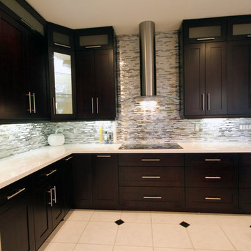
Inspiration for a contemporary l-shaped eat-in kitchen remodel in Miami with an undermount sink, shaker cabinets, brown cabinets, quartzite countertops, metallic backsplash and stainless steel appliances
 User
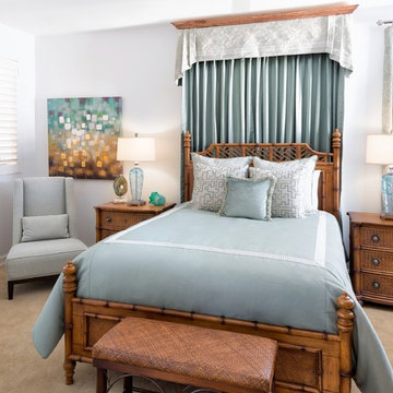
UserOur client and her sister own a condo in Florida and although her sister lives there full-time, our client only comes to Florida for the winter and utilizes the guest room and a separate bathroom as her own. At the time, enthusiastic to be in Florida she went all out in decorating in the old Florida style with a green and yellow tropical feel including a plethora of palm trees (see before picture). All the furniture had to be from Tommy Bahama and even the light fixtures had a tropical theme.
Fast forward to 2015 and our client was tired and bored in these surroundings and said to me, “what was I thinking!” She didn’t have the budget to change everything and I assured her that we could update her bedroom keeping the existing furniture. One of her previous decorating problems was the tiny window over the bed which she had covered by adding a faux canopy. Unfortunately, the fabric was thin and the window showed through. I tried to persuade her that a solution for the window issue could be a large painting over the bed but she wasn’t keen so we agreed to refresh the canopy with a more modern look.
We started with fresh silvery-grey paint and glossy white trim. Using subtle greeny-blue bedding from Eastern Accents we extracted a simple palette and mixed in several patterns including a classic Greek key. There are geometrics in the pillows and a floral in the custom cornice and draperies and we found a fabric from the same color palette for the drapery behind the bed from Kravet. It has a beautiful sheen which reflects light and is heavily lined to cover the window. Our project manager added the wood trim to the cornice board.
The modern chair is upholstered in a sea green herringbone while the table has an interesting story; my client loved the shape of the table but it was originally finished completely in gold leaf. Part of our update was to change everything metal such as door knobs and drapery hardware to chrome so our project manager offered to re-finish the table in silver leaf. Along the way we had a hiccup in the communication… she asked if the top was glass and was told it was but we didn’t realize that she hadn’t unpacked it so didn’t see the gold rim. On installation day we were surprised to see the gold rim against the silver legs! Happily, it was a really good error as the painting behind the chair has both gold and silver leaf and our error looks as though it were meant to be.
We finished with turquoise blown glass lamps, several pieces of art, and a large floor mirror (not in photo). The client asked if she could choose some pretty accessories at local art fairs and one painting is by her artist brother-in-law.
This project was very enjoyable as we were able to modernize the room with an updated coastal palette while at the same time utilizing existing furniture.
Photographer: Rolando Diaz

 GMI Design Group
Breezy Coastal-Inspired Hearth Room
Sustainable, natural, wholly engaging, and a showcase for their cultural pieces and art was the concept for this home. The couple wanted to use sustainable and environmentally friendly products throughout their home as much as possible.
Being from both California and Florida, they wanted a coastal influence that didn’t look contrived or over-stylized in a Midwestern home. Also, they desired a serene, peaceful space where all senses were engaged. Incorporating the Feng Shui elements of wood, fire, earth, metal and water in color, texture and product choice was used in this design.
A problem area with the original room was a large, blocky oak fireplace. The top half was removed and the hearth was painted white, opening up the space considerably. The back wall was painted a serene blue as an accent.
An overall neutral palette of taupe, blues and grey balanced the wood tones found in the flooring and teak accents the couple acquired on their travels. We recovered their existing love seat with taupe diamond-stripe cotton in a slipcover style, adding to the casual atmosphere of a beach house. Organic cotton, hand-blocked pillows with red cherry blossoms provide a pop of color to the seating. A swivel rocker gives flexibility to multiple focal points and conversation.
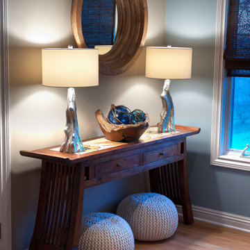
The 100% hemp rug has a turquoise oversized damask print and is a plush anchor to the hearth setting. A long grey-washed rattan bench serves as a cocktail table and woven Roman shades provide needed contrast to the back wall. A distressed, reclaimed bench sits below bold art as a bright accent area to an overall neutral space.
The centerpiece of the room is a large cerulean blue buffet with fretwork & glass doors. A large Buddha head serves as a meditative focal point with Asian-inspired art and lighting.
Julie Austin Photography
 Beth Dotolo, ASID, RID, NCIDQ
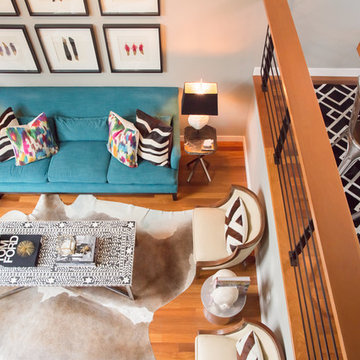
A jewel box townhouse with a high/low approach gave our busy working couple a design-forward space, arousing a new sense of happiness and pride in their home. With a love for entertaining, our clients needed a space that would meet their functional needs and be a reflection of them. They brought on Pulp to create a vision that would functionally articulate their style. Our design team imagined this edgy concept with lots of unique style elements, texture, and contrast. Pulp mixed luxury items, such as the bone-inlay cocktail table and textual black croc wall covering, and offset them with more affordable whimsical touches, like individual framed feathers. Beth and Carolina pushed their tastes to the limit with unexpected touches, like the split face bookends and the teak hand chair, to add a quirky layer and graphic edge that our homeowners would come to fall in love with.
 Advance Design Studio, Ltd.
After six years of living in their Huntley IL home, Chris and Meghan were tired of their dark, dingy, outdated kitchen and it was finally time for a long-anticipated change. “The kitchen is the place where we live, it’s where we do everything,” Meghan said. “It was important that it be a space where we wanted to be.” Meghan loves cooking and enjoys including their girls in healthy meal prepping, this led them to want a brighter, more enjoyable kitchen with increased functionality and improved storage.
For Chris especially, the laundry room was an entirely dysfunctional eyesore. “We had a washer and a dryer, but it was all kind-of cobbled together!” Chris said. “There were always laundry piles everywhere, we weren’t really sure what we wanted to do in there, but it was time for us to make a change.” The mess of the space was stressful every time they walked in the door from the garage each day. Kids’ backpacks and shoes piled up haphazardly in the makeshift boot-bench closet left the family feeling disorganized and stressed. They needed space for folding clothes and locker cubbies to help keep the family organized.
Having known Christine and Todd in the Huntley community for years, Chris and Meghan were familiar with their work. “We already trusted them personally and having seen their projects for years we knew they did top notch work. After we reviewed the initial round of designs, we knew that hiring them was definitely the right choice,” Meghan and Chris said. Although Chris had done a lot of work in their home himself, the kitchen and laundry room renovation was such a large undertaking that he didn’t want to steal time away from his family to spend what would surely be many long weekends doing the job himself. “That would not have been a wise choice for us,” Chris laughed.
“Our designer, Michelle was very, very, easy to work with; anything we wanted to see or weren’t sure about, she went above and beyond to make this easy for us. She was easy to get hold of and always quick to respond,” the couple said. Michelle pulled ideas that mirrored the couple’s taste and style and was adept at directing the couple to limited choices that didn’t overwhelm them and kept the process moving. “I have a hard time making decisions. Michelle made the decision-making process so easy. I loved how she listened to what I liked and then presented three great options for me to choose from,” Meghan said.
The main objectives for the kitchen were better storage solutions, they wanted the space to reflect their lifestyle and taste, and they wanted it to last for years with low maintenance. One of the first steps in creating a more functional kitchen was relocating the refrigerator, creating an improved workflow for the busy family.
“We didn’t know that we could even move the refrigerator to a new location where it is now, that was something that we never would have thought of,” Chris said. “The new refrigerator location makes the kitchen feel so much bigger. We didn’t add any space, but our whole kitchen with the new design just seems like it’s so much larger than before!” Meghan said.
The perimeter mist colored cabinets helped warm and brighten the entire room, while the graphite colored cabinets on the island added contrast. Using this fresh, clean color palette satisfied the couple’s desire for a bright space that was the exact opposite of what they had before. Organization accessories were also added to the cabinets such as a spice drawer tray and roll outs to create hidden convenience.
“I absolutely love the hidden spices – it makes cooking so much more enjoyable!” Chris said. “And all the pull outs, and the double trash bin, who would think you could get so excited about organization!” the couple said in unison.
One thing they hated in their original kitchen was how dark the space felt. Added lighting on the ceiling with the new light fixtures combined with the lighter cabinetry colors throughout solved this problem. “Our new kitchen has this warm, almost cozy feeling that our old kitchen never had, it’s just a space that I love spending my time in now,” Meghan said. The light airy feeling was accentuated with the use of floating white shelves on either side of the decorative range hood. “We have so much cabinetry space, the new design is amazing we actually have more storage space than we will ever need,” Meghan said.
The island was extended to create more work surface and added space for stool seating. “The new island changes how we live. Now the kids can be in the kitchen with us, doing homework, eating breakfast, and the three of us have special dinners there when Chris is working late,” Meghan said.
The Carrara Marmi Quartz countertops were chosen because they are, not only beautiful, but are made from hard-working material that doesn’t require maintenance. The white subway tile backsplash that wraps to the ceiling behind the focal point cooktop range/hood compliments the crisp white countertops perfectly, while brushed brass hardware and light fixtures keep the design fresh and new.
The couple had a few fears at the beginning of the project, as most homeowners do. Their biggest fear was being out of their kitchen and laundry room for an extended time. The crew made it very easy for the family to work in a limited space keeping the washer and dryer hooked up the majority of the time, and also getting appliances working with minimal downtime.
“They above and beyond accommodated us to get us through the process,” Meghan said. “They did a great job making sure we were as comfortable as possible throughout the process,” Chris added.
“Our project manager DJ did a great job. He was very good at updating us on schedule changes, getting guys in as quickly as possible. Everyone that stepped in the house was nice and did great work,” said Chris. They thought Advance’s carpenter was phenomenal and were impressed when he took a conceptual idea from a photograph and worked with designer Michelle to create a one of a kind range/hood that has become the topic of conversation with friends and family who visit the new kitchen. “He was in our house literally every day for several weeks. He was easy to work with and good at what he did,” Meghan and Chris said.
The focal point of the kitchen; a hand-crafted, custom-built ventilation hood was clad with handpicked reclaimed barnwood. Advance Design’s carpenter built the framework and the cladding to create a one-of-a-kind design element that the couple loves.
“I think it was especially fun for him to create something unique from scratch, showcasing his talent in this area,” Meghan said. “I love that my kitchen is not like everyone else’s. I got to pick out the wood on my hood and watch it being built and was able to choose what pieces of wood went where on it. It’s totally unique.”
Red Oak flooring was toothed-in throughout the kitchen and the rest of the first floor anywhere changes were made. Then the whole floor was refinished to tone down the orange undertones in the existing floor stain, ultimately changing the color complexion of the entire first floor. The result is a completely new feeling to the entire home.
Renovating the laundry room was extremely important to Meghan and Chris, but they had trouble visualizing what the possibilities were for the seemingly small space. Michelle produced beautiful 3D illustrations that helped them envision the space in a whole new way.
“I must have told Michelle 100 times that I am a visual person, seeing the designs in 3D made it so easy to make decisions and see what we could really do with our space,” Meghan said.
A dividing wall and doorway were removed between the existing laundry room and hallway formerly containing a coat closet, providing space to design specialized graphite colored cabinetry matching the kitchen island to house custom storage cubbies for each family member. Adding the tall utility cabinetry in the new laundry area helped solve the storage issue, tucking away cleaning supplies, household items, and even the cat got its own cubby.
“I love how everything is now hidden in its own space. I can’t tell you how much I hated coming home and seeing everything sitting around on counters,” Chris said.
Electrical outlets were planned for the inside of utility cabinets, so devices could charge in hidden locations. Stacking the washer and dryer allowed for wider countertop space to provide a folding area and a special space for clothes to hang. “The way I do laundry has been completely transformed! I can actually fold clothes and hang them now right out of the washer and dryer,” Meghan said.
“The end result in the kitchen and the laundry/mud room was an updated light and bright space, with a smarter work flow that better meets the needs of this family,” Michelle said.
“I would totally recommend Advance Design,” Meghan said. “Sometimes I sit and just look at my kitchen and laundry room and think ‘Wow, I can’t believe I get to live here!’ It’s an understatement to say we love our new space.”
46