
Search results for "Piece problem" in Home Design Ideas
 River Valley Landscapes
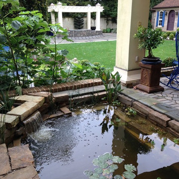
This zealous gardener was tired of her pool taking up so much space in her landscape. She asked me for ideas. The answer was simple. Since her garden brings her so much joy, I proposed adding more garden rooms to experience. We removed the large expansive pool and replaced it with a small reflecting pond that doubles as the pool. This allowed us to create 4 new garden spaces. We replaced all concrete pavers with natural PA flagstone. The traditional square lawn provides elements of simplicity, elegance and classical style while creating a new play space for the grand kids. The pergola creates depth and a great focal point from the loggia. We illuminated all the walkways and garden rooms with Escort Lighting. One of the most fun transformations was converting the spa to a fish pond. The pond provides just enough sound to drain out all neighborhood activities. In the front, we created a new permeable brick paving parking area. The parking area was designed to keep visitors from venturing to the back parking. We chose the permeable brick pavers to collect runoff that is becoming more of a problem in the neighborhood. Our final piece to this property was to come up with a unique solution creating additional privacy while minimizing root damage to the existing plant material. Our client was looking for a permanent solution that required little to no maintenance. Masonry walls were out due to the necessary footers. We looked at fence options. Wood and plastics were out, so we created post out of steel “I” beams and setting concrete lintels in between the lintels. It was perfect. This has to be one of my favorite projects to design and implement of my 25 year experience.
 Advance Design Studio, Ltd.
Our clients in Tower Lakes, IL, needed more storage and functionality from their kitchen. They were primarily focused on finding the right combination of cabinets, shelves, and drawers that fit all their cookware, flatware, and appliances. They wanted a brighter, bigger space with a natural cooking flow and plenty of storage. Soffits and crown molding needed to be removed to make the kitchen feel larger. Redesign elements included: relocating the fridge, adding a baking station and coffee bar, and placing the microwave in the kitchen island.
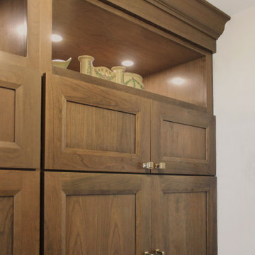
Advance Design Studio’s Claudia Pop offered functional, creative, and unique solutions to the homeowners’ problems. Our clients wanted a unique kitchen that was not completely white, a balance of design and function. Claudia offered functional, creative, and unique solutions to Chad and Karen’s kitchen design challenges. The first thing to go was soffits. Today, most kitchens can benefit from the added height and space; removing soffits is nearly always step one. Steely gray-blue was the color of choice for a freshly unique look bringing a sophisticated-looking space to wrap around the fresh new kitchen. Cherry cabinetry in a true brown stain compliments the stormy accents with sharp contrasting white Cambria quartz top balancing out the space with a dramatic flair.
“We wanted something unique and special in this space, something none of the neighbors would have,” said Claudia.
The dramatic veined Cambria countertops continue upward into a backsplash behind three complimentary open shelves. These countertops provide visual texture and movement in the kitchen. The kitchen includes two larder cabinets for both the coffee bar and baking station. The kitchen is now functional and unique in design.
“When we design a new kitchen space, as designers, we are always looking for ways to balance interesting design elements with practical functionality,” Claudia said. “This kitchen’s new design is not only way more functional but is stunning in a way a piece of art can catch one’s attention.”
Decorative mullions with mirrored inserts sit atop dual sentinel pantries flanking the new refrigerator, while a 48″ dual fuel Wolf range replaced the island cooktop and double oven. The new microwave is cleverly hidden within the island, eliminating the cluttered counter and attention-grabbing wall of stainless steel from the previous space.
The family room was completely renovated, including a beautifully functional entertainment bar with the same combination of woods and stone as the kitchen and coffee bar. Mesh inserts instead of plain glass add visual texture while revealing pristine glassware. Handcrafted built-ins surround the fireplace.
The beautiful and efficient design created by designer Claudia transitioned directly to the installation team seamlessly, much like the basement project experience Chad and Karen enjoyed previously.
“We definitely will and have recommended Advance Design Studio to friends who are looking to embark on a project small or large,” Karen said.
“Everything that was designed and built exactly how we envisioned it, and we are really enjoying it to its full potential,” Karen said.
Our award-winning design team would love to create a beautiful, functional, and spacious place for you and your family. With our “Common Sense Remodeling” approach, the process of renovating your home has never been easier. Contact us today at 847-665-1711 or schedule an appointment.
 Artisan Kitchen & Bath GC License #107583
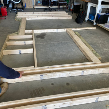
The Tiny Farmhouse Kitchen is by far one of the most complex, rewarding, and unforgettable projects we’ve ever completed. Designed to be fully mobile and 100% solar-powered, this one-of-a-kind kitchen on wheels pushed our creativity, craftsmanship, and problem-solving skills to new heights. Every time we transported it through town, it turned heads—people would literally stop in their tracks just to get a closer look.
Building a fully functional commercial kitchen in such a small footprint required precision in every detail. We carefully selected each piece of equipment to minimize electrical draw, including a commercial refrigerator and four recessed induction food warmers—all powered entirely by solar energy. Onboard water storage, filtration, and gray water management were meticulously engineered to maximize both functionality and space.
The Tiny Farmhouse Kitchen features:
• Custom handcrafted cabinetry
• Granite countertops
• Vaulted ceilings with dimmable LED lighting
• A full POS system with a built-in Wi-Fi hotspot
• A gas-shock lift service window with a live-edge oak flip-down counter, finished with crystal-clear epoxy for a stunning, natural look
Every inch of this mobile kitchen was designed for both beauty and efficiency, blending farmhouse charm with modern utility. It’s a project we are immensely proud of—and one that perfectly captures the spirit of what we do at Artisan Kitchen & Bath: bringing bold ideas to life with craftsmanship, innovation, and heart.
Find the right local pro for your project
 Thyme & Place Design LLC
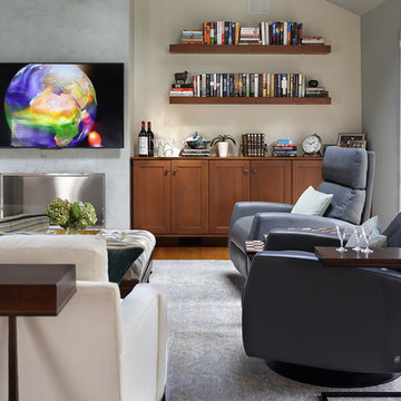
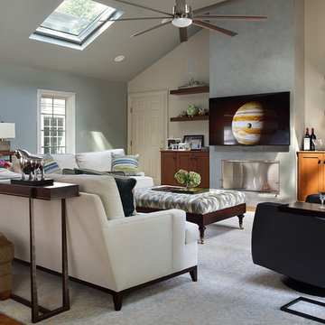
My clients always wanted a fireplace in the family room but could not build the necessary chimney due to building restrictions. To overcome this obstacle we installed an Eco Smart bio fuel fireplace. which became the focal point of the room. Next we added custom cabinetry for storage which coordinated with the kitchen (which is an open room adjacent to this space). Custom furnishings from American Leather and Hickory Chair were selected for my tall client. High performance fabrics were selected to provide worry free enjoyment of the furniture. Finishing accent pieces from Charleston Forge add a warm and contemporary vibe to the pace. The dark stain is a beautiful contrast to the lighter colorway. As you can see there are 2 skylights and 2 very large windows so light is not a problem but sun and heat are. With the height of the ceilings, we needed a large but good looking ceiling fan to control the temperature. An oversize custom ceiling fan was chosen. The walls are a coordinated blue grey to compliment the Venetian plaster finished fireplace column. The rear wall is painted a contrasting color to highlight the fireplace and the built in cherry cabinetry. a Vintage Patchwork rug defines the furniture area and helps soften the sound in the room Custom artwork by the clients mother add the final touches. Peter Rymwid Architectural Photography
 Dreamwork Kitchens
From builder standard to designer upgrade.
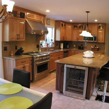
A recent project of ours in Harrison NY had us taking an adequate builder designed kitchen to something much more special. The original layout led to traffic jams while entertaining and valuable storage was lost due to the fact that the cabinets did not go to the ceiling.
The new design moves the refrigerator out of the traffic pattern that often lead to gridlock
in previous years as well as providing ample storage for trays and baking sheets in the slim pantry. Grillwork doors allow for airflow from the air-conditioning vents, while still allowing for cabinets to the ceiling.
A professional grade range replaces the old smaller model, with a heavy-duty hood to assure complete ventilation no matter what the cook creates. The microwave moves farther down the work triangle to assure that the heating of a cup of coffee or bag of popcorn need never interfere with the chef again. Equally of value is the island mini-frig not just to chill the occasional bottle of wine, but to keep the kids sodas out the main refrigerator.
And then there is the desk/ command central area. The formerly blank wall where no piece of furniture seemed to fit, because of the radiator, has become an efficient home office.
With room for two people to work, grown-ups can search Food Network for recipes while the kids do their homework – problem area solved!
 Paul Lopa Designs
See what our client say about Paul Lopa Designs:
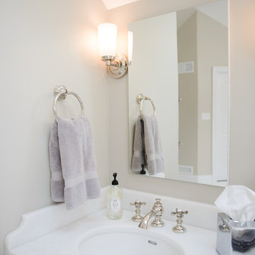
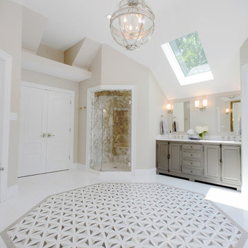
We hired Paul Lopa to remodel our master bathroom. During the project, we increased the work to include upgrading all moldings and replaced all interior doors including our front door. We are very pleased with his work. There were no hidden costs, he followed through on every last detail and did so in a timely manner.
He guided us toward materials that were of a higher quality to prevent problems down the road. His team was respectful of our home and did their best to protect our belongings from the renovation destruction. We will definitely hire Paul Lopa again for future renovations.
Haw, Ron
 Paul Lopa Designs
See what our client say about Paul Lopa Designs:
We hired Paul Lopa to remodel our master bathroom. During the project, we increased the work to include upgrading all moldings and replaced all interior doors including our front door. We are very pleased with his work. There were no hidden costs, he followed through on every last detail and did so in a timely manner.
He guided us toward materials that were of a higher quality to prevent problems down the road. His team was respectful of our home and did their best to protect our belongings from the renovation destruction. We will definitely hire Paul Lopa again for future renovations.
Haw, Ron
Sponsored
Columbus, OH

Wannemacher Interiors
Customized Award-Winning Interior Design Solutions in Franklin Cnty OH
 Design Vision Studio
James Latta of Rancho Images -
MOVIE COLONY
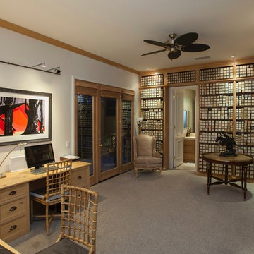
When we met these wonderful Palm Springs clients, they were overwhelmed with the task of downsizing their vast collection of fine art, antiques, and sculptures. The problem was it was an amazing collection so the task was not easy. What do we keep? What do we let go? Design Vision Studio to the rescue! We realized that to really showcase these beautiful pieces, we needed to pick and choose the right ones and ensure they were showcased properly.
Lighting was improved throughout the home. We installed and updated recessed lights and cabinet lighting. Outdated ceiling fans and chandeliers were replaced. The walls were painted with a warm, soft ivory color and the moldings, door and windows also were given a complimentary fresh coat of paint. The overall impact was a clean bright room.
We replaced the outdated oak front doors with modern glass doors. The fireplace received a facelift with new tile, a custom mantle and crushed glass to replace the old fake logs. Custom draperies frame the views. The dining room was brought to life with recycled magazine grass cloth wallpaper on the ceiling, new red leather upholstery on the chairs, and a custom red paint treatment on the new chandelier to tie it all together. (The chandelier was actually powder-coated at an auto paint shop!)
Once crammed with too much, too little and no style, the Asian Modern Bedroom Suite is now a DREAM COME TRUE. We even incorporated their much loved (yet horribly out-of-date) small sofa by recovering it with teal velvet to give it new life.
Underutilized hall coat closets were removed and transformed with custom cabinetry to create art niches. We also designed a custom built-in media cabinet with "breathing room" to display more of their treasures. The new furniture was intentionally selected with modern lines to give the rooms layers and texture.
When we suggested a crystal ship chandelier to our clients, they wanted US to walk the plank. Luckily, after months of consideration, the tides turned and they gained the confidence to follow our suggestion. Now their powder room is one of their favorite spaces in their home.
Our clients (and all of their friends) are amazed at the total transformation of this home and with how well it "fits" them. We love the results too. This home now tells a story through their beautiful life-long collections. The design may have a gallery look but the feeling is all comfort and style.
 Natural Stone Institute
Gallegos was contacted by a client about a project where stone was not just to be an accent material, but the main visual and perceived structural element to create a timeless architectural composition. To further the endeavor: all veneers and dimension stone must be locally sourced and sustainably quarried. The design called for a moss rock veneer with cut stone trim. Sourcing the sandstone moss rock was simple because there were several local quarries to use. The problem
was with the trim pieces.
Gallegos selected Colorado Buff sandstone for the trim since the buff body was a good contrast to the moss rock and it is a stone that can be cut to size. One main concern with any sedimentary stone is hitting what is known as a “dry” layer in the ledge. This is an area in the stone between sedimentary layers that has not solidified or cemented. It is still granular and can lead to future stone failure as water penetrates these layers and creates freeze/thaw issues. To avoid this, they used
an epoxy injected into the dry layers to help solidify the material and prevent any future failures.
The client also wanted sustainable materials for their countertops and bathrooms. Many of the interior stones were either reclaimed materials or were sourced from Colorado quarries – Calacatta Lincoln was used extensively.
Gallegos sourced tiles from reclamation projects in Europe and Asia for use in the master bath and front entry areas. For many of the countertops, the owner’s interior designer spent hours looking through remnants and applied several throughout the residence.
Willow Court is a spectacular and dramatic nod to stone masonry, something the owner, architect, and builder can be proud of and, for the most part, was built with the environment in mind.
 Paul Lopa Designs
See what our client say about Paul Lopa Designs:
We hired Paul Lopa to remodel our master bathroom. During the project, we increased the work to include upgrading all moldings and replaced all interior doors including our front door. We are very pleased with his work. There were no hidden costs, he followed through on every last detail and did so in a timely manner.
He guided us toward materials that were of a higher quality to prevent problems down the road. His team was respectful of our home and did their best to protect our belongings from the renovation destruction. We will definitely hire Paul Lopa again for future renovations.
Haw, Ron
 Paul Lopa Designs
See what our client say about Paul Lopa Designs:
We hired Paul Lopa to remodel our master bathroom. During the project, we increased the work to include upgrading all moldings and replaced all interior doors including our front door. We are very pleased with his work. There were no hidden costs, he followed through on every last detail and did so in a timely manner.
He guided us toward materials that were of a higher quality to prevent problems down the road. His team was respectful of our home and did their best to protect our belongings from the renovation destruction. We will definitely hire Paul Lopa again for future renovations.
Haw, Ron
 Simply Home Decorating
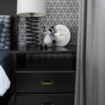
For Ryan's bedroom we took our usual approach to decorating kids rooms which is to develop a scheme that will grow with a child into adolescence. We are confident that Ryan will have no problem transitioning his bedroom into a cool teen hangout when he decides to trade stuffed animals for video games and sports equipment. We paired classic black furniture with grey walls and some key pieces like an industrial spring table lamp, polyhedron light fixture and metal side table to create a boy's bedroom with character. Interior Decorating by Lori Steeves of Simply Home Decorating. Photos by Tracey Ayton Photography
 Advance Design Studio, Ltd.
After six years of living in their Huntley IL home, Chris and Meghan were tired of their dark, dingy, outdated kitchen and it was finally time for a long-anticipated change. “The kitchen is the place where we live, it’s where we do everything,” Meghan said. “It was important that it be a space where we wanted to be.” Meghan loves cooking and enjoys including their girls in healthy meal prepping, this led them to want a brighter, more enjoyable kitchen with increased functionality and improved storage.
For Chris especially, the laundry room was an entirely dysfunctional eyesore. “We had a washer and a dryer, but it was all kind-of cobbled together!” Chris said. “There were always laundry piles everywhere, we weren’t really sure what we wanted to do in there, but it was time for us to make a change.” The mess of the space was stressful every time they walked in the door from the garage each day. Kids’ backpacks and shoes piled up haphazardly in the makeshift boot-bench closet left the family feeling disorganized and stressed. They needed space for folding clothes and locker cubbies to help keep the family organized.
Having known Christine and Todd in the Huntley community for years, Chris and Meghan were familiar with their work. “We already trusted them personally and having seen their projects for years we knew they did top notch work. After we reviewed the initial round of designs, we knew that hiring them was definitely the right choice,” Meghan and Chris said. Although Chris had done a lot of work in their home himself, the kitchen and laundry room renovation was such a large undertaking that he didn’t want to steal time away from his family to spend what would surely be many long weekends doing the job himself. “That would not have been a wise choice for us,” Chris laughed.
“Our designer, Michelle was very, very, easy to work with; anything we wanted to see or weren’t sure about, she went above and beyond to make this easy for us. She was easy to get hold of and always quick to respond,” the couple said. Michelle pulled ideas that mirrored the couple’s taste and style and was adept at directing the couple to limited choices that didn’t overwhelm them and kept the process moving. “I have a hard time making decisions. Michelle made the decision-making process so easy. I loved how she listened to what I liked and then presented three great options for me to choose from,” Meghan said.
The main objectives for the kitchen were better storage solutions, they wanted the space to reflect their lifestyle and taste, and they wanted it to last for years with low maintenance. One of the first steps in creating a more functional kitchen was relocating the refrigerator, creating an improved workflow for the busy family.
“We didn’t know that we could even move the refrigerator to a new location where it is now, that was something that we never would have thought of,” Chris said. “The new refrigerator location makes the kitchen feel so much bigger. We didn’t add any space, but our whole kitchen with the new design just seems like it’s so much larger than before!” Meghan said.
The perimeter mist colored cabinets helped warm and brighten the entire room, while the graphite colored cabinets on the island added contrast. Using this fresh, clean color palette satisfied the couple’s desire for a bright space that was the exact opposite of what they had before. Organization accessories were also added to the cabinets such as a spice drawer tray and roll outs to create hidden convenience.
“I absolutely love the hidden spices – it makes cooking so much more enjoyable!” Chris said. “And all the pull outs, and the double trash bin, who would think you could get so excited about organization!” the couple said in unison.
One thing they hated in their original kitchen was how dark the space felt. Added lighting on the ceiling with the new light fixtures combined with the lighter cabinetry colors throughout solved this problem. “Our new kitchen has this warm, almost cozy feeling that our old kitchen never had, it’s just a space that I love spending my time in now,” Meghan said. The light airy feeling was accentuated with the use of floating white shelves on either side of the decorative range hood. “We have so much cabinetry space, the new design is amazing we actually have more storage space than we will ever need,” Meghan said.
The island was extended to create more work surface and added space for stool seating. “The new island changes how we live. Now the kids can be in the kitchen with us, doing homework, eating breakfast, and the three of us have special dinners there when Chris is working late,” Meghan said.
The Carrara Marmi Quartz countertops were chosen because they are, not only beautiful, but are made from hard-working material that doesn’t require maintenance. The white subway tile backsplash that wraps to the ceiling behind the focal point cooktop range/hood compliments the crisp white countertops perfectly, while brushed brass hardware and light fixtures keep the design fresh and new.
The couple had a few fears at the beginning of the project, as most homeowners do. Their biggest fear was being out of their kitchen and laundry room for an extended time. The crew made it very easy for the family to work in a limited space keeping the washer and dryer hooked up the majority of the time, and also getting appliances working with minimal downtime.
“They above and beyond accommodated us to get us through the process,” Meghan said. “They did a great job making sure we were as comfortable as possible throughout the process,” Chris added.
“Our project manager DJ did a great job. He was very good at updating us on schedule changes, getting guys in as quickly as possible. Everyone that stepped in the house was nice and did great work,” said Chris. They thought Advance’s carpenter was phenomenal and were impressed when he took a conceptual idea from a photograph and worked with designer Michelle to create a one of a kind range/hood that has become the topic of conversation with friends and family who visit the new kitchen. “He was in our house literally every day for several weeks. He was easy to work with and good at what he did,” Meghan and Chris said.
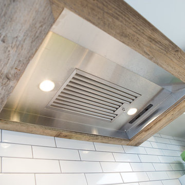
The focal point of the kitchen; a hand-crafted, custom-built ventilation hood was clad with handpicked reclaimed barnwood. Advance Design’s carpenter built the framework and the cladding to create a one-of-a-kind design element that the couple loves.
“I think it was especially fun for him to create something unique from scratch, showcasing his talent in this area,” Meghan said. “I love that my kitchen is not like everyone else’s. I got to pick out the wood on my hood and watch it being built and was able to choose what pieces of wood went where on it. It’s totally unique.”
Red Oak flooring was toothed-in throughout the kitchen and the rest of the first floor anywhere changes were made. Then the whole floor was refinished to tone down the orange undertones in the existing floor stain, ultimately changing the color complexion of the entire first floor. The result is a completely new feeling to the entire home.
Renovating the laundry room was extremely important to Meghan and Chris, but they had trouble visualizing what the possibilities were for the seemingly small space. Michelle produced beautiful 3D illustrations that helped them envision the space in a whole new way.
“I must have told Michelle 100 times that I am a visual person, seeing the designs in 3D made it so easy to make decisions and see what we could really do with our space,” Meghan said.
A dividing wall and doorway were removed between the existing laundry room and hallway formerly containing a coat closet, providing space to design specialized graphite colored cabinetry matching the kitchen island to house custom storage cubbies for each family member. Adding the tall utility cabinetry in the new laundry area helped solve the storage issue, tucking away cleaning supplies, household items, and even the cat got its own cubby.
“I love how everything is now hidden in its own space. I can’t tell you how much I hated coming home and seeing everything sitting around on counters,” Chris said.
Electrical outlets were planned for the inside of utility cabinets, so devices could charge in hidden locations. Stacking the washer and dryer allowed for wider countertop space to provide a folding area and a special space for clothes to hang. “The way I do laundry has been completely transformed! I can actually fold clothes and hang them now right out of the washer and dryer,” Meghan said.
“The end result in the kitchen and the laundry/mud room was an updated light and bright space, with a smarter work flow that better meets the needs of this family,” Michelle said.
“I would totally recommend Advance Design,” Meghan said. “Sometimes I sit and just look at my kitchen and laundry room and think ‘Wow, I can’t believe I get to live here!’ It’s an understatement to say we love our new space.”

 Abigail Shea Interiors
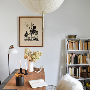
I had a blast working on this personal project. My partner, Alex, is working from home and I needed a space where I could be creative but also put in the hard work. We had 100sf, a budget of "as-cheap-as-possible," and tons of rental restrictions--but good design always starts with a little problem solving, right?
I infused the space with lots of neutral colors and tons of texture to keep it warm. I threw in my favorite vintage pieces, a big oversized paper lantern, and a bookshelf bar for some soul. & just like that, it's our favorite spot in town.
 Robin's Nest Interiors
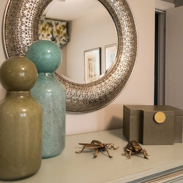
So this is one of my Guest Rooms. I love using twin beds in a Bedroom (although it can be pricey – two of everything!). I found these vintage iron bed frames from one of my favorite vendors. I wanted to lots of layers of bedding so I have two duvets – one on the bed and one at the foot of the bed – and a colorful throw and accent pillow. I repurposed the window treatment from my Master Bedroom. The balloon valance is the perfect style for this large scale floral fabric in vibrant blues and greens. The walls are painted one of my favorites – Sherwin Williams’ Anew Gray (SW7030). I love painted pieces – especially those with storage for a bedroom. The fun green chest with interesting shape fits nicely between the beds. The two shade lamp could not be more perfect for the twin beds. Every Bedroom needs seating, and I love a bench at the end of the bed. I had two problems – I did not have room for a full bench and I did not want to hide the bed frame. These small ottomans in rich blue velvet were the perfect solution. I added a gray wool rug for softness underfoot. On the wall opposite the beds, I used a painted blue dresser. To finish off the vignette, I selected a round mirror (because every Bedroom needs a mirror) with an oversized frame and unique accessories to support my color palette. Notice how nicely all of the different finishes – silver on the mirror, black iron on the bed and dresser and burnished brass on my little insect sculptures – work together. You can and should mix your metals – it makes every room more interesting! With the twin beds, the room was calling for symmetry so I dressed the walls with 6 botanical prints – 3 on each side.
This Bedroom makes me want to be a guest in my own home! Enjoy!
 Natural Stone Institute
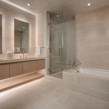
Formerly the workshop of mid-century artisans, this manufacturing building in NYC's SoHo neighborhood was transformed into an 11,000 sf townhouse. The home features a full level spa, two-story living room, six bedrooms, eleven bathrooms, and rooftop addition with pool.
Neighboring buildings were underpinned to lower the cellar to accommodate the spa which features dry stacked stone walls that blend into the swimming pool and hot tub and are featured throughout the entire level. The architect’s vision was to have visual recognition that the space was below ground. Thinking about the striations of the earth beneath its surface, he was inspired by the Therme Baths and Spa in Zurich where all the walls are clad with narrow strips of Vals quartzite. After seeing a rendering, the stone supplier advised that only certain stones could survive constant submersion in pool water and the stone should not have the cleft face he had originally imagined due to bacteria issues. Honed, Super Grey granite with white veining was used – the slabs cut into long 3” wide strips installed at random lengths to accentuate the concept of layering as found in the Earth.
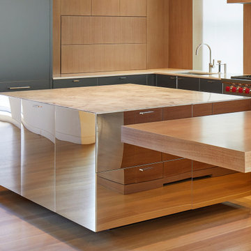
The kitchen was designed to feel more like a furnished room to integrate with the family room. The architect addressed this through materials and the design of the over-sized island. The countertop is the only veined stone in the kitchen – a beautiful single slab of Super White marble. The island is clad in mirror-polished stainless steel, transforming it into a beautiful piece of furniture that blends into the space.
A two-story living room with 22' ceilings created a problem of comfortable scale. The key was the fireplace – the strongest vertical element in the room. By using horizontal vein-cut slabs of light-colored Driftwood marble, the scale of the space instantly became more intimate.

 Truitt and White Window and Door Showroom
This hillside home in Piedmont, CA was remodeled to change the style from a 1940's rancher with eight foot ceilings and dark interiors, into a modern geometric composition with vast white interiors for casual living and generous daylighting for displaying the artist-owner's works.
In a city known for rigorous and difficult design review, an addition, two variances, and a full stylistic change were unanimously approved on the first round. All sloped roofs and attics were eliminated and replaced by a series of stacked and overlapping flat roofs. This made the house taller on the inside and shorter on the outside, which helped earn design review cooperation in the community. Windows were concentrated toward the rear yard views or moved up high on the side walls for daylight and privacy, benefitting the owners as well as the neighbors.
At the start, the owner husband was so enthusiastic and engaged in transforming his house into something modern that he presented the architect with a scaled foamcore model, rather than the usual magazine clippings and wish list. He participated in the design decisions throughout the process. The owner wife is the artist who did all the artwork in the house. She had been craving a display space with large walls and good natural light. Both of them loved the location and great views.
The project was an opportunity to transform the style of an older traditional home into a modern one, while solving numerous problems. By rebuilding the 1800 ft2 top of the 3-story home it was possible to change the style of the whole building, since the lower floors were a neutral base, and also to change the lifestyle of the owners, who wanted to move their master suite upstairs and live primarily on the top floor as empty nesters.
Going into the project, the architect knew there were multiple encroachments into the setbacks and potential privacy issues with close by neighbors. He approached this as a complex puzzle made up of architectural and political pieces which all had to fit together elegantly. It took many careful moves, small and large, to arrive at a serene and cohesive result that tied old and new together seamlessly.
The design-build contractor worked closely with the owners and handled all of the construction phase documents and design adjustments, adding ideas of their own to make the project really sing.
The project was a collaboration in three acts. The owner had a strong design concept from the start. The architect developed it into a realistic project and garnered the design approvals. Then the contractor executed brilliantly

 Redecorating Vancouver
A classic style arranged with bold prints and vibrant colours
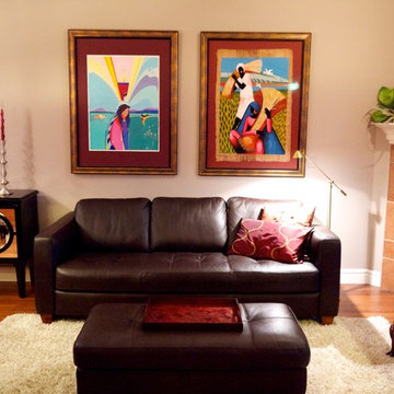
This condo started with a fantastic base. Priceless art collected during trips around the world and an eye for beauty that any designer would envy. My client was purposeful in her approach, but she still thought there was something not quite right about the room. Sitting room conversations felt awkward. You would catch guests unsure of where to sit or place their drink. The client needed a change and Redecorating Vancouver was there to correct common mistakes and look at the problems from a professional angle.
After the consultation and rearrangement the client was thrilled with the changes we made. The space opened up. The flow of energy from the staircase through the living area and into the dining room was no longer blocked. By grouping two pieces of art with matching framing material, we were able to create a focal point in the room, around which we centred the furniture. Conversations were more natural and now we all had a place to set our drinks.
This redecoration took place during the holiday season and my client also chose to add Holiday Decorating to the consultation. I offered suggestions that helped give a fresh new feel to her existing christmas ornaments. Entertaining during the holiday season was important to her as well, so I used my expertise to add some holiday cheer and maintain the great flow we had just created.
This redecoration was a pleasure. A lifetime of collecting fine things from a plethora of fantastic destinations and only one day with Redecorating Vancouver to make them all shine!
 Thyme & Place Design LLC
My clients always wanted a fireplace in the family room but could not build the necessary chimney due to building restrictions. To overcome this obstacle we installed an Eco Smart bio fuel fireplace. which became the focal point of the room. Next we added custom cabinetry for storage which coordinated with the kitchen (which is an open room adjacent to this space). Custom furnishings from American Leather and Hickory Chair were selected for my tall client. High performance fabrics were selected to provide worry free enjoyment of the furniture. Finishing accent pieces from Charleston Forge add a warm and contemporary vibe to the pace. The dark stain is a beautiful contrast to the lighter colorway. As you can see there are 2 skylights and 2 very large windows so light is not a problem but sun and heat are. With the height of the ceilings, we needed a large but good looking ceiling fan to control the temperature. An oversize custom ceiling fan was chosen. The walls are a coordinated blue grey to compliment the Venetian plaster finished fireplace column. The rear wall is painted a contrasting color to highlight the fireplace and the built in cherry cabinetry. a Vintage Patchwork rug defines the furniture area and helps soften the sound in the room Custom artwork by the clients mother add the final touches. Peter Rymwid Architectural Photography
 Paul Lopa Designs
See what our client say about Paul Lopa Designs:
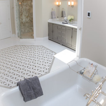
We hired Paul Lopa to remodel our master bathroom. During the project, we increased the work to include upgrading all moldings and replaced all interior doors including our front door. We are very pleased with his work. There were no hidden costs, he followed through on every last detail and did so in a timely manner.
He guided us toward materials that were of a higher quality to prevent problems down the road. His team was respectful of our home and did their best to protect our belongings from the renovation destruction. We will definitely hire Paul Lopa again for future renovations.
Haw, Ron
68