
Search results for "Poor decision making" in Home Design Ideas
 SOIA Design
Project Overview
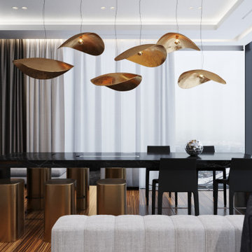
In one of the most iconic skyscrapers of Moscow City "Neva Towers", SOIA DESIGN was commissioned to design a refined, modern apartment that would harmonize with the panoramic skyline while remaining deeply personal and livable. The result is a bespoke 3D interior design project where every square meter was crafted with purpose and elegance.
The Challenge
The client approached us with a stunning high-rise space—but also with a complex brief:
Maximize views while ensuring privacy
Infuse warmth and comfort into a glass and steel environment
Introduce high-end materials and modern finishes without making the space feel cold
Optimize layout for both entertaining and everyday living
Achieve it all remotely
Our Solution
✦ Space Planning with Purpose: We reconfigured the layout to establish a seamless flow between the living, dining, and kitchen areas. Custom-built millwork and integrated storage solutions allowed us to keep the space minimalist without compromising on functionality.
✦ Warm Modernism: To contrast the building’s steel-and-glass architecture, we brought in natural stone, matte wood finishes, and warm lighting. Curated textures and neutral tones created a soft yet sophisticated atmosphere.
✦ 3D Visualization Precision: Leveraging high-end 3D modeling and photorealistic rendering, we presented the design in full detail—allowing the client to walk through the space virtually, make informed decisions, and see exactly how each element would look and feel.
✦ Tailored Detailing: Every aspect was custom—from the furniture selection and lighting scenarios to the precise alignment of veined marble in the bathroom. We collaborated with local artisans and international brands to bring this level of refinement to life.
The Impact
The final design not only honored the prestige of Neva Towers but elevated it into a private sanctuary above the city. What began as a challenging high-rise shell became a warm, modern home tailored to the client’s lifestyle.
 Liz Schupanitz Designs
A PLACE TO GATHER
Location: Eagan, MN, USA
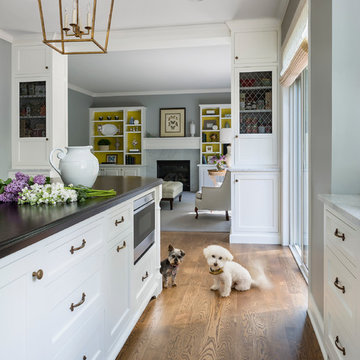
This family of five wanted an inviting space to gather with family and friends. Mom, the primary cook, wanted a large island with more organized storage – everything in its place – and a crisp white kitchen with the character of an older home.
Challenges:
Design an island that could accommodate this family of five for casual weeknight dinners.
Create more usable storage within the existing kitchen footprint.
Design a better transition between the upper cabinets on the 8-foot sink wall and the adjoining 9-foot cooktop wall.
Make room for more counter space around the cooktop. It was poorly lit, cluttered with small appliances and confined by the tall oven cabinet.
Solutions:
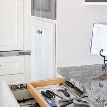
A large island, that seats 5 comfortably, replaced the small island and kitchen table. This allowed for more storage including cookbook shelves, a heavy-duty roll out shelf for the mixer, a 2-bin recycling center and a bread drawer.
Tall pantries with decorative grilles were placed between the kitchen and family room. These created ample storage and helped define each room, making each one feel larger, yet more intimate.
A space intentionally separates the upper cabinets on the sink wall from those on the cooktop wall. This created symmetry on the sink wall and made room for an appliance garage, which keeps the countertops uncluttered.
Moving the double ovens to the former pantry location made way for more usable counter space around the cooktop and a dramatic focal point with the hood, cabinets and marble backsplash.
Special Features:
Custom designed corbels and island legs lend character.
Gilt open lanterns, antiqued nickel grilles on the pantries, and the soft linen shade at the kitchen sink add personality and charm.
The unique bronze hardware with a living finish creates the patina of an older home.
A walnut island countertop adds the warmth and feel of a kitchen table.
This homeowner truly understood the idea of living with the patina of marble. Her grandmother’s marble-topped antique table inspired the Carrara countertops.
The result is a highly organized kitchen with a light, open feel that invites you to stay a while.
Liz Schupanitz Designs
Photographed by: Andrea Rugg
 SV Design
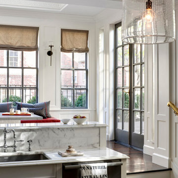
Located on the flat of Beacon Hill, this iconic building is rich in history and in detail. Constructed in 1828 as one of the first buildings in a series of row houses, it was in need of a major renovation to improve functionality and to restore as well as re-introduce charm.Originally designed by noted architect Asher Benjamin, the renovation was respectful of his early work. “What would Asher have done?” was a common refrain during design decision making, given today’s technology and tools.
Photographer: Bruce Buck
Find the right local pro for your project
 Boheen & Co
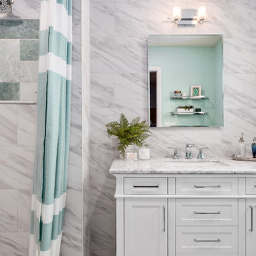
This was a small, enclosed shower in this Master Bathroom. We wanted to give all the glitz and glam this homeowner deserved and make this small space feel larger. We achieved this by running the same wall tile in the shower as the sink wall. It was a tight budget that we were able to make work with real and faux marble mixed together in a clever way. We kept everything light and in cool colors to give that luxurious spa feel.
 Melissa Hill Home Design
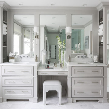
We were so delighted to be able to bring to life our fresh take and new renovation on a picturesque bathroom. A scene of symmetry, quite pleasing to the eye, the counter and sink area was cultivated to be a clean space, with hidden storage on the side of each elongated mirror, and a center section with seating for getting ready each day. It is highlighted by the shiny silver elements of the hardware and sink fixtures that enhance the sleek lines and look of this vanity area. Lit by a thin elegant sconce and decorated in a pathway of stunning tile mosaic this is the focal point of the master bathroom. Following the tile paths further into the bathroom brings one to the large glass shower, with its own intricate tile detailing within leading up the walls to the waterfall feature. Equipped with everything from shower seating and a towel heater, to a secluded toilet area able to be hidden by a pocket door, this master bathroom is impeccably furnished. Each element contributes to the remarkably classic simplicity of this master bathroom design, making it truly a breath of fresh air.
Custom designed by Hartley and Hill Design. All materials and furnishings in this space are available through Hartley and Hill Design. www.hartleyandhilldesign.com 888-639-0639
 Kimberlee Marie Interiors
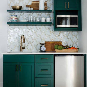
This one is near and dear to my heart. Not only is it in my own backyard, it is also the first remodel project I've gotten to do for myself! This space was previously a detached two car garage in our backyard. Seeing it transform from such a utilitarian, dingy garage to a bright and cheery little retreat was so much fun and so rewarding! This space was slated to be an AirBNB from the start and I knew I wanted to design it for the adventure seeker, the savvy traveler, and those who appreciate all the little design details . My goal was to make a warm and inviting space that our guests would look forward to coming back to after a full day of exploring the city or gorgeous mountains and trails that define the Pacific Northwest. I also wanted to make a few bold choices, like the hunter green kitchen cabinets or patterned tile, because while a lot of people might be too timid to make those choice for their own home, who doesn't love trying it on for a few days?At the end of the day I am so happy with how it all turned out!

 Twelve Stones Designs, LLC
The owners of this kitchen had spent the money to upgrade the finishes in their kitchen upon building the home 12 years ago, but after living in the space for several years they realized how nonfunctional the layout really was. The (then) two preschool aged children had grown into busy, hungry teenagers with many friends who also liked to hang out at the house. So the family needed a more functional kitchen with better traffic flow, space for daily activities revolving around the kitchen at different times of day, and a kitchen that could accommodate cooking for and serving large groups. Furthermore, the dark, traditional finishes no longer reflected the homeowners’ style. They requested a brighter, more relaxed, coastal style that reflected their love of the seaside cities they like to visit.
Originally, the kitchen was U-shaped with a narrow island in the middle. The island created narrow aisles that bottle-necked at the dishwasher, refrigerator, and cooktop areas. There was a pass-through from the foyer into the kitchen, but the owners never liked that the pass-through was also located so close to the powder room. The awkward proximity was unappealing and made guests feel uncomfortable.
The kitchen’s storage was made up of lots of narrow cabinets, apothecary drawers, clipped corner units, and very few drawers. It lacked useful storage for the larger items the family used on a daily basis. And the kitchen’s only pantry was small closet that had only builder-grade, narrow shelving with no illumination to be able to see the contents inside.
Overall, the kitchen’s lighting plan was poorly executed. Only six recessed cans illuminated the entire kitchen and nook areas. The under cabinet lighting was not evenly distributed either. In fact, the builder had mis-placed the under cabinet lighting around the decorative pilasters which made for choppy, dark cubbies. Further, the builder didn’t include any lighting over the sink or the bar area, which meant whoever was doing the dishes was always in their own shadow. That, coupled with the steep overhang of the game room above made the bar area feel like a dim, cavernous space that wasn’t inviting or task oriented. The kitchen looked out into the main living space, but the raised bar and a narrow wall (which held the only large cabinet in the kitchen) created more of a barrier than a relationship to the living room or breakfast nook. In fact, one couldn’t even see the breakfast nook from the cooktop or sink areas due to its orientation. The raised bar top was too narrow to comfortably sit to either dine at or chat from due to the lack of knee space. The the homeowners confided that the kitchen felt more like a dark, dirty prison than place where the family, or their guests, wanted to gather and commune.
The clients' needs and desires were:
➢ to create a kitchen that would be a space the family loved to be in; to relate to the adjacent spaces all around, and to have better flow for entertaining large groups
➢ to remove the walls between the breakfast nook and living area and to be able to utilize the natural light from the windows in both those areas
➢ to incorporate a functional chopping block for prepping fresh food for home cooked meals, an island with a large sink and drain board, 2 pull out trash cans, and seating for at least the 2 teens to eat or do homework
➢ to design a kitchen and breakfast nook with an airy, coastal, relaxed vibe that blended with the rest of the house's coastal theme
➢ to integrate a layered lighting plan which would include ample general illumination, specific task lighting, decorative lighting, and lots of illuminated storage
➢ to design a kitchen with not only more storage for all the husband’s kitchen gadgets and collection of oils and spices, but smart storage, including a coffee/breakfast bar and a place to store and conceal the toaster oven and microwave
➢ to find a way to utilize the large open space between the kitchen, pantry area, and breakfast nook
Twelve Stones Designs achieved the owner's goals by:
➢ removing the walls between the kitchen and living room to allow the natural light to filter in from the adjacent rooms and to create a connection between the kitchen, nook, and living spaces for a sense of unity and communion
➢ removing the existing pantry and designing 3 large pantry style cabinets with LED tape lights and rollout drawers to house lots of kitchen appliances, gadgets, and tons of groceries. We also took the cabinets all the way up to the 9’ ceiling for additional storage for seasonal items and bulk storage.
➢ designing 2 islands - 1 with a gorgeous black walnut chopping block that houses a drawer for chopping and carving knives and a custom double pull out trash unit for point of use utilization - and 1 that houses the dishwasher, a large Blanco Gourmet sink with integrated drain board, woven baskets for fresh root vegetables and kitchen towels, plenty of drawer storage for kitchen items, and bar seating for up to 4 diners.
➢ closing off the space between the kitchen and the powder room to create a beautiful new private alcove for the powder room as well as adding some decorative storage. This also gave us space to include more tall storage near the new range for precision placement of the husband’s extensive oil and spice collection as well as a location for a combo-steam oven the wife wanted for baking and cooking healthy meals.
The project is enhanced functionally by:
➢ incorporated USB and standard receptacles for the kids’ laptops and phone charging in the large island
➢ designing the small island to include additional open shelving for items used on a daily basis such as a variety of bowls, plates, and colanders. This set up also works well for the husband who prefers to “plate” his dinners in restaurant-style fashion before presenting them to the table.
➢ the integration of specific storage units, such as double stacked cutlery drawers, a custom spice pull-out, a Kuerig coffee and tea pod drawer, and custom double stacked utensil drawers
➢ moving the refrigerator to the old oven location - this eliminated the bottle neck as well as created a better relationship to the eating table. It also utilizes the floor space between the pantry, nook, and kitchen
➢ creating a banquet style breakfast nook - this banquette seating not only doubles the amount of seating for large gatherings but it better utilizes the odd space between the kitchen and the previous nook area. It also helps to create a distinct pathway from the mudroom room through the pantry area, kitchen, nook, and living room.
➢ the coffee/breakfast bar area which includes the perfect location for the concealed microwave and toaster oven, convenient storage for the coffee pods and tea accoutrements. Roll-out drawers below also house the smoothie maker, hot water kettle, and a plethora of smoothie-making ingredients such as protein powders, smoothie additives, etc. Furthermore, the drawers below the Keurig house measuring utensil, cutlery, baking supplies and tupperware storage.
➢ incorporating lots of wide drawers and pullouts to accommodate large cookware.
➢ utilizing as much vertical space as possible by building storage to the ceiling which accommodates the family’s abundant amount of serving platters, baking sheets, bakeware, casserole dishes, and additional cutting boards.
The project is enhanced aesthetically by:
➢ new 5-piece Versailles pattern porcelain tile that now seamlessly joins the entire down stairs area together creating a bright, cohesiveness feeling instead of choppy separated spaces - it also adds a coastal feeling
➢ designing a cabinet to conceal the microwave and toaster oven
➢ the coastal influenced light fixtures over the nook table and island
➢ the sandy colors of the Langdon Cambria countertops. The swirling pattern and sparkling quartz pieces remind the homeowner of black-and-tan sandy beaches
➢ the striped banquet seating whose creamy white background and blue-green stripes were the inspiration for the cabinet and wall colors.
➢ All the interior doors were painted black to coordinate with the blacks and grays in the backsplash tile and countertop. This also adds a hint of tailored formality to an otherwise casual space.
➢ the use of WAC's Oculux small aperture LED units for the overhead lighting complimented with Diode LED strips for task lighting under the cabinets and inside the pantry and glass wall cabinets. All of the lighting applications are on separate dimmer switches.
Innovative uses of materials or construction methods by Realty Restoration LLC:
➢ Each 1-1/2” x 3” block of reclaimed end-grain black walnut that makes up the center island chopping block was hand milled and built in the shop. It was designed to look substantial and proportional to the surrounding elements, executed by creating the 4 inch tall top with a solid wood chamfered edge band.
➢ The metal doors on either side of the vent hood were also custom designed for this project and built in the Realty Restoration LLC shop. They are made 1x2, 11-gauge mild steel with ribbed glass. Weighing 60 lbs a piece, heavy duty cabinet hinges were added to support the weight of the door and keep them from sagging.
➢ Under-cabinet receptacles were added along the range wall in order to have a clean, uninterrupted backsplash.
Design obstacles to overcome:
➢ Because we were removing the demising walls between the kitchen and living room, we had to find a way to plumb and vent the new island. We did this by tunneling through the slab (the slab had post tension cables which prevented us from just trenching) to run a new wet vent through a nearby structural wall. We pulled the existing hot and cold lines between upper floor joists and ran them down the structural wall as well and up through a conduit in the tunnel.
➢ Since we were converting from wall overs to a gas range it allowed us to utilize the 220 feed for the wall ovens to provide a new sub panel for all the new kitchen circuits
➢ Due to framing deficiencies inherited from the original build there was a 1-1/2” differential in the floor-to-ceiling height over a 20 foot span; by utilizing the process of cutting and furring coupled with the crown moulding details on the cabinet elevations we were able to mask the problem and provide seamless transitions between the cabinet components.
Evidence of superior craftsmanship:
➢ uniquely designed, one-of-a-kind metal “X” end panels on the large island. The end panels were custom made in the Realty Restoration LLC shop and fitted to the exact dimensions of the island. The welding seams are completely indistinguishable - the posts look like they are cut from a single sheet of metal
➢ square metal posts on the small island were also custom made and designed to compliment and carry through the metal element s throughout the kitchen
➢ the beautiful, oversized end panels on the pantry cabinets which give the breakfast nook a tailored look
➢ integrating a large format 5 piece Versailles tile pattern to seamlessly flow from the existing spaces into the new kitchen space
➢ By constructing a custom cabinet that jogged around a corner we could not remodel (housing the entry way coat closet) we were able to camouflage the adjacent wall offset within the upper and lower cabinets. By designing around the existing jog in the structural walls we accomplished a few things: we were able to find the space to house, and hide, the microwave and toaster oven yet still have a clean cohesive appearance from the kitchen side. Additionally, the owners were able to keep their much needed coat closet and we didn’t have to increase the budget with unnecessary structural work.
Sponsored
Sunbury, OH

J.Holderby - Renovations
Franklin County's Leading General Contractors - 2X Best of Houzz!
 KSI Kitchen & Bath
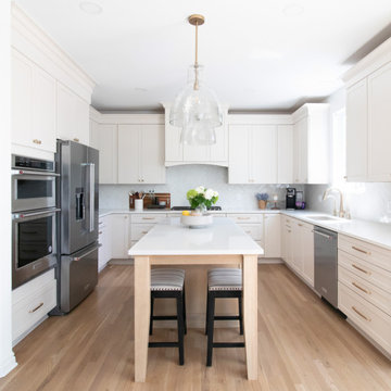
Every design project has its own story, and this one stands out for the creative collaboration and smart decision-making that brought it to life. Our client—a designer herself—came to us with a clear vision: she wanted a lighter, brighter kitchen with more functional storage and a larger island for seating that wouldn’t disrupt the flow of the space. From our first meeting, I knew we were going to build something special together!
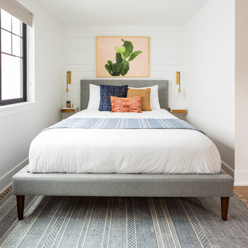 Kimberlee Marie Interiors
This one is near and dear to my heart. Not only is it in my own backyard, it is also the first remodel project I've gotten to do for myself! This space was previously a detached two car garage in our backyard. Seeing it transform from such a utilitarian, dingy garage to a bright and cheery little retreat was so much fun and so rewarding! This space was slated to be an AirBNB from the start and I knew I wanted to design it for the adventure seeker, the savvy traveler, and those who appreciate all the little design details . My goal was to make a warm and inviting space that our guests would look forward to coming back to after a full day of exploring the city or gorgeous mountains and trails that define the Pacific Northwest. I also wanted to make a few bold choices, like the hunter green kitchen cabinets or patterned tile, because while a lot of people might be too timid to make those choice for their own home, who doesn't love trying it on for a few days?At the end of the day I am so happy with how it all turned out!
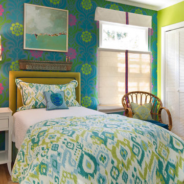
 Charmean Neithart Interiors
The homeowners of this California Cottage wanted a beach vibe in their 1700 sq. ft. home. They wanted to make the most of their spaces by widening doorways, adding wood floors throughout the house, and adding a skylight. The result is cozy, casual California living at its best with frequent family dinners and celebrations with friends. The teenage daughter in the family requested a colorful, patterned, ethnic vibe for her bedroom.
Photos by Erika Bierman www.erikabiermanphotography.com

 Interiors by Popov
This newly built custom residence turned out to be spectacular. With Interiors by Popov’s magic touch, it has become a real family home that is comfortable for the grownups, safe for the kids and friendly to the little dogs that now occupy this space.The start of construction was a bumpy road for the homeowners. After the house was framed, our clients found themselves paralyzed with the million and one decisions that had to be made. Decisions about plumbing, electrical, millwork, hardware and exterior left them drained and overwhelmed. The couple needed help. It was at this point that they were referred to us by a friend.We immediately went about systematizing the selection and design process, which allowed us to streamline decision making and stay ahead of construction.
We designed every detail in this house. And when I say every detail, I mean it. We designed lighting, plumbing, millwork, hard surfaces, exterior, kitchen, bathrooms, fireplace and so much more. After the construction-related items were addressed, we moved to furniture, rugs, lamps, art, accessories, bedding and so on.
The result of our systematic approach and design vision was a client head over heels in love with their new home. The positive feedback we received from this homeowner was immensely gratifying. They said the only thing that they regret was not hiring Interiors by Popov sooner!
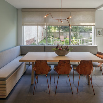
 mercer INTERIOR
We created a light fixture (based on Lindsay Adelman's You Make It) and had it plated copper to coordinate with the lovely copper chairs. Both metal pieces were not sealed and allow the natural patina and fingerprints to add interesting texture and warmth. The shades were of a natural material and allow light to pass through for an airy feel but diffuse it enough to avoid a harsh glare.
© scott benedict | practical(ly) studios
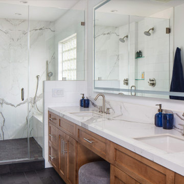
 Metropolis Drafting and Construction Inc
Creation of a new master bathroom, kids’ bathroom, toilet room and a WIC from a mid. size bathroom was a challenge but the results were amazing.
The master bathroom has a huge 5.5'x6' shower with his/hers shower heads.
The main wall of the shower is made from 2 book matched porcelain slabs, the rest of the walls are made from Thasos marble tile and the floors are slate stone.
The vanity is a double sink custom made with distress wood stain finish and its almost 10' long.
The vanity countertop and backsplash are made from the same porcelain slab that was used on the shower wall.
The two pocket doors on the opposite wall from the vanity hide the WIC and the water closet where a $6k toilet/bidet unit is warmed up and ready for her owner at any given moment.
Notice also the huge 100" mirror with built-in LED light, it is a great tool to make the relatively narrow bathroom to look twice its size.
Sponsored
Columbus, OH

Hope Restoration & General Contracting
Columbus Design-Build, Kitchen & Bath Remodeling, Historic Renovations
 Crown Point Cabinetry
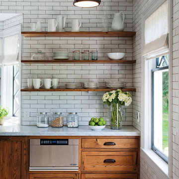
Everyday dishes are displayed on three understated shelves, also crafted from Reclaimed Chestnut.
Photo Credit: Crown Point Cabinetry
Kitchen - rustic kitchen idea in Burlington with recessed-panel cabinets, medium tone wood cabinets, granite countertops, white backsplash, subway tile backsplash and stainless steel appliances
Kitchen - rustic kitchen idea in Burlington with recessed-panel cabinets, medium tone wood cabinets, granite countertops, white backsplash, subway tile backsplash and stainless steel appliances
 Liz Schupanitz Designs
A PLACE TO GATHER
Location: Eagan, MN, USA
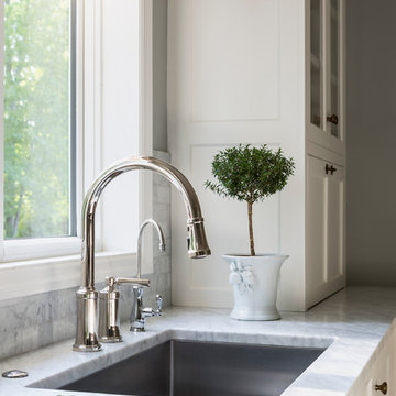
This family of five wanted an inviting space to gather with family and friends. Mom, the primary cook, wanted a large island with more organized storage – everything in its place – and a crisp white kitchen with the character of an older home.
Challenges:
Design an island that could accommodate this family of five for casual weeknight dinners.
Create more usable storage within the existing kitchen footprint.
Design a better transition between the upper cabinets on the 8-foot sink wall and the adjoining 9-foot cooktop wall.
Make room for more counter space around the cooktop. It was poorly lit, cluttered with small appliances and confined by the tall oven cabinet.
Solutions:
A large island, that seats 5 comfortably, replaced the small island and kitchen table. This allowed for more storage including cookbook shelves, a heavy-duty roll out shelf for the mixer, a 2-bin recycling center and a bread drawer.
Tall pantries with decorative grilles were placed between the kitchen and family room. These created ample storage and helped define each room, making each one feel larger, yet more intimate.
A space intentionally separates the upper cabinets on the sink wall from those on the cooktop wall. This created symmetry on the sink wall and made room for an appliance garage, which keeps the countertops uncluttered.
Moving the double ovens to the former pantry location made way for more usable counter space around the cooktop and a dramatic focal point with the hood, cabinets and marble backsplash.
Special Features:
Custom designed corbels and island legs lend character.
Gilt open lanterns, antiqued nickel grilles on the pantries, and the soft linen shade at the kitchen sink add personality and charm.
The unique bronze hardware with a living finish creates the patina of an older home.
A walnut island countertop adds the warmth and feel of a kitchen table.
This homeowner truly understood the idea of living with the patina of marble. Her grandmother’s marble-topped antique table inspired the Carrara countertops.
The result is a highly organized kitchen with a light, open feel that invites you to stay a while.
Liz Schupanitz Designs
Photographed by: Andrea Rugg
 Liz Schupanitz Designs
A PLACE TO GATHER
Location: Eagan, MN, USA
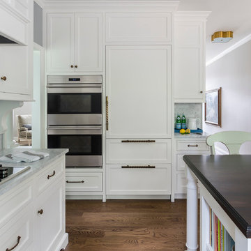
This family of five wanted an inviting space to gather with family and friends. Mom, the primary cook, wanted a large island with more organized storage – everything in its place – and a crisp white kitchen with the character of an older home.
Challenges:
Design an island that could accommodate this family of five for casual weeknight dinners.
Create more usable storage within the existing kitchen footprint.
Design a better transition between the upper cabinets on the 8-foot sink wall and the adjoining 9-foot cooktop wall.
Make room for more counter space around the cooktop. It was poorly lit, cluttered with small appliances and confined by the tall oven cabinet.
Solutions:
A large island, that seats 5 comfortably, replaced the small island and kitchen table. This allowed for more storage including cookbook shelves, a heavy-duty roll out shelf for the mixer, a 2-bin recycling center and a bread drawer.
Tall pantries with decorative grilles were placed between the kitchen and family room. These created ample storage and helped define each room, making each one feel larger, yet more intimate.
A space intentionally separates the upper cabinets on the sink wall from those on the cooktop wall. This created symmetry on the sink wall and made room for an appliance garage, which keeps the countertops uncluttered.
Moving the double ovens to the former pantry location made way for more usable counter space around the cooktop and a dramatic focal point with the hood, cabinets and marble backsplash.
Special Features:
Custom designed corbels and island legs lend character.
Gilt open lanterns, antiqued nickel grilles on the pantries, and the soft linen shade at the kitchen sink add personality and charm.
The unique bronze hardware with a living finish creates the patina of an older home.
A walnut island countertop adds the warmth and feel of a kitchen table.
This homeowner truly understood the idea of living with the patina of marble. Her grandmother’s marble-topped antique table inspired the Carrara countertops.
The result is a highly organized kitchen with a light, open feel that invites you to stay a while.
Liz Schupanitz Designs
Photographed by: Andrea Rugg
 Swedish Blue Designs / LMF Design LLC
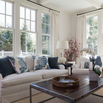
My client Kyra asked me to help her update their family room which was done in peach and green several years ago. She gave me carte blanche initially at the first meeting to come up with fabric selections and a new color scheme. Then once I showed her the indigo, white and grey colors and fabrics, I had nailed it on the head and it was a reflection of the client's personality and design aesthetic. She was probably the most decisive person I know in making quick fabric and design decisions throughout the rest of this project!
We kept to the idea of a white background because the client was afraid she would get tired quickly with colors and patterns. We used a gorgeous Holland & Sherry white linen for the window treatments with a white decorative tape along the lead edge. The white window treatments along with the white furniture and white/pale gray painted walls became her blank canvas. With a few shots of indigo and a blue-grey mohair chair, she shouldn't outgrow this room for a long time. Even if she did want to change out the color scheme, it would involve only a small investment to change out a few pillows and one club chair.
The client already had a coffee table made of reclaimed wood. It looked pretty beat up so I suggested a refinish in a lacquered dark walnut. A totally different look and "instant update". The client had a refinisher she wanted to use herself so that was one way to bring the total project cost down and at the same time recreate an almost brand new piece for such a reasonable price (workroom labor alone transformed this piece into a gorgeous table and focal point in the room).
For the side tables, the client wanted to do "linen wrapped" tables in a ming style. She requested a navy blue rather than another shade of blue or even another accent color; this way she should be able to use a neutral color like navy to go with almost any other color scheme.
The best part of this project is that this is the home of a very active family with 4 children and one large dog, and we were able to do everything with indoor/outdoor performance fabrics and one sturdy mohair fabric.
Cherry blossoms, flowers and foliage can introduce new colors depending on the season so the client won't get sick of seeing the same thing, and it makes the whole room cozier and even more beautiful at different times of the year. Kyra is so very talented with designing and arranging flowers and foliage which makes her entire home look and feel warm and inviting.
Overall, with this one redo, the family room has been transformed into a peaceful haven with a beautiful design aesthetic that the client and their family will be able to enjoy for years.
Sam Gray Photography
Sponsored
Sunbury, OH
J.Holderby - Renovations
Franklin County's Leading General Contractors - 2X Best of Houzz!
 Twelve Stones Designs, LLC
The owners of this kitchen had spent the money to upgrade the finishes in their kitchen upon building the home 12 years ago, but after living in the space for several years they realized how nonfunctional the layout really was. The (then) two preschool aged children had grown into busy, hungry teenagers with many friends who also liked to hang out at the house. So the family needed a more functional kitchen with better traffic flow, space for daily activities revolving around the kitchen at different times of day, and a kitchen that could accommodate cooking for and serving large groups. Furthermore, the dark, traditional finishes no longer reflected the homeowners’ style. They requested a brighter, more relaxed, coastal style that reflected their love of the seaside cities they like to visit.
Originally, the kitchen was U-shaped with a narrow island in the middle. The island created narrow aisles that bottle-necked at the dishwasher, refrigerator, and cooktop areas. There was a pass-through from the foyer into the kitchen, but the owners never liked that the pass-through was also located so close to the powder room. The awkward proximity was unappealing and made guests feel uncomfortable.
The kitchen’s storage was made up of lots of narrow cabinets, apothecary drawers, clipped corner units, and very few drawers. It lacked useful storage for the larger items the family used on a daily basis. And the kitchen’s only pantry was small closet that had only builder-grade, narrow shelving with no illumination to be able to see the contents inside.
Overall, the kitchen’s lighting plan was poorly executed. Only six recessed cans illuminated the entire kitchen and nook areas. The under cabinet lighting was not evenly distributed either. In fact, the builder had mis-placed the under cabinet lighting around the decorative pilasters which made for choppy, dark cubbies. Further, the builder didn’t include any lighting over the sink or the bar area, which meant whoever was doing the dishes was always in their own shadow. That, coupled with the steep overhang of the game room above made the bar area feel like a dim, cavernous space that wasn’t inviting or task oriented. The kitchen looked out into the main living space, but the raised bar and a narrow wall (which held the only large cabinet in the kitchen) created more of a barrier than a relationship to the living room or breakfast nook. In fact, one couldn’t even see the breakfast nook from the cooktop or sink areas due to its orientation. The raised bar top was too narrow to comfortably sit to either dine at or chat from due to the lack of knee space. The the homeowners confided that the kitchen felt more like a dark, dirty prison than place where the family, or their guests, wanted to gather and commune.
The clients' needs and desires were:
➢ to create a kitchen that would be a space the family loved to be in; to relate to the adjacent spaces all around, and to have better flow for entertaining large groups
➢ to remove the walls between the breakfast nook and living area and to be able to utilize the natural light from the windows in both those areas
➢ to incorporate a functional chopping block for prepping fresh food for home cooked meals, an island with a large sink and drain board, 2 pull out trash cans, and seating for at least the 2 teens to eat or do homework
➢ to design a kitchen and breakfast nook with an airy, coastal, relaxed vibe that blended with the rest of the house's coastal theme
➢ to integrate a layered lighting plan which would include ample general illumination, specific task lighting, decorative lighting, and lots of illuminated storage
➢ to design a kitchen with not only more storage for all the husband’s kitchen gadgets and collection of oils and spices, but smart storage, including a coffee/breakfast bar and a place to store and conceal the toaster oven and microwave
➢ to find a way to utilize the large open space between the kitchen, pantry area, and breakfast nook
Twelve Stones Designs achieved the owner's goals by:
➢ removing the walls between the kitchen and living room to allow the natural light to filter in from the adjacent rooms and to create a connection between the kitchen, nook, and living spaces for a sense of unity and communion
➢ removing the existing pantry and designing 3 large pantry style cabinets with LED tape lights and rollout drawers to house lots of kitchen appliances, gadgets, and tons of groceries. We also took the cabinets all the way up to the 9’ ceiling for additional storage for seasonal items and bulk storage.
➢ designing 2 islands - 1 with a gorgeous black walnut chopping block that houses a drawer for chopping and carving knives and a custom double pull out trash unit for point of use utilization - and 1 that houses the dishwasher, a large Blanco Gourmet sink with integrated drain board, woven baskets for fresh root vegetables and kitchen towels, plenty of drawer storage for kitchen items, and bar seating for up to 4 diners.
➢ closing off the space between the kitchen and the powder room to create a beautiful new private alcove for the powder room as well as adding some decorative storage. This also gave us space to include more tall storage near the new range for precision placement of the husband’s extensive oil and spice collection as well as a location for a combo-steam oven the wife wanted for baking and cooking healthy meals.
The project is enhanced functionally by:
➢ incorporated USB and standard receptacles for the kids’ laptops and phone charging in the large island
➢ designing the small island to include additional open shelving for items used on a daily basis such as a variety of bowls, plates, and colanders. This set up also works well for the husband who prefers to “plate” his dinners in restaurant-style fashion before presenting them to the table.
➢ the integration of specific storage units, such as double stacked cutlery drawers, a custom spice pull-out, a Kuerig coffee and tea pod drawer, and custom double stacked utensil drawers
➢ moving the refrigerator to the old oven location - this eliminated the bottle neck as well as created a better relationship to the eating table. It also utilizes the floor space between the pantry, nook, and kitchen
➢ creating a banquet style breakfast nook - this banquette seating not only doubles the amount of seating for large gatherings but it better utilizes the odd space between the kitchen and the previous nook area. It also helps to create a distinct pathway from the mudroom room through the pantry area, kitchen, nook, and living room.
➢ the coffee/breakfast bar area which includes the perfect location for the concealed microwave and toaster oven, convenient storage for the coffee pods and tea accoutrements. Roll-out drawers below also house the smoothie maker, hot water kettle, and a plethora of smoothie-making ingredients such as protein powders, smoothie additives, etc. Furthermore, the drawers below the Keurig house measuring utensil, cutlery, baking supplies and tupperware storage.
➢ incorporating lots of wide drawers and pullouts to accommodate large cookware.
➢ utilizing as much vertical space as possible by building storage to the ceiling which accommodates the family’s abundant amount of serving platters, baking sheets, bakeware, casserole dishes, and additional cutting boards.
The project is enhanced aesthetically by:
➢ new 5-piece Versailles pattern porcelain tile that now seamlessly joins the entire down stairs area together creating a bright, cohesiveness feeling instead of choppy separated spaces - it also adds a coastal feeling
➢ designing a cabinet to conceal the microwave and toaster oven
➢ the coastal influenced light fixtures over the nook table and island
➢ the sandy colors of the Langdon Cambria countertops. The swirling pattern and sparkling quartz pieces remind the homeowner of black-and-tan sandy beaches
➢ the striped banquet seating whose creamy white background and blue-green stripes were the inspiration for the cabinet and wall colors.
➢ All the interior doors were painted black to coordinate with the blacks and grays in the backsplash tile and countertop. This also adds a hint of tailored formality to an otherwise casual space.
➢ the use of WAC's Oculux small aperture LED units for the overhead lighting complimented with Diode LED strips for task lighting under the cabinets and inside the pantry and glass wall cabinets. All of the lighting applications are on separate dimmer switches.
Innovative uses of materials or construction methods by Realty Restoration LLC:
➢ Each 1-1/2” x 3” block of reclaimed end-grain black walnut that makes up the center island chopping block was hand milled and built in the shop. It was designed to look substantial and proportional to the surrounding elements, executed by creating the 4 inch tall top with a solid wood chamfered edge band.
➢ The metal doors on either side of the vent hood were also custom designed for this project and built in the Realty Restoration LLC shop. They are made 1x2, 11-gauge mild steel with ribbed glass. Weighing 60 lbs a piece, heavy duty cabinet hinges were added to support the weight of the door and keep them from sagging.
➢ Under-cabinet receptacles were added along the range wall in order to have a clean, uninterrupted backsplash.
Design obstacles to overcome:
➢ Because we were removing the demising walls between the kitchen and living room, we had to find a way to plumb and vent the new island. We did this by tunneling through the slab (the slab had post tension cables which prevented us from just trenching) to run a new wet vent through a nearby structural wall. We pulled the existing hot and cold lines between upper floor joists and ran them down the structural wall as well and up through a conduit in the tunnel.
➢ Since we were converting from wall overs to a gas range it allowed us to utilize the 220 feed for the wall ovens to provide a new sub panel for all the new kitchen circuits
➢ Due to framing deficiencies inherited from the original build there was a 1-1/2” differential in the floor-to-ceiling height over a 20 foot span; by utilizing the process of cutting and furring coupled with the crown moulding details on the cabinet elevations we were able to mask the problem and provide seamless transitions between the cabinet components.
Evidence of superior craftsmanship:
➢ uniquely designed, one-of-a-kind metal “X” end panels on the large island. The end panels were custom made in the Realty Restoration LLC shop and fitted to the exact dimensions of the island. The welding seams are completely indistinguishable - the posts look like they are cut from a single sheet of metal
➢ square metal posts on the small island were also custom made and designed to compliment and carry through the metal element s throughout the kitchen
➢ the beautiful, oversized end panels on the pantry cabinets which give the breakfast nook a tailored look
➢ integrating a large format 5 piece Versailles tile pattern to seamlessly flow from the existing spaces into the new kitchen space
➢ By constructing a custom cabinet that jogged around a corner we could not remodel (housing the entry way coat closet) we were able to camouflage the adjacent wall offset within the upper and lower cabinets. By designing around the existing jog in the structural walls we accomplished a few things: we were able to find the space to house, and hide, the microwave and toaster oven yet still have a clean cohesive appearance from the kitchen side. Additionally, the owners were able to keep their much needed coat closet and we didn’t have to increase the budget with unnecessary structural work.
 All Marble Tiles
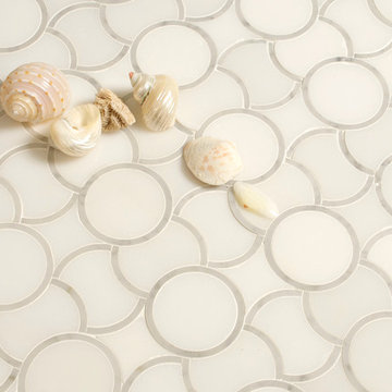
Thassos White Marble Waterjet Mosaic and Floor Tiles
Thassos white marble has become prominent in modern interior revamping. It’s unique on the surface and pleasing to the eye in whichever area it carpets. Thasos also has quite a number of advantages to it which make it the ideal option when installing or replacing floor tiles in your home or office.
Its white hue gives it a contemporary look which is fits in any kind of floor renovation arrangement. For quite some time now Thassos white marble waterjet mosaic tile has been used to accentuate other tile colors, especially the Carrara range, or can also be used as the main tile which then gets tweaks from glass mosaics or vinyl. The white color may also vary with some tiles have a creamy white look while others will have a snowy white surface. What is consistent in all Thassos stone tiles is the spotless look when shipped from their origin, Thassos Island in Greece.
With technology advancing, today we can add a little bit of texture on Thassos marble or just give it a bit of polishing to give it a smooth look. The polishing style can be honed or thoroughly polished; when honed the stone surface gets mild polishing so it doesn’t reflect light on any floor it is used. On the other hand, heavily polished Thassos white marble has a slick shimmery look which makes it perfect for areas you want light illuminated. This makes the stone marble perfect for bathroom floor tiles where a bit of water accentuates the shine.
Being in the range of natural stone, Thassos white marble also comes with the same advantages we find in all stone tiles. The surface is non porous which means water cannot seep through no matter how much splashing is made on the floor. Stone tiles are quite tough in nature as well which makes them. Marble is resistant to corrosive material like harsh chemical cleaners, bleaches or acidic drinks like Soda. This makes them ideal for use as kitchen floor tiles or industrial flooring.
So the next time you are thinking of remodeling, Thassos white marble can be the best decision you make. Yes the tile is not expensive comparing to others; in fact the entire range of stone marble doesn’t come cheap. But if we look on the brighter side, Thassos floor tiles is a onetime investment that will last for years. Moreover, Thassos marble is exquisite and it brings up the value of any houses it is used in; even an old looking shack!
http://AllMarbletiles.com
 Klopf Architecture
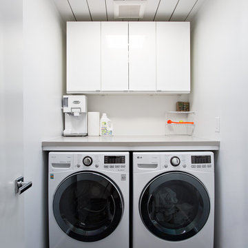
Inspiration for a small 1950s single-wall black floor dedicated laundry room remodel in San Francisco with flat-panel cabinets, white cabinets, white walls, a side-by-side washer/dryer and gray countertops
13