
Search results for "Poor decision making" in Home Design Ideas
 Kaufman Construction Design and Build
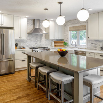
Emily and Steve have remodeled several pieces of their home and because they love Kaufman’s process so much, they keep coming back. In past years, we’ve remodeled most of their main floor including an updated living space and staircase, and a completely remodeled powder room and kitchen with a nice big island that’s perfect for entertaining. Their most recent project was this year when we remodeled their deck. The major pain points Steve and Emily dealt with before the remodel was lack of functionality due to poor design and because the previous owners had built the deck themselves, there were quite a few safety concerns. Throughout the design process, we decided to remove the existing deck completely and start fresh with a screened in porch, Emily’s Porch, and a deck off the porch with stairs going down to the beautiful backyard – one of the factors that motivated them to make this house their home to begin with.
 Kathleen Jennison
An Arts & Crafts Bungalow is one of my favorite styles of homes. We have quite a few of them in our Stockton Mid-Town area. And when C&L called us to help them remodel their 1923 American Bungalow, I was beyond thrilled.
As per usual, when we get a new inquiry, we quickly Google the project location while we are talking to you on the phone. My excitement escalated when I saw the Google Earth Image of the sweet Sage Green bungalow in Mid-Town Stockton. "Yes, we would be interested in working with you," I said trying to keep my cool.
But what made it even better was meeting C&L and touring their home, because they are the nicest young couple, eager to make their home period perfect. Unfortunately, it had been slightly molested by some bad house-flippers, and we needed to bring the bathroom back to it "roots."
We knew we had to banish the hideous brown tile and cheap vanity quickly. But C&L complained about the condensation problems and the constant fight with mold. This immediately told me that improper remodeling had occurred and we needed to remedy that right away.
The Before: Frustrations with a Botched Remodel
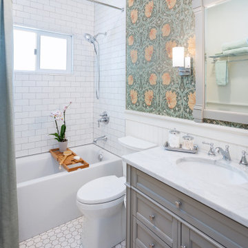
The bathroom needed to be brought back to period appropriate design with all the functionality of a modern bathroom. We thought of things like marble countertop, white mosaic floor tiles, white subway tile, board and batten molding, and of course a fabulous wallpaper.
This small (and only) bathroom on a tight budget required a little bit of design sleuthing to figure out how we could get the proper look and feel. Our goal was to determine where to splurge and where to economize and how to complete the remodel as quickly as possible because C&L would have to move out while construction was going on.
The Process: Hard Work to Remedy Design and Function
During our initial design study, (which included 2 hours in the owners’ home), we noticed framed images of William Morris Arts and Crafts textile patterns and knew this would be our design inspiration. We presented C&L with three options and they quickly selected the Pimpernel Design Concept.
We had originally selected the Black and Olive colors with a black vanity, mirror, and black and white floor tile. C&L liked it but weren’t quite sure about the black, We went back to the drawing board and decided the William & Co Pimpernel Wallpaper in Bayleaf and Manilla color with a softer gray painted vanity and mirror and white floor tile was more to their liking.
After the Design Concept was approved, we went to work securing the building permit, procuring all the elements, and scheduling our trusted tradesmen to perform the work.
We did uncover some shoddy work by the flippers such as live electrical wires hidden behind the wall, plumbing venting cut-off and buried in the walls (hence the constant dampness), the tub barely balancing on two fence boards across the floor joist, and no insulation on the exterior wall.
All of the previous blunders were fixed and the bathroom put back to its previous glory. We could feel the house thanking us for making it pretty again.
The After Reveal: Cohesive Design Decisions
We selected a simple white subway tile for the tub/shower. This is always classic and in keeping with the style of the house.
We selected a pre-fab vanity and mirror, but they look rich with the quartz countertop. There is much more storage in this small vanity than you would think.
The Transformation: A Period Perfect Refresh
We began the remodel just as the pandemic reared and stay-in-place orders went into effect. As C&L were already moved out and living with relatives, we got the go-ahead from city officials to get the work done (after all, how can you shelter in place without a bathroom?).
All our tradesmen were scheduled to work so that only one crew was on the job site at a time. We stayed on the original schedule with only a one week delay.
The end result is the sweetest little bathroom I've ever seen (and I can't wait to start work on C&L's kitchen next).
Thank you for joining me in this project transformation. I hope this inspired you to think about being creative with your design projects, determining what works best in keeping with the architecture of your space, and carefully assessing how you can have the best life in your home.
 Thyme & Place Design LLC
The client requested a kitchen that would not only provide a great space to cook and enjoy family meals but one that would fit in with her unique design sense. An avid collector of contemporary art, she wanted something unexpected in her 100-year-old home in both color and finishes but still providing a great layout with improved lighting, storage, and superior cooking abilities. The existing kitchen was in a closed off space trapped between the family room and the living. If you were in the kitchen, you were isolated from the rest of the house. Making the kitchen an integrated part of the home was a paramount request.
Step one, remove the wall separating the kitchen from the other rooms in the home which allowed the new kitchen to become an integrated space instead of an isolation room for the cook. Next, we relocated the pantry access which was in the family room to the kitchen integrating a poorly used recess which had become a catch all area which did not provide any usable space for storage or working area. To add valuable function in the kitchen we began by capturing unused "cubbies", adding a walk-in pantry from the kitchen, increasing the storage lost to un-needed drop ceilings and bring light and design to the space with a new large awning window, improved lighting, and combining interesting finishes and colors to reflect the artistic attitude of the client.
A bathroom located above the kitchen had been leaking into the plaster ceiling for several years. That along with knob and tube wiring, rotted beams and a brick wall from the back of the fireplace in the adjacent living room all needed to be brought to code. The walls, ceiling and floors in this 100+ year old home were completely out of level and the room’s foot print could not be increased.
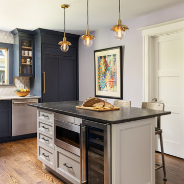
The choice of a Sub-Zero wolf product is a standard in my kitchen designs. The quality of the product, its manufacturing and commitment to food preservation is the reason I specify Sub Zero Wolf. For the cook top, the integrated line of the contemporary cooktop and the signature red knobs against the navy blue of the cabinets added to the design vibe of the kitchen. The cooking performance and the large continuous grate on the cooktop makes it an obvious choice for a cook looking for a great cook top with professional results in a more streamlined profile. We selected a Sharp microwave drawer for the island, an XO wine refrigerator, Bosch dishwasher and Kitchen Aid double convection wall ovens to round out the appliance package.
A recess created by the fireplace was outfitted with a cabinet which now holds small appliances within easy reach of my very petite client. Natural maple accents were used inside all the wall cabinets and repeated on the front of the hood and for the sliding door appliance cabinet and the floating shelves. This allows a brighter interior for the painted cabinets instead of the traditional same interior as exterior finish choice. The was an amazing transformation from the old to the new.
The final touches are the honey bronze hardware from Top Knobs, Mitzi pendants from Hudson Valley Lighting group,
a fabulous faucet from Brizo. To eliminate the old freestanding bottled water cooler, we specified a matching water filter faucet.
Find the right local pro for your project
 Twelve Stones Designs, LLC
The owners of this kitchen had spent the money to upgrade the finishes in their kitchen upon building the home 12 years ago, but after living in the space for several years they realized how nonfunctional the layout really was. The (then) two preschool aged children had grown into busy, hungry teenagers with many friends who also liked to hang out at the house. So the family needed a more functional kitchen with better traffic flow, space for daily activities revolving around the kitchen at different times of day, and a kitchen that could accommodate cooking for and serving large groups. Furthermore, the dark, traditional finishes no longer reflected the homeowners’ style. They requested a brighter, more relaxed, coastal style that reflected their love of the seaside cities they like to visit.
Originally, the kitchen was U-shaped with a narrow island in the middle. The island created narrow aisles that bottle-necked at the dishwasher, refrigerator, and cooktop areas. There was a pass-through from the foyer into the kitchen, but the owners never liked that the pass-through was also located so close to the powder room. The awkward proximity was unappealing and made guests feel uncomfortable.
The kitchen’s storage was made up of lots of narrow cabinets, apothecary drawers, clipped corner units, and very few drawers. It lacked useful storage for the larger items the family used on a daily basis. And the kitchen’s only pantry was small closet that had only builder-grade, narrow shelving with no illumination to be able to see the contents inside.
Overall, the kitchen’s lighting plan was poorly executed. Only six recessed cans illuminated the entire kitchen and nook areas. The under cabinet lighting was not evenly distributed either. In fact, the builder had mis-placed the under cabinet lighting around the decorative pilasters which made for choppy, dark cubbies. Further, the builder didn’t include any lighting over the sink or the bar area, which meant whoever was doing the dishes was always in their own shadow. That, coupled with the steep overhang of the game room above made the bar area feel like a dim, cavernous space that wasn’t inviting or task oriented. The kitchen looked out into the main living space, but the raised bar and a narrow wall (which held the only large cabinet in the kitchen) created more of a barrier than a relationship to the living room or breakfast nook. In fact, one couldn’t even see the breakfast nook from the cooktop or sink areas due to its orientation. The raised bar top was too narrow to comfortably sit to either dine at or chat from due to the lack of knee space. The the homeowners confided that the kitchen felt more like a dark, dirty prison than place where the family, or their guests, wanted to gather and commune.
The clients' needs and desires were:
➢ to create a kitchen that would be a space the family loved to be in; to relate to the adjacent spaces all around, and to have better flow for entertaining large groups
➢ to remove the walls between the breakfast nook and living area and to be able to utilize the natural light from the windows in both those areas
➢ to incorporate a functional chopping block for prepping fresh food for home cooked meals, an island with a large sink and drain board, 2 pull out trash cans, and seating for at least the 2 teens to eat or do homework
➢ to design a kitchen and breakfast nook with an airy, coastal, relaxed vibe that blended with the rest of the house's coastal theme
➢ to integrate a layered lighting plan which would include ample general illumination, specific task lighting, decorative lighting, and lots of illuminated storage
➢ to design a kitchen with not only more storage for all the husband’s kitchen gadgets and collection of oils and spices, but smart storage, including a coffee/breakfast bar and a place to store and conceal the toaster oven and microwave
➢ to find a way to utilize the large open space between the kitchen, pantry area, and breakfast nook
Twelve Stones Designs achieved the owner's goals by:
➢ removing the walls between the kitchen and living room to allow the natural light to filter in from the adjacent rooms and to create a connection between the kitchen, nook, and living spaces for a sense of unity and communion
➢ removing the existing pantry and designing 3 large pantry style cabinets with LED tape lights and rollout drawers to house lots of kitchen appliances, gadgets, and tons of groceries. We also took the cabinets all the way up to the 9’ ceiling for additional storage for seasonal items and bulk storage.
➢ designing 2 islands - 1 with a gorgeous black walnut chopping block that houses a drawer for chopping and carving knives and a custom double pull out trash unit for point of use utilization - and 1 that houses the dishwasher, a large Blanco Gourmet sink with integrated drain board, woven baskets for fresh root vegetables and kitchen towels, plenty of drawer storage for kitchen items, and bar seating for up to 4 diners.
➢ closing off the space between the kitchen and the powder room to create a beautiful new private alcove for the powder room as well as adding some decorative storage. This also gave us space to include more tall storage near the new range for precision placement of the husband’s extensive oil and spice collection as well as a location for a combo-steam oven the wife wanted for baking and cooking healthy meals.
The project is enhanced functionally by:
➢ incorporated USB and standard receptacles for the kids’ laptops and phone charging in the large island
➢ designing the small island to include additional open shelving for items used on a daily basis such as a variety of bowls, plates, and colanders. This set up also works well for the husband who prefers to “plate” his dinners in restaurant-style fashion before presenting them to the table.
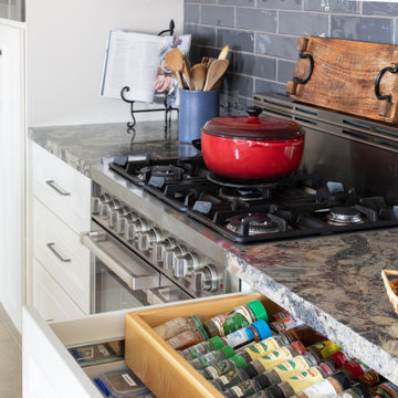
➢ the integration of specific storage units, such as double stacked cutlery drawers, a custom spice pull-out, a Kuerig coffee and tea pod drawer, and custom double stacked utensil drawers
➢ moving the refrigerator to the old oven location - this eliminated the bottle neck as well as created a better relationship to the eating table. It also utilizes the floor space between the pantry, nook, and kitchen
➢ creating a banquet style breakfast nook - this banquette seating not only doubles the amount of seating for large gatherings but it better utilizes the odd space between the kitchen and the previous nook area. It also helps to create a distinct pathway from the mudroom room through the pantry area, kitchen, nook, and living room.
➢ the coffee/breakfast bar area which includes the perfect location for the concealed microwave and toaster oven, convenient storage for the coffee pods and tea accoutrements. Roll-out drawers below also house the smoothie maker, hot water kettle, and a plethora of smoothie-making ingredients such as protein powders, smoothie additives, etc. Furthermore, the drawers below the Keurig house measuring utensil, cutlery, baking supplies and tupperware storage.
➢ incorporating lots of wide drawers and pullouts to accommodate large cookware.
➢ utilizing as much vertical space as possible by building storage to the ceiling which accommodates the family’s abundant amount of serving platters, baking sheets, bakeware, casserole dishes, and additional cutting boards.
The project is enhanced aesthetically by:
➢ new 5-piece Versailles pattern porcelain tile that now seamlessly joins the entire down stairs area together creating a bright, cohesiveness feeling instead of choppy separated spaces - it also adds a coastal feeling
➢ designing a cabinet to conceal the microwave and toaster oven
➢ the coastal influenced light fixtures over the nook table and island
➢ the sandy colors of the Langdon Cambria countertops. The swirling pattern and sparkling quartz pieces remind the homeowner of black-and-tan sandy beaches
➢ the striped banquet seating whose creamy white background and blue-green stripes were the inspiration for the cabinet and wall colors.
➢ All the interior doors were painted black to coordinate with the blacks and grays in the backsplash tile and countertop. This also adds a hint of tailored formality to an otherwise casual space.
➢ the use of WAC's Oculux small aperture LED units for the overhead lighting complimented with Diode LED strips for task lighting under the cabinets and inside the pantry and glass wall cabinets. All of the lighting applications are on separate dimmer switches.
Innovative uses of materials or construction methods by Realty Restoration LLC:
➢ Each 1-1/2” x 3” block of reclaimed end-grain black walnut that makes up the center island chopping block was hand milled and built in the shop. It was designed to look substantial and proportional to the surrounding elements, executed by creating the 4 inch tall top with a solid wood chamfered edge band.
➢ The metal doors on either side of the vent hood were also custom designed for this project and built in the Realty Restoration LLC shop. They are made 1x2, 11-gauge mild steel with ribbed glass. Weighing 60 lbs a piece, heavy duty cabinet hinges were added to support the weight of the door and keep them from sagging.
➢ Under-cabinet receptacles were added along the range wall in order to have a clean, uninterrupted backsplash.
Design obstacles to overcome:
➢ Because we were removing the demising walls between the kitchen and living room, we had to find a way to plumb and vent the new island. We did this by tunneling through the slab (the slab had post tension cables which prevented us from just trenching) to run a new wet vent through a nearby structural wall. We pulled the existing hot and cold lines between upper floor joists and ran them down the structural wall as well and up through a conduit in the tunnel.
➢ Since we were converting from wall overs to a gas range it allowed us to utilize the 220 feed for the wall ovens to provide a new sub panel for all the new kitchen circuits
➢ Due to framing deficiencies inherited from the original build there was a 1-1/2” differential in the floor-to-ceiling height over a 20 foot span; by utilizing the process of cutting and furring coupled with the crown moulding details on the cabinet elevations we were able to mask the problem and provide seamless transitions between the cabinet components.
Evidence of superior craftsmanship:
➢ uniquely designed, one-of-a-kind metal “X” end panels on the large island. The end panels were custom made in the Realty Restoration LLC shop and fitted to the exact dimensions of the island. The welding seams are completely indistinguishable - the posts look like they are cut from a single sheet of metal
➢ square metal posts on the small island were also custom made and designed to compliment and carry through the metal element s throughout the kitchen
➢ the beautiful, oversized end panels on the pantry cabinets which give the breakfast nook a tailored look
➢ integrating a large format 5 piece Versailles tile pattern to seamlessly flow from the existing spaces into the new kitchen space
➢ By constructing a custom cabinet that jogged around a corner we could not remodel (housing the entry way coat closet) we were able to camouflage the adjacent wall offset within the upper and lower cabinets. By designing around the existing jog in the structural walls we accomplished a few things: we were able to find the space to house, and hide, the microwave and toaster oven yet still have a clean cohesive appearance from the kitchen side. Additionally, the owners were able to keep their much needed coat closet and we didn’t have to increase the budget with unnecessary structural work.
 Eden LA Furniture and Interiors
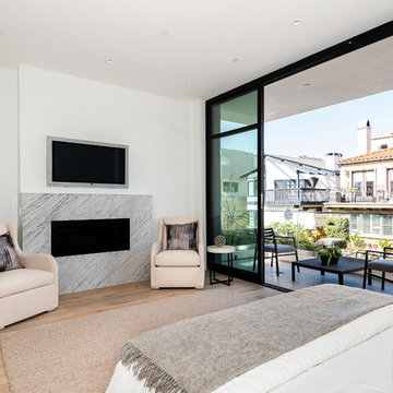
Modern living with ocean breezes
__
This is another development project EdenLA assisted the client to finish quickly and for top dollar. The fun challenge of more contemporary spaces is how to make them warm and inviting while still maintaining the overall masculine appeal of their architecture. Water features, playful custom abstract art, unique furniture layouts, and warm stone and cabinetry decisions all helped to achieve that in this space. Beach Life Construction implemented the architect's indoor-outdoor flow on the top floor beautifully as well.
__
Kim Pritchard Photography
 Oseka Homes
Anna Oseka
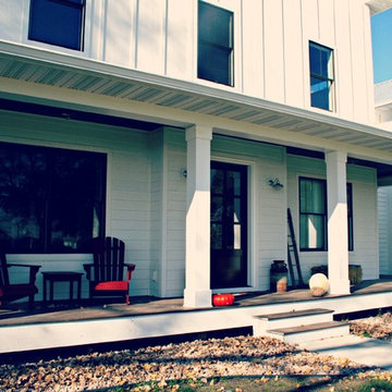
Oseka Homes is a custom home design-build company owned by Justin and Anna Oseka. Justin holds a degree in Construction Management, and Anna in Interior Design, both from the University of Nebraska at Kearney. They started the company in 2005 after moving back to Central Nebraska and have been passionately building beautiful, high-quality homes for their clients ever since.
Oseka Homes will see your home through from concept to creation. Starting by drawing our own blueprints, we walk you through the entire building process, addressing all of the necessary selections up front. You will know exactly what is included in your project with our thorough contract and selections booklet. We are truly a turn-key operation.
When it comes time to finalize selections on fixtures and finishes for your home, we do all the legwork and present you with the options. Using an experienced Interior Designer to guide you in your decisions makes the process easy and fun!
Whether you are looking for a rustic retreat pulled straight out of the Rockies, a classic colonial with grand facade, or a charming farmhouse reminiscent of days-gone-by, Justin and Anna will guide you step-by-step through a comprehensive and efficient process. Let Oseka Homes make your dream home a reality!
 Deborah Leamann
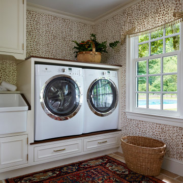
This laundry has the same stone flooring as the mudroom connecting the two spaces visually. While the wallpaper and matching fabric also tie into the mudroom area. Raised washer and dryer make use easy breezy. A Kohler sink with pull down faucet from Newport brass make doing laundry a fun task.

Sponsored
Columbus, OH

Hope Restoration & General Contracting
Columbus Design-Build, Kitchen & Bath Remodeling, Historic Renovations
 Twelve Stones Designs, LLC
The owners of this kitchen had spent the money to upgrade the finishes in their kitchen upon building the home 12 years ago, but after living in the space for several years they realized how nonfunctional the layout really was. The (then) two preschool aged children had grown into busy, hungry teenagers with many friends who also liked to hang out at the house. So the family needed a more functional kitchen with better traffic flow, space for daily activities revolving around the kitchen at different times of day, and a kitchen that could accommodate cooking for and serving large groups. Furthermore, the dark, traditional finishes no longer reflected the homeowners’ style. They requested a brighter, more relaxed, coastal style that reflected their love of the seaside cities they like to visit.
Originally, the kitchen was U-shaped with a narrow island in the middle. The island created narrow aisles that bottle-necked at the dishwasher, refrigerator, and cooktop areas. There was a pass-through from the foyer into the kitchen, but the owners never liked that the pass-through was also located so close to the powder room. The awkward proximity was unappealing and made guests feel uncomfortable.
The kitchen’s storage was made up of lots of narrow cabinets, apothecary drawers, clipped corner units, and very few drawers. It lacked useful storage for the larger items the family used on a daily basis. And the kitchen’s only pantry was small closet that had only builder-grade, narrow shelving with no illumination to be able to see the contents inside.
Overall, the kitchen’s lighting plan was poorly executed. Only six recessed cans illuminated the entire kitchen and nook areas. The under cabinet lighting was not evenly distributed either. In fact, the builder had mis-placed the under cabinet lighting around the decorative pilasters which made for choppy, dark cubbies. Further, the builder didn’t include any lighting over the sink or the bar area, which meant whoever was doing the dishes was always in their own shadow. That, coupled with the steep overhang of the game room above made the bar area feel like a dim, cavernous space that wasn’t inviting or task oriented. The kitchen looked out into the main living space, but the raised bar and a narrow wall (which held the only large cabinet in the kitchen) created more of a barrier than a relationship to the living room or breakfast nook. In fact, one couldn’t even see the breakfast nook from the cooktop or sink areas due to its orientation. The raised bar top was too narrow to comfortably sit to either dine at or chat from due to the lack of knee space. The the homeowners confided that the kitchen felt more like a dark, dirty prison than place where the family, or their guests, wanted to gather and commune.
The clients' needs and desires were:
➢ to create a kitchen that would be a space the family loved to be in; to relate to the adjacent spaces all around, and to have better flow for entertaining large groups
➢ to remove the walls between the breakfast nook and living area and to be able to utilize the natural light from the windows in both those areas
➢ to incorporate a functional chopping block for prepping fresh food for home cooked meals, an island with a large sink and drain board, 2 pull out trash cans, and seating for at least the 2 teens to eat or do homework
➢ to design a kitchen and breakfast nook with an airy, coastal, relaxed vibe that blended with the rest of the house's coastal theme
➢ to integrate a layered lighting plan which would include ample general illumination, specific task lighting, decorative lighting, and lots of illuminated storage
➢ to design a kitchen with not only more storage for all the husband’s kitchen gadgets and collection of oils and spices, but smart storage, including a coffee/breakfast bar and a place to store and conceal the toaster oven and microwave
➢ to find a way to utilize the large open space between the kitchen, pantry area, and breakfast nook
Twelve Stones Designs achieved the owner's goals by:
➢ removing the walls between the kitchen and living room to allow the natural light to filter in from the adjacent rooms and to create a connection between the kitchen, nook, and living spaces for a sense of unity and communion
➢ removing the existing pantry and designing 3 large pantry style cabinets with LED tape lights and rollout drawers to house lots of kitchen appliances, gadgets, and tons of groceries. We also took the cabinets all the way up to the 9’ ceiling for additional storage for seasonal items and bulk storage.
➢ designing 2 islands - 1 with a gorgeous black walnut chopping block that houses a drawer for chopping and carving knives and a custom double pull out trash unit for point of use utilization - and 1 that houses the dishwasher, a large Blanco Gourmet sink with integrated drain board, woven baskets for fresh root vegetables and kitchen towels, plenty of drawer storage for kitchen items, and bar seating for up to 4 diners.
➢ closing off the space between the kitchen and the powder room to create a beautiful new private alcove for the powder room as well as adding some decorative storage. This also gave us space to include more tall storage near the new range for precision placement of the husband’s extensive oil and spice collection as well as a location for a combo-steam oven the wife wanted for baking and cooking healthy meals.
The project is enhanced functionally by:
➢ incorporated USB and standard receptacles for the kids’ laptops and phone charging in the large island
➢ designing the small island to include additional open shelving for items used on a daily basis such as a variety of bowls, plates, and colanders. This set up also works well for the husband who prefers to “plate” his dinners in restaurant-style fashion before presenting them to the table.
➢ the integration of specific storage units, such as double stacked cutlery drawers, a custom spice pull-out, a Kuerig coffee and tea pod drawer, and custom double stacked utensil drawers
➢ moving the refrigerator to the old oven location - this eliminated the bottle neck as well as created a better relationship to the eating table. It also utilizes the floor space between the pantry, nook, and kitchen
➢ creating a banquet style breakfast nook - this banquette seating not only doubles the amount of seating for large gatherings but it better utilizes the odd space between the kitchen and the previous nook area. It also helps to create a distinct pathway from the mudroom room through the pantry area, kitchen, nook, and living room.
➢ the coffee/breakfast bar area which includes the perfect location for the concealed microwave and toaster oven, convenient storage for the coffee pods and tea accoutrements. Roll-out drawers below also house the smoothie maker, hot water kettle, and a plethora of smoothie-making ingredients such as protein powders, smoothie additives, etc. Furthermore, the drawers below the Keurig house measuring utensil, cutlery, baking supplies and tupperware storage.
➢ incorporating lots of wide drawers and pullouts to accommodate large cookware.
➢ utilizing as much vertical space as possible by building storage to the ceiling which accommodates the family’s abundant amount of serving platters, baking sheets, bakeware, casserole dishes, and additional cutting boards.
The project is enhanced aesthetically by:
➢ new 5-piece Versailles pattern porcelain tile that now seamlessly joins the entire down stairs area together creating a bright, cohesiveness feeling instead of choppy separated spaces - it also adds a coastal feeling
➢ designing a cabinet to conceal the microwave and toaster oven
➢ the coastal influenced light fixtures over the nook table and island
➢ the sandy colors of the Langdon Cambria countertops. The swirling pattern and sparkling quartz pieces remind the homeowner of black-and-tan sandy beaches
➢ the striped banquet seating whose creamy white background and blue-green stripes were the inspiration for the cabinet and wall colors.
➢ All the interior doors were painted black to coordinate with the blacks and grays in the backsplash tile and countertop. This also adds a hint of tailored formality to an otherwise casual space.
➢ the use of WAC's Oculux small aperture LED units for the overhead lighting complimented with Diode LED strips for task lighting under the cabinets and inside the pantry and glass wall cabinets. All of the lighting applications are on separate dimmer switches.
Innovative uses of materials or construction methods by Realty Restoration LLC:
➢ Each 1-1/2” x 3” block of reclaimed end-grain black walnut that makes up the center island chopping block was hand milled and built in the shop. It was designed to look substantial and proportional to the surrounding elements, executed by creating the 4 inch tall top with a solid wood chamfered edge band.
➢ The metal doors on either side of the vent hood were also custom designed for this project and built in the Realty Restoration LLC shop. They are made 1x2, 11-gauge mild steel with ribbed glass. Weighing 60 lbs a piece, heavy duty cabinet hinges were added to support the weight of the door and keep them from sagging.
➢ Under-cabinet receptacles were added along the range wall in order to have a clean, uninterrupted backsplash.
Design obstacles to overcome:
➢ Because we were removing the demising walls between the kitchen and living room, we had to find a way to plumb and vent the new island. We did this by tunneling through the slab (the slab had post tension cables which prevented us from just trenching) to run a new wet vent through a nearby structural wall. We pulled the existing hot and cold lines between upper floor joists and ran them down the structural wall as well and up through a conduit in the tunnel.
➢ Since we were converting from wall overs to a gas range it allowed us to utilize the 220 feed for the wall ovens to provide a new sub panel for all the new kitchen circuits
➢ Due to framing deficiencies inherited from the original build there was a 1-1/2” differential in the floor-to-ceiling height over a 20 foot span; by utilizing the process of cutting and furring coupled with the crown moulding details on the cabinet elevations we were able to mask the problem and provide seamless transitions between the cabinet components.
Evidence of superior craftsmanship:
➢ uniquely designed, one-of-a-kind metal “X” end panels on the large island. The end panels were custom made in the Realty Restoration LLC shop and fitted to the exact dimensions of the island. The welding seams are completely indistinguishable - the posts look like they are cut from a single sheet of metal
➢ square metal posts on the small island were also custom made and designed to compliment and carry through the metal element s throughout the kitchen
➢ the beautiful, oversized end panels on the pantry cabinets which give the breakfast nook a tailored look
➢ integrating a large format 5 piece Versailles tile pattern to seamlessly flow from the existing spaces into the new kitchen space
➢ By constructing a custom cabinet that jogged around a corner we could not remodel (housing the entry way coat closet) we were able to camouflage the adjacent wall offset within the upper and lower cabinets. By designing around the existing jog in the structural walls we accomplished a few things: we were able to find the space to house, and hide, the microwave and toaster oven yet still have a clean cohesive appearance from the kitchen side. Additionally, the owners were able to keep their much needed coat closet and we didn’t have to increase the budget with unnecessary structural work.
 Liz Schupanitz Designs
A PLACE TO GATHER
Location: Eagan, MN, USA
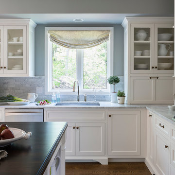
This family of five wanted an inviting space to gather with family and friends. Mom, the primary cook, wanted a large island with more organized storage – everything in its place – and a crisp white kitchen with the character of an older home.
Challenges:
Design an island that could accommodate this family of five for casual weeknight dinners.
Create more usable storage within the existing kitchen footprint.
Design a better transition between the upper cabinets on the 8-foot sink wall and the adjoining 9-foot cooktop wall.
Make room for more counter space around the cooktop. It was poorly lit, cluttered with small appliances and confined by the tall oven cabinet.
Solutions:
A large island, that seats 5 comfortably, replaced the small island and kitchen table. This allowed for more storage including cookbook shelves, a heavy-duty roll out shelf for the mixer, a 2-bin recycling center and a bread drawer.
Tall pantries with decorative grilles were placed between the kitchen and family room. These created ample storage and helped define each room, making each one feel larger, yet more intimate.
A space intentionally separates the upper cabinets on the sink wall from those on the cooktop wall. This created symmetry on the sink wall and made room for an appliance garage, which keeps the countertops uncluttered.
Moving the double ovens to the former pantry location made way for more usable counter space around the cooktop and a dramatic focal point with the hood, cabinets and marble backsplash.
Special Features:
Custom designed corbels and island legs lend character.
Gilt open lanterns, antiqued nickel grilles on the pantries, and the soft linen shade at the kitchen sink add personality and charm.
The unique bronze hardware with a living finish creates the patina of an older home.
A walnut island countertop adds the warmth and feel of a kitchen table.
This homeowner truly understood the idea of living with the patina of marble. Her grandmother’s marble-topped antique table inspired the Carrara countertops.
The result is a highly organized kitchen with a light, open feel that invites you to stay a while.
Liz Schupanitz Designs
Photographed by: Andrea Rugg
 TKS Design Group
Free ebook, Creating the Ideal Kitchen. DOWNLOAD NOW
Collaborations with builders on new construction is a favorite part of my job. I love seeing a house go up from the blueprints to the end of the build. It is always a journey filled with a thousand decisions, some creative on-the-spot thinking and yes, usually a few stressful moments. This Naperville project was a collaboration with a local builder and architect. The Kitchen Studio collaborated by completing the cabinetry design and final layout for the entire home.
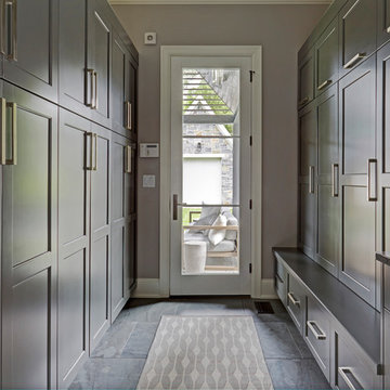
Access to the back of the house is through the mudroom which is outfitted with just about every possible storage feature you can think of for a mudroom. For starters, the basics – a locker for each family member. In addition to that, there is an entire cabinet with roll outs devoted just to shoes, one for cleaning supplies and one for extra coats. The room also features a small clean up sink as well as a set of refrigerator drawers making grabbing a Gatorade on the way to soccer practice a piece of cake.
If you are building a new home, The Kitchen Studio can offer expert help to make the most of your new construction home. We provide the expertise needed to ensure that you are getting the most of your investment when it comes to cabinetry, design and storage solutions. Give us a call if you would like to find out more!
Designed by: Susan Klimala, CKBD
Builder: Hampton Homes
Photography by: Michael Alan Kaskel
For more information on kitchen and bath design ideas go to: www.kitchenstudio-ge.com

 Tom Bassett-Dilley Architect, Ltd.
Photography by Natalie Marotta
Bungalows are lovable homes, but how can they be better? Along with many of our clients, we find that older (early 20th c.) homes have a lot of character and a comfortable scale, but are leaky, damp (especially in the basement), have fair to poor air quality, and use unconscionable amounts of fossil fuels to heat. The owners of this bungalow were ready to change that, and wanted to do so with minimal upfront carbon emissions as well.
The gut renovation included replacing the basement slab and providing capillary breaks and insulation continuously below grade. The brick structure was treated with a fluid-applied air and water barrier from the interior and insulated entirely with cellulose, a carbon-storing insulation. The roof used HFO-blown spray foam to provide sufficient insulation while allowing headroom for bedrooms, bathrooms, and laundry.
One great benefit of a full renovation is the possibility of reconfiguring spaces to suit the family’s lifestyle, and to make the best of indoor-outdoor connections. We opened up the main rooms on the first floor, creating a family gathering spot with a view to the back yard, and a spacious kitchen that supports the family’s commitment to cooking for healthy eating. The stair uses a north-facing skylight to bring light from above into the middle of the home, where it was previously dark.
As a decarbonization retrofit, the inefficient furnace was replaced with two small ducted heat pump systems, water heating and clothes drying are powered by air-source heat pumps, and cooking uses an induction cooktop plus electric ovens. Energy recovery ventilation provides filtered fresh air continuous exhaust from the kitchen, baths, and laundry, and supplies fresh, highly filtered air to bedrooms and living spaces.
The Better Bungalow now makes sense for the 21st century–it now fits the owners’ life-patterns, is super comfortable, has great air quality, and uses a fraction of the energy it did before, greatly lowering the demand on the utility grid. In the near future, when solar PV is installed, it can achieve net zero or near net zero emissions, and with battery backup, can provide great resilience in the event of power outages.
 Fiorito Interior Design
My clients approached this kitchen remodel hoping not only for improved functionality but for a space that invited comfort, warmth, and daily enjoyment. Their existing kitchen was limited in both layout and atmosphere where a small island barely larger than a podium offered little utility. An oversized double-width doorway at the rear of the room leading into the adjacent living space disrupted the flow, making furniture placement nearly impossible. They longed for a kitchen where cooking felt easy and intuitive, but also one where they could sit at the table with a book and a cup of tea, or host friends without feeling cramped or awkwardly positioned.
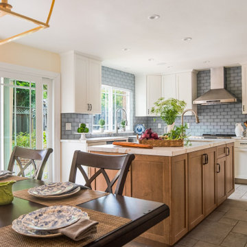
One of the most impactful decisions we made early on was to close off that extra-wide opening to the living room. Doing so allowed us to reclaim the wall, which not only improved circulation but also gave us the freedom to rethink the spacing of the kitchen and eat-in area. With that change, we could introduce a much larger island—truly functional this time—complete with generous workspace and storage. It became a true centerpiece for meal prep, casual dining, and gathering.
From there I turned my attention to layering in comfort, personality, and style. I curated a color palette of soft white, pale blue, light wood tones, and touches of sunshine yellow. This fresh and uplifting combination feels timeless and relaxed. We chose cabinetry with traditional Shaker-style doors, accented by black forged iron hardware for a subtle hint of contrast and authenticity. For the countertops we chose a Gold Calacatta-look quartz, bringing elegance and warmth with its soft veining and classic appeal.
To elevate the kitchen walls I selected a soft matte glass tile in a moody, sky-blue that blankets the backsplash, providing a gentle wash of color that’s calming and cohesive. On the floors I chose a limestone-look porcelain tile in a classic Versailles pattern as an homage to old English manor houses—bringing character and texture underfoot while remaining durable and low-maintenance for modern life.
Lastly I transformed the adjacent eat-in area into a cozy, multifunctional space. We added custom built-in bookshelves and a sideboard for serving and display—perfect for entertaining or simply making daily routines feel more special. A black iron picture light softly illuminates the buffet, lending a warm, ambient glow in the evenings. I carefully planned the seating arrangement to include a space-saving banquette along the wall, paired with a trestle-style dining table and side chairs. At either end I placed tufted host chairs upholstered in an exquisite, tonal Chinoiserie dragon pattern that are comfortable enough to sit on for hours. Whether sharing a leisurely meal, reading in the sunlight, or gazing out at the greenery just beyond the windows, this spot now invites my clients to truly enjoy their home in a new, deeper way.
Photo: Bernardo Grijalva
 butter+velvet DESIGN · HOME
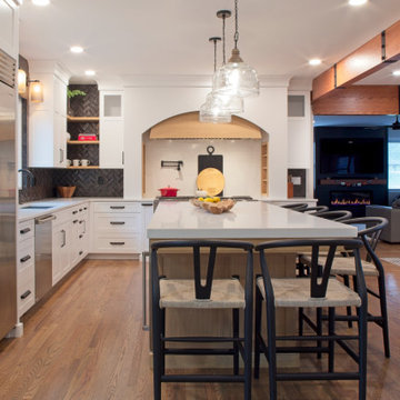
This renovation for a young family with two boys truly reflects the essence of thoughtful design that balances aesthetics with practicality. The decision to remove two walls and replace them with beams covered in red oak veneers speaks to the family’s need for an open floor plan, ensuring important sight lines while the boys play—a perfect solution for parents who want a balance between modern living and supervision.
The arch in the range hood becomes a focal point, introducing elegance and architectural sophistication to the space, while the black gloss "handmade" herringbone backsplash tiles add a layer of dynamic texture that elevates the kitchen's design. These touches show that this renovation wasn’t just about creating a functional space, but one with character and style.
Functionality was clearly top of mind, with the focus on ample storage, modern appliances, and smart layouts. These elements allow the kitchen to meet the demands of a busy family, whether it’s for everyday meals or special gatherings. The seamless flow between the kitchen, dining room, and great room makes this space ideal for entertaining and family interaction, further enhanced by the clean, open lines.
This renovation serves as a great example of how thoughtful design can transform a home, making it not only more beautiful but also more enjoyable and efficient for day-to-day living.


 Klopf Architecture
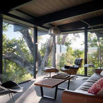
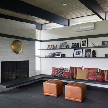
Set in a quiet neighborhood and framed by mature trees, this residence presented a unique opportunity: to thoughtfully evolve a custom mid-century modern home into a space that supports the everyday rhythms of a growing family. With a deep respect for the home’s original architecture, Klopf Architecture reimagined the house to better meet the needs of its owners—introducing functional improvements while preserving the spirit and character of its mid-century roots.
The clients approached Klopf Architecture with a clear vision: refresh their home while seamlessly integrating new programmatic elements. Key goals included clarifying and enhancing the entry sequence; connecting the detached garage to the main house with a practical yet architecturally intentional intervention; adding functional spaces such as a mudroom and laundry room; expanding and remodeling the primary suite’s bathroom and closet; and creating a more engaging outdoor space that capitalized on the site’s impressive views, featuring a fire pit and outdoor kitchen.
As a couple with distinct yet complementary perspectives—one focused on modern functionality and technology, and the other dedicated to preserving the home’s architectural integrity—their collaboration with Klopf Architecture resulted in a solution that harmonized both ideals. Their shared commitment to improving the livability of their home led to a design dialogue rooted in balance. This dynamic partnership shaped the direction of the renovation, ensuring that every decision honored the spirit of the original home while aligning with the practical needs of their growing family.
Designing within the constraints of the sloped site posed one of the project’s central challenges. The detached garage sat at a higher elevation than the main house, requiring a solution that ensured architectural and geometric compatibility between the two structures. Rather than create a purely utilitarian link, Klopf Architecture introduced an intentional connection that contributes to the overall architectural language. A notable pinch point in the plan—where differing geometries converged—was treated as a hinge point, turning a potentially awkward juncture into an architectural feature. This area now functions as both a transition and a moment of design interest that unifies the overall plan.
The design also addressed the underutilized outdoor area, which was located in a shadowed portion of the site with geometrical limitations. A new connection to the rear deck was created in this same area, making the outdoor space more useful and inviting. Klopf Architecture introduced carefully positioned openings and spatial improvements that forged a strong visual and functional connection between indoor and outdoor spaces. The outdoor area now reads as a deliberate extension of the home, embracing natural light and emphasizing the dramatic views.
Working through multiple design iterations, Klopf Architecture crafted a solution that preserved the architectural language of the original home while supporting the functional needs of modern life. The garage-to-house connection became more than a passage—it evolved into an architectural moment of transition. A new mudroom and laundry space enhanced convenience without compromising the clean lines of the design. The primary suite was expanded to create a private, serene retreat. The reimagined backyard, complete with fire pit and kitchen, now plays a vital role in the family’s daily routine and social life.
Outcomes and Lasting Impact
The result is a home that balances heritage with contemporary design, technical precision with design sensibility. The redesign not only met the clients’ initial goals but also exceeded expectations in its ability to seamlessly blend past and present, function and beauty, making the outdoor kitchen a favorite gathering place.
Beyond aesthetics, the renovation has significantly improved daily life for the family. The newly integrated garage connection has streamlined routines, providing a seamless transition between arriving home, storing belongings, and entering the main living spaces. The expanded primary suite offers a retreat-like atmosphere, creating a private space to unwind at the end of the day. The redesigned outdoor areas have also become an extension of their lifestyle—whether it's casual family dinners around the fire pit, entertaining friends in the outdoor kitchen, or simply enjoying the view from the reimagined backyard.
Through a thoughtful and strategic approach, the house has been successfully evolved into a home that remains true to its mid-century modern roots while enhancing livability, functionality, and the overall quality of life for the modern-day owners.
Klopf Architecture Team: Geoffrey Campen, Fernanda Bernardes
Architectural Interior Design: Klopf Architecture
Structural Engineer: Base Design Inc.
Contractor: Golden Snail Builders
Photography: Mariko Reed
Year Completed:2022
 Klopf Architecture
Set in a quiet neighborhood and framed by mature trees, this residence presented a unique opportunity: to thoughtfully evolve a custom mid-century modern home into a space that supports the everyday rhythms of a growing family. With a deep respect for the home’s original architecture, Klopf Architecture reimagined the house to better meet the needs of its owners—introducing functional improvements while preserving the spirit and character of its mid-century roots.
The clients approached Klopf Architecture with a clear vision: refresh their home while seamlessly integrating new programmatic elements. Key goals included clarifying and enhancing the entry sequence; connecting the detached garage to the main house with a practical yet architecturally intentional intervention; adding functional spaces such as a mudroom and laundry room; expanding and remodeling the primary suite’s bathroom and closet; and creating a more engaging outdoor space that capitalized on the site’s impressive views, featuring a fire pit and outdoor kitchen.
As a couple with distinct yet complementary perspectives—one focused on modern functionality and technology, and the other dedicated to preserving the home’s architectural integrity—their collaboration with Klopf Architecture resulted in a solution that harmonized both ideals. Their shared commitment to improving the livability of their home led to a design dialogue rooted in balance. This dynamic partnership shaped the direction of the renovation, ensuring that every decision honored the spirit of the original home while aligning with the practical needs of their growing family.
Designing within the constraints of the sloped site posed one of the project’s central challenges. The detached garage sat at a higher elevation than the main house, requiring a solution that ensured architectural and geometric compatibility between the two structures. Rather than create a purely utilitarian link, Klopf Architecture introduced an intentional connection that contributes to the overall architectural language. A notable pinch point in the plan—where differing geometries converged—was treated as a hinge point, turning a potentially awkward juncture into an architectural feature. This area now functions as both a transition and a moment of design interest that unifies the overall plan.
The design also addressed the underutilized outdoor area, which was located in a shadowed portion of the site with geometrical limitations. A new connection to the rear deck was created in this same area, making the outdoor space more useful and inviting. Klopf Architecture introduced carefully positioned openings and spatial improvements that forged a strong visual and functional connection between indoor and outdoor spaces. The outdoor area now reads as a deliberate extension of the home, embracing natural light and emphasizing the dramatic views.
Working through multiple design iterations, Klopf Architecture crafted a solution that preserved the architectural language of the original home while supporting the functional needs of modern life. The garage-to-house connection became more than a passage—it evolved into an architectural moment of transition. A new mudroom and laundry space enhanced convenience without compromising the clean lines of the design. The primary suite was expanded to create a private, serene retreat. The reimagined backyard, complete with fire pit and kitchen, now plays a vital role in the family’s daily routine and social life.
Outcomes and Lasting Impact
The result is a home that balances heritage with contemporary design, technical precision with design sensibility. The redesign not only met the clients’ initial goals but also exceeded expectations in its ability to seamlessly blend past and present, function and beauty, making the outdoor kitchen a favorite gathering place.
Beyond aesthetics, the renovation has significantly improved daily life for the family. The newly integrated garage connection has streamlined routines, providing a seamless transition between arriving home, storing belongings, and entering the main living spaces. The expanded primary suite offers a retreat-like atmosphere, creating a private space to unwind at the end of the day. The redesigned outdoor areas have also become an extension of their lifestyle—whether it's casual family dinners around the fire pit, entertaining friends in the outdoor kitchen, or simply enjoying the view from the reimagined backyard.
Through a thoughtful and strategic approach, the house has been successfully evolved into a home that remains true to its mid-century modern roots while enhancing livability, functionality, and the overall quality of life for the modern-day owners.
Klopf Architecture Team: Geoffrey Campen, Fernanda Bernardes
Architectural Interior Design: Klopf Architecture
Structural Engineer: Base Design Inc.
Contractor: Golden Snail Builders
Photography: Mariko Reed
Year Completed:2022
 Klopf Architecture
Set in a quiet neighborhood and framed by mature trees, this residence presented a unique opportunity: to thoughtfully evolve a custom mid-century modern home into a space that supports the everyday rhythms of a growing family. With a deep respect for the home’s original architecture, Klopf Architecture reimagined the house to better meet the needs of its owners—introducing functional improvements while preserving the spirit and character of its mid-century roots.
The clients approached Klopf Architecture with a clear vision: refresh their home while seamlessly integrating new programmatic elements. Key goals included clarifying and enhancing the entry sequence; connecting the detached garage to the main house with a practical yet architecturally intentional intervention; adding functional spaces such as a mudroom and laundry room; expanding and remodeling the primary suite’s bathroom and closet; and creating a more engaging outdoor space that capitalized on the site’s impressive views, featuring a fire pit and outdoor kitchen.
As a couple with distinct yet complementary perspectives—one focused on modern functionality and technology, and the other dedicated to preserving the home’s architectural integrity—their collaboration with Klopf Architecture resulted in a solution that harmonized both ideals. Their shared commitment to improving the livability of their home led to a design dialogue rooted in balance. This dynamic partnership shaped the direction of the renovation, ensuring that every decision honored the spirit of the original home while aligning with the practical needs of their growing family.
Designing within the constraints of the sloped site posed one of the project’s central challenges. The detached garage sat at a higher elevation than the main house, requiring a solution that ensured architectural and geometric compatibility between the two structures. Rather than create a purely utilitarian link, Klopf Architecture introduced an intentional connection that contributes to the overall architectural language. A notable pinch point in the plan—where differing geometries converged—was treated as a hinge point, turning a potentially awkward juncture into an architectural feature. This area now functions as both a transition and a moment of design interest that unifies the overall plan.
The design also addressed the underutilized outdoor area, which was located in a shadowed portion of the site with geometrical limitations. A new connection to the rear deck was created in this same area, making the outdoor space more useful and inviting. Klopf Architecture introduced carefully positioned openings and spatial improvements that forged a strong visual and functional connection between indoor and outdoor spaces. The outdoor area now reads as a deliberate extension of the home, embracing natural light and emphasizing the dramatic views.
Working through multiple design iterations, Klopf Architecture crafted a solution that preserved the architectural language of the original home while supporting the functional needs of modern life. The garage-to-house connection became more than a passage—it evolved into an architectural moment of transition. A new mudroom and laundry space enhanced convenience without compromising the clean lines of the design. The primary suite was expanded to create a private, serene retreat. The reimagined backyard, complete with fire pit and kitchen, now plays a vital role in the family’s daily routine and social life.
Outcomes and Lasting Impact
The result is a home that balances heritage with contemporary design, technical precision with design sensibility. The redesign not only met the clients’ initial goals but also exceeded expectations in its ability to seamlessly blend past and present, function and beauty, making the outdoor kitchen a favorite gathering place.
Beyond aesthetics, the renovation has significantly improved daily life for the family. The newly integrated garage connection has streamlined routines, providing a seamless transition between arriving home, storing belongings, and entering the main living spaces. The expanded primary suite offers a retreat-like atmosphere, creating a private space to unwind at the end of the day. The redesigned outdoor areas have also become an extension of their lifestyle—whether it's casual family dinners around the fire pit, entertaining friends in the outdoor kitchen, or simply enjoying the view from the reimagined backyard.
Through a thoughtful and strategic approach, the house has been successfully evolved into a home that remains true to its mid-century modern roots while enhancing livability, functionality, and the overall quality of life for the modern-day owners.
Klopf Architecture Team: Geoffrey Campen, Fernanda Bernardes
Architectural Interior Design: Klopf Architecture
Structural Engineer: Base Design Inc.
Contractor: Golden Snail Builders
Photography: Mariko Reed
Year Completed:2022
 lavish
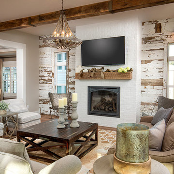
This Raleigh, NC home was reimagined from the ground up — not room by room, but as a single, cohesive expression of how a family lives, gathers, and rests.
The architecture drove every decision. Custom millwork and panel molding were carried through every space, creating a visual language that connects the entry to the living room, the dining room to the primary suite. It's what makes the home feel complete — not like a collection of individually finished rooms.
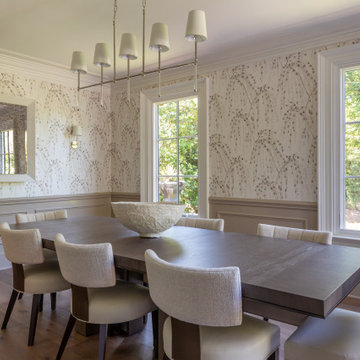
In the kitchen, a full marble slab backsplash reads as one uninterrupted surface — giving the room its presence without competing with the custom white inset cabinetry and brushed nickel hardware. The dining room lives in deliberate contrast: deep-toned oak table, delicate botanical wallpaper, antique mirror. Light and organic, yet entirely considered.
The living room was designed around its connection to the outside — French doors that open directly to a substantial outdoor kitchen and entertaining space, anchored on the interior by a cast stone fireplace with an arched surround that commands the room.
The entry sets the expectation for everything that follows: a double-height foyer, geometric pendants cascading from above, large-scale original artwork, and a carved console that makes the first impression without overstating it.
Designed and executed by Lavish — Raleigh, NC's full-service interior design and remodeling firm.
 SOIA Design
Project Overview
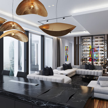
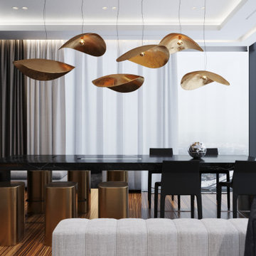
In one of the most iconic skyscrapers of Moscow City "Neva Towers", SOIA DESIGN was commissioned to design a refined, modern apartment that would harmonize with the panoramic skyline while remaining deeply personal and livable. The result is a bespoke 3D interior design project where every square meter was crafted with purpose and elegance.
The Challenge
The client approached us with a stunning high-rise space—but also with a complex brief:
Maximize views while ensuring privacy
Infuse warmth and comfort into a glass and steel environment
Introduce high-end materials and modern finishes without making the space feel cold
Optimize layout for both entertaining and everyday living
Achieve it all remotely
Our Solution
✦ Space Planning with Purpose: We reconfigured the layout to establish a seamless flow between the living, dining, and kitchen areas. Custom-built millwork and integrated storage solutions allowed us to keep the space minimalist without compromising on functionality.
✦ Warm Modernism: To contrast the building’s steel-and-glass architecture, we brought in natural stone, matte wood finishes, and warm lighting. Curated textures and neutral tones created a soft yet sophisticated atmosphere.
✦ 3D Visualization Precision: Leveraging high-end 3D modeling and photorealistic rendering, we presented the design in full detail—allowing the client to walk through the space virtually, make informed decisions, and see exactly how each element would look and feel.
✦ Tailored Detailing: Every aspect was custom—from the furniture selection and lighting scenarios to the precise alignment of veined marble in the bathroom. We collaborated with local artisans and international brands to bring this level of refinement to life.
The Impact
The final design not only honored the prestige of Neva Towers but elevated it into a private sanctuary above the city. What began as a challenging high-rise shell became a warm, modern home tailored to the client’s lifestyle.
 SOIA Design
Project Overview
In one of the most iconic skyscrapers of Moscow City "Neva Towers", SOIA DESIGN was commissioned to design a refined, modern apartment that would harmonize with the panoramic skyline while remaining deeply personal and livable. The result is a bespoke 3D interior design project where every square meter was crafted with purpose and elegance.
The Challenge
The client approached us with a stunning high-rise space—but also with a complex brief:
Maximize views while ensuring privacy
Infuse warmth and comfort into a glass and steel environment
Introduce high-end materials and modern finishes without making the space feel cold
Optimize layout for both entertaining and everyday living
Achieve it all remotely
Our Solution
✦ Space Planning with Purpose: We reconfigured the layout to establish a seamless flow between the living, dining, and kitchen areas. Custom-built millwork and integrated storage solutions allowed us to keep the space minimalist without compromising on functionality.
✦ Warm Modernism: To contrast the building’s steel-and-glass architecture, we brought in natural stone, matte wood finishes, and warm lighting. Curated textures and neutral tones created a soft yet sophisticated atmosphere.
✦ 3D Visualization Precision: Leveraging high-end 3D modeling and photorealistic rendering, we presented the design in full detail—allowing the client to walk through the space virtually, make informed decisions, and see exactly how each element would look and feel.
✦ Tailored Detailing: Every aspect was custom—from the furniture selection and lighting scenarios to the precise alignment of veined marble in the bathroom. We collaborated with local artisans and international brands to bring this level of refinement to life.
The Impact
The final design not only honored the prestige of Neva Towers but elevated it into a private sanctuary above the city. What began as a challenging high-rise shell became a warm, modern home tailored to the client’s lifestyle.
 User
UserAll Weather teamed up with the Property Brothers and Friend’s Alumnus Lisa Kudrow on this week’s episode of HGTV’s hit show Celebrity IOU. In the Lisa Kudrow’s Stunning Condo Surprise episode, Lisa stuns her deserving cousin and best friend Thea, by transforming her condo into a stylish, functional and animal friendly home for the rescued abused animals she cares for.
Lisa not only helped the brothers come up with design ideas, but also picked up a sledgehammer and an electric saw to help them break up a wall. She also helped them kick down a dividing wall and pull tiles off the fireplace. After both of Thea’s parents passed away suddenly, she channeled her grief in meaningful ways, namely by caring for abused shelter pets. Lisa wanted to make sure Thea knew she was loved Renovating her outdated condo was the perfect gift. “Thea has spent the last few years navigating loss,” said Lisa. “She needs a soft place to land.” Lisa added. “She needs a functional space that’s safe and comfortable for the pets she loves.”
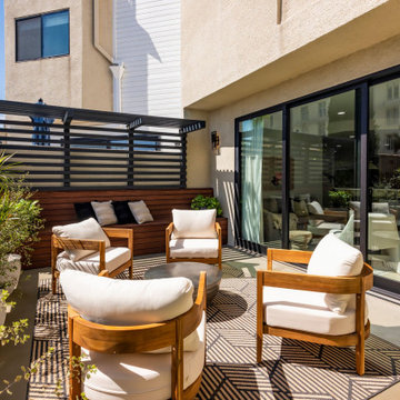
Besides modernizing Thea’s outdated condo, the focus was to make everything pet friendly in the remodeled the living room, dining room and outdoor patio. From premium vinyl plank flooring, to performance fabric furniture, to an outdoor dog run and pet potty platform.
All Weather Series 8100 Multi Slide Doors effortlessly connect the indoors to the outdoors allowing Thea’s four legged friends to explore the pet friendly outdoor patio. The magnificent makeover includes a custom built pantry, new modern fireplace, more storage, an open living room floor plan, pet friendly floating shelves and bench seating and slat wall shading. Check out more PROJECT PHOTOS here.
Lisa did join THE PROPERTY BROTHERS to sing her famous song Smelly Cat from the beloved sitcom Friends. ‘I’m just embarrassed I did such a poor job with Smelly Cat,’ Lisa added. ‘I should have just let Drew do it.”
Now in its third season, Celebrity IOU gives celebrities a chance to show their deepest gratitude and to surprise someone who is important in their life by giving their living space a complete transformation, courtesy of the Drew and Jonathan Scott.
12