
Search results for "Poor functionality" in Home Design Ideas
 Nicole Arnold Interiors
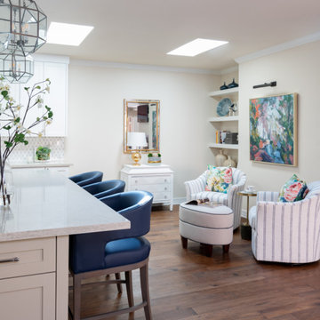
This home’s kitchen was dated, small and poorly laid out, leaving its avid cook frustrated and eager to realize new possibilities. We eliminated a rarely used exterior side patio and moved the exterior wall and roofline out to gain additional square footage, tons of functional storage, a large island and a quaint sitting area. Skylights were added to bring in natural light. This new layout is now perfect for entertaining lots of friends as well as intimate fireside chats.
 Dave Fox Design Build Remodelers
Dave Fox Design Build Remodelers
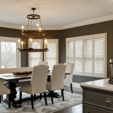
This kitchen remodel combined an under-utilized formal dining room and a small, poorly laid-out, kitchen into one large cohesive and functional space. The two furniture-inspired custom islands are great for entertaining; one can be used for socializing, while the other can be utilized for cleaning and prep work. A custom thin brick surround encompasses the professional-grade gas range with additional spice and oil storage while other interesting materials including, honed quartz countertops, glazed thin brick backsplash, and oversized statement lighting complete this gourmet kitchen.
 Saikley Architects
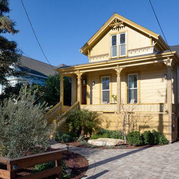
This beautiful 1881 Alameda Victorian cottage, wonderfully embodying the Transitional Gothic-Eastlake era, had most of its original features intact. Our clients, one of whom is a painter, wanted to preserve the beauty of the historic home while modernizing its flow and function.
From several small rooms, we created a bright, open artist’s studio. We dug out the basement for a large workshop, extending a new run of stair in keeping with the existing original staircase. While keeping the bones of the house intact, we combined small spaces into large rooms, closed off doorways that were in awkward places, removed unused chimneys, changed the circulation through the house for ease and good sightlines, and made new high doorways that work gracefully with the eleven foot high ceilings. We removed inconsistent picture railings to give wall space for the clients’ art collection and to enhance the height of the rooms. From a poorly laid out kitchen and adjunct utility rooms, we made a large kitchen and family room with nine-foot-high glass doors to a new large deck. A tall wood screen at one end of the deck, fire pit, and seating give the sense of an outdoor room, overlooking the owners’ intensively planted garden. A previous mismatched addition at the side of the house was removed and a cozy outdoor living space made where morning light is received. The original house was segmented into small spaces; the new open design lends itself to the clients’ lifestyle of entertaining groups of people, working from home, and enjoying indoor-outdoor living.
Photography by Kurt Manley.
https://saikleyarchitects.com/portfolio/artists-victorian/
Find the right local pro for your project
 Nicole Arnold Interiors
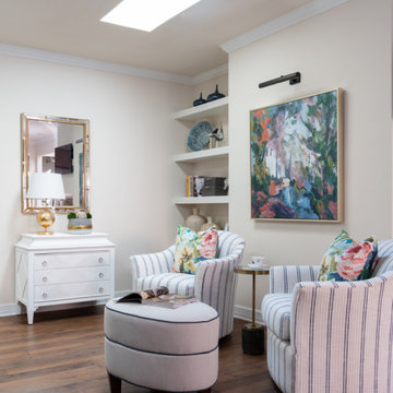
This home’s kitchen was dated, small and poorly laid out, leaving its avid cook frustrated and eager to realize new possibilities. We eliminated a rarely used exterior side patio and moved the exterior wall and roofline out to gain additional square footage, tons of functional storage, a large island and a quaint sitting area. Skylights were added to bring in natural light. This new layout is now perfect for entertaining lots of friends as well as intimate fireside chats.
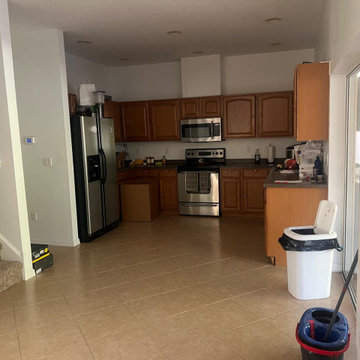
 Voar Construction
Before the Renovation:
An outdated and cramped kitchen with poor lighting and a lack of functional layout. This space was in dire need of a makeover to bring more comfort, efficiency, and style to daily life. The transformation begins here!
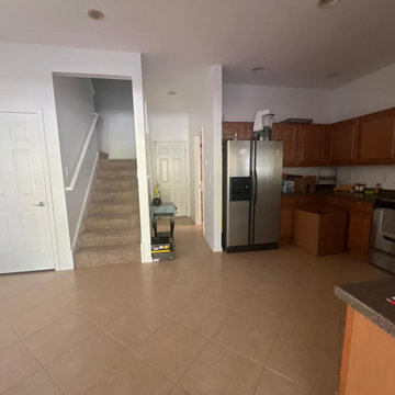 Voar Construction
Before the Renovation:
An outdated and cramped kitchen with poor lighting and a lack of functional layout. This space was in dire need of a makeover to bring more comfort, efficiency, and style to daily life. The transformation begins here!
 AFFD Design Firm
GAO Zhiqiang: Exploring the infinite possibilities beyond boundaries - Space Emotion Design Series - Vniau Office
The essence of space design is to pay attention to people’s emotional needs, especially in office designs.
Vniau office is designed by GAO Zhiqiang, a space emotion designer. He created an extremely comfortable and inclusive office space by modern design tech-niques, combined with technology, history and humanities.
/ Explore /
Infinite possibilities beyond boundaries
A humanistic caring, warm and emotional design work, under the continuous changes of social forms, evolves into a space in accordance with the develop-ment of the current era, which is the most solid response from the designer to the space.
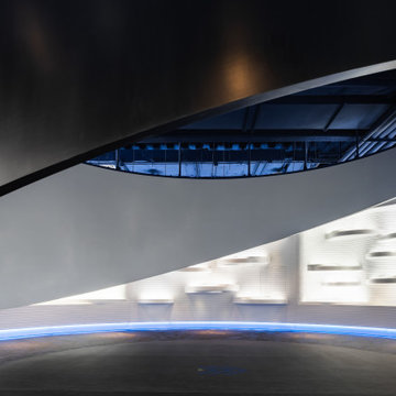
This open space makes you feel like entering into a movie scene. Large areas of black and white contrast, and smooth lines create a powerful aura. However, soft lights bring back a romantic atmosphere. The space is highlighted by vir-tuality and reality.
The development of modern technology diversified people’s cognition and iden-tification of space dimension. The designer tries to break the inherent bound-ary consciousness among technology, humanities and nature by comfortable and efficient spatial perception.
Wandering between virtual and real, light and shadow, the space presents a fu-ture sense through symbols. It shows a bold, free, open, lush, and new office format.
"Compared with technology, we pay more attention to people's emotions and feelings. We have always been advocating using the most common materials to create different spaces, and the key is depended on design." Said designer GAO Zhiqiang.
Therefore, when it came to the selection of materials, pureness presents in-finity, simplicity creates richness. Bright green brings cheerfulness, and the exposed ceiling and cloud-like chandeliers create a natural and agile visual perception. The combination of dynamic and stillness embodies the concentra-tion of the designer.
As the previous office was in Chinese style with redwood furniture, in order to have good effect of the overall space, the designer discussed with the own-er repeatedly, strive to change into a modern style, which matches more with their products, clients, competitors, brand culture and temperament of the of-fice, younger staff, etc., in the end, this design shows up.
This is a ring-shaped office space with same walls and same core tubes, which make people easily disoriented. By the principle of 5 elements - metal, wood, water, fire and earth, the designer placed the reception and exhibition room in the middle, and painted in yellow, corresponding to central earth.
According to this principle, the R & D department on the east side is decorat-ed in green, corresponding to wood, also, the market and finance department on the south side is orange, corresponding to fire. Service department on the west is white color representing metal, CEO and QC office on the north side is given black color, representing water. 5 directions are painted in 5 colors, which make people clearly distinguish departments and directions.
The building wall of the void area has a huge sloped beam, which causes poor visual experience. To solve this problem, the designer creates a magnificent X-shaped style by making use of the original beam structure. Its perforated sides and the luminous aluminum plates are very sci-fi, showing a similar vision of X-Men headquarters.
The interaction, communication and intersection among people are the key points of designing moving lines. Their optimization brings closer collaboration among departments,shorten the distance that people have to walk in the space, such as in conference rooms, negotiation rooms, recreation area, water bar, reception area.
Reasonable moving lines make discussion and communication between people, de-partments, and customers more efficient. At the same time, different spaces create different atmospheres and emotions, relax, or serious, or leisurable, etc., so as to meet needs of different moments.
In addition, the designer GAO Zhiqiang said, "We want to create a feeling of flowing clouds. Lights and curves create moving lines, and give a sense of freedom."
To remove the shackles of traditional office designs, and give a space infi-nite vitality is not just a change in form, it is more about 'people' them-selves. Here, everyone has a very large degree of freedom, and they can feel the infinite possibilities of future. Initiative and creativity are stimulated at the same time. Once people create the environment, areas interact with each other, and the power of design emerges.
Soft curve is a visual expression of tolerance and infinite possibilities. The spatial layout breaks isolation and shortens the distance of human hearts. High efficiency while no boundaries, and everywhere has space for independent thinking and solitude. The space respects each individual and can also unit as a whole.
Gaudi, the most famous Spanish architect, once said that straight lines belong to human, and curves belong to the God. It is probably that the curves give birth to too many wonderful changes. In this space, the curves are formed smoothly, either on the ground or ceiling, or a room, a partition.
"Spatial emotion design" advocates bringing human attributes to spatial func-tions. By designing and shaping the space, people are able to work in the best state of physiological and psychological emotions. Therefore, AFFD is trying their best to create comfortable working environments for employees, to ensure efficient work, as well as physical and mental health of staff.

Sponsored
Columbus, OH

Structural Remodeling
Franklin County's Heavy Timber Specialists | Best of Houzz 2020!
 MMW Architects
What the owners of the Madeline Ave Residence loved about the home when they bought it was the charm of the original 1920’s structure. However, a dissonance addition from the 1970’s shifted original charm to aesthetic awkwardness and poor flow. While maintaining the feel of the front façade, the rest of the home was reconfigured and choreographed to offer beauty and meet functional needs. Like many homes in historic districts, the homes grow organically to meet needs. Multiple forms and roof lines result.
Due to incorporating these same moves, this renovation fits seamlessly into the neighborhood. It is formal where it needs to be yet comfortable for the daily life. The people, the dog, the cats, the wine: all were carefully tended to throughout the design of the home. The spacious rooms and crisp white palette set the stage for vibrant tile and offers many locations for large scale art. Easy connections to the exterior spaces offer all-season gathering under the shade of the trellis or while making s’mores around the fire pit.
 Sue Oda
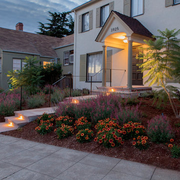
After one of the family took a fall on a slippery, sloped and painted walkway, our clients decided it was time to update their home's entry walkway. A large cedar tree, in poor health, also dripped sap on the sidewalk and parked cars, creating a sticky mess. We replaced the tree and water wasting lawn with drought tolerant alternatives and created a lighted, flagstone pathway, with custom steel railing leading to the front door.
In the backyard, our clients wanted to create a space for entertaining, hanging out with their grandchildren, and growing their own vegetables. The yard was replaced with a flagstone patio including a large raised bed. We also hid the air conditiong unit to create a convivial and functional area.
 Amsted Design-Build
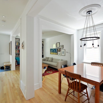
Previously renovated with a two-story addition in the 80’s, the home’s square footage had been increased, but the current homeowners struggled to integrate the old with the new.
An oversized fireplace and awkward jogged walls added to the challenges on the main floor, along with dated finishes. While on the second floor, a poorly configured layout was not functional for this expanding family.
From the front entrance, we can see the fireplace was removed between the living room and dining rooms, creating greater sight lines and allowing for more traditional archways between rooms.
At the back of the home, we created a new mudroom area, and updated the kitchen with custom two-tone millwork, countertops and finishes. These main floor changes work together to create a home more reflective of the homeowners’ tastes.
On the second floor, the master suite was relocated and now features a beautiful custom ensuite, walk-in closet and convenient adjacency to the new laundry room.
Gordon King Photography
 Nip Tuck Remodeling
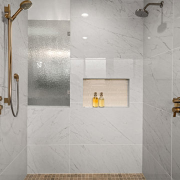
This home had dated and falling apart finishes, an insignificant fireplace in a giant living room, and a poor layout in the family room. Not to mention the primary bath covered in bamboo wallpaper.
The clients wanted a functional, updated and good-looking kitchen, a more adult family room, an updated serene primary bath. The remaining baths to be updated and modern. And, to make it feel like a holistic update, they wanted a welcoming staircase/entry.
As with most clients, stretching their dollar as far as possible was important. They didn't want to enlarge any footprint or move walls - we had to stay within existing bounds. With a whole home remodel costs can add up quickly depending on where we start & stop. For this family it made sense to do all the work at once to avoid repeat remodels. It was either buy new and still have to customize, or remodel to their exact needs and wants. The remodel was more affordable and made just for them.
Many finishes are clean, simple, and modern. A window was removed! in the family room to allow for a symmetrical entertainment center. A dramatic floor to ceiling fireplace surround was created in the Living room. The staircase was totally redone in both shape and style! The primary bath was reworked to get a two-person shower, and soaking tub. Serene /quiet finishes in the primary helped achieve a mellow /calming atmosphere. All new doors and trim throughout.
 Kaufman Construction Design and Build
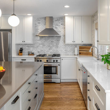
Emily and Steve have remodeled several pieces of their home and because they love Kaufman’s process so much, they keep coming back. In past years, we’ve remodeled most of their main floor including an updated living space and staircase, and a completely remodeled powder room and kitchen with a nice big island that’s perfect for entertaining. Their most recent project was this year when we remodeled their deck. The major pain points Steve and Emily dealt with before the remodel was lack of functionality due to poor design and because the previous owners had built the deck themselves, there were quite a few safety concerns. Throughout the design process, we decided to remove the existing deck completely and start fresh with a screened in porch, Emily’s Porch, and a deck off the porch with stairs going down to the beautiful backyard – one of the factors that motivated them to make this house their home to begin with.
 Kitchen Solvers of Spring Hill
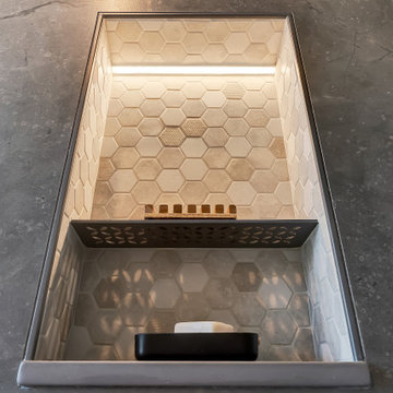
These homeowners were ready to completely transform their master bathroom. The existing space felt cramped and outdated, with an impractical linen closet, a small vanity, poor lighting, a bulky tub, and a shower that had seen better days. Their vision was clear—they wanted a warm, inviting, spa-inspired retreat with natural elements, rich textures, and a unique wood feature wall, rather than the all-white look that has become so common.
The finished design brings that vision to life through a beautiful blend of color, texture, and thoughtful details. A stunning cherry vanity and counter stack, topped with luxurious quartzite countertops, create warmth and elegance. The feature wall, finished in 1" x 3" Articulo tile, adds depth and visual interest, while large-format floor tiles provide a clean, modern foundation.
The curbless shower features coordinating hex tile flooring and niches, complemented by porcelain slab walls and glass panels that create an open, airy feel. A spacious freestanding tub offers the perfect place to relax and unwind. To maximize functionality, the doorway was relocated to accommodate a larger vanity, and custom barn and closet doors were added to enhance the room's character.
Programmable lighting tailored to the homeowners' lifestyle, along with a custom wood feature wall designed to showcase decorative plants, transformed a once-empty wall into a stunning focal point. What was once a dreaded space is now a beautiful spa-like retreat and one of the homeowners' favorite rooms in the house.


 San Luis Kitchen Co.
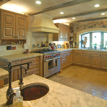
When the homeowners decided to move from San Francisco to the Central Coast, they were looking for a more relaxed lifestyle, a unique place to call their own, and an environment conducive to raising their young children. They found it all in San Luis Obispo. They had owned a house here in SLO for several years that they had used as a rental. As the homeowners own and run a contracting business and relocation was not impossible, they decided to move their business and make this SLO rental into their dream home.
As a rental, the house was in a bare-bones condition. The kitchen had old white cabinets, boring white tile counters, and a horrendous vinyl tile floor. Not only was the kitchen out-of-date and old-fashioned, it was also pretty worn out. The tiles were cracking and the grout was stained, the cabinet doors were sagging, and the appliances were conflicting (ie: you could not open the stove and dishwasher at the same time).
To top it all off, the kitchen was just too small for the custom home the homeowners wanted to create.
Thus enters San Luis Kitchen. At the beginning of their quest to remodel, the homeowners visited San Luis Kitchen’s showroom and fell in love with our Tuscan Grotto display. They sat down with our designers and together we worked out the scope of the project, the budget for cabinetry and how that fit into their overall budget, and then we worked on the new design for the home starting with the kitchen.
As the homeowners felt the kitchen was cramped, it was decided to expand by moving the window wall out onto the existing porch. Besides the extra space gained, moving the wall brought the kitchen window out from under the porch roof – increasing the natural light available in the space. (It really helps when the homeowner both understands building and can do his own contracting and construction.) A new arched window and stone clad wall now highlights the end of the kitchen. As we gained wall space, we were able to move the range and add a plaster hood, creating a focal nice focal point for the kitchen.
The other long wall now houses a Sub-Zero refrigerator and lots of counter workspace. Then we completed the kitchen by adding a wrap-around wet bar extending into the old dining space. We included a pull-out pantry unit with open shelves above it, wine cubbies, a cabinet for glassware recessed into the wall, under-counter refrigerator drawers, sink base and trash cabinet, along with a decorative bookcase cabinet and bar seating. Lots of function in this corner of the kitchen; a bar for entertaining and a snack station for the kids.
After the kitchen design was finalized and ordered, the homeowners turned their attention to the rest of the house. They asked San Luis Kitchen to help with their master suite, a guest bath, their home control center (essentially a deck tucked under the main staircase) and finally their laundry room. Here are the photos:
I wish I could show you the rest of the house. The homeowners took a poor rental house and turned it into a showpiece! They added custom concrete floors, unique fiber optic lighting, large picture windows, and much more. There is now an outdoor kitchen complete with pizza oven, an outdoor shower and exquisite garden. They added a dedicated dog run to the side yard for their pooches and a rooftop deck at the very peak. Such a fun house.
Wood-Mode Fine Custom Cabinetry, Barcelona
 Nip Tuck Remodeling
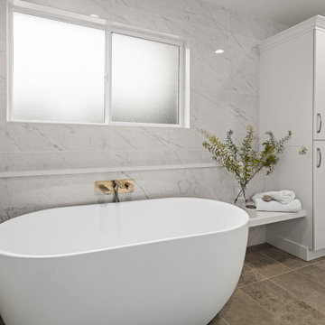
This home had dated and falling apart finishes, an insignificant fireplace in a giant living room, and a poor layout in the family room. Not to mention the primary bath covered in bamboo wallpaper.
The clients wanted a functional, updated and good-looking kitchen, a more adult family room, an updated serene primary bath. The remaining baths to be updated and modern. And, to make it feel like a holistic update, they wanted a welcoming staircase/entry.
As with most clients, stretching their dollar as far as possible was important. They didn't want to enlarge any footprint or move walls - we had to stay within existing bounds. With a whole home remodel costs can add up quickly depending on where we start & stop. For this family it made sense to do all the work at once to avoid repeat remodels. It was either buy new and still have to customize, or remodel to their exact needs and wants. The remodel was more affordable and made just for them.
Many finishes are clean, simple, and modern. A window was removed! in the family room to allow for a symmetrical entertainment center. A dramatic floor to ceiling fireplace surround was created in the Living room. The staircase was totally redone in both shape and style! The primary bath was reworked to get a two-person shower, and soaking tub. Serene /quiet finishes in the primary helped achieve a mellow /calming atmosphere. All new doors and trim throughout.
 Designs by KS
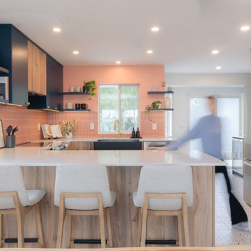
When our clients came to us with their renovation project asking for a pink kitchen, we were thrilled at the opportunity to create a unique, bright and colourful kitchen. It’s not something you see everyday, and we live for it! Being that they are a young family, who loves to cook but felt secluded and overwhelmed when in this space, we knew that this was going to be an epic transformation, not just aesthetically but also for their day-to-day life.
This renovation transformed a closed off, cramped, and poorly laid-out kitchen into a colourful, bright, open, and inviting space that combines functionality with vibrant colours and character. The redesign focused on maximizing storage, improving layout efficiency, and infusing the space with unique design elements that make it both practical and fun.
 Coastal Home Design Studio
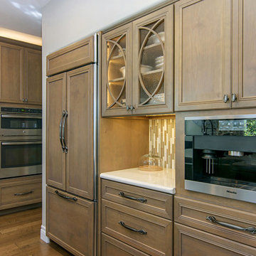
This kitchen started as a builder basic with no personality or charm. The layout didn't have the best function and the island was poorly placed. The homeowners purchased this house with remodeling and upgrading in mind. The layout was changed to accommodate two people cooking together. Zones were created for meal prepping, cooking and baking. The island was expanded to fill the space and utilize bar seating. The walk through butlers pantry was turned in to a wine bar with a fridge, storage and custom glass cabinets. A medium toned hardwood floor was layed throughout the entire lower level
 Designs by BSB
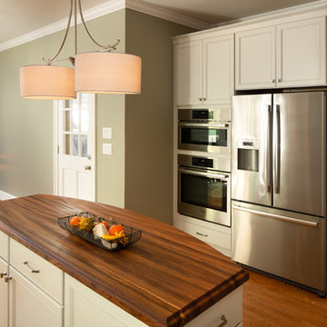
This modest kitchen renovation in Lilburn, GA including removing a short peninsula and transforming the space to allow for an island. This greatly improved not only the flow of traffic but also the function of work zones. There was an awkward deep corner with a hutch display that yielded to unfunctional counter space and poor storage. This area was redesigned to be the wall ovens & refrigerator thus allowing more counter space where it was needed -- by the cooktop.
The shallow island features a Zebrawood Island Top with a mineral oil finish, practical and beautiful for food prep! The backside has a soft elliptical arch to increase the top size and allow for a stool for long prep or quick snacks.
The unique monochromatic mosaic backsplash by SOHO Tile creates a beautiful backdrop that compliments with the leathered Fantasy Brown Quartzite counter tops.
 Nip Tuck Remodeling
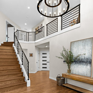
This home had dated and falling apart finishes, an insignificant fireplace in a giant living room, and a poor layout in the family room. Not to mention the primary bath covered in bamboo wallpaper.
The clients wanted a functional, updated and good-looking kitchen, a more adult family room, an updated serene primary bath. The remaining baths to be updated and modern. And, to make it feel like a holistic update, they wanted a welcoming staircase/entry.
As with most clients, stretching their dollar as far as possible was important. They didn't want to enlarge any footprint or move walls - we had to stay within existing bounds. With a whole home remodel costs can add up quickly depending on where we start & stop. For this family it made sense to do all the work at once to avoid repeat remodels. It was either buy new and still have to customize, or remodel to their exact needs and wants. The remodel was more affordable and made just for them.
Many finishes are clean, simple, and modern. A window was removed! in the family room to allow for a symmetrical entertainment center. A dramatic floor to ceiling fireplace surround was created in the Living room. The staircase was totally redone in both shape and style! The primary bath was reworked to get a two-person shower, and soaking tub. Serene /quiet finishes in the primary helped achieve a mellow /calming atmosphere. All new doors and trim throughout.
 Kitchen Solvers of Spring Hill
These homeowners were ready to completely transform their master bathroom. The existing space felt cramped and outdated, with an impractical linen closet, a small vanity, poor lighting, a bulky tub, and a shower that had seen better days. Their vision was clear—they wanted a warm, inviting, spa-inspired retreat with natural elements, rich textures, and a unique wood feature wall, rather than the all-white look that has become so common.
The finished design brings that vision to life through a beautiful blend of color, texture, and thoughtful details. A stunning cherry vanity and counter stack, topped with luxurious quartzite countertops, create warmth and elegance. The feature wall, finished in 1" x 3" Articulo tile, adds depth and visual interest, while large-format floor tiles provide a clean, modern foundation.
The curbless shower features coordinating hex tile flooring and niches, complemented by porcelain slab walls and glass panels that create an open, airy feel. A spacious freestanding tub offers the perfect place to relax and unwind. To maximize functionality, the doorway was relocated to accommodate a larger vanity, and custom barn and closet doors were added to enhance the room's character.
Programmable lighting tailored to the homeowners' lifestyle, along with a custom wood feature wall designed to showcase decorative plants, transformed a once-empty wall into a stunning focal point. What was once a dreaded space is now a beautiful spa-like retreat and one of the homeowners' favorite rooms in the house.
44