
Search results for "Poor functionality" in Home Design Ideas
 Saikley Architects
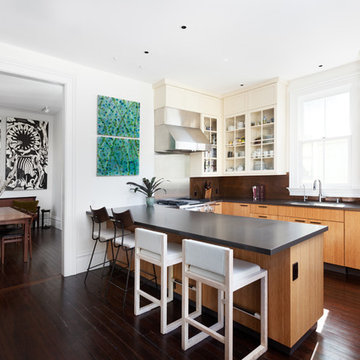
This beautiful 1881 Alameda Victorian cottage, wonderfully embodying the Transitional Gothic-Eastlake era, had most of its original features intact. Our clients, one of whom is a painter, wanted to preserve the beauty of the historic home while modernizing its flow and function.
From several small rooms, we created a bright, open artist’s studio. We dug out the basement for a large workshop, extending a new run of stair in keeping with the existing original staircase. While keeping the bones of the house intact, we combined small spaces into large rooms, closed off doorways that were in awkward places, removed unused chimneys, changed the circulation through the house for ease and good sightlines, and made new high doorways that work gracefully with the eleven foot high ceilings. We removed inconsistent picture railings to give wall space for the clients’ art collection and to enhance the height of the rooms. From a poorly laid out kitchen and adjunct utility rooms, we made a large kitchen and family room with nine-foot-high glass doors to a new large deck. A tall wood screen at one end of the deck, fire pit, and seating give the sense of an outdoor room, overlooking the owners’ intensively planted garden. A previous mismatched addition at the side of the house was removed and a cozy outdoor living space made where morning light is received. The original house was segmented into small spaces; the new open design lends itself to the clients’ lifestyle of entertaining groups of people, working from home, and enjoying indoor-outdoor living.
Photography by Kurt Manley.
https://saikleyarchitects.com/portfolio/artists-victorian/
 Reico Kitchen & Bath
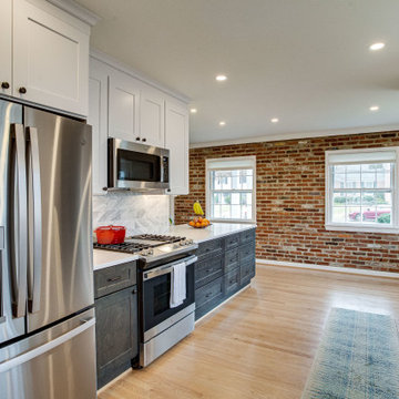
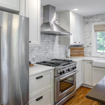
Designed by Marc Jean-Michel of Reico Kitchen & Bath in Bethesda, MD in collaboration with Liz Forgione of MMD Construction, this small transitional kitchen features Green Forest cabinets in the Park Place shaker door style in two finishes. The base cabinets feature a Summit Grey finish and the wall cabinets a White finish. The kitchen countertops are MSI Artic White Quartz.
The kitchen includes a Maravilla/Alvetian Isles Honed Marble 4x16 tile backsplash along with GE and Frigidaire appliances.
“The hardest part was envisioning a new functional space in an old kitchen with a poor layout and use of space,” said the client. “I love most the transformation in the flow of the whole first floor. The kitchen entries are wide, more inviting and create a lot of great light! There is so much great storage in a small kitchen! Marc was great to work with. I loved all of his ideas.”
Photos courtesy of BTW Images LLC.
 River Woodcraft
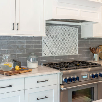
A must see before and after kitchen. What was a drab brown kitchen before with a not-so-functional layout, we have completely opened up the space, by removing a peninsula and a poorly used pantry space and added a large floating island and slide-out pantry storage instead. Now this bright and open space now feels fresh, clean and expansive.
Find the right local pro for your project
 Mom's Design Build
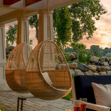
The #LakesideLeisure Project was a comprehensive redesign of a lakefront property that transformed various challenges into stunning solutions. Initially, the property featured a small, high-maintenance cedar deck with minimal lake views, poorly placed stairs, limited flat yard space due to extensive tiered landscaping and excessive plantings, obstructed lake views, and privacy concerns from a neighboring home.
The client’s vision was clear: they wanted a large, flat yard for family activities and hosting, enhanced outdoor living spaces for dining and lounging, increased privacy from neighbors, more shaded hangout areas, improved “curb appeal” from the lake, and reduced maintenance.
 Nancy Finneson | DeMane Design
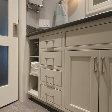
The owners of this remodel desired a refreshing new master bathroom. The original layout was poorly designed with minimal storage, a small shower, a rarely used bathtub and a water closet that was difficult to access. The old vanity flanked a curved wall of glass block (the main challenge with this space) which didn’t allow for mirrors and was always cluttered because of limited storage.
With smart space planning and attention to detail this well-appointed bathroom is now a uniquely personal space that functions brilliantly and balanced for the homeowners.
Photo: DeMane Design
 LA Turf & Paver
Transformed Urban Oasis: Premium Artificial Turf Installation"
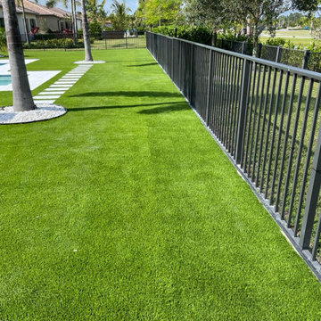
Set in the heart of Palm Beach Gardens, this backyard underwent a comprehensive transformation, turning a previously underutilized space into a lush, evergreen oasis. The aim was clear: to craft an outdoor environment that requires minimal maintenance, provides aesthetic pleasure, and offers functional space for various activities.
Initially, the backyard presented challenges including uneven ground, patchy grass areas, and poor soil conditions. Our team addressed these issues with precision grading and soil stabilization techniques, preparing a perfect base for the upcoming transformation.
We opted for a premium artificial turf, chosen for its realistic texture, durability, and environmental resilience. Spread across [specific square footage/size of the area], the turf exudes a natural charm that rivals the best of lawns. With its soft pile height and UV resistance, it promises year-round greenery without the hassle of watering, mowing, or fertilizing.
Details, such as the seamless integration of the turf with existing patios or garden beds, highlight our team's meticulous attention to detail and commitment to excellence. The results are evident — a green sanctuary ready for sunbathing, children's play, or simply lounging.
Homeowners have praised the transformation, noting the newfound usability of their outdoor space, the reduction in water bills, and the numerous compliments they receive from visitors.
This project isn't just about installing artificial turf; it's about reimagining urban backyards, bringing nature closer to home, and offering sustainable and beautiful solutions for modern living.
 Castle Building & Remodeling
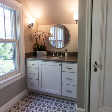
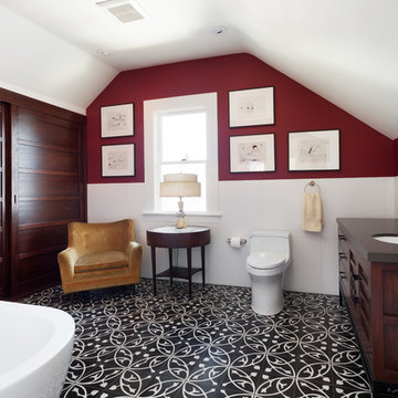
This 1932 South Minneapolis bathroom was OK to look at but did not suit the client’s aesthetics. Not to mention, it was composed of poorly-made and impractical products. Glass mosaic tiles in the shower were hard to clean and were cracking, while the vanity was falling apart.
The clients wanted something fresher that connected with the rest of the feel of their home, and products that were easier to maintain. The layout remained the same, but the space was updated with traditional style cement tiles, subway tiles and a timeless style/finish for the new vanity. Quartz was used for the vanity top, which will be easy to clean and maintain for the homeowner for years to come. A frameless glass enclosure was installed in order to eliminate the problematic stall-style shower curtain that the client despised.
The result was a bathroom that is classic in style but modern in maintenance and function.

Sponsored
Columbus, OH

Structural Remodeling
Franklin County's Heavy Timber Specialists | Best of Houzz 2020!
 Kitchen Solvers of Spring Hill
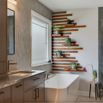
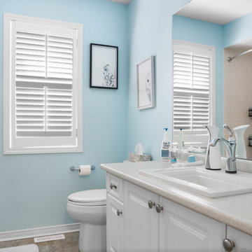
These homeowners were ready to completely transform their master bathroom. The existing space felt cramped and outdated, with an impractical linen closet, a small vanity, poor lighting, a bulky tub, and a shower that had seen better days. Their vision was clear—they wanted a warm, inviting, spa-inspired retreat with natural elements, rich textures, and a unique wood feature wall, rather than the all-white look that has become so common.
The finished design brings that vision to life through a beautiful blend of color, texture, and thoughtful details. A stunning cherry vanity and counter stack, topped with luxurious quartzite countertops, create warmth and elegance. The feature wall, finished in 1" x 3" Articulo tile, adds depth and visual interest, while large-format floor tiles provide a clean, modern foundation.
The curbless shower features coordinating hex tile flooring and niches, complemented by porcelain slab walls and glass panels that create an open, airy feel. A spacious freestanding tub offers the perfect place to relax and unwind. To maximize functionality, the doorway was relocated to accommodate a larger vanity, and custom barn and closet doors were added to enhance the room's character.
Programmable lighting tailored to the homeowners' lifestyle, along with a custom wood feature wall designed to showcase decorative plants, transformed a once-empty wall into a stunning focal point. What was once a dreaded space is now a beautiful spa-like retreat and one of the homeowners' favorite rooms in the house.
 Sosna Inc
The family's once-loved home had become a source of frustration. Their kitchen, a space meant for gathering and creating, felt cramped and outdated. Limited storage and poor organization made meal prep a tedious task, and entertaining guests a logistical nightmare. The laundry room, often overlooked, was equally problematic. Its cramped layout and lack of storage made laundry day a chore, and the noise of the washing machine echoed through the living room.
To compound the issue, the absence of dedicated office spaces made working from home a constant struggle. One makeshift office was squeezed into the dining room, while another was relegated to the basement.
The family was hesitant to embark on a major renovation, fearing the challenges and uncertainties that come with such a project. Finding a reliable contractor, ensuring timely completion, and worrying about potential shoddy workmanship were all valid concerns.
We understood their anxieties and were committed to providing a smooth and stress-free experience. Our team crafted a design that addressed each of their concerns, transforming their home into a functional and stylish space.
We reimagined the laundry room, creating a custom storage solution and incorporating a stackable washer and dryer. The open hallway to the living room was enclosed, creating a spacious closet with ample storage. The laundry room now seamlessly connected to the kitchen, simplifying the grocery unloading process.
A former juliette balcony was converted into a dedicated office space, providing a peaceful and productive work-from-home environment.
The dated and cluttered ensuite bathroom received a luxurious makeover. A clever pull-out storage system in the shower wall and a spacious niche provided much-needed organization.
While every renovation project has its challenges, this one was remarkably smooth. The only significant hurdle was some additional structural work required in the basement to support the new office space. Our experienced team handled this efficiently, minimizing any disruption.
The final result is a home that truly reflects the family's personality and lifestyle. The laundry room, now a cheerful and organized space with soft green cabinets, patterned floor tiles, and gold accents, showcases our attention to detail.
The kitchen is a stunning centerpiece, featuring a striking combination of blue and white cabinets, dark hardwood floors, and a sleek white backsplash. The adjacent beverage bar, with its glass-fronted upper cabinets, provides an elegant space for entertaining.
The ensuite bathroom is a spa-like retreat, with large-format marble tiles, a black vanity, and chrome fixtures creating an atmosphere of understated luxury.
The renovation has had a profound impact on the family's daily life. Ample storage throughout the house has banished clutter, making it easier to maintain a tidy home. The seamless flow from the laundry room to the kitchen has streamlined the grocery unloading process, and the dedicated office spaces have transformed the work-from-home experience.
Beyond the physical transformation, it was the shared moments and laughter that made this project truly special. The family's enthusiasm and good humor were contagious. One of the clients, with his big personality, even starred in a walk-through video of the finished project, showcasing his infectious joy.
From choosing tiles to navigating unexpected challenges, the entire process was filled with warmth and collaboration. Even their four-year-old son, initially shy, warmed up to our site leader, Gus, nicknaming him "Gus the Bus," a moniker that endeared him to the entire team.
 Kitchen Solvers of Spring Hill
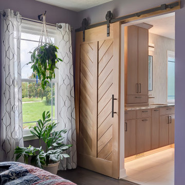
These homeowners were ready to completely transform their master bathroom. The existing space felt cramped and outdated, with an impractical linen closet, a small vanity, poor lighting, a bulky tub, and a shower that had seen better days. Their vision was clear—they wanted a warm, inviting, spa-inspired retreat with natural elements, rich textures, and a unique wood feature wall, rather than the all-white look that has become so common.
The finished design brings that vision to life through a beautiful blend of color, texture, and thoughtful details. A stunning cherry vanity and counter stack, topped with luxurious quartzite countertops, create warmth and elegance. The feature wall, finished in 1" x 3" Articulo tile, adds depth and visual interest, while large-format floor tiles provide a clean, modern foundation.
The curbless shower features coordinating hex tile flooring and niches, complemented by porcelain slab walls and glass panels that create an open, airy feel. A spacious freestanding tub offers the perfect place to relax and unwind. To maximize functionality, the doorway was relocated to accommodate a larger vanity, and custom barn and closet doors were added to enhance the room's character.
Programmable lighting tailored to the homeowners' lifestyle, along with a custom wood feature wall designed to showcase decorative plants, transformed a once-empty wall into a stunning focal point. What was once a dreaded space is now a beautiful spa-like retreat and one of the homeowners' favorite rooms in the house.
 Saikley Architects
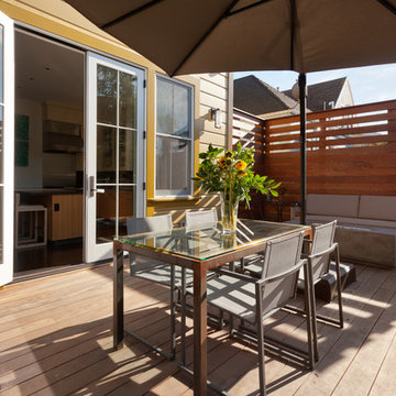
This beautiful 1881 Alameda Victorian cottage, wonderfully embodying the Transitional Gothic-Eastlake era, had most of its original features intact. Our clients, one of whom is a painter, wanted to preserve the beauty of the historic home while modernizing its flow and function.
From several small rooms, we created a bright, open artist’s studio. We dug out the basement for a large workshop, extending a new run of stair in keeping with the existing original staircase. While keeping the bones of the house intact, we combined small spaces into large rooms, closed off doorways that were in awkward places, removed unused chimneys, changed the circulation through the house for ease and good sightlines, and made new high doorways that work gracefully with the eleven foot high ceilings. We removed inconsistent picture railings to give wall space for the clients’ art collection and to enhance the height of the rooms. From a poorly laid out kitchen and adjunct utility rooms, we made a large kitchen and family room with nine-foot-high glass doors to a new large deck. A tall wood screen at one end of the deck, fire pit, and seating give the sense of an outdoor room, overlooking the owners’ intensively planted garden. A previous mismatched addition at the side of the house was removed and a cozy outdoor living space made where morning light is received. The original house was segmented into small spaces; the new open design lends itself to the clients’ lifestyle of entertaining groups of people, working from home, and enjoying indoor-outdoor living.
Photography by Kurt Manley.
https://saikleyarchitects.com/portfolio/artists-victorian/
 MMW Architects
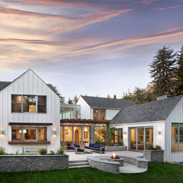
What the owners of the Madeline Ave Residence loved about the home when they bought it was the charm of the original 1920’s structure. However, a dissonance addition from the 1970’s shifted original charm to aesthetic awkwardness and poor flow. While maintaining the feel of the front façade, the rest of the home was reconfigured and choreographed to offer beauty and meet functional needs. Like many homes in historic districts, the homes grow organically to meet needs. Multiple forms and roof lines result.
Due to incorporating these same moves, this renovation fits seamlessly into the neighborhood. It is formal where it needs to be yet comfortable for the daily life. The people, the dog, the cats, the wine: all were carefully tended to throughout the design of the home. The spacious rooms and crisp white palette set the stage for vibrant tile and offers many locations for large scale art. Easy connections to the exterior spaces offer all-season gathering under the shade of the trellis or while making s’mores around the fire pit.
 Kaufman Construction Design and Build
Emily and Steve have remodeled several pieces of their home and because they love Kaufman’s process so much, they keep coming back. In past years, we’ve remodeled most of their main floor including an updated living space and staircase, and a completely remodeled powder room and kitchen with a nice big island that’s perfect for entertaining. Their most recent project was this year when we remodeled their deck. The major pain points Steve and Emily dealt with before the remodel was lack of functionality due to poor design and because the previous owners had built the deck themselves, there were quite a few safety concerns. Throughout the design process, we decided to remove the existing deck completely and start fresh with a screened in porch, Emily’s Porch, and a deck off the porch with stairs going down to the beautiful backyard – one of the factors that motivated them to make this house their home to begin with.


 LA Turf & Paver
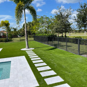
Transformed Urban Oasis: Premium Artificial Turf Installation"
Set in the heart of Palm Beach Gardens this backyard underwent a comprehensive transformation, turning a previously underutilized space into a lush, evergreen oasis. The aim was clear: to craft an outdoor environment that requires minimal maintenance, provides aesthetic pleasure, and offers functional space for various activities.
Initially, the backyard presented challenges including uneven ground, patchy grass areas, and poor soil conditions. Our team addressed these issues with precision grading and soil stabilization techniques, preparing a perfect base for the upcoming transformation.
We opted for a premium artificial turf, chosen for its realistic texture, durability, and environmental resilience. Spread across [specific square footage/size of the area], the turf exudes a natural charm that rivals the best of lawns. With its soft pile height and UV resistance, it promises year-round greenery without the hassle of watering, mowing, or fertilizing.
Details, such as the seamless integration of the turf with existing patios or garden beds, highlight our team's meticulous attention to detail and commitment to excellence. The results are evident — a green sanctuary ready for sunbathing, children's play, or simply lounging.
Homeowners have praised the transformation, noting the newfound usability of their outdoor space, the reduction in water bills, and the numerous compliments they receive from visitors.
This project isn't just about installing artificial turf; it's about reimagining urban backyards, bringing nature closer to home, and offering sustainable and beautiful solutions for modern living.
 Saikley Architects
This beautiful 1881 Alameda Victorian cottage, wonderfully embodying the Transitional Gothic-Eastlake era, had most of its original features intact. Our clients, one of whom is a painter, wanted to preserve the beauty of the historic home while modernizing its flow and function.
From several small rooms, we created a bright, open artist’s studio. We dug out the basement for a large workshop, extending a new run of stair in keeping with the existing original staircase. While keeping the bones of the house intact, we combined small spaces into large rooms, closed off doorways that were in awkward places, removed unused chimneys, changed the circulation through the house for ease and good sightlines, and made new high doorways that work gracefully with the eleven foot high ceilings. We removed inconsistent picture railings to give wall space for the clients’ art collection and to enhance the height of the rooms. From a poorly laid out kitchen and adjunct utility rooms, we made a large kitchen and family room with nine-foot-high glass doors to a new large deck. A tall wood screen at one end of the deck, fire pit, and seating give the sense of an outdoor room, overlooking the owners’ intensively planted garden. A previous mismatched addition at the side of the house was removed and a cozy outdoor living space made where morning light is received. The original house was segmented into small spaces; the new open design lends itself to the clients’ lifestyle of entertaining groups of people, working from home, and enjoying indoor-outdoor living.
Photography by Kurt Manley.
https://saikleyarchitects.com/portfolio/artists-victorian/
 Mom's Design Build
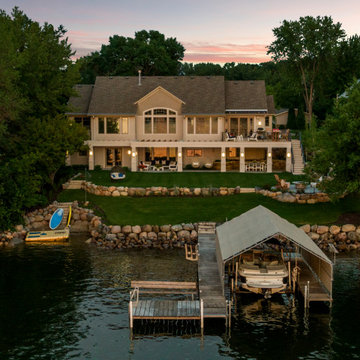
The #LakesideLeisure Project was a comprehensive redesign of a lakefront property that transformed various challenges into stunning solutions. Initially, the property featured a small, high-maintenance cedar deck with minimal lake views, poorly placed stairs, limited flat yard space due to extensive tiered landscaping and excessive plantings, obstructed lake views, and privacy concerns from a neighboring home.
The client’s vision was clear: they wanted a large, flat yard for family activities and hosting, enhanced outdoor living spaces for dining and lounging, increased privacy from neighbors, more shaded hangout areas, improved “curb appeal” from the lake, and reduced maintenance.
 J Design Group - Interior Designers Miami - Modern
AVENTURA MAGAZINE selected our client’s luxury 5000 Sf ocean front apartment in Miami Beach, to publish it in their issue and they Said:
Story by Linda Marx, Photography by Daniel Newcomb
Light & Bright
New York snowbirds redesigned their Miami Beach apartment to take advantage of the tropical lifestyle.
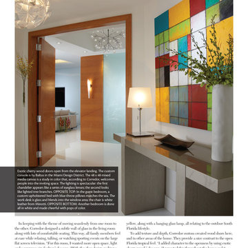
WHEN INTERIOR DESIGNER JENNIFER CORREDOR was asked to recreate a four-bedroom, six-bath condominium at The Bath Club in Miami Beach, she seized the opportunity to open the rooms and better utilize the vast ocean views.
In five months last year, the designer transformed a dark and closed 5,000-square-foot unit located on a high floor into a series of sweeping waterfront spaces and updated the well located apartment into a light and airy retreat for a sports-loving family of five.
“They come down from New York every other weekend and wanted to make their waterfront home a series of grand open spaces,” says Corrredor, of the J. Design Group in Coral Gables, a firm specializing in modern and contemporary interiors. “Since many of the rooms face the ocean, it made sense to open and lighten up the home, taking advantage of the awesome views of the sea and the bay.”
The designer used 40 x 40 all white tile throughout the apartment as a clean base. This way, her sophisticated use of color would stand out and bring the outdoors in.
The close-knit family members—two parents and three boys in college—like to do things together. But there were situations to overcome in the process of modernizing and opening the space. When Corredor was briefed on their desires, nothing seemed too daunting. The confident designer was ready to delve in. For example, she fixed an area at the front door
that was curved. “The wood was concave so I straightened it out,” she explains of a request from the clients. “It was an obstacle that I overcame as part of what I do in a redesign. I don’t consider it a difficult challenge. Improving what I see is part of the process.”
She also tackled the kitchen with gusto by demolishing a wall. The kitchen had formerly been enclosed, which was a waste of space and poor use of available waterfront ambience. To create a grand space linking the kitchen to the living room and dining room area, something had to go. Once the wall was yesterday’s news, she relocated the refrigerator and freezer (two separate appliances) to the other side of the room. This change was a natural functionality in the new open space. “By tearing out the wall, the family has a better view of the kitchen from the living and dining rooms,” says Corredor, who also made it easier to walk in and out of one area and into the other. “The views of the larger public space and the surrounding water are breathtaking.
Opening it up changed everything.”
They clients can now see the kitchen from the living and dining areas, and at the same time, dwell in an airy and open space instead of feeling stuck in a dark enclosed series of rooms. In fact, the high-top bar stools that Corredor selected for the kitchen can be twirled around to use for watching TV in the living room.
In keeping with the theme of moving seamlessly from one room to the other, Corredor designed a subtle wall of glass in the living room along with lots of comfortable seating. This way, all family members feel at ease while relaxing, talking, or watching sporting events on the large flat screen television. “For this room, I wanted more open space, light and a supreme airy feeling,” she says. “With the glass design making a statement, it quickly became the star of the show.”…….
….. To add texture and depth, Corredor custom created wood doors here, and in other areas of the home. They provide a nice contrast to the open Florida tropical feel. “I added character to the openness by using exotic cherry wood,” she says. “I repeated this throughout the home and it works well.”
Known for capturing the client’s vision while adding her own innovative twists, Corredor lightened the family room, giving it a contemporary and modern edge with colorful art and matching throw pillows on the sofas. She added a large beige leather ottoman as the center coffee table in the room. This round piece was punctuated with a bold-toned flowering plant atop. It effortlessly matches the pillows and colors of the contemporary canvas.
Miami,
Miami Interior Designers,
Miami Interior Designer,
Interior Designers Miami,
Interior Designer Miami,
Modern Interior Designers,
Modern Interior Designer,
Modern interior decorators,
Modern interior decorator,
Contemporary Interior Designers,
Contemporary Interior Designer,
Interior design decorators,
Interior design decorator,
Interior Decoration and Design,
Black Interior Designers,
Black Interior Designer,
Interior designer,
Interior designers,
Interior design decorators,
Interior design decorator,
Home interior designers,
Home interior designer,
Interior design companies,
Interior decorators,
Interior decorator,
Decorators,
Decorator,
Miami Decorators,
Miami Decorator,
Decorators Miami,
Decorator Miami,
Interior Design Firm,
Interior Design Firms,
Interior Designer Firm,
Interior Designer Firms,
Interior design,
Interior designs,
Home decorators,
Miami Beach
Interior decorating Miami,
Best Interior Designers,
Interior design decorator,
 CBI Design Professionals, Inc.
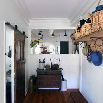
This home addition was intended to expand the home to provide the space needed for the growing new family. The existing kitchen was gutted, expanded and opened up to a family room and nook area. Custom inset cabinets were our preference; however cost was a significant concern. The owner researched multiple companies and standard product lines to save on her budget. After careful analysis, we discovered that it was just as cost effective to use the local custom cabinet maker we preferred. This allowed for more precise detailing and unique features. The goal of a classical farm house kitchen character updated with modern features was able to be obtained much to the home owner's delight.
A family room was added to this home, opening up to a screen porch that takes advantage of a previously unused side yard. The much needed new rear entry provides the family a space for their laundry room and is now the primary entry point from the detached garage. Great care was taken to ensure that the home’s new detailing could have been built this way originally. The space however needed to have a modern function for a modern family. The homes existing exterior had aluminum siding and trim which concealed original millwork and shingles. When the nondescript materials were removed, it was discovered that the original was in poor condition. Careful attention was taken to replace and/or repair original materials wherever possible around the entire home, in order to create a seamless exterior character.
 LaMantia Design and Remodeling
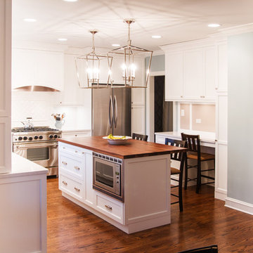
The clients found a house they loved for two reasons…location, location, location (first reason) and the exterior style was similar to a beloved childhood home. They came to LaMantia inquiring as to the possibilities for the first floor. Armed with the clients’ “wants and desires” LaMantia designers Jackie Prazak and Andy LaMantia went about redesigning most of the first floor into an open floor plan fit for the young family.
LaMantia & Prazak found the key to providing the enlarged feeling was through the poorly designed existing home addition. The additional living space was difficult to access, thus providing no useful function to the home.
Completely removing the original exterior walls of the home that blocked access into the addition was the first step in the plan. With the walls removed, the original walled-off space became a part of the home. Relocating the first floor Powder Room, revising the entry closet, removing the wall into the kitchen and resizing the Living Room all were key components to the final rebirth of the larger picture.
To finalize the new kitchen space, it was suggested to raise the Bay window unit thus allowing the relocated sink location. With all the revisions, the Kitchen now could easily accommodate a stretched out “L” layout with a large seated Island and a separate desk area.
With the final plans in place, the clients were amazed to find that within the existing walls of their newly purchased home they had gained so much extra use. And…the very last prize they gained was a dreamed of Mudroom!
 Coastal Home Design Studio
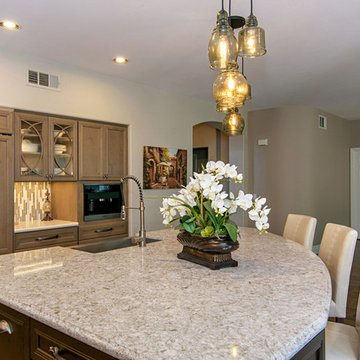
This kitchen started as a builder basic with no personality or charm. The layout didn't have the best function and the island was poorly placed. The homeowners purchased this house with remodeling and upgrading in mind. The layout was changed to accommodate two people cooking together. Zones were created for meal prepping, cooking and baking. The island was expanded to fill the space and utilize bar seating. The walk through butlers pantry was turned in to a wine bar with a fridge, storage and custom glass cabinets. A medium toned hardwood floor was layed throughout the entire lower level
45