
Search results for "Poor functionality" in Home Design Ideas
 Nip Tuck Remodeling
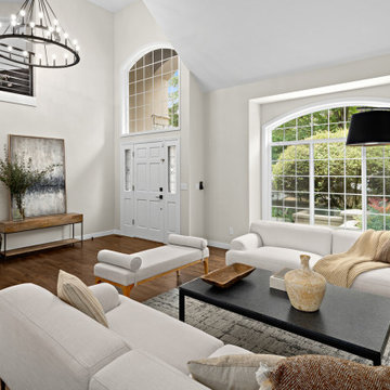
This home had dated and falling apart finishes, an insignificant fireplace in a giant living room, and a poor layout in the family room. Not to mention the primary bath covered in bamboo wallpaper.
The clients wanted a functional, updated and good-looking kitchen, a more adult family room, an updated serene primary bath. The remaining baths to be updated and modern. And, to make it feel like a holistic update, they wanted a welcoming staircase/entry.
As with most clients, stretching their dollar as far as possible was important. They didn't want to enlarge any footprint or move walls - we had to stay within existing bounds. With a whole home remodel costs can add up quickly depending on where we start & stop. For this family it made sense to do all the work at once to avoid repeat remodels. It was either buy new and still have to customize, or remodel to their exact needs and wants. The remodel was more affordable and made just for them.
Many finishes are clean, simple, and modern. A window was removed! in the family room to allow for a symmetrical entertainment center. A dramatic floor to ceiling fireplace surround was created in the Living room. The staircase was totally redone in both shape and style! The primary bath was reworked to get a two-person shower, and soaking tub. Serene /quiet finishes in the primary helped achieve a mellow /calming atmosphere. All new doors and trim throughout.
 Wellstudio Architecture
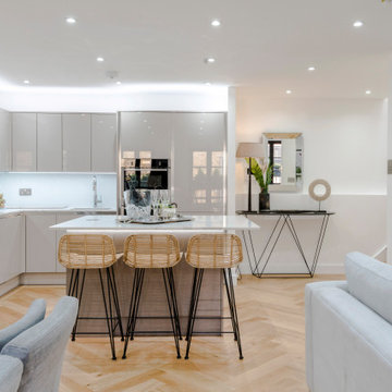
Renovation of an existing mews house, transforming it from a poorly planned out and finished property to a highly desirable residence that creates wellbeing for its occupants.
Wellstudio demolished the existing bedrooms on the first floor of the property to create a spacious new open plan kitchen living dining area which enables residents to relax together and connect.
Wellstudio inserted two new windows between the garage and the corridor on the ground floor and increased the glazed area of the garage door, opening up the space to bring in more natural light and thus allowing the garage to be used for a multitude of functions.
Wellstudio replanned the rest of the house to optimise the space, adding two new compact bathrooms and a utility room into the layout.
 Art Garden Design
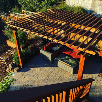
This Oakland backyard was overgrown with 5’ tall grasses, it had an uneven concrete slab with a giant shed, brick edging and poorly located concrete retaining walls. After finalizing the design, a two-weeklong demolition took place. Unnecessary debris was removed and the property was terraced to provide defined areas of entertaining and play for the adults, children, and pets. The transformation from an unusable backyard to a functioning landscape was highlighted by an entertainment patio, redwood arbor, medicinal herbs, fruit trees, and a curvilinear shaped lawn. After the house remodel, we continued to unify the landscape with a new backdoor landing, moss rock retaining walls, and a flagstone pathway planted with shade tolerant ground covers.
Find the right local pro for your project
 Murphy Bros. Design | Build | Remodel
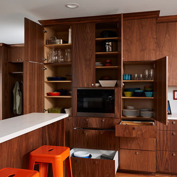
If the cook ain’t happy, ain’t nobody happy. The cramped design and dated condition of this south Minneapolis story and a half frustrated the gourmet cook in this family of four, who wanted more space to entertain. We removed a wall and designed a 5-foot addition off the back for the expanded dining/living space.
To bring this dark cramped, poorly designed kitchen into the 21st century without destroying its charm, we added new windows, more lighting, custom flat-panel walnut cabinets, quartz countertops with a companion geometric backsplash tile and new appliances. Keeping the cove ceilings and “toothing” in matching hardwood floors paid homage to the aesthetics of the previous era. The added mudroom off the kitchen completes the functional design. Now everyone is happy!
Design/Build Consultant — Courtney Cartee
Photography — Alyssa Lee
 Walczak Design And Build
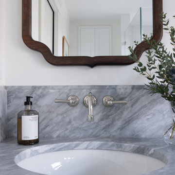
When this family came to us, they loved their home — but their bathrooms were failing them. The kids' bathroom had a non-functioning tub, a serious problem with two young children in the house. The primary bathroom was battling an active shower leak, a poor layout, and finishes well past their prime. Both spaces needed to be gutted. We got to work.
The Primary Bath: Elevated, Effortless, Unmistakably Theirs
Our clients arrived with a clear vision and a beautiful, refined sense of style. The layout was reconfigured from the ground up, and at the heart of the room sits a custom double vanity in a soft, sophisticated sage, topped with a stunning marble countertop and coordinating backsplash. Paired with elegant walnut-framed mirrors, a sculptural black and brass sconce, and wall-mounted polished nickel faucets, the vanity wall is a showpiece. Custom woven shades add warmth without sacrificing light.
The walk-in shower delivers — floor-to-ceiling white subway tile, a mosaic marble floor, transom windows, and frameless glass. Schluter DITRA radiant floor heating adds the kind of quiet luxury you feel every morning. Both marble surfaces were professionally sealed with StoneGuard to protect the investment for the long haul.
The Kids' Bath: Cheerful, Timeless, Built to Last
The girls' bathroom is designed with just as much intention as any room in the house. A warm white oak vanity with marble countertop anchors the space, paired with an antique brass-framed mirror and raspberry custom sconce shades that bring personality without being precious. A botanical-print Roman shade layers in pattern and charm.
The fully rebuilt tub-shower features wall-to-wall white subway tile, polished nickel fixtures, and a beautiful geometric floor tile in cream and warm taupe. A glass-front wall cabinet keeps things tidy, and tile wainscoting wraps the room for durability where it counts. Schluter DITRA radiant heat runs underfoot here too — because warm floors aren't just for adults.
Two bathrooms. Completely distinct. Completely intentional. Built for a family that already loved their home — and loves it even more now.
 Coastal Home Design Studio
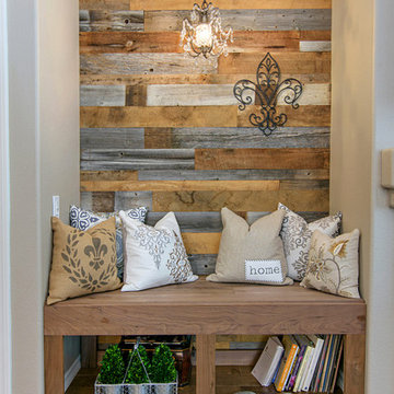
This kitchen started as a builder basic with no personality or charm. The layout didn't have the best function and the island was poorly placed. The homeowners purchased this house with remodeling and upgrading in mind. The layout was changed to accommodate two people cooking together. Zones were created for meal prepping, cooking and baking. The island was expanded to fill the space and utilize bar seating. The walk through butlers pantry was turned in to a wine bar with a fridge, storage and custom glass cabinets. A medium toned hardwood floor was layed throughout the entire lower level. An awkward niche off the kitchen was transformed into a cozy seating area for reading.
 ForeverLawn, Inc.
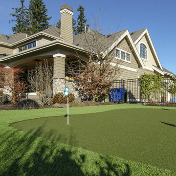
The owners of this incredible home in Lake Sammamish, Washington, had been discouraged by the work done by a previous artificial turf company at their home—a low quality product was installed poorly and therefore didn’t function as it should. Their faith in the artificial turf industry was restored when ForeverLawn Bellevue stepped in to remove and correct the issues that the previous company had created. ForeverLawn transformed a disaster into the homeowners’ dream yard. This wonderfully executed installation included over 4,000 square feet of DuPont™ ForeverLawn® Select HD and a unique backyard putting green surfaced with EZ Putt, a variation of GolfGreens™ ideal for fun, family-focused putting greens that requires little maintenance and will provide endless entertainment.

Sponsored
Columbus, OH

Structural Remodeling
Franklin County's Heavy Timber Specialists | Best of Houzz 2020!
 McAdams Remodeling & Design
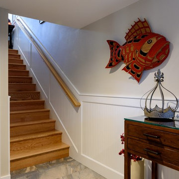
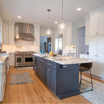
The old stairs were steep and poorly placed. With the new addition, a more functional staircase was added that easily connected the homeowner from her garage to her basement and then to the main floor.
Photos courtesy of Jesse Young Photography
 Bel Air Construction
The homeowner’s goal for this kitchen remodel was to improve functionality and increase the home’s value. The existing kitchen was old and needed an update – cabinets were falling apart, the downdraft on the Jenn-Air range made it difficult to cook items correctly, there was little to no storage, lighting was insufficient. A poor layout dominated by a hook-shaped peninsula inhibited the ability to work efficiently
 Imagine That Kitchens + Baths
Client desire:
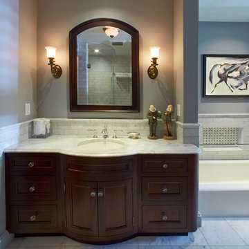
Bring back the original splendor of the master bathroom in her 1905 four-square mansion, including a low profile bathtub for her mother, a separate shower for herself, and plenty of storage.
Design challenges:
The bathroom had been part of a poorly constructed 1960’s addition with a narrow passage and a substandard foundation resulting in a room that was always too cold. The original part of the house had a foot of concrete for the sub-flooring so we were unsure about the ability to move fixtures. The window size and location had to remain fixed due to architectural details on the outside of the home.
Solutions:
We removed the addition subfloor to repair the weak footings and added closed cell insulation. We widened the passage and added a floor to ceiling armoire and shallow base cabinets with a curved end for storage. Inside one of the base cabinets we concealed a new larger radiator and we added in-floor heat. Functionality and flow were improved by switching the placement of the vanity and bathtub. The arched doors throughout the house were the inspiration for the curved glass shower door, arched medicine cabinet, and curved cabinetry. The antique wall sconces were purchased by the homeowner on her quest to find lighting in keeping with the era of the home. But the pièce de résistance is the beautiful Carrera marble and basket weave tile flooring achieved by a master tilesetter who worked meticulously to create the perfect result from my design.
 River Woodcraft
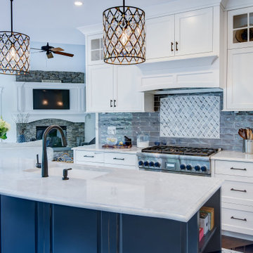
A must see before and after kitchen. What was a drab brown kitchen before with a not-so-functional layout, we have completely opened up the space, by removing a peninsula and a poorly used pantry space and added a large floating island and slide-out pantry storage instead. Now this bright and open space now feels fresh, clean and expansive.
 Voar Construction
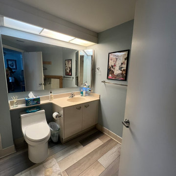
Before – Guest Bathroom: Outdated and Lacking Accessibility
The guest bathroom originally featured an old tub, dark and outdated tiles, and poor lighting. The finishes and colors were no longer in style, and the space lacked the functionality and accessibility needed for the clients. The transformation included replacing the tub with a modern shower and rethinking the layout to bring brightness, safety, and a more contemporary design.
 Sue Oda
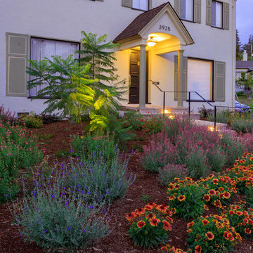
After one of the family took a fall on a slippery, sloped and painted walkway, our clients decided it was time to update their home's entry walkway. A large cedar tree, in poor health, also dripped sap on the sidewalk and parked cars, creating a sticky mess. We replaced the tree and water wasting lawn with drought tolerant alternatives and created a lighted, flagstone pathway, with custom steel railing leading to the front door.
In the backyard, our clients wanted to create a space for entertaining, hanging out with their grandchildren, and growing their own vegetables. The yard was replaced with a flagstone patio including a large raised bed. We also hid the air conditiong unit to create a convivial and functional area.


 Saikley Architects
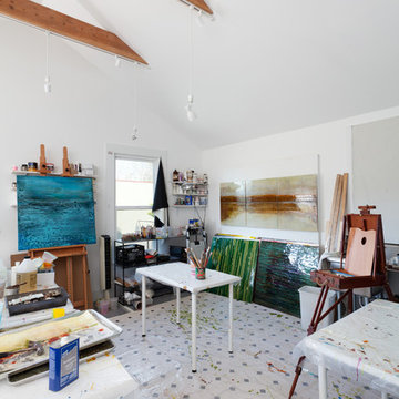
This beautiful 1881 Alameda Victorian cottage, wonderfully embodying the Transitional Gothic-Eastlake era, had most of its original features intact. Our clients, one of whom is a painter, wanted to preserve the beauty of the historic home while modernizing its flow and function.
From several small rooms, we created a bright, open artist’s studio. We dug out the basement for a large workshop, extending a new run of stair in keeping with the existing original staircase. While keeping the bones of the house intact, we combined small spaces into large rooms, closed off doorways that were in awkward places, removed unused chimneys, changed the circulation through the house for ease and good sightlines, and made new high doorways that work gracefully with the eleven foot high ceilings. We removed inconsistent picture railings to give wall space for the clients’ art collection and to enhance the height of the rooms. From a poorly laid out kitchen and adjunct utility rooms, we made a large kitchen and family room with nine-foot-high glass doors to a new large deck. A tall wood screen at one end of the deck, fire pit, and seating give the sense of an outdoor room, overlooking the owners’ intensively planted garden. A previous mismatched addition at the side of the house was removed and a cozy outdoor living space made where morning light is received. The original house was segmented into small spaces; the new open design lends itself to the clients’ lifestyle of entertaining groups of people, working from home, and enjoying indoor-outdoor living.
Photography by Kurt Manley.
https://saikleyarchitects.com/portfolio/artists-victorian/
 Walczak Design And Build
When this family came to us, they loved their home — but their bathrooms were failing them. The kids' bathroom had a non-functioning tub, a serious problem with two young children in the house. The primary bathroom was battling an active shower leak, a poor layout, and finishes well past their prime. Both spaces needed to be gutted. We got to work.
The Primary Bath: Elevated, Effortless, Unmistakably Theirs
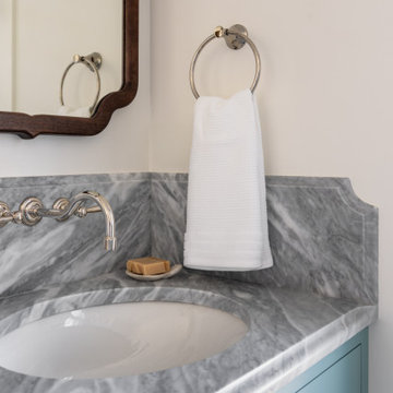
Our clients arrived with a clear vision and a beautiful, refined sense of style. The layout was reconfigured from the ground up, and at the heart of the room sits a custom double vanity in a soft, sophisticated sage, topped with a stunning marble countertop and coordinating backsplash. Paired with elegant walnut-framed mirrors, a sculptural black and brass sconce, and wall-mounted polished nickel faucets, the vanity wall is a showpiece. Custom woven shades add warmth without sacrificing light.
The walk-in shower delivers — floor-to-ceiling white subway tile, a mosaic marble floor, transom windows, and frameless glass. Schluter DITRA radiant floor heating adds the kind of quiet luxury you feel every morning. Both marble surfaces were professionally sealed with StoneGuard to protect the investment for the long haul.
The Kids' Bath: Cheerful, Timeless, Built to Last
The girls' bathroom is designed with just as much intention as any room in the house. A warm white oak vanity with marble countertop anchors the space, paired with an antique brass-framed mirror and raspberry custom sconce shades that bring personality without being precious. A botanical-print Roman shade layers in pattern and charm.
The fully rebuilt tub-shower features wall-to-wall white subway tile, polished nickel fixtures, and a beautiful geometric floor tile in cream and warm taupe. A glass-front wall cabinet keeps things tidy, and tile wainscoting wraps the room for durability where it counts. Schluter DITRA radiant heat runs underfoot here too — because warm floors aren't just for adults.
Two bathrooms. Completely distinct. Completely intentional. Built for a family that already loved their home — and loves it even more now.
 LaMantia Design and Remodeling
The clients found a house they loved for two reasons…location, location, location (first reason) and the exterior style was similar to a beloved childhood home. They came to LaMantia inquiring as to the possibilities for the first floor. Armed with the clients’ “wants and desires” LaMantia designers Jackie Prazak and Andy LaMantia went about redesigning most of the first floor into an open floor plan fit for the young family.
LaMantia & Prazak found the key to providing the enlarged feeling was through the poorly designed existing home addition. The additional living space was difficult to access, thus providing no useful function to the home.
Completely removing the original exterior walls of the home that blocked access into the addition was the first step in the plan. With the walls removed, the original walled-off space became a part of the home. Relocating the first floor Powder Room, revising the entry closet, removing the wall into the kitchen and resizing the Living Room all were key components to the final rebirth of the larger picture.
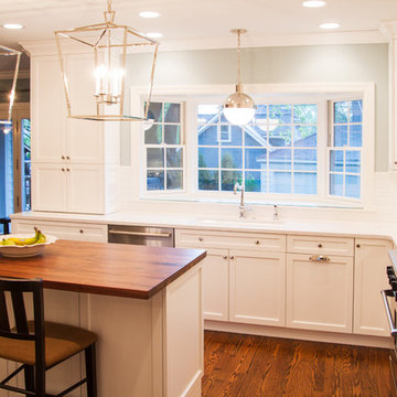
To finalize the new kitchen space, it was suggested to raise the Bay window unit thus allowing the relocated sink location. With all the revisions, the Kitchen now could easily accommodate a stretched out “L” layout with a large seated Island and a separate desk area.
With the final plans in place, the clients were amazed to find that within the existing walls of their newly purchased home they had gained so much extra use. And…the very last prize they gained was a dreamed of Mudroom!
 Mom's Design Build
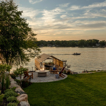
The #LakesideLeisure Project was a comprehensive redesign of a lakefront property that transformed various challenges into stunning solutions. Initially, the property featured a small, high-maintenance cedar deck with minimal lake views, poorly placed stairs, limited flat yard space due to extensive tiered landscaping and excessive plantings, obstructed lake views, and privacy concerns from a neighboring home.
The client’s vision was clear: they wanted a large, flat yard for family activities and hosting, enhanced outdoor living spaces for dining and lounging, increased privacy from neighbors, more shaded hangout areas, improved “curb appeal” from the lake, and reduced maintenance.
 Voar Construction
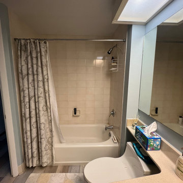
Before – Guest Bathroom: Outdated and Lacking Accessibility
The guest bathroom originally featured an old tub, dark and outdated tiles, and poor lighting. The finishes and colors were no longer in style, and the space lacked the functionality and accessibility needed for the clients. The transformation included replacing the tub with a modern shower and rethinking the layout to bring brightness, safety, and a more contemporary design.
 Castle Building & Remodeling
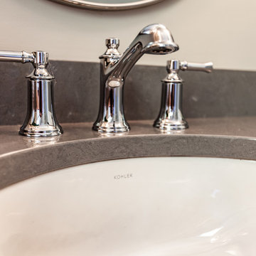
This 1932 South Minneapolis bathroom was OK to look at but did not suit the client’s aesthetics. Not to mention, it was composed of poorly-made and impractical products. Glass mosaic tiles in the shower were hard to clean and were cracking, while the vanity was falling apart.
The clients wanted something fresher that connected with the rest of the feel of their home, and products that were easier to maintain. The layout remained the same, but the space was updated with traditional style cement tiles, subway tiles and a timeless style/finish for the new vanity. Quartz was used for the vanity top, which will be easy to clean and maintain for the homeowner for years to come. A frameless glass enclosure was installed in order to eliminate the problematic stall-style shower curtain that the client despised.
The result was a bathroom that is classic in style but modern in maintenance and function.
 Elzo Landscape
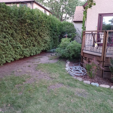
Before renovation: undefined circulation areas, compacted soil, and poor drainage contributed to patchy turf and underutilized space adjacent to the deck. The yard required regrading, structural bed definition, and improved water management to restore function.
32