
Search results for "Potential clients" in Home Design Ideas
 Cantoni Irvine
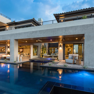
Design by Blue Heron in Partnership with Cantoni. Photos By: Stephen Morgan
For many, Las Vegas is a destination that transports you away from reality. The same can be said of the thirty-nine modern homes built in The Bluffs Community by luxury design/build firm, Blue Heron. Perched on a hillside in Southern Highlands, The Bluffs is a private gated community overlooking the Las Vegas Valley with unparalleled views of the mountains and the Las Vegas Strip. Indoor-outdoor living concepts, sustainable designs and distinctive floorplans create a modern lifestyle that makes coming home feel like a getaway.
To give potential residents a sense for what their custom home could look like at The Bluffs, Blue Heron partnered with Cantoni to furnish a model home and create interiors that would complement the Vegas Modern™ architectural style. “We were really trying to introduce something that hadn’t been seen before in our area. Our homes are so innovative, so personal and unique that it takes truly spectacular furnishings to complete their stories as well as speak to the emotions of everyone who visits our homes,” shares Kathy May, director of interior design at Blue Heron. “Cantoni has been the perfect partner in this endeavor in that, like Blue Heron, Cantoni is innovative and pushes boundaries.”
Utilizing Cantoni’s extensive portfolio, the Blue Heron Interior Design team was able to customize nearly every piece in the home to create a thoughtful and curated look for each space. “Having access to so many high-quality and diverse furnishing lines enables us to think outside the box and create unique turnkey designs for our clients with confidence,” says Kathy May, adding that the quality and one-of-a-kind feel of the pieces are unmatched.
rom the perfectly situated sectional in the downstairs family room to the unique blue velvet dining chairs, the home breathes modern elegance. “I particularly love the master bed,” says Kathy. “We had created a concept design of what we wanted it to be and worked with one of Cantoni’s longtime partners, to bring it to life. It turned out amazing and really speaks to the character of the room.”
The combination of Cantoni’s soft contemporary touch and Blue Heron’s distinctive designs are what made this project a unified experience. “The partnership really showcases Cantoni’s capabilities to manage projects like this from presentation to execution,” shares Luca Mazzolani, vice president of sales at Cantoni. “We work directly with the client to produce custom pieces like you see in this home and ensure a seamless and successful result.”
And what a stunning result it is. There was no Las Vegas luck involved in this project, just a sureness of style and service that brought together Blue Heron and Cantoni to create one well-designed home.
To learn more about Blue Heron Design Build, visit www.blueheron.com.
 Savos Interiors
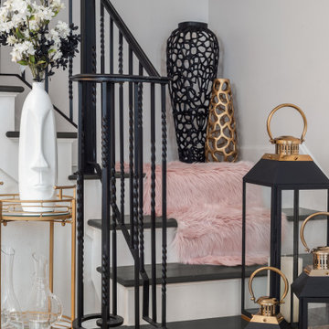
Full Furnishing and Styling Service - Maximizing seating for the client’s social life was a must in this cozy town home. The large sectional and additional seating in front of the television create an inviting conversation area for game nights and movie nights. Behind the sectional, the two console tables and ottomans can be rearranged and pushed together to create an impromptu dining space. Utilizing every inch of this space allows the client to truly enjoy her home to its full potential.
 Design Lifestyles, LLC
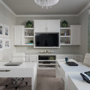
This home office started as a blank room and needed the capability for three people to have their own workspaces but keeping in mind the potential for this space to be a game room in the future. The cased opening was changed to a pair of transitional French doors with clear glass to keep an open feel but providing a private work space. The natural light coming into the room from the windows needed to be an uninterrupted element, therefore the stationary drapery panels were mounted outside the windows to frame them. Custom cabinets were designed to incorporate drawer storage, shelving storage, TV mounting and decorative display. The continuous quartz countertop gives an additional multi-use workspace. All of these dual-function cabinet elements can be transitioned from office to game room when required. The acrylic and chrome cabinet hardware was a new release and gives a modern touch to the space. The client also had a pair of vintage family chests that they wanted to incorporate into the space so we updated them with a new coat of grey paint and had new Carrara marble tops fabricated with a traditional ogee edge. The acrylic hardware is consistent with the vintage chest but gives an updated modern flare. The sleek L-shaped white desks provide a neutral but modern look with ample workspace. White leather desk chairs give the comfort of an office chair but the modern style that the client desired.
Find the right local pro for your project
 Straight Line Design and Remodeling
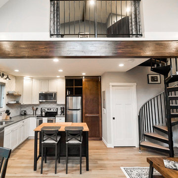
Our clients were looking to build an income property for use as a short term rental in their backyard. In order to keep maximize the available space on a limited footprint, we designed the ADU around a spiral staircase leading up to the loft bedroom. The vaulted ceiling gives the small space a much larger appearance.
To provide privacy for both the renters and the homeowners, the ADU was set apart from the house with its own private entrance.
The design of the ADU was done with local Pacific Northwest aesthetics in mind, including green exterior paint and a mixture of woodgrain and metal fixtures for the interior.
Durability was a major concern for the homeowners. In order to minimize potential damages from renters, we selected quartz countertops and waterproof flooring. We also used a high-quality interior paint that will stand the test of time and clean easily.
The end result of this project was exactly what the client was hoping for, and the rental consistently receives 5-star reviews on Airbnb.
 Advance Design Studio, Ltd.
Our clients in Tower Lakes, IL, needed more storage and functionality from their kitchen. They were primarily focused on finding the right combination of cabinets, shelves, and drawers that fit all their cookware, flatware, and appliances. They wanted a brighter, bigger space with a natural cooking flow and plenty of storage. Soffits and crown molding needed to be removed to make the kitchen feel larger. Redesign elements included: relocating the fridge, adding a baking station and coffee bar, and placing the microwave in the kitchen island.
Advance Design Studio’s Claudia Pop offered functional, creative, and unique solutions to the homeowners’ problems. Our clients wanted a unique kitchen that was not completely white, a balance of design and function. Claudia offered functional, creative, and unique solutions to Chad and Karen’s kitchen design challenges. The first thing to go was soffits. Today, most kitchens can benefit from the added height and space; removing soffits is nearly always step one. Steely gray-blue was the color of choice for a freshly unique look bringing a sophisticated-looking space to wrap around the fresh new kitchen. Cherry cabinetry in a true brown stain compliments the stormy accents with sharp contrasting white Cambria quartz top balancing out the space with a dramatic flair.
“We wanted something unique and special in this space, something none of the neighbors would have,” said Claudia.
The dramatic veined Cambria countertops continue upward into a backsplash behind three complimentary open shelves. These countertops provide visual texture and movement in the kitchen. The kitchen includes two larder cabinets for both the coffee bar and baking station. The kitchen is now functional and unique in design.
“When we design a new kitchen space, as designers, we are always looking for ways to balance interesting design elements with practical functionality,” Claudia said. “This kitchen’s new design is not only way more functional but is stunning in a way a piece of art can catch one’s attention.”
Decorative mullions with mirrored inserts sit atop dual sentinel pantries flanking the new refrigerator, while a 48″ dual fuel Wolf range replaced the island cooktop and double oven. The new microwave is cleverly hidden within the island, eliminating the cluttered counter and attention-grabbing wall of stainless steel from the previous space.
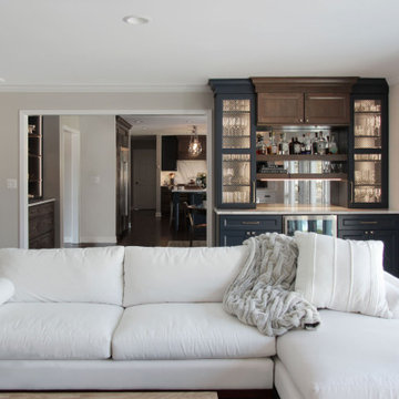
The family room was completely renovated, including a beautifully functional entertainment bar with the same combination of woods and stone as the kitchen and coffee bar. Mesh inserts instead of plain glass add visual texture while revealing pristine glassware. Handcrafted built-ins surround the fireplace.
The beautiful and efficient design created by designer Claudia transitioned directly to the installation team seamlessly, much like the basement project experience Chad and Karen enjoyed previously.
“We definitely will and have recommended Advance Design Studio to friends who are looking to embark on a project small or large,” Karen said.
“Everything that was designed and built exactly how we envisioned it, and we are really enjoying it to its full potential,” Karen said.
Our award-winning design team would love to create a beautiful, functional, and spacious place for you and your family. With our “Common Sense Remodeling” approach, the process of renovating your home has never been easier. Contact us today at 847-665-1711 or schedule an appointment.
 TVL Creative Ltd.
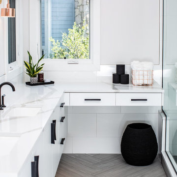
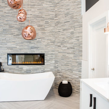
Our clients were looking to erase the 90s from their master bathroom and create a space that blended their contemporary tastes with natural elements. This bathroom had wonderful bones with a high ceiling and plenty of space, but we were able to work with our clients to create a design that better met their needs and utilized the space to its full potential. We wanted to create a sense of warmth in this large master bathroom and adding a fireplace to the space did the trick. By moving the tub location, we were able to create a stunning accent wall of stacked stone that provided a home for the fireplace and a perfectly dramatic backdrop for the new freestanding bathtub. The sculptural copper light fixture helps to soften the stone wall and allowed us to emphasize those vaulted ceiling. Playing with metal finishes is one of our favorite pastimes, and this bathroom was the perfect opportunity to blend sleek matte black plumbing fixtures with a mirrored copper finish on the light fixtures. We tied the vanity wall sconces in with a dramatic sculptural chandelier above the bath tub by using copper finishes on both and allowing the light fixtures to be the shining stars of this space. We selected a clean white finish for the custom vanity cabinets and lit them from below to accentuate their floating design. We then completed the look with a waterfall quartz counter to add an elegant texture to the area and extended the stone onto the shower bench to bring the two elements together. The existing shower had been on the small side, so we expanded it into the room and gave them a more spacious shower complete with a built-in bench and recessed niche. Hard surfaces play an important role in any bathroom design, and we wanted to use this opportunity to create an interesting layer of texture through our tile selections. The bathroom floor utilizes a large-scale plank tile installed in a herringbone pattern, while the shower and walls are tiled in a polished white tile to add a bit of reflectivity. The newly transformed bathroom is now a sophisticated space the brings together sleek contemporary finishes with textured natural elements and provides the perfect retreat from the outside world.
 SGDI - Sarah Gallop Design Inc.
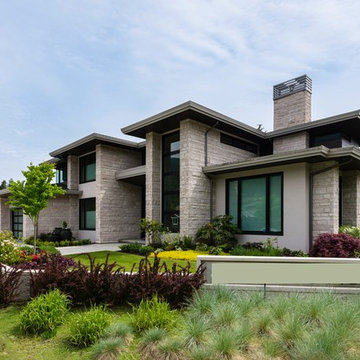
The objective was to create a warm neutral space to later customize to a specific colour palate/preference of the end user for this new construction home being built to sell. A high-end contemporary feel was requested to attract buyers in the area. An impressive kitchen that exuded high class and made an impact on guests as they entered the home, without being overbearing. The space offers an appealing open floorplan conducive to entertaining with indoor-outdoor flow.
Due to the spec nature of this house, the home had to remain appealing to the builder, while keeping a broad audience of potential buyers in mind. The challenge lay in creating a unique look, with visually interesting materials and finishes, while not being so unique that potential owners couldn’t envision making it their own. The focus on key elements elevates the look, while other features blend and offer support to these striking components. As the home was built for sale, profitability was important; materials were sourced at best value, while retaining high-end appeal. Adaptations to the home’s original design plan improve flow and usability within the kitchen-greatroom. The client desired a rich dark finish. The chosen colours tie the kitchen to the rest of the home (creating unity as combination, colours and materials, is repeated throughout).
Photos- Paul Grdina
Sponsored
Delaware, OH

Buckeye Basements, Inc.
Central Ohio's Basement Finishing ExpertsBest Of Houzz '13-'21
 TVL Creative Ltd.
Our clients were looking to erase the 90s from their master bathroom and create a space that blended their contemporary tastes with natural elements. This bathroom had wonderful bones with a high ceiling and plenty of space, but we were able to work with our clients to create a design that better met their needs and utilized the space to its full potential. We wanted to create a sense of warmth in this large master bathroom and adding a fireplace to the space did the trick. By moving the tub location, we were able to create a stunning accent wall of stacked stone that provided a home for the fireplace and a perfectly dramatic backdrop for the new freestanding bathtub. The sculptural copper light fixture helps to soften the stone wall and allowed us to emphasize those vaulted ceiling. Playing with metal finishes is one of our favorite pastimes, and this bathroom was the perfect opportunity to blend sleek matte black plumbing fixtures with a mirrored copper finish on the light fixtures. We tied the vanity wall sconces in with a dramatic sculptural chandelier above the bath tub by using copper finishes on both and allowing the light fixtures to be the shining stars of this space. We selected a clean white finish for the custom vanity cabinets and lit them from below to accentuate their floating design. We then completed the look with a waterfall quartz counter to add an elegant texture to the area and extended the stone onto the shower bench to bring the two elements together. The existing shower had been on the small side, so we expanded it into the room and gave them a more spacious shower complete with a built-in bench and recessed niche. Hard surfaces play an important role in any bathroom design, and we wanted to use this opportunity to create an interesting layer of texture through our tile selections. The bathroom floor utilizes a large-scale plank tile installed in a herringbone pattern, while the shower and walls are tiled in a polished white tile to add a bit of reflectivity. The newly transformed bathroom is now a sophisticated space the brings together sleek contemporary finishes with textured natural elements and provides the perfect retreat from the outside world.
 Vetter Architects
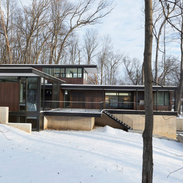
The client’s request was quite common - a typical 2800 sf builder home with 3 bedrooms, 2 baths, living space, and den. However, their desire was for this to be “anything but common.” The result is an innovative update on the production home for the modern era, and serves as a direct counterpoint to the neighborhood and its more conventional suburban housing stock, which focus views to the backyard and seeks to nullify the unique qualities and challenges of topography and the natural environment.
The Terraced House cautiously steps down the site’s steep topography, resulting in a more nuanced approach to site development than cutting and filling that is so common in the builder homes of the area. The compact house opens up in very focused views that capture the natural wooded setting, while masking the sounds and views of the directly adjacent roadway. The main living spaces face this major roadway, effectively flipping the typical orientation of a suburban home, and the main entrance pulls visitors up to the second floor and halfway through the site, providing a sense of procession and privacy absent in the typical suburban home.
Clad in a custom rain screen that reflects the wood of the surrounding landscape - while providing a glimpse into the interior tones that are used. The stepping “wood boxes” rest on a series of concrete walls that organize the site, retain the earth, and - in conjunction with the wood veneer panels - provide a subtle organic texture to the composition.
The interior spaces wrap around an interior knuckle that houses public zones and vertical circulation - allowing more private spaces to exist at the edges of the building. The windows get larger and more frequent as they ascend the building, culminating in the upstairs bedrooms that occupy the site like a tree house - giving views in all directions.
The Terraced House imports urban qualities to the suburban neighborhood and seeks to elevate the typical approach to production home construction, while being more in tune with modern family living patterns.
Overview:
Elm Grove
Size:
2,800 sf,
3 bedrooms, 2 bathrooms
Completion Date:
September 2014
Services:
Architecture, Landscape Architecture
Interior Consultants: Amy Carman Design
 Stebnitz Builders, Inc.
This East Troy home on Booth Lake had a few drainage issues that needed to be resolved, but one thing was clear, the homeowners knew with the proper design features, their property had amazing potential to be a fixture on the lake.
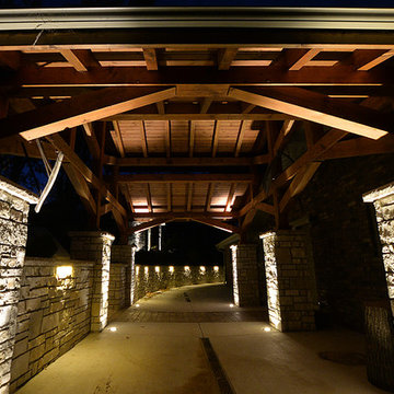
Starting with a redesign of the backyard, including retaining walls and other drainage features, the home was then ready for a radical facelift. We redesigned the entry of the home with a timber frame portico/entryway. The entire portico was built with the old-world artistry of a mortise and tenon framing method. We also designed and installed a new deck and patio facing the lake, installed an integrated driveway and sidewalk system throughout the property and added a splash of evening effects with some beautiful architectural lighting around the house.
A Timber Tech deck with Radiance cable rail system was added off the side of the house to increase lake viewing opportunities and a beautiful stamped concrete patio was installed at the lower level of the house for additional lounging.
Lastly, the original detached garage was razed and rebuilt with a new design that not only suits our client’s needs, but is designed to complement the home’s new look. The garage was built with trusses to create the tongue and groove wood cathedral ceiling and the storage area to the front of the garage. The secondary doors on the lakeside of the garage were installed to allow our client to drive his golf cart along the crushed granite pathways and to provide a stunning view of Booth Lake from the multi-purpose garage.
Terry Mayer http://www.terrymayerphotography.com/
 Cure Design Group
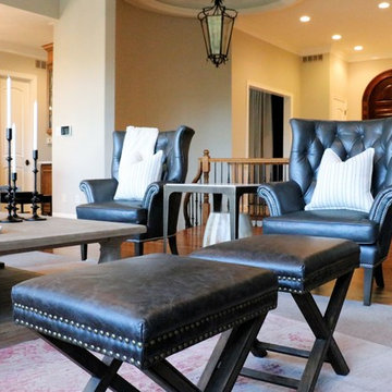
After just moving to STL from Atlanta with her husband, triplets, and 4 rescue dogs...this client was looking for a sophisticated space that was a reflection of her love of Design and a space that kept in line with an overall budget.
The Great Room needed to accommodate the daily needs of a family of 5 and 4 dogs.... but also the extended family and friends that came to visit from out of town.
2 CR Laine custom sofas, oversized cocktail table, leather updated custom wing chairs, accent tables that not only looked the part, but that were functional for this large family...no coasters necessary, and a plethora of pillows for cozying up on the floor.
After seeing the potential of the home and what good Design can accomplish, we took to the Office and Dining Room. Using the clients existing furniture in the Dining, adding an updated metal server and an oversized Visual Comfort Lantern Light were just the beginning. Top it off with a deep navy high gloss paint color , custom window treatments and a light overdyed area rug to lighten the heavy existing dining table and chairs, and job complete!
In the Office, adding a coat of deep green/gray paint to the wood bookcases set the backdrop for the bronze metal desk and glass floor lamps. Oversized tufted ottoman, and chairs to cozy up to the fire were the needed layers. Custom window treatments and artwork that reflected the clients love of golf created a functional and updated space.
THE KITCHEN!!
During our First Design phase, the kitchen was going to stay "as is"...but after completing a stunning Great Room space to accommodate triplets and 4 dogs, we knew the kitchen needed to compliment. Wolf appliances, Sub Zero refrigeration, custom cabinets were all a great foundation to a soon to be spectacular kitchen. Taj Mahal quartzite was just what was necessary to enhance the warm tones of the cabinetry and give the kitchen the necessary sustainability. New flooring to compliment the warm tones but also to introduce some cooler tones were the crescendo to this update! This expansive space is connected and cohesive, despite its grand footprint. Floating shelves and simple artwork all reflect the lifestyle of this active family.
 Kaoud Carpet & Rugs
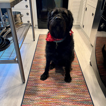
Runner Rugs in the kitchen can serve several purposes. They can add warmth and comfort to your
space, especially if you have hard flooring like tile or hardwood. Standing on a rug while cooking or doing dishes can be more comfortable for your feet and legs. Runner rugs in your kitchen can also provide protection for your floors against scratches and stains. Rugs can act as a barrier between your kitchen floors and potential sources of damage. Area rugs in your kitchen can also enhance the overall design and aesthetics of the space. Take a look at this colorful indoor outdoor runner rug we created for our client. Our client wanted a colorful 2' x 6' runner rug in between the kitchen island and sink. The runner was cut to preferred size and fabricated with a navy binding. Our client and their furry friend "Oscar" simply love the runner!
 Heidi Reis / Abode Agency LLC
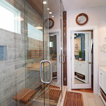
This Grant Park house was built in 1999. With that said, this bathroom was dated, builder grade with a tiny shower (3 ft x 3 ft) and a large jacuzzi-style 90s tub. The client was interested in a much larger shower, and he really wanted a sauna if squeeze it in there. Because this bathroom was tight, I decided we could potentially go into the large walk-in closet and expand to include a sauna. The client was looking for a refreshing coastal theme, a feel good space that was completely different than what existed.
This renovation was designed by Heidi Reis with Abode Agency LLC, she serves clients in Atlanta including but not limited to Intown neighborhoods such as: Grant Park, Inman Park, Midtown, Kirkwood, Candler Park, Lindberg area, Martin Manor, Brookhaven, Buckhead, Decatur, and Avondale Estates.
For more information on working with Heidi Reis, click here: https://www.AbodeAgency.Net/

Sponsored
Westerville, OH

Custom Home Works
Franklin County's Award-Winning Design, Build and Remodeling Expert
 Stebnitz Builders, Inc.
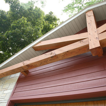
This East Troy home on Booth Lake had a few drainage issues that needed to be resolved, but one thing was clear, the homeowners knew with the proper design features, their property had amazing potential to be a fixture on the lake.
Starting with a redesign of the backyard, including retaining walls and other drainage features, the home was then ready for a radical facelift. We redesigned the entry of the home with a timber frame portico/entryway. The entire portico was built with the old-world artistry of a mortise and tenon framing method. We also designed and installed a new deck and patio facing the lake, installed an integrated driveway and sidewalk system throughout the property and added a splash of evening effects with some beautiful architectural lighting around the house.
A Timber Tech deck with Radiance cable rail system was added off the side of the house to increase lake viewing opportunities and a beautiful stamped concrete patio was installed at the lower level of the house for additional lounging.
Lastly, the original detached garage was razed and rebuilt with a new design that not only suits our client’s needs, but is designed to complement the home’s new look. The garage was built with trusses to create the tongue and groove wood cathedral ceiling and the storage area to the front of the garage. The secondary doors on the lakeside of the garage were installed to allow our client to drive his golf cart along the crushed granite pathways and to provide a stunning view of Booth Lake from the multi-purpose garage.
Photos by Beth Welsh, Interior Changes
 Middleton Inc.
Project Type: Full House Remodel
Client Type: Builder
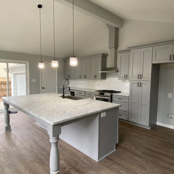
Overview: We were commissioned by our clients over at Housekick to create a set of design plans and provide our standard visualization package. The crew over at Housekick builds/renovates and sells over forty houses a year in the Raleigh Triangle area, so having an efficient construction process and the ability to pre-sell their properties is crucial to their business model. Because of our extensive experience with interior design, real estate, and construction projects, they rely on us to come up with complete design plans from start to finish and then use these to build and pre-sell their projects.
Original Conditions: This typical 1970’s choppy split-level house was e “functionally obsolete,” had three bedrooms, two baths, and no real master suite before we got our hands on it.
Changes: Upon completion, the home had four bedrooms, three full baths, a full master suite, and an open floorplan with modern architectural details.
The Result: Because of our design plans and visualizations, our clients were able to create a stunning property that was functionally current, appealed to the correct demographic, and wowed potential buyers resulting in the home selling before it ever hit the market!
 Simply Home Decorating
This beautiful North Vancouver home belongs to a nature-loving and health-conscious couple, Emma and Vince (names changed), their two young children, and their dog, Jasper. When they contacted us about renovating and furnishing their kitchen and family room, we walked in and saw a world of potential waiting to be uncovered.
Before: Larkhall Crescent Home:
Like many original North Vancouver homes, the interior was definitely dated. We encountered late ‘80s finishes in powder pink and teal green, old carpet, and a kitchen that wasn’t maximized to suit this family’s modern-day lifestyle. However, the size of the rooms offered us a ton of space with which to get creative.
Knowing our clients’ love of cooking, need for work spaces (Emma and Vince both work remotely), and growing family, we developed a design concept that would increase usable space, optimize storage, and create intimacy in this large area. As for the style, we were inspired by their European roots, inventing a new and modern take on “Belgian Farmhouse” style. Now, the home is truly one-of-a-kind.
After: Warm & Cozy Family Room:
Fresh, bright, and comfortable, this living area has been transformed! We started with the fireplace as a focal point, selecting aged brick tiles for added texture and a crisp wood mantle. The taupe-coloured sectional infuses the room with visual warmth and serves the added purpose of separating the family room from the kitchen.
Emma and Vince were also keen on using non-toxic materials in their home, and we were happy to oblige. To meet their needs, we sourced natural wood elements and sought out Canadian-made products - that adhere to high health standards - whenever possible.
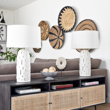
Look closer at the elements of this space, and you will find this stunning, honeycomb-patterned rug in earthy gold, beige, and charcoal tones. It’s plush to the touch and full of visual texture that brings this room’s colour palette together. We sourced these two-tone chairs with caning, petrified wood side table, black sconces, and botanical prints in greyscale from local artist, Heather Johnston.
We topped off the space with this dark wood and rattan console that offers storage facing the kitchen and presents an opportunity to display cherished items. The result is a cozy lounging space brimming with comfort and functionality. It’s perfect for enjoying quality family time, or Emma can simply slide the coffee table away to make room for her morning yoga practice.
Now, let’s turn around and give some attention to the kitchen. Do you remember what the original kitchen looked like? If not, scroll back up, because the transformation is shocking…
Moody & Welcoming Kitchen for Healthy Living:
This kitchen looks very different from how it started, right? Though we didn’t touch any walls, the kitchen has almost doubled in usable space! We created a long, extended island with storage, an outlet for small appliances, and seating for comfortable prep, after-school snacking, or mingling among friends.
On the other side of the island, the family has even more storage and an integrated dishwasher within easy reach of the sink, perfect for quick clean-up. From this angle, you can also see the expansive custom Shaker cabinetry in white and the integrated double ovens. These facilitate their cooking experience and gave us the opportunity to add an additional surprise…
A coffee garage station and more hidden storage! Keeping these items located along the perimeter allows them to be accessed by the family or their guests without someone getting under the cook’s feet. These are the little details that make everyday life easier and more enjoyable.
Moving deeper into the kitchen, the seamless induction cooktop topped with a freestanding concealed hood fan commands attention in a soft yet prominent way. The natural wood accent mirrors the fireplace mantle, and the choice of off-black wood-grain cabinets not only continues our black-and-white colour palette but adds a sense of depth and contrast. The corner sink is located to the right and perfectly positioned with a view of their thriving backyard.
To invite more of this family’s character into the space, we mixed metals for interest — matte black, dark pewter, and warm brass — and created open shelves in white oak for their plants and decor. You can also glimpse the tumbled edge of the backsplash tile, which echoes the rustic brick of the fireplace. It adds that farmhouse charm while still feeling timeless and sophisticated.
Last but not least, we designed this dining banquette in the bay window (with integrated bench storage, of course), where the family can share a meal together, the kids can do homework, or Emma and Vince can work and enjoy a change of scenery from their offices. Like the other spaces in the home, it was designed to be beautiful, multi-functional, and long-lasting.
Praise from Our Clients:
It is clear that we love this home, but what did our clients have to say?
“Lori is a visionary and masters execution to the finest detail all at the same time. When she first met us to know more about who we are and how we live, she could right away envision how we could use the space in our kitchen and living room…The results exceeded our expectations.
Lori and her team were also a delight to work with — coordination with all the trades, fast problem-solving, regular updates, professional and friendly attitude of her entire team — made it the dream team. Thank you SHD for making our space so beautiful!”
In turn, we are so grateful for this family’s trust, their open communication, and for being wonderful people with whom to work. (So, thank you!)
 Stebnitz Builders, Inc.
This East Troy home on Booth Lake had a few drainage issues that needed to be resolved, but one thing was clear, the homeowners knew with the proper design features, their property had amazing potential to be a fixture on the lake.
Starting with a redesign of the backyard, including retaining walls and other drainage features, the home was then ready for a radical facelift. We redesigned the entry of the home with a timber frame portico/entryway. The entire portico was built with the old-world artistry of a mortise and tenon framing method. We also designed and installed a new deck and patio facing the lake, installed an integrated driveway and sidewalk system throughout the property and added a splash of evening effects with some beautiful architectural lighting around the house.
A Timber Tech deck with Radiance cable rail system was added off the side of the house to increase lake viewing opportunities and a beautiful stamped concrete patio was installed at the lower level of the house for additional lounging.
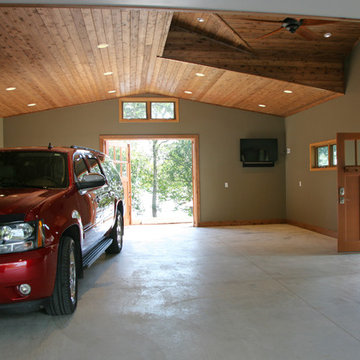
Lastly, the original detached garage was razed and rebuilt with a new design that not only suits our client’s needs, but is designed to complement the home’s new look. The garage was built with trusses to create the tongue and groove wood cathedral ceiling and the storage area to the front of the garage. The secondary doors on the lakeside of the garage were installed to allow our client to drive his golf cart along the crushed granite pathways and to provide a stunning view of Booth Lake from the multi-purpose garage.
Photos by Beth Welsh, Interior Changes

Sponsored
Columbus, OH

Snider & Metcalf Interior Design, LTD
Leading Interior Designers in Columbus, Ohio & Ponte Vedra, Florida
 Cure Design Group
After just moving to STL from Atlanta with her husband, triplets, and 4 rescue dogs...this client was looking for a sophisticated space that was a reflection of her love of Design and a space that kept in line with an overall budget.
The Great Room needed to accommodate the daily needs of a family of 5 and 4 dogs.... but also the extended family and friends that came to visit from out of town.
2 CR Laine custom sofas, oversized cocktail table, leather updated custom wing chairs, accent tables that not only looked the part, but that were functional for this large family...no coasters necessary, and a plethora of pillows for cozying up on the floor.
After seeing the potential of the home and what good Design can accomplish, we took to the Office and Dining Room. Using the clients existing furniture in the Dining, adding an updated metal server and an oversized Visual Comfort Lantern Light were just the beginning. Top it off with a deep navy high gloss paint color , custom window treatments and a light overdyed area rug to lighten the heavy existing dining table and chairs, and job complete!
In the Office, adding a coat of deep green/gray paint to the wood bookcases set the backdrop for the bronze metal desk and glass floor lamps. Oversized tufted ottoman, and chairs to cozy up to the fire were the needed layers. Custom window treatments and artwork that reflected the clients love of golf created a functional and updated space.
THE KITCHEN!!
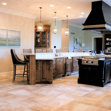
During our First Design phase, the kitchen was going to stay "as is"...but after completing a stunning Great Room space to accommodate triplets and 4 dogs, we knew the kitchen needed to compliment. Wolf appliances, Sub Zero refrigeration, custom cabinets were all a great foundation to a soon to be spectacular kitchen. Taj Mahal quartzite was just what was necessary to enhance the warm tones of the cabinetry and give the kitchen the necessary sustainability. New flooring to compliment the warm tones but also to introduce some cooler tones were the crescendo to this update! This expansive space is connected and cohesive, despite its grand footprint. Floating shelves and simple artwork all reflect the lifestyle of this active family.
Cure Design Group (636) 294-2343 https://curedesigngroup.com/
Town & Country, MO
 Kim Teron Design Studio
Our clients were a couple about to retire, who wanted to stay in their family home where they raised their children. They knew their kitchen was not working to its full potential but were unsure how to make the best changes or where to start. It was important their new kitchen yielded the feeling of a fresh, new environment that offered timeless longevity but didn’t break the bank.
Knowing that the kitchen now needed the space to accommodate two people regularly, we reconfigured it to suit our clients’ lifestyle change. We increased counter space significantly for preparation and presentation, making it intrinsically more functional but also yielding a greater sense of luxury. Storage was increased and planned around our understanding of their cooking and entertaining style, and how they move through the space.
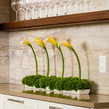
Our clients were comfortable and very much aware of their own sense of style – simplicity was the driving force behind their aesthetic. We removed all unnecessary embellishments and used a classic, neutral palette while introducing texture with rich walnut touches. Knowing their penchant for entertaining, we included integrated lighting to allow easy control of ambiance.
This project was a joy to work on!
 Stebnitz Builders, Inc.
This East Troy home on Booth Lake had a few drainage issues that needed to be resolved, but one thing was clear, the homeowners knew with the proper design features, their property had amazing potential to be a fixture on the lake.
Starting with a redesign of the backyard, including retaining walls and other drainage features, the home was then ready for a radical facelift. We redesigned the entry of the home with a timber frame portico/entryway. The entire portico was built with the old-world artistry of a mortise and tenon framing method. We also designed and installed a new deck and patio facing the lake, installed an integrated driveway and sidewalk system throughout the property and added a splash of evening effects with some beautiful architectural lighting around the house.
A Timber Tech deck with Radiance cable rail system was added off the side of the house to increase lake viewing opportunities and a beautiful stamped concrete patio was installed at the lower level of the house for additional lounging.
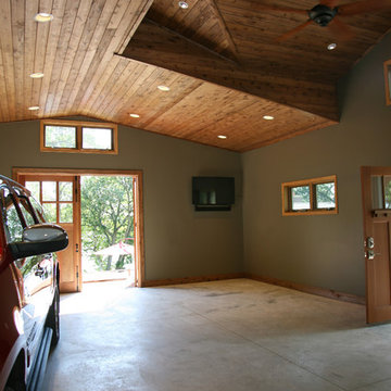
Lastly, the original detached garage was razed and rebuilt with a new design that not only suits our client’s needs, but is designed to complement the home’s new look. The garage was built with trusses to create the tongue and groove wood cathedral ceiling and the storage area to the front of the garage. The secondary doors on the lakeside of the garage were installed to allow our client to drive his golf cart along the crushed granite pathways and to provide a stunning view of Booth Lake from the multi-purpose garage.
Photos by Beth Welsh, Interior Changes
38