
Search results for "Practically passing" in Home Design Ideas
 Royston Wilson Design
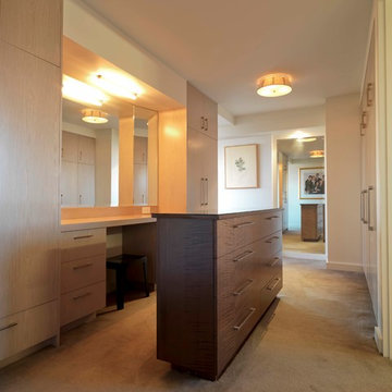
This photograph shows the combined WIR/dressing room . Contrasting timbers have been used to impart a feeling of warmth as you pass through to the Ensuite. The middle drawers provide a subtle division between robes and dressing table while also forming a practical use.
Photo's Andrew Ashton
 Jarrett Design
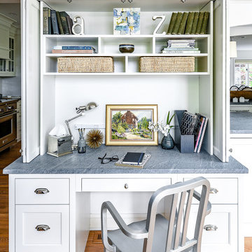
Eat-in kitchen - large transitional l-shaped light wood floor eat-in kitchen idea in Philadelphia with a farmhouse sink, flat-panel cabinets, white cabinets, soapstone countertops, white backsplash, ceramic backsplash, paneled appliances, an island and gray countertops
 Klopf Architecture
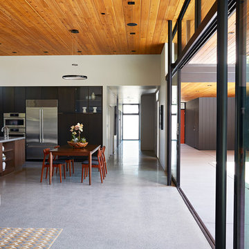
Klopf Architecture, Arterra Landscape Architects and Henry Calvert of Calvert Ventures Designed and built a new warm, modern, Eichler-inspired, open, indoor-outdoor home on a deeper-than-usual San Mateo Highlands property where an original Eichler house had burned to the ground.
The owners wanted multi-generational living and larger spaces than the original home offered, but all parties agreed that the house should respect the neighborhood and blend in stylistically with the other Eichlers. At first the Klopf team considered re-using what little was left of the original home and expanding on it. But after discussions with the owner and builder, all parties agreed that the last few remaining elements of the house were not practical to re-use, so Klopf Architecture designed a new home that pushes the Eichler approach in new directions.
One disadvantage of Eichler production homes is that the house designs were not optimized for each specific lot. A new custom home offered the team a chance to start over. In this case, a longer house that opens up sideways to the south fit the lot better than the original square-ish house that used to open to the rear (west). Accordingly, the Klopf team designed an L-shaped “bar” house with a large glass wall with large sliding glass doors that faces sideways instead of to the rear like a typical Eichler. This glass wall opens to a pool and landscaped yard designed by Arterra Landscape Architects.
Driving by the house, one might assume at first glance it is an Eichler because of the horizontality, the overhanging flat roof eaves, the dark gray vertical siding, and orange solid panel front door, but the house is designed for the 21st Century and is not meant to be a “Likeler.” You won't see any posts and beams in this home. Instead, the ceiling decking is a western red cedar that covers over all the beams. Like Eichlers, this cedar runs continuously from inside to out, enhancing the indoor / outdoor feeling of the house, but unlike Eichlers it conceals a cavity for lighting, wiring, and insulation. Ceilings are higher, rooms are larger and more open, the master bathroom is light-filled and more generous, with a separate tub and shower and a separate toilet compartment, and there is plenty of storage. The garage even easily fits two of today's vehicles with room to spare.
A massive 49-foot by 12-foot wall of glass and the continuity of materials from inside to outside enhance the inside-outside living concept, so the owners and their guests can flow freely from house to pool deck to BBQ to pool and back.
During construction in the rough framing stage, Klopf thought the front of the house appeared too tall even though the house had looked right in the design renderings (probably because the house is uphill from the street). So Klopf Architecture paid the framer to change the roofline from how we had designed it to be lower along the front, allowing the home to blend in better with the neighborhood. One project goal was for people driving up the street to pass the home without immediately noticing there is an "imposter" on this lot, and making that change was essential to achieve that goal.
This 2,606 square foot, 3 bedroom, 3 bathroom Eichler-inspired new house is located in San Mateo in the heart of the Silicon Valley.
Klopf Architecture Project Team: John Klopf, AIA, Klara Kevane
Landscape Architect: Arterra Landscape Architects
Contractor: Henry Calvert of Calvert Ventures
Photography ©2016 Mariko Reed
Location: San Mateo, CA
Year completed: 2016
Find the right local pro for your project
 Columbia Cabinets
 http://www.ccabinet.com
Understated Elegance for Historic Saratoga Home
Project Details
Designer: Ray Roberts
Cabinetry: Wood-Mode Framed Cabinetry
Wood: Perimeter – Maple; Island – Quarter Sawn Oak
Finishes: Perimeter – Nordic White; Island – Nut Brown
Door: Perimeter – Regent Recessed Inset; Island – Alexandria Recessed Inset
Countertop: Perimeter – Soapstone; Island – Calacatta Marble
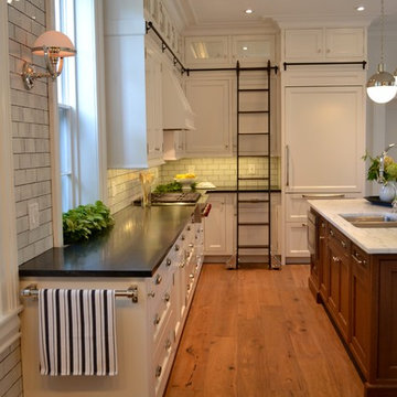
Perhaps one of my favorite projects of the year, this historic home on Broadway in Saratoga Springs deserved the finest of kitchens. And that it always fun to design. The real challenge here was to capture an understated elegance worthy of the history of the home, the street, the town itself. This particular refinement meant having the sum of the parts be greater than the whole…meticulous focus on every detail to create something grand but livable, historically appropriate but adapted for today’s modern family, luxe but quietly graceful. Some of the details include a beautifully detailed wooden hood, a rolling ladder to access the double stacked upper cabinets which feature antiqued mirror inserts, a substantial, grounding quarter sawn oak island in a contrasting nut brown finish as well as historically appropriate hardware contrasted with modern fixtures and lighting.
 Urban Purpose Design
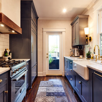
Small elegant galley medium tone wood floor enclosed kitchen photo in Atlanta with a farmhouse sink, shaker cabinets, blue cabinets, white backsplash, subway tile backsplash, stainless steel appliances and no island
 Interiors by Popov
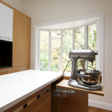
Inspiration for a small modern galley light wood floor and brown floor kitchen remodel in Seattle with a single-bowl sink, flat-panel cabinets, light wood cabinets, quartz countertops, white backsplash, ceramic backsplash, stainless steel appliances and an island
 SIDG Design
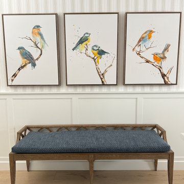
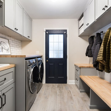
Adding layers of wainscoting and wallpaper in this space gave it personality and made it better than a pass-through area.
The bench is both practical and beautiful, it makes a nice landing space for removing shoes, placing personal items, etc. and warms ups the space.

 Closet Organizing Systems
This mudroom is finished in grey melamine with shaker raised panel door fronts and butcher block counter tops. Bead board backing was used on the wall where coats hang to protect the wall and providing a more built-in look.
Bench seating is flanked with large storage drawers and both open and closed upper cabinetry. Above the washer and dryer there is ample space for sorting and folding clothes along with a hanging rod above the sink for drying out hanging items.
Designed by Jamie Wilson for Closet Organizing Systems
 Koch Architects
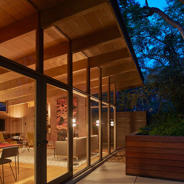
Concrete patio with Ipe wood walls. Floor to ceiling windows and doors to living room with exposed wood beamed ceiling and mid-century modern style furniture, in mid-century-modern home renovation in Berkeley, California - Photo by Bruce Damonte.


 Attleboro Kitchen and Bath
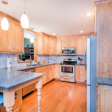
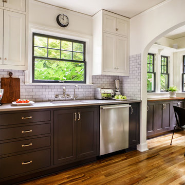
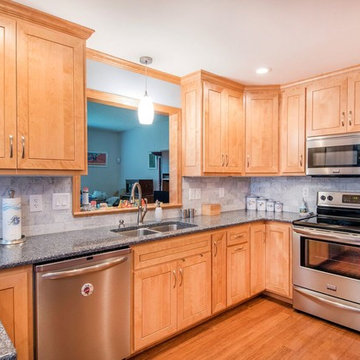
This "pass though" kitchen needed definition and more storage space. By closing up an unneccessary doorway, the homeowner gained a full wall of cabinetry and a more practical home for their refrigerator. Countertops are Cambria quartz and cabinetry is Aristokraft. Design and photo by Attleboro Kitchen and Bath
 Gary Earl Parsons, Architect
Muffy Kibbey, Photographer
Carlen and Company, General Contractor
Jeff Ward, Cabinetmaker
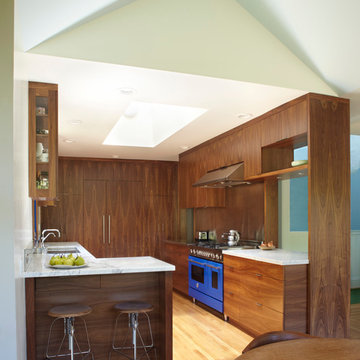
Example of a minimalist galley light wood floor eat-in kitchen design in San Francisco with dark wood cabinets, marble countertops, colored appliances and flat-panel cabinets
Example of a minimalist galley light wood floor eat-in kitchen design in San Francisco with dark wood cabinets, marble countertops, colored appliances and flat-panel cabinets
 Drury Design
THE SETUP
“You have to figure out how to rebuild a life worth living,” Basia Kozub’s client says. Her husband passed away suddenly three years ago. Holidays with family became more important, and she found herself struggling with a 37-year old kitchen that was falling apart. “I made a decision to move forward,” she says. “I went, ‘You know what? I’m redoing the kitchen.'”
The big task of getting started was as easy as having a conversation – literally. Basia was on the job, helping the client sort through priorities, wishes and ideas. Basia’s client is 5′ 4″, likes keeping an eye on the kiddoes in the backyard and wanted certain things to have their own place.
THE REMODEL
The objectives were:
Enlarge and open the space
Find a classic look that incorporates blues
Upgrade to easy-to-use appliances
Hide an office space within the space
Ample storage for dishes
Design challenges:
Uneven window alignment on the back wall
Original kitchen smaller than desired, stuctural concerns if walls to be moved
Keep folks close – figure out seating for entertaining
Main sink in corner is ideal, but windows are hard to reach
Lots of storage needed for dishes, glass collection, pantry items, bar bottles and office supplies
Specific storage needs for oft-used spices and utensils
THE RENEWED SPACE
Design solutions:
Replace back wall windows, establish window size continuity
Take out two walls to open up the space, tall shallow cabinet and a tall filler added to conceal a new header
Large island that seats six easily
Custom corner sink cabinet with recessed edge allows vertically challenged homeowner to reach the windows
Mindful storage planning features: plenty of cabinets, pull-out bar bottle storage, file drawers & cubbies with pocket doors for office appliances, magic corner pullouts, and appliance garages with pocket doors
Shelf behind range for easy access to daily-use spices and oils. Also: spice and utensil pullouts on either side of range
The clients says every priority and wish box got checked. The highly functional design absorbed everything that used to be in that area of the house, but now those things are out of the way.
“In the past, we were all spread out when we gathered for the holidays, because we had to spread out. Now, we’re all in here together, including my 92-year old mother. We’re visiting, cooking, laughing… everyone is here. And I’m really learning how to use these appliances. This kitchen has given me a whole new life.”
 Stowe Craft and Design
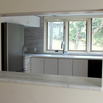
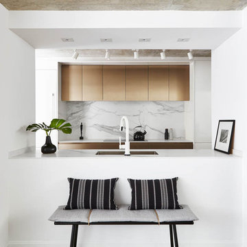
This pass through is a great way for the kitchen and dining rooms to feel integrated, yet still defined as separate spaces. The opening between the two rooms allows for daylight to enter into the dining room and for the home-owners and visitors to be a part of the activities of two spaces at once. The white marble countertop is a beautiful and practical surface for passing and serving food.
 Toronto Interior Design Group
Valerie Wilcox
Inspiration for a contemporary kitchen remodel in Toronto
Inspiration for a contemporary kitchen remodel in Toronto
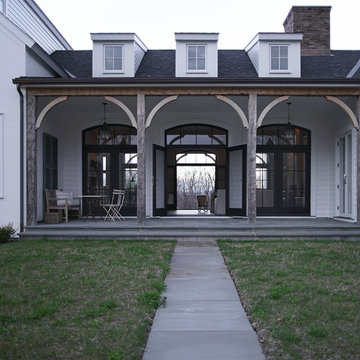
 Kate Johns Designs
The center Great Room opens through french doors and transoms to timber framed porches on both sides.
Photos: Scott Benedict, Practical(ly) Studios
Inspiration for a large country stone front porch remodel in New York with a roof extension
Inspiration for a large country stone front porch remodel in New York with a roof extension
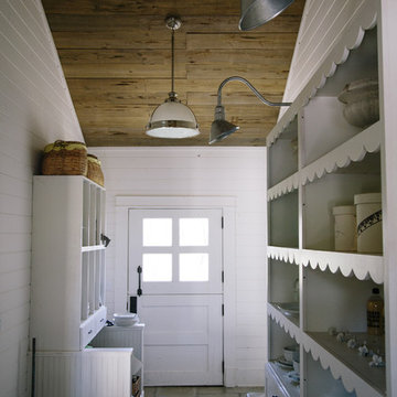
 Jordana Nicholson
Photo: Jordana Nicholson © 2016 Houzz
Mudroom - farmhouse mudroom idea in Nashville with white walls and a white front door
Mudroom - farmhouse mudroom idea in Nashville with white walls and a white front door

Sponsored
Columbus, OH

Hope Restoration & General Contracting
Columbus Design-Build, Kitchen & Bath Remodeling, Historic Renovations
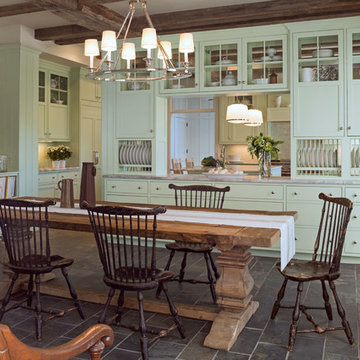
Large farmhouse u-shaped slate floor eat-in kitchen photo in DC Metro with shaker cabinets, green cabinets, marble countertops and an island
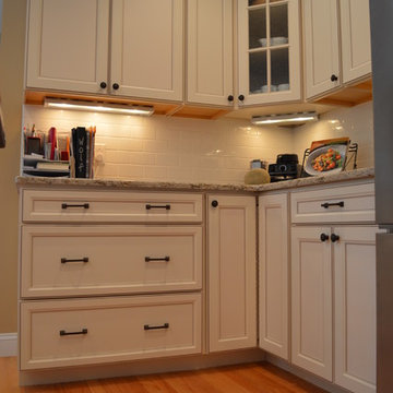 Attleboro Kitchen and Bath
This "pass though" kitchen needed definition and more storage space. By closing up an unneccessary doorway, the homeowner gained a full wall of cabinetry and a more practical home for their refrigerator. Countertops are Cambria quartz and cabinetry is Aristokraft. Design and photo by Attleboro Kitchen and Bath
 David Heide Design Studio
Architecture & Interior Design: David Heide Design Studio
Photo: Susan Gilmore Photography
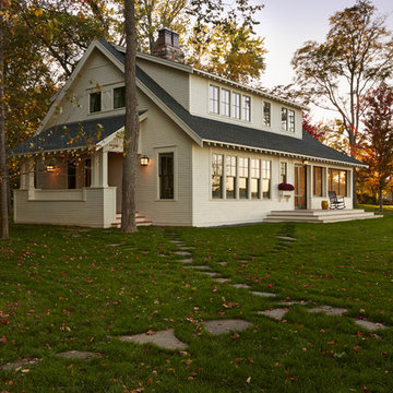
Inspiration for a mid-sized timeless white two-story wood gable roof remodel in Minneapolis with a shingle roof
Inspiration for a mid-sized timeless white two-story wood gable roof remodel in Minneapolis with a shingle roof
9