
Search results for "Pre existing challenges" in Home Design Ideas
 AXIS Productions
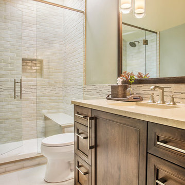
a bathroom was added between the existing garage and home. A window couldn't be added, so a skylight brings needed sunlight into the space.
WoodStone Inc, General Contractor
Home Interiors, Cortney McDougal, Interior Design
Draper White Photography
 David Stern Architecture
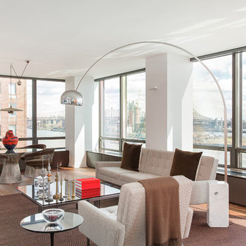
New walnut flooring, stone convector tops and aluminum grills. Sofa and chair by owner. Selected the fabric for re upholstery. All other furniture sourced and purchased..
 Pennsylvania Landscape & Nursery Association
Terren Landscapes http://www.terrenlandscapes.com
Project Entry: Pembrooke Estate Rain Garden
2014 PLNA Awards for Landscape Excellence Winner
Category: Sustainable Landscape &60,000-$120,000
Award Level: Silver
Project Description:
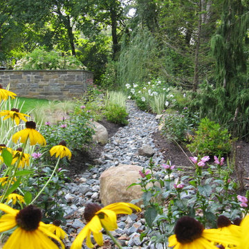
The client contracted our company to solve multiple existing drainage problems. In a heavy rain event the existing French drain system would overflow, causing water to pool in the driveway. After investigating the system we found that the capacity of the French drain was undersized for the amount of storm water from the large rain events received in recent years. As a result of our findings and at the request of the homeowner, we designed a storm water management system to capture all storm water from the structures on the property and regenerate the underground aquifers for the volume of a 5.8” rainstorm. In addition to the new drain system, the homeowners wanted a rain garden to provide a backdrop for an existing formal garden, provide a habitat for wildlife, and provide screening from an adjacent neighbor.
Throughout the design process many challenges were presented, including an existing gas line, which ran directly through the area that best suited the bioswale. The existence of the gas line caused us to alter the shape and depth of the bioswale in some areas. We also inspected the existing downspouts to make sure there were no obstructions that would impede the system’s efficiency, and then conducted a test pit dig to make sure we had sufficient percolation rates for disposal of storm water.
To effectively capture the storm water runoff, the existing downspouts were piped from the main house and the large detached garage to a large catch basin located at the low point in the driveway. The driveway catch basin contains two outlet pipes at different elevations within the basin allowing water from smaller rain events to enter the bioswale and rain garden area to percolate into the soil before excess water overflows into a sediment trap which filters out any debris and is then piped to an underground StormTech® pit to slowly percolate into the ground. The other outlet pipe in the driveway catch basin is used for larger storm water events, taking the water directly to the StormTech® pit.
Accepting and slowing the velocity of the storm water, mitigation of erosion, and filtering out pollutants contained in the “first flush” of rainfall are the primary functions of the bioswale and rain garden. Planting these areas with mostly native plant species helps carry out these functions while attracting and providing shelter for wildlife.
The ‘Niobe’ weeping willow is the centerpiece of the rain garden, connecting with the axis of the existing formal garden. To screen the neighboring property we chose Chamaecyparis nootkatensis ‘Pendula’ for its graceful evergreen habit and tolerance of wet sites. ‘Ivory Halo’ dogwood and Panicum ‘Cloud Nine’ were used for screening as well as winter interest. To provide deciduous structure to the garden Taxodium distichum and Magnolia virginiana were used in conjunction with witch hazel. Mostly native wetland perennials were used due to their tolerance of wet conditions and occasional drought.
The area above the StormTech® pit provides space for the client’s family to relax. The rain garden and bioswale provide screening, storm water management, a habitat for wildlife, and plants that enhance the adjacent formal garden.
Photo Credit: Terren Landscapes
Find the right local pro for your project
 User
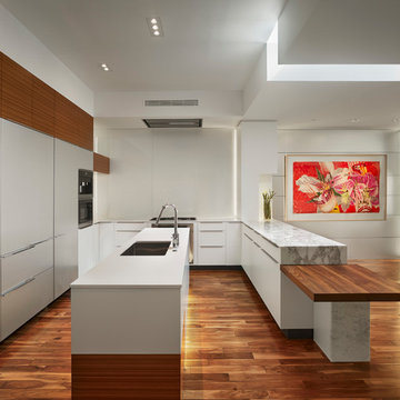
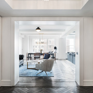
UserThe challenge of merging contemporary design with a classic traditional interior is emblematic of the vitality experienced in the evolution of Philadelphia’s urban fabric. The design of this Center City apartment engages a rich discourse between the new and the existing, focusing on areas of the residence that contradicted the new owners’ aesthetic and lifestyle.
The elevator opens to the center of the spacious living area that includes the foyer, kitchen and living room. The serene, geometric character of the foyer enhances the sense of arrival – offering a moment to contemplate the owners’ art, the interplay of the old and the new, and the subtleties of light.
The kitchen, while fully functional, willingly and quietly participates in the composition. Symmetry and asymmetry are seamlessly woven.
The depth and endurance of daily experiences are the ingredients that transform architecture into a vital framework for living. As it relates to a home, the framework requires a resonate balance of comfort and drama, achieved here with a cast of dynamic materials and details that subtly collaborate in simple composition.
Barry Halkin and Todd Mason Photography
 StudioLAB
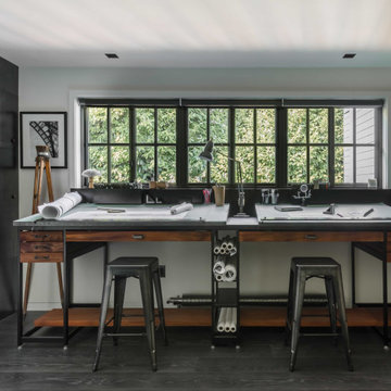
Across from Hudson River Park, the Classic 7 pre-war apartment had not renovated in over 50 years. The new owners, a young family with two kids, desired to open up the existing closed in spaces while keeping some of the original, classic pre-war details. Dark, dimly-lit corridors and clustered rooms that were a detriment to the brilliant natural light and expansive views the existing apartment inherently possessed, were demolished to create a new open plan for a more functional style of living. Custom charcoal stained white oak herringbone floors were laid throughout the space. The dark blue lacquered kitchen cabinets provide a sharp contrast to the otherwise neutral colored space. A wall unit in the same blue lacquer floats on the wall in the Den.
 SkB Architects
Originally built in 1955, this modest penthouse apartment typified the small, separated living spaces of its era. The design challenge was how to create a home that reflected contemporary taste and the client’s desire for an environment rich in materials and textures. The keys to updating the space were threefold: break down the existing divisions between rooms; emphasize the connection to the adjoining 850-square-foot terrace; and establish an overarching visual harmony for the home through the use of simple, elegant materials.
The renovation preserves and enhances the home’s mid-century roots while bringing the design into the 21st century—appropriate given the apartment’s location just a few blocks from the fairgrounds of the 1962 World’s Fair.
 JAMES DIXON ARCHITECT PC
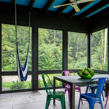
A former summer camp, this site came with a unique set of challenges. An existing 1200 square foot cabin was perched on the shore of Thorndike Pond, well within the current required setbacks. Three additional outbuildings were part of the property, each of them small and non-conforming. By limiting reconstruction to the existing footprints we were able to gain planning consent to rebuild each structure. A full second story added much needed space to the main house. Two of the outbuildings have been rebuilt to accommodate guests, maintaining the spirit of the original camp. Black stained exteriors help the buildings blend into the landscape.
The project was a collaboration with Spazio Rosso Interior Design.
Photographs by Sean Litchfield

Sponsored
Columbus, OH

Hope Restoration & General Contracting
Columbus Design-Build, Kitchen & Bath Remodeling, Historic Renovations
 White Sands Coastal Development
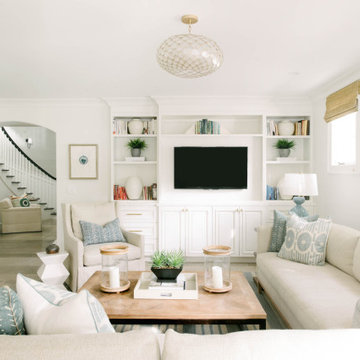
We remodeled this 5,400-square foot, 3-story home on ’s Second Street to give it a more current feel, with cleaner lines and textures. The result is more and less Old World Europe, which is exactly what we were going for. We worked with much of the client’s existing furniture, which has a southern flavor, compliments of its former South Carolina home. This was an additional challenge, because we had to integrate a variety of influences in an intentional and cohesive way.
We painted nearly every surface white in the 5-bed, 6-bath home, and added light-colored window treatments, which brightened and opened the space. Additionally, we replaced all the light fixtures for a more integrated aesthetic. Well-selected accessories help pull the space together, infusing a consistent sense of peace and comfort.
 Gilmans Kitchens and Baths
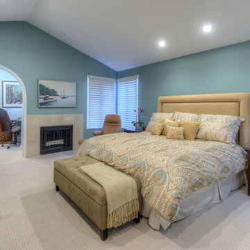
The client's purchased an 80's condo unit of the 4th floor.
The main goal(s): To create a space suitable for aging-in-place and to successfully incorporate pre-existing furniture and decor from the client's previous home.
The challenges:
- To be able to fully incorporate existing furniture into a smaller space, as the client's had down-sized by moving into a condo unit.
- Creating and providing a wide range of accessibility and universal design to accommodate certain health issues of one of the clients.
Inspiration: Existing arches throughout the home.
Treve Johnson Photography
 Gilmans Kitchens and Baths
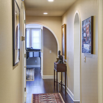
The client's purchased an 80's condo unit of the 4th floor.
The main goal(s): To create a space suitable for aging-in-place and to successfully incorporate pre-existing furniture and decor from the client's previous home.
The challenges:
- To be able to fully incorporate existing furniture into a smaller space, as the client's had down-sized by moving into a condo unit.
- Creating and providing a wide range of accessibility and universal design to accommodate certain health issues of one of the clients.
Inspiration: Existing arches throughout the home.
Treve Johnson Photography
 Gilmans Kitchens and Baths
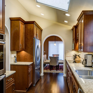
The client's purchased an 80's condo unit of the 4th floor.
The main goal(s): To create a space suitable for aging-in-place and to successfully incorporate pre-existing furniture and decor from the client's previous home.
The challenges:
- To be able to fully incorporate existing furniture into a smaller space, as the client's had down-sized by moving into a condo unit.
- Creating and providing a wide range of accessibility and universal design to accommodate certain health issues of one of the clients.
Inspiration: Existing arches throughout the home.
Treve Johnson Photography
 Gilmans Kitchens and Baths
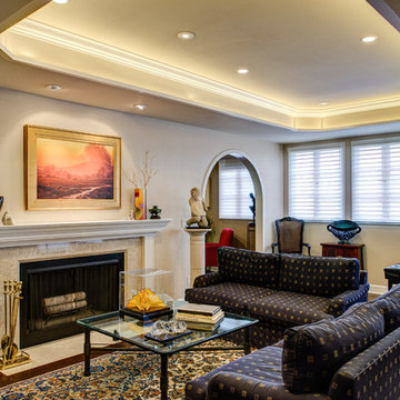
The client's purchased an 80's condo unit of the 4th floor.
The main goal(s): To create a space suitable for aging-in-place and to successfully incorporate pre-existing furniture and decor from the client's previous home.
The challenges:
- To be able to fully incorporate existing furniture into a smaller space, as the client's had down-sized by moving into a condo unit.
- Creating and providing a wide range of accessibility and universal design to accommodate certain health issues of one of the clients.
Inspiration: Existing arches throughout the home.
Treve Johnson Photography
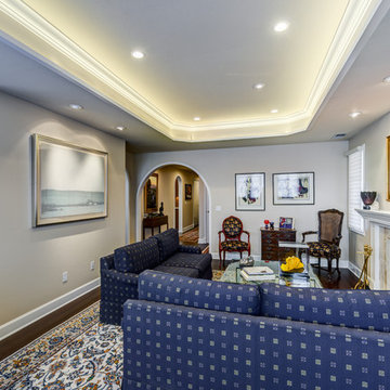 Gilmans Kitchens and Baths
The client's purchased an 80's condo unit of the 4th floor.
The main goal(s): To create a space suitable for aging-in-place and to successfully incorporate pre-existing furniture and decor from the client's previous home.
The challenges:
- To be able to fully incorporate existing furniture into a smaller space, as the client's had down-sized by moving into a condo unit.
- Creating and providing a wide range of accessibility and universal design to accommodate certain health issues of one of the clients.
Inspiration: Existing arches throughout the home.
Treve Johnson Photography
Sponsored
Columbus, OH
Hope Restoration & General Contracting
Columbus Design-Build, Kitchen & Bath Remodeling, Historic Renovations
 TKS Design Group
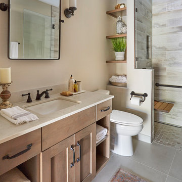
This project was completed for clients who wanted a comfortable, accessible 1ST floor bathroom for their grown daughter to use during visits to their home as well as a nicely-appointed space for any guest. Their daughter has some accessibility challenges so the bathroom was also designed with that in mind.
The original space worked fairly well in some ways, but we were able to tweak a few features to make the space even easier to maneuver through. We started by making the entry to the shower flush so that there is no curb to step over. In addition, although there was an existing oversized seat in the shower, it was way too deep and not comfortable to sit on and just wasted space. We made the shower a little smaller and then provided a fold down teak seat that is slip resistant, warm and comfortable to sit on and can flip down only when needed. Thus we were able to create some additional storage by way of open shelving to the left of the shower area. The open shelving matches the wood vanity and allows a spot for the homeowners to display heirlooms as well as practical storage for things like towels and other bath necessities.
We carefully measured all the existing heights and locations of countertops, toilet seat, and grab bars to make sure that we did not undo the things that were already working well. We added some additional hidden grab bars or “grabcessories” at the toilet paper holder and shower shelf for an extra layer of assurance. Large format, slip-resistant floor tile was added eliminating as many grout lines as possible making the surface less prone to tripping. We used a wood look tile as an accent on the walls, and open storage in the vanity allowing for easy access for clean towels. Bronze fixtures and frameless glass shower doors add an elegant yet homey feel that was important for the homeowner. A pivot mirror allows adjustability for different users.
If you are interested in designing a bathroom featuring “Living In Place” or accessibility features, give us a call to find out more. Susan Klimala, CKBD, is a Certified Aging In Place Specialist (CAPS) and particularly enjoys helping her clients with unique needs in the context of beautifully designed spaces.
Designed by: Susan Klimala, CKD, CBD
Photography by: Michael Alan Kaskel
 Amanda Martocchio Architecture
Michael Moran/OTTO photography.
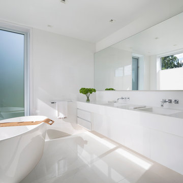
The objective of this award-winning gut renovation was to create a spatially dynamic, light-filled, and energy-efficient home with a strong connection to Long Island Sound. The design strategy is straightforward: a gabled roof covers a central “spine” corridor that terminates with cathedral ceilinged spaces at both ends. The relocated approach and entry deposit visitors into the front hall with its curvilinear, cantilevered stair. A two-story, windowed family gathering space lies ahead – a straight shot to the water beyond.
The design challenge was to utilize the existing house footprint and structure, while raising the top of foundation walls to exceed new flood regulations, reconfiguring the spatial organization, and using innovative materials to produce a tight thermal envelope and contemporary yet contextually appropriate facades.
 TVL Creative Ltd.
This project was such an incredible design opportunity, and instilled inspiration and excitement at every turn! Our amazing clients came to us with the challenge of converting their beloved family home into a welcoming haven for all members of the family. At the time that we met our clients, they were struggling with the difficult personal decision of the fate of the home. Their father/father-in-law had passed away and their mother/mother-in-law had recently been admitted into a nursing facility and was fighting Alzheimer’s. Resistant to loss of the home now that both parents were out of it, our clients purchased the home to keep in in the family. Despite their permanent home currently being in New Jersey, these clients dedicated themselves to keeping and revitalizing the house. We were moved by the story and became immediately passionate about bringing this dream to life.
The home was built by the parents of our clients and was only ever owned by them, making this a truly special space to the family. Our goal was to revitalize the home and to bring new energy into every room without losing the special characteristics that were original to the home when it was built. In this way, we were able to develop a house that maintains its own unique personality while offering a space of welcoming neutrality for all members of the family to enjoy over time.
The renovation touched every part of the home: the exterior, foyer, kitchen, living room, sun room, garage, six bedrooms, three bathrooms, the laundry room, and everything in between. The focus was to develop a style that carried consistently from space to space, but allowed for unique expression in the small details in every room.
Starting at the entry, we renovated the front door and entry point to offer more presence and to bring more of the mid-century vibe to the home’s exterior. We integrated a new modern front door, cedar shingle accents, new exterior paint, and gorgeous contemporary house numbers that really allow the home to stand out. Just inside the entry, we renovated the foyer to create a playful entry point worthy of attention. Cement look tile adorns the foyer floor, and we’ve added new lighting and upgraded the entry coat storage.
Upon entering the home, one will immediately be captivated by the stunning kitchen just off the entry. We transformed this space in just about every way. While the footprint of the home ultimately remained almost identical, the aesthetics were completely turned on their head. We re-worked the kitchen to maximize storage and to create an informal dining area that is great for casual hosting or morning coffee.
We removed the entry to the garage that was once in the informal dining, and created a peninsula in its place that offers a unique division between the kitchen/informal dining and the formal dining and living areas. The simple light warm light gray cabinetry offers a bit of traditional elegance, along with the marble backsplash and quartz countertops. We extended the original wood flooring into the kitchen and stained all floors to match for a warmth that truly resonates through all spaces. We upgraded appliances, added lighting everywhere, and finished the space with some gorgeous mid century furniture pieces.
In the formal dining and living room, we really focused on maintaining the original marble fireplace as a focal point. We cleaned the marble, repaired the mortar, and refinished the original fireplace screen to give a new sleek look in black. We then integrated a new gas insert for modern heating and painted the upper portion in a rich navy blue; an accent that is carried through the home consistently as a nod to our client’s love of the color.
The former entry into the old covered porch is now an elegant glass door leading to a stunning finished sunroom. This room was completely upgraded as well. We wrapped the entire space in cozy white shiplap to keep a casual feel with brightness. We tiled the floor with large format concrete look tile, and painted the old brick fireplace a bright white. We installed a new gas burning unit, and integrated transitional style lighting to bring warmth and elegance into the space. The new black-frame windows are adorned with decorative shades that feature hand-sketched bird prints, and we’ve created a dedicated garden-ware “nook” for our client who loves to work in the yard. The far end of this space is completed with two oversized chaise loungers and overhead lights…the most perfect little reading nook!
Just off the dining room, we created an entirely new space to the home: a mudroom. The clients lacked this space and desperately needed a landing spot upon entering the home from the garage. We uniquely planned existing space in the garage to utilize for this purpose, and were able to create a small but functional entry point without losing the ability to park cars in the garage. This new space features cement-look tile, gorgeous deep brown cabinetry, and plenty of storage for all the small items one might need to store while moving in and out of the home.
The remainder of the upstairs level includes massive renovations to the guest hall bathroom and guest bedroom, upstairs master bed/bath suite, and a third bedroom that we converted into a home office for the client.
Some of the largest transformations were made in the basement, where unfinished space and lack of light were converted into gloriously lit, cozy, finished spaces. Our first task was to convert the massive basement living room into the new master bedroom for our clients. We removed existing built-ins, created an entirely new walk-in closet, painted the old brick fireplace, installed a new gas unit, added carpet, introduced new lighting, replaced windows, and upgraded every part of the aesthetic appearance. One of the most incredible features of this space is the custom double sliding barn door made by a Denver artisan. This space is truly a retreat for our clients!
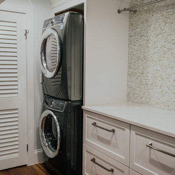
We also completely transformed the laundry room, back storage room, basement master bathroom, and two bedrooms.
This home’s massive scope and ever-evolving challenges were thrilling and exciting to work with, and the result is absolutely amazing. At the end of the day, this home offers a look and feel that the clients love. Above all, though, the clients feel the spirit of their family home and have a welcoming environment for all members of the family to enjoy for years to come.
 SkB Architects
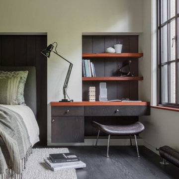
Originally built in 1955, this modest penthouse apartment typified the small, separated living spaces of its era. The design challenge was how to create a home that reflected contemporary taste and the client’s desire for an environment rich in materials and textures. The keys to updating the space were threefold: break down the existing divisions between rooms; emphasize the connection to the adjoining 850-square-foot terrace; and establish an overarching visual harmony for the home through the use of simple, elegant materials.
The renovation preserves and enhances the home’s mid-century roots while bringing the design into the 21st century—appropriate given the apartment’s location just a few blocks from the fairgrounds of the 1962 World’s Fair.

Sponsored
Columbus, OH
Hope Restoration & General Contracting
Columbus Design-Build, Kitchen & Bath Remodeling, Historic Renovations
 MOTIV Interiors
Interior Designer: MOTIV Interiors LLC
Photographer: Sam Angel Photography
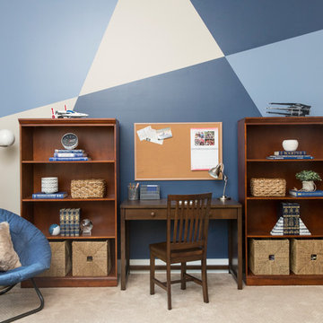
Design Challenge: This 8 year-old boy and girl were outgrowing their existing setup and needed to update their rooms with a plan that would carry them forward into middle school and beyond. In addition to gaining storage and study areas, could these twins show off their big personalities? Absolutely, we said! MOTIV Interiors tackled the rooms of these youngsters living in Nashville's 12th South Neighborhood and created an environment where the dynamic duo can learn, create, and grow together for years to come.
Design Solution:
In his room, we wanted to continue the feature wall fun, but with a different approach. Since our young explorer loves outer space, being a boy scout, and building with legos, we created a dynamic geometric wall that serves as the backdrop for our young hero’s control center. We started with a neutral mushroom color for the majority of the walls in the room, while our feature wall incorporated a deep indigo and sky blue that are as classic as your favorite pair of jeans. We focused on indoor air quality and used Sherwin Williams’ Duration paint in a satin sheen, which is a scrubbable/no-VOC coating.
We wanted to create a great reading corner, so we placed a comfortable denim lounge chair next to the window and made sure to feature a self-portrait created by our young client. For night time reading, we included a super-stellar floor lamp with white globes and a sleek satin nickel finish. Metal details are found throughout the space (such as the lounge chair base and nautical desk clock), and lend a utilitarian feel to the room. In order to balance the metal and keep the room from feeling too cold, we also snuck in woven baskets that work double-duty as decorative pieces and functional storage bins.
The large north-facing window got the royal treatment and was dressed with a relaxed roman shade in a shiitake linen blend. We added a fabulous fabric trim from F. Schumacher and echoed the look by using the same fabric for the bolster on the bed. Royal blue bedding brings a bit of color into the space, and is complimented by the rich chocolate wood tones seen in the furniture throughout. Additional storage was a must, so we brought in a glossy blue storage unit that can accommodate legos, encyclopedias, pinewood derby cars, and more!
Comfort and creativity converge in this space, and we were excited to get a big smile when we turned it over to its new commander.
 White Sands Coastal Development
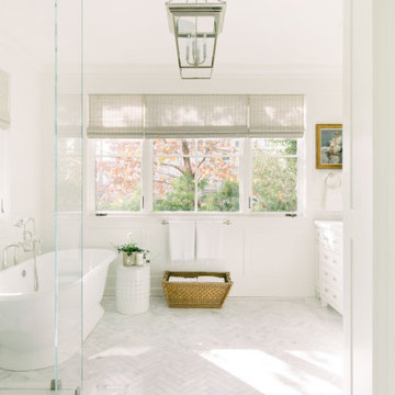
We remodeled this 5,400-square foot, 3-story home on ’s Second Street to give it a more current feel, with cleaner lines and textures. The result is more and less Old World Europe, which is exactly what we were going for. We worked with much of the client’s existing furniture, which has a southern flavor, compliments of its former South Carolina home. This was an additional challenge, because we had to integrate a variety of influences in an intentional and cohesive way.
We painted nearly every surface white in the 5-bed, 6-bath home, and added light-colored window treatments, which brightened and opened the space. Additionally, we replaced all the light fixtures for a more integrated aesthetic. Well-selected accessories help pull the space together, infusing a consistent sense of peace and comfort.
 Amanda Martocchio Architecture
Michael Moran/OTTO photography.
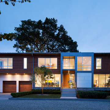
The objective of this award-winning gut renovation was to create a spatially dynamic, light-filled, and energy-efficient home with a strong connection to Long Island Sound. The design strategy is straightforward: a gabled roof covers a central “spine” corridor that terminates with cathedral ceilinged spaces at both ends. The relocated approach and entry deposit visitors into the front hall with its curvilinear, cantilevered stair. A two-story, windowed family gathering space lies ahead – a straight shot to the water beyond.
The design challenge was to utilize the existing house footprint and structure, while raising the top of foundation walls to exceed new flood regulations, reconfiguring the spatial organization, and using innovative materials to produce a tight thermal envelope and contemporary yet contextually appropriate facades.
9